Not every font survives the jump from screen to glowing tube.
Choosing the best fonts for neon signs isn’t just a design decision. It’s a fabrication one. Stroke width, letter spacing, and counter size all determine whether a typeface can actually be produced in LED neon without losing legibility or structural integrity.
Pick the wrong font and the sign looks uneven when lit, costs more to fabricate, or simply can’t be bent into shape at all.
This guide covers 10 typefaces that work in real neon production, from bold display fonts for storefronts to flowing script fonts for wedding backdrops. Each entry includes structural attributes, weight recommendations, licensing details, and pairing options.
By the end, you’ll know exactly which font fits your sign context, your viewing distance, and your budget.
The Best Fonts For Neon Signs
Not every font works in neon. The physics of the medium are strict: LED tubing needs consistent stroke width, open letterforms, and clean junctions to glow evenly. Fonts with hairline strokes, tight counters, or complex decorative details break down fast under light.
This guide covers the 10 best fonts for neon signs — each chosen based on structural attributes that directly affect neon fabrication and legibility, not just how they look on screen.
| Font | Classification | Best For | Style |
| Bebas Neue | Display sans-serif | Storefronts, retail | Bold, all-caps |
| Pacifico | Brush script | Cafés, wedding signs | Retro, casual |
| Gotham | Geometric sans-serif | Upscale business signage | Modern, clean |
| Bayshore | Monoline script | Bars, retro-themed signs | 80s retro |
| Scriptina | Calligraphic script | Wedding, décor | Ornate, flowing |
| Helvetica | Neo-grotesque sans-serif | Wayfinding, corporate | Neutral, precise |
| Avant Garde Gothic | Geometric sans-serif | Modern interiors, studios | Minimal, circular |
| Sign Painter | Display script | Vintage-themed retail | Hand-painted |
| Blockbuster | Condensed display | Entertainment, events | Bold, nostalgic |
| Montserrat | Geometric sans-serif | Urban brands, menus | Modern, geometric |
—
Bebas Neue
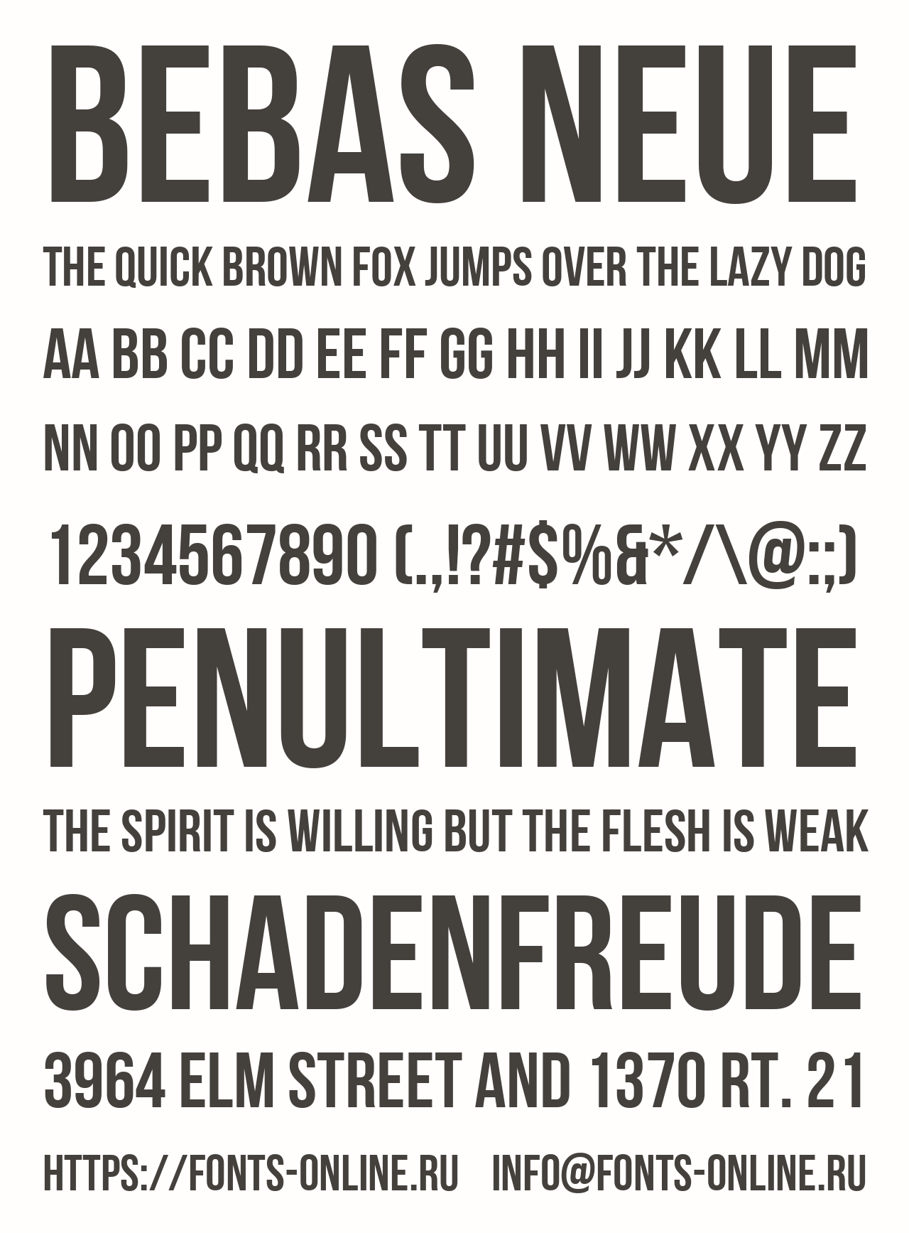
Bebas Neue is a display sans-serif typeface designed by Ryoichi Tsunekawa in 2010, released through Dharma Type and later expanded by Fontfabric. It delivers high-impact all-caps lettering with consistent stroke weight across every character.
Bebas Neue works best for storefront neon signs and retail signage because its uniform, monolinear stroke structure allows even LED light distribution with no weak pinch points.
It was featured on the movie title for La La Land and has been used in major brand campaigns globally, which confirms its legibility at large display sizes.
What makes Bebas Neue suitable for neon signs?
Bebas Neue uses a near-monolinear stroke, meaning thick-to-thin contrast is minimal across letterforms. This directly reduces the risk of uneven glow in neon fabrication. Its condensed width and tall cap height also allow more text in a smaller physical footprint without sacrificing readability at distance.
Key attributes:
| Attribute | Value |
| Classification | Display sans-serif (all-caps) |
| Designer | Ryoichi Tsunekawa, 2010 |
| Weight range | Thin to Black (5 weights in family) |
| Variable font | No |
| Letter-spacing default | Tight |
| License | OFL (open source, free for commercial use) |
| Available on | Google Fonts, Adobe Fonts, Fontfabric |
| Price | Free |
How does Bebas Neue perform at neon sign scale?
At large display sizes (8 inches and above), Bebas Neue renders with strong silhouette definition. Its geometric structure holds up under glow diffusion, meaning letters stay legible even when lit from behind or surrounded by color bleed. The condensed letterforms also hold structural integrity at viewing distances over 20 feet.
What are the best pairings for Bebas Neue in neon signs?
Bebas Neue pairs with Pacifico for contrast between rigid all-caps and flowing script lettering, which is a common combo in bar and café neon setups. It also works alongside Montserrat when a secondary information line needs to match the geometric structure without competing with the headline weight.
What are the limitations of Bebas Neue for neon signs?
Bebas Neue is uppercase-only in its base version, which restricts use cases requiring mixed-case neon lettering. The tight default letter-spacing needs manual adjustment to prevent glow from merging between adjacent characters in fabricated LED signs.
Bebas Neue – Recommended Use Cases Within Neon Signs
- Best for: Bold headline signs on storefronts, event branding, and gym interiors
- Avoid for: Decorative wedding signs or contexts requiring lowercase characters
- Optimal weight: Regular for standard neon; Bold for large-format outdoor signs
- Optimal size range: 8–24 inches letter height for neon fabrication
—
Pacifico
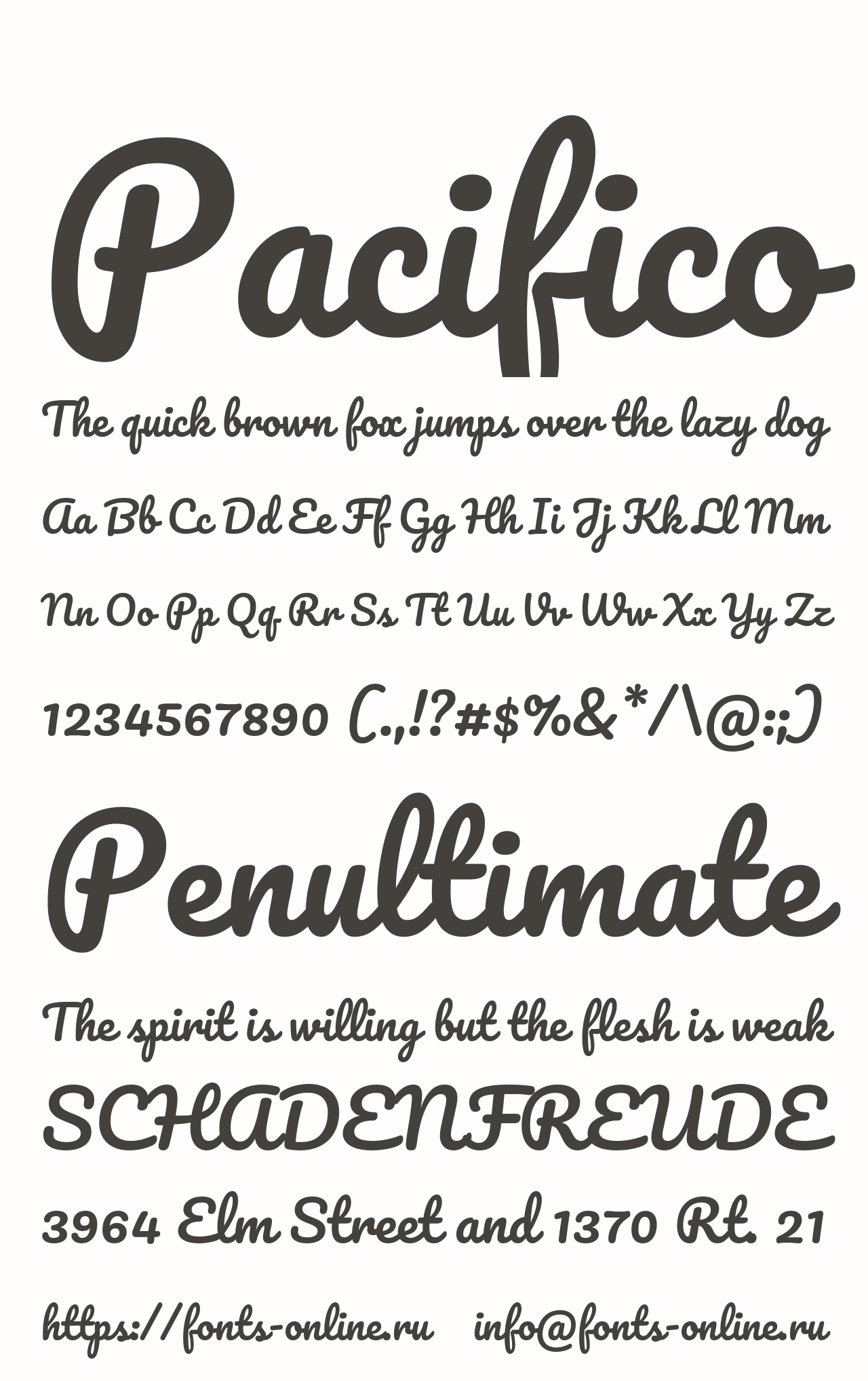
Pacifico is a brush script font designed by Vernon Adams in 2011, inspired by 1950s American surf culture, released through Google Fonts under the SIL Open Font License.
It suits casual and lifestyle neon signs because its thick, consistent brush strokes translate directly into LED tubing without sharp junctions or hairline details.
What makes Pacifico suitable for neon signs?
Pacifico uses a high-contrast brush script style with strokes that stay broad throughout the letterform, rarely dipping below the minimum 20–25mm stroke width recommended by neon fabricators. Its rounded terminals reduce sharp bending angles in physical neon tubing. The connected letter structure also creates a natural, flowing sign aesthetic that reads as a single visual unit.
Key attributes:
| Attribute | Value |
| Classification | Brush script |
| Designer | Vernon Adams, 2011 |
| Weight range | Regular only |
| Variable font | No |
| Letter-spacing default | Normal |
| License | OFL (free for commercial use) |
| Available on | Google Fonts, Adobe Fonts |
| Price | Free |
How does Pacifico perform at neon sign scale?
Pacifico reads clearly at medium viewing distances (10–30 feet) due to its generous x-height and open counters. At large fabricated sizes, the brush stroke weight distributes light evenly across each letter. The flowing connected style works particularly well in warm white or amber neon, which suits the retro surf aesthetic the font was built for.
What are the best pairings for Pacifico in neon signs?
Pacifico pairs with Bebas Neue for a classic retro contrast — script headline with a bold sans-serif secondary line. For warmer or boutique contexts, it pairs with Montserrat Light when a clean supporting typeface is needed without competing visual weight.
What are the limitations of Pacifico for neon signs?
Pacifico ships in a single weight with no bold variant, which limits flexibility for signs that need strong hierarchy between heading and subtext. Its script style also adds fabrication complexity compared to simpler sans-serif neon fonts, which can increase production cost.
Pacifico – Recommended Use Cases Within Neon Signs
- Best for: Café name signs, wedding backdrops, beach bar signage
- Avoid for: Industrial, corporate, or formal business contexts
- Optimal weight: Regular (only option available)
- Optimal size range: 6–18 inches letter height
—
Gotham

Gotham is a geometric sans-serif font designed by Tobias Frere-Jones in 2000 and released through Hoefler & Co. in 2002. It delivers a clean, structured letterform inspired by mid-century New York architectural signage.
Gotham works best for upscale business and brand neon signs because its high x-height and wide apertures maintain strong legibility at distance, and its 8-weight range covers every hierarchy need in multi-line sign layouts.
Gotham was used by Barack Obama’s 2008 presidential campaign and is in the permanent collection of MoMA — the most cited example of its credibility as a display typeface.
What makes Gotham suitable for neon signs?
Gotham has wide apertures in characters like “c,” “e,” and “a,” which prevent glow bleed from closing off letterform openings in illuminated signs. Its consistent stroke weight across all 8 styles (Thin through Ultra) means designers can select exactly the right stroke thickness for a given neon tube diameter. The geometric structure also holds its visual integrity at architectural scale.
Key attributes:
| Attribute | Value |
| Classification | Geometric sans-serif |
| Designer | Tobias Frere-Jones, 2000 |
| Weight range | Thin to Ultra (8 weights, 4 widths, 33 total styles) |
| Variable font | No |
| Letter-spacing default | Normal to wide |
| License | Commercial (Hoefler & Co.) |
| Available on | Hoefler & Co. direct, MyFonts |
| Price | Paid (subscription or per-style purchase) |
How does Gotham perform at neon sign scale?
Gotham Bold and Black hold strong silhouette definition at sizes above 6 inches. Its open counters resist glow merging even in humid or outdoor conditions where LED diffusion spreads. The font has been used in large-format architectural signage at One World Trade Center, confirming its structural performance at scale.
What are the best pairings for Gotham in neon signs?
Gotham pairs with Sentinel (a Hoefler & Co. slab serif) for signs that need a warm, structured secondary line — common in hospitality and restaurant branding. For purely geometric neon layouts, it pairs with Gotham Light as a subheading weight under Gotham Bold headlines.
What are the limitations of Gotham for neon signs?
Gotham is a paid commercial font with per-style pricing through Hoefler & Co., which makes it one of the more expensive choices on this list. No free or open-source version exists, so budget-sensitive projects typically use Montserrat as a structural alternative.
Gotham – Recommended Use Cases Within Neon Signs
- Best for: Upscale bar signage, hotel lobbies, branded storefront neon
- Avoid for: Budget projects or casual/retro-themed signs
- Optimal weight: Bold or Black for primary sign text
- Optimal size range: 6–30 inches letter height
—
Bayshore

Bayshore is a monoline script font designed by Sam Parrett and published through Set Sail Studios in 2017. It delivers a consistent single-stroke letterform modeled on 1980s hand-lettered script.
Bayshore suits retro-themed bar, event, and entertainment neon signs because its monoline structure — uniform stroke width throughout every character — produces perfectly even LED glow with no bright or dim spots.
What makes Bayshore suitable for neon signs?
The monoline design is the key structural advantage here. Most script fonts have thick downstrokes and thin upstrokes, which creates uneven illumination in neon fabrication. Bayshore avoids this entirely. Every stroke runs at the same width, which matches the physical tube diameter of LED neon flex tubing without adjustment. It also includes OpenType end-swashes and underline swashes that add decorative neon detail without increasing fabrication complexity.
Key attributes:
| Attribute | Value |
| Classification | Monoline retro script |
| Designer | Sam Parrett (Set Sail Studios), 2017 |
| Weight range | Single weight only |
| Variable font | No |
| Letter-spacing default | Normal |
| License | Commercial (one-time purchase) |
| Available on | Creative Market, MyFonts, YouWorkForThem, Fontspring |
| Price | Paid |
How does Bayshore perform at neon sign scale?
Bayshore was literally designed with neon in mind — the commercial release includes 10 Photoshop neon glow layer styles. At fabricated sizes above 4 inches, its consistent stroke translates directly to LED flex tubing. The script loops are broad enough to accommodate standard tube diameters without pinching. Its retro 80s aesthetic also matches the visual context of neon bar signs and entertainment venues where the font appears most.
What are the best pairings for Bayshore in neon signs?
Bayshore pairs with Bebas Neue for a retro neon aesthetic — the tight all-caps structure of Bebas contrasts cleanly against Bayshore’s flowing curves. For more playful setups, Bayshore works alongside Pacifico when two script-style elements are needed at different hierarchy levels.
What are the limitations of Bayshore for neon signs?
Bayshore ships in a single weight with no variation options, which limits its use in complex multi-weight sign layouts. Its strong 1980s personality also makes it context-specific — it fits retro and entertainment signs but reads as out of place in modern minimalist or formal business signage.
Bayshore – Recommended Use Cases Within Neon Signs
- Best for: Bar signs, entertainment venue branding, retro event backdrops
- Avoid for: Corporate, luxury, or formal signage contexts
- Optimal weight: Regular (only option)
- Optimal size range: 4–16 inches letter height
—
Scriptina
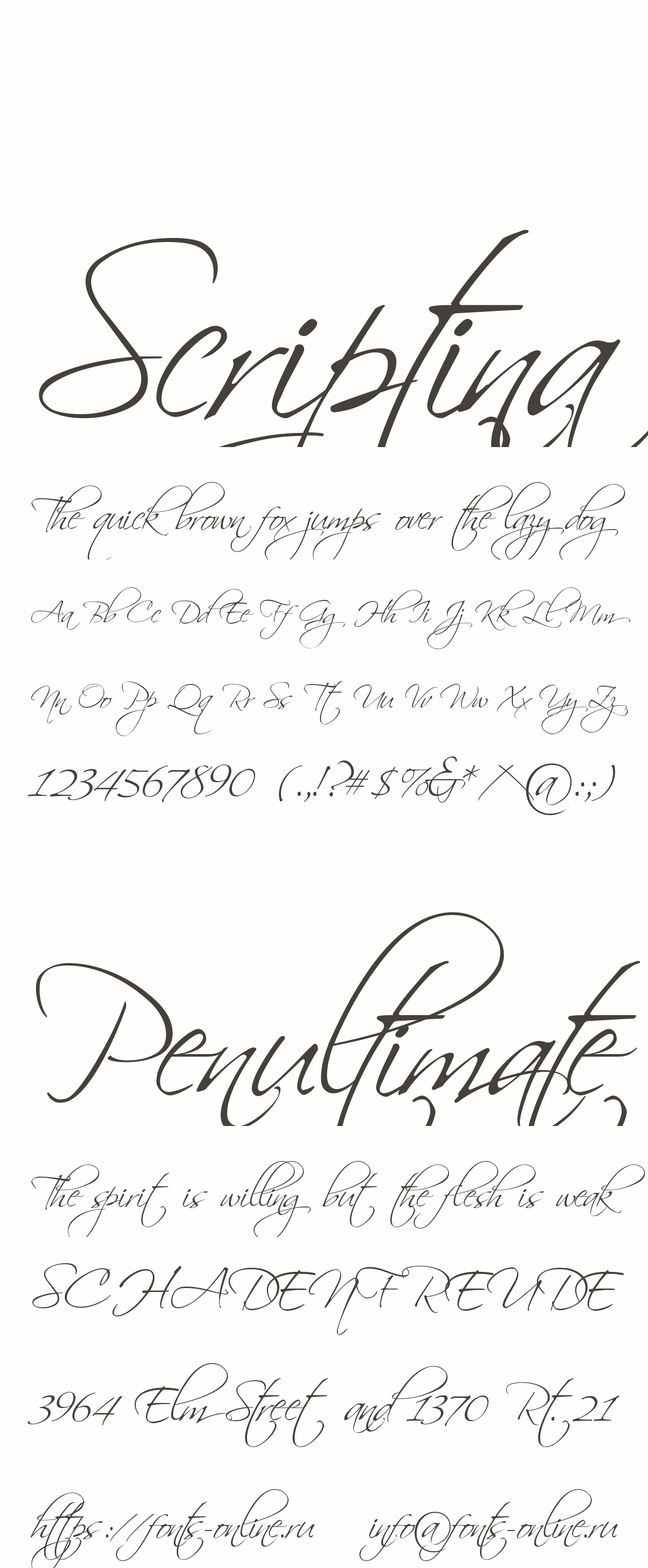
Scriptina is a calligraphic script font designed by Apostrophic Labs (the designer credited as “Apostrophe”) and released in 2001. It delivers flowing, ornate uppercase and lowercase letterforms built on a connected calligraphic structure.
Scriptina works best for decorative and wedding neon signs because its sweeping uppercase initials and continuous letter connections create visually unified script words that read as single flowing elements under illumination.
What makes Scriptina suitable for neon signs?
Scriptina’s stroke weight stays in a semi-light to medium range, which sits within the usable thickness range for LED neon flex tubing when fabricated at standard sign sizes (6 inches and above). Its connected letterforms reduce the number of separate tube segments needed per word, which simplifies fabrication. The ornate uppercase characters create strong visual anchors at the start of a sign phrase.
Key attributes:
| Attribute | Value |
| Classification | Calligraphic script |
| Designer | Apostrophic Labs, 2001 |
| Weight range | Regular only (semi-light weight) |
| Variable font | No |
| Letter-spacing default | Normal |
| License | Free for personal and commercial use |
| Available on | DaFont, 1001 Fonts, Fonts4Free |
| Price | Free |
How does Scriptina perform at neon sign scale?
Scriptina performs well at medium to large sizes (8 inches and above). Its thin strokes in certain letterform transitions can cause inconsistent glow at smaller sizes, so it requires careful minimum size management. At wedding backdrop scale (12–24 inches), the ornate style shows fully and delivers the elegant handwritten neon sign aesthetic common in event photography setups.
What are the best pairings for Scriptina in neon signs?
Scriptina pairs with Gotham Light as a supporting sans-serif for venue names or dates below a main script phrase — the contrast between ornate calligraphy and clean geometric sans is a standard wedding sign pairing. For all-script layouts, it reads well alongside Pacifico at a reduced size for secondary text.
What are the limitations of Scriptina for neon signs?
Scriptina’s intricate letterforms and fine stroke transitions in certain characters can create fabrication challenges at sizes below 6 inches. Its ornate style also limits its versatility — it suits only decorative, romantic, or ceremonial neon sign contexts.
Scriptina – Recommended Use Cases Within Neon Signs
- Best for: Wedding name signs, “happily ever after” event backdrops, boutique décor neon
- Avoid for: Sizes below 6 inches, business signage, outdoor commercial applications
- Optimal weight: Regular (only option)
- Optimal size range: 8–24 inches letter height
—
Helvetica

Helvetica is a neo-grotesque sans-serif font designed by Max Miedinger with Eduard Hoffmann in 1957, released by the Haas Type Foundry in Switzerland. It produces neutral, high-legibility letterforms with minimal stylistic personality.
Helvetica works best for wayfinding, directional, and corporate neon signs because its consistent stroke weight and generous x-height maintain legibility under glow diffusion and at distances exceeding 30 feet.
What makes Helvetica suitable for neon signs?
Helvetica’s strokes maintain a remarkably consistent width throughout each letterform, with minimal thick-to-thin contrast. This near-monolinear quality is ideal for neon fabrication — it produces even illumination across every character. Its generous x-height (tall lowercase relative to cap height) also keeps small supporting text legible even on illuminated signs viewed from a distance.
Research shows that sans-serif fonts like Helvetica reduce misreadings by up to 40% in low-light conditions compared to serif alternatives — a direct benefit in neon sign contexts.
Key attributes:
| Attribute | Value |
| Classification | Neo-grotesque sans-serif |
| Designer | Max Miedinger, 1957 |
| Weight range | Ultralight to Black (multiple widths and weights) |
| Variable font | No (standard); Helvetica Now has variable version |
| Letter-spacing default | Tight |
| License | Commercial (Monotype) |
| Available on | Adobe Fonts, Monotype, MyFonts |
| Price | Paid (subscription or license) |
How does Helvetica perform at neon sign scale?
Helvetica Bold and Heavy perform best in neon fabrication. Its tight apertures (the openings in letters like “c,” “e,” “a”) can partially close under glow diffusion at smaller sizes, so Bold weight or heavier is recommended to maintain open counter areas. At large outdoor sign sizes, it delivers maximum legibility with no distraction from decorative elements.
What are the best pairings for Helvetica in neon signs?
Helvetica pairs with Pacifico for corporate-casual signs — the contrast between Helvetica’s rigid precision and Pacifico’s brush script creates strong visual hierarchy. For dual-language or high-information neon signs, Helvetica pairs with itself across weights (Bold headline, Light subtext) for a clean, structured layout.
What are the limitations of Helvetica for neon signs?
Helvetica’s tight apertures at Light and Regular weights can cause legibility issues when glow diffusion fills in the narrow letter openings. A paid commercial license from Monotype is required, and the cost can be significant for multi-weight purchases. Designers working with budget constraints often substitute Helvetica with the free alternative Arial for neon mockups.
Helvetica – Recommended Use Cases Within Neon Signs
- Best for: Wayfinding signs, corporate lobby neon, directional signage
- Avoid for: Light or thin weight variants in neon; decorative or script contexts
- Optimal weight: Bold 700 or Heavy for primary neon text
- Optimal size range: 6–30 inches letter height
—
Avant Garde Gothic
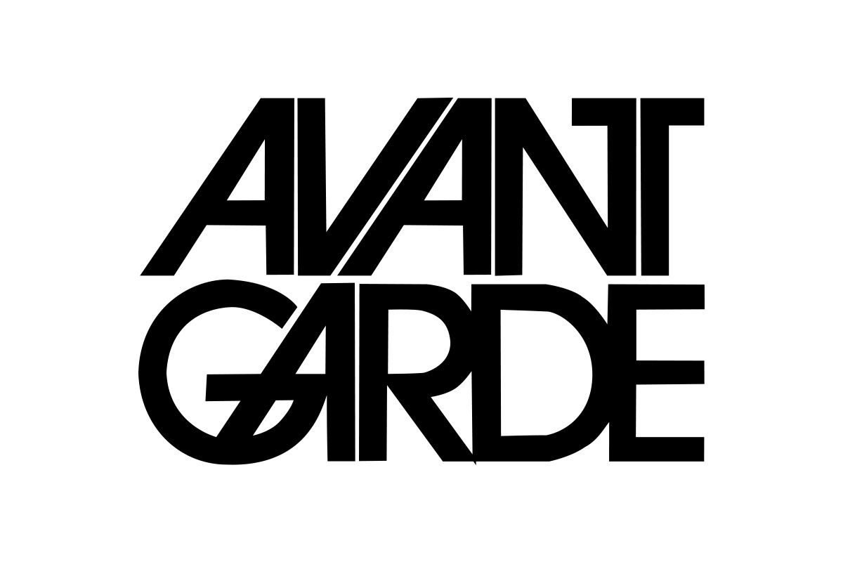
Avant Garde Gothic is a geometric sans-serif font designed by Herb Lubalin and Tom Carnase in 1970, originally created for Avant Garde magazine and released through ITC. It produces perfectly circular letterforms built on a strict geometric grid.
Avant Garde works best for modern interior neon signs and studio branding because its circular “O,” “C,” “G,” and “Q” letterforms create smooth, continuous curves that translate into clean LED neon bends without sharp directional changes.
What makes Avant Garde Gothic suitable for neon signs?
The circular geometry of Avant Garde’s letterforms directly maps to the physical bending properties of LED neon flex tubing. Round letters bend smoothly; angular letters require tight, stress-prone bends. Avant Garde has one of the highest proportions of curved letterforms among geometric sans-serifs. Its consistent stroke weight across all characters also eliminates the uneven glow problem common with high-contrast fonts.
Key attributes:
| Attribute | Value |
| Classification | Geometric sans-serif |
| Designer | Herb Lubalin and Tom Carnase, 1970 |
| Weight range | Extra Light to Bold (5 weights) |
| Variable font | No |
| Letter-spacing default | Tight (designed for near-zero tracking) |
| License | Commercial (ITC, Monotype) |
| Available on | Adobe Fonts, MyFonts, Monotype |
| Price | Paid |
How does Avant Garde Gothic perform at neon sign scale?
Avant Garde Bold delivers clean glow diffusion at neon sign sizes above 6 inches. Its circular shapes produce consistent ring-like illumination in round characters, which is visually distinctive in illuminated signage. The font’s very tight default spacing needs to be opened slightly for neon to prevent glow from merging between adjacent characters — a standard fabrication adjustment.
What are the best pairings for Avant Garde Gothic in neon signs?
Avant Garde pairs with Montserrat as a structurally similar but slightly warmer alternative for secondary text — both are geometric, but Montserrat’s slightly larger x-height provides visual contrast. It also pairs with Bebas Neue for a mixed-weight layout where Bebas Neue handles the condensed headline and Avant Garde manages wider supporting text.
What are the limitations of Avant Garde Gothic for neon signs?
The Extra Light and Light weights are too thin for direct neon fabrication — minimum stroke widths for LED neon (20–25mm) require at least Medium weight at standard sign sizes. The commercial license cost through ITC/Monotype adds to project budget.
Avant Garde Gothic – Recommended Use Cases Within Neon Signs
- Best for: Modern studio neon, minimalist interior signs, lifestyle brand displays
- Avoid for: Light and Extra Light weights in neon; retro or vintage-themed contexts
- Optimal weight: Medium to Bold for neon fabrication
- Optimal size range: 6–20 inches letter height
—
Sign Painter

Sign Painter is a display script font family designed by House Industries and released in 2013. It replicates the hand-painted letterforms used in mid-20th century American commercial signage, covering 8 distinct sign-painting sub-styles within the family.
Sign Painter works best for vintage-themed retail, diner, and bar neon signs because it directly references the historical visual language of neon sign lettering from the 1940s and 1950s.
What makes Sign Painter suitable for neon signs?
Sign Painter’s letterforms were drawn from actual sign-painting reference — the stroke weights and letterform structures are inherently suited to physical sign production. The bolder styles within the family (House Casual, House Script) maintain the minimum stroke widths needed for neon fabrication. Its 8-style range also gives designers multiple lettering moods under a single font family, from casual to formal vintage.
Key attributes:
| Attribute | Value |
| Classification | Display script (hand-lettered) |
| Designer | House Industries, 2013 |
| Weight range | 8 distinct styles (not weight-based) |
| Variable font | No |
| Letter-spacing default | Normal |
| License | Commercial (House Industries) |
| Available on | Adobe Fonts, House Industries direct |
| Price | Paid |
How does Sign Painter perform at neon sign scale?
The bolder Sign Painter styles perform well at neon sign sizes from 6 inches upward. The casual hand-lettered quality adds visual warmth that differentiates vintage neon signs from digitally precise alternatives. Lighter, more detailed styles within the family can develop thin-stroke issues in LED neon, so style selection within the family matters significantly.
What are the best pairings for Sign Painter in neon signs?
Sign Painter pairs with Bebas Neue for a vintage-meets-bold diner aesthetic — the contrast between the hand-painted script and Bebas Neue’s mechanical precision creates visual tension that reads as retro-modern. It also pairs with Blockbuster for fully vintage entertainment signage.
What are the limitations of Sign Painter for neon signs?
Sign Painter’s hand-painted irregularity makes it context-specific — it reads as out of place in modern, minimalist, or corporate neon sign contexts. Some of the lighter decorative styles within the 8-style family contain stroke widths too thin for LED neon fabrication and should be avoided in physical production.
Sign Painter – Recommended Use Cases Within Neon Signs
- Best for: Vintage diner signs, bar and brewery neon, retro retail displays
- Avoid for: Modern minimalist contexts; lighter style variants in physical neon
- Optimal weight: House Casual or House Script styles
- Optimal size range: 8–24 inches letter height
—
Blockbuster
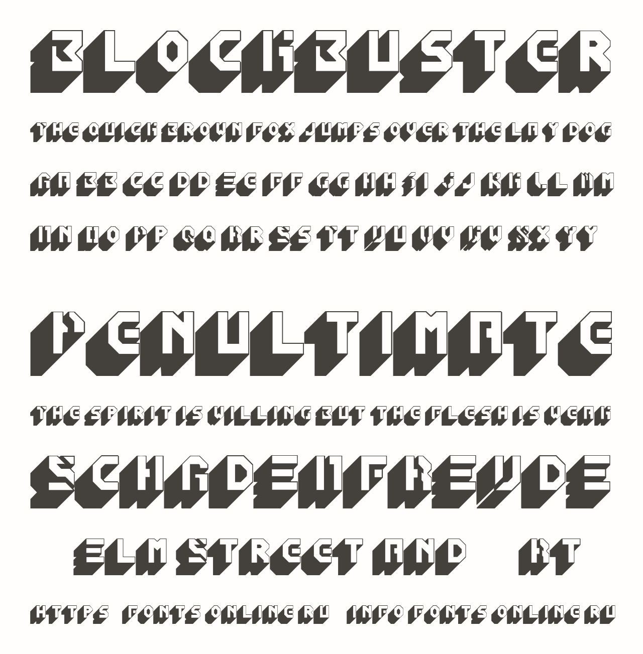
Blockbuster is a condensed display font with bold, rounded edges that evoke mid-20th century entertainment signage. Its condensed letterforms and retro proportions make it a direct reference to classic movie theater and arcade signage from the 1970s and 1980s.
Blockbuster works best for entertainment venue and event neon signs because its bold condensed letterforms allow long words or phrases to fit within a compact sign footprint while maintaining high stroke weight for even LED illumination.
What makes Blockbuster suitable for neon signs?
Blockbuster’s rounded corners directly reduce sharp-angle fabrication challenges in LED neon tubing. Rounded terminals in a display font translate into smoother bends and more consistent glow distribution at curve points. Its condensed width (narrow character set with tall cap height) allows more words per sign panel without reducing letter height below legibility thresholds.
Key attributes:
| Attribute | Value |
| Classification | Condensed rounded display |
| Letter-spacing default | Tight |
| License | Varies by source (check individual license) |
| Available on | MK Neon, various font platforms |
How does Blockbuster perform at neon sign scale?
Blockbuster holds its visual character well at large sign sizes. The rounded edge structure means the glow halo adds to rather than distorts the letterform shape. At viewing distances over 20 feet, the condensed letterforms maintain adequate character spacing and remain legible for short phrases (3–6 words maximum).
What are the best pairings for Blockbuster in neon signs?
Blockbuster pairs with Sign Painter for fully vintage entertainment sign setups. For a retro-modern mix, it works alongside Montserrat Bold as a secondary typeface — Montserrat’s geometric structure provides a clean contrast to Blockbuster’s rounded condensed personality.
What are the limitations of Blockbuster for neon signs?
Blockbuster’s retro entertainment personality limits its use to nostalgia-driven contexts. Its tight default letter spacing requires manual adjustment for neon to prevent glow bleed between adjacent characters. License details vary significantly depending on source, so verification is needed before commercial sign production.
Blockbuster – Recommended Use Cases Within Neon Signs
- Best for: Entertainment venues, event signage, retro gaming bars, cinema lobbies
- Avoid for: Formal business, wedding, or contemporary minimalist contexts
- Optimal weight: Bold (standard style)
- Optimal size range: 8–30 inches letter height
—
Montserrat
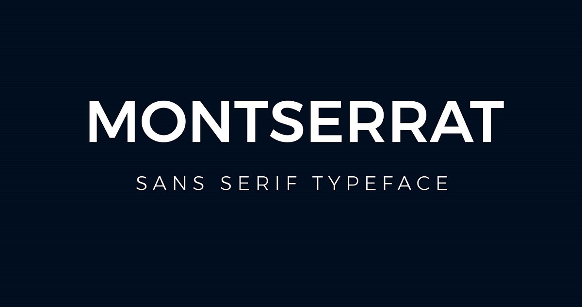
Montserrat is a geometric sans-serif font designed by Julieta Ulanovsky in 2011 and released through Google Fonts in 2017 under the SIL Open Font License. It delivers clean geometric letterforms inspired by early 20th century urban signage from the Montserrat neighborhood of Buenos Aires.
Montserrat suits modern urban brand neon signs because its 18-weight range — from Thin 100 to Black 900 — gives fabricators precise control over stroke thickness to match specific neon tube diameters.
What makes Montserrat suitable for neon signs?
Montserrat’s 18 available weights mean designers can select the exact stroke weight that matches a given LED neon tube size, which eliminates the guesswork common with single-weight fonts. Its geometric construction uses near-circular letter shapes that bend cleanly in neon tubing. The open counters in medium-to-bold weights remain clearly readable under glow diffusion. Montserrat is one of the most downloaded fonts on Google Fonts, making it a reliable, well-tested choice for sign production across multiple fabricators.
Key attributes:
| Attribute | Value |
| Classification | Geometric sans-serif |
| Designer | Julieta Ulanovsky, 2011 |
| Weight range | Thin 100 to Black 900 (18 styles) |
| Variable font | Yes |
| Letter-spacing default | Normal |
| License | OFL (free for commercial use) |
| Available on | Google Fonts, Adobe Fonts |
| Price | Free |
How does Montserrat perform at neon sign scale?
Montserrat Bold and ExtraBold perform best in neon fabrication, maintaining open counter areas that resist glow closure at standard sign sizes. The variable font version allows intermediate weight adjustments, which is useful for matching non-standard neon tube diameters. At viewing distances up to 50 feet, Montserrat ExtraBold renders with consistent legibility on illuminated signs.
What are the best pairings for Montserrat in neon signs?
Montserrat pairs with Pacifico for urban café and restaurant neon where a geometric sans-serif headline needs a warmer script companion. It also pairs with Bebas Neue — both are geometric and free, which is why this combination appears frequently in budget-conscious commercial neon sign projects. For more on how to combine these effectively, see our guide on pairing fonts.
What are the limitations of Montserrat for neon signs?
Montserrat Thin and Light weights (100–300) carry stroke widths too narrow for LED neon fabrication at standard sign sizes and should not be used for physical neon production. Its geometric neutrality also means it lacks the strong visual personality of fonts like Bayshore or Sign Painter for context-specific retro or script neon signs.
Montserrat – Recommended Use Cases Within Neon Signs
- Best for: Urban restaurant menus, co-working space signs, lifestyle brand neon displays
- Avoid for: Thin and Light weight variants in physical neon; vintage or script-themed contexts
- Optimal weight: Bold 700 to ExtraBold 800 for neon fabrication
- Optimal size range: 4–24 inches letter height
—
What To Consider When Choosing Fonts for Neon Signs
Font selection for neon signs follows different rules than digital or print typography. The physical constraints of LED neon tubing override aesthetic preference.
A minimum stroke width of 20–25mm is the standard fabrication threshold — fonts with strokes thinner than this cannot hold LEDs without compromising light distribution, according to sign fabricators at Butler Signs.
Neon sign font spacing also requires adjustment. Default letter-spacing values in most fonts cause glow to merge between adjacent characters when lit. Adding 5–10% extra tracking is standard practice before sending a design to a neon fabricator.
Here’s a quick reference by sign context:
| Context | Recommended Font | Key Reason |
| Wedding backdrop | Scriptina, Pacifico | Connected letterforms, flowing curves |
| Storefront | Bebas Neue, Gotham | Bold stroke, high legibility at distance |
| Bar / entertainment | Bayshore, Blockbuster | Retro personality, monoline structure |
| Modern interior | Avant Garde, Montserrat | Geometric curves, clean minimal form |
| Wayfinding | Helvetica, Gotham | Open apertures, neutral legibility |
Understanding font psychology also plays a role — script fonts signal warmth and celebration, while geometric sans-serifs communicate authority and modernity. The message your sign needs to send should drive the classification choice before any other decision.
For signs combining two typefaces, the structural contrast between a serif and a sans-serif font usually reads more clearly in neon than two similar classifications competing at the same visual weight. Always verify font licensing before using any typeface in commercial neon sign production — free-for-personal-use licenses do not automatically cover commercial signage.
What Makes a Font Work in Neon Signs?
Font selection for neon signs is a fabrication problem before it is a design problem.
The global neon signs market was valued at USD 2 billion in 2023 and is projected to reach USD 3.1 billion by 2032 (DataIntelo), with LED neon technology now accounting for approximately 65% of total market share. That shift from glass tubes to LED flex has changed which fonts actually work in production.
| Structural Factor | Why It Matters | Threshold |
| Stroke width | Must physically hold LED modules | Minimum 20–25mm |
| Counter openness | Prevents glow from closing letter openings | Wide apertures required |
| Corner geometry | Sharp angles stress the tube during bending | Rounded terminals preferred |
| Letter spacing | Default kerning lets glows merge | Add 5–10% tracking before production |
Does stroke width determine whether a font can be physically fabricated in neon?
Yes, directly. Sign fabricators require a minimum stroke width of 20–25mm for effective face illumination, according to Butler Signs. Anything thinner and LED modules cannot be installed without compromising light distribution.
This rules out entire font categories: hairline serifs, thin-weight sans-serifs, and most Display fonts at Light or ExtraLight weight. A font that passes the stroke width threshold at Bold weight will often fail entirely at Regular.
- Bebas Neue Regular: passes at standard neon sizes
- Gotham Light: fails below 10-inch letter height
- Montserrat Thin: not fabricable in most standard LED neon setups
- Scriptina Regular: marginal, requires 8-inch minimum height
How does letter spacing affect readability in illuminated neon signs?
Glow radius is the variable most designers overlook. Each LED neon tube emits a halo of light that extends beyond the physical letterform boundary.
At standard LED brightness levels, adjacent characters can appear to merge when default kerning values are used. The industry fix: increase tracking by 5–10% before sending vector files to a fabricator.
Yellowpop, one of the largest direct-to-consumer LED neon sign platforms, explicitly recommends adding letter spacing in their design guidelines to prevent glow merging, especially in script fonts where letterforms already connect.
—
How Does Font Classification Affect Neon Sign Performance?
Each font classification behaves differently in neon fabrication. The classification determines stroke consistency, bend complexity, and how well the letterform holds up under sustained illumination.
LED neon signs now account for 92% of new sign installations in the bar and hospitality sector for 2023–2024, according to industry analysis. That means fabrication physics, not glass-blowing craft, now governs which fonts perform.
Are script fonts harder to fabricate in LED neon than sans-serif fonts?
It depends entirely on stroke consistency, not the classification itself.
Monoline scripts like Bayshore are actually easier to fabricate than many sans-serif fonts because every stroke runs at the same width, matching the physical LED neon tube diameter exactly. No compensation needed.
Calligraphic scripts like Scriptina are harder. High-contrast strokes (thick downstrokes, thin upstrokes) create fabrication tension: the thick areas diffuse light broadly, the thin areas emit a weak glow, and the result looks uneven when lit.
| Classification | Fabrication Difficulty | Key Reason |
| Monoline script | Low | Consistent stroke matches tube diameter |
| Geometric sans-serif | Low | Circular shapes bend cleanly |
| Calligraphic script | Medium | Stroke variation creates uneven glow |
| High-contrast serif | High | Hairline serifs cannot hold LED modules |
Which font classifications are structurally incompatible with neon signs?
High-contrast typefaces are the primary incompatible category. Didot-style and Bodoni-style serifs, which use extreme thick-thin stroke variation as their defining visual characteristic, are structurally broken by that same feature in neon fabrication.
Incompatible by default:
- Didone serifs (Bodoni, Didot) — hairline strokes cannot hold LEDs
- Ultra-condensed display fonts — letter width too narrow for standard tube bending
- Decorative typefaces with inline or outline effects — fabrication complexity spikes
Slab serifs are a partial exception. Bold slab serifs (Rockwell, Clarendon) hold light well because their blocky terminals maintain adequate stroke width throughout. The rule: if the serif is thick enough to hold a 20mm tube, the font can work in neon.
—
How Does Viewing Distance Determine Font Choice for Neon Signs?
The physical environment of a sign determines which fonts are appropriate before any aesthetic decision is made.
Research from the United States Sign Council (USSC) and Pennsylvania Transportation Institute establishes the industry standard: 1 inch of capital letter height provides 10 feet of readability with maximum impact. A 10-inch letter is legible at 100 feet. A 24-inch letter reaches 240 feet.
Which neon fonts hold legibility at 30 feet and beyond?
At 30 feet and beyond, font weight becomes the deciding variable.
Helvetica Bold, Gotham Black, and Bebas Neue maintain strong silhouette definition at those distances because their stroke widths remain above the minimum LED neon threshold even at viewing-distance sizes. Open counters in characters like “c,” “e,” and “a” resist the glow fill-in that can close off letterform openings at distance.
Script fonts — even good ones — begin to lose individual letter definition beyond 20–25 feet because the connected letterforms read as a single mass, not as individual characters. Pacifico and Scriptina are best suited to close-viewing contexts: wedding backdrops, interior café walls, residential décor installations viewed from under 15 feet.
How do indoor and outdoor neon signs differ in font requirements?
Ambient light changes the effective glow radius of any neon sign.
Indoor neon operates in controlled lighting. Glow radius stays predictable. Lighter-weight fonts can work if the interior is dim enough to maintain contrast between the illuminated sign and the background surface.
Outdoor neon competes with daylight, street lighting, and other signage. Bold weight becomes mandatory. Signage legibility studies show that sans-serif fonts reduce misreadings by up to 40% in low-light outdoor conditions compared to serif alternatives, according to a signage analysis published by Zigosign.
Streetside retail neon (viewed from vehicles) needs letters sized for the driving speed. A sign readable for 3 full seconds at 45 mph requires legibility at 198 feet, which means a minimum 6-inch letter height per US Sign Council guidelines.
—
How Do Neon Sign Context and Setting Determine Font Selection?
Context maps to font classification in neon signage more reliably than in any other medium. The setting physically constrains the aesthetic choices available.
Restaurants and cafés dominate the neon sign end-user market, accounting for the largest revenue share in 2023 according to DataIntelo, followed by retail shops, content production studios, and night clubs. Each segment uses neon for different visual purposes, and those purposes directly determine which font classifications perform.
What fonts are best for wedding neon signs?
Script fonts with connected letterforms and consistent medium-weight strokes dominate wedding neon sign production.
Pacifico and Scriptina lead this category because their flowing, connected letter structures create visually unified phrases that read as single decorative elements. Wedding backdrops are typically viewed at 8–15 feet by guests and photographers, which keeps the minimum size requirements within script font legibility range.
Practical specs for wedding neon sign fonts:
- Minimum 8-inch letter height for script fonts at backdrop distance
- Warm white or soft pink LED color pairs best with calligraphic styles
- Word count limited to 3–6 words for readability in photography
Yellowpop reports that wedding and event neon accounts for a significant portion of their custom sign production, with script fonts used in nearly all personal-occasion applications.
What fonts work best for commercial storefront neon signs?
Geometric sans-serifs are the structural default for commercial storefront neon.
Gotham, Helvetica Bold, and Montserrat ExtraBold cover the range from upscale to accessible brand positioning. All three maintain open counters and consistent stroke weights at the sizes required for storefront legibility (typically 6–18 inches).
Signage research shows that geometric and neo-grotesque sans-serifs outperform all other classifications for speed of recognition on storefront and retail signs. Recognition speed matters in commercial contexts where pedestrians make a 1–2 second judgment about whether to enter.
Bar and entertainment neon follows a different logic. Bayshore and Blockbuster dominate those contexts because their retro visual personality signals the type of venue before the text is even read. Fonts for signs used in entertainment settings carry psychological associations that geometric sans-serifs cannot replicate.
—
What Font Licensing Rules Apply to Commercial Neon Sign Production?
Font licensing is the most frequently ignored production step in neon sign design. A “free” font downloaded from DaFont or a random font aggregator site is not automatically cleared for commercial sign production.
Many fonts on aggregator platforms are licensed for personal use only. Using them in a client sign or a commercially produced product technically violates the license, even if the font was free to download, according to Indotype’s font licensing analysis. More importantly, it exposes the designer or sign producer to foundry claims after production is complete.
Which fonts on this list are free for commercial neon sign production?
Three fonts from this list carry the SIL Open Font License (OFL), which explicitly permits commercial use including physical product production:
- Bebas Neue — OFL since 2018, confirmed free for commercial use including physical signage
- Pacifico — OFL via Google Fonts, no commercial restrictions
- Montserrat — OFL via Google Fonts, all 18 weights cleared for commercial use
The OFL permits modification, redistribution, and use in any commercial product as long as the font is not sold as a standalone font file. A physical neon sign is a product containing the font’s letterforms, not a font file — OFL permits this use.
Which fonts require a paid commercial license before production?
Font licensing expert analysis from Monotype and Fontfabric confirms that desktop licenses do not automatically cover commercial signage production or client deliverables.
Gotham (Hoefler & Co.) requires a commercial desktop license before a fabricator can produce a sign from its letterforms. A personal-use download of an unofficial Gotham copy does not constitute legal licensing for commercial sign production.
Helvetica (Monotype) follows the same rule. Licensing is available through Adobe Fonts subscription for design use, but production of physical commercial signage from Helvetica requires verifying that the Monotype EULA covers product manufacturing.
Bayshore (Set Sail Studios) and Sign Painter (House Industries) are commercial fonts. The retail purchase from Creative Market, MyFonts, or the foundry direct covers personal and professional design use, but sign producers should confirm the EULA covers commercial physical production specifically.
The practical rule: if a font came from a “1000 free fonts” bundle or an unofficial download site, assume it is not cleared for commercial sign production. Go to the foundry directly. For anyone working with font licensing questions on client projects, the foundry’s EULA is the only authoritative source.
—
How Do You Pair Two Fonts on a Neon Sign?
Most neon signs that use two fonts fail because the designer chose two fonts that look similar, not two fonts that create clear visual hierarchy. The goal of font pairing in neon is contrast, not harmony.
The global neon signs market growing at a CAGR of 5–7.5% through 2032 means more designers are producing neon sign work without physical fabrication experience. Pairing decisions made in Illustrator or Canva do not always survive the move to physical production. Font pairing must account for both visual hierarchy and fabrication compatibility.
What is the structural contrast principle for neon sign font pairing?
Script + geometric sans-serif is the most reliable pairing structure for neon signs. It works because the two classifications contrast on every structural axis: stroke consistency, letter connection, geometric rigidity, and visual personality.
Effective neon pairings from this list:
- Pacifico + Bebas Neue: brush script warmth meets rigid all-caps structure. Standard in café and bar neon setups.
- Scriptina + Gotham Light: ornate calligraphic headline above a clean secondary line. Used in hospitality and wedding signage.
- Bayshore + Montserrat ExtraBold: retro monoline script with geometric supporting text. Both are free for commercial use.
For a structured approach to finding these combinations, a font pairing generator can surface viable contrast options quickly before committing to fabrication costs.
How does weight hierarchy work in multi-line neon signs?
Weight hierarchy in a two-line neon sign follows one rule: one font carries primary weight, the other recedes.
Reversing weight hierarchy is the most common neon sign pairing mistake. If both fonts run at similar visual weight, the sign reads as two competing elements rather than one unified message. From a viewing distance of 15–30 feet, that competition collapses into visual noise.
Practical specs for multi-line neon:
- Primary line: 8–24 inches, heavy weight, maximum 3–5 words
- Secondary line: 50–60% of primary letter height, lighter weight
- Line gap: minimum 1.5x the letter height of the secondary line to prevent glow from the two lines merging
Color contrast can substitute for weight contrast in two-color LED neon layouts. A warm amber primary line paired with a cool white secondary line creates hierarchy through color even when both fonts run at similar stroke weights. This is a common approach in bar and restaurant neon where two brand elements need equal visual emphasis without one overpowering the other.
For deeper context on how type classifications interact in pairing, see the guide on pairing fonts — the same structural contrast principles that apply to screen typography apply to neon, with the additional constraint of fabrication physics limiting which contrast pairings are actually producible.
FAQ on The Best Fonts For Neon Signs
What is the most popular font used for neon signs?
Bebas Neue is the most widely used font in commercial neon sign production. Its all-caps structure, consistent stroke weight, and monolinear design make it ideal for LED neon fabrication. It’s free under the SIL Open Font License and available on Google Fonts.
Can any font be used for a neon sign?
No. Fonts with hairline strokes or extreme thick-thin contrast cannot be physically fabricated in LED neon. The minimum stroke width for neon production is 20–25mm. High-contrast typefaces like Didot or thin-weight sans-serifs fail this threshold entirely.
What font is best for a wedding neon sign?
Pacifico and Scriptina are the top choices for wedding neon signs. Both use connected, flowing letterforms that read as single decorative elements. They work best at 8 inches or taller and pair well with warm white or soft pink LED neon colors.
Are script fonts good for neon signs?
Monoline script fonts work well. Their consistent stroke width matches LED tube diameter and produces even illumination. Calligraphic scripts with thick-thin variation are harder to fabricate and require larger minimum sizes to avoid uneven glow across letterforms.
What font is used in retro neon signs?
Bayshore is the go-to retro neon sign font. Designed by Sam Parrett in 2017, it replicates 1980s hand-lettered script with a monoline structure built for neon production. Sign Painter by House Industries also captures the vintage hand-painted signage aesthetic accurately.
Is Helvetica good for neon signs?
Yes, in Bold or Heavy weight. Helvetica’s near-monolinear stroke and generous x-height produce even LED illumination and strong legibility at distance. Avoid Light and Regular weights — their stroke width falls below the 20–25mm fabrication minimum at standard neon sign sizes.
What is the best free font for neon signs?
Bebas Neue, Pacifico, and Montserrat are all free under the SIL Open Font License, cleared for commercial sign production. Montserrat offers the widest flexibility with 18 weights. All three are available directly on Google Fonts with no licensing restrictions on physical products.
How does letter spacing affect neon sign readability?
Default kerning values cause glow from adjacent characters to merge when lit. Adding 5–10% tracking before sending files to a fabricator prevents this. Script fonts with connected letterforms are especially prone to this issue at standard LED neon brightness levels.
What font size should a neon sign be?
Use the United States Sign Council standard: 1 inch of letter height per 10 feet of viewing distance. A sign viewed from 30 feet needs 3-inch letters at minimum. Storefront neon typically runs 6–18 inches. Wedding backdrop neon works well at 8–12 inches.
Do font licenses cover commercial neon sign production?
Not automatically. Personal-use and desktop licenses do not always cover commercial physical signage. OFL fonts like Bebas Neue and Montserrat are safe for commercial production. Gotham, Helvetica, and Bayshore require verified commercial licenses from their respective foundries before production.
Conclusion
This conclusion is for an article presenting the best fonts for neon signs, and the core takeaway is simple: font choice is a structural decision, not just a visual one.
Stroke width, counter openness, and letter spacing determine what survives LED neon fabrication. Aesthetic preference comes second.
For storefront and commercial signage, geometric sans-serifs like Gotham and Montserrat deliver the strongest legibility at distance. For wedding backdrops and personal décor, script typefaces with consistent stroke weight outperform calligraphic alternatives every time.
Always verify font licensing before production. OFL fonts are safe. Everything else needs a confirmed commercial license from the foundry.
Get the neon sign font right from the start and the fabrication, the glow, and the readability all follow.

Renowned for his expertise in logo design and visual branding, Bogdan has developed a multitude of logos for various clients.
His skills extend to creating posters, vector illustrations, business cards, and brochures. Additionally, Bogdan's UI kits were featured on marketplaces like Visual Hierarchy and UI8.
He also wrote in the past years on sites like Design Your Way, WebDesignerDepot, WPDean, Designmodo, Speckyboy, Slider Revolution, and more.
- The Substack Logo History, Colors, Font, And Meaning - 2 October 2026
- How UX Design Impacts SaaS User Retention and Churn - 1 October 2026
- How to Embed Fonts in PDF for Reliable Printing - 30 September 2026

Bogdan Sandu is a seasoned designer who has been designing websites since 2008. Renowned for his expertise in logo design and visual branding, Bogdan has developed a multitude of logos for various clients. His skills extend to creating posters, vector illustrations, business cards, and brochures. Additionally, Bogdan's UI kits were featured on marketplaces like Visual Hierarchy and UI8. He also wrote in the past years on sites like Design Your Way, WebDesignerDepot, WPDean, Designmodo, Speckyboy, Slider Revolution, and more.
You Might Also Like