


Two fonts sit next to each other on your screen. One feels right. The other looks like a mistake you can’t quite explain.
Learning how to pair fonts is one of those skills that separates polished design from amateur layouts. It affects readability, brand perception, and how long someone actually stays on your page.
This guide covers the contrast method, superfamily shortcuts, specific typeface combinations you can use right now, and the performance trade-offs most people ignore. You’ll also find common mistakes that quietly wreck otherwise solid designs.
What Is Font Pairing?
Font pairing is the practice of selecting two or more typefaces that work together in a single design. The goal is to build contrast without conflict, where each typeface plays a clear role while sharing enough visual DNA to feel connected.
It sounds simple. Pick a heading font, pick a body font, call it a day. But most designers know the reality is trickier than that.
A 2024 study published in Scientific Reports used network analysis across thousands of real-world font pairings and found that different mediums (web, print, advertising) preferentially use fonts with distinct morphological features. The research confirmed that successful pairings follow identifiable structural patterns, not just gut instinct.
Monotype’s 2024 Global Font Use Survey found that 83% of designers rank font selection among their top three creative decisions. And 75% of respondents said a distinctive typeface is critical for shaping brand identity.
That’s the weight this carries. Your font combination sets the tone before anyone reads a single word.
The difference between a good pairing and a bad one often comes down to typographic hierarchy. One font leads, the other supports. When both compete for attention, the layout falls apart. When both are too similar, the whole thing looks like a mistake.
Font Pairing vs. Just Picking Two Fonts
Pairing is intentional. You’re matching structure, proportion, and mood across typefaces so they create a system, not just sitting next to each other.
Randomly grabbing Montserrat for headings and Roboto for body text might work. But knowing why it works (similar geometric skeleton, different weight distribution) is what separates considered typography from guesswork.
A quick test: squint at your layout. If you can clearly distinguish heading from body text without reading, your pairing has enough contrast. If everything blurs into one level, you’ve paired too closely.
Why Certain Fonts Work Together and Others Don’t
Two fonts clash for one reason. They’re either too similar or too different with nothing connecting them.
Took me a while to really internalize that. I used to think “just use a serif and a sans-serif” was the whole answer. It’s not. Two geometric sans-serifs side by side (say, Futura and Montserrat) can look like a typo because they occupy the same visual space without creating any tension.
The Similarity Problem
Smashing Magazine’s typeface combination guide puts it clearly: putting two fonts with similar personalities together creates unwanted conflict. Trade Gothic paired with Bell Gothic, for example, both want to do the same job. Neither yields to the other.
A 2024 study on font effects from the All India Institute of Medical Sciences found that serif, sans-serif, and script fonts each produce measurably different effects on attention and working memory. Fonts aren’t just visual decorations. They affect how people process information.
So pairing two typefaces that trigger the same cognitive response? You’re wasting a slot.
What Actually Makes Pairings Click
Shared proportions are the invisible glue. Two fonts can look completely different in style but if their x-height and letter width are close, they’ll feel cohesive at any size.
Mood alignment matters more than category matching. A warm humanist sans-serif can pair beautifully with a transitional serif because they share a “friendly authority” tone, even though they belong to different classifications.
| What Connects a Pairing | What Breaks a Pairing |
|---|---|
| Similar x-height and proportions | Competing for the same visual role |
| Complementary mood/tone | Clashing personality (playful + rigid) |
| Clear role assignment (lead + support) | Too many weights from each family |
| Enough structural contrast to create hierarchy | Nearly identical structure with no contrast |
The UCF Readability Consortium found that matching readers with their best-fitting font improved reading speed by 14 to 25 words per minute without hurting comprehension. Your mileage may vary, but the point stands: font choices directly impact how fast people can consume your content.
The Contrast Method for Pairing Fonts

Contrast is the single most reliable principle for building font combinations. Not contrast for its own sake, but purposeful differences across specific axes that create clear visual hierarchy.
Adobe’s font pairing framework breaks this down into three steps: anchor (choose your primary font), balance (find contrast plus similarity), and job plus emotion (make sure both fonts serve their assigned roles). That’s actually the best mental model I’ve come across.
Contrast in Classification
The classic move is pairing a serif heading with a sans-serif body, or vice versa. There’s a reason this approach has survived every design trend since movable type.
Pangram Pangram Foundry’s 2025 pairing guide highlights combinations like Neue Montreal (grotesque sans) with Editorial New (high-contrast serif) as a current favorite. The structural gap between these two classifications gives your layout immediate depth.
But don’t treat this as a rule you can’t break. Two sans-serifs can pair well if they differ in other ways. Josefin Sans with Lato works because Josefin has handwriting-like qualities while Lato stays neutral. The contrast lives in personality, not classification.
Contrast in Weight and Texture

Heavy display face + light text face is a pairing pattern that almost always works. The weight difference does most of the hierarchy work before size even enters the equation.
Figma’s font pairing resource recommends Fjalla One (bold, condensed) with Cantarell (open, humanist) as a strong example. One font demands attention. The other steps back and lets you read comfortably.
The HTTP Archive’s 2024 Web Almanac found that 87% of websites now use web fonts, up from near-zero in 2010. With that many sites pulling custom typefaces, the quality of your font weight and texture decisions is what separates you from the crowd.
A practical thing most people overlook: test your weight contrast at mobile sizes. A pairing that creates beautiful tension on a 27-inch monitor can completely collapse on a phone screen where everything shrinks to roughly the same optical weight.
Pairing Fonts by Superfamily and Type Foundry

This is the safe route. And honestly? Sometimes safe is exactly what the project needs.
Font superfamilies are typeface systems where a serif and sans-serif (and sometimes a monospace) share the same underlying skeleton. They were literally designed to be paired.
Built-In Harmony with Superfamilies
Source Sans + Source Serif from Adobe is probably the most widely used superfamily pairing on the web right now. Both share identical proportions, which means they sit on the same baseline without any awkward optical adjustments.
Other reliable superfamily options:
- Roboto and Roboto Slab (Google’s workhorse, used across Android and Material Design)
- Noto Sans and Noto Serif (covers 1,000+ languages, designed for global readability)
- IBM Plex Sans, Serif, and Mono (built for IBM’s design system, extremely consistent)
Google Fonts now offers 1,826 font families as of early 2025, with roughly 468 supporting variable font technology (Photutorial). That’s a lot of free pairing material sitting right there.
Foundry-Based Pairing
Fonts from the same type foundry often share structural habits even when they’re not part of a superfamily. The designers at a given foundry tend to use similar stroke terminals, curve logic, and spacing conventions.
Pangram Pangram, for example, builds multiple typefaces that share a common design philosophy. Their Neue Montreal pairs cleanly with their Hatton serif because both fonts come from the same design DNA, even though they serve opposite roles.
The limitation: superfamily and foundry pairings are predictable. They’re correct but rarely surprising. If a project calls for a strong personality (think poster design or brand typography for a startup), you’ll probably want to step outside this comfort zone.
Font Pairing Combinations That Work Across Projects’

Enough theory. Here are specific pairings you can grab and use right now, grouped by the kind of project they fit best.
I’ve tested most of these in actual client work or personal projects. Your mileage may vary depending on the content, but these are solid starting points.
Pairings for Clean, Minimal Interfaces
Inter + Merriweather. Inter handles UI labels, navigation, and small text with extreme clarity. Merriweather’s generous x-height makes it readable down to 14px for body content. Together, they’re clean without being sterile.
Work Sans + Lora. Work Sans brings a slightly warmer geometric feel to headings while Lora adds subtle calligraphic curves in the body text. Great for SaaS dashboards and documentation sites.
The HTTP Archive’s 2024 data shows Google Fonts still powers about 57% of all web font hosting, making free pairings like these accessible to basically everyone.
Pairings for Editorial and Long-Form Reading
Playfair Display + Source Sans Pro. This one shows up everywhere for good reason. Playfair’s high-contrast strokes make elegant headlines while Source Sans Pro disappears into comfortable body text. Figma’s own pairing resource lists this combo for professional websites and editorial layouts.
Libre Baskerville + Montserrat. Old-style serifs meeting geometric sans. The contrast between Baskerville’s traditional curves and Montserrat’s clean geometry creates a dynamic that works for magazines, blogs, and academic sites.
EB Garamond paired with Montserrat is another editorial favorite. Webflow’s pairing guide highlights it because Garamond’s classic typewriter appeal contrasts sharply with Montserrat’s modern spacing.
Pairings for Bold, Expressive Layouts
If you’re building something that needs to grab attention fast (book cover design, event pages, advertising design), safe pairings won’t cut it.
Alfa Slab One + Source Code Pro. A heavy slab serif against a light monospace. Webflow calls this one out specifically for designs that want to “break away from the norm.” The weight gap is extreme and that’s the point.
| Pairing | Best For | Why It Works |
|---|---|---|
| Inter + Merriweather | SaaS, dashboards | Clarity + warmth at small sizes |
| Playfair Display + Source Sans Pro | Editorial, blogs | High contrast headlines, invisible body |
| Work Sans + Lora | Documentation, corporate | Warm geometry meets calligraphic curves |
| Alfa Slab One + Source Code Pro | Creative, tech | Extreme weight contrast grabs attention |
| Libre Baskerville + Montserrat | Academic, magazines | Traditional authority + modern geometry |
Monotype’s 2024 survey found that 45% of designers cited AI-suggested font pairings as one of the most valuable design applications of AI. Tools are getting better at this, but understanding why a pairing works still matters more than any auto-generated suggestion.
How to Test Font Pairings Before Committing
Looking at two font names side by side in a Google Fonts preview tells you almost nothing. You need to see them in context, at real sizes, with actual content.
Browser-Based Testing Tools
Typescale.com lets you set a base font size and modular ratio, then preview heading and body text simultaneously. It’s the fastest way to check if your type scale makes sense before you touch any code.
Google Fonts itself has improved its preview significantly. You can now type custom text, adjust sizes, and compare multiple families side by side. For a free tool, it’s surprisingly capable.
Archetype by Fathom goes deeper. You can build a full typographic system with multiple levels of hierarchy and export the CSS directly.
Testing in Your Actual Design Environment
Figma remains the most popular place to test pairings in context. Drop both fonts into a real layout (not just sample text on a blank canvas) and check how they behave next to buttons, images, and white space.
Chrome DevTools is underrated for this. You can swap fonts on any live website by editing the font-family property in the inspector. Took me forever to start doing this regularly, but it’s the fastest reality check available.
What to look for during testing:
- X-height alignment: do both fonts look optically centered on the same line?
- Typographic color: does the body text create an even gray texture, or are there dark and light patches?
- Rhythm: does the leading and spacing feel consistent across both typefaces?
The 2024 Web Almanac found that variable fonts now appear on 34% of mobile pages, up from 30% the year before. If you’re testing pairings in 2025, check whether a variable font version exists. You might get the same visual range from a single file, which cuts your HTTP requests in half.
And test on mobile. Seriously. A pairing that sings on desktop can turn into mush on a 375px screen where your heading and body fonts render at nearly identical optical sizes.
How Many Fonts to Use in One Project
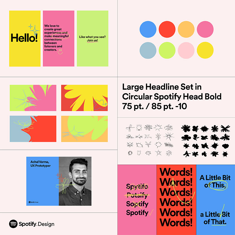
Two. That’s the number most experienced designers settle on.
The “two-font rule” exists because it forces you to create hierarchy through weight, size, and scale and proportion rather than piling on more typefaces. One font for headings. One for body text. Done.
When Three Fonts Make Sense
A third font earns its place only when it fills a role the first two can’t. The most common scenario: adding a monospace for code snippets on a tech blog, or a display font for hero sections that need serious visual punch.
GitHub, Booking.com, and Medium all use system fonts exclusively, according to Wholegrain Digital’s performance analysis. No custom web fonts at all. That’s one font family, and their sites look great.
The 5-Minute Designer puts it bluntly: two font families maximum for most projects. Use different weights within each family to create the hierarchy you need.
The Performance Cost of Extra Fonts
Each font weight you load is a separate file download. Two families with four weights each means eight HTTP requests before your text even renders.
The 2024 Web Almanac found the median web font file sits around 35 to 36 kilobytes. That adds up fast when you’re loading multiple families and weights.
WOFF2 format cuts file sizes by roughly 30% compared to WOFF, according to SearchX. Font subsetting can reduce sizes even further. Paul Conroy documented a case where subsetting fonts to Latin characters only improved Largest Contentful Paint by 20% and First Contentful Paint by 10%.
Variable Fonts as a Solution
A single variable font file can contain an entire range of weights, widths, and styles. Instead of loading Regular, Bold, and Italic as three separate files, you load one.
| Approach | Files Loaded | Flexibility | Performance |
|---|---|---|---|
| Static fonts (2 families, 4 weights each) | 8 files | Fixed weights only | Heavy |
| Static fonts (2 families, 2 weights each) | 4 files | Limited | Moderate |
| Variable fonts (2 families) | 2 files | Full weight/width range | Light |
Google Fonts now hosts about 468 variable font families (Photutorial, 2025). Open Sans and Montserrat are among the most popular variable options, appearing on 16% and 10% of sites using variable fonts respectively, per the HTTP Archive.
Font Pairing and Typographic Hierarchy

Picking two fonts that look nice together is half the job. The other half is building a system where every text element has a clear role and no two levels of your hierarchy compete for the same attention.
Assigning Roles Beyond Heading and Body
A real typographic system has more than two levels. Think about it:
- H1 headline
- H2 and H3 subheadings
- Body paragraph
- Captions and labels
- Navigation and UI elements
Each of these needs to feel distinct while still belonging to the same family of decisions. Kerning and tracking adjustments play a bigger role here than most people realize.
Type Scale Systems
Modular scale uses a ratio (like 1.25 or 1.333) to generate consistent size steps. Your body text might be 16px, subheadings 20px, headings 25px, and display text 31px.
The Learn UI Design guidelines recommend starting at 17px for body text and adjusting from there. iOS defaults to 17px SF Pro, Material Design defaults to 16px Roboto.
Manual scale gives you more control. You pick each size by eye rather than formula. Slower to set up, but better for layouts where certain levels need to break the pattern for emphasis.
Size and Weight Do More Than Font Choice
A single font family at different sizes and weights can create more hierarchy than two fonts at the same size. Monotype’s 2024 survey found 76% of designers prioritize readability and accessibility in their font decisions, which comes down to spacing and sizing more than the typeface itself.
Stripe’s website is a good reference. It uses a single typeface across the entire site but creates clear hierarchy through weight, color, and spacing alone. No second font needed.
Common Font Pairing Mistakes
Most pairing failures fall into a handful of patterns. Once you know what they are, they’re easy to spot and fix.
Pairing Fonts That Are Too Similar
This is the number one mistake beginners make. Two geometric sans-serifs, two transitional serifs, two humanist sans-serifs. They sit next to each other and the reader can’t tell which is the heading font and which is the body font.
Supercharge Design’s typography guide calls this out directly: when typefaces are too similar, the design looks like an error, not a deliberate choice.
The fix: pair across classifications. If your heading is a slab serif, your body text should be a sans-serif. If both fonts are sans-serifs, they need to differ in at least two properties (weight, width, or personality).
Using a Display Font for Body Text
Display fonts are designed to look striking at large sizes. At 14px body text, they collapse into an unreadable mess.
The IK Agency test: set your “pretty” font at 16px in a paragraph. If you squint to read it, it’s a display-only font. Body text should be invisible. Readers absorb content without noticing the type.
Ignoring X-Height Differences
Mismatched x-heights between your heading and body fonts create an optical misalignment that’s hard to pinpoint but easy to feel. Text looks “off” even when the sizes are technically correct.
Newform’s typography fix guide recommends fonts with similar x-heights and proportions as the baseline for any pairing. Match those first, then introduce contrast through weight and style.
Not Checking Fallback Fonts
Your pairing might look perfect locally. But what happens when the web font fails to load and the browser falls back to Arial or Times New Roman?
The web.dev font best practices guide explains that font-display: swap can cause layout shifts when the fallback and web font occupy different amounts of space. If your fallback font has a wildly different x-height or width, the page literally jumps when the custom font loads.
| Mistake | Why It Happens | Quick Fix |
|---|---|---|
| Fonts too similar | Both from same classification | Switch one to a different category |
| Display font as body text | Looks great in hero, breaks at small sizes | Reserve display fonts for 24px+ only |
| X-height mismatch | Different proportions between families | Preview both at body size side by side |
| Fallback font ignored | Only tested with web fonts loaded | Check with DevTools “block requests” |
| Too many weights | Loading 6+ weights “just in case” | Stick to Regular + Bold per family |
Font Pairing for Web Performance

Every font file your page loads is a network request that sits between your visitor and your content. Getting this wrong doesn’t just slow your site down. It can break your carefully designed pairings entirely.
The Real Cost of Web Fonts
The HTTP Archive’s 2025 Web Almanac shows median font file sizes have increased year over year as sites use more complex fonts with broader glyph sets. At the 90th percentile, font payloads hit 115 to 116 kilobytes per file.
Multiply that across several weights and families and you’re looking at hundreds of kilobytes just for text rendering. Images still dwarf font sizes in most cases, but fonts uniquely affect how fast visible text appears on screen.
Core Web Vitals directly impacted:
- First Contentful Paint (delayed if fonts block rendering)
- Largest Contentful Paint (if the LCP element is text)
- Cumulative Layout Shift (when fallback swaps to web font)
Google Fonts vs. Self-Hosting
Google Fonts powers roughly 57% of all web font hosting according to the 2024 HTTP Archive data. But that number has actually dropped from 60% in 2022.
The shift toward self-hosting makes sense for performance. Self-hosted fonts eliminate the third-party connection overhead. You control caching, compression, and delivery.
The trade-off: Google Fonts handles subsetting, format optimization, and serving automatically. If you self-host, you need to handle WOFF2 conversion, subset generation, and cache headers yourself. For small teams without a build pipeline, Google Fonts is still the faster path to “good enough.”
Auditing Font Loading with DevTools
Chrome DevTools Network tab, filtered to “Font,” shows every font file your page requests. You can see file size, load time, and whether it’s blocking rendering.
Google Lighthouse flags font-specific bottlenecks and recommends fixes like preloading critical fonts or using font-display: swap. The 2025 Web Almanac reports that 18.3% of desktop sites now use preconnect hints for fonts, up from previous years.
A web design that loads fast but looks generic, or looks stunning but takes four seconds to show text… neither is acceptable. The sweet spot is two well-chosen font families, served as WOFF2, with proper loading strategies. That gives you personality without the performance penalty.
FAQ on How To Pair Fonts
What is font pairing?
Font pairing is selecting two or more typefaces that work together in a design. The goal is creating typographic hierarchy through contrast while keeping a cohesive visual feel across headings, body text, and UI elements.
How many fonts should I use on a website?
Stick to two font families for most projects. One for headings, one for body text. A third is acceptable only when it fills a specific role like code snippets or decorative accents.
Should I pair a serif with a sans-serif?
It’s the most reliable approach. Serif and sans-serif fonts differ enough in structure to create clear contrast. But it’s not the only option. Two sans-serifs with different personalities can work if their weight and width contrast enough.
What makes two fonts work together?
Shared proportions and similar x-heights create cohesion. Contrasting classification, weight, or texture creates hierarchy. The fonts need enough difference to be distinct, but enough common ground to feel intentional.
What are the best free font pairing tools?
Google Fonts lets you preview combinations side by side. Typescale.com generates full type scale previews. Fontjoy uses machine learning to suggest pairings. Archetype by Fathom builds complete typographic systems with exportable CSS.
Can I pair two sans-serif fonts together?
Yes, but they need to differ in personality or structure. Pairing a geometric sans like Montserrat with a humanist sans like Lato works because they contrast in stroke and tone despite sharing a classification.
What is a font superfamily?
A font superfamily includes serif, sans-serif, and sometimes monospace versions built from the same skeleton. Source Sans and Source Serif from Adobe are a common example. They’re designed to pair automatically.
How do I test font pairings before using them?
Drop both fonts into a real layout in Figma or your browser. Check them at body text sizes, not just headlines. Use Chrome DevTools to swap fonts on live sites and preview how they render across devices.
Do font choices affect website performance?
Each font file adds an HTTP request and download weight. Loading multiple weights across two families can add hundreds of kilobytes. Using WOFF2 format and variable fonts reduces file sizes and speeds up rendering.
What are the most common font pairing mistakes?
Choosing fonts that are too similar, using display fonts for body text, ignoring x-height differences between families, and loading too many font weights. Each of these quietly damages readability or page performance.
Conclusion
Knowing how to pair fonts comes down to a few repeatable decisions. Pick one font that leads. Pick another that supports. Make sure they contrast in structure but share enough proportion to feel like they belong together.
The rest is testing. Check your font combination at real sizes, on real devices, with actual content. What looks balanced in Figma can fall apart on a phone screen.
Keep your font selection lean. Two families, minimal weights, served in WOFF2. That covers web performance and gives you enough range to build a full hierarchy.
Don’t overthink it. Start with a proven serif and sans-serif pairing from Google Fonts or Adobe Fonts. Adjust line spacing, weight, and size until the layout reads clearly. That’s the whole process.
Good type choices are invisible. Your reader should absorb the content without ever noticing the fonts underneath.

Renowned for his expertise in logo design and visual branding, Bogdan has developed a multitude of logos for various clients.
His skills extend to creating posters, vector illustrations, business cards, and brochures. Additionally, Bogdan's UI kits were featured on marketplaces like Visual Hierarchy and UI8.
He also wrote in the past years on sites like Design Your Way, WebDesignerDepot, WPDean, Designmodo, Speckyboy, Slider Revolution, and more.
- The Windsurf Logo History, Colors, Font, And Meaning - 10 October 2026
- How to Remove Background From Product Photos (No Photoshop) - 10 October 2026
- How Designers can Build a Stronger Online Creative Identity - 9 October 2026

Bogdan Sandu is a seasoned designer who has been designing websites since 2008. Renowned for his expertise in logo design and visual branding, Bogdan has developed a multitude of logos for various clients. His skills extend to creating posters, vector illustrations, business cards, and brochures. Additionally, Bogdan's UI kits were featured on marketplaces like Visual Hierarchy and UI8. He also wrote in the past years on sites like Design Your Way, WebDesignerDepot, WPDean, Designmodo, Speckyboy, Slider Revolution, and more.
You Might Also Like


