


A single sheet of paper, designed well, can stop someone mid-step on a busy sidewalk. That’s the entire job of poster design, and it’s been doing it since the 1860s.
But what is poster design, really? It’s the practice of combining type, imagery, color, and layout on a fixed format to deliver one message fast. Three seconds fast, usually.
The global poster design market hit $7.2 billion in 2024. Clearly, this format isn’t fading.
This guide breaks down how poster composition works, the core visual elements involved, which tools professionals actually use, and what separates effective poster work from forgettable noise. Whether you’re creating your first event flyer or refining a large-format campaign, the fundamentals covered here apply across every type of poster.
What Is Poster Design
Poster design is the practice of combining typography, imagery, color, and layout on a fixed-dimension format to communicate a single message to a specific audience. It’s one of the oldest forms of visual communication that still works in 2025.
What separates a poster from a flyer or a brochure? Scale and intent. A poster is built to be read at a distance, often in seconds. A brochure asks someone to sit down and read. A poster demands attention while people walk past it.
The global poster design market was valued at $7.2 billion in 2024, according to Dataintelo research. That number is projected to reach $13.8 billion by 2033, growing at a 6.9% compound annual rate.
That growth isn’t random. Businesses keep coming back to poster formats because they work across both digital and physical environments. Visual hierarchy does the heavy lifting here. Without it, a poster is just a decorated rectangle.
The whole point is getting someone to absorb a message without reading a paragraph of text. Three seconds. That’s roughly what you get before someone decides to look away or keep walking.
Poster design sits at the overlap of commercial advertising and artistic expression. Some posters sell concert tickets. Others end up in museum collections. The Shepard Fairey “Hope” poster did both. Took me a while to appreciate how a political campaign poster could also function as a standalone piece of graphic art, but that’s the range this format covers.
Origins and Evolution of Poster Design

Poster design as we know it started with lithography. The printing technique was invented in 1798 by Alois Senefelder in Bavaria, but for decades it remained too slow and too expensive for mass poster production.
That changed in the 1860s when Jules Chéret returned to Paris from London and started applying color lithography to large-format advertising. He worked directly on the stone, drawing freehand instead of commissioning separate artists and craftsmen. By the end of his career, Chéret had designed over 1,000 posters for music halls, theaters, and consumer products.
The French government awarded him the Légion d’honneur in 1890, specifically citing his creation of an art form that served both commerce and industry. That’s a government literally saying: yes, advertising posters count as art.
The Art Nouveau and Belle Époque Period
Chéret’s success opened the door for a generation of poster artists. Henri de Toulouse-Lautrec’s 1891 Moulin Rouge poster is still one of the most recognizable images in graphic design history.
Alphonse Mucha pushed the style further with ornate, flowing compositions that drew from Byzantine art and the Pre-Raphaelites. By the 1890s, poster collecting had become a genuine cultural craze in Paris. The dealer Sagot listed 2,200 different posters in his catalog.
These weren’t cheap prints people ignored on the street. Collectors actually peeled them off walls.
From Bauhaus to Swiss Style
Bauhaus design brought a radical shift in the 1920s. The focus moved from illustration to structured layout, geometric shapes, and functional typography. Posters became cleaner, more systematic.
Swiss design (also called the International Typographic Style) took this further in the 1950s and 60s. Grid systems became the foundation. Typefaces like Helvetica weren’t just popular, they were treated almost like doctrine. The result was poster work that prioritized clarity and mathematical precision over decorative flair.
The Polish Poster School offered a counterpoint during the same period, pushing toward conceptual and illustrative approaches that treated each poster as an individual artwork.
Digital Transition
The shift from print-only to digital poster formats accelerated in the 2000s. According to Market.us research, digital posters held a 47.60% share of the poster design market in 2025.
That’s significant. But printed posters haven’t disappeared. RRD data shows 72% of recipients still engage with print advertisements. Physical posters continue to perform in retail, hospitality, and event spaces where tangible presence matters.
| Era | Key Movement | Primary Influence |
|---|---|---|
| 1860s–1890s | Lithographic posters, Art Nouveau | Jules Chéret, Mucha, Toulouse-Lautrec |
| 1920s–1930s | Bauhaus, Constructivism | Geometric layout, functional type |
| 1950s–1970s | Swiss Style, Polish Poster School | Grid systems, conceptual illustration |
| 2000s–present | Digital and hybrid formats | Software tools, screen-first design |
Core Elements of a Poster
Every poster, regardless of style or era, is built from the same set of design elements. How you arrange them is what makes the difference between something forgettable and something that gets photographed off a wall.
How Typography Drives a Poster’s Message
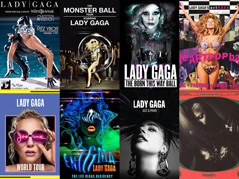
Type does more work in poster design than most people realize. The typeface you pick communicates tone before anyone reads a single word.
Serif fonts signal tradition, authority, editorial weight. A sans-serif font reads as modern and clean. Display fonts grab attention at large sizes but fall apart in body copy.
Typographic hierarchy determines what gets read first. The headline, the date, the call to action. Get this wrong and the whole poster fails, even if the visuals are strong.
Spacing matters just as much as the font itself. Kerning (the space between individual letter pairs), tracking (uniform letter spacing), and leading (line spacing) all affect readability at distance. I’ve seen posters with gorgeous typefaces that were completely unreadable from six feet away because the font spacing was off.
The Role of Color in Poster Communication

Color choices in poster design aren’t decorative decisions. They’re functional ones.
According to branding research, a signature color can increase brand recognition by up to 80% (Zippia). Color psychology directly influences how viewers respond to a poster before they process the text.
Key color relationships for poster work:
- Complementary color schemes create maximum contrast and visual tension
- Analogous colors produce a harmonious, unified look
- Monochrome palettes force the eye toward composition and type instead of color
Understanding the color wheel and how to build a strong color palette is table stakes. Picking colors that “look nice” isn’t the same as picking colors that communicate the right message at the right distance.
Imagery, Layout, and Composition
The layout determines how someone’s eye moves across a poster. This is where graphic design principles like alignment, balance, and proximity become non-negotiable.
A clear focal point anchors the entire composition. Without one, the viewer’s eye wanders and nothing sticks. The rule of thirds works reliably for poster layouts, though breaking it intentionally can produce more dramatic results.
White space is the part most beginners get wrong. They try to fill every inch. But breathing room is what makes the important stuff readable. Well-placed negative space guides the viewer exactly where you want them to look.
Types of Posters and Their Purposes

Poster design isn’t one thing. The format bends to fit dozens of industries and contexts, each with different rules and expectations.
Advertising and Product Posters
The original purpose of the modern poster. Selling stuff. From Chéret’s perfume ads in the 1860s to Apple’s current out-of-home campaigns, product posters have always been about making something look desirable in a single glance.
In 2024, OOH advertising revenue hit $9.1 billion for the first time in history, a 4.5% increase year-over-year (OAAA). Apple, McDonald’s, Amazon, and Coca-Cola topped the list of top OOH spenders, with 60% of the top 100 brands increasing their investment.
Poster-based advertising design is clearly not going away. If anything, it’s accelerating.
Event Posters
Concerts, theater, film festivals, conferences. Event posters carry a specific set of constraints: date, time, venue, ticket info. The challenge is fitting all that information while still creating something that feels exciting enough to stop someone scrolling (or walking).
Concert posters have their own collector culture. Limited-run gig posters from artists like Emek or Ames Bros sell for hundreds of dollars after a show ends. The poster becomes part of the experience itself.
Political and Propaganda Posters
From Soviet Constructivist work to Shepard Fairey’s 2008 Obama “Hope” poster, political poster design has always been about distilling a complex message into a single, emotionally charged image.
Bold colors, strong faces, minimal text. Emphasis on a single visual idea. The best political posters work because they’re almost impossible to misread.
Educational and Infographic Posters
These prioritize information density over emotional impact. Hospital safety protocols, classroom diagrams, scientific conference presentations. Infographic design principles apply here: clear data visualization, logical flow, and minimal decoration.
The academic research poster is a category of its own. Anyone who’s walked through a scientific conference hall knows these range from excellent to nearly unreadable. The ones that work treat hierarchy seriously.
Movie Posters
Movie posters operate under their own conventions. Famous graphic designers like Saul Bass created an entire visual language for film through his poster and title sequence work in the 1950s and 60s.
Modern movie posters tend to follow stricter commercial templates (floating heads, blue-and-orange color grading), but independent and festival films still produce some of the strongest poster design work out there.
| Poster Type | Primary Goal | Key Design Priority | |—|—|—| | Advertising | Drive purchase or brand recall | Visual impact, product visibility | | Event | Communicate details, build excitement | Information hierarchy, date/venue clarity | | Political | Persuade, mobilize | Emotional resonance, simplicity | | Educational | Inform, explain | Data clarity, logical flow | | Movie | Attract audiences, set tone | Mood, star recognition, genre cues |
Poster Design Principles That Affect Readability

A good-looking poster that nobody can read is a failed poster. Period. Readability isn’t just about picking a legible typeface. It’s about every design decision working together so the message lands instantly.
Designing for Distance
Posters are viewed from distances that most other design formats never deal with. A billboard gets read from 50+ feet. A bus shelter poster from 10 feet. An A3 print on a café wall from maybe three or four feet.
Each distance demands different decisions about type size, line weight, and image detail. What looks perfect on a 27-inch monitor can completely fall apart on a 24×36-inch print viewed from across the street.
Marketing LTB research found that one-message-per-billboard improves recall by up to 60%. And bold type increases read time significantly from vehicle distance. Simplicity isn’t just an aesthetic choice for posters. It’s a functional requirement.
Contrast and Scale as Attention Tools
Color contrast is what makes a poster punch through visual clutter. Dark text on a light background (or the reverse) is the baseline, but scale and proportion amplify it.
An oversized headline next to a small block of body copy creates instant hierarchy without the viewer having to think about it. The Gestalt principles explain why this works: our brains automatically group and prioritize visual elements by size, proximity, and similarity.
Reducing Clutter
Every element on a poster either helps the message or hurts it. There’s no neutral.
Common clutter problems:
- Too many typefaces competing for attention (stick to two, maybe three)
- Multiple competing focal points that cancel each other out
- Decorative elements that add nothing to comprehension
According to a 2024 OAAA/Harris Poll study, 80% of consumers are likely to take action after seeing a funny, creative, or visually engaging OOH ad. Notice that “visually engaging” doesn’t mean “visually busy.” The best-performing poster work is almost always the simplest.
Poster Dimensions, Formats, and Print Specifications
The creative side of poster design gets all the attention. But if you don’t understand the technical specs, your beautiful design will come back from the printer looking wrong.
Standard Poster Sizes
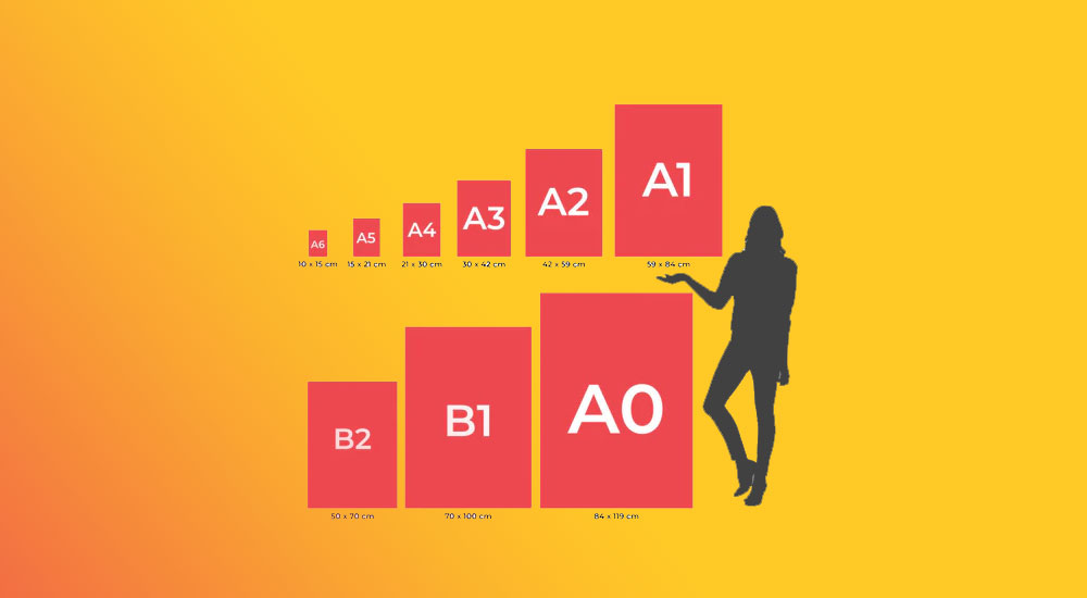
Poster dimensions vary by region and use case. Here are the formats you’ll run into most often:
| Size Name | Dimensions | Common Use |
|---|---|---|
| A0 | 841 × 1189 mm (33.1 × 46.8 in) | Conference presentations, large displays |
| A1 | 594 × 841 mm (23.4 × 33.1 in) | Event posters, retail |
| A2 | 420 × 594 mm (16.5 × 23.4 in) | Indoor promotions, classrooms |
| 24 × 36 in | 610 × 914 mm | US standard, movies, concerts |
| 11 × 17 in | 279 × 432 mm | Tabloid/ledger, small-format events |
ISO 216 governs the A-series paper sizes used internationally. US poster formats follow their own standards, and if you’re designing for both markets, you’ll need separate files.
Resolution and File Preparation
DPI (dots per inch) determines print quality. The baseline for poster printing is 300 DPI. Anything lower and you’ll see pixelation, especially in photographic elements and fine type.
Digital posters displayed on screens can work at 72 to 150 DPI. The key difference: a screen poster at 72 DPI looks sharp because screen pixels are backlit. Print that same file and it’ll look soft and blurry.
File format matters too. PDF is the standard for print delivery. Adobe Illustrator (.ai) files preserve vector graphics for clean scaling. Photoshop (.psd) files work for photo-composited posters. Avoid sending JPEG files directly to print. The compression artifacts will show up at large sizes.
Color Modes and Print Finishing
Design for screen in RGB. Design for print in CMYK. Getting this wrong is one of the most common mistakes.
RGB colors look more vibrant on screen because they use light mixing. CMYK uses ink mixing, which produces a narrower color range. That neon green you love on your monitor? It won’t survive the conversion. Pantone spot colors offer more precise color matching but add to the print cost.
Don’t forget bleed, trim, and safe zones. Bleed extends your design past the final trim line (usually 3mm or 0.125 inches on each side). Trim is where the paper gets cut. Safe zone is the inner margin where critical content must stay. Ignore these and your text gets chopped off at the edges.
Paper stock and finish round out the technical decisions. Matte paper reduces glare and suits text-heavy posters. Gloss boosts color vibrancy and suits photo-based work. Uncoated stock gives a raw, tactile feel that works well for Art Deco or vintage-inspired designs.
Tools and Software Used for Poster Design
The tool you pick shapes the poster you make. That sounds obvious, but it’s true in a way most people underestimate. A poster built in Illustrator looks and behaves differently than one made in Canva, even if the concept is identical.
Statista data shows Adobe Photoshop leads the graphics software market with roughly 42% market share as of 2024. Adobe InDesign follows at about 26%, with Illustrator at 12%.
But market share doesn’t tell the full story. The right tool depends on the type of poster you’re making.
| Tool | Best For | Format Strength |
|---|---|---|
| Adobe Illustrator | Vector-based layouts, clean type work | Scalable without quality loss |
| Adobe Photoshop | Photo composites, textured designs | Raster/pixel-based editing |
| Adobe InDesign | Multi-page layouts, print prep | Precise print production |
| Figma | Collaborative digital poster work | Real-time team editing |
| Canva | Template-based, quick turnaround | Drag-and-drop simplicity |
| Procreate | Hand-illustrated poster artwork | Brush-based iPad drawing |
When to Use Vector vs. Raster Tools for Posters
Vector tools (Illustrator, Inkscape) create artwork using mathematical paths. Scale a vector poster from A3 to a billboard and nothing degrades. Clean lines, sharp text, smooth gradients.
Raster tools (Photoshop, GIMP) work with individual pixels. Better for photographic composites and textured poster art. But enlarge a bitmap image past its original resolution and you’ll see blur and artifacts fast.
Most professional poster designers use both. Vector for type and layout, raster for photographic elements and texture overlays.
Canva and the Democratization of Poster Creation
Canva reported 220 million monthly active users by the end of 2024 (Backlinko). Over 30 billion designs have been created on the platform since launch.
That’s a staggering number. And it explains why so many event posters, social media graphics, and promotional materials now share a certain visual sameness. Templates get the job done fast, but they rarely produce anything distinctive.
Canva’s 2024 acquisition of Affinity (a professional-grade creative suite) signals a push upmarket. The gap between “quick template” and “professional output” is narrowing, but it hasn’t closed yet.
Figma for Digital Poster Collaboration
Figma hit over 4 million users in 2024, with revenue growing to $700 million (Cropink). It’s primarily known for UI/UX design, but its real-time collaboration tools make it surprisingly useful for team-based poster projects.
When three people need to work on the same event poster simultaneously (the designer, the copywriter, and the marketing lead who keeps changing the date), Figma handles that better than passing Illustrator files back and forth over email.
Free and Open-Source Alternatives
Inkscape: Full-featured vector editor. Handles most of what Illustrator does for poster layout work, minus the polish and plugin ecosystem.
GIMP: Raster image editor with strong compositing tools. Steeper learning curve than Photoshop, but entirely free. Good enough for photo-heavy poster compositions.
Neither tool matches Adobe’s color management workflow for professional printing. But for digital posters, social media posters, and budget-conscious projects, they get the job done.
What Separates Good Poster Design from Bad
You know a bad poster when you see one. Usually before you even finish reading it. And that’s kind of the point. Bad posters reveal themselves in the first second.
Good poster work does the opposite. The message lands before you’re consciously aware you’ve read anything.
Clarity of Message
The single most reliable test for any poster: can someone understand the main idea within three seconds of looking at it?
Saul Bass built an entire career on this principle. His movie posters for Vertigo, Anatomy of a Murder, and The Man with the Golden Arm each communicated genre, mood, and tone through one visual concept and a handful of words. No clutter. No competing messages.
According to Canva’s Visual Economy Report, 77% of business leaders say communicating visually has directly increased business performance. That stat applies to posters too. If the visual message is clear, it performs.
Consistent Visual Language
Unity across a poster’s elements isn’t optional. The type choices, the color scheme, the imagery, and the layout need to feel like they belong together.
What breaks consistency:
- Mixing four or five different fonts with no clear typographic reasoning
- Using stock photos with clashing lighting or color temperatures
- Combining decorative elements from different visual traditions (grunge textures next to corporate gradients, for instance)
Shepard Fairey’s political poster work succeeds partly because every element follows the same restricted palette and stencil-based graphic language. Variety in a poster should be deliberate, not accidental.
Common Mistakes That Kill a Poster
Too many fonts. Two is safe. Three is the maximum for most poster layouts. Past that, you’re creating visual noise instead of hierarchy.
Weak color saturation choices. Low-contrast palettes might look sophisticated on a website, but they disappear at poster viewing distances. Hue shifts that are barely perceptible on screen become invisible on a wall.
Buried information. If the event date is the same size as the sponsor logos, you’ve made a hierarchy mistake. The most critical detail (date, location, call to action) should be immediately findable, not hidden in a corner.
According to research from Dash, 55% of a brand’s first impression is based on visuals alone. That first impression happens faster with a poster than with almost any other format. Get it wrong and there’s no second page to save you.
How Poster Design Fits into Broader Visual Communication
Poster design doesn’t exist on its own. It’s one piece of a larger system. The skills that make someone good at poster layout directly transfer to web design, motion graphics, packaging, and pretty much every other visual communication format.
Poster as a Brand Touchpoint
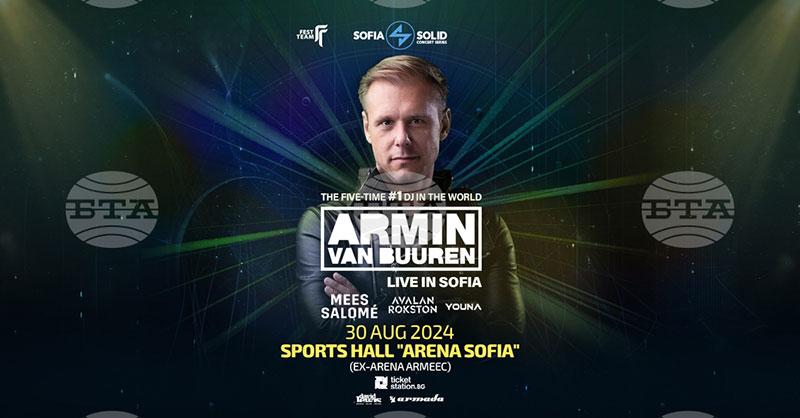
A poster is one expression of a company’s visual identity. When Nike produces an OOH campaign poster, that poster needs to align with everything else Nike puts out: the website, the product packaging, the social media posts, the retail displays.
This is where brand guidelines come in. A brand style guide defines the fonts, colors, logo usage, and tone that must stay consistent across every format. Poster designers work within these constraints, not outside them.
Crowdspring data shows consistent branding can increase revenue by up to 23%. A poster that breaks from the brand system doesn’t just look off. It costs money.
Transferable Design Skills
The core skills of poster design carry over to nearly everything else in visual communication:
- Visual movement and composition work the same way in book cover design
- Rhythm and repetition translate directly into web and UI layout patterns
- Tight type hierarchy training pays off in every format, from social media cards to signage
Visual formats generate 40 times more shares on social media than text-only content (Neal Schaffer). Poster design teaches you how to make those formats hit harder, because you’ve already learned to communicate within the constraints of a single, fixed canvas.
The Poster as a Portfolio Piece
For graphic designers early in their careers, poster projects are portfolio gold. They demonstrate color palette thinking, font pairing skill, layout control, and the ability to communicate a clear message, all in a single deliverable.
A well-executed concert poster or campaign poster shows more about a designer’s abilities than a dozen social media templates. Hiring managers and creative directors can evaluate composition, type selection, and storytelling in one glance.
Figma’s 2025 research found that 84% of designers collaborate with developers weekly. Poster design is one of the few disciplines where the designer retains full control of the output. No developer handoff. No responsive breakpoints. Just the design itself, exactly as intended.
That’s why poster work remains a benchmark. It reveals how a designer thinks when there’s no framework doing the heavy lifting.
FAQ on What Is Poster Design
What is poster design in graphic design?
Poster design is a graphic design discipline focused on combining typography, imagery, and color on a single fixed-format surface. The goal is delivering a clear message that communicates at a glance, typically within three seconds of viewing.
What are the basic elements of a poster?
Every poster relies on five core elements: typography, imagery, color palette, layout composition, and a focal point. These work together through visual hierarchy to guide the viewer’s eye toward the most critical information first.
What software do professionals use for poster design?
Adobe Illustrator and Photoshop remain industry standards. InDesign handles print preparation well. Canva works for template-based projects. Figma suits collaborative digital work, and Procreate is popular for hand-illustrated poster artwork.
What is the standard size for a poster?
Standard sizes vary by region. The US commonly uses 24 × 36 inches for large format. International standards follow the ISO A-series, with A1 and A2 being the most common for event and retail posters.
What makes a poster design effective?
Clarity. An effective poster communicates one message quickly through strong visual hierarchy, readable typography, intentional color choices, and enough white space to let the composition breathe. Simplicity almost always outperforms complexity.
What is the difference between a poster and a flyer?
Scale and viewing distance. A poster is designed to be read from several feet away and typically stays mounted in one location. A flyer is a handheld format meant for close-range reading and distribution.
What resolution should a poster be designed at?
Print posters require a minimum of 300 DPI for sharp output. Digital posters displayed on screens work fine at 72 to 150 DPI. Always design in CMYK color mode for print and RGB for screen.
How does color theory apply to poster design?
Color sets the emotional tone before anyone reads the text. Complementary colors create contrast and energy. Analogous palettes feel harmonious. A well-chosen color scheme directs attention and reinforces the poster’s message.
Can AI tools be used for poster design?
Yes. AI tools now assist with layout suggestions, image generation, and color recommendations. Canva and Adobe have both integrated AI features. But strong poster work still depends on human decisions about hierarchy, messaging, and audience context.
Why is poster design still relevant in the digital age?
OOH advertising revenue surpassed $9.1 billion in 2024. Physical posters can’t be blocked, skipped, or scrolled past. They build brand recognition in high-traffic spaces where digital ads simply don’t reach.
Conclusion
Poster design is a discipline where every single decision shows. There’s no second page, no scroll, no click-through. What you put on that fixed canvas is the entire message.
The fundamentals haven’t changed much since Jules Chéret started printing chromolithographic posters in Paris. Visual hierarchy, strong type choices, intentional color, and clear composition still drive everything.
What has changed is accessibility. Tools like Adobe Illustrator, Figma, and Canva have made poster creation possible for anyone with a laptop. The barrier to entry dropped. The bar for quality didn’t.
Whether you’re producing large format print work or designing digital promotional materials for social media, the same rules apply. Lead with clarity. Respect the viewer’s time. Cut what doesn’t serve the message.
A well-designed poster still does something no other format can. It stops people. Literally.

Renowned for his expertise in logo design and visual branding, Bogdan has developed a multitude of logos for various clients.
His skills extend to creating posters, vector illustrations, business cards, and brochures. Additionally, Bogdan's UI kits were featured on marketplaces like Visual Hierarchy and UI8.
He also wrote in the past years on sites like Design Your Way, WebDesignerDepot, WPDean, Designmodo, Speckyboy, Slider Revolution, and more.
- The Arc Browser Logo History, Colors, Font, And Meaning - 14 September 2026
- From Information to Persuasion: A Practical Framework for Strategic Presentation Design - 14 September 2026
- Canva vs Photoshop: When Does Each Make Sense? - 12 September 2026

Bogdan Sandu is a seasoned designer who has been designing websites since 2008. Renowned for his expertise in logo design and visual branding, Bogdan has developed a multitude of logos for various clients. His skills extend to creating posters, vector illustrations, business cards, and brochures. Additionally, Bogdan's UI kits were featured on marketplaces like Visual Hierarchy and UI8. He also wrote in the past years on sites like Design Your Way, WebDesignerDepot, WPDean, Designmodo, Speckyboy, Slider Revolution, and more.
You Might Also Like


