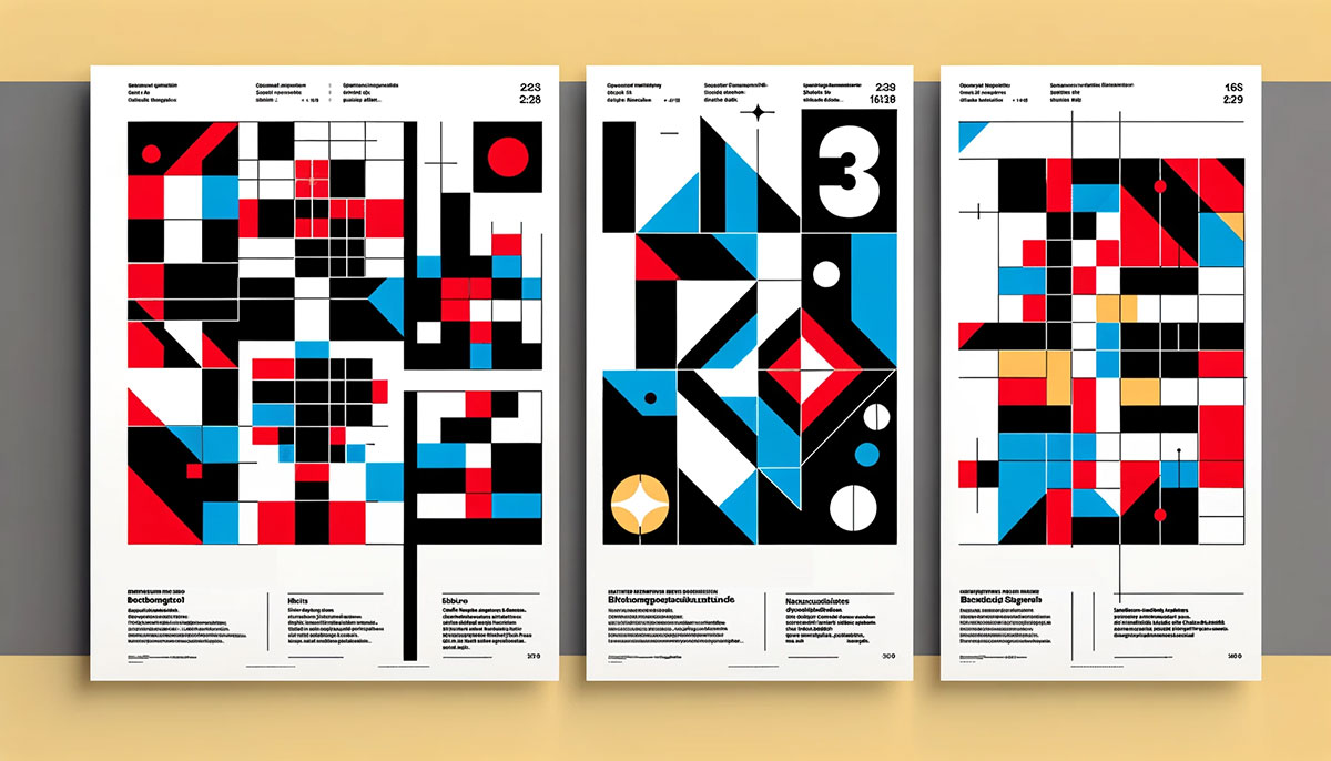
Every photograph you stop scrolling for, every landing page that just feels right, likely follows the same compositional grid that painters have used since 1797. So what is the rule of thirds in design, and why does it still matter after more than two centuries?
This guide breaks down how the 3×3 grid works across graphic design, photography, web layout, and film. You’ll learn how to apply it in tools like Figma and Photoshop, when to break it on purpose, and how it compares to the golden ratio and other composition techniques.
Whether you’re placing a headline on a landing page or framing a landscape shot on your phone, the rule of thirds gives you a reliable starting point for layouts that hold attention.
What Is the Rule of Thirds in Design

The rule of thirds is a compositional guideline that splits any visual frame into nine equal sections using two horizontal and two vertical lines. Where those lines cross, you get four intersection points. These are sometimes called “power points” or “crash points.”
Place your most important element at or near one of those intersections, and the composition immediately feels more engaging than a centered layout. That’s the whole idea. It sounds almost too simple, but it works across photography, graphic design, web layouts, film, and poster design.
John Thomas Smith first put the term in writing back in 1797 in his book Remarks on Rural Scenery. He was building on Sir Joshua Reynolds’ earlier observations about proportional balance in paintings, specifically the ratio of two-thirds to one-third across light, shade, and spatial elements.
The concept itself is older than that. The ancient Greeks worked with similar proportional thinking, and you can trace threads of it through Renaissance painting. But Smith gave it a name, and that name stuck for over 200 years.
Why it matters today: Stanford research shows that 94% of first impressions are design-related, and users form opinions about a website within 50 milliseconds. Where you place things on a page or screen has real, measurable impact on how people perceive your work.
The rule of thirds isn’t a rigid law. It’s a starting grid for layout decisions. It helps answer the first question every designer faces when staring at a blank canvas: where does the important stuff go?
How the Rule of Thirds Grid Works
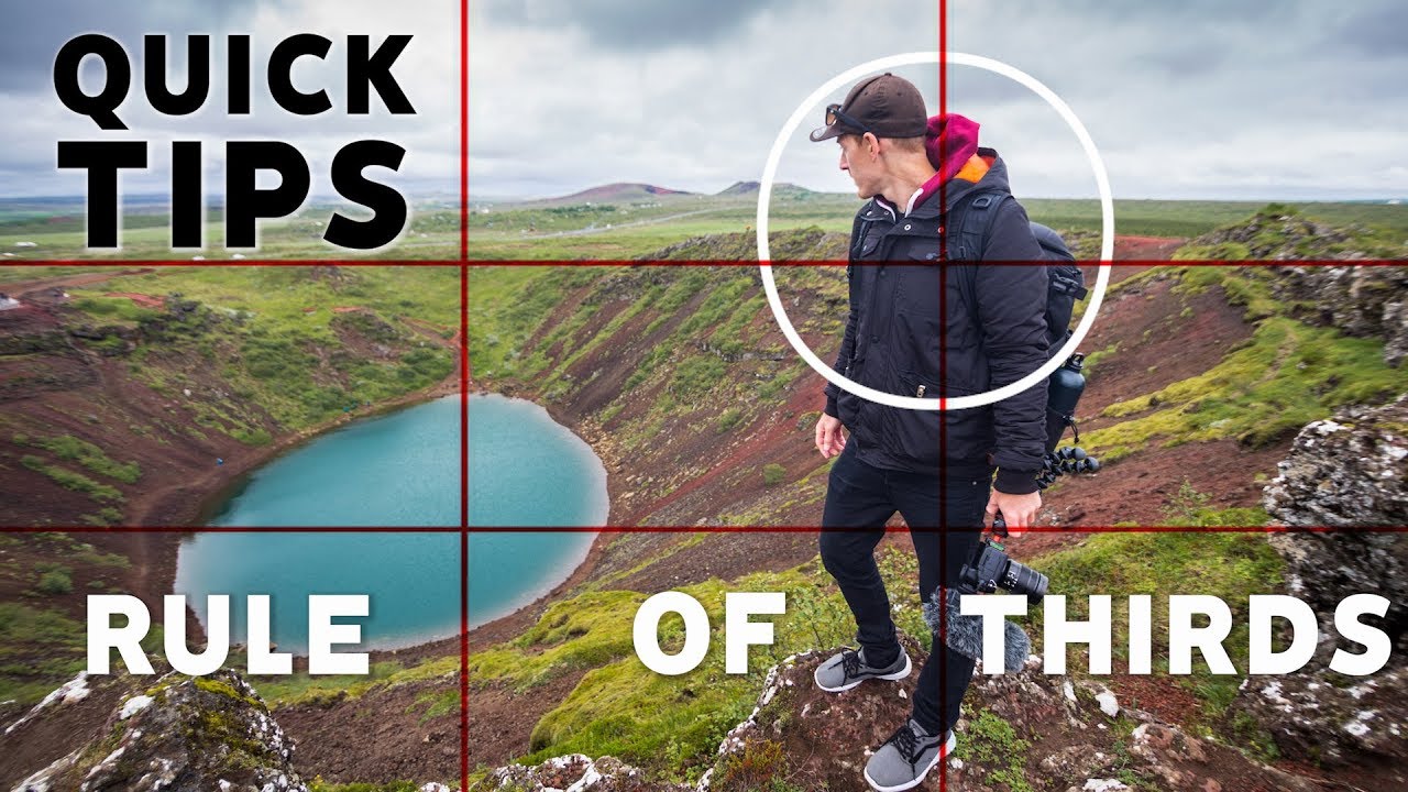
Take any rectangle. Divide it into three equal columns and three equal rows. You now have a 3×3 grid of nine sections, four grid lines, and four intersections.
That’s the entire mechanical setup. No math degree required.
Grid Anatomy and Visual Weight
The nine rectangles created by the grid aren’t just decorative guides. They map out where visual weight naturally distributes across a frame.
Our eyes don’t scan a composition evenly. A 2024 eye-tracking study published in the Journal of Eye Movement Research (Chuang, Tseng & Chiang) confirmed that compositional techniques like the rule of thirds and leading lines significantly influence where viewers fixate and how long they dwell on specific areas.
The grid creates three zones of control:
- Grid lines act as natural tracks for placing horizons, text baselines, or structural edges
- Intersections serve as anchors for your dominant subject or focal point
- The nine sections help distribute secondary elements and manage white space
When you place your heaviest visual element at one intersection and leave the opposing sections relatively empty, you create tension. That tension is what makes a composition feel alive instead of static.
Intersection Points and Focal Placement
Not all four intersections carry the same weight.
In Western cultures, people read left to right and top to bottom. Research from Eyequant (2017) found that most users look at the top-left corner of a web page first. That means the upper-left intersection naturally draws the most attention.
But here’s the tricky part. If you always default to the upper-left power point, your compositions start looking predictable. Took me years to break that habit.
| Intersection | Natural Strength | Best Used For |
|---|---|---|
| Upper-left | Strongest (in LTR layouts) | Headlines, primary subjects |
| Upper-right | Secondary | CTAs, navigation elements |
| Lower-left | Moderate | Supporting imagery, captions |
| Lower-right | Terminal (eye exits here) | Logos, closing elements |
The best compositions place a dominant subject at one intersection and a secondary element at the diagonally opposite one. This creates a visual path the eye follows naturally. You’re basically giving viewers a roadmap without them realizing it.
Apple’s product pages do this constantly. The product image sits on one intersection, the headline on another. Nothing feels centered, yet everything feels balanced. That’s asymmetry working exactly as intended.
The Rule of Thirds in Graphic Design and Web Layout

Photography gets most of the credit for popularizing the rule of thirds. But graphic designers and web developers use it just as heavily, sometimes without even thinking about it.
A layout that follows the thirds grid just feels right. And feelings drive behavior. According to Adobe, 59% of users prefer well-designed, attractive websites over basic ones.
Layout Applications for Print and Digital
In print design, the rule of thirds shows up in magazine spreads, book cover design, and advertising layouts. The grid helps determine where the headline sits, where the hero image goes, and how much breathing room the margins get.
For web design, the same thinking applies to landing pages, hero sections, and content blocks. Place your CTA button near one of the four intersections. Align your main headline along a grid line. Let the remaining two-thirds of the section work as negative space.
Practical application breakdown:
- Hero sections with headline on the left third and image spanning the right two-thirds
- Product cards where the image occupies the top two-thirds, text in the bottom third
- Blog layouts with content in two-thirds width, sidebar in one-third
G2 research shows it takes 2.6 seconds for a user’s eye to settle on key areas of a web page. The grid helps you make those 2.6 seconds count by placing what matters most where the eye lands first.
Applying the Grid to Responsive Web Design
Here’s where things get complicated. A layout that looks great on a 1440px desktop screen collapses into a single column on mobile. Your carefully placed thirds vanish.
CSS Grid and Flexbox help bridge this gap. You can approximate thirds-based placement at larger breakpoints and gracefully stack content vertically on smaller screens. Bootstrap’s 12-column grid system maps nicely onto thirds thinking (four columns per third).
But at some point on smaller screens, you have to let the grid go. Mobile is essentially a single-column format, and forcing thirds onto a 375px viewport just creates clutter. Know when to hold the grid and when to drop it. At least in my experience, the breakpoint around 768px is where I stop thinking in thirds and start thinking in stacks.
Hostinger data from 2026 reports that 79% of visitors leave a site with poor usability, including cluttered layouts. On mobile, the rule of thirds matters less than clear visual hierarchy and adequate spacing.
The Rule of Thirds in Photography and Film

This is where most people first encounter the grid. Every iPhone and Android phone ships with a built-in 3×3 overlay you can activate in camera settings. Canon, Sony, and Nikon DSLRs have offered it for decades.
The grid overlay is probably the most used composition tool in photography, and for good reason. It takes the guesswork out of placement.
Landscape and Portrait Photography
Landscape rule: Place the horizon on the upper or lower third line, never dead center. If the sky is dramatic, give it two-thirds. If the foreground is the story, flip it.
For portraits, align the subject’s eyes with the upper horizontal line. If you’re shooting someone looking to the side, place them on the vertical third line opposite to their gaze direction. This leaves “breathing room” in the direction they’re looking, and the composition feels natural.
An eye-tracking study by Torabi and Teeravarunyou (2021) tested 30 participants and found that experts preferred rule-of-thirds images significantly more than novices, who tended to favor centered compositions. The researchers noted that while the grid doesn’t automatically make a photo more appealing to untrained viewers, it does make images more engaging once the viewer knows what to look for.
National Geographic photographers lean on this technique heavily. Look at any cover, and you’ll notice the subject’s eye sitting right on an intersection point. Magazine editors at that level leave nothing to chance.
Cinematography and Film Framing
Directors like Wes Anderson play with centered framing as a deliberate stylistic signature. But most cinematographers, including Roger Deakins, use off-center compositions rooted in the rule of thirds as their default.
Michael Ryan and Melissa Lenos, authors of An Introduction to Film Analysis, describe the rule of thirds as a technique favored by cinematographers who want to create images that feel both balanced and unified.
When filming a moving subject, the standard practice puts the character on one vertical third with the majority of space in front of them (the direction they’re moving). This creates movement and anticipation within a static frame.
Quick side note. Once you start noticing the thirds grid in movies, you can’t unsee it. That can ruin or improve your movie-watching experience, depending on how you feel about it.
Rule of Thirds vs. Other Composition Techniques
The rule of thirds isn’t the only compositional framework out there. It’s the most accessible one. But how does it actually compare to its alternatives?
The Phi Grid and the Golden Ratio
The golden ratio (approximately 1:1.618) produces a grid that looks similar to the rule of thirds but with a key difference. The center column and center row are narrower, pushing the intersection points slightly closer to the middle of the frame.
In the rule of thirds, the grid lines sit at 33.3% from each edge. In the Phi Grid (the golden ratio’s grid equivalent), the lines fall at roughly 38%. That 5% difference is subtle but real.
| Feature | Rule of Thirds | Golden Ratio (Phi Grid) |
|---|---|---|
| Grid line position | 33.3% from edge | ~38% from edge |
| Grid symmetry | Perfectly symmetrical | Asymmetrical center |
| Complexity | Low, easy to visualize | Moderate, harder to apply in-camera |
| Built into cameras | Yes (standard) | Some apps, hidden in Lightroom |
| Best for | Quick compositions, beginners | Refined layouts, fine art |
Most designers treat them as interchangeable for practical purposes. And honestly? That’s fine for 90% of projects. The Fibonacci spiral (a visual extension of the golden ratio) adds a curved guide that sweeps the eye through the frame, which can help with complex scenes that have multiple subjects.
Lightroom hides the golden ratio overlay behind its crop tool. Press R to crop, then cycle through overlays with O until you find the spiral. Took me forever to discover that shortcut.
When the Golden Ratio and Rule of Thirds Overlap
They overlap a lot more than people think. Both push subjects off-center. Both discourage dead-center placement. The difference only becomes visible in tightly controlled compositions where a few percentage points of placement actually matter.
For web layouts, the distinction is mostly academic. A hero section aligned to the thirds grid versus the Phi Grid will produce nearly identical results on screen. The golden ratio starts mattering more in fine art, product photography, and packaging design where spatial relationships get scrutinized closely.
Center Composition and Dynamic Symmetry
Centered composition works when symmetry is the point. Architectural photography, product shots on clean backgrounds, mandala-like patterns. These subjects demand center placement, and applying the rule of thirds to them would look forced.
Dynamic symmetry, developed by Jay Hambridge in the early 20th century, uses diagonal-based composition instead of a rectangular grid. It’s more advanced and harder to apply, but some fine art photographers and painters swear by it.
The real takeaway: the rule of thirds is a starting framework. Gestalt principles, the golden ratio, dynamic symmetry, and leading lines all work alongside it or replace it depending on the situation.
When to Break the Rule of Thirds
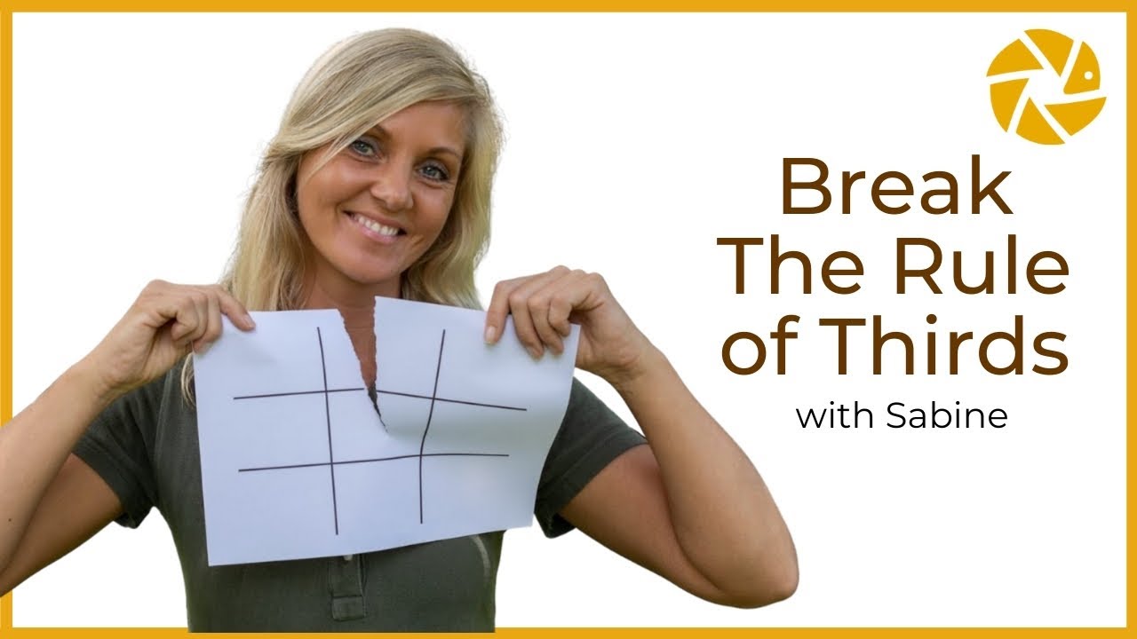
Every composition guideline has limits. The rule of thirds is no exception. Knowing when to ignore it is just as important as knowing when to use it.
Centered Compositions That Work
Perfect balance has its place. Centered subjects create a sense of stillness and formality that off-center placement can’t replicate.
Think about product photography for e-commerce. The item needs to be front and center. Nobody wants to hunt for the product in a lifestyle shot when they’re trying to decide whether to buy it. Same with headshots, passport photos, and certain types of logo design.
Wes Anderson’s entire filmography is a masterclass in centered composition. His frames are deliberately, almost obsessively symmetrical. It works because the centering is the style. Breaking the rule becomes the rule.
Extreme Off-Center and Full-Frame
Sometimes pushing a subject way past the third line (into the outer fifth or even the edge of the frame) creates dramatic tension that the standard grid can’t deliver. This is common in editorial design and fine art photography where provoking a reaction matters more than “pleasant” composition.
Full-frame compositions, where the subject fills the entire canvas, also bypass the thirds grid completely. Close-up macro photography, face-filling portraits, and abstract texture shots don’t need grid placement because there’s nothing to position relative to anything else.
Situations where breaking the grid makes sense:
- Reflection shots where dead-center symmetry doubles the impact
- Flat-lay food photography shot directly from above
- Architectural interiors with strong bilateral symmetry
- Minimalist design where a single element anchors the center
The key is intentionality. Breaking the rule because you have a reason produces strong work. Breaking it because you didn’t know it existed produces weak work. That’s the difference.
How to Practice the Rule of Thirds
Knowing the theory is one thing. Training your eye to see the grid instinctively is something else entirely. Most designers and photographers I know say it took months of deliberate practice before thirds-based thinking became automatic.
The good news: the tools are already built into the software you’re probably using right now.
Enabling Grid Overlays in Design Tools
Figma holds a 40.65% market share in design tools, according to Cropink (2025). It’s where most UI work happens these days, and its built-in layout grid feature lets you set up a thirds overlay in seconds.
| Tool | How to Access the Grid | Grid Type |
|---|---|---|
| Figma | Frame > Layout Grid > Columns (set to 3) | Customizable columns/rows |
| Adobe Photoshop | View > Show > Grid, or Crop Tool overlay | Rule of thirds, golden ratio |
| Lightroom | Press R (crop), then O to cycle overlays | Thirds, Phi Grid, spiral |
| Canva | Built-in guides when dragging elements | Smart snap lines |
iPhone users can turn on the camera grid under Settings > Camera > Composition > Grid. Android devices offer the same option in most default camera apps, with some (like the Google Pixel) supporting 3×3, 4×4, and golden ratio grids.
Cropping as a Training Exercise
This is the fastest way to internalize the grid.
Take photos you’ve already shot (or grab stock images) and crop them to align with the thirds grid. Photoshop and Lightroom both show the overlay automatically when you enter crop mode.
You’ll start noticing patterns. Shots where the subject sits slightly off an intersection feel “almost right.” A small crop adjustment locks it in. After doing this with 50 or 100 images, you’ll find yourself composing on the grid without thinking about it.
Digital Photography School notes that viewers form impressions of photos within 2 to 3 seconds, and composition is the primary factor in whether they keep looking. Cropping exercises sharpen your instinct for that split-second impact.
Wireframing with the Grid Before Going Digital
Sketch a 3×3 grid on paper before opening any design software. Rough out where headlines, images, and CTAs go relative to the grid lines and intersections.
This works especially well for advertising layouts and social media design where you need fast compositions that still look polished.
The other useful exercise? Analyze existing work backward. Take a well-designed website, book cover, or film still and overlay the grid on top. You’ll see how often professional compositions align with the thirds structure, even when the designer didn’t consciously apply it.
Common Mistakes When Using the Rule of Thirds

The grid is a tool, not a formula. Misusing it can make your compositions weaker, not stronger. These are the patterns I see most often, especially from people who just learned about the rule and are applying it everywhere.
Treating the Grid as a Rigid Formula
The rule of thirds is a guideline. Always has been. John Thomas Smith called it exactly that back in 1797.
Designers who lock every element to a grid line end up with layouts that look mechanical. There’s no rhythm or surprise. Everything snaps to the same invisible structure, and the result feels like a template rather than a considered design.
The fix: use the grid as a starting point, then adjust based on what the specific composition needs. Some elements should sit slightly off the grid line. That tiny bit of imprecision is what separates good design from rigid ones.
Overcrowding the Intersections
Four intersection points does not mean four focal points. Placing a competing element at every power point scatters the viewer’s attention instead of focusing it.
A 2024 eye-tracking study in the Journal of Eye Movement Research (Chuang, Tseng & Chiang) found that images with clear subject elements received significantly higher aesthetic ratings than cluttered compositions. Viewers fixated longer and rated images more favorably when one element dominated the frame.
One primary subject. That’s the goal. Everything else supports it. If you have a headline at the upper-left intersection and a CTA at the lower-right, the space between should breathe. Let those two points create a diagonal path, and keep the remaining intersections relatively quiet.
Ignoring the Empty Two-Thirds
This is the mistake nobody talks about.
People focus so hard on where to place the subject that they forget about the remaining six sections of the grid. Those empty areas aren’t wasted space. They’re negative space that gives the subject room to exist.
- Too little negative space: composition feels cramped and the eye has nowhere to rest
- Too much negative space: the subject loses presence and the layout looks incomplete
- Well-balanced negative space: the subject commands attention while the surrounding area creates context
Figma’s 2026 design statistics report that 39.6% of digital sessions contain “frustration signals” like rage clicks or dead clicks (Contentsquare, 2024). Cluttered layouts where every grid section fights for attention contribute directly to this kind of user friction.
Forcing the Rule on Every Project
Not every composition benefits from the thirds grid. Centered logos, symmetrical architectural shots, and flat-lay product photography often work better with different compositional approaches entirely.
The core principles of graphic design include contrast, repetition, and proximity. All of these sometimes override the thirds grid. A layout driven by strong emphasis on a central element doesn’t need off-center placement to succeed.
Your mileage may vary, but the best approach is having multiple composition tools in your toolkit and picking the right one for each situation. The rule of thirds is the most accessible starting point, not the only destination.
FAQ on What Is The Rule Of Thirds In Design
What is the rule of thirds in simple terms?
The rule of thirds divides any image or layout into a 3×3 grid of nine equal sections. You place key elements along the grid lines or at their four intersections to create visually balanced, off-center compositions.
Who invented the rule of thirds?
John Thomas Smith coined the term in 1797 in his book Remarks on Rural Scenery. He expanded on Sir Joshua Reynolds’ earlier observations about proportional balance in painting, specifically the ratio of two-thirds to one-third.
How do you apply the rule of thirds in graphic design?
Position headlines, images, and CTAs along the grid lines or intersections. In web layouts, this often means placing the hero content in one-third and leaving the remaining two-thirds as breathing room.
What are the four intersection points called?
They’re commonly called power points or crash points. These are the spots where horizontal and vertical grid lines cross, and they naturally attract the viewer’s eye more than centered positions.
Is the rule of thirds the same as the golden ratio?
No. The rule of thirds places grid lines at 33.3% from each edge. The golden ratio’s Phi Grid places them at roughly 38%. They produce similar results but are mathematically different frameworks.
How do I turn on the rule of thirds grid on my phone?
On iPhone, go to Settings > Camera > Grid. On most Android devices, open the Camera app, tap Settings, and enable Grid Lines. Both display a 3×3 overlay on your viewfinder.
When should you break the rule of thirds?
Break it when the subject demands centered placement. Symmetrical architecture, flat-lay food photography, product shots on clean backgrounds, and reflection images all work better with centered composition.
Does the rule of thirds work for web design?
Yes, on desktop layouts. It maps well onto column-based systems like Bootstrap’s 12-column grid. On mobile, single-column stacking takes priority over thirds-based placement at smaller breakpoints.
What tools support a rule of thirds overlay?
Adobe Photoshop, Lightroom, Figma, Canva, and most DSLR cameras from Canon, Sony, and Nikon include built-in grid overlays. Lightroom lets you cycle through thirds, Phi Grid, and spiral overlays.
Can you use the rule of thirds with other composition techniques?
Absolutely. It pairs well with leading lines, negative space management, and Gestalt grouping principles. Most professional compositions layer multiple techniques rather than relying on a single grid.
Conclusion
Understanding what is the rule of thirds in design gives you a compositional framework that works across every visual medium. From web layouts and photography to cinematography and print, this 3×3 grid remains one of the most practical tools for creating off-center compositions that hold attention.
But the grid is a starting point, not a finish line. The best designers combine it with other techniques like alignment, scale and proportion, and color theory to build layouts that feel intentional.
Practice with the grid overlay in Figma or Lightroom. Crop old photos to thirds. Analyze how brands like Apple use asymmetric placement on their product pages.
Then, once the grid becomes second nature, give yourself permission to break it. That’s when composition stops being a rule and becomes instinct.

Renowned for his expertise in logo design and visual branding, Bogdan has developed a multitude of logos for various clients.
His skills extend to creating posters, vector illustrations, business cards, and brochures. Additionally, Bogdan's UI kits were featured on marketplaces like Visual Hierarchy and UI8.
He also wrote in the past years on sites like Design Your Way, WebDesignerDepot, WPDean, Designmodo, Speckyboy, Slider Revolution, and more.
- The Cursor Logo History, Colors, Font, And Meaning - 24 September 2026
- Top 7 Web Design Subscription Services That Replace Full-Time Hires - 24 September 2026
- Canva vs PowerPoint: Which Is Better for Presentations? - 22 September 2026

Bogdan Sandu is a seasoned designer who has been designing websites since 2008. Renowned for his expertise in logo design and visual branding, Bogdan has developed a multitude of logos for various clients. His skills extend to creating posters, vector illustrations, business cards, and brochures. Additionally, Bogdan's UI kits were featured on marketplaces like Visual Hierarchy and UI8. He also wrote in the past years on sites like Design Your Way, WebDesignerDepot, WPDean, Designmodo, Speckyboy, Slider Revolution, and more.
You Might Also Like