

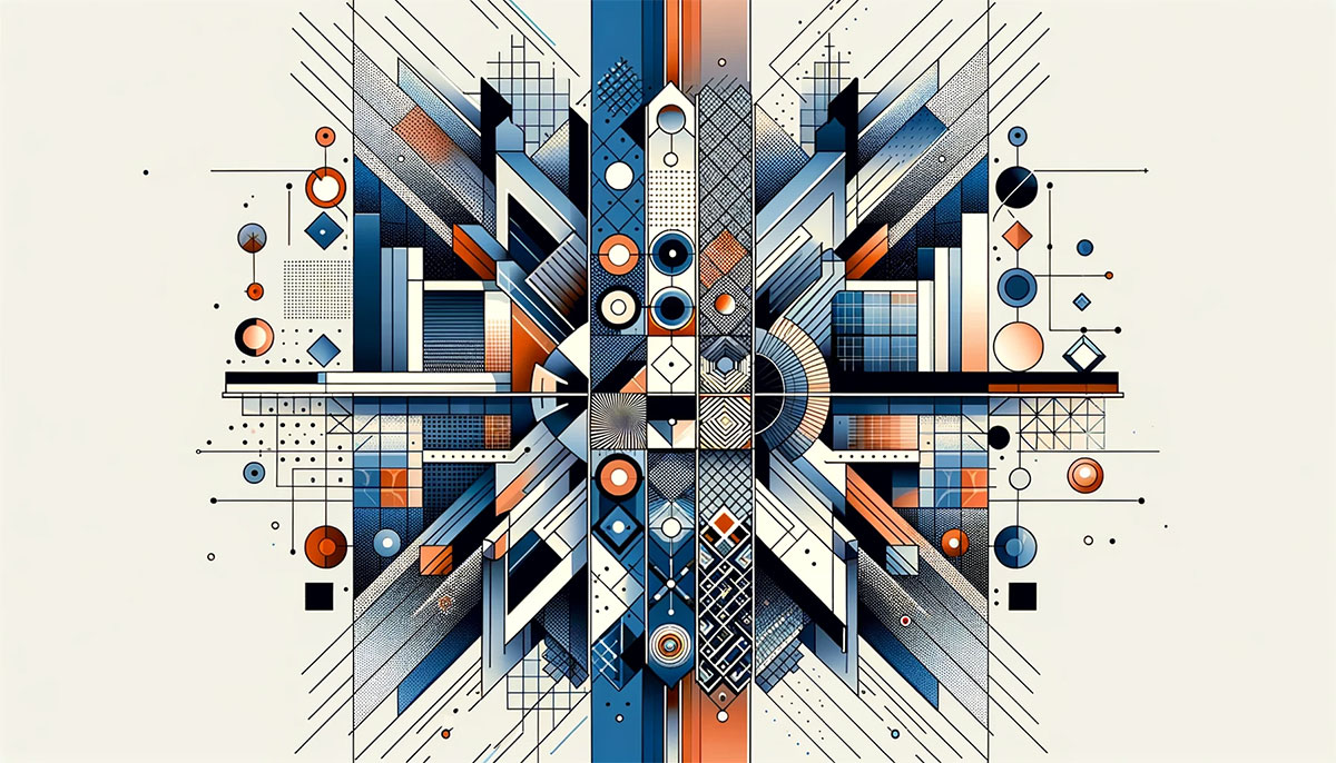
Your brain decides whether a design feels “right” in about 50 milliseconds. More often than not, that snap judgment comes down to symmetry in graphic design, the balanced arrangement of visual elements around a central axis.
Symmetry shapes everything from logo marks and page layouts to color distribution and typographic structure. It’s one of those principles that works quietly in the background, guiding the viewer’s eye without them realizing it.
This article breaks down the types of symmetry designers actually use, why they work on a cognitive level, and when rigid symmetry starts doing more harm than good. You’ll also find practical techniques for building symmetrical compositions, plus guidance on when to break the pattern on purpose.
What Is Symmetry in Graphic Design?
Symmetry is the balanced distribution of visual elements around a central axis, point, or plane within a composition. When one side of a design mirrors the other in size, shape, and position, you get a structured visual that the human eye processes almost instantly.
It’s not the same thing as balance in graphic design. Balance is the broader concept. Symmetry is one specific way to achieve it.
The idea dates back to ancient geometry and architecture. The Parthenon. Leonardo da Vinci’s Vitruvian Man. These aren’t accidents. They’re built on precise mathematical relationships between mirrored parts.
A 2025 study published in Frontiers in Neuroscience confirmed that the human visual system identifies reflective symmetry as one of the most powerful cues for perceptual grouping. Your brain spots it before you consciously decide to look.
This connects directly to Gestalt principles, specifically the law of Prägnanz. People naturally prefer order. They look for patterns, and symmetrical arrangements satisfy that preference faster than asymmetrical ones.
Three axes define how symmetry works in practice:
- Vertical axis: left and right sides mirror each other (the most common in logos and page layouts)
- Horizontal axis: top and bottom halves reflect
- Diagonal axis: elements balance across a slanted line, less common but used in dynamic compositions
Research from Scientific Reports (2024) found that symmetrical stimuli lead to higher accuracy and faster recall in memory tasks, especially under high cognitive load. Diagonal symmetry, interestingly, performed best.
So symmetry isn’t just decoration. It’s a cognitive shortcut. Your audience processes symmetrical layouts faster, remembers them more accurately, and trusts them more readily.
Types of Symmetry Used in Design
Most designers stick to two types and rarely think about the others. But there are four distinct categories, each producing a different visual effect.
Reflective (Bilateral) Symmetry
This is the one everybody knows. Flip a design along a vertical axis, and both sides match. The Starbucks logo does this. So does Target’s bullseye. Chanel’s interlocking Cs. Volkswagen’s circle mark.
Carey Business School research found that symmetrical logos are perceived as more formal and serious. That’s why banks, law firms, and Fortune 500 companies lean so heavily on bilateral symmetry for their brand marks.
Paul Rand once wrote that bilateral symmetry offers viewers “too simple and too obvious a statement.” He had a point. But sometimes obvious is exactly what a brand needs, particularly when the goal is trust over excitement.
Rotational Symmetry
How it works: elements rotate around a center point while maintaining their visual weight. Think of the Mercedes-Benz star or a compass rose.
Best for: badges, emblems, motion graphics, and any design that needs to suggest movement without losing structure.
Key difference from reflective: rotational symmetry creates a sense of spin and energy that mirror symmetry simply can’t produce. A 2024 Frontiers in Neuroscience study by Wang et al. found that the brain processes rotational patterns through distinct neural mechanisms compared to reflective ones.
Translational Symmetry
Take an element. Repeat it at regular intervals across a surface. That’s translational symmetry.
You see it in textile patterns, wallpaper design, website backgrounds, and packaging design. The repetition creates rhythm, and rhythm keeps the eye moving predictably across the composition.
Glide Reflection
This one combines reflection with translation. Picture footprints in sand, where each step mirrors and shifts from the last. It’s the least used type in mainstream graphic design, but it shows up in more complex pattern work and decorative Art Deco motifs.
| Type | Axis | Visual Effect | Common Use |
|---|---|---|---|
| Reflective | Vertical/horizontal line | Calm, formal, stable | Logos, layouts, branding |
| Rotational | Central point | Dynamic, energetic | Emblems, icons, badges |
| Translational | Repeated intervals | Rhythmic, consistent | Patterns, textiles, backgrounds |
| Glide reflection | Reflect + shift | Complex, decorative | Ornamental, Art Deco patterns |
Reflective Symmetry vs. Rotational Symmetry in Practice
Reflective symmetry says “we’re stable, we’re trustworthy, we’re not going anywhere.” Rotational symmetry says “we’re moving, we’re active, there’s energy here.”
A hospital brand would pick reflective. A cycling team or tech startup might reach for rotational.
Took me a while to figure out why certain logos just feel more alive than others, even when both are technically symmetrical. The axis type is the answer almost every time.
Why Symmetry Works on the Human Brain

Symmetrical compositions are faster for the brain to interpret. That’s not opinion. That’s processing fluency, a well-documented phenomenon in cognitive psychology.
When your brain encounters a symmetrical image, it only needs to process half the visual information and extrapolate the rest. Less work, faster comprehension, more positive feeling about what you’re looking at.
A 2024 study in Empirical Studies of the Arts by Leder et al. found that symmetry functions as a cross-cultural feature of beauty. Participants in both Japan and Germany showed implicit and explicit preferences for symmetrical visual stimuli, regardless of cultural background.
Hostinger’s 2025 web design research shows that 94% of first impressions online are design-related, and visitors form opinions in about 50 milliseconds. Symmetrical layouts process faster in that tiny window.
There’s a direct connection to color psychology here too. When symmetrical layouts pair with consistent color palettes, the brain registers both pattern and color harmony simultaneously. That double signal builds trust even faster.
Research from Bucknell University demonstrated something genuinely surprising. Subjects showed cognitive conflict when asked to associate asymmetrical images with positive emotions. The brain doesn’t just prefer symmetry. It actively resists pairing asymmetry with good feelings.
This matters for branding in a concrete way. According to a Lucidpress study, consistent brand presentation (which heavily relies on symmetrical, structured design) can increase revenue by up to 33%.
Symmetry in Logo Design

Look at Apple, Volkswagen, Chanel, Airbnb. All built on bilateral symmetry. This isn’t coincidence.
Website Planet’s Fortune 500 logo analysis found that more than 60% of these companies use combination marks with structured, balanced elements. Symmetrical logos read cleanly at any size, from a billboard to a 16-pixel favicon.
There’s a practical reason beyond aesthetics. Vector graphics scale without distortion, and symmetrical vector logos hold their structure better across wildly different resolutions, from high-DPI print to compressed JPEG web exports.
When Brands Intentionally Break Logo Symmetry
Studies from Carey Business School found that asymmetrical logos are perceived as more exciting. Burger King’s 1990s rebrand demonstrated this clearly, moving from a front-view symmetrical mark to an off-center, tilted design.
Pepsi’s logo carries a slight offset in its circle split. It’s technically asymmetrical, but close enough to symmetry that your brain still reads it as balanced. Designers call this pseudo-symmetry.
The psychology behind logo design suggests symmetrical marks communicate seriousness and formality. Asymmetrical ones signal excitement and novelty. Your brand personality should dictate which direction you go.
Logo Symmetry and Brand Recognition
A signature visual identity can boost brand recognition by up to 80%, according to multiple branding studies. Symmetrical logos contribute directly to this because they’re easier to recall.
The Branded in Memory study asked 150 Americans to draw 10 famous brands’ logos from memory. Simpler, more symmetrical marks were reproduced with far greater accuracy than complex or asymmetrical ones.
If you’re building a visual identity from scratch, symmetry gives you a head start on memorability. It doesn’t guarantee a great logo, but it removes one barrier to recognition.
Symmetry in Layout and Composition

Beyond logos, symmetry governs how entire pages and compositions are structured. Grid systems are really just symmetry with guidelines attached.
The Swiss Design movement (also called the International Typographic Style) built its entire philosophy around structured, grid-based layouts. Aligned columns, consistent white space, centered typography. It all traces back to symmetrical composition.
Massimo Vignelli’s work for the New York City subway system is probably the best-known example. Clean grids, strict visual hierarchy, everything in its place. No surprise it still holds up decades later.
G2’s 2024 research found that 42% of online shoppers base their opinion of a website on overall design alone. Symmetrical layouts score well here because they feel organized without demanding effort from the viewer.
Symmetrical Web Layouts and When They Fail
Here’s where things get tricky. Symmetry works beautifully on desktop, but mobile breakpoints force asymmetry whether you planned for it or not.
Hostinger reports that 90% of websites now use responsive design. That means your carefully centered, symmetrical desktop layout is getting restacked into a single column on phones. The symmetry disappears.
Content-heavy pages also break under rigid symmetry. A news site or editorial design layout with dozens of articles can’t mirror left and right. There’s too much variability in headline length, image size, and content blocks.
Some high-profile sites have shifted from symmetrical to asymmetrical redesigns specifically to handle these issues. When Apple redesigned their product pages, they moved from centered layouts to offset image-and-text blocks that work better on mobile. But the brand’s underlying sense of order remains.
Print Layout and Symmetry
Poster design and magazine spreads still rely heavily on symmetrical structure. A centered headline with evenly distributed body text is a classic layout for a reason.
Print design doesn’t deal with responsive breakpoints. The dimensions are fixed. That makes symmetry much easier to maintain and much more effective as a compositional tool.
Symmetry vs. Asymmetry in Graphic Design
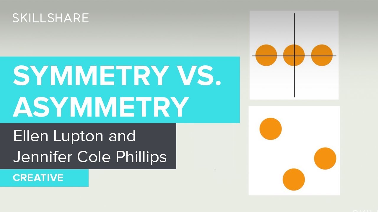
Asymmetry is not randomness. It’s deliberate imbalance. The difference matters.
A symmetrical composition distributes visual weight evenly. An asymmetrical one shifts weight to one side on purpose, usually to create a focal point or guide the viewer’s eye in a specific direction.
| Attribute | Symmetry | Asymmetry |
|---|---|---|
| Visual feel | Calm, ordered, formal | Energetic, dynamic, modern |
| Hierarchy | Harder to establish | Naturally creates emphasis |
| Trust signal | Strong (stability) | Weaker (excitement) |
| Best for | Corporate, finance, healthcare | Creative agencies, startups, editorial |
| Difficulty | Easier to execute | Harder to balance well |
The Tradeoff
Symmetry communicates order. Asymmetry communicates energy. You don’t always get both.
Massimo Vignelli built a career on symmetrical order. David Carson made his name doing the opposite, tearing apart grids and layering type in ways that felt chaotic but were actually carefully composed.
Both approaches work. The question is always what the project needs. A bank’s annual report and a music festival poster demand completely different compositional strategies. Trying to apply the same visual structure to both would be a mistake.
Mixing Both for Stronger Results
The strongest designs often use symmetry as the foundation and break it strategically. A symmetrical grid with one element that breaks the pattern, like a high-contrast color accent or an oversized image, pulls the eye exactly where you want it.
According to Renderforest, 84.6% of users prefer minimalist design layouts. Minimalist design almost always starts with a symmetrical base, then introduces selective asymmetry for emphasis.
That combo (structured symmetry plus intentional disruption) is honestly what separates decent layouts from the ones that actually hold your attention.
How to Create Symmetry in a Design

Start with an axis. Before placing a single element, decide where the center line sits. Vertical, horizontal, or both. Everything else builds from that decision.
Most design tools make this straightforward. Figma’s auto-layout, Adobe Illustrator’s reflect tool, and even Canva’s snap-to-center guides all handle the mechanical part. The hard part is knowing when the math is wrong and your eye is right.
Mirroring Techniques Across Tools
| Tool | Symmetry Feature | Best Use Case |
|---|---|---|
| Figma | Auto-layout, align to center | UI layouts, component design |
| Illustrator | Reflect tool, transform panel | Logo creation, vector icons |
| Canva | Snap-to-center guides | Social media, quick layouts |
| CSS Grid | justify-content, align-items | Responsive web layouts |
One mistake I see constantly: designers mirror elements pixel-for-pixel and call it done. But mathematical symmetry and optical symmetry are not the same thing. Your eyes don’t process geometry the way a computer does.
Optical Symmetry vs. Mathematical Symmetry
The optical center of a page sits slightly above and to the right of the mathematical center. Place something at the geometric midpoint, and it looks like it’s drifting low.
Classic example: YouTube’s play button. That triangle isn’t centered mathematically inside its red rectangle. It’s nudged slightly right because the left side of a triangle carries more visual weight. If placed at true center, it would look off-balance.
Google’s Material Design documentation includes keyline grids specifically for this purpose. They account for the different visual weights of circles, triangles, and squares at identical pixel dimensions.
Toyota’s logo uses subtly adjusted ellipses, with thickness variations that aren’t geometrically equal but appear perfectly balanced to the eye. That’s optical correction in action.
Common Mistakes with Symmetrical Layouts
- Forced symmetry: cramming unequal content into identical containers
- Ignoring leading and font spacing when centering text blocks
- Using mathematical centering on typefaces with uneven ascenders and descenders
The fix is always the same. Step back. Squint. Does it look centered? If not, move it until it does, even if the pixel values stop matching.
Symmetry in Color and Typography
Symmetry isn’t only about shape placement. Color distribution and typographic arrangement carry visual weight too, and that weight needs to balance just like any other element.
A consistent color scheme across a composition creates a form of color symmetry. Consistent brand colors can boost recognition by up to 80%, according to multiple branding studies including data from Capital One Shopping Research (2025).
Symmetrical Color Distribution
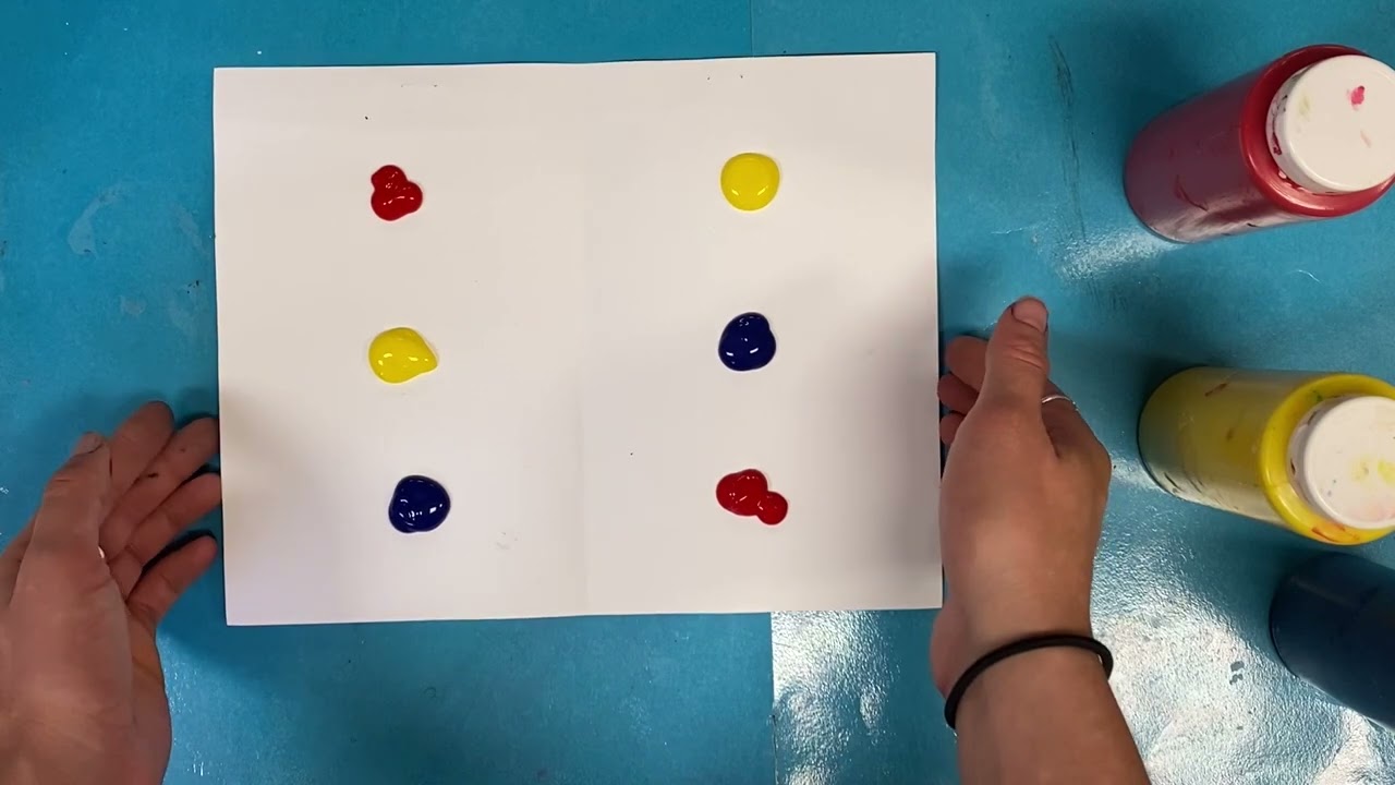
Weight matching: if a heavy, saturated hue anchors the left side of a layout, something of equal visual pull needs to exist on the right. Doesn’t have to be the same color. Just the same weight.
Intentional breaks: a symmetrical color layout with one accent that breaks the pattern becomes a tool for directing attention. That’s how you create a point of emphasis without restructuring the entire composition.
According to a 2025 Amra and Elma analysis, 85% of consumers say color is the main reason they choose one product over another. When the color system within a design feels balanced, it reinforces the credibility that symmetry already provides.
Typography and Symmetrical Layouts
Centered type is the most visible expression of typographic symmetry. Wedding invitations, title pages, book covers. Every line stacks along a vertical axis.
But centered text creates problems with readability past about three lines. The eye loses its anchor point and has to re-find the start of each new line.
| Layout | Readability | Symmetry Level | Best For |
|---|---|---|---|
| Centered | Low (over 3 lines) | Full | Titles, short headings, invitations |
| Left-aligned | High | None (asymmetric) | Body text, articles, interfaces |
| Justified | Medium | Near-symmetrical | Print columns, formal documents |
A common editorial technique: pair symmetrical type layouts (centered headlines) with asymmetrical imagery. The type gives structure, the image gives energy. You get both signals at once.
Designers working with serif fonts in symmetrical layouts often need to adjust kerning manually because optical spacing between curved and straight letterforms rarely matches mathematical spacing.
When Symmetry Becomes a Problem
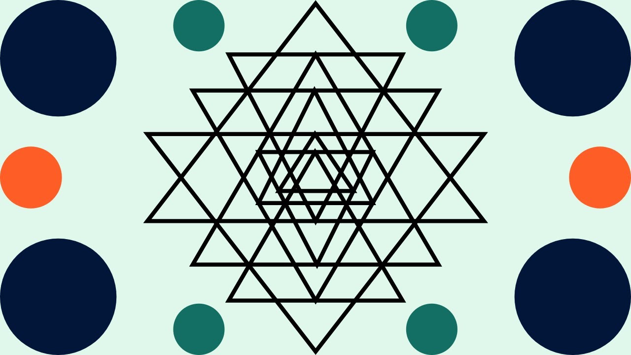
Too much symmetry kills a design. Sounds dramatic, but the Interaction Design Foundation puts it bluntly: a design that features symmetry exclusively “can feel monotonous and predictable.”
That’s the trap. Symmetry is safe. And safe, applied everywhere without thinking, turns into boring.
Visual Monotony and the “Corporate Blandness” Effect
Nielsen Norman Group research found that 79% of users scan web pages rather than read word-by-word. Symmetrical layouts distribute visual weight evenly, which sounds good until you realize it means nothing stands out.
If everything on the page carries equal importance, users struggle to find what they actually came for. The IxDF notes that complete symmetry “might distribute focus evenly,” making it harder for users to spot the parts that matter most.
This is the “corporate blandness” problem. Banks, insurance companies, enterprise SaaS products. Perfectly symmetrical, perfectly forgettable. The layout works, but nothing about it sticks in memory.
Scannability Problems in UX
The core issue: symmetrical layouts fight against how people actually read screens.
Users scan in F-patterns and Z-patterns, both of which are inherently asymmetrical. A rigidly symmetrical page doesn’t align with either scanning behavior, so users spend more cognitive effort navigating it.
Attention Insight’s 2026 analysis warns that too much repetition in symmetrical blocks “might create monotony” and that you need a clear hierarchy inside repeated elements so scanning stays easy.
Knowing When to Break Symmetry
The answer is almost always: break it with one element, not several.
- An oversized image on an otherwise centered layout
- A single color accent against a monochrome palette
- One off-grid text block that disrupts an otherwise structured page
WebFX describes it well: “asymmetry is effective in drawing attention and breaking monotony.” The trick is using it like seasoning, not like the main ingredient.
Google’s own homepage is a good example of this approach. It’s pseudo-symmetrical (centered search bar, balanced navigation), but the colorful logo and “I’m Feeling Lucky” button introduce just enough asymmetry to keep it from feeling sterile.
FAQ on Symmetry In Graphic Design
What is symmetry in graphic design?
Symmetry is the balanced distribution of visual elements around a central axis or point. One side mirrors the other in size, shape, and position. It creates visual harmony and helps viewers process compositions faster.
What are the main types of symmetry in design?
The four main types are reflective (bilateral), rotational, translational, and glide reflection. Reflective symmetry mirrors elements across a vertical or horizontal line. Rotational symmetry arranges elements around a center point.
Why do designers use symmetry?
Symmetrical compositions process faster in the brain because the visual system only needs to interpret half the information. This creates feelings of stability, trust, and professionalism, which is why it’s common in corporate branding and logo design.
What is the difference between symmetry and balance?
Balance is the broader concept of distributing visual weight evenly. Symmetry is one specific method of achieving balance through mirrored elements. A design can be balanced without being symmetrical, using asymmetrical arrangements instead.
Is symmetry always better than asymmetry?
No. Symmetry communicates order and formality. Asymmetry communicates energy and excitement. The right choice depends entirely on the project’s goals. Many strong designs combine both approaches.
How does symmetry affect logo design?
Symmetrical logos read cleanly at any size, from billboards to favicons. They signal reliability and professionalism. Research from Carey Business School found that asymmetrical logos are perceived as more exciting, while symmetrical ones feel more serious.
What is optical symmetry versus mathematical symmetry?
Mathematical symmetry means pixel-perfect mirroring. Optical symmetry adjusts element placement so the design looks balanced to the human eye, even when measurements aren’t identical. Google’s Material Design guidelines account for this difference.
Can too much symmetry hurt a design?
Yes. Excessive symmetry creates visual monotony. Users scanning a rigidly symmetrical page struggle to find focal points because everything carries equal weight. Strategic asymmetrical breaks solve this problem.
How do grid systems relate to symmetry?
Grid systems provide the structural framework for symmetrical layouts. The Swiss Design movement built its entire approach around structured grids with consistent columns, spacing, and aligned typography.
What tools help create symmetrical designs?
Figma’s auto-layout, Adobe Illustrator’s reflect tool, and CSS Grid all handle symmetrical composition. The key is using these tools as a starting point, then making optical adjustments by eye where needed.
Conclusion
Symmetry in graphic design isn’t a rule you follow blindly. It’s a tool you pick up when the project calls for order, stability, or visual clarity.
The strongest compositions use symmetrical structure as a foundation, then break it deliberately. One off-center element. A single color accent against a balanced layout. That controlled disruption is where good design becomes memorable.
Understanding the difference between optical and mathematical centering matters more than most designers realize. So does knowing when bilateral symmetry serves a brand better than rotational, or when a centered typographic layout will hurt readability instead of helping it.
Symmetry gives you control. Knowing when to let go of it gives you range. Use both, and your compositions will hold up across any format, from a printed poster to a responsive mobile screen.

Renowned for his expertise in logo design and visual branding, Bogdan has developed a multitude of logos for various clients.
His skills extend to creating posters, vector illustrations, business cards, and brochures. Additionally, Bogdan's UI kits were featured on marketplaces like Visual Hierarchy and UI8.
He also wrote in the past years on sites like Design Your Way, WebDesignerDepot, WPDean, Designmodo, Speckyboy, Slider Revolution, and more.
- Versatile Work Sans Font Pairing for Every Project - 16 September 2026
- Organize Digital Files Like a Pro Before Your Next Client Handoff - 16 September 2026
- How to Set Up a Digital Menu Board: Hardware to Layout - 15 September 2026

Bogdan Sandu is a seasoned designer who has been designing websites since 2008. Renowned for his expertise in logo design and visual branding, Bogdan has developed a multitude of logos for various clients. His skills extend to creating posters, vector illustrations, business cards, and brochures. Additionally, Bogdan's UI kits were featured on marketplaces like Visual Hierarchy and UI8. He also wrote in the past years on sites like Design Your Way, WebDesignerDepot, WPDean, Designmodo, Speckyboy, Slider Revolution, and more.
You Might Also Like


