

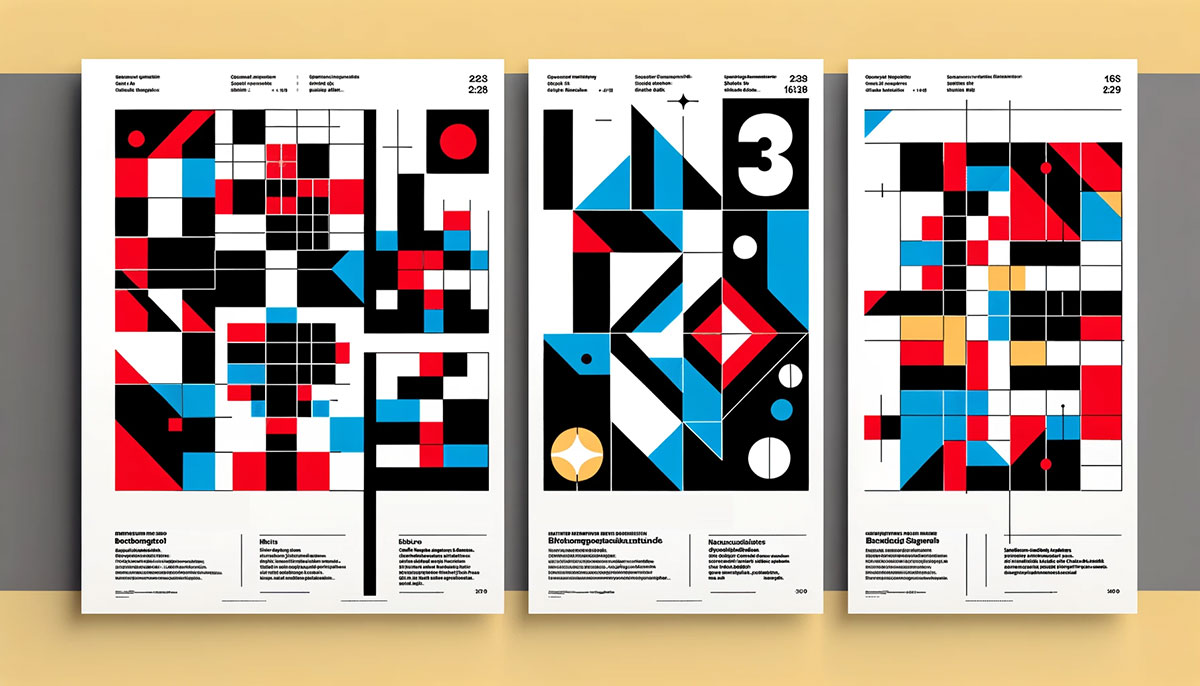
Helvetica is on your phone. The grid layout behind your favorite website started in 1950s Zürich. Whether you realize it or not, Swiss design shapes how you read, navigate, and process visual information every single day.
This graphic design movement, also known as the International Typographic Style, built its reputation on clarity, structured layouts, and sans-serif typography. It started in two Swiss schools and spread to corporate boardrooms, subway systems, and eventually every screen you own.
This guide covers the movement’s origins, its core principles (grids, type, photography), the designers who built it, and how it continues to influence modern branding and digital interfaces. You’ll also find honest criticism of where the style falls short.
What Is Swiss Design?

Swiss design is a graphic design movement that started in Switzerland during the 1950s. It’s also called the International Typographic Style.
The whole thing was built on a few clear ideas: readability, objectivity, and structured visual communication. No decoration for the sake of it. Every element on the page had to earn its place.
What set it apart from other mid-century movements was its commitment to removing the designer’s personal expression from the work. The content spoke. The designer organized. That was the deal.
Unlike Bauhaus-era design, which blended fine art with applied design across furniture, architecture, and graphics, Swiss design zeroed in on visual communication specifically. Posters, books, corporate identities. And unlike American commercial design of the same period, which leaned hard into illustration and persuasion, the Swiss approach stayed neutral. Almost clinical.
The movement produced some of the most recognized typefaces in history, including Helvetica and Univers. Both designed in 1957. Both still everywhere.
Figma data shows the global web design services market reached $61.23 billion in 2025, and a huge chunk of modern interface design still follows principles that Josef Müller-Brockmann and his peers laid down over sixty years ago.
That’s the thing about Swiss design. It never really went away. It just got absorbed into everything.
Origins and Historical Context of Swiss Design

Post-World War II Switzerland was a unique environment for design to grow. The country was neutral, multilingual (German, French, Italian, Romansh), and deeply practical. Communication needed to work across language barriers, and Swiss designers took that seriously.
Two schools drove everything forward. And they approached the same problem from slightly different angles.
Josef Müller-Brockmann and the Zürich School
Kunstgewerbeschule Zürich was where Ernst Keller began teaching in 1918, and his influence ran deep. Keller pushed for functional use of geometric shapes and a design philosophy that balanced expression with practical application.
But it was Josef Müller-Brockmann who became the face of the Zürich approach. His concert posters for the Zurich Tonhalle (produced throughout the 1950s to 1970s) are probably the most referenced examples of Swiss graphic design ever made.
Müller-Brockmann cofounded Neue Grafik magazine in 1958 alongside Richard Paul Lohse, Hans Neuburg, and Carlo Vivarelli. The magazine ran until 1965 and basically served as the movement’s manifesto, spreading Swiss design principles internationally through its own grid-based layouts.
Armin Hofmann, Emil Ruder, and the Basel Approach
The Basel School of Design took a different path. Armin Hofmann focused on stripping compositions down to their most basic design elements (dot, line, shape) and using photography with a reduced color palette.
Emil Ruder, teaching alongside Hofmann, concentrated on typographic composition. His book Typographie (1967) became one of the foundational texts on how type should function on a page.
Where the Zürich school leaned toward systematic order and mathematical precision, Basel allowed for a bit more visual experimentation within the rules. Both arrived at clean, objective results. They just took different routes.
The broader influences feeding into both schools came from earlier movements. Constructivism out of Russia. De Stijl from the Netherlands. And the Bauhaus tradition from Germany, particularly through Max Bill, who had studied under the Bauhaus before bringing those ideas back to Switzerland.
Core Principles of Swiss Design

Swiss design runs on a specific set of rules. Not suggestions. Rules. The whole movement was built on the idea that design should be objective and systematic, not expressive or emotional.
Here’s what defines it at its core:
| Principle | What It Means | Why It Matters |
|---|---|---|
| Grid-based layout | Mathematical structure for all compositions | Creates consistent, readable pages |
| Sans-serif type | Helvetica, Univers, Akzidenz-Grotesk | Removes decorative bias from text |
| Objective photography | Photos over illustrations | Presents information without persuasion |
| Asymmetric layout | Off-center compositions with math behind them | Adds visual interest within structure |
| Active white space | Empty areas are designed, not leftover | Guides the eye, reduces clutter |
The big idea here is objectivity. The designer removes themselves from the equation. No personal flair. No stylistic signatures. Just clear communication.
The Grid System
This is the backbone of everything. Müller-Brockmann’s Grid Systems in Graphic Design (1981) remains the definitive reference, and it’s still read by web designers today.
The grid organizes text, images, and negative space into proportional relationships. Column-based and modular structures give designers a framework that’s flexible enough for creativity but rigid enough to keep things consistent.
This isn’t just a print thing anymore. The 2024 State of CSS Survey found that 78% of developers now use CSS Grid regularly, up from 62% three years prior. The concept Müller-Brockmann formalized in the 1950s literally runs the modern web.
Typography Choices and Hierarchy
Swiss designers didn’t just pick sans-serif fonts because they looked clean. They believed sans-serifs expressed, as early practitioners put it, “the spirit of a more progressive age.”
The typographic hierarchy in Swiss design works through size, weight, and position, not through decorative variation. No script fonts. No ornamental lettering. Just structured arrangements of clean type.
Leading, tracking, and kerning all get meticulous attention. Every space between letters and lines is calculated, not eyeballed. Flush left, ragged right text alignment became the standard because it maintained natural reading rhythm without the artificial gaps of justified text.
Swiss Design and Typography

Typography isn’t just a feature of Swiss design. It’s the center of it. The movement is literally named “International Typographic Style” for a reason.
Two typefaces became synonymous with the entire movement, and both were born in the same year.
Helvetica and Its Global Spread
Max Miedinger designed Helvetica in 1957 at the Haas Type Foundry. Originally called Neue Haas Grotesk, it was renamed “Helvetica” in 1960 (the word comes from “Helvetia,” the Latin name for Switzerland) to make it easier to sell internationally.
The font now exists in 34 weights and has been adapted to different alphabets and languages. It’s used by the U.S. government, NASA, the New York City subway system, Lufthansa, Target, BMW, Nestlé, and Panasonic, among dozens of others.
In 1984, Steve Jobs selected Helvetica as the headline font for the first Macintosh computers. It remained part of iOS until 2015, when Apple replaced it with their own San Francisco typeface.
Monotype acquired the rights and released Helvetica Now in 2019, updating the design for modern screen rendering. Even critics who call the font iconic but overused can’t deny its reach.
Adrian Frutiger’s Univers
Adrian Frutiger took a different approach. His Univers typeface introduced a systematic numbering system for weight and width variations, replacing the inconsistent naming conventions (bold, semibold, condensed) that made pairing fonts across a family confusing.
Where Helvetica spread through corporate adoption and consumer electronics, Univers gained ground in wayfinding and signage. Frutiger later designed the Frutiger typeface specifically for airport signage at Charles de Gaulle Airport in Paris.
Both typefaces reject decoration. Both treat the letterform as a functional tool, not a canvas for self-expression. That’s the psychology behind their design: neutrality builds trust precisely because it doesn’t try to persuade.
Emil Ruder’s Typographie
Ruder’s 1967 book Typographie codified how Swiss designers thought about type on a page. He treated every typographic element as both functional and visual, insisting that readability and aesthetic quality were the same goal, not competing ones.
The book covers spacing between characters, line length, margins, and the relationship between text blocks and surrounding space. It reads like a manual for achieving clarity through precision. No shortcuts, no guesswork.
The Grid System in Swiss Design

Look, every design tradition uses some form of structure. But Swiss designers turned the grid into a philosophy.
Müller-Brockmann put it bluntly: “The grid system is an aid, not a guarantee. It permits a number of possible uses and each designer can look for a solution appropriate to his personal style. But one must learn how to use the grid; it is an art that requires practice.”
How the Grid Structures Information
Column-based grids divide the page into vertical sections. Text and images snap to these columns, creating consistent alignment across different pages of the same publication.
Modular grids add horizontal divisions, creating a matrix of cells. This gives designers more control over where elements sit, especially useful for complex layouts with multiple image sizes and text blocks.
The result is a page where nothing feels random. Every element relates to every other element through shared proportions. It’s mathematical balance made visible.
From Print to Screen
The grid didn’t stay on paper. Bootstrap, one of the most widely used front-end frameworks, is built on a 12-column grid system directly descended from Swiss design principles. CSS Grid and Flexbox carry the same DNA.
Figma’s 2025 research indicates that the global web design market reached $61.23 billion, with grid-based responsive layouts as a baseline expectation across the industry. Hostinger data shows 90% of all websites (roughly 1.2 billion sites) have adopted responsive design, which fundamentally depends on grid structures.
The Clutch survey on design trends found that flat design (at 88.5%) remains the dominant web design approach. That number matters because flat design itself grew directly out of Swiss design’s emphasis on clean surfaces, strong contrast, and typographic clarity.
The Grid as Constraint and Freedom
There’s a common misconception that grids make design rigid. Actually, the opposite tends to happen. When you have a solid structural framework, you can break it intentionally, and those breaks create emphasis precisely because the surrounding structure is consistent.
Swiss designers understood this. Asymmetric compositions within a grid system are one of the movement’s signatures. The grid provides order. The asymmetry provides energy. Took me a while to really get why that combination works so well, but once you see it, you can’t unsee it.
Swiss Design in Branding and Corporate Identity

By the 1960s, multinational companies had a problem. They needed visual identities that worked across languages, cultures, and media formats. Swiss design gave them exactly that.
The Corporate Identity Boom
IBM’s identity system, shaped by Paul Rand (who was heavily influenced by Swiss principles), became a model for corporate branding. The horizontal-striped logo set in a clean sans-serif typeface communicated technology and precision without saying a word.
Massimo Vignelli and Bob Noorda created the New York City Transit Authority’s Graphic Standards Manual, which unified signage across the entire subway system using Helvetica and a grid-based system. That manual is now considered one of the most significant corporate identity examples in design history.
Otl Aicher designed Lufthansa’s visual identity, and his work for the 1972 Munich Olympics set a standard for systematic, icon-driven design that still influences signage design and wayfinding.
Why Swiss Design Works for Global Brands
Language independence: Grid structures, photography, and sans-serif type don’t rely on cultural context to communicate. A Helvetica headline reads the same way in Tokyo, São Paulo, and Berlin.
Consistency across media: Swiss design principles translate from business cards to billboards to digital interfaces without losing coherence. That systematic approach to brand guidelines saves companies from the chaos of inconsistent design across departments and regions.
Longevity: Adobe research shows that 78% of customers want consistent brand experiences across all channels. Swiss design principles deliver that consistency almost by default, which explains why many identities built on these principles (BMW, Lufthansa, American Airlines under Vignelli) lasted decades with minimal changes.
The Shift from Decoration to Systems
Before Swiss design influenced corporate branding, most company identities were decorative. Ornamental logos, illustrated mastheads, inconsistent applications. Swiss thinking replaced all of that with rule-based systems: specified typefaces, defined color palettes, clear spacing rules, and documented usage guidelines.
That shift from “make something pretty” to “build a system” is maybe the single biggest contribution Swiss design made to creating brand identity. Every modern brand style guide descends from this way of thinking.
Swiss Design’s Influence on Digital and Web Design

When Apple launched iOS 7 in 2013, it stripped away every skeuomorphic texture (the fake leather, the stitched calendars, the glossy buttons) and replaced them with flat surfaces, clean type, and structured layouts. That was Swiss design thinking, applied to a phone screen.
Google followed a year later with Material Design, a system built on grid-based organization, bold color choices, and deliberate spacing. Both tech giants landed on principles that Müller-Brockmann had published decades earlier.
Flat Design and Interface Minimalism
A Clutch survey found that 88.5% of web design approaches now follow flat design principles. That number traces directly back to Swiss design’s preference for clean surfaces and rejection of decorative ornamentation.
The connection is pretty straightforward:
- Flat icons load faster and scale cleanly across devices
- Sans-serif type remains the default for screen readability
- Grid-based layouts power every major CSS framework
Apple’s SF Pro and Google’s Roboto both descend from the same typographic lineage as Helvetica. They’re designed for neutrality, clarity, and cross-platform consistency.
Grid Systems in Modern Frameworks
Figma’s 2025 data shows teams using well-adopted design systems complete tasks 34% faster. Those systems are built on component libraries, spacing tokens, and (you guessed it) grids.
| Framework / Tool | Grid Foundation | Swiss Design Connection |
|---|---|---|
| Bootstrap | 12-column responsive grid | Direct column-based structure |
| CSS Grid | Two-dimensional rows + columns | Modular grid concept |
| Figma auto-layout | Spacing and alignment tokens | Proportional relationships |
| Material Design | 8dp baseline grid | Mathematical spacing system |
LinkedIn data indicates a 30% surge in job postings for design system roles over the past year. Companies like Salesforce, Shopify, and Uber now treat design system adoption as a core quality metric, on the same level as test coverage or uptime.
Where Swiss Principles Fall Short on Screen
Here’s the honest part. Swiss design’s love of low-contrast text and thin type doesn’t always translate well to screens.
WebAIM’s 2025 analysis found that 79.1% of homepages fail minimum color contrast requirements. Low-contrast text is the single most common accessibility violation on the web. Some of that traces back to design trends that prioritize aesthetic minimalism over readability.
Helvetica itself has narrow apertures that limit legibility at small sizes on screen. Apple eventually replaced it with San Francisco for exactly this reason. The lesson: Swiss principles need adaptation for digital contexts, not blind replication.
Criticism and Limitations of Swiss Design

Swiss design gets treated like gospel in a lot of design programs. But it has real problems that are worth talking about honestly.
The “Cold and Sterile” Problem
Wolfgang Weingart, who studied and taught at the Basel School of Design, called it out directly. He said classical Swiss typography had become “conservative” with “strict limitations” that stifled experimentation.
By the early 1970s, Weingart was deliberately breaking Swiss conventions (stretching letterspacing, layering film positives, pushing readability to its limits) while still acknowledging the movement’s strengths. His work launched what became known as New Wave or Swiss Punk typography.
He put it plainly: “I took Swiss Typography as my starting point, but then I blew it apart.”
Cultural Assumptions Behind “Universal” Design
The “International” label doesn’t hold up. Swiss design emerged from a specific Western European context, with specific cultural values around order, neutrality, and restraint.
Applying those values globally and calling it “universal” ignores how different cultures communicate visually. What reads as “clean” in Zürich might read as “cold” or “empty” in contexts where visual density signals trust and completeness.
The Gestalt idea that perceptual grouping works the same way everywhere has been questioned by cross-cultural psychology research for years now.
The Homogeneity Trap
When every brand uses the same grid, the same sans-serif typeface, and the same minimalist approach, differentiation disappears. Designer Dalton Maag criticized Helvetica directly, saying designers use it because it’s “the lazy choice” and “the safe choice,” creating homogeneity across brand identity work.
There’s a reason postmodern design exploded in the 1980s. Designers like April Greiman and David Carson were reacting against exactly this sameness. They wanted expression, texture, and rule-breaking, things the Swiss system explicitly rejected.
The Postmodern Response
| Movement | When | Key Figures | Relationship to Swiss Design |
|---|---|---|---|
| New Wave / Swiss Punk | 1970s | Wolfgang Weingart, Dan Friedman | Evolved from within, broke the grid |
| Postmodern design | 1980s | April Greiman, Neville Brody | Rejected objectivity, embraced expression |
| Grunge typography | 1990s | David Carson, Emigre | Full rejection of readability as goal |
The pattern is clear. Each generation that grew up with Swiss design eventually pushed against it. That tension between structure and expression keeps both sides productive.
Key Works and Resources for Studying Swiss Design
If you actually want to study this stuff (not just read about it), these are the primary sources. Not blog posts. The real things.
Books That Define the Movement
Grid Systems in Graphic Design by Josef Müller-Brockmann (1981). This is the book on grid-based layout. Still referenced by print and poster designers, web developers, and design educators. If you only read one book on Swiss design, make it this one.
Typographie by Emil Ruder (1967). Covers everything from baseline alignment to line length to the relationship between text and surrounding space. It’s methodical. Some people find it dry. I think that’s the point.
Graphic Design Manual by Armin Hofmann (1965). Focuses on the fundamental visual elements (point, line, plane) and how to compose with them. Less about rules, more about training your eye.
Original Design Work Worth Studying
- Müller-Brockmann’s concert posters for the Zurich Tonhalle (1950s-1970s)
- The Neue Grafik magazine archive (1958-1965), all 18 issues
- Massimo Vignelli’s NYC Transit Authority Graphic Standards Manual
- Otl Aicher’s pictograms and identity system for the 1972 Munich Olympics
Where to See It in Person
Museum für Gestaltung Zürich holds the largest collection of Swiss graphic design, including original posters, typeface specimens, and archival material. In 2014, they hosted a full retrospective of Wolfgang Weingart’s work.
MoMA’s design collection in New York includes significant Swiss design pieces, and the book design archives at several European institutions preserve original printed works from the movement’s peak period.
Richard Hollis’s Swiss Graphic Design: The Origins and Growth of an International Style (2006) provides the most complete historical overview if you’re looking for secondary source material to round out the primary texts.
FAQ on Swiss Design
What is Swiss design?
Swiss design is a graphic design movement from 1950s Switzerland built on grid-based layouts, sans-serif typography, and objective visual communication. Also called the International Typographic Style, it prioritizes clarity and readability over decoration or personal expression.
Who are the most important Swiss designers?
Josef Müller-Brockmann, Armin Hofmann, Emil Ruder, and Max Bill shaped the movement’s foundations. Max Miedinger created Helvetica. Adrian Frutiger designed Univers. Wolfgang Weingart later challenged Swiss conventions from within, launching a new wave in graphic design.
Why is the grid system so central to Swiss design?
The grid gives every element on a page a mathematical relationship to every other element. It creates consistent rhythm and structure. Müller-Brockmann’s Grid Systems in Graphic Design remains the definitive reference for this approach.
What typefaces are associated with Swiss design?
Helvetica and Univers are the two most recognized. Both were designed in 1957. Akzidenz-Grotesk, an earlier sans-serif from 1896, also played a role. Swiss designers rejected decorative or display-oriented fonts in favor of functional neutrality.
How is Swiss design different from Bauhaus?
Bauhaus blended fine art, architecture, furniture, and graphics into a total creative philosophy. Swiss design narrowed the focus to visual communication specifically. Both share a love of geometry and function, but Swiss design is more restrained and typography-driven.
Is Swiss design the same as minimalist design?
Not exactly. Minimalist design is a broader aesthetic that reduces elements to their simplest form. Swiss design is specifically a structured system with defined rules around grids, type, and photography. Minimalism borrows from it, but they’re not interchangeable.
How does Swiss design influence modern web design?
CSS Grid, Bootstrap’s 12-column layout, and flat UI trends all trace back to Swiss principles. Tools like Figma have grid systems and type scales built in. Apple’s iOS 7 redesign and Google’s Material Design both drew heavily from this tradition.
What are the main criticisms of Swiss design?
Critics call it cold, sterile, and culturally biased toward Western European aesthetics. The “International” label overstates its universality. When applied rigidly, it creates homogeneity across brands. Wolfgang Weingart and the postmodern movement pushed back against these limits.
What is the role of photography in Swiss design?
Swiss designers preferred objective photography over illustration. Photos presented information directly, without the persuasive bias that hand-drawn images could carry. This gave the work a documentary quality and reinforced the movement’s commitment to factual communication.
Where can I study Swiss design in depth?
Start with Müller-Brockmann’s grid book and Ruder’s Typographie. The Museum für Gestaltung Zürich holds the largest collection of original Swiss graphic work. Richard Hollis’s 2006 book provides the most complete historical overview of the movement’s growth.
Conclusion
Swiss design didn’t just change how posters and magazines looked in the 1950s. It rewired how we organize visual information across every medium that followed.
The grid system, the preference for clean sans-serif typefaces, the deliberate use of restrained color palettes, and the commitment to functional composition still sit at the foundation of modern brand identity design and user interface work.
But the movement works best when treated as a starting point, not a rigid set of rules. Weingart proved that. So did every designer who learned the grid, then bent it.
Study Müller-Brockmann’s proportions. Read Ruder’s typographic theory. Then figure out where structure serves your message and where it gets in the way. That’s the real lesson the Swiss school left behind.

Renowned for his expertise in logo design and visual branding, Bogdan has developed a multitude of logos for various clients.
His skills extend to creating posters, vector illustrations, business cards, and brochures. Additionally, Bogdan's UI kits were featured on marketplaces like Visual Hierarchy and UI8.
He also wrote in the past years on sites like Design Your Way, WebDesignerDepot, WPDean, Designmodo, Speckyboy, Slider Revolution, and more.
- Best Visual Regression Testing Tools for Web and App Design in 2026 - 13 October 2026
- Jujutsu Kaisen Font Generator - 12 October 2026
- The Windsurf Logo History, Colors, Font, And Meaning - 10 October 2026

Bogdan Sandu is a seasoned designer who has been designing websites since 2008. Renowned for his expertise in logo design and visual branding, Bogdan has developed a multitude of logos for various clients. His skills extend to creating posters, vector illustrations, business cards, and brochures. Additionally, Bogdan's UI kits were featured on marketplaces like Visual Hierarchy and UI8. He also wrote in the past years on sites like Design Your Way, WebDesignerDepot, WPDean, Designmodo, Speckyboy, Slider Revolution, and more.
You Might Also Like


