


The Capcom Logo History, Colors, Font, And Meaning

Imagine unfurling the banner of gaming nostalgia; the Capcom logo beams as a beacon of digital artistry.
Within its modest contours lies a narrative woven into the very fabric of interactive entertainment. Its distinctive visage hints at a legacy where pixels met passion to script our cherished virtual odysseys.
This article descends into the crucible of design, delving into the emblem that crowned an empire built on joysticks and imaginations. I stand at the confluence of visual identity and corporate branding, your guide through the story etched into this iconic symbol.
You’ll emerge versed in the evolution of a symbol that paralleled gaming company emblems, evolving beyond a mere trademark design.
Together, we’ll dissect the elements that confer essence upon the emblem: from the color scheme to its impact on brand image.
The Resident Evil insignia and Street Fighter emblem also join our journey as tributaries feeding the great Capcom river. We’ll scrutinize how a mere logo transcends to become an enduring visual identity, an irreplaceable article of the digital world.
The Meaning Behind the Capcom Logo
Symbolism and Impact
The Capcom logo, at its core, is more than just a name inscribed stylishly. It embodies a legacy of gaming, adventures, and stories that span generations.
With every pixel, the logo communicates not just a brand, but an emotion. Think about it – the moment you see it, memories of intense boss battles and epic narratives come flooding back.
A Cultural Icon
What makes the Capcom logo so iconic? It’s its ability to be instantly recognizable. A good logo isn’t just about aesthetics; it’s about resonating with its audience, and Capcom nails this.
The logo speaks volumes, representing a brand that has given the world some of the most legendary games.
The History of the Capcom Logo
Humble Beginnings
The journey of the Capcom logo traces back to the early days of arcade gaming. Capcom, initially a little-known company, began as an ambitious dream. As it grew, so did the need for a logo that could encapsulate its essence.
Evolutions and Iterations
Like any brand worth its salt, the Capcom logo has seen changes over the years. However, each iteration has been about refining and evolving rather than complete overhauls. This consistency has played a significant role in making the logo an enduring emblem.
The Colors of the Capcom Logo

Shades of Passion
The primary color palette of the Capcom logo has mostly revolved around reds and whites. Red, in design lingo, is often associated with passion, energy, and action. Sounds like Capcom, right?
Psychology and Perception
Colors play a massive role in how a brand is perceived. Capcom’s choice resonates with the adrenaline-pumping experiences their games provide. The white, on the other hand, lends a clean, sleek look, making the logo pop against various backgrounds.
The Font Used in the Capcom Logo
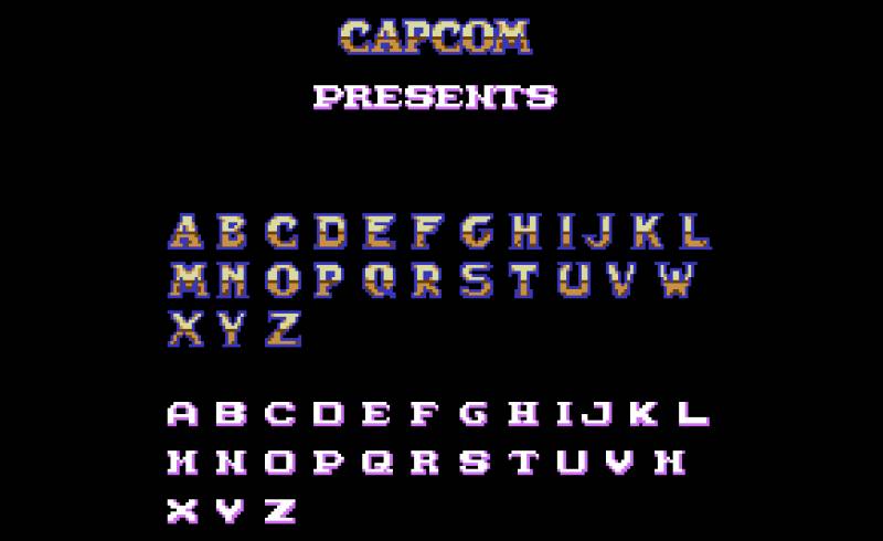
Typography Tells a Tale
The font in the Capcom logo isn’t just about legibility; it’s about identity. The choice of typeface gives the logo a modern feel, aligning with the brand’s forward-thinking ethos.
Balancing Aesthetics and Function
It’s not just about looking good. The Capcom font ensures that the logo remains clear and discernible, whether it’s on a game cover or a giant billboard. It’s a masterclass in balancing aesthetics with functionality.
Iconography Accompanying the Capcom Logo
Beyond Text
While the text is a dominant part of the Capcom logo, occasional iconography accompanying it adds layers of meaning. From fiery dragons to intricate crests, these symbols amplify the logo’s message.
Memorable Mascots
Capcom’s rich history of game characters has sometimes played a role in their branding. From Mega Man to Ryu, these characters have become synonymous with Capcom, reinforcing the brand’s legacy.
The Global Reception of the Capcom Logo
East Meets West
Originating in Japan, Capcom’s brand and logo faced the challenge of resonating with global audiences. Yet, its universal design and the global appeal of its games ensured that the logo became a familiar sight worldwide.
Legacy and Loyalty
For many gamers, the Capcom logo isn’t just a brand; it’s a symbol of countless hours spent in immersive worlds. This global reception is a testament to the logo’s design, which transcends cultural and linguistic barriers.
FAQ On The Capcom Logo
What is the history behind the Capcom logo?
Grains of the past spill through our fingers as we trace the timeline of an icon. The Capcom logo sprung from the company’s founding in 1983, its design embodying the fusion of Capsule and Computer—words that are the company’s heartbeat.
A nod to the company’s dedication to compact, explosive gaming experiences.
How has the Capcom logo evolved over time?
As a river carves a canyon, time shapes emblems. From its genesis, the Capcom logo bore a stark, typographic style, later embracing subtle refinements.
Its evolution mirrors an odyssey of brand recognition —a salute to the company’s enduring presence and hallmark heroes like Mega Man, against an ever-shifting digital skyline.
Why is the Capcom logo significant in gaming culture?
Brandishing iconic gaming symbols, the logo is more than art; it’s a totem of legacy.
The Capcom logo—etched into the minds of joystick warriors and pixel paladins—stands as a testament to countless adventures within the realms of Monster Hunter and adversarial clashes in the Street Fighter arenas.
What does the Capcom logo represent?
A glyph cast in the forge of creativity, the logo isn’t a mere trademark design but a flag for storytelling prowess and intellectual property richness.
It symbolizes their commitment to innovation, the thrills of battle in Devil May Cry, and the chilling narratives woven through Resident Evil.
How does the design of the Capcom logo contribute to its brand image?
Design whispers before words shout. The Capcom logo marries simplicity and sophistication, imbuing the brand with an aura of elegance.
Its minimalistic design allows for instant recognition and versatile usage, reinforcing the brand’s visual identity as a maestro of interactive escapades.
What are the key elements of the Capcom logo?
Stripping it down to its skeleton, the logo’s key elements—a bespoke typeface and blue color palette—lay foundations of brand architecture.
These serve not just as visual identity markers but signposts guiding us through the lore-laden landscapes Capcom has birthed.
How do trademark laws protect the Capcom logo?
Trademark laws envelop the logo in a cocoon of legal safeguarding, zealously guarding it against misuse. These regulatory bindings ensure that when one encounters the Capcom emblem, it is the genuine maestro of gaming experiences—authentic and unadulterated.
What are the different variations of the Capcom logo used in their games?
Variations unfold like chapters of a book, with each adaptation tailored for its vessel.
Be it etched into the title screen of Resident Evil or Street Fighter, each variation echoes the core identity while lending it sparks of adaptability—allowing Resident Evil’s insignia and Street Fighter’s emblem to flourish in their unique narratives.
Can the Capcom logo be used by third parties?
Bound by trademark laws, third-party use of the Capcom logo requires a waltz with legalities.
Licensing agreements are the golden keys that unlock usage—preserving the sanctity of the emblem while nurturing partnerships with entities like merchandise manufacturers, evoking its essence in physical form.
What is the impact of the Capcom logo on the company’s marketing?
It’s a lighthouse for all marketing endeavors—a continuity across corporate branding.
The logo sails across seas of digital and physical advertisements, whispering tales of Capcom’s innovative spirit. It’s a seal that promises a voyage into incredible worlds—where stories, not just games, await to unfold.
Conclusion
Unveiling the Capcom logo invites an expedition through time—a profound dive into a reservoir of digital culture. Within the concise strokes of its emblem, a narrative unfolds. One of mastery in interactive storytelling celebrated across eras, emblematic of both innovation and reverence for gaming lore.
It’s witnessed evolutions subtle yet unequivocal, mirroring the growth of an entity synonymous with iconic gaming symbols. This insignia stands as more than a trademark design; it is a heart-pumping prelude to the tapestries of gameplay weaved by titles like Resident Evil and Street Fighter.
As the final pixel on this textual canvas dries, consider the enduring legacy cast by this unassuming mark. It has secured its berth not merely in the annals of its corporation’s history but as a standard-bearing flagship within the vast gaming cosmos.
So let it be known: the Capcom logo—less a mere graphic, more a beacon for the boundless universes charted by thumb and screen.
If you enjoyed reading this article about the Capcom logo, you should read these as well:
- Cool video game fonts to use for designing game-related projects
- Steve Madden Ads: Elevate Your Shoe Game, Own the Trend
- 6 Alternatives To Invideo in 2023
Bogdan Sandu, a seasoned designer with 15 years of diverse experience, has been designing websites since 2008.
Renowned for his expertise in logo design and visual branding, Bogdan has developed a multitude of logos for various clients.
His skills extend to creating posters, vector illustrations, business cards, and brochures. Additionally, Bogdan's UI kits were featured on marketplaces like Visual Hierarchy and UI8.
Latest posts by Bogdan Sandu (see all)
- Soft Cream Color Palettes for Subtle Designs - 7 May 2024
- True Tones: Skin Color Palettes for Inclusive Designs - 7 May 2024
- The Budweiser Logo History, Colors, Font, And Meaning - 6 May 2024