The Zynga logo is one of those marks you’ve probably seen hundreds of times without really thinking about it. A white dog silhouette sitting next to bold lowercase letters on a red background. Simple enough, right?
But there’s a real story behind it. The Zynga logo represents one of the biggest social gaming companies ever built, and it started with a dead dog named Zinga. Mark Pincus, the company’s founder, named his entire company after his American bulldog. The logo became the face of a brand that, at its peak, had 10% of the world’s internet users playing its games.
Zynga was founded in April 2007 in San Francisco. The company has gone through two main logo versions since then. The current iteration, introduced in 2012, is what most people recognize today. It’s now a subsidiary of Take-Two Interactive, which acquired the company for $12.7 billion in 2022.
What Is the Zynga Logo?
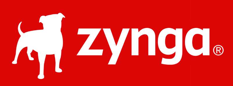
The Zynga logo is a combination mark featuring a white bulldog silhouette and a lowercase wordmark, both set against a red rectangular background. Introduced in its current form in 2012, the logo was designed in-house by Zynga’s creative team. It represents the company’s social gaming mission and pays tribute to founder Mark Pincus’ American bulldog, Zinga.
Here’s what you need to know about the logo’s makeup:
- Design Type: Combination mark (mascot plus wordmark)
- Primary Elements: White bulldog silhouette, lowercase “zynga” wordmark, red rectangular background
- Official Introduction Date: 2007 (original), 2012 (current version)
- Designer/Agency: In-house creative team at Zynga. The specific designer’s name was never publicly credited
- Trademark Status: Registered with the USPTO. The original dog-plus-wordmark trademark (Serial Number 77684104, Registration Number 3685749) was filed in March 2009 and registered in September 2009. A standard character mark for “ZYNGA” (Registration Number 4977615) was filed in October 2015 and registered in June 2016
- Color Palette: Zynga Red (#DA1F26), White (#FFFFFF), with secondary brand colors including Cadet Blue (#ABB8C3) and Tundora (#444444)
- Usage Context: Mobile game apps, social media platforms, the Zynga website, marketing materials, app store icons, merchandise, and corporate communications under Take-Two Interactive
How Has the Zynga Logo Evolved Over Time?

The Zynga logo has gone through two primary versions since 2007. The original used a gradient effect and a more realistic dog silhouette. The 2012 redesign flattened everything out, moving to solid colors and a cleaner layout that worked better on mobile screens.
Not a massive overhaul, honestly. But the differences matter when you’re talking about a brand seen by hundreds of millions of people.
Original Zynga Logo (2007-2012)
The first version hit the scene when Zynga was still called Presidio Media, before the name change in July 2007.
It featured a gradient red-to-gray composition. The dog silhouette sat on the left, and you could clearly see the bulldog breed in its outline. I’ve always thought the original looked a bit more emotional, if that makes sense.
The wordmark used bold lowercase letters in a confident sans-serif font with thick, straight lines. The whole thing felt heavier, more grounded.
The gradient background went from lighter red at the bottom to darker at the top. Some folks interpreted that as a sort of memorial flame for Zinga, the bulldog who had passed away. Pincus named the company in memory of his pet, so the logo carried genuine personal weight.
This version was the face of Zynga during its explosive growth period. FarmVille launched in 2009, CityVille hit 61 million monthly users in 2010, and the company went public on NASDAQ in December 2011. That original logo was everywhere on Facebook.
Current Zynga Logo (2012-Present)
The 2012 redesign happened during a period of corporate change. Zynga was transitioning from a private company to a public one, and the logo needed to grow up a bit.
Gone was the gradient. In came a flat red rectangle (#DA1F26) with everything rendered in pure white.
The dog silhouette got softer. Less bulldog, more generically friendly. There was a reason for this. Most users never knew the backstory about Pincus’ pet, so the aggressive bulldog outline was being associated with fighting breeds. The redesigned dog looks playful and approachable instead.
The wordmark kept its lowercase treatment but gained cleaner glyphs. The letter “a” changed notably. Everything got simpler.
This version has survived the Take-Two acquisition in May 2022 and continues to represent the brand across all platforms.
What Do the Design Elements of the Zynga Logo Mean?
Every piece of the Zynga logo ties back to the company’s identity. The dog represents loyalty and companionship, connecting to social gaming’s core idea of playing with friends. The red background signals energy and excitement. The lowercase letters keep things casual and accessible, which fits a company that makes games for everyone.
None of it is accidental. Well, maybe some of the associations people read into it are. But the core choices were deliberate.
The Dog Silhouette
The bulldog silhouette is a tribute to Zinga, Mark Pincus’ American bulldog who passed away before the company was founded. Pincus loved that dog enough to name a billion-dollar company after it.
In terms of shape psychology, rounded forms like the dog silhouette create feelings of warmth and friendliness. That works well for a casual gaming company. Dogs in general represent loyalty, trust, and companionship.
The choice also made Zynga instantly different from other gaming companies. Most gaming company logos lean toward abstract marks or aggressive imagery. A dog is disarming. It says “come play” rather than “prepare for battle.”
Why Did Zynga Choose These Specific Colors?

The color palette is intentionally limited. Two colors. That’s it for the primary logo.
Zynga Red (#DA1F26)
RGB: 218, 31, 38 | CMYK: 0, 86, 83, 15
Red communicates energy, urgency, and excitement. From a color psychology standpoint, it increases heart rate and grabs attention fast. For a gaming company, that’s the right signal. You want people to feel activated, not relaxed.
It’s also one of the most visible colors on app store grids, which matters more than people think. Among the sea of blue and green app icons, red pops.
White (#FFFFFF)
RGB: 255, 255, 255 | CMYK: 0, 0, 0, 0
The white wordmark and dog create contrast against the red background. White also signals cleanliness, simplicity, and openness. After the 2012 redesign, Zynga specifically cited the white as representing renewal and forward motion.
Secondary Colors
The broader brand system includes Cadet Blue (#ABB8C3) and Tundora gray (#444444) for supporting materials, but these don’t appear in the primary logo mark.
What Typography Style Is Used in the Zynga Logo?
The Zynga wordmark uses a custom sans-serif typeface. It resembles fonts like Esm Black or Halcom, but with custom modifications, particularly to the letter “a.”
All lowercase. That was a conscious choice. Lowercase letters feel less corporate, more approachable. Think about it. “ZYNGA” in all caps would read totally different. The lowercase treatment matches the casual gaming audience.
The spacing between letters is tight but not cramped. Each character has clean, straight edges. No curves where there don’t need to be. The weight is heavy, which gives the wordmark presence even at small sizes on mobile screens.
What Are the Hidden Meanings in the Zynga Logo?
The most obvious “hidden” meaning is the personal one. The entire brand identity traces back to Pincus’ grief over losing his dog. That’s not something most users ever knew. The company turned a private loss into a public-facing brand that millions of people interacted with daily.
The dog’s posture matters too. It faces forward with ears up, alert and engaged. It’s an active stance, not a passive one. For a company built on interactive gaming, that body language reinforces engagement.
Some design observers have noted that the red rectangle format mirrors a notification badge or an app icon shape. Whether that was intentional or just a coincidence, it works. The logo reads well as an app icon, which became increasingly important as Zynga shifted to mobile.
How Does the Zynga Logo Compare to Competitor Logos?
Zynga sits in a strange spot among gaming brands. Its logo feels warmer and friendlier than most competitors, which tend to go abstract or aggressive. That tracks with the kind of games Zynga makes. Casual, social stuff. Not hardcore action.
Look at EA’s logo. A circle with angular letters. Pure corporate. Epic Games uses a stylized letterform that feels more tech-forward. Supercell’s logo goes for the bold, playful route but without a mascot. Activision Blizzard leans into sharp, aggressive geometry.
Zynga’s closest visual cousin might be Riot Games, which also uses a strong red, though their mark is more angular and combat-oriented. The Nintendo logo shares some DNA in terms of being approachable and using red, but Nintendo’s wordmark-only approach is much more restrained.
Among video game logos as a whole, Zynga stands out for being one of few major studios to use a pet mascot as a core brand element. Datadog does something similar in the tech space (also with a dog, funny enough), but that’s a monitoring platform, not a gaming company.
The mascot approach gives Zynga an advantage in brand recognition. People remember animals. They remember stories. A bulldog named Zinga is a better story than a geometric wordmark.
What Are the Technical Specifications of the Zynga Logo?
Official Color Codes
Primary Color: Zynga Red
- Hex: #DA1F26
- RGB: (218, 31, 38)
- CMYK: (0, 86, 83, 15)
- HSL: (358, 75%, 49%)
Secondary Color: White
- Hex: #FFFFFF
- RGB: (255, 255, 255)
- CMYK: (0, 0, 0, 0)
Brand Support Color: Cadet Blue
- Hex: #ABB8C3
- RGB: (171, 184, 195)
- CMYK: (12, 6, 0, 24)
Brand Support Color: Tundora
- Hex: #444444
- RGB: (68, 68, 68)
- CMYK: (0, 0, 0, 73)
Note: Some sources list the primary red as #DC0606, which is slightly different. The #DA1F26 value comes from Brandfetch’s brand asset database and appears to be the most current version. Your mileage may vary depending on the source. The difference is minor, but if you’re working on official materials, always pull colors from Zynga’s actual brand assets.
Dimensions and Proportions
The logo uses a horizontal layout with the dog silhouette positioned to the left of the wordmark. Both elements sit within a red rectangle.
The aspect ratio of the full logo is approximately 4:1 (width to height). The icon-only version (just the dog within a square or the “Z” badge) uses a 1:1 ratio for app store icons and social media profiles.
For minimum size, the logo should remain legible at small sizes, but Zynga doesn’t publicly share exact minimum pixel requirements. Standard practice for marks like this is around 24px height minimum for digital and 10mm for print.
Clear space around the logo should equal at least the height of the “z” in the wordmark on all sides. This keeps the mark from getting crowded by other elements.
What Cultural Impact Has the Zynga Logo Had?

The Zynga logo became a symbol of the social gaming boom that defined late 2000s and early 2010s internet culture. For millions of Facebook users, that red rectangle with the dog was as familiar as the Facebook logo itself. FarmVille alone had 80 million players at its peak.
The logo also helped normalize the idea that gaming companies didn’t need to look “hardcore.” Before Zynga, most game logos skewed dark, angular, and aggressive. Zynga proved that a friendly dog on a bright red background could represent a company worth billions.
That influence shows up in how newer casual and mobile gaming companies approach their branding. The shift toward warmer, more accessible red logos and mascot-based marks in mobile gaming owes something to what Zynga established.
The dog became a sort of cultural shorthand for casual gaming. Even people who didn’t play Zynga games recognized it. That kind of penetration, getting non-gamers to identify your logo, is something most gaming studios never achieve.
How Does the Zynga Logo Fit Into the Overall Brand Identity?
The Zynga logo sits at the center of a broader brand system that connects the parent company to dozens of individual game titles. Each game (FarmVille, Words With Friends, Zynga Poker) has its own look, but the Zynga mark acts as the trust signal, the “powered by” badge.
Since the Take-Two Interactive acquisition, the Zynga brand operates as a label within Take-Two’s larger portfolio alongside Rockstar Games and 2K. The logo still appears on all Zynga-published titles and marketing materials. It hasn’t been absorbed into Take-Two’s visual identity.
The logo’s minimalist approach makes it flexible across contexts. It works as a small app icon, a loading screen splash, a watermark on promotional videos, or scaled up on a conference booth. The two-color system keeps reproduction simple across both digital and physical formats.
The typography and color choices carry through to the company’s website, corporate presentations, and social media profiles. The red-and-white palette shows up consistently across all touchpoints, creating recognition even when the full logo isn’t present.
How Should the Zynga Logo Be Used?
If you’re using the Zynga logo for press, editorial, or partnership purposes, there are a few things to keep in mind.
Do:
- Use the logo on the official red background as provided in Zynga’s brand assets
- Maintain clear space around the logo equal to the height of the “z” in the wordmark
- Use the white-on-red version as the primary treatment
- Download official logo files from Zynga’s press page or authorized brand asset platforms
Don’t:
- Alter the colors, stretch the logo, or separate the dog from the wordmark in ways not specified by the brand
- Place the logo on busy backgrounds that reduce its visual clarity
- Recreate the logo using a similar font and a random dog clip art
- Use the logo to imply endorsement or partnership without authorization
The Zynga name and logo are registered trademarks of Zynga Inc., now owned by Take-Two Interactive. Unauthorized commercial use is a trademark violation. For editorial and informational purposes (like this article), fair use generally applies, but always check with legal counsel for specific use cases.
Official logo files in vector and raster formats can be found through Zynga’s official press resources and authorized brand asset databases like Brandfetch. Stick to those sources. Don’t pull logos from random Google Image searches, because the colors, proportions, or versions might be wrong.
FAQ on The Zynga Logo
What Does the Zynga Logo Look Like?
The Zynga logo features a white bulldog silhouette next to a lowercase wordmark, both set on a red rectangular background. It’s a combination mark that blends mascot and text into one clean unit.
You’ve probably seen it on FarmVille or Words With Friends without even realizing it.
Why Is There a Dog in the Zynga Logo?
The dog is a tribute to Zinga, founder Mark Pincus’ American bulldog who passed away before the company launched in 2007. Pincus named the entire company after his pet.
That personal connection is why the bulldog mascot has stayed through every brand update.
What Font Is Used in the Zynga Logo?
Zynga uses a custom sans-serif font similar to Esm Black or Halcom. The letterforms are bold, clean, and entirely lowercase.
The custom modifications, especially to the letter “a,” keep the typographic treatment unique to the brand.
What Are the Official Zynga Logo Colors?
The primary colors are Zynga Red (Hex #DA1F26) and White (#FFFFFF). Secondary brand colors include Cadet Blue (#ABB8C3) and Tundora gray (#444444).
The red-and-white complementary color scheme gives the mobile game icon strong visibility on app store grids.
When Was the Zynga Logo First Created?
The original Zynga logo appeared in 2007 when the San Francisco-based social gaming company launched. It featured a gradient red-to-gray background with a detailed bulldog silhouette.
That first version lasted five years before the 2012 redesign.
Has the Zynga Logo Changed Since the Take-Two Acquisition?
No. Since Take-Two Interactive completed its $12.7 billion acquisition in May 2022, the Zynga logo has remained the same. The brand operates as a separate label within Take-Two’s portfolio.
The visual identity stayed intact alongside Rockstar Games and 2K.
What Does the Red Color in the Zynga Logo Represent?
Red signals energy, excitement, and urgency. For a casual gaming platform, that hue grabs attention and triggers engagement. The color also reflects the brand’s rapid growth during its peak years on Facebook.
Is the Zynga Logo Trademarked?
Yes. The Zynga logo with the dog silhouette is a registered trademark (USPTO Registration Number 3685749, filed March 2009). A separate standard character mark for “ZYNGA” holds Registration Number 4977615.
Both are owned by Zynga Inc.
How Does the Zynga Logo Compare to Other Gaming Logos?
Most tech company logos in gaming go dark and angular. Zynga went the opposite direction. The friendly dog and bright red background make it feel approachable compared to marks from Valve or Ubisoft.
Where Can I Download the Official Zynga Logo?
Official logo files in JPEG, PNG, and SVG formats are available through Zynga’s press resources and brand asset platforms like Brandfetch. Always use authorized sources for correct colors and proportions.
Don’t pull assets from random image search results. The versions floating around are often outdated or color-shifted.
Conclusion
The Zynga logo has done something few graphic design marks manage. It turned a personal story about a founder’s pet into one of the most recognized symbols in mobile gaming.
From a gradient bulldog silhouette in 2007 to the flat white-on-red mark we see today, the evolution has been subtle but smart. The core idea never changed.
That bulldog mascot still carries the weight of Zynga’s brand identity across every app store, every loading screen, every piece of corporate material under Take-Two Interactive.
Whether you’re a casual FarmVille player or someone studying emphasis in branding, there’s something worth learning from how Zynga built lasting recognition with just two colors and a dog.

Renowned for his expertise in logo design and visual branding, Bogdan has developed a multitude of logos for various clients.
His skills extend to creating posters, vector illustrations, business cards, and brochures. Additionally, Bogdan's UI kits were featured on marketplaces like Visual Hierarchy and UI8.
He also wrote in the past years on sites like Design Your Way, WebDesignerDepot, WPDean, Designmodo, Speckyboy, Slider Revolution, and more.
- The Windsurf Logo History, Colors, Font, And Meaning - 10 October 2026
- How to Remove Background From Product Photos (No Photoshop) - 10 October 2026
- How Designers can Build a Stronger Online Creative Identity - 9 October 2026

Bogdan Sandu is a seasoned designer who has been designing websites since 2008. Renowned for his expertise in logo design and visual branding, Bogdan has developed a multitude of logos for various clients. His skills extend to creating posters, vector illustrations, business cards, and brochures. Additionally, Bogdan's UI kits were featured on marketplaces like Visual Hierarchy and UI8. He also wrote in the past years on sites like Design Your Way, WebDesignerDepot, WPDean, Designmodo, Speckyboy, Slider Revolution, and more.
You Might Also Like