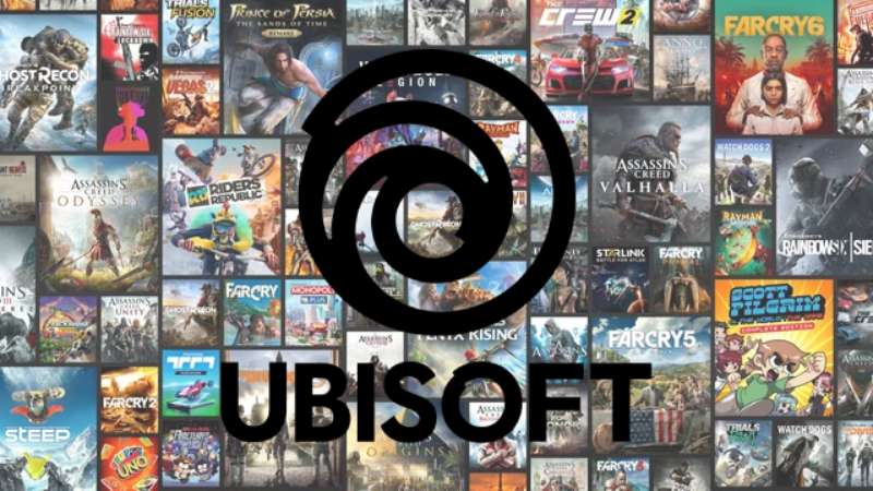
The Ubisoft logo is one of the most recognized symbols in the gaming industry. It belongs to Ubisoft Entertainment SA, a French video game publisher founded in 1986 by the five Guillemot brothers in Carentoir, Brittany. The company name comes from “ubiquity,” meaning the ability to exist everywhere at once.
Within the broader history of gaming company logos, Ubisoft’s branding stands out for how frequently it has changed. At least six distinct versions have appeared since the mid-1980s. The current version, introduced on May 31, 2017, features a flat, black-and-white swirl paired with a custom wordmark. The 2017 redesign was developed in collaboration with Method, a global design firm, and the custom typeface was created by Colophon Foundry.
Ubisoft has grown from a small family-run distributor in rural France to a global publisher with studios in more than 20 countries. The logo has tracked that growth at every step.
What Is the Ubisoft Logo?
![]()
The Ubisoft logo is a monochromatic swirl symbol paired with a custom sans-serif wordmark reading “UBISOFT.” Officially introduced in its current form on May 31, 2017, it was developed by Method design agency with typography by Colophon Foundry. The swirl represents creativity, curiosity, and what the company calls a “grain de folie” (touch of madness).
Here’s a breakdown of its key attributes:
- Design Type: Combination mark (abstract symbol + wordmark)
- Primary Elements: A hand-drawn style swirl/spiral symbol with an “eye” at the center, placed above the “UBISOFT” wordmark. The letter “O” in the wordmark mirrors the swirl’s central shape.
- Official Introduction Date: May 31, 2017 (current version). The swirl concept itself first appeared on September 9, 2003.
- Designer/Agency: Method (design agency, London office) with Colophon Foundry handling the custom typeface, Ubisoft Sans
- Trademark Status: Registered trademark (®)
- Color Palette: Black (#000000) and White (#FFFFFF). The previous 2003 version used a blue-violet gradient.
- Usage Context: Game boot sequences, box art, marketing materials, Ubisoft Connect platform, merchandise, digital storefronts, and corporate communications. Each game title gets a uniquely animated and colored version of the swirl during its opening sequence.
How Has the Ubisoft Logo Evolved Over Time?
![]()
Ubisoft has gone through at least six major logo changes since 1986. Each one marked a shift in the company’s identity, from local distributor to global publisher.
Most of these weren’t small tweaks. They were complete overhauls. The brand basically started from scratch multiple times before settling on the swirl concept in 2003.
Original Ubi Soft Logo (1986–1989)
- Years Active: 1986–1989
- Design Description: Bold, 3D-style lettering spelling “UBI” in large pinkish-purple and light blue letters. The word “Soft” appeared in a smaller white cursive script positioned diagonally across the “I.”
- Color Scheme: Pinkish-purple, light blue, white, with black outlines
- Context: Introduced when the Guillemot brothers first launched Ubi Soft Entertainment. The company was distributing games for Amstrad and Atari consoles at this point. The flashy 1980s-style design was common for entertainment brands during that era.
- Cultural Significance: It looked like something straight out of an arcade. The cartoonish, chunky lettering told you right away this was a company in the entertainment business. Nothing subtle about it.
Serif Wordmark Logo (1989–1993)
- Years Active: 1989–1993
- Design Description: A black-and-white wordmark reading “UBI SOFT” in ITC Lubalin Graph Bold, with “Entertainment Software” in the same font but italicized below
- Color Scheme: Black and white only
- Context: The company was maturing and wanted to look more serious. This was a common move for tech and software companies in the late 1980s.
- Key Changes from Previous: Complete removal of color. Gone were the 3D effects and the playful cursive. Everything went conservative.
- Cultural Significance: Signaled that Ubi Soft wanted to be taken seriously as a software company, not just seen as a fun little game shop. The design had a similar feel to what Microsoft was doing at the time.
Colored Squares Logo (1993–1995)
- Years Active: 1993–1995
- Design Description: The letters “u,” “b,” and “i” appeared in lowercase italics inside separate colored squares (green, yellow, and blue). “SOFT” was written in uppercase black letters. All elements sat within a large red square.
- Color Scheme: Green, yellow, blue squares with a red background and black text
- Context: Ubisoft tried to go playful and geometric. It was meant to appeal to younger audiences. It didn’t last long.
- Key Changes from Previous: Went from conservative black-and-white back to full color, but in a completely different direction than the original 1986 logo. The approach drew from the psychology of shapes with its bold square motifs.
- Cultural Significance: This is probably the least remembered Ubisoft logo. It was short-lived and, honestly, didn’t quite work. Too busy, too many competing elements.
Rainbow Arch Logo (1995–2003)
- Years Active: 1995–2003
- Design Description: A simple black serif font wordmark reading “Ubi Soft” beneath a multicolored rainbow arch. The word “Entertainment” appeared in smaller spaced-out sans-serif letters below.
- Color Scheme: Rainbow-colored arch with black text
- Designer: Introduced alongside the launch of Rayman, Ubisoft’s first major original game
- Context: This logo appeared when Ubisoft shifted from being a distributor to becoming a game publisher and developer. Rayman’s release in 1995 was the turning point. The rainbow represented the company’s focus on family-friendly, universally appealing content.
- Key Changes from Previous: Completely ditched the geometric squares. Went back to a more refined look with the addition of a distinctive rainbow element that gave the brand strong shelf presence.
- Cultural Significance: This is the logo that many 1990s gamers remember most fondly. It accompanied the era of Rayman, the early Tom Clancy titles, and Ubisoft’s expansion into North America with the opening of Ubisoft Montreal in 1997.
Blue Swirl Logo (2003–2017)
- Years Active: 2003–2017
- Design Description: A blue-violet spiral (the “swirl”) with a gradient effect, darkening at the outer edges and brightening toward the center. An “eye” shape sat at the core. The wordmark “UBISOFT” appeared in a modified Microgramma Bold font with sharp, angular letter corners.
- Color Scheme: Blue-violet gradient with white and black
- Context: Introduced on September 9, 2003, when the company officially dropped the space in its name, becoming “Ubisoft.” The change followed the acquisition of the Tom Clancy license and a deliberate pivot toward more mature game content.
- Key Changes from Previous: The rainbow was gone. For the first time, Ubisoft had an abstract symbol rather than just a wordmark. The swirl felt futuristic and became genuinely iconic through its animated game intros.
- Cultural Significance: This is the logo that defined Ubisoft during its biggest growth years. Assassin’s Creed, Far Cry, Watch Dogs, the Tom Clancy franchise. When people picture Ubisoft, many still think of this blue spinning vortex.
Monochrome Swirl Logo (2017–Present)
- Years Active: 2017–present
- Design Description: A simplified, flat black-and-white version of the swirl. The lines appear deliberately hand-drawn rather than perfectly smooth. The wordmark uses the custom Ubisoft Sans typeface, with the letter “O” designed to echo the swirl’s center.
- Color Scheme: Black (#000000) on white (#FFFFFF), or white on dark backgrounds
- Designer: Method (London office) for the overall identity; Colophon Foundry for the Ubisoft Sans typeface
- Context: Revealed on May 31, 2017, following a broader industry trend toward flat, minimalist design. Ubisoft described the new logo as “minimalist, modern, and monochromatic.”
- Key Changes from Previous: The blue-violet gradient was stripped away entirely. The spiral shape was simplified. The typography was completely replaced with a bespoke typeface.
- Cultural Significance: The flat design allows infinite customization. Each game title now gets its own animated, colored version of the swirl during boot sequences. The simplicity makes it work across any medium, from mobile screens to massive billboards.
What Do the Design Elements of the Ubisoft Logo Mean?
The Ubisoft swirl represents growth, infinity, and forward motion. Its spiral shape suggests something that keeps expanding outward without a clear endpoint.
Ubisoft has also said it symbolizes curiosity, enthusiasm, and their French concept of “grain de folie,” a touch of creative madness. The imperfect, hand-drawn quality of the lines is intentional.
What Is the Symbolism Behind the Swirl?
The spiral references the idea of worlds within worlds. Ubisoft creates entire game universes, from the historical settings of Assassin’s Creed to the open landscapes of Far Cry.
Spirals carry universal associations with evolution and progress. Given Ubisoft’s trajectory from a small Brittany startup to one of Europe’s largest publishers, the fit makes sense.
The “eye” at the center of the swirl adds another layer. It suggests a window into these created worlds, an invitation to look deeper. The deliberately shifted center breaks what would otherwise be perfect symmetry, and that’s on purpose.
Why Did Ubisoft Choose These Specific Colors?
The current Ubisoft logo uses only two colors:
- Black (#000000) – RGB: (0, 0, 0), CMYK: (0, 0, 0, 100). Black communicates authority and sophistication. It gives the logo weight and makes it stand out in basically any context. For a company operating across games, merchandise, and digital platforms, black works everywhere.
- White (#FFFFFF) – RGB: (255, 255, 255), CMYK: (0, 0, 0, 0). White provides the breathing room. It creates the negative space within the swirl that gives it its depth and sense of movement. The white space in the design does as much work as the black lines.
The previous 2003 version used a blue-violet palette. Blue traditionally conveys trust and reliability, and the gradient added depth. But by 2017, the shift to monochrome colors followed a broader industry pattern. Companies like Apple and Microsoft had already moved toward flat, simplified identities. The color psychology behind the switch was clear: sophistication, maturity, and adaptability.
What Typography Style Is Used in the Ubisoft Logo?
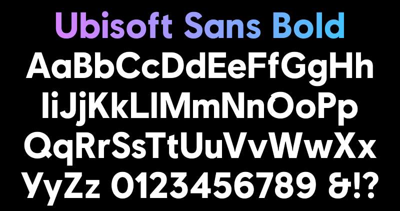
The current wordmark uses Ubisoft Sans, a custom typeface designed by Colophon Foundry specifically for Ubisoft. It resembles a modified Gilroy Extra Bold.
The sans-serif letters are clean and bold, with one notable exception. The letter “O” has a broken stroke that mirrors the central eye of the swirl symbol. That small detail ties the wordmark and the icon together visually.
Before 2017, the logo used a modified Microgramma Bold, which had sharp, angular corners on certain letters. And the very first 1989 logo used ITC Lubalin Graph, a slab serif that gave it a more traditional software-company feel.
What Are the Hidden Meanings in the Ubisoft Logo?
Look at the swirl closely. The lines don’t connect perfectly. That’s deliberate. Ubisoft wanted the logo to feel hand-drawn, to look like something a person made rather than a computer.
The company stated this represents their “human qualities,” qualities like playfulness, imperfection, and creative restlessness.
The “O” in “UBISOFT” is another subtle touch. Its broken circular shape echoes the eye at the center of the swirl. You might not notice it on first glance, but it creates a quiet connection between the symbol and the text. Some fans also see the swirl as a stylized letter “U” for Ubisoft, though the company hasn’t officially confirmed that reading.
How Does the Ubisoft Logo Compare to Competitor Logos?
Among major game publishers, Ubisoft’s logo is the most abstract. Most competitors lean on wordmarks or literal imagery. Ubisoft stands alone with its spiral.
The EA logo, for example, is a simple circle containing the letters “EA.” Clean, direct, no room for interpretation. The Nintendo logo has barely changed in decades, a rounded rectangle with the brand name inside. It works through sheer familiarity.
Epic Games uses a minimal wordmark. Valve has its memorable figure with a valve on the back of a head. Rockstar Games keeps things tight with its yellow “R” star icon.
Where Ubisoft really differs is in how it uses its logo. Because the swirl is so simple in its monochrome form, it becomes a canvas. Every game gets a custom-animated, uniquely colored version. The Activision Blizzard logo doesn’t do that. Neither does Square Enix or Sega.
That adaptability is the real differentiator. Among all the video game logos out there, Ubisoft’s swirl might be the most flexible.
What Are the Technical Specifications of the Ubisoft Logo?
Official Color Codes
- Primary Color: Black
- Hex: #000000
- RGB: (0, 0, 0)
- CMYK: (0, 0, 0, 100)
- Secondary Color: White
- Hex: #FFFFFF
- RGB: (255, 255, 255)
- CMYK: (0, 0, 0, 0)
- Legacy Accent (2003–2017): Blue Ribbon
- Hex: #1472F1
- RGB: (20, 114, 241)
- CMYK: (92, 53, 0, 5)
Dimensions and Proportions
The logo consists of two elements stacked vertically: the swirl symbol on top, the “UBISOFT” wordmark below. The swirl is roughly circular in proportion but not geometrically perfect, its center is deliberately off-axis.
Ubisoft maintains clear space requirements around the logo to keep it from being crowded by other visual elements. The minimum recommended clear space is typically equal to the height of the “U” in the wordmark, applied on all sides.
The logo is distributed as a vector graphic (SVG format) for scalability. This means it renders cleanly at any size, from a tiny mobile app icon to a stadium-sized banner. Pixel-based versions in PNG format are also available for contexts where vector files aren’t practical.
The flat, monochromatic design keeps the logo legible even at very small sizes. That was a deliberate consideration in the 2017 redesign. High DPI rendering is never an issue with the vector source file.
What Cultural Impact Has the Ubisoft Logo Had?
The Ubisoft swirl is one of those logos that gamers recognize instantly. Even non-gamers have probably seen it spinning at the start of a YouTube trailer or on a billboard for Assassin’s Creed.
The animated versions of the logo have become part of the gaming experience itself. That moment when the swirl appears before a new Far Cry or Watch Dogs title? It builds anticipation. Some players have even made compilation videos of every unique swirl animation across different Ubisoft games.
The 2017 redesign generated strong reactions online. Some fans loved the clean new look. Others missed the blue gradient. That kind of split opinion usually means the brand has real emotional weight with its audience. People don’t argue about logos they don’t care about.
Within the broader design community, the Ubisoft rebrand became a case study in flat design done right. The intentional imperfection of the swirl lines, the broken “O,” the focus on animation-ready simplicity. It showed that good logo design doesn’t have to be complicated. Sometimes stripping things back reveals more than adding layers ever could.
How Does the Ubisoft Logo Fit Into the Overall Brand Identity?
The Ubisoft swirl is the anchor of a much larger brand system. It connects to Ubisoft Connect (the company’s gaming platform), individual game franchises, studio sub-brands like Ubisoft Montreal and Ubisoft Paris, and all corporate communications.
The custom Ubisoft Sans typeface extends beyond the logo itself. It’s used across the company’s web presence, marketing materials, and in-game UI elements. That kind of typographic consistency ties everything together.
The logo’s adaptability is central to how Ubisoft approaches brand guidelines. The monochrome base version stays consistent, but each franchise can color and animate the swirl to fit its world. Assassin’s Creed might give it a golden, historical treatment. Far Cry could go tropical and wild. The structure stays, the personality changes.
This flexibility also extends to motion graphics. Every animated intro is different, which turns the logo itself into a form of storytelling. You see the swirl, and the way it moves tells you something about the game you’re about to play.
How Should the Ubisoft Logo Be Used?
If you’re working with the Ubisoft logo for any authorized purpose, there are rules. Here’s what you need to know:
- Don’t modify the swirl. Don’t stretch it, rotate it beyond approved orientations, or separate the symbol from the wordmark in ways not covered in the guidelines.
- Maintain clear space. The logo needs breathing room. Don’t crowd it with other logos, text, or imagery.
- Color usage matters. Use the black version on light backgrounds and the white version on dark backgrounds. Don’t add colors to the base logo unless you’re part of Ubisoft’s internal creative team working on game-specific animations.
- Don’t recreate it. Always use the official files. The hand-drawn quality of the swirl is very specific, and trying to redraw it will look off.
- Official assets are available through Ubisoft’s press and media portals. The logo is offered in SVG (vector) and PNG (raster) formats.
- Trademark protection: The Ubisoft logo is a registered trademark (®). Unauthorized commercial use is not allowed. If you need to use it editorially, the standard brand style rules apply: use the official version, don’t alter it, and include the trademark symbol where required.
FAQ on The Ubisoft Logo
What Does the Ubisoft Logo Represent?
The Ubisoft swirl represents creativity, curiosity, and what the company calls “grain de folie,” a French expression meaning a touch of madness. The spiral shape suggests infinite growth.
It also works as a visual window into the game worlds Ubisoft builds, from Assassin’s Creed to Far Cry.
Who Designed the Current Ubisoft Logo?
Method, a global design firm working from their London office, handled the 2017 redesign. Colophon Foundry created the custom Ubisoft Sans typeface that sits beneath the swirl.
The previous 2003 swirl version used a modified Microgramma Bold for its wordmark instead.
When Was the Ubisoft Swirl First Introduced?
The swirl symbol debuted on September 9, 2003. That was when the company dropped the space in “Ubi Soft” and became simply Ubisoft.
The redesign followed the acquisition of the Tom Clancy franchise, marking a shift toward mature gaming content.
Why Did Ubisoft Change Its Logo to Black and White?
The shift to a flat, monochromatic design in 2017 followed a broader industry trend. Companies like Apple and Microsoft had already gone minimal.
Ubisoft called the new look “minimalist, modern, and monochromatic.” The simplified form also makes it easier to animate uniquely for each game title.
What Font Does the Ubisoft Logo Use?
The current wordmark uses Ubisoft Sans, a bespoke typeface by Colophon Foundry. It looks similar to Gilroy Extra Bold but has key differences.
The letter “O” has a broken stroke that mirrors the eye at the center of the swirl. That small detail ties both elements together.
How Many Times Has the Ubisoft Logo Changed?
At least six major versions have appeared since 1986. That’s a lot of changes for a company that’s only been around for about four decades.
Most weren’t small updates. Each version was a complete overhaul of the logo and the company’s visual identity.
What Are the Official Ubisoft Logo Colors?
The current logo uses just black (#000000) and white (#FFFFFF). That’s it. No gradients, no accent hues.
The 2003 version used a blue-violet color palette with a gradient effect. The switch to monochrome made the brand more adaptable across different media.
Is the Ubisoft Logo Trademarked?
Yes. The Ubisoft logo carries a registered trademark symbol (®). This protects the swirl design and the wordmark from unauthorized commercial use.
The trademark covers all versions of the logo used across Ubisoft’s products, marketing, and packaging.
Why Does the Ubisoft Logo Look Hand-Drawn?
That’s intentional. Ubisoft specifically wanted imperfect lines in the swirl rather than computer-smooth curves. The broken strokes represent what they call their “human qualities.”
It’s a deliberate rejection of rigid precision. The slightly rough edges give the brand identity a sense of personality.
Can I Download and Use the Ubisoft Logo?
Official logo files are available through Ubisoft’s press and media portals. The logo comes in SVG and JPEG formats.
You can use it for editorial or informational purposes. Commercial use without authorization from Ubisoft Entertainment SA is not allowed.
Conclusion
The Ubisoft logo has gone through more reinventions than most gaming brands see in a lifetime. Six versions in four decades. Each one told a different story about where the company was headed.
The current monochrome swirl works because it doesn’t try to do too much. It’s a blank canvas that adapts to every franchise, every platform, every animated intro sequence.
From a small French distributor’s flashy 1980s wordmark to one of the most recognizable symbols in the tech company space, Ubisoft’s visual branding reflects a company that keeps evolving. The hand-drawn imperfections in the swirl say it best. Perfection was never the point.
Renowned for his expertise in logo design and visual branding, Bogdan has developed a multitude of logos for various clients.
His skills extend to creating posters, vector illustrations, business cards, and brochures. Additionally, Bogdan's UI kits were featured on marketplaces like Visual Hierarchy and UI8.
He also wrote in the past years on sites like Design Your Way, WebDesignerDepot, WPDean, Designmodo, Speckyboy, Slider Revolution, and more.
- Timeless Open Sans Font Pairing for Any Project - 22 July 2026
- Pantone to HEX converter - 21 July 2026
- The Retool Logo History, Colors, Font, And Meaning - 20 July 2026
Bogdan Sandu is a seasoned designer who has been designing websites since 2008. Renowned for his expertise in logo design and visual branding, Bogdan has developed a multitude of logos for various clients. His skills extend to creating posters, vector illustrations, business cards, and brochures. Additionally, Bogdan's UI kits were featured on marketplaces like Visual Hierarchy and UI8. He also wrote in the past years on sites like Design Your Way, WebDesignerDepot, WPDean, Designmodo, Speckyboy, Slider Revolution, and more.
You Might Also Like


