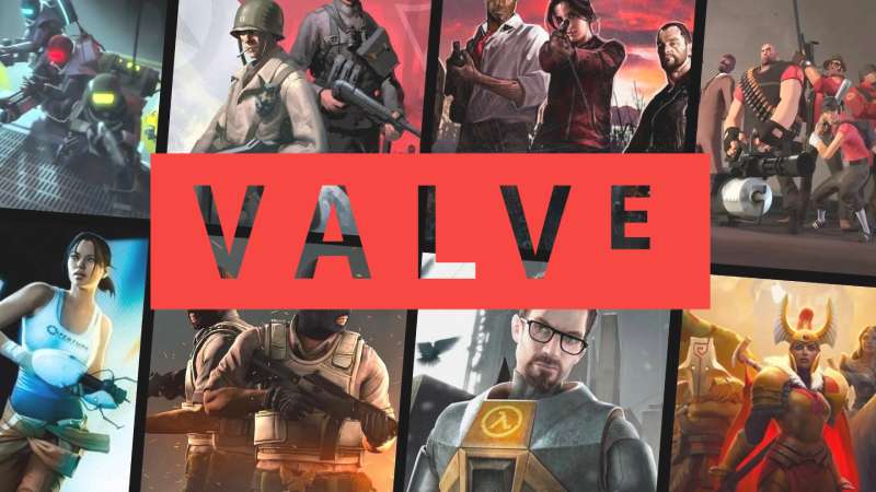
The Valve logo is one of the most recognized symbols in PC gaming. It belongs to Valve Corporation, the American game developer and digital distribution company behind Steam, Half-Life, Counter-Strike, and Dota 2. Founded on August 24, 1996, by former Microsoft employees Gabe Newell and Mike Harrington in Kirkland, Washington, the company has shaped how millions of people buy and play games. The logo itself has gone through several versions since 1996, though its core identity, a clean wordmark paired with the unforgettable “Valve Guy” mascot, has stayed remarkably consistent. Few gaming company logos carry this kind of instant recognition across generations of players.
What Is the Valve Logo?

The Valve logo is a combination mark that pairs a bold, uppercase wordmark spelling “VALVE” with the company’s famous mascot images showing a man with a red valve attached to his head. It was first introduced in 1996 when the company was founded. The brand identity was developed internally by Gabe Newell and Ray Ueno, with the visual concept built around the tagline “Open your mind. Open your eyes.”
Here’s what makes it tick:
- Design Type: Combination mark. The wordmark functions independently, but the mascot imagery (known as “Mr. Valve” or “The Valve Guy”) is just as central to the brand.
- Primary Elements: An all-caps “VALVE” wordmark with a distinctive shrunken “E” at the end, plus two mascot images. One shows a bald man with a red valve protruding from the back of his head. The other shows a different man with a valve coming out of his eye.
- Official Introduction Date: 1996, coinciding with the company’s founding.
- Designer: Created internally by Gabe Newell and Ray Ueno, with additional contributions from Greg Coomer (map design), Steve Theodore (models), and Doug Wood (animations) for the early animated version.
- Trademark Status: Valve and the Valve logo are registered trademarks of Valve Corporation in the United States and other countries. Use without express permission constitutes trademark infringement.
- Color Palette: The primary wordmark version uses a coral-red background (#F74843) with white lettering. The mascot images use sepia tones with a dark red valve element. Older versions featured white or orange outlined boxes on black backgrounds.
- Usage Context: Game intro sequences, the Steam platform, product packaging, marketing materials, merchandise, and digital storefronts. The animated mascot appears at the start of every Valve-developed game.
How Has the Valve Logo Evolved Over Time?

The Valve logo has been through multiple versions since 1996, though the changes have been more about refinement than radical redesign.
The wordmark itself has stayed largely the same. But the mascot intro sequences that players associate with the brand have shifted several times, each tied to new game engine capabilities and shifts in the company’s visual direction.
The Animated Workshop Logo (1998)
Years Active: 1998, debuting with Half-Life
This was the first animated version players actually saw in a game. The camera zooms into a dark building, finding a shirtless bald man pulling a lever on a machine. The press stamps a dark red valve onto the side of his forehead.
Greg Coomer designed the map. Steve Theodore handled the 3D models. Doug Wood animated the whole sequence. It ran on the GoldSrc engine and set the tone for what would become one of gaming’s most recognized intros.
The “VALVE” wordmark appeared with the now-signature shrunken “E,” something Ray Ueno designed deliberately so people wouldn’t misread it as “VALUE.” That little detail has stuck around for nearly three decades.
The “Open Your Eyes” Logo (1998-2006)
Years Active: 1998 to approximately 2006
A sepia-toned photograph fades in on a black background. It shows a young man with slicked-back hair and a goatee, staring directly at the camera. A red valve protrudes from his left eye.
The concept? “Open your eyes.” The model was found through casting agencies in Seattle after Valve kept rejecting the typical headshots they were being sent. They wanted someone who looked normal, not a model.
A white box outline containing the “VALVE” wordmark fades in at the bottom right. The man in this image has been identified by some sources as Valve employee Kelly Bailey, though this was never officially confirmed. For Half-Life 2 in 2004, the sepia tones were muted further and trembling visual effects were added to the photo.
The “Open Your Mind” Logo (2006-Present)
Years Active: 2006 to present
This version replaced the “Open Your Eyes” image for most Valve titles starting with Half-Life 2: Episode One. It shows a bald man’s head, mostly silhouetted in darkness, with a red valve sticking out from the back of his skull.
The model was a random person found on the streets of Seattle’s Broadway district. Valve’s agencies had walked the neighborhood taking Polaroids of “interesting” looking people, since casting agencies kept sending conventionally attractive headshots. His identity has never been confirmed.
In 2012, a “turning head” variant appeared in Portal 2, Dota 2, and Counter-Strike: Global Offensive. The still photograph came to life, with the man slowly turning his head toward the camera before cutting back. That moment genuinely startled people who had gotten used to the static image.
The VR Logo (2020-Present)
Years Active: 2020 to present, VR titles only
With Half-Life: Alyx, Valve rebuilt the “Open Your Mind” concept in full 3D for virtual reality. You’re standing in a room filled with red valves. The bald man appears again, modeled in three dimensions, and begins turning his head toward you.
It’s the same idea, just brought into a space where you can actually look around. The Valve wordmark appears in white 3D text. The VR version keeps the eerie factory sounds and fragments of the “Hazardous Environments” theme that have accompanied the logo since the beginning.
The Modern Wordmark
Alongside the mascot logos, Valve has used a cleaner standalone wordmark for corporate and web design purposes. The current version features white uppercase letters on a coral-red (#F74843) background. It’s minimalist in its approach, direct, and functions well across digital and print contexts.
What Do the Design Elements of the Valve Logo Mean?
Every piece of the Valve logo connects back to a single idea: controlling the flow of something. A valve controls the flow of liquid or gas. Valve Corporation controls the flow of gaming experiences.
The mascot images take that concept literally by showing a valve physically attached to a human head. It’s weird. It’s slightly unsettling. And that was the point.
What Does the Valve Mascot Symbolize?
The two mascot images represent “Open your mind” and “Open your eyes,” the original brand concepts from 1995-1996. The valve-in-the-head version suggests opening your mind to new experiences. The valve-in-the-eye version suggests seeing things differently.
Both images use ordinary, non-model people on purpose. Valve specifically rejected attractive headshots from casting agencies because they wanted the mascot to feel real, not polished. That decision actually makes the images more unsettling and memorable. The psychology of shapes at play here is interesting, too. The round valve creates a jarring interruption against the organic curves of the human head.
Why Did Valve Choose These Specific Colors?

The Valve color scheme is deliberately limited.
Coral Red (#F74843): The primary brand color. It’s not an aggressive, pure red. It’s a medium-light shade with warmth to it, sitting at 2° hue with 92% saturation. The red ties back to the physical valve element in the mascot images and communicates energy without crossing into aggression. Based on color psychology, red signals passion, urgency, and action, all fitting for a gaming company.
White (#FFFFFF): Used for the wordmark text and box outlines. Clean contrast against the red. Nothing more, nothing less.
Dark Red / Sepia Tones: The mascot imagery uses a muted, brownish-red palette. The sepia treatment gives the photos a vintage, slightly eerie quality that wouldn’t work in full color.
It’s a monochrome color strategy at its core. Limited color palette, maximum impact.
What Typography Style Is Used in the Valve Logo?
The Valve wordmark uses a custom-modified sans-serif font. The closest commercially available matches are Titling Gothic Narrow Medium (by David Berlow, published by Font Bureau) or Core Sans N SC 65 Bold.
All letters are uppercase with wide tracking. The standout feature is the shrunken “E” at the end of “VALVE.” Ray Ueno made that call specifically to prevent misreading the name as “VALUE.” Took me a while to notice that detail the first time, honestly.
The typeface has clean straight lines and geometric proportions. No curves where they’re not needed. It reads well at small sizes on game packaging and at large sizes during intro animations. The typographic hierarchy is flat by design since there’s only one word to read.
What Are the Hidden Meanings in the Valve Logo?
The shrunken “E” is the most discussed subtlety. Beyond preventing the “VALUE” misread, it creates a visual irregularity that catches your eye. Your brain expects uniform letter sizing, so the smaller “E” forces a second look.
The mascot images were never meant to be comfortable. Ray Ueno and Gabe Newell specifically chose to attach a mechanical object to a human face because it’s jarring. That discomfort is the point. It makes you remember it. Some fans have read deeper meanings into the valve placement (controlling thoughts, controlling vision), but according to Ueno’s own account, the concept was straightforward: “Open your mind. Open your eyes.”
How Does the Valve Logo Compare to Competitor Logos?
Most gaming company logos play it safe. Valve doesn’t.
Look at the competition. The EA logo is a clean circle with letters. The Epic Games logo is a stylized geometric mark. The Ubisoft logo went from a swirl to a simplified icon. Nintendo uses a rounded rectangle with its name. Riot Games has a fist. Rockstar Games uses a yellow star with an “R.”
All recognizable. All fairly conventional.
Valve went with a guy who has a pipe fitting stuck in his skull. That’s a fundamentally different approach to logo design principles. Where other studios lean toward abstract marks or clean wordmarks, Valve built its brand around a photographic mascot that borders on body horror.
The Bethesda logo and Square Enix logo also use relatively conservative designs. Capcom keeps things corporate. Even Sega, with its classic blue branding, stays within expected boundaries.
What makes Valve’s approach work is that it matches the company’s personality. They’re the studio that made a game about solving physics puzzles with a portal gun. Their brand identity is supposed to be a little strange.
What Are the Technical Specifications of the Valve Logo?
Official Color Codes
- Primary Color: Coral Red
- Hex: #F74843
- RGB: (247, 72, 67)
- CMYK: (0, 71, 73, 3)
- HSL: 2°, 92%, 62%
- Secondary Color: White
- Hex: #FFFFFF
- RGB: (255, 255, 255)
- CMYK: (0, 0, 0, 0)
- Tertiary Color: Black (used in mascot intros and alternate wordmark versions)
- Hex: #000000
- RGB: (0, 0, 0)
- CMYK: (0, 0, 0, 100)
- Accent: Dark Red (valve element in mascot imagery)
- Approximate Hex: #8B1A1A
- RGB: (139, 26, 26)
Dimensions and Proportions
Valve hasn’t published a comprehensive public brand guide for its corporate logo the way it has for Steam. But from available materials and usage patterns, a few things are clear.
The wordmark maintains a roughly 4:1 width-to-height ratio when enclosed in its rectangular border. The letter “E” is reduced to approximately half the height of the other characters. Letter spacing is wider than standard, giving each character room to breathe.
For the Steam brand (Valve’s primary consumer-facing platform), the brand guidelines specify that logos must maintain clear space equal to the diameter of the Steam symbol on all sides. Minimum print height is 12.5mm, and minimum screen height is 50 pixels. It’s reasonable to assume similar standards apply to the Valve wordmark itself.
What Cultural Impact Has the Valve Logo Had?

The Valve logo, specifically the “Mr. Valve” mascot, has become a meme and a cultural touchstone in gaming communities. The bald man turning his head in later versions genuinely startled players who had grown used to the static image, spawning reaction videos and fan art.
“Mr. Valve” gets referenced constantly. Fans have debated the identity of the models for years. The “Open Your Mind” concept has been parodied, remixed, and recreated in fan animations hundreds of times over. There’s something about a photorealistic image of a man with hardware attached to his head that just stays with people.
The logo intro has also become a quality signal. When you see that valve turning, you expect a certain caliber of game. That kind of association between a logo and perceived product quality is what most brands spend decades trying to build. Valve got there partly because the games delivered, but also because the logo itself is so distinct that it burned into players’ memories from the first encounter.
How Does the Valve Logo Fit Into the Overall Brand Identity?
The Valve logo sits at the center of a wider brand system that includes the Steam platform, individual game franchises, and hardware products like the Steam Deck and Valve Index.
Each sub-brand has its own identity. Steam uses a dark blue palette with a locomotive crank icon. Half-Life has its orange lambda symbol. Counter-Strike, Portal, Dota 2, and Team Fortress 2 all carry their own distinct marks. But the Valve wordmark and mascot sit above all of them as the parent brand.
The brand style guide relationship works because Valve keeps its corporate logo separate from its product logos. You see the Valve intro before the game starts. Then the game’s own branding takes over. It’s a clean separation, and it mirrors how the company actually operates: Valve is the creator, the individual games and platforms are the products.
This structure lets each franchise build its own visual hierarchy and storytelling approach without competing with the parent brand. The Valve logo opens the door. Everything after that belongs to the specific product. It’s a smart way to handle design elements across a portfolio this diverse.
How Should the Valve Logo Be Used?
Valve is protective of its trademarks. Here’s what you need to know.
Do:
- Use official logo files obtained through Valve’s partner resources or Steamworks for authorized purposes
- Maintain the original proportions and colors
- Provide adequate clear space around the logo
- Include the ® symbol where required for trademark compliance
- Follow Valve’s Steam Brand Guidelines document when using any Steam-related marks
Don’t:
- Modify, stretch, recolor, or distort the logo
- Combine it with other branding elements unless authorized
- Use the Valve logo or mascot imagery to suggest endorsement or affiliation without permission
- Use the logo at sizes below minimum specifications (50px height for screen, 12.5mm for print applies to Steam marks)
- Recreate or approximate the logo using similar fonts or valve imagery
For official assets, Valve provides logo files through its Steamworks partner portal. The Steam brand guidelines PDF covers usage rules for Steam-related marks in detail. If you need the Valve corporate logo for press, editorial, or partnership purposes, reach out to Valve directly.
All Valve trademarks, including the Valve name, the Valve logo, the “Mr. Valve” mascot images, Steam, and related marks are the property of Valve Corporation. Any unauthorized use could result in legal action. Your mileage may vary on fair use for editorial or commentary purposes, but when in doubt, ask first.
FAQ on The Valve Logo
What does the Valve logo look like?
The Valve logo features an all-caps “VALVE” wordmark in a bold sans-serif typeface with a distinctively shrunken letter “E.” The current version places white text on a coral-red background (#F74843). It’s paired with the iconic “Mr. Valve” mascot showing a bald man with a red valve on his head.
Who designed the Valve Corporation logo?
Ray Ueno and Gabe Newell developed the Valve logo internally around 1995-1996. The Leonhardt Group helped name the company, suggesting “Valve” among thirty options. Ueno specifically shrank the “E” so nobody would misread it as “VALUE.” The mascot photos were shot using non-professional models found on Seattle streets.
Why does the Valve intro show a guy with a valve in his head?
The mascot images represent the brand concept “Open your mind. Open your eyes.” One image shows a valve in the back of a bald man’s head. The other shows a valve in a man’s eye. Both communicate the idea of unlocking new perspectives through gaming experiences.
Has the Valve logo changed over the years?
The core wordmark has stayed consistent since 1996. But the mascot intro has gone through major versions. The original animated workshop sequence debuted with Half-Life in 1998. The “Open Your Eyes” photo followed, then the “Open Your Mind” version, and finally a full 3D VR rebuild for Half-Life: Alyx in 2020.
What font does Valve use in its logo?
Valve uses a custom-modified sans-serif font. The closest match is Titling Gothic Narrow Medium by David Berlow. All characters are uppercase with wide spacing. That smaller “E” at the end is the most recognizable typography element of the whole design.
What are the official Valve logo colors?
The primary color is coral red with hex code #F74843. In RGB terms, that’s (247, 72, 67). White (#FFFFFF) is used for the wordmark text. The mascot imagery uses sepia tones and dark red for the valve hardware. It’s a tight, intentional color palette.
Who is the bald guy in the Valve logo?
Nobody knows for sure. The model was a random person found on Seattle’s Broadway district. Valve’s casting agencies walked the streets taking Polaroids because standard talent agencies only sent attractive headshots. The man’s identity was never recorded. He wasn’t a professional model.
What does the Valve logo represent?
A physical valve controls the flow of liquids or gases. Valve Corporation controls the flow of gaming experiences through Steam and its game catalog. The logo ties that mechanical concept directly to a human element, suggesting that the company opens minds and changes how people see entertainment.
Can I use the Valve logo for my project?
Not without permission. The Valve logo is a registered trademark of Valve Corporation. Unauthorized use counts as infringement. For authorized purposes, official assets are available through the Steamworks partner portal. Valve’s brand guidelines document covers specific usage rules for partners.
How does the Valve logo compare to other gaming logos?
Most video game logos use abstract symbols or clean wordmarks. The Activision Blizzard logo, Konami logo, and Bungie logo all follow conventional approaches. Valve stands apart by using a photographic mascot with body-horror undertones. Few competitors have tried anything this strange or this memorable.

Renowned for his expertise in logo design and visual branding, Bogdan has developed a multitude of logos for various clients.
His skills extend to creating posters, vector illustrations, business cards, and brochures. Additionally, Bogdan's UI kits were featured on marketplaces like Visual Hierarchy and UI8.
He also wrote in the past years on sites like Design Your Way, WebDesignerDepot, WPDean, Designmodo, Speckyboy, Slider Revolution, and more.
- Canva vs PowerPoint: Which Is Better for Presentations? - 22 September 2026
- How to Install Fonts on Mac (Step-by-Step Guide) - 20 September 2026
- From Mockup to Code: How AI-Augmented Development Speeds Up the Design Handoff - 19 September 2026

Bogdan Sandu is a seasoned designer who has been designing websites since 2008. Renowned for his expertise in logo design and visual branding, Bogdan has developed a multitude of logos for various clients. His skills extend to creating posters, vector illustrations, business cards, and brochures. Additionally, Bogdan's UI kits were featured on marketplaces like Visual Hierarchy and UI8. He also wrote in the past years on sites like Design Your Way, WebDesignerDepot, WPDean, Designmodo, Speckyboy, Slider Revolution, and more.
You Might Also Like