The Red Dead Redemption logo is the official visual identity of Rockstar Games’ western action-adventure franchise, first introduced in 2004 with Red Dead Revolver and refined for the 2010 release of Red Dead Redemption. It combines distressed gothic typography with frontier-era visual motifs to represent outlaws, moral complexity, and the dying American West. Among video game logos, it stands out as one of the most atmospheric and design-intentional marks in the industry.
The logo’s visual weight and weathered character place it in a specific lineage of game branding that prioritizes mood over modernity. It communicates tone before a single line of gameplay is experienced.
What Is the Red Dead Redemption Logo?
The Red Dead Redemption logo is a distressed gothic wordmark introduced in 2010, designed in-house by Rockstar Games. It features aged serif lettering in deep red and black, evoking wanted posters and frontier Americana, with no standalone symbol or icon.
- Design Type: Wordmark (text-based, no standalone icon)
- Primary Elements: Distressed gothic serif lettering, aged texture overlay, bold weight typography across two stacked lines (“Red Dead” above “Redemption”)
- Official Introduction Date: 2010 (with Red Dead Redemption); franchise logo origins trace to 2004 (Red Dead Revolver)
- Designer/Agency: Rockstar Games in-house design team
- Trademark Status: Registered trademark owned by Take-Two Interactive Software, Inc.
- Color Palette: Deep red (#8B0000 approximately), black (#000000), aged parchment/off-white (#F5E6C8 approximately) for background contexts
- Usage Context: Game packaging, promotional materials, digital storefronts, merchandise, trailers, in-game splash screens
How Has the Red Dead Redemption Logo Evolved Over Time?

The logo’s history spans three distinct titles across two decades, each version pushing further into a refined western aesthetic while keeping the core distressed character intact.
Red Dead Revolver Logo (2004)
- Years Active: 2004
- Design Description: Bold, blocky western serif lettering with limited distressing. More literal and less refined than later versions. Included a revolver graphic element.
- Color Scheme: Red, black, and white
- Designer: Rockstar San Diego (in-house)
- Context: Introduced as a spiritual revival of Capcom’s Red Dead project, positioned as a straightforward western shooter
- Key Changes from Previous: N/A (first entry)
- Cultural Significance: Established the franchise’s name and red-and-black color identity
Red Dead Redemption Logo (2010-2018)
- Years Active: 2010-2018
- Design Description: Full gothic serif wordmark with heavy distressing and texture. Two-line stacked layout. No icon. The word “Redemption” carries more visual weight than “Red Dead.”
- Color Scheme: Deep crimson red on black, with weathered texture overlays
- Designer: Rockstar Games in-house team
- Context: Launched with one of the most critically acclaimed open-world games ever made. The logo needed to carry serious narrative weight.
- Key Changes from Previous: Dropped the revolver graphic; switched to pure wordmark; significantly increased distressing and gothic character
- Cultural Significance: Became one of the most recognized game logos of its generation
Red Dead Redemption 2 Logo (2018-Present)
- Years Active: 2018-present
- Design Description: Refined version of the 2010 wordmark. Slightly cleaner letterforms while preserving the distressed texture. “2” added in a smaller, subordinate position.
- Color Scheme: Deep red and black, consistent with original
- Designer: Rockstar Games in-house team
- Context: Released alongside what became one of the best-selling games in history
- Key Changes from Previous: Minor letterform refinements; numerical sequel indicator added; slightly better optimized for digital display at small sizes
- Cultural Significance: Cemented the logo as a franchise-defining mark with serious cultural staying power
What Do the Design Elements of the Red Dead Redemption Logo Mean?
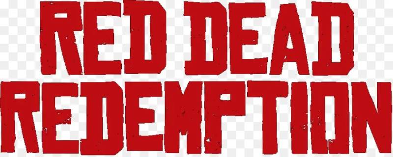
Every element in the logo points back to the same source: the American frontier as a place of violence, consequence, and fading mythology.
The distressed texture isn’t decorative. It signals age, wear, and moral weight. These are not clean heroic letterforms.
The gothic serif structure references 19th-century wanted poster typography, a direct visual cue that puts the audience in a specific historical and emotional space before they’ve touched the game.
What Does the Logo’s Typography Symbolize?
Gothic serifs carry authority and age. That combination is exactly right for a story about outlaws facing the end of an era.
The heaviness of the letterforms communicates that this isn’t a light adventure. There’s gravity here. The distressed finish reinforces that the world these characters live in is already breaking down.
The stacked two-line layout creates a visual tension between “Red Dead” (blunt, violent) and “Redemption” (aspirational, spiritual). That tension is the whole game.
Why Did Rockstar Choose These Specific Colors?

- Deep Red
- Hex: ~#8B0000
- Symbolic meaning: Blood, danger, passion, the West
- Psychological impact: Urgency, threat, emotional intensity
- Brand connection: Consistent with Rockstar’s tendency toward high-contrast, aggressive color choices across franchises including Grand Theft Auto
- Black
- Hex: #000000
- Symbolic meaning: Death, the unknown, moral ambiguity
- Psychological impact: Weight, finality, seriousness
- Brand connection: Grounds the red and prevents the palette from reading as generic action-game branding. Together, red and black form a near-complementary color scheme that maximizes visual tension.
There’s no warm color in this logo. No gold, no amber. That’s a deliberate choice. The warmth of the West is absent. What’s left is cold consequence.
What Typography Style Is Used in the Red Dead Redemption Logo?

The typeface is a custom-distressed gothic serif, not a commercial off-the-shelf font.
It shares DNA with 19th-century wood-type display faces common on wanted posters and saloon signage. High contrast between thick and thin strokes. Strong horizontal serifs. Condensed proportions that stack well vertically.
The distressing was applied as a texture layer over the clean letterforms, not baked into the typeface itself. This matters because it means the underlying typeface is actually quite authoritative and legible. The weathering adds character without hurting readability.
At smaller sizes, the distressing compresses and the logo reads almost clean. That’s good typography thinking.
What Are the Hidden Meanings in the Red Dead Redemption Logo?
The word “Dead” sits between “Red” and “Redemption.” Visually and literally, death is centered in the franchise name. That’s not accidental.
“Redemption” is the longest word and anchors the bottom of the mark. It carries the most visual weight. The logo’s structure tells you the story: violence up top, salvation at the bottom, death in the middle.
The distressing also functions as a metaphor. These are letters that have survived something. They look like they’ve been through weather, through time. Just like the characters in the game.
How Does the Red Dead Redemption Logo Compare to Competitor Logos?
Most open-world game logos go clean and modern. RDR goes the opposite direction, and that’s exactly why it works so well as a differentiator.
Compare it to the Fallout logo, which uses retro-futurist optimism as its visual tone. Or the Skyrim logo, which relies on a standalone dragon icon with clean wordmark. Or God of War‘s angular, mythological mark.
RDR is the only major franchise in the open-world space that uses a pure distressed wordmark with zero iconographic support. No symbol. No mascot. Just letters that look like they’ve aged a hundred years.
That’s a confident design decision. It trusts the words and the texture to carry everything.
The Last of Us logo comes closest in terms of tonal seriousness, but even that uses negative-space imagery within the letterforms. RDR stays pure wordmark throughout.
Among gaming company logos and their associated titles, the Red Dead mark is genuinely unusual in how much it relies on typographic expression alone.
What Are the Technical Specifications of the Red Dead Redemption Logo?
Official Color Codes
- Primary Color: Deep Crimson Red
- Hex: #8B0000
- RGB: (139, 0, 0)
- CMYK: (0, 100, 100, 45)
- Pantone: ~PMS 187 C
- Secondary Color: Black
- Hex: #000000
- RGB: (0, 0, 0)
- CMYK: (0, 0, 0, 100)
- Pantone: Process Black C
- Accent Color: Aged Parchment (background contexts)
- Hex: ~#F5E6C8
- RGB: (245, 230, 200)
- CMYK: (0, 6, 18, 4)
Dimensions and Proportions
- Aspect ratio: Approximately 3:1 (width to height) in standard horizontal layout
- Minimum size requirements: Not officially published; practically, the logo holds legibility down to approximately 120px wide in digital contexts due to the condensed letterforms
- Clear space specifications: Not officially disclosed; standard practice for Rockstar titles applies a clear space equal to the cap-height of the wordmark on all sides
- Official usage guidelines: Governed by Take-Two Interactive’s brand and trademark policies; no public-facing brand guidelines document exists for consumer use
- File formats used in official materials: Vector graphics for print and large-format; JPEG and PNG for digital distribution. High-DPI raster exports used for physical merchandise and packaging.
What Cultural Impact Has the Red Dead Redemption Logo Had?

The logo became shorthand for a specific mood. Serious. Weathered. Narrative-heavy. When people see that gothic distressed red wordmark, they already know what kind of experience they’re about to have.
It influenced how other western-themed games and media approached their own visual identities. The distressed serif + deep red formula got borrowed a lot after 2010.
Fan recreations of the logo are everywhere. It’s been rendered in custom embroidery, tattooed, painted on guitar bodies, and used as wallpaper art. That level of engagement with a wordmark is genuinely rare.
The logo also functions as a cultural signal in gaming communities. Wearing or displaying it communicates something specific about taste and values. Similar to how the Dark Souls logo signals a certain player identity.
Among red logos in the gaming space specifically, RDR’s mark is one of the most recognized and emotionally resonant. It’s not just a game logo at this point. It’s a cultural artifact.
How Does the Red Dead Redemption Logo Fit Into the Overall Brand Identity?

The logo doesn’t exist in isolation. It’s the anchor of a broader visual system that includes wanted poster layouts, sepia photography, hand-lettered UI elements, and period-accurate typography across all in-game and marketing materials.
Rockstar built the entire RDR visual identity around the same principles as the logo: aged, serious, western, morally complex.
The logo connects directly to the game’s storytelling approach. Every design decision reinforces the narrative. The color palette used in marketing, the texture treatments in the UI, the typeface choices in loading screens. It all points back to the same visual philosophy as the wordmark.
It also connects to Rockstar’s broader identity as a studio. The GTA franchise uses saturated pop-art aesthetics. RDR uses the opposite. That contrast is intentional and shows a studio that thinks about what a logo actually communicates at a brand level, not just how it looks on a box.
How Should the Red Dead Redemption Logo Be Used?
Official Usage Guidelines
- Do: Use official logo files sourced from Rockstar’s press kit or authorized distributor materials. Maintain the original proportions. Use on appropriate dark or neutral backgrounds that support the color scheme.
- Don’t: Stretch, recolor, add drop shadows, place on busy backgrounds, or modify the distressed texture. Don’t use the logo to imply official endorsement, partnership, or affiliation without written permission from Take-Two Interactive.
Where to Access Official Logo Files
- Rockstar Games official press site (rockstargames.com/press)
- Authorized media and press kits distributed to journalists and partners
- Take-Two Interactive’s brand licensing department for commercial inquiries
Licensing and Trademark Details
- The Red Dead Redemption logo is a registered trademark of Take-Two Interactive Software, Inc.
- Fan art and non-commercial use fall under Rockstar’s published fan policy, which permits personal, non-monetized creative use
- Commercial use of any kind (merchandise, print-on-demand, promotional materials) requires formal licensing through Take-Two Interactive’s legal and licensing team
- Unauthorized commercial use is actively enforced. Several third-party merchandise sellers have received takedowns for unlicensed use of the mark.
Brand Guidelines for Partners
- No public-facing brand guidelines document exists for consumer access
- Official partners and licensees receive private brand documentation directly from Take-Two Interactive
- Journalists and press contacts can request official assets through Rockstar’s press portal
FAQ on The Red Dead Redemption Logo
What font is used in the Red Dead Redemption logo?
The logo uses a custom-distressed gothic serif typeface created in-house by Rockstar Games.
It’s not available commercially. The letterforms draw from 19th-century wood-type display font traditions common on wanted posters and frontier signage.
What do the colors in the Red Dead Redemption logo mean?
Deep crimson red signals danger, blood, and the violence of the frontier. Black adds weight and moral darkness.
Together they form a high-contrast pairing rooted in color theory that communicates threat and consequence before anyone plays a single minute.
Who designed the Red Dead Redemption logo?
Rockstar Games’ in-house design team created it. No individual designer has been publicly credited.
The studio keeps its internal design process private, which is consistent across all Rockstar titles including the Grand Theft Auto logo.
Has the Red Dead Redemption logo changed between games?
Yes, across three titles. The 2004 Red Dead Revolver logo included a revolver graphic. The 2010 redesign dropped it entirely, going pure wordmark.
RDR2’s version made subtle letterform refinements and added the numeral, but kept the same distressed gothic serif font character throughout.
What is the Red Dead Redemption logo supposed to represent?
The aged, weathered letterforms represent the dying American West and moral decay. “Redemption” anchors the bottom visually and narratively.
The design reflects the franchise’s core tension between violence and conscience, using emphasis through typography rather than imagery.
Is the Red Dead Redemption logo trademarked?
Yes. It’s a registered trademark of Take-Two Interactive Software, Inc.
Commercial use without licensing is actively enforced. Fan and non-commercial creative use falls under Rockstar’s published fan policy, which permits personal projects that aren’t monetized.
Where can I download the official Red Dead Redemption logo?
Official logo files are available through Rockstar’s press portal at rockstargames.com/press.
Third-party download sites often circulate low-quality bitmap versions. For anything print-related, always source directly from Rockstar’s official press kit to get proper resolution files.
What makes the Red Dead Redemption logo different from other game logos?
It’s a pure wordmark with zero iconographic support. No symbol, no mascot, no emblem.
Most major franchises rely on a standalone icon. Compare it to the Legend of Zelda logo or Witcher logo, both of which pair type with graphic elements. RDR trusts the letters alone.
What color format should I use for the Red Dead Redemption logo in print vs. digital?
For print, use CMYK values: the primary red is approximately (0, 100, 100, 45). For digital screens, work in RGB with the deep crimson sitting around (139, 0, 0).
Always check saturation levels when converting between formats. Red shifts noticeably between color spaces.
What design style does the Red Dead Redemption logo belong to?
It pulls most heavily from Grunge design sensibilities combined with authentic 19th-century western typography conventions.
There’s also a clear connection to postmodern design thinking in how it rejects clean modernist logo conventions entirely in favor of texture, age, and emotional weight.
Conclusion
The Red Dead Redemption logo is a rare case of game branding that does exactly what it needs to do without relying on icons, mascots, or visual shortcuts.
Its distressed gothic wordmark, deep crimson palette, and frontier typography all point to the same thing: a franchise with a clear identity and the confidence to express it through type alone.
Few video game logos carry this much narrative weight in their visual design.
From the RDR logo history through to RDR2’s refined letterforms, every iteration has stayed true to the same western visual identity while quietly getting sharper.
That kind of consistency is worth paying attention to.

Renowned for his expertise in logo design and visual branding, Bogdan has developed a multitude of logos for various clients.
His skills extend to creating posters, vector illustrations, business cards, and brochures. Additionally, Bogdan's UI kits were featured on marketplaces like Visual Hierarchy and UI8.
He also wrote in the past years on sites like Design Your Way, WebDesignerDepot, WPDean, Designmodo, Speckyboy, Slider Revolution, and more.
- The Windsurf Logo History, Colors, Font, And Meaning - 10 October 2026
- How to Remove Background From Product Photos (No Photoshop) - 10 October 2026
- How Designers can Build a Stronger Online Creative Identity - 9 October 2026

Bogdan Sandu is a seasoned designer who has been designing websites since 2008. Renowned for his expertise in logo design and visual branding, Bogdan has developed a multitude of logos for various clients. His skills extend to creating posters, vector illustrations, business cards, and brochures. Additionally, Bogdan's UI kits were featured on marketplaces like Visual Hierarchy and UI8. He also wrote in the past years on sites like Design Your Way, WebDesignerDepot, WPDean, Designmodo, Speckyboy, Slider Revolution, and more.
You Might Also Like