


The Witcher logo is one of the most recognizable emblems in modern gaming and entertainment, built around a silver wolf head medallion that has become shorthand for the entire franchise. CD Projekt Red first introduced it alongside the original game in 2007, and it has carried through every major release since. What started as a fairly niche Polish RPG brand has grown into a global identity spanning games, a Netflix series, comics, and merchandise. Few video game logos have crossed over into mainstream pop culture this cleanly.
What Is the Witcher Logo?
The Witcher logo is an emblem-style mark centered on a stylized wolf head medallion, paired with a custom gothic-influenced wordmark. CD Projekt Red introduced the current version in 2015 with The Witcher 3: Wild Hunt. The wolf symbolizes the School of the Wolf, Geralt’s monster-hunting order, and anchors the franchise’s dark fantasy identity.
- Design Type: Combination mark (emblem symbol + wordmark)
- Primary Elements: Wolf head medallion, custom serif-influenced lettering, ornamental detailing
- Official Introduction Date: 2007 (original); current refined version 2015
- Designer/Agency: CD Projekt Red internal design team
- Trademark Status: Registered trademark held by CD Projekt Red S.A.
- Color Palette: Gold (#C9A84C), Black (#000000), White (#FFFFFF), Silver (#C0C0C0)
- Usage Context: Game packaging, Netflix promotional materials, merchandise, digital storefronts, marketing campaigns
How Has the Witcher Logo Evolved Over Time?

The Witcher logo has gone through three distinct phases across nearly two decades, moving from rough fantasy-genre conventions to a polished, globally recognized emblem. Each version reflected where the franchise stood at that moment.
Original Witcher Logo (2007–2011)
- Years Active: 2007–2011
- Design Description: A fairly basic wolf medallion paired with blocky gothic lettering. The overall look was functional but didn’t carry much visual weight on its own.
- Color Scheme: Dark browns, muted golds, black
- Designer: CD Projekt Red internal team
- Context: Introduced with the first PC game, built from Andrzej Sapkowski’s book series. Budget constraints showed in the execution.
- Key Changes from Previous: N/A – first version
- Cultural Significance: Established the wolf medallion as the franchise’s core visual identity from day one
Witcher 2 Logo (2011–2014)
- Years Active: 2011–2014
- Design Description: The wolf head became sharper and more detailed. Lettering was refined with better proportions and cleaner lines throughout.
- Color Scheme: Deeper blacks, richer gold tones
- Designer: CD Projekt Red internal team
- Context: The Witcher 2: Assassins of Kings raised the franchise’s profile significantly, and the logo had to keep up.
- Key Changes from Previous: Increased detail in the wolf emblem, improved typography spacing and weight
- Cultural Significance: Signaled that this was now a serious AAA franchise, not just a cult PC RPG
Witcher 3 and Current Logo (2015–Present)
- Years Active: 2015–present
- Design Description: The most polished version. The wolf medallion became fully sculpted and three-dimensional in feel, with the wordmark refined into a confident, balanced mark. The Netflix adaptation adopted a variation of this version.
- Color Scheme: Gold, black, white, silver
- Designer: CD Projekt Red internal team
- Context: The Witcher 3: Wild Hunt turned the franchise into a global phenomenon. The logo had to work on everything from console dashboards to billboard campaigns.
- Key Changes from Previous: Heavier ornamental detail, stronger contrast, better scalability across formats
- Cultural Significance: The version most people recognize. It now carries the weight of one of the best-selling RPGs of all time.
What Do the Design Elements of the Witcher Logo Mean?

Every part of the Witcher logo connects back to the lore. The wolf head isn’t decorative – it’s a direct reference to the School of the Wolf, the order Geralt belongs to. The medallion worn by Witchers vibrates in the presence of magic, making it both a practical tool and a symbol of identity within the fiction.
The gothic lettering reinforces the dark fantasy setting without leaning into cliché horror aesthetics.
The ornamental details around the emblem nod to medieval heraldry, which fits a world built on feudal politics and monster-hunting guilds.
What Does the Wolf Symbol Represent in the Witcher Logo?
The wolf is the School of the Wolf’s emblem, the order Geralt trained under at Kaer Morhen. Wolves in Slavic mythology carry dual meaning – dangerous predator and protector. That tension fits Geralt perfectly: feared by the people he protects, respected by those who understand what he does. The medallion form specifically signals that Witchers are marked, set apart from ordinary people by mutation and training.
Why Did CD Projekt Red Choose These Specific Colors?

- Gold (#C9A84C)
- Symbolic meaning: Prestige, the supernatural, alchemical transformation
- Psychological impact: Conveys quality and weight; keeps the mark from reading as generic dark fantasy
- Brand connection: Gold works across merchandise, limited editions, and premium packaging
- Black (#000000)
- Symbolic meaning: Darkness, moral ambiguity, the unknown
- Psychological impact: Grounds the logo, makes it feel serious rather than playful
- Brand connection: Standard for dark fantasy branding; also practical for most backgrounds
- Silver (#C0C0C0)
- Symbolic meaning: Silver swords, the primary tool Witchers use against monsters
- Psychological impact: Adds a metallic quality that reinforces the medallion concept
- Brand connection: Direct lore reference, not just an aesthetic choice
What Typography Style Is Used in the Witcher Logo?
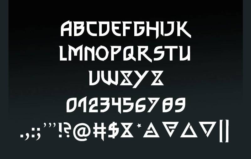
The wordmark uses a custom display typeface with serif influences and gothic detailing. It’s not a standard off-the-shelf font – the letterforms were modified specifically for the franchise. The characters have slightly condensed proportions, which gives the wordmark a strong vertical presence that pairs well with the circular medallion above it. Tracking is tight, keeping the word “Witcher” compact and easy to read even at small sizes. Over the three logo versions, the typography moved from rough and decorative to controlled and intentional.
What Are the Hidden Meanings in the Witcher Logo?
The medallion design mirrors actual amulet and talisman traditions from Eastern European folk culture – not by accident. Andrzej Sapkowski drew heavily from Slavic mythology, and the design team carried that through visually. The wolf’s downward gaze in the medallion is worth noticing: it reads as watchful rather than aggressive, which matches Geralt’s characterization. Some fans have pointed out that the circular medallion format echoes coin and seal designs from medieval heraldry, reinforcing the feudal world the story inhabits.
How Does the Witcher Logo Compare to Competitor Logos?
The Witcher logo holds its own against other major dark fantasy and RPG franchises. Where many lean on swords or abstract symbols, the wolf medallion is genuinely specific to this fictional world, which makes it harder to confuse with anything else.
Compared to the Dark Souls logo, which relies almost entirely on typography and atmospheric lettering, the Witcher mark has a stronger pictorial anchor. The wolf gives it immediate recognition even without the wordmark.
The Diablo logo goes for a completely different approach – aggressive red, fire-based imagery, demonic energy. The Witcher logo is more controlled, more ambiguous. It doesn’t tell you upfront whether this world is good or evil.
The Skyrim logo leans on its dragon symbol with similar logic – franchise-specific creature, emblem format, dark palette. Both are effective. The Witcher medallion reads slightly more grounded because it’s an object that exists within the fiction, not just a symbol layered on top of it.
Compared to Final Fantasy logo variations, which change dramatically with each entry, the Witcher mark has stayed consistent. That consistency has paid off in brand recognition.
The God of War logo uses a similarly focused symbol approach – the Omega mark is simple and bold. The Witcher wolf is more detailed, more decorative. Different philosophy, both effective.
What Are the Technical Specifications of the Witcher Logo?
Official Color Codes
- Primary Color: Gold – Hex: #C9A84C, RGB: (201, 168, 76), CMYK: (0, 16, 62, 21), Pantone: 7408 C
- Secondary Color: Black – Hex: #000000, RGB: (0, 0, 0), CMYK: (0, 0, 0, 100), Pantone: Black C
- Accent Color: Silver – Hex: #C0C0C0, RGB: (192, 192, 192), CMYK: (0, 0, 0, 25), Pantone: 877 C
- Background White: Hex: #FFFFFF, RGB: (255, 255, 255), CMYK: (0, 0, 0, 0)
Dimensions and Proportions
- Aspect ratio: Approximately 1:1.4 (portrait orientation, emblem above wordmark)
- Minimum size requirements: Emblem alone: 32px minimum for digital; 15mm minimum for print
- Clear space specifications: Minimum clear space equal to the height of the “W” in the wordmark on all sides
- File formats available: Vector (SVG, AI, EPS) for scalable use; PNG with transparent background for digital applications
- Official usage guidelines: Available through CD Projekt Red’s press kit; commercial use requires licensing
What Cultural Impact Has the Witcher Logo Had?

The wolf medallion has gone well beyond gaming. You see it on tattoos, jewelry, fan-made metalwork, and custom merchandise at conventions worldwide. That kind of organic adoption is rare for a franchise emblem – it means people identify with the symbol personally, not just as brand recognition.
The Netflix series brought the logo to an audience that had never touched the games. Henry Cavill wearing the medallion on screen gave it a physical presence that the digital version couldn’t fully replicate.
Among gaming company logos, CD Projekt Red’s approach with the Witcher has been studied as an example of how franchise branding can carry genuine narrative weight rather than just aesthetic appeal.
The logo also helped position CD Projekt Red as a serious developer on the world stage. Before The Witcher 3, the studio was respected in niche circles. The logo became part of how they announced themselves globally.
It’s worth comparing this cultural reach to other game logos that have crossed into mainstream culture. The Witcher wolf sits alongside a very short list of gaming emblems that people outside the gaming community can identify.
How Does the Witcher Logo Fit Into the Overall Brand Identity?

The logo doesn’t exist in isolation. It’s part of a broader visual system that CD Projekt Red has built across games, merchandise, and the Netflix collaboration. The wolf medallion functions as the core anchor point for that system. Everything else – color choices, typography in marketing materials, packaging design – orbits around the identity the medallion establishes.
The brand guidelines CD Projekt Red follows for the franchise keep the wolf consistently rendered across contexts, which is harder to maintain than it sounds when you’re dealing with game UI, physical merchandise, streaming platform assets, and press materials simultaneously.
The relationship between the game logo and the Netflix logo variant is interesting. Netflix’s version slightly simplifies the ornamental detail for better performance in digital streaming contexts – smaller thumbnails, mobile screens, app icons. The core identity stays intact; only the complexity level adjusts.
Related entities within the brand system include: the individual school emblems (Wolf, Cat, Bear, Griffin, Viper, Manticore), Gwent’s separate visual identity, and the Cyberpunk 2077 branding that CD Projekt Red developed using some similar design thinking.
How Should the Witcher Logo Be Used?
Official Usage Guidelines
- Do: Use official files sourced from CD Projekt Red’s press kit or GOG.com media resources
- Do: Maintain proportions when scaling; never stretch or compress the emblem independently of the wordmark
- Do: Use on approved background colors (dark backgrounds preferred; white backgrounds acceptable with the black version)
- Don’t: Alter the colors outside of approved monochrome versions
- Don’t: Add effects, drop shadows, or filters not present in the official files
- Don’t: Separate the wolf emblem from the wordmark for commercial use without explicit permission
Where to Access Official Logo Files
- CD Projekt Red press kit (press.cdprojektred.com)
- GOG.com media resources
- Netflix press site for series-specific assets
Licensing and Trademark Details
The Witcher logo is a registered trademark of CD Projekt Red S.A. Fan use for non-commercial purposes is generally tolerated, though not explicitly licensed. Any commercial application – merchandise, print-on-demand, event branding – requires direct licensing through CD Projekt Red’s business development team. Unauthorized commercial use of the trademark is an infringement regardless of how the logo was obtained.
For fan art and personal projects, the community standard is that non-profit use with clear attribution is accepted. Selling products featuring the logo without a license is a different matter entirely.
FAQ on The Witcher Logo
What does the Witcher logo represent?
The Witcher logo centers on the wolf head medallion worn by Geralt of Rivia.
It represents the School of the Wolf, the monster-hunting order Geralt trained under at Kaer Morhen.
The symbol signals danger, expertise, and moral ambiguity – core themes of the entire franchise.
Who designed the Witcher logo?
CD Projekt Red’s internal design team created and refined the logo across all versions.
No single external agency is credited. The design evolved in-house alongside the games themselves, from the 2007 original through the current version introduced with The Witcher 3: Wild Hunt in 2015.
What font is used in the Witcher logo?
The wordmark uses a custom typeface built on gothic serif influences – not a standard commercial font.
The letterforms were modified specifically for the franchise. Condensed proportions, tight tracking, and heavy stroke weight give it a distinctly medieval feel.
What colors are in the Witcher logo?
The primary palette is gold (#C9A84C), black (#000000), and silver (#C0C0C0).
Gold signals prestige and the supernatural. Silver directly references the silver swords Witchers carry. Black reinforces the dark fantasy setting throughout.
Has the Witcher logo changed over time?
Yes – three distinct versions exist.
The 2007 original was rough and functional. The Witcher 2 version sharpened the wolf medallion considerably. The current Witcher logo design from 2015 is the most polished, with stronger contrast and cleaner ornamental detail.
Is the Witcher logo the same for the games and the Netflix show?
Mostly, but not exactly. Netflix uses a slightly simplified variation of the game logo.
The wolf head emblem stays consistent, but ornamental detail is reduced for better performance on streaming thumbnails, mobile screens, and app icons.
What is the Witcher wolf medallion based on?
It draws from Slavic mythology and Eastern European talisman traditions.
Author Andrzej Sapkowski built the Witcher universe on this cultural foundation, and CD Projekt Red carried it into the visual identity. The medallion form echoes medieval seal and amulet design specifically.
Can I use the Witcher logo for fan art or merchandise?
Fan art for personal, non-commercial use is generally tolerated by CD Projekt Red.
Selling products – print-on-demand, merchandise, event branding – without a license is trademark infringement. The Witcher logo copyright is held by CD Projekt Red S.A., and commercial use requires direct licensing.
Where can I download the official Witcher logo?
Official Witcher logo PNG and vector files are available through CD Projekt Red’s press kit at press.cdprojektred.com.
GOG.com also provides media resources. These are the only legitimate sources – third-party download sites often distribute altered or low-quality versions.
How does the Witcher logo compare to other fantasy game logos?
It stands out because the wolf medallion is an object that exists within the fiction, not just a brand symbol layered on top.
Compared to the Last of Us logo or the Mass Effect logo, the Witcher mark carries stronger lore weight. It means something specific inside the story world.
Conclusion
The Witcher logo is more than franchise branding – it’s a piece of visual storytelling that works because every element connects back to the fiction itself.
The wolf head medallion, the gold and silver palette, the gothic wordmark: none of it is decorative for its own sake.
From the School of the Wolf lore to the Slavic mythology underneath it, CD Projekt Red built a mark with genuine depth.
That’s why the Witcher wolf emblem still resonates across games, the Netflix series, and merchandise – it means something specific, and people feel that.

Renowned for his expertise in logo design and visual branding, Bogdan has developed a multitude of logos for various clients.
His skills extend to creating posters, vector illustrations, business cards, and brochures. Additionally, Bogdan's UI kits were featured on marketplaces like Visual Hierarchy and UI8.
He also wrote in the past years on sites like Design Your Way, WebDesignerDepot, WPDean, Designmodo, Speckyboy, Slider Revolution, and more.
- The Windsurf Logo History, Colors, Font, And Meaning - 10 October 2026
- How to Remove Background From Product Photos (No Photoshop) - 10 October 2026
- How Designers can Build a Stronger Online Creative Identity - 9 October 2026

Bogdan Sandu is a seasoned designer who has been designing websites since 2008. Renowned for his expertise in logo design and visual branding, Bogdan has developed a multitude of logos for various clients. His skills extend to creating posters, vector illustrations, business cards, and brochures. Additionally, Bogdan's UI kits were featured on marketplaces like Visual Hierarchy and UI8. He also wrote in the past years on sites like Design Your Way, WebDesignerDepot, WPDean, Designmodo, Speckyboy, Slider Revolution, and more.
You Might Also Like


