


The God of War logo is one of gaming’s most recognizable visual marks, built around the Greek Omega symbol (Ω) that Kratos wears as a chest scar. Sony Santa Monica Studio has used this emblem across the franchise since 2005, making it a shorthand for the series’ brutal, mythologically grounded identity. Few video game logos carry that kind of symbolic weight, where a single character does so much work.
Within the broader history of gaming company logos and franchise branding, the God of War mark stands out for how deeply it ties visual design to narrative. The Omega isn’t decoration. It references Kratos’ identity, his past, and his ongoing relationship with the Greek gods. That kind of intentional storytelling through a logo is genuinely rare.
The current version, introduced with the 2018 reboot, paired a refined Omega emblem with a custom serif wordmark that shifted the franchise’s tone toward something more grounded. The original logo debuted in 2005, designed internally at Sony Santa Monica. The franchise has seen six major logo iterations across its main entries, each reflecting shifts in setting, tone, and platform.
Sony Santa Monica Studio was founded in 1999. God of War launched six years later, and the logo has been revised meaningfully with each major entry, most significantly in 2018 and again in 2022 with God of War Ragnarök.
What Is the God of War Logo?
The God of War logo combines a custom serif wordmark with the Greek Omega symbol (Ω), representing Kratos’ chest scar. Developed internally by Sony Santa Monica Studio, it first appeared in 2005 and was significantly redesigned for the 2018 PS4 reboot, adopting a heavier, more refined typographic style.
- Design Type: Combination mark (symbol + wordmark)
- Primary Elements: Omega symbol (Ω), custom serif typography, horizontal rule dividers in some versions
- Official Introduction Date: 2005 (original); 2018 (current primary version)
- Designer/Agency: Sony Santa Monica Studio (in-house)
- Trademark Status: Registered trademark of Sony Interactive Entertainment
- Color Palette:
- Blood Red: #8B0000 / #C0392B (varies by application)
- Black: #0A0A0A
- Off-White/Bone: #E8E0D0 (used in certain versions)
- Gold: #B8860B (used selectively in premium contexts)
- Usage Context: Game covers, marketing materials, merchandise, digital storefronts, trailers, in-game UI
How Has the God of War Logo Evolved Over Time?

The logo has changed meaningfully six times since 2005, tracking the franchise’s shift from Greek mythology to Norse settings and from arcade-style brutality to emotionally complex storytelling. Each redesign reflected a deliberate change in tone rather than simple visual refresh.
Original God of War Logo (2005–2007)
- Years Active: 2005–2007
- Design Description: Aggressive serif wordmark with the Omega symbol prominently featured. Rough, jagged letterforms conveyed raw violence.
- Color Scheme: Deep red on black
- Designer: Sony Santa Monica Studio (in-house)
- Context: Introduced for the PS2 launch; needed to convey mature, violent content in a crowded action game market
- Key Changes from Previous: N/A (original version)
- Cultural Significance: Immediately associated the Omega with Kratos. Became a template for how the franchise would present itself visually for the next decade.
God of War II Logo (2007–2010)
- Years Active: 2007–2010
- Design Description: Refined version of the original with slightly tighter letterforms and a more prominent Omega placement
- Color Scheme: Red and black, with added gold accents in some marketing uses
- Designer: Sony Santa Monica Studio
- Context: PS2 sequel, released during the console’s final years
- Key Changes from Previous: Subtle typographic refinement; Omega symbol slightly enlarged
- Cultural Significance: Solidified the franchise visual identity before the jump to PS3
God of War III Logo (2010–2013)
- Years Active: 2010–2013
- Design Description: Bolder, heavier letterforms built for HD display. The Omega gained more visual weight and was often presented with a stone or blood-etched texture.
- Color Scheme: High-contrast red and near-black
- Designer: Sony Santa Monica Studio
- Context: PS3 launch, first full HD entry in the series
- Key Changes from Previous: Heavier stroke weight throughout; texture added to symbol
- Cultural Significance: The HD version of the logo became the definitive “classic era” mark
God of War: Ascension Logo (2013–2018)
- Years Active: 2013–2018
- Design Description: Cleaner execution of the classic formula with some typographic tightening
- Color Scheme: Red and black
- Designer: Sony Santa Monica Studio
- Context: Prequel entry, late PS3 cycle
- Key Changes from Previous: Minor refinements; subtitle added below main wordmark
- Cultural Significance: Last logo of the Greek mythology era
God of War (2018) Logo (2018–2022)
- Years Active: 2018–2022
- Design Description: Complete redesign. Custom serif wordmark with significantly more refined letterforms. The Omega symbol was simplified and given cleaner lines. The overall mark shifted from aggressive to restrained, reflecting the game’s more mature, emotionally complex tone.
- Color Scheme: Darker, more subdued red; heavy use of black and stone gray
- Designer: Sony Santa Monica Studio (with external brand partners)
- Context: PS4 soft reboot, major tonal shift for the franchise
- Key Changes from Previous: Completely new typographic approach; more refined Omega; removal of rough textures
- Cultural Significance: Marked the franchise’s reinvention. Widely praised as one of the stronger game logo redesigns of the PS4 era.
God of War Ragnarök Logo (2022–Present)
- Years Active: 2022–present
- Design Description: Builds directly on the 2018 design with subtle refinements. The wordmark carries slightly adjusted spacing and the subtitle “Ragnarök” is integrated in a complementary custom serif style.
- Color Scheme: Consistent with 2018; some applications introduce icy blue accents referencing Norse settings
- Designer: Sony Santa Monica Studio
- Context: PS5 sequel, continuing the Norse mythology arc
- Key Changes from Previous: Subtitle integration; minor typographic refinements
- Cultural Significance: Confirmed the 2018 redesign as the franchise’s long-term visual direction
What Do the Design Elements of the God of War Logo Mean?
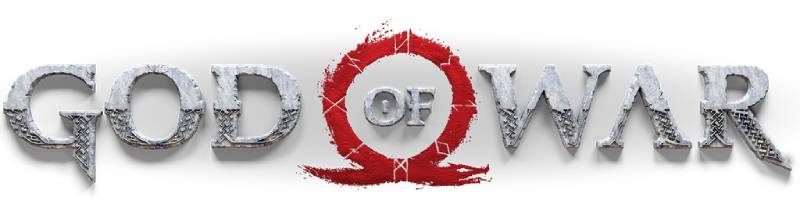
Every element in the God of War logo connects directly to the franchise’s narrative. The Omega symbol isn’t a stylistic choice. It’s a story beat. Kratos received the mark as a scar after killing his family, and wearing it became both punishment and identity, which is actually a pretty heavy thing to put in a logo.
What Does the Omega Symbol Represent in the God of War Logo?
The Omega (Ω) is the last letter of the Greek alphabet, carrying connotations of finality and endings.
In the context of God of War, it references Kratos’ scar, branded onto him by Ares after he unknowingly killed his wife and daughter.
It also functions as a broader thematic statement: Kratos as the end of the Greek gods, the last chapter of their reign. That double meaning, personal trauma plus mythological finality, is what makes it work as a symbol rather than just a decorative letter.
What Historical References Are in the God of War Logo?
The Omega has deep roots in ancient Greek culture, used in classical texts to denote the end of sequences or cycles.
The franchise borrows from actual Greek and later Norse mythology, and the logo’s symbol keeps one foot in that historical world. The 2018 redesign’s typography, with its sharp serifs and stone-like weight, references classical inscription styles found on ancient Greek architecture.
What Cultural References Are Present?
Beyond Greek symbolism, the Omega mark has become a gaming cultural reference in its own right.
It appears on merchandise, tattoos (fan and fictional), and is immediately recognizable to anyone familiar with the franchise. The mark functions similarly to how superhero logos work: instant character identification without any text needed.
Why Did Sony Santa Monica Choose These Specific Colors?
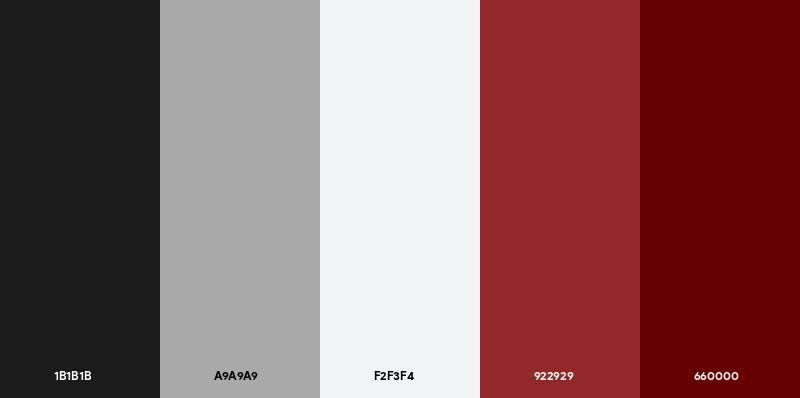
- Blood Red (#8B0000 / #C0392B)
- Symbolic meaning: Violence, sacrifice, Kratos’ past
- Psychological impact: Aggression, urgency, danger. Red is one of the most psychologically activating colors in color psychology.
- Brand connection: Consistent with the franchise’s mature, combat-heavy identity. Fits neatly within the broader category of red logos used by brands that want to signal intensity.
- Black (#0A0A0A)
- Symbolic meaning: Death, the underworld, Kratos’ cursed existence
- Psychological impact: Authority, weight, finality
- Brand connection: Standard for mature-rated games; creates maximum contrast with red
- Gold (#B8860B, selective use)
- Symbolic meaning: Divinity, the gods, Olympus
- Psychological impact: Prestige, power
- Brand connection: Used sparingly in collector’s editions and premium contexts. Fits within the broader range of gold logos associated with high-end branding.
What Typography Style Is Used in the God of War Logo?

The current wordmark uses a custom serif typeface developed specifically for the franchise, with no direct public equivalent.
The letterforms have sharp, angular serifs that reference classical stone inscription styles while remaining legible at small sizes. The serif font choice was a deliberate shift from the more aggressive, rougher type used in the pre-2018 versions.
The 2018 redesign prioritized typography that could hold up across both physical packaging and digital storefronts, which meant cleaner stroke contrast and more consistent tracking across the wordmark.
Earlier versions used display-style type with texture overlays that worked on disc covers but struggled at smaller sizes on screens. The switch to a cleaner custom serif fixed that problem across the board.
What Are the Hidden Meanings in the God of War Logo?
The most discussed “hidden” element is the Omega’s dual reading: as a Greek letter and as a chest scar worn by Kratos.
Most players initially read it as simply a stylized symbol, only later connecting it to the in-game narrative. That layered reading, decoration first, story second, is intentional design.
Some fans have noted that the Omega’s open base resembles a pair of blades, referencing the Blades of Chaos. Sony Santa Monica hasn’t confirmed this as intentional, but given how deliberately every other element was designed, it probably isn’t accidental either.
How Does the God of War Logo Compare to Competitor Logos?
Among major action-adventure game franchises, the God of War mark is unusually narrative-driven. Most franchise logos prioritize genre signaling over character identity. God of War does both at once.
Compare it to the Dark Souls logo, which uses gothic typography and fire imagery to signal difficulty and atmosphere without specific character reference. Or the Final Fantasy logo, which changes significantly with each entry rather than maintaining a consistent mark.
The Doom logo is probably the closest comparison in terms of aggressive typography paired with franchise identity, though it leans more on raw typographic weight than symbolic depth.
The Witcher logo and Mass Effect logo both use combination marks with symbols and wordmarks, but neither ties the symbol as directly to character narrative as God of War does.
Within PlayStation exclusives specifically, the God of War mark is the most symbolically loaded. The Last of Us logo uses a spore/firefly motif, which is thematically relevant but less immediately tied to a specific character’s physical identity.
What separates God of War is that the symbol is the character in a way that most franchise marks never achieve. That’s genuinely hard to pull off.
What Are the Technical Specifications of the God of War Logo?
Official Color Codes
- Primary Color: Blood Red
- Hex: #8B0000 (dark variant) / #C0392B (standard variant)
- RGB: (139, 0, 0) / (192, 57, 43)
- CMYK: (0, 100, 100, 45) / (0, 70, 78, 25)
- Pantone: 7621 C (closest match)
- Secondary Color: Black
- Hex: #0A0A0A
- RGB: (10, 10, 10)
- CMYK: (0, 0, 0, 96)
- Pantone: Black C
- Accent Color: Gold (selective)
- Hex: #B8860B
- RGB: (184, 134, 11)
- CMYK: (0, 27, 94, 28)
- Pantone: 7753 C (closest match)
Note: Sony Santa Monica has not published an official brand style guide with confirmed RGB and CMYK values. The above are widely accepted approximations based on official marketing assets and disc packaging. For verified values, contact Sony Interactive Entertainment directly.
Dimensions and Proportions
- Aspect ratio: Approximately 3:1 (wordmark with Omega symbol), varies by layout
- Minimum size requirements: Not officially published; standard practice for comparable marks is 100px wide minimum for digital use
- Clear space: Typically equal to the height of the Omega symbol on all sides
- File formats available officially: Not publicly distributed; assets appear in press kits as high-resolution raster files and occasionally as vector graphics
- DPI for print use: Minimum 300 DPI for print applications per standard press kit specifications
What Cultural Impact Has the God of War Logo Had?

The Omega symbol went from a Greek letter to a gaming cultural shorthand largely because of this franchise. That’s a meaningful shift for a logo to achieve.
Fan tattoos of the Omega mark are common enough to be a documented phenomenon online, which puts it in a small category of game logos that people permanently put on their bodies. The Fortnite logo, Minecraft logo, and a handful of others have similar fan adoption rates, but God of War’s mark carries specific narrative meaning that most purely aesthetic logos don’t have.
The 2018 redesign became a reference point in game branding discussions, cited in design communities as an example of how to successfully update a franchise visual identity without losing the original’s core recognition. Not many redesigns earn that kind of professional attention.
The mark also appears extensively on licensed merchandise, from apparel to collectibles, giving it physical presence beyond screens. That kind of product extension is where logos either hold up or fall apart, and the God of War symbol holds up well across materials and scales.
How Does the God of War Logo Fit Into the Overall Brand Identity?
The logo sits at the center of a connected identity system that includes packaging, in-game UI, merchandise, and marketing. Every element references the same visual language: heavy serif type, the Omega symbol, a red-black color palette, and stone-like textures in environmental applications.
The brand guidelines for the franchise (not publicly available but visible through consistent application) treat the Omega as a standalone icon that can function without the wordmark in certain contexts, particularly on merchandise and secondary marketing materials.
This flexibility is a sign of mature brand development. The Omega works alone because it has enough recognition to carry meaning independently. The wordmark and symbol work together for primary applications like box art and key marketing. That separation of functions within a single mark reflects solid logo design principles.
Related brand elements include the Blades of Chaos as a secondary visual motif, the franchise’s distinct use of runic and classical lettering in environmental design, and a consistent UI language across the game series that echoes the logo’s typographic choices. The whole system is tightly connected in a way that makes the logo feel like part of something larger rather than a standalone mark.
How Should the God of War Logo Be Used?
Official Usage Guidelines
- Do: Use official assets sourced directly from Sony Interactive Entertainment press kits
- Do: Maintain clear space around the mark as specified in press materials
- Do: Use approved color versions (full color, black, white) appropriate to the background
- Don’t: Alter proportions, colors, or letterforms
- Don’t: Use the logo on backgrounds that reduce legibility
- Don’t: Recreate the logo from scratch for commercial use
- Don’t: Use the mark to imply official endorsement or affiliation without authorization
Where to Access Official Logo Assets
Official God of War logo files are available through the Sony Interactive Entertainment press portal at pressroom.playstation.com. Media outlets, event organizers, and licensed partners can request assets directly. Fan and educational use typically falls under fair use provisions, but commercial applications require explicit licensing.
Licensing and Trademark Information
The God of War logo is a registered trademark of Sony Interactive Entertainment LLC. Unauthorized commercial use, including merchandise, print-on-demand products, and promotional materials, is prohibited without a formal licensing agreement. Sony actively enforces its trademark rights across major retail platforms.
For fan art and non-commercial creative projects, Sony has historically taken a relatively permissive stance, though this is not a formal policy and can change. When in doubt, keep it non-commercial and clearly labeled as fan work.
FAQ on The God Of War Logo
What Is the Symbol on the God of War Logo?
The symbol is the Greek letter Omega (Ω), representing the scar branded onto Kratos after he killed his family.
It signals both personal trauma and mythological finality, making it one of the most narratively loaded symbols in video game logo design.
Who Designed the God of War Logo?
Sony Santa Monica Studio created the logo in-house for the original 2005 PS2 release.
The 2018 redesign involved closer collaboration with external brand partners, though Sony Santa Monica retained creative direction throughout.
What Font Is Used in the God of War Logo?
The current wordmark uses a custom serif typeface built specifically for the franchise.
It draws from classical stone inscription styles with sharp, angular serifs. No direct public equivalent exists. Earlier versions used rougher display-style type that didn’t hold up well at smaller sizes on digital platforms.
What Do the Colors in the God of War Logo Mean?
The deep red references blood, sacrifice, and Kratos’ violent past.
Black signals death and the underworld. Together they create a high-contrast color scheme that communicates the franchise’s tone instantly, without any supporting imagery needed.
How Many Times Has the God of War Logo Changed?
The logo has gone through six meaningful iterations since 2005, tracking each major release.
The most significant change came with the 2018 reboot, which completely overhauled the typography and refined the Omega symbol from aggressive to restrained.
What Is the Difference Between the God of War 2018 Logo and the Original?
The original used rough, textured letterforms built for PS2-era packaging.
The 2018 version replaced all of that with a cleaner custom serif wordmark and a simplified Omega. The visual hierarchy shifted dramatically, reflecting the game’s more emotionally grounded storytelling approach.
Is the God of War Logo Trademarked?
Yes. The God of War logo is a registered trademark of Sony Interactive Entertainment LLC.
Commercial use without a licensing agreement is prohibited. Fan and non-commercial creative work generally falls under fair use, though Sony has not published a formal policy on this.
Where Can I Download the Official God of War Logo?
Official assets are available through Sony Interactive Entertainment’s press portal at pressroom.playstation.com.
These files are intended for media and licensed partners. Raster files appear in most press kits, with vector format assets available on request for certain applications.
What Makes the God of War Logo Different From Other Game Logos?
Most franchise marks signal genre or tone. The God of War Omega symbol does that and ties directly to the protagonist’s physical identity and backstory.
That dual function, decoration and narrative device simultaneously, puts it in rare company among game logos built around a single character.
What Are the Official Color Codes for the God of War Logo?
The primary red sits at approximately #8B0000 to #C0392B depending on the application, with near-black at #0A0A0A.
Sony hasn’t published confirmed Pantone values officially. The closest Pantone match for the standard red is 7621 C, widely used in licensed merchandise production.
Conclusion
The God of War logo works because it earns its symbolism rather than borrowing it.
The Omega isn’t just Kratos’ chest scar. It’s the franchise’s entire identity compressed into a single mark, connecting the Spartan warrior’s personal history to the broader mythology of gods and endings.
Few graphic design principles are applied as deliberately here as they are across the logo’s six iterations, each one tracking a real shift in tone rather than chasing visual trends.
The 2018 redesign remains the clearest proof that a logo can mature without losing its core identity. Sony Santa Monica got that balance right.

Renowned for his expertise in logo design and visual branding, Bogdan has developed a multitude of logos for various clients.
His skills extend to creating posters, vector illustrations, business cards, and brochures. Additionally, Bogdan's UI kits were featured on marketplaces like Visual Hierarchy and UI8.
He also wrote in the past years on sites like Design Your Way, WebDesignerDepot, WPDean, Designmodo, Speckyboy, Slider Revolution, and more.
- The Windsurf Logo History, Colors, Font, And Meaning - 10 October 2026
- How to Remove Background From Product Photos (No Photoshop) - 10 October 2026
- How Designers can Build a Stronger Online Creative Identity - 9 October 2026

Bogdan Sandu is a seasoned designer who has been designing websites since 2008. Renowned for his expertise in logo design and visual branding, Bogdan has developed a multitude of logos for various clients. His skills extend to creating posters, vector illustrations, business cards, and brochures. Additionally, Bogdan's UI kits were featured on marketplaces like Visual Hierarchy and UI8. He also wrote in the past years on sites like Design Your Way, WebDesignerDepot, WPDean, Designmodo, Speckyboy, Slider Revolution, and more.
You Might Also Like


