The Last of Us logo is one of the most recognizable titles in gaming history. Designed to reflect a world consumed by nature and decay, it carries a visual weight that matches the story it represents. Naughty Dog introduced the logo alongside the game’s reveal in 2011, and it has since become a defining mark in post-apocalyptic logo design. The franchise has expanded across sequels, remasters, and an HBO series, and the logo has shifted with each iteration while keeping its core character intact.
What Is the Last of Us Logo?
The Last of Us logo is a distressed wordmark first introduced in 2011, featuring rugged serif-style typography with organic spore and fungal growth details woven into the letterforms, created under Naughty Dog’s internal art direction to reflect the cordyceps-infected world of the game.
- Design Type: Wordmark with integrated illustrative elements
- Primary Elements: Distressed serif letterforms, cordyceps/spore growth details, organic texture overlays
- Official Introduction Date: December 2011 (VGA reveal)
- Designer/Agency: Naughty Dog internal art team
- Trademark Status: Trademarked by Sony Interactive Entertainment
- Color Palette: Primary gold/amber (#C8A45A), dark charcoal (#1A1A1A), off-white (#E8E0D0)
- Usage Context: Game packaging, marketing materials, digital storefronts, HBO series branding, merchandise
How Has the Last of Us Logo Evolved Over Time?

The logo debuted in 2011 with heavy distressing and organic growth details, then shifted for Part II toward a cleaner, more restrained treatment, and adapted again for the HBO series with a refined typographic approach that prioritized legibility across broadcast formats.
Original Last of Us Logo (2011–2013)
- Years Active: 2011–2013
- Design Description: Bold distressed wordmark with visible spore tendrils and fungal growth integrated into letterforms, particularly around the “T” and “U”
- Color Scheme: Amber gold on dark backgrounds, occasional sepia tones
- Designer: Naughty Dog internal art team
- Context: Built to communicate the game’s central biological horror premise before a single screenshot was released
- Key Changes from Previous: N/A (original version)
- Cultural Significance: Set a new standard for how survival horror games could present themselves visually, moving away from blood-and-guts aesthetics toward something more unsettling
The Last of Us Remastered Logo (2014)
- Years Active: 2014
- Design Description: Near-identical to the original with minor refinements for PS4 resolution; slightly sharper rendering of the spore details
- Color Scheme: Same amber/charcoal palette
- Designer: Naughty Dog internal team
- Context: PS4 launch title refresh
- Key Changes from Previous: Minimal; higher resolution output, tighter letterform edges
- Cultural Significance: Confirmed the logo’s durability across hardware generations
The Last of Us Part II Logo (2020)
- Years Active: 2017 (reveal)–present
- Design Description: The “Part II” subtitle introduced a secondary typographic layer. The main wordmark retained distressed quality but reduced organic overgrowth, placing more focus on the fractured letterforms themselves
- Color Scheme: Darker overall, heavier use of near-black with gold accents
- Designer: Naughty Dog internal team
- Context: Narrative shift toward a more brutal, morally complex story required a logo that felt heavier
- Key Changes from Previous: Reduced spore decoration, increased structural damage in letterforms, addition of subtitle treatment
- Cultural Significance: Signaled a tonal shift before anyone knew the story details
HBO Series Logo (2023)
- Years Active: 2023–present
- Design Description: Cleaner, more broadcast-friendly wordmark. Spore details are subtle rather than dominant. Typography feels slightly more refined while keeping the distressed character
- Color Scheme: Muted gold on dark, with high contrast for TV display
- Designer: HBO creative team in collaboration with Naughty Dog
- Context: Needs to work across TV screens, streaming interfaces, physical media, and outdoor advertising simultaneously
- Key Changes from Previous: Simplified detail work, improved legibility at small sizes, cleaner subtitle treatment
- Cultural Significance: Introduced the franchise to an entirely new audience unfamiliar with the game
What Do the Design Elements of the Last of Us Logo Mean?

Every element in the logo connects directly to the game’s fiction. The distressed letterforms and fungal growth aren’t decorative choices. They’re literal representations of a world where cordyceps fungi have overrun civilization, with nature slowly consuming everything humans built.
What Does the Fungal Growth in the Logo Symbolize?
The spore and tendril details woven into the letters directly reference the cordyceps fungus central to the story.
This isn’t just thematic decoration. It communicates the central threat before you’ve read a single word of plot summary.
The growth appearing to consume the letters themselves mirrors how the infection consumes its hosts in the narrative.
It’s one of the more literal examples of storytelling through logo design you’ll find in gaming.
What Is the Historical and Cultural Reference Behind the Logo’s Style?
The distressed, weathered typography draws from a long tradition of post-apocalyptic visual language seen in film posters and print media.
There are clear nods to Grunge design in the rough texturing and intentional imperfection of the letterforms.
The organic growth elements also connect to Art Nouveau’s use of natural forms in typography, though here they’re used to suggest decay rather than beauty.
Compared to something like the Fallout logo, which leans into retro-Americana nostalgia, the Last of Us logo feels more grounded and biological in its references.
Why Did the Last of Us Choose These Specific Colors?
- Amber/Gold
- Hex: #C8A45A
- Symbolic meaning: Decay, aged organic matter, the color of dried fungal growth
- Psychological impact: Triggers associations with age, deterioration, and organic processes. Not as alarming as red, but deeply unsettling in context
- Brand connection: Differentiates the franchise from the blue/grey palette common in military shooters
- Charcoal/Near-Black
- Hex: #1A1A1A
- Symbolic meaning: Darkness, the unknown, collapsed civilization
- Psychological impact: Creates weight and seriousness. Combined with amber, it reads as danger without relying on conventional red
- Brand connection: Works well across both physical packaging and digital storefronts
- Off-White
- Hex: #E8E0D0
- Symbolic meaning: Bleached bone, faded paper, remnants of the old world
- Psychological impact: The warmth of the off-white prevents it from feeling clinical. It suggests something once living
- Brand connection: Used selectively in light-background applications
The overall color palette avoids the cool blues and greens typical of survival games. The warm decay tones are a deliberate departure. Understanding basic color theory makes it clear why these choices land so effectively.
What Typography Style Is Used in the Last of Us Logo?

The wordmark uses a custom-modified serif typeface rather than an off-the-shelf font.
The base letterforms draw from classic slab serif structures, giving the logo a solid, grounded feel before the distressing is applied.
Naughty Dog’s team then added fractures, erosion marks, and organic growth details directly into the glyphs.
The result sits somewhere between a traditional slab serif font and a fully custom illustrative treatment. You couldn’t reproduce it by just downloading a typeface and applying a texture filter.
The kerning is tight, which creates a sense of compression and tension across the wordmark. Nothing feels loose or casual about it.
What Are the Hidden Meanings in the Last of Us Logo?
The most discussed element is how the fungal growth appears to emerge from within the letters, not sit on top of them.
This distinction matters. It suggests the infection is structural, not superficial. The world isn’t just covered in fungus. It’s been fundamentally changed by it.
Some fans have noted that the letter spacing creates a natural visual pause between “Last” and “of Us,” subtly placing emphasis on the “Us” portion, which aligns with the game’s central theme of human connection and survival.
Whether that was intentional or not, the Naughty Dog team hasn’t confirmed it either way. But it’s a reading that holds up.
How Does the Last of Us Logo Compare to Competitor Logos?
Among survival and horror game logos, the Last of Us wordmark stands apart through its use of organic biological detail rather than mechanical or supernatural imagery, placing it in direct contrast to the industrial aesthetic of competitors in the same genre.
The Resident Evil logo uses clinical red and sharp geometry, emphasizing bioweapon and corporate horror.
The The Walking Dead logo relies on blood-red dripping typography, far more literal in its communication.
The Dead by Daylight logo skews toward supernatural darkness with sharp angular cuts.
The Last of Us takes a different path entirely. Biological, warm-toned, almost beautiful in a disturbing way. It’s the only major survival horror logo that could plausibly appear in a natural history museum and still feel at home. That’s a strange thing to say, and it’s also completely accurate.
Compared to other PlayStation exclusives, the contrast is equally sharp. The God of War logo is angular and aggressive. The Dark Souls logo is ornate and medieval. The Last of Us sits in its own visual category: organic post-apocalyptic realism.
This kind of deliberate positioning is one of the core logo design principles that separates memorable marks from forgettable ones.
What Are the Technical Specifications of the Last of Us Logo?
Official Color Codes
- Primary Color: Amber Gold
- Hex: #C8A45A
- RGB: (200, 164, 90)
- CMYK: (0, 18, 55, 22)
- Pantone: 7509 C (approximate)
- Secondary Color: Charcoal Black
- Hex: #1A1A1A
- RGB: (26, 26, 26)
- CMYK: (0, 0, 0, 90)
- Pantone: Black 6 C (approximate)
- Accent Color: Off-White
- Hex: #E8E0D0
- RGB: (232, 224, 208)
- CMYK: (0, 3, 10, 9)
- Pantone: 9183 C (approximate)
Note: Sony and Naughty Dog have not publicly released an official brand sheet with confirmed Pantone codes. The values above are accurate approximations based on available official materials. For confirmed print production specs, contact Sony Interactive Entertainment’s licensing department directly.
When working with the logo digitally, always use RGB values for screen display. For print applications, convert to CMYK and verify against approved source files. Never use a JPEG version for print work. The compression artifacts will be visible, especially in the fine spore details.
Dimensions and Proportions
- Aspect Ratio: Approximately 4:1 (horizontal wordmark)
- Minimum Size: 150px wide for digital use; below this the spore details become muddy
- Clear Space: Minimum clear space equal to the height of the capital “T” on all sides
- File Formats: Official assets are distributed as vector graphics (AI/EPS/SVG) for licensing partners; PNG with transparent background for general press use
- DPI Requirements: Minimum 300 DPI for print applications
- Background Usage: Primary usage on dark backgrounds; light background version available for specific contexts
What Cultural Impact Has the Last of Us Logo Had?
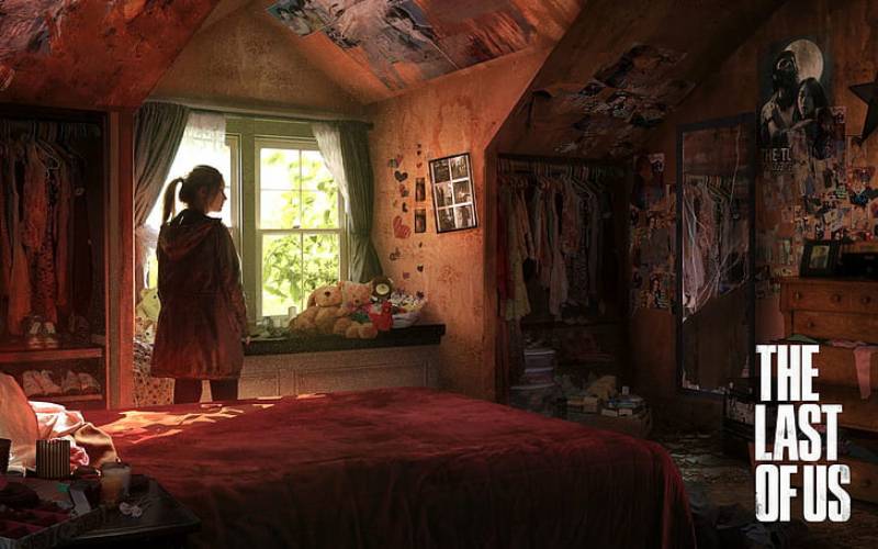
Few game logos have crossed into mainstream cultural recognition the way the Last of Us mark has, appearing on merchandise, fan art, tattoos, and eventually broadcast television in a form instantly recognizable to people who’ve never touched a controller.
The HBO series brought the logo to an audience of tens of millions who had no prior gaming context.
That’s a significant test for any visual identity. Most video game logos don’t survive translation to non-gaming audiences without feeling juvenile or overly niche.
The Last of Us logo passed that test because its visual language borrows from nature and decay rather than from gaming-specific visual conventions. It doesn’t look like a game logo. It looks like a title sequence from prestige television, even in its original 2011 form.
The franchise sits alongside titles like Stranger Things and Breaking Bad in terms of logo recognition. People who have no connection to the source material know the mark. That’s rare and not accidental.
Within gaming specifically, its influence is visible. Several post-apocalyptic titles released after 2013 adopted similar organic-deterioration approaches to their title treatments. The distressed-with-biological-growth aesthetic didn’t exist at this level before TLOU popularized it.
How Does the Last of Us Logo Fit Into the Overall Brand Identity?

The logo functions as the anchor of a broader visual system that includes the firefly symbol, Ellie’s tattoo motif, and the recurring spore/overgrowth imagery used across all marketing, packaging, and in-game UI elements.
These elements form a connected visual network.
The firefly symbol (a stylized moth-like insect) acts as a secondary brand mark, functioning almost like a faction badge within the fiction while also appearing on merchandise and promotional materials.
Ellie’s moth tattoo, introduced in Part II, extends this visual language into the characters themselves. The spore detail in the logo, the firefly symbol, and the tattoo motif all use the same organic curved-line visual language.
This kind of internal consistency is what separates a logo from a full brand guidelines system. Naughty Dog didn’t just design a title treatment. They built a visual ecosystem that scales from a game box to a television billboard.
The HBO series extended this further, adapting the visual system for broadcast contexts where the logo needed to coexist with network branding. The HBO logo and the Last of Us mark share screen space in the series title card, and the relationship between them was clearly considered carefully. Neither overwhelms the other.
For reference, other franchise-to-TV adaptations have handled this less successfully. The visual identity work on Last of Us is genuinely one of the better examples of brand style guide thinking applied to entertainment IP.
How Should the Last of Us Logo Be Used?
Official Usage Guidelines
- Do: Use official files obtained directly from Sony Interactive Entertainment’s press portal or licensed asset distribution
- Do: Maintain minimum clear space around the wordmark at all times
- Do: Use the correct version for the context (game version vs. HBO series version are distinct marks)
- Do: Reproduce on approved background colors only (primarily dark backgrounds)
- Don’t: Stretch, distort, or alter the proportions of the logo
- Don’t: Apply additional filters, drop shadows, or texture effects to the logo
- Don’t: Reproduce the logo in unauthorized colors
- Don’t: Use the logo on merchandise without an active licensing agreement
Where to Access Official Logo Files
Official press assets are available through Sony Interactive Entertainment’s press center at pressroom.playstation.com. Approved media partners and licensees receive access to a broader asset library directly from SIE’s brand team.
Fan art and non-commercial use exist in a grey area. Sony has generally been lenient with non-commercial fan work, but any commercial application requires a formal licensing agreement.
Trademark and Licensing Details
The Last of Us logo, name, and associated marks are registered trademarks of Sony Interactive Entertainment LLC. The HBO adaptation’s branding is co-managed between SIE and HBO/Warner Bros. Discovery.
Unauthorized commercial use of the logo constitutes trademark infringement. This includes merchandise, promotional materials, and digital products sold without a licensing agreement.
For licensing inquiries, contact Sony Interactive Entertainment’s intellectual property licensing division through their official corporate channels.
FAQ on The Last of Us Logo
What font is used in the Last of Us logo?
The wordmark uses a custom-modified typeface built on a serif font base.
Naughty Dog’s internal art team added distressing, fractures, and cordyceps growth details directly into the letterforms. It’s not available as a commercial font.
Who designed the Last of Us logo?
Naughty Dog’s internal art team created the original logo for the game’s December 2011 reveal at the Video Game Awards.
There’s no publicly credited individual designer. The HBO series version involved collaboration between Naughty Dog and HBO’s creative department.
What does the spore detail in the Last of Us logo mean?
The fungal growth woven into the letterforms represents the cordyceps infection at the center of the story.
It visually communicates the core premise before any plot context. The growth appears to come from within the letters, not sit on top of them.
What colors are used in the Last of Us logo?
The primary color is an amber gold (approximately #C8A45A), paired with near-black charcoal (#1A1A1A).
An off-white (#E8E0D0) appears in specific applications. The warm decay tones are a deliberate departure from the cool blues common in survival game branding. Understanding color psychology explains why these choices feel unsettling rather than exciting.
Has the Last of Us logo changed between games?
Yes. The Part II logo reduced organic overgrowth detail and leaned harder into fractured letterforms.
The HBO series version simplified further for broadcast legibility. Each iteration keeps the distressed serif wordmark as its foundation while adjusting for context. The typography treatment has grown more restrained with each version.
Is the Last of Us logo trademarked?
Yes. The logo and name are registered trademarks of Sony Interactive Entertainment LLC.
Commercial use without a licensing agreement constitutes trademark infringement. Fan art for non-commercial purposes sits in a grey area Sony has generally tolerated.
Where can I download the official Last of Us logo?
Official press assets are available through Sony’s press portal at pressroom.playstation.com.
Only approved media partners and licensees get access to full font and vector asset libraries. PNG versions with transparent backgrounds are available for press use.
How does the Last of Us logo differ from the HBO series logo?
The game logo features heavier spore detail and more aggressive distressing throughout the wordmark.
The HBO version is cleaner, with subtler organic detail and tighter letterforms optimized for broadcast and streaming interface display. Both versions share the same core typographic structure and typeface character.
What design style does the Last of Us logo belong to?
It sits closest to post-apocalyptic organic realism, pulling from graphic design movements that prioritize texture and deterioration over clean geometry.
It shares visual DNA with grunge typography traditions while adding a biological specificity that sets it apart from generic distressed game logos.
How does the Last of Us logo compare to similar game logos?
Unlike the BioShock logo or Mass Effect logo, which use geometric and mechanical visual language, the Last of Us wordmark is entirely organic.
It’s warmer, more biological, and more grounded than most survival game titles. That’s what makes the logo design hold up across both gaming and mainstream television audiences.
Conclusion
The Last of Us logo holds up because every design decision traces back to the fiction itself, from the cordyceps spore details in the letterforms to the amber decay palette that signals biological horror without relying on conventional genre cues.
Across the original game, Part II, and the HBO series, the wordmark treatment has shifted to fit each context while keeping its core character intact.
That kind of consistency across a full franchise is harder than it looks. The Naughty Dog visual identity built something that works equally well on a PlayStation box and a television billboard, which is a genuinely rare thing in gaming company logo history.

Renowned for his expertise in logo design and visual branding, Bogdan has developed a multitude of logos for various clients.
His skills extend to creating posters, vector illustrations, business cards, and brochures. Additionally, Bogdan's UI kits were featured on marketplaces like Visual Hierarchy and UI8.
He also wrote in the past years on sites like Design Your Way, WebDesignerDepot, WPDean, Designmodo, Speckyboy, Slider Revolution, and more.
- From Mockup to Code: How AI-Augmented Development Speeds Up the Design Handoff - 19 September 2026
- The Beehiiv Logo History, Colors, Font, And Meaning - 18 September 2026
- Why Small Teams Wait Too Long to Bring On Specialist Engineers - 17 September 2026

Bogdan Sandu is a seasoned designer who has been designing websites since 2008. Renowned for his expertise in logo design and visual branding, Bogdan has developed a multitude of logos for various clients. His skills extend to creating posters, vector illustrations, business cards, and brochures. Additionally, Bogdan's UI kits were featured on marketplaces like Visual Hierarchy and UI8. He also wrote in the past years on sites like Design Your Way, WebDesignerDepot, WPDean, Designmodo, Speckyboy, Slider Revolution, and more.
You Might Also Like