The Stranger Things logo is one of those rare title designs that people recognize instantly, even outside the context of the show itself. It landed in 2016 and pretty much took over pop culture overnight.
Built around the ITC Benguiat typeface, the mark draws heavily from 1980s horror and sci-fi paperback covers. Think Stephen King novels, think old Spielberg movie posters. The red glowing letters against a black background became a shorthand for an entire era of nostalgia-driven entertainment.
Within the broader history of entertainment branding, this title treatment sits at a turning point. It proved that a streaming show could generate the same kind of logo recognition that used to be reserved for major film franchises. Netflix introduced the current version in July 2016, designed by Imaginary Forces. The show has gone through four seasons so far, with each season making small refinements while keeping the core design intact.
What Is the Stranger Things Logo?
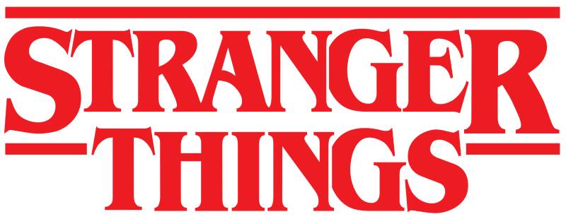
The Stranger Things logo is a red, glowing wordmark set in the ITC Benguiat Bold typeface. Introduced in July 2016 by design studio Imaginary Forces, it references 1980s horror and sci-fi cover art to signal the show’s nostalgic, supernatural tone.
Here’s what defines this mark at a technical level:
- Design Type: Wordmark (text-only logo with no icon or symbol component)
- Primary Elements: The show title “STRANGER THINGS” rendered in all caps with a glowing red light effect. The letters are stacked, with “STRANGER” on top and “THINGS” below, both left-aligned
- Official Introduction Date: July 15, 2016, coinciding with the Season 1 premiere on Netflix
- Designer/Agency: Imaginary Forces, a Los Angeles-based title design studio known for their work on film and television title sequences
- Trademark Status: Registered trademark owned by Netflix, Inc. The mark covers entertainment services, merchandise, and related licensing categories
- Color Palette: Primary red (#BE1B1B), with variations in luminous red glow (#E50914 to #FF0000) against a pure black background (#000000). Some promotional uses include a cooler white variant
- Usage Context: The logo appears across Netflix’s platform, all show marketing materials, licensed merchandise (apparel, toys, games), promotional partnerships, and poster designs for each season
How Has the Stranger Things Logo Evolved Over Time?
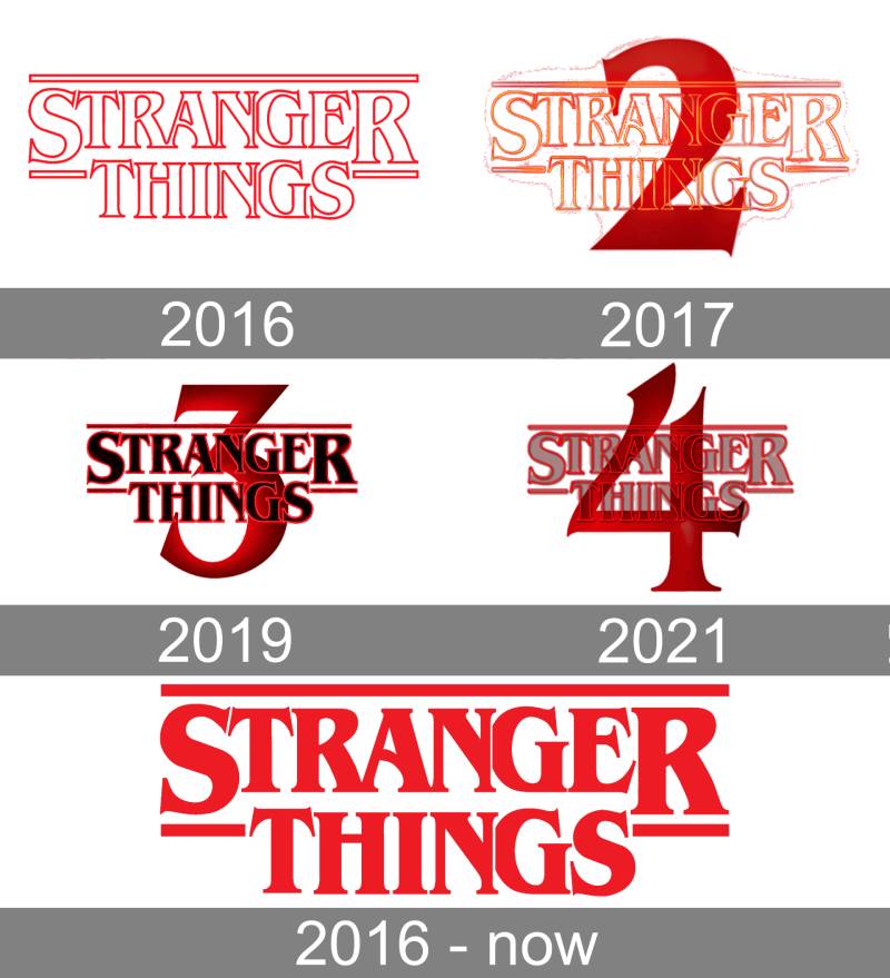
The Stranger Things logo has stayed remarkably consistent since 2016. Unlike most entertainment properties that go through dramatic redesigns, this one has only seen subtle seasonal tweaks while keeping the ITC Benguiat foundation untouched across all four seasons.
Original Stranger Things Logo (2016)
Years Active: 2016 to present (core design unchanged)
The original version dropped with Season 1 and set the standard. Clean red Benguiat Bold letterforms against pitch black. The glow effect was relatively subtle compared to later versions.
Imaginary Forces created the title sequence after experimenting with dozens of font options. They landed on Benguiat because it immediately triggered the right associations. Old paperback covers. VHS rental boxes. That specific kind of 1980s dread.
The letters animate into position during the opening credits, sliding and locking together like pieces of a puzzle. That animation became almost as iconic as the letterforms themselves.
Culturally, it hit at exactly the right moment. The 80s nostalgia wave was building, and this logo became its visual anchor.
Season 2 Variant (2017)
Years Active: 2017 (promotional period)
The core wordmark stayed the same. What changed was the surrounding treatment. Marketing materials leaned into a deeper, more ominous red glow with heavier atmospheric effects.
A “2” appeared beneath the main title in some promotional versions, using the same Benguiat typeface. The saturation on the red was pushed slightly higher in key art.
This was the season that proved the logo had staying power. No redesign needed. Just context shifts.
Season 3 Variant (2019)
Years Active: 2019 (promotional period)
Season 3 brought the most noticeable visual departure, not in the logo itself, but in how it was used. Promotional materials introduced brighter, almost neon-tinged color treatments reflecting the season’s summer setting.
Some posters placed the logo against vibrant blues and teals instead of the standard black. The red letterforms stayed, but the surrounding palette got a lot more playful.
The “3” numeral matched the Benguiat styling. Your mileage may vary on whether you consider this a “new” logo or just smart seasonal adaptation. I’d call it the latter.
Season 4 Variant (2022)
Years Active: 2022 (promotional period)
Back to darkness. Season 4’s marketing stripped away the brighter elements from Season 3 and returned to a more menacing presentation. The glow effect got sharper, more defined.
Some teaser materials cracked and fractured the letterforms, suggesting the Upside Down’s growing influence. But the base wordmark? Still Benguiat. Still red. Still stacked left.
At this point, four seasons in, the logo had become one of the most recognizable title treatments in streaming history.
Season 5 (Upcoming)
Early promotional materials for the final season suggest the wordmark will remain consistent. Teaser imagery has shown the familiar red letters, this time with what appears to be a slightly distressed or deteriorating texture.
Which makes sense. The story is ending. Let the logo reflect that.
What Do the Design Elements of the Stranger Things Logo Mean?

Every piece of this logo points backward in time. The typography, the color, the glow effect, they all work together to trigger a very specific set of cultural memories tied to 1980s horror and science fiction media.
Why Did the Creators Choose These Specific Colors?
The primary red (#BE1B1B) pulls directly from color psychology associations with danger, urgency, and the supernatural. Red has been the go-to color for horror branding for decades. It works.
The glowing variation (#E50914 to #FF0000) adds a luminous quality that references neon signage and the Netflix brand red simultaneously. Whether that overlap was intentional is debatable. But it’s there.
Pure black (#000000) as the background does exactly what you’d expect. It creates maximum contrast, makes the red pop harder, and sets an immediate mood of darkness and mystery.
The color palette is deliberately narrow. Two colors, basically. That restraint is part of why it works so well at any size, on any surface.
What Typography Style Is Used in the Stranger Things Logo?
ITC Benguiat Bold is the serif font behind the wordmark. Ed Benguiat designed the original typeface in 1977 for the International Typeface Corporation.
It’s a high-contrast serif with exaggerated thick-thin stroke variation, distinctive ball terminals, and slightly flared serifs. The x-height is generous, which keeps it readable even at smaller sizes.
Before Stranger Things, Benguiat was mostly known from Stephen King book cover designs and the Choose Your Own Adventure series. The show brought it back from near-obscurity.
The leading between “STRANGER” and “THINGS” is tight, creating a compact, block-like shape that reads as a single unit rather than two separate words.
What Are the Hidden Meanings in the Stranger Things Logo?
The letter animation in the title sequence is the big one. Letters slide into place from different directions, like puzzle pieces assembling themselves. That mirrors the show’s plot structure, where scattered clues gradually connect.
The glow effect isn’t just decorative. It suggests something emerging from darkness, which is literally the show’s premise.
Some fans have pointed out that the stacked alignment creates a visual resemblance to a doorway or portal. The Duffer Brothers haven’t confirmed that reading, but it tracks with the Upside Down concept.
Look, some of this might be overanalysis. But good design invites that kind of reading, whether the designer planned every detail or not.
How Does the Stranger Things Logo Compare to Competitor Logos?
In the streaming horror space, this logo stands apart because of its commitment to retro authenticity. Most competitors lean modern. Stranger Things went the other direction and it paid off.
The The Walking Dead logo uses a distressed, decaying sans-serif treatment that signals post-apocalyptic grit. Totally different vibe, different era of horror being referenced.
The American Horror Story logo changes dramatically each season, which is the opposite approach. Stranger Things picked one look and committed.
Over on streaming competitors, the Squid Game logo went with a geometric, almost childlike simplicity that reflects its own themes. And The Boys logo uses a bold, punchy sans-serif that feels deliberately modern and aggressive.
What makes Stranger Things different is that its emphasis isn’t on looking current. It’s on looking timeless by looking dated. That’s a tricky thing to pull off, and most shows that tried to copy it failed.
Other genre shows worth comparing: the Game of Thrones logo used metallic, medieval-inspired letterforms that felt like artifacts from its own world. Peaky Blinders went with an Art Deco-influenced design matching its time period. Different genres, but the same basic idea of letting the logo do worldbuilding.
What Are the Technical Specifications of the Stranger Things Logo?

Official Color Codes
- Primary Red: Hex: #BE1B1B | RGB: (190, 27, 27) | CMYK: (0, 86, 86, 25)
- Glow Red (Bright): Hex: #E50914 | RGB: (229, 9, 20) | CMYK: (0, 96, 91, 10)
- Maximum Red (Glow Peak): Hex: #FF0000 | RGB: (255, 0, 0) | CMYK: (0, 100, 100, 0)
- Background Black: Hex: #000000 | RGB: (0, 0, 0) | CMYK: (0, 0, 0, 100)
- Alternate White Version: Hex: #FFFFFF | RGB: (255, 255, 255) | CMYK: (0, 0, 0, 0)
Dimensions and Proportions
The logo uses a roughly 2.5:1 aspect ratio in its standard horizontal configuration. “STRANGER” sits on top, slightly wider than “THINGS” below it, with both words left-aligned to create a clean vertical edge on the left side.
For web design and digital use, Netflix maintains minimum size requirements to keep the kerning legible. The fine serifs of Benguiat can collapse at very small sizes, so there’s a floor below which the logo shouldn’t be reproduced.
Clear space around the logo typically equals the height of the “S” in “STRANGER” on all sides. This keeps the mark from feeling cramped against other elements.
For print reproduction, a minimum DPI of 300 is standard. The glow effect requires careful handling in print design contexts since that luminous quality doesn’t translate directly from screen to paper without gradient adjustments.
The wordmark is primarily distributed as vector graphics for scalability, though bitmap versions in JPEG and PNG formats are used for digital and social media contexts where the glow effect needs to be baked in at the pixel level.
What Cultural Impact Has the Stranger Things Logo Had?
This logo did something few TV title designs have ever managed. It made a typeface famous again. ITC Benguiat went from a dusty relic to one of the most searched-for fonts on the internet within months of the show’s premiere.
Fan-made logo generators exploded across the web. “Stranger Things text generator” became a hugely popular search term. People were typing their names, their band names, their pet’s names into these tools. That level of public engagement with a piece of typographic design is basically unheard of.
The design influenced an entire wave of 80s-inspired branding across industries. Restaurants, breweries, clothing brands, indie games, they all started reaching for that retro serif-with-a-glow look. Some pulled it off. Most didn’t.
Merchandise sales proved just how much the logo itself carried commercial weight. You could slap those red letters on a black t-shirt with zero other design elements and it would sell. That’s the kind of brand recognition most tech company logos and film company logos spend decades trying to build.
How Does the Stranger Things Logo Fit Into the Overall Brand Identity?
The logo sits at the center of a carefully constructed visual system. Every piece of Stranger Things branding connects back to the same 1980s reference points that the wordmark establishes.
Netflix uses the logo as the anchor for all brand guidelines related to the show. Season-specific key art, social media assets, merchandise templates, and partnership materials all start with the wordmark and build outward.
The brand style guide extends beyond the logo into a complete design system. The color theory stays consistent, reds and blacks dominate with occasional cool-toned accents for specific seasons. Photography treatments lean toward film grain and warm tungsten lighting. Even social copy adopts a tone that matches what the logo promises.
The motion graphics in the title sequence tie everything together. That opening animation isn’t just a credit sequence. It’s the brand identity in motion, reinforcing the same feelings the static logo creates.
Merchandise design follows a clear visual hierarchy with the logo at the top. Licensed products use the wordmark as the primary identifier, supported by character art and show imagery as secondary elements.
How Should the Stranger Things Logo Be Used?
Netflix controls logo usage tightly through their licensing agreements. If you’re a licensed partner, you’ll receive official assets with detailed guidelines. If you’re not, well, that’s where trademark law comes in.
Official usage rules include:
- Never alter the proportions, colors, or letter arrangement of the wordmark
- Maintain required clear space around the logo at all times
- Use only approved color versions (red on black, white on black, or all-black for specific print applications)
- Don’t add effects, shadows, or outlines beyond what’s provided in official asset packages
- Don’t recreate the logo using the raw Benguiat font, since the official version includes custom modifications
Official logo files are distributed through Netflix’s partner portal for licensed manufacturers, media outlets, and promotional partners. The general public doesn’t have access to official vector files.
Regarding font licensing, it’s worth knowing that ITC Benguiat itself is available for purchase through standard font distributors. But using it to create a Stranger Things-style logo for commercial purposes will run into trademark issues fast. The specific combination of typeface, color treatment, glow effect, and layout arrangement is protected.
Fan art exists in a gray area. Netflix has been relatively tolerant of non-commercial fan creations, but anything sold for profit without a license is technically infringement. Your mileage may vary on enforcement, but the legal exposure is real.
FAQ on The Stranger Things Logo
What Font Is Used in the Stranger Things Logo?
The Stranger Things title uses ITC Benguiat Bold, a serif typeface designed by Ed Benguiat in 1977. It was originally popular on 1980s horror novel covers and sci-fi paperbacks.
Imaginary Forces selected it specifically for those retro associations. The show basically rescued this iconic font from obscurity.
Who Designed the Stranger Things Logo?
Imaginary Forces, a title design studio based in Los Angeles, created the logo and opening title sequence. They tested dozens of lettering options before settling on Benguiat.
The studio is known for crafting cinematic title cards across film and television. This one became their most recognized work.
What Do the Colors in the Stranger Things Logo Mean?
The red glowing text signals danger and the supernatural. It pulls from decades of horror genre branding where red equals threat.
Black provides total contrast and sets an immediate dark mood. The narrow monochrome color approach keeps the design focused and instantly readable.
Can I Use the Stranger Things Logo for My Own Project?
Not commercially. Netflix holds the trademark. The specific combination of typeface treatment, glow effect, and layout is protected intellectual property.
Fan art for personal, non-commercial use generally gets a pass. But selling anything with this title design without a license is infringement.
Has the Stranger Things Logo Changed Between Seasons?
The core wordmark has stayed the same since 2016. Each season tweaks the surrounding promotional art, but the red Benguiat letterforms remain untouched.
Season 3 pushed brighter, neon-tinged colors in marketing. Season 4 went darker again. The base logo never changed.
Why Does the Stranger Things Logo Look Like Old Stephen King Book Covers?
Because that’s exactly the point. The Duffer Brothers wanted the show’s visual identity to reference 1980s pop culture, and Benguiat appeared on many Stephen King paperbacks from that era.
It’s a deliberate callback. The font psychology triggers nostalgia in viewers who grew up with those covers.
What Are the Official Stranger Things Logo Colors?
Primary red is #BE1B1B. The glow peaks at #FF0000. Background is pure black, #000000.
An alternate white version (#FFFFFF) exists for specific print applications. The palette is deliberately limited to keep the hue range tight and the brand recognition high.
How Do I Make a Stranger Things-Style Text Effect?
Start with ITC Benguiat Bold in all caps. Set the text in red against a black background. Add an outer glow in a brighter red.
CSS text-shadow properties or Photoshop’s outer glow layer style both work. Plenty of free Stranger Things text generators exist online too.
Is the Stranger Things Logo Available as a Vector File?
Official vector files are only available through Netflix’s partner portal for licensed use. The public can find PNG versions, but not official SVG or AI files.
For clean scaling, you’d need display font access to Benguiat and permission to recreate the design. Unauthorized recreation for commercial use isn’t legal.
What Makes the Stranger Things Logo So Recognizable?
Simplicity. Two words, one color, black background. The glyph shapes in Benguiat are distinctive enough to register even at a glance.
The animated title sequence cemented it further. That slow letter assembly became a cultural moment, turning a static wordmark into something people feel connected to on a deeper level.
Conclusion
The Stranger Things logo proved that a Netflix series could build the kind of brand recognition usually reserved for decades-old franchises. Red Benguiat letters on black. That’s it. And it worked better than anyone expected.
Imaginary Forces made a typographic hierarchy decision that defined an entire era of storytelling in design. The 80s horror aesthetic wasn’t just a style choice. It was the show’s identity, compressed into two words.
With Season 5 approaching, the wordmark remains unchanged. That kind of consistency is rare in entertainment branding.
Few video game logos or TV title treatments have sparked this level of cultural response. Took me a while to think of another example that even comes close. Maybe the Friends logo, but that took years to reach the same status.

Renowned for his expertise in logo design and visual branding, Bogdan has developed a multitude of logos for various clients.
His skills extend to creating posters, vector illustrations, business cards, and brochures. Additionally, Bogdan's UI kits were featured on marketplaces like Visual Hierarchy and UI8.
He also wrote in the past years on sites like Design Your Way, WebDesignerDepot, WPDean, Designmodo, Speckyboy, Slider Revolution, and more.
- The Windsurf Logo History, Colors, Font, And Meaning - 10 October 2026
- How to Remove Background From Product Photos (No Photoshop) - 10 October 2026
- How Designers can Build a Stronger Online Creative Identity - 9 October 2026

Bogdan Sandu is a seasoned designer who has been designing websites since 2008. Renowned for his expertise in logo design and visual branding, Bogdan has developed a multitude of logos for various clients. His skills extend to creating posters, vector illustrations, business cards, and brochures. Additionally, Bogdan's UI kits were featured on marketplaces like Visual Hierarchy and UI8. He also wrote in the past years on sites like Design Your Way, WebDesignerDepot, WPDean, Designmodo, Speckyboy, Slider Revolution, and more.
You Might Also Like