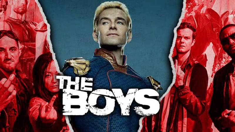
The Boys logo is one of the most recognizable brand marks in modern streaming television. It represents Amazon Prime Video’s hit anti-superhero series based on the comic book created by Garth Ennis and Darick Robertson. The distressed, bold lettering captures the raw, rebellious tone that separates The Boys from every polished superhero logo out there.
The series first appeared as a comic in October 2006 under WildStorm, a DC Comics imprint. After six issues, it moved to Dynamite Entertainment, where it ran until 2012 across 72 issues. Amazon adapted it into a TV series in July 2019, and the logo became a cultural shorthand for dark, adult superhero content almost overnight.
The current TV version features custom distressed lettering with blood-red or white text against dark backgrounds. Sony Pictures Television and Amazon Studios developed it collaboratively, pulling from Darick Robertson’s original comic artwork. The logo has gone through at least two main iterations: the raw comic version (2006) and the streamlined television adaptation (2019).
What Is The Boys Logo?
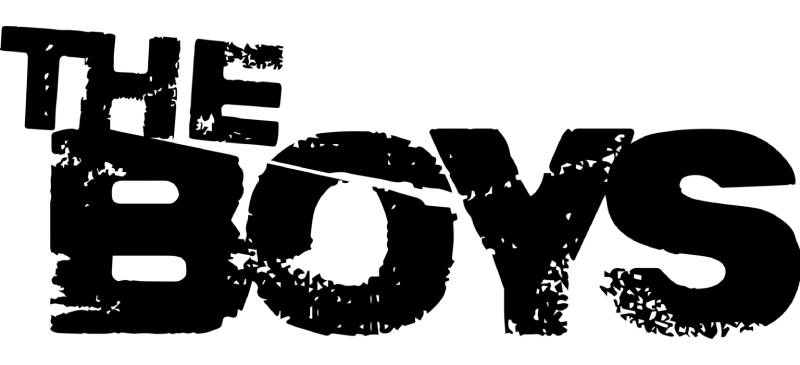
The Boys logo is a custom wordmark featuring bold, uppercase distressed lettering that spells out the series title across two levels. It was developed in 2019 by Amazon Studios’ brand team in collaboration with Sony Pictures Television designers, drawing from Garth Ennis and Darick Robertson’s original comic book aesthetics. The core symbolism is rebellion, imperfection, and anti-establishment power.
Here’s what defines the logo at a technical level:
- Design Type: Custom wordmark with distressed treatment. No symbol, no emblem, no mascot. Just text that looks like it survived a fight.
- Primary Elements: The word “The” sits on a tilted line in smaller letters, angled downward. “BOYS” appears below in large, weathered capital letters. The “B” shows cuts, and the “O” has visible cracks. Blood splatter effects appear in many versions.
- Official Introduction Date: The comic logo debuted in October 2006 with WildStorm’s first issue. The TV adaptation logo launched in July 2019 with Amazon Prime Video’s Season 1.
- Designer/Agency: The original comic logo was created as part of Darick Robertson’s cover artwork. The TV version was developed through Amazon Studios and Sony Pictures Television, with input from Seth Rogen and Evan Goldberg’s Point Grey Pictures.
- Trademark Status: Amazon Prime Video holds trademark rights to the TV series logo. Commercial or personal use requires permission from Sony Pictures Television and Amazon Studios.
- Color Palette: Primary black (#000000), blood red (deep crimson, approximately #B30000), and white (#FFFFFF). The red functions as the accent color with splatter effects in promotional materials.
- Usage Context: Streaming platform thumbnails, promotional posters, merchandise, social media graphics, title cards, motion graphics in opening sequences, and physical products like pins and apparel.
How Has The Boys Logo Evolved Over Time?
The Boys logo has shifted from raw comic book lettering to a polished-but-still-gritty television wordmark. The comic version (2006) used jagged, uneven white or red letters. The TV adaptation (2019) cleaned up the edges while keeping the distressed personality. Each season has introduced subtle tonal changes, with later seasons pushing darker textures and deeper crimson shades.
Original Comic Logo (2006-2012)
Years Active: October 2006 to November 2012, across 72 issues plus spin-off series like Herogasm and Highland Laddie.
The original lettering was raw. Jagged. Almost aggressive in how unpolished it looked.
Darick Robertson handled the cover art, and the logo sat right in the thick of his illustrations. White or blood-red letters against dark, chaotic backgrounds. The letters had rough, uneven edges that matched the comic’s confrontational style.
There was no glossy finish. No corporate shine. That was the point.
The color scheme ran mostly stark white on black, with red variants showing up on certain covers and collected editions. WildStorm published the first six issues before DC Comics got uncomfortable with the anti-superhero content and cancelled it. Dynamite Entertainment picked it up, and the logo stayed largely the same.
Culturally, the comic logo stood for something specific. It said: this is not your typical cape story. The scratchy, almost hand-drawn quality of the letters told readers what they were getting into before they turned a single page. That kind of storytelling through design is tricky to pull off, but Robertson nailed it.
Television Series Logo (2019-Present)
Years Active: July 2019 to present, spanning multiple seasons on Amazon Prime Video.
When Eric Kripke adapted the series for television, the logo needed a rethink. Not a complete overhaul. More like taking the comic’s energy and making it work on screens, billboards, and tiny streaming thumbnails.
The TV version keeps the two-level layout. “The” still tilts downward in smaller text. “BOYS” still dominates in large capitals. But the letters are cleaner. Bolder. There’s a slight glossy finish that nods to Hollywood production values.
Sony Pictures Television worked with Amazon Studios on the design. Seth Rogen’s Point Grey Pictures pushed for something grittier than the initial clean sans-serif concepts the team explored early on. Good call, honestly.
The blood-red splatter effect became a signature element of the TV logo. It adds that visceral edge the comic always had, but in a way that pops on digital platforms.
The key change from the comic version? Precision. The distressing is still there, but it feels deliberate rather than chaotic. Every crack and abrasion in the lettering was placed with intent. The result is a logo that reads as rebellious but also professional enough for a major streaming platform.
By Season 4, teasers started showing darker textures and deeper red tones, hinting at where the story was heading.
What Do the Design Elements of The Boys Logo Mean?

Every part of The Boys logo carries weight. The tilted “The” represents the team’s lack of superpowers and their off-kilter existence. The distressed letters mirror the physical and emotional damage the characters have endured. And the blood-red color ties directly to the violence running through every episode and issue.
Why Did The Boys Choose These Specific Colors?
The color palette is tight. Three colors do all the heavy lifting.
Black (#000000) serves as the primary background. It creates intensity and aggression. In terms of color psychology, black signals secrecy and darkness, fitting for a show where heroes hide their true nature behind polished public personas.
Blood Red (approximately #B30000) is the accent color. It represents violence, rebellion, and the literal bloodshed that defines the series. This deep crimson shade separates The Boys from the brighter, more optimistic reds you see in traditional red logos used by mainstream superhero brands.
White (#FFFFFF) appears in alternate versions of the logo, usually the comic iteration. It provides maximum contrast against dark backgrounds and, symbolically, hints that some good still exists in the series’ morally gray world.
The deliberate clash between black and red creates a complementary tension that grabs attention. It does well on everything from poster prints to tiny mobile thumbnails.
What Typography Style Is Used in The Boys Logo?

The logo uses a custom distressed typeface built specifically for the show. It closely resembles “Charlie Don’t Surf!”, a grungy font created by Finnish designer Juha Korhonen (junkohanhero) in 2014.
Forum experts on DaFont confirmed the match. Slightly modified in the actual logo, but the base typography is unmistakable everywhere else in the show’s marketing materials.
The lettering is all uppercase, bold, with visible wear patterns. Each character has unique abrasions that suggest physical damage. The x-height runs tall, which makes the text feel imposing even at smaller sizes. Letter spacing is relatively tight, adding density and force to the overall wordmark.
What Are the Hidden Meanings in The Boys Logo?
Look, most people glance at the logo and think “cool, gritty text.” But there’s more going on.
The tilted “The” partially overlaps the “B” in “BOYS.” That overlap isn’t accidental. It suggests the team operates in the shadows of larger powers. The downward angle of “The” has been interpreted as representing how each character’s childhood was set on a path toward tragedy.
The abrasions on the letters parallel the scars of the characters themselves. Kimiko’s silence. Frenchie’s past. Mother’s Milk’s dependency. The shape psychology of those broken, angular forms triggers associations with danger and instability, which is… pretty much the entire show.
How Does The Boys Logo Compare to Competitor Logos?

The Boys logo sits at the opposite end of the spectrum from traditional superhero branding. Where Marvel and DC use clean, corporate wordmarks with precise geometry, The Boys leans into damage and imperfection. That gap is intentional.
The closest comparison in tone might be The Walking Dead logo, which also uses distressed lettering to signal dark content. But The Walking Dead’s approach is more horror-focused. The Boys feels more punk. More underground.
Within the Amazon Prime Video lineup, the logo stands out against cleaner designs like those used for The Marvelous Mrs. Maisel or Jack Ryan. That visual hierarchy is clear when you’re scrolling through the platform.
Other film and entertainment company logos tend to favor polish and precision. HBO‘s clean three-letter mark, for example, or the established weight of the Paramount mountain. The Boys breaks from all of that. And that break is exactly what makes it work.
Compare it to other TV show logos in the adult content space. Stranger Things uses retro-inspired serif lettering that leans nostalgic. Breaking Bad used clean periodic-table styling. Game of Thrones went with elegant, medieval-inspired type. The Boys chose violence. (In design terms, at least.)
What Are the Technical Specifications of The Boys Logo?
Here are the technical details based on available information:
Official Color Codes
- Primary – Black: Hex: #000000 | RGB: (0, 0, 0) | CMYK: (0, 0, 0, 100)
- Accent – Blood Red: Hex: #B30000 (approximate) | RGB: (179, 0, 0) | CMYK: (0, 100, 100, 30)
- Alternate – White: Hex: #FFFFFF | RGB: (255, 255, 255) | CMYK: (0, 0, 0, 0)
Note: Amazon Studios has not released an official public style guide with exact Pantone codes for The Boys logo. The red shade used in promotional materials varies slightly between seasons and mediums. The hex codes above are based on commonly referenced values from design community analysis.
Dimensions and Proportions
The logo’s aspect ratio sits around 2.5:1 (width to height), based on the SVG file hosted on Wikimedia Commons (nominally 2,500 x 975 pixels). “The” occupies roughly one-third of the total height in the upper portion, while “BOYS” takes up the remaining two-thirds.
Minimum size requirements and clear space specifications fall under Amazon Studios’ internal brand guidelines, which are not publicly available. For any official use, you’d need to contact Sony Pictures Television’s licensing department directly.
The logo is distributed as vector graphics (SVG format) for scalability and in bitmap formats like PNG for digital use. The vector version ensures the distressed textures and fine crack details stay crisp at any size, from a billboard to a phone screen. For print merchandise, the DPI recommendation would follow standard practice (300 DPI minimum for high-quality output).
What Cultural Impact Has The Boys Logo Had?
The Boys logo went from a TV title card to a full-blown meme format in less than a year after the show launched. Fans started pairing the red logo animation with songs like “Bones” by Imagine Dragons, turning it into a social media trend about stereotypical male behavior. The logo became shorthand for a whole category of internet humor.
Beyond memes, the logo’s aggressive typographic style influenced how other streaming shows approach their visual identity. It proved that distressed, imperfect branding can work at a commercial scale. Not everything needs to look like a tech company logo to be successful.
The show earned six Emmy nominations, and the logo played its part in building that recognition. When you see those battered red letters, you know what you’re getting. That instant association between visual mark and content tone is something most brands spend years trying to achieve.
Merchandise featuring the logo sells consistently. T-shirts, pins based on Darick Robertson’s original artwork, phone cases, posters. The logo translates well across physical products because its bold simplicity holds up at any size.
How Does The Boys Logo Fit Into the Overall Brand Identity?
The Boys logo doesn’t exist in isolation. It sits at the center of a larger brand system that includes Vought International’s fictional corporate branding, the polished logos of The Seven, and the scrappy underground aesthetic of the titular team. The logo ties the whole thing together by being the visual opposite of Vought’s clean, corporate identity. That contrast in design tells you everything about the show’s core conflict before a single scene plays.
The relationship between The Boys’ branding and Vought’s is basically a built-in lesson in how graphic design principles can drive narrative. One side is pristine, corporate, polished. The other is cracked, bleeding, and unapologetically rough. Eric Kripke’s production team understood that these two visual languages needed to coexist for the satire to land.
Gen V, the spinoff series, carries its own visual identity but stays connected to The Boys’ brand universe. The franchise has expanded into animated content too, with The Boys Presents: Diabolical. Across all these extensions, the core distressed typographic DNA of the original logo remains a through-line.
The logo also connects to Garth Ennis’s broader body of work and the punk aesthetics that defined his comics. If you’ve read Preacher, you can see the same design sensibility at play. Street-level. Raw. Anti-corporate.
How Should The Boys Logo Be Used?
If you’re thinking about using The Boys logo for anything, here’s what you need to know.
Don’t use it commercially without permission. Amazon Prime Video owns the trademark. Sony Pictures Television handles licensing. Using the logo on merchandise, marketing materials, or any product without explicit written consent puts you at legal risk. That’s not a suggestion. It’s the reality of intellectual property law.
Fan art exists in a gray area. Most fan creations using the logo for non-commercial purposes have been tolerated. But tolerance isn’t the same as legal permission. If your project could generate revenue, get proper licensing.
Where to access official assets: Amazon Studios provides approved logo files to authorized media partners. For press use, official high-resolution versions are typically available through Amazon’s press center. Public downloads floating around the internet (PNG, SVG) are unofficial reproductions, not licensed files.
Usage guidelines: While Amazon’s full brand style guide for The Boys isn’t public, standard logo design principles apply. Don’t alter the proportions. Don’t change the colors without authorization. Don’t place it on busy backgrounds where the distressed details get lost. Keep adequate clear space around it.
The logo’s distressed nature makes it a bit more forgiving than ultra-clean marks when it comes to background placement. But you still want to respect the original design intent. Placing it on a bright, cheerful background, for example, would completely undermine what it’s supposed to communicate.
For print applications, make sure you’re working with vector files to preserve the fine crack details in the lettering. Rasterized versions can lose that texture at larger print sizes, and then the whole thing just looks like a blurry mess.
FAQ on The Boys Logo
What font is used in The Boys logo?
The Boys logo uses a custom distressed typeface closely based on “Charlie Don’t Surf!” by Finnish designer Juha Korhonen. The TV series version has slight modifications, but the base lettering matches across all Amazon Prime Video promotional materials and merchandise.
Who designed The Boys TV series logo?
Sony Pictures Television and Amazon Studios collaborated on the design. Seth Rogen and Evan Goldberg’s Point Grey Pictures pushed for grittier options over initial clean concepts. The team drew directly from Darick Robertson’s original comic book cover artwork.
What do the colors in The Boys logo mean?
Black represents secrecy and the dark side of power. The blood-red accent signals violence and rebellion. White appears in alternate versions, suggesting that some good persists in the show’s morally complicated world. The color theory behind it is deliberately aggressive.
Why is The Boys logo distressed and cracked?
The weathered lettering mirrors the physical and emotional damage the characters carry. Every abrasion on those letters represents broken people fighting corrupt superheroes. It’s anti-hero branding at its most direct, rejecting the polished look of traditional serif title treatments.
Is The Boys logo copyrighted?
Yes. Amazon Prime Video holds full trademark rights. Any commercial use requires explicit permission from Sony Pictures Television and Amazon Studios. Fan art for personal, non-commercial purposes has generally been tolerated, but that’s not the same as legal clearance.
What is the difference between The Boys comic logo and the TV logo?
The comic version by Darick Robertson used raw, jagged white or red letters with rough edges. The TV adaptation cleaned up the linework with a slight glossy finish while keeping the distressed personality. Both use the tilted “The” over large “BOYS” capitals.
Can I download The Boys logo for free?
Unofficial PNG and SVG versions exist online for personal reference. But these aren’t licensed files. Official high-resolution assets are only available through Amazon Studios’ press center or Sony Pictures Television’s licensing department for authorized partners.
Why does “The” tilt downward in The Boys logo?
The downward angle represents the team’s lack of superpowers and their disadvantaged position against Vought International’s superheroes. It also suggests how each character’s life was set on a downward path from childhood. Subtle, but it works once you notice it.
Has The Boys logo changed between seasons?
The core design stays consistent. But each season introduces subtle shifts in texture and color tone. Season 4 teasers showed deeper crimson shades and darker surface textures, hinting at escalating stakes in the story.
What makes The Boys logo different from other superhero show logos?
Most superhero branding goes clean and corporate. The Boys does the opposite. Its emphasis on imperfection and grit sets it apart from polished marks like those used by Marvel or DC. That raw, punk-inspired approach to display lettering made it instantly recognizable on Amazon Prime Video’s streaming platform.
Conclusion
The Boys logo proves that imperfection can be a branding strength. From Garth Ennis and Darick Robertson’s 2006 comic debut through Eric Kripke’s Amazon Prime Video adaptation, that distressed wordmark has become one of the most recognized title treatments in streaming television.
The custom lettering, blood-red color saturation, and cracked typographic elements all work together to reject the sanitized look of mainstream superhero branding.
It’s a design that matches its content. Raw, confrontational, and built to stand out in a crowded field of entertainment logos.
Whether you’re studying it for design inspiration or just appreciate how well it captures the show’s anti-hero identity, the craftsmanship behind every weathered letter holds up.

Renowned for his expertise in logo design and visual branding, Bogdan has developed a multitude of logos for various clients.
His skills extend to creating posters, vector illustrations, business cards, and brochures. Additionally, Bogdan's UI kits were featured on marketplaces like Visual Hierarchy and UI8.
He also wrote in the past years on sites like Design Your Way, WebDesignerDepot, WPDean, Designmodo, Speckyboy, Slider Revolution, and more.
- The Windsurf Logo History, Colors, Font, And Meaning - 10 October 2026
- How to Remove Background From Product Photos (No Photoshop) - 10 October 2026
- How Designers can Build a Stronger Online Creative Identity - 9 October 2026

Bogdan Sandu is a seasoned designer who has been designing websites since 2008. Renowned for his expertise in logo design and visual branding, Bogdan has developed a multitude of logos for various clients. His skills extend to creating posters, vector illustrations, business cards, and brochures. Additionally, Bogdan's UI kits were featured on marketplaces like Visual Hierarchy and UI8. He also wrote in the past years on sites like Design Your Way, WebDesignerDepot, WPDean, Designmodo, Speckyboy, Slider Revolution, and more.
You Might Also Like