The Breaking Bad logo is one of those designs that stuck with people long after the credits rolled. It first appeared in January 2008 when AMC launched the crime drama series created by Vince Gilligan. The design combines periodic table elements with bold lettering to connect directly to the show’s chemistry-driven plot. Set against a dark background, the green and white wordmark became a cultural marker for television branding done right.
Within the broader history of entertainment branding, this logo sits alongside a small group of TV title cards that became bigger than the shows themselves. Think about how few television designs actually work as standalone symbols. The Breaking Bad title card pulled it off by tying science to storytelling in a single visual hit.
The current (and only) version debuted in 2008 and never changed across five seasons. That kind of consistency is rare. The logo was built around the Cooper BT Medium typeface, styled with periodic table references for the letters “Br” (bromine, element 35) and “Ba” (barium, element 56). AMC approved the final design after multiple revision rounds before the pilot aired.
Breaking Bad premiered on January 20, 2008, and ran through September 29, 2013. Across 62 episodes and five seasons, the logo appeared unchanged on every title card, piece of merchandise, and promotional material Sony Pictures Television produced.
What Is the Breaking Bad Logo?
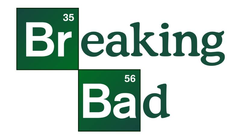
The Breaking Bad logo is a two-line wordmark featuring the show’s title in a modified Cooper BT Medium typeface, with the letters “Br” and “Ba” styled as periodic table element cells for bromine and barium. It debuted on AMC in January 2008 and was designed under the creative direction of Vince Gilligan’s production team.
Design type: Wordmark with integrated scientific symbols. It functions as a combination mark since the periodic table squares act as embedded graphic elements inside the text itself.
Primary elements: Two green rectangular boxes resembling periodic table cells contain the letters “Br” (with atomic number 35) and “Ba” (with atomic number 56). The remaining letters complete the words “Breaking” and “Bad” in a smooth, rounded serif typeface.
Official introduction date: January 20, 2008, coinciding with the premiere of Season 1 on AMC.
Designer/Agency: The logo was developed under the creative oversight of show creator Vince Gilligan and AMC’s in-house branding team. Some sources credit graphic designer Talia Ewing as a contributor to the final design.
Trademark status: The Breaking Bad name and logo are trademarked properties of Sony Pictures Television. Commercial use requires licensing agreements through Sony’s intellectual property division.
Color palette: The primary palette uses green (#026635 or close variations) for the periodic table cells and white (#FFFFFF) for the element letters, set against black or very dark backgrounds. The remaining title text appears in off-white or light gray depending on the application.
Usage context: The logo appears on title cards during the show’s opening sequence, all official merchandise (t-shirts, posters, mugs), DVD and Blu-ray packaging, streaming platform thumbnails on Netflix and AMC+, and promotional materials for related properties like El Camino and Better Call Saul.
How Has the Breaking Bad Logo Evolved Over Time?

The Breaking Bad logo never went through a redesign. It launched with the pilot in January 2008 and stayed identical through the series finale in September 2013.
That five-year stretch without a single change is actually pretty unusual for television branding. Most shows tweak their title cards between seasons, even slightly. Breaking Bad didn’t.
The Original Breaking Bad Logo (2008-2013)
Years active: 2008 to 2013, covering all five seasons and 62 episodes.
Design description: A stacked two-line wordmark reading “Breaking” on top and “Bad” below. The first two letters of each word (“Br” and “Ba”) sit inside green rectangular boxes that mimic periodic table element cells. Small atomic numbers (35 and 56) appear in the upper right corners of each box. The rest of the lettering uses a soft, rounded serif style.
Color scheme: Green boxes with white lettering for the element symbols. The non-element portions of the text appear in light tones (white to light gray) against the show’s dark backgrounds.
Designer: Created under the direction of Vince Gilligan’s production team with AMC’s branding department. The design went through three revision rounds before AMC approved the final version.
Context: The logo needed to communicate the core premise instantly. A chemistry teacher turned drug manufacturer. The periodic table reference did exactly that without being heavy-handed about it.
Key detail: The atomic numbers aren’t just decoration. Bromine is element 35 and barium is element 56. Some fans have noted these numbers are close to the ages of the show’s two leads, Bryan Cranston and Aaron Paul, when filming began. Whether that’s intentional or coincidence depends on who you ask.
Cultural significance: The logo became a template for how entertainment properties could bake narrative into their branding. It launched hundreds of fan-made name generators where people could render their own names in the Breaking Bad periodic table style. That kind of audience participation is something most film company logos and TV branding teams dream about.
Post-Series Usage (2013-Present)
After the finale, the logo continued appearing on merchandise, streaming platforms, and anniversary materials. Sony Pictures Television maintained the exact same design for El Camino: A Breaking Bad Movie (2019), though that film added its own sub-branding beneath the original mark.
The Better Call Saul logo took a different visual direction but maintained enough of the periodic table DNA to keep the family connection alive. You can see the influence without it being a copy.
What Do the Design Elements of the Breaking Bad Logo Mean?

Every part of this logo ties back to the show’s central conflict: a chemistry teacher who breaks bad. The periodic table cells represent Walter White’s scientific background. The green color connects to money, greed, and the drug trade. Even the font choice carries weight, pairing academic softness with an underlying edge.
The design works because it doesn’t try to do too much. It picks one concept (chemistry) and commits.
Why Did Breaking Bad Choose These Specific Colors?
Green is the dominant color, and it does a lot of heavy lifting here.
The primary green (#026635) sits in a dark, slightly muted range. Not bright enough to feel playful, not so dark that it disappears on screen. It reads as toxic. Chemical. Dangerous.
From a color psychology standpoint, green connects to money and greed, which maps perfectly onto Walter White’s motivations. But it also signals poison, chemicals, and lab environments. Vince Gilligan’s team used green throughout the show’s visual language, from Walter’s apron in the pilot to the overall production design.
White (#FFFFFF) serves as the secondary color inside the periodic table cells. It provides the contrast needed for readability on dark backgrounds. But it also carries a thematic reference to the character’s surname: White.
The black background creates separation and a sense of darkness that matches the show’s tone. This color palette stays consistent across every piece of official material, from poster designs to streaming thumbnails.
What Typography Style Is Used in the Breaking Bad Logo?

The main text uses Cooper BT Medium, a display typeface originally designed by Oswald Bruce Cooper in 1921. Cooper Black and its variations have soft, rounded serifs that feel approachable but heavy.
The “Br” and “Ba” letters inside the periodic table boxes use a different treatment. These are cleaner, more geometric, often compared to Helvetica Bold. The two-font approach creates internal tension inside the logo itself.
That mix of warm, rounded letterforms with stiff, clinical element boxes is the whole show in miniature. Comfortable domesticity meets cold science. The kerning runs tight throughout, building visual pressure that keeps the eye moving.
What Are the Hidden Meanings in the Breaking Bad Logo?
The atomic numbers are the most discussed detail. Bromine (35) and barium (56) don’t just represent random elements. Both substances have real-world connections to the show’s themes. Bromine is used in flame retardants. Barium shows up in medical imaging. A substance that prevents fire and a substance that reveals what’s hidden inside you.
The two-line stacking of the title creates a visual break between “Breaking” and “Bad.” That physical separation mirrors the character’s split identity. Walter White above, Heisenberg below. At least, that’s how fans have read it.
Whether all of this was planned from day one or emerged organically during the design process, nobody’s said for sure. But the best logos let people find meaning in them. This one gives you plenty to find.
How Does the Breaking Bad Logo Compare to Competitor Logos?

Breaking Bad’s logo stands apart from other prestige TV branding by embedding narrative directly into the typography. Most drama series rely on mood and style alone. This one gives you plot information before you’ve watched a single frame.
The Stranger Things logo, for example, uses the retro ITC Benguiat typeface to trigger 1980s nostalgia. It sets a time period and a feeling, but it doesn’t tell you what the show is about.
Game of Thrones went with ornate, medieval-style lettering that communicates “fantasy” and “power” through sheer weight and decoration. Beautiful work, but it’s about genre, not story.
The Walking Dead logo decays across seasons, which is a clever approach to serial branding. But it’s a trick that only works over time. The Breaking Bad logo communicated everything it needed to from episode one.
Where most TV logos function as genre signals, the Breaking Bad design operates more like a puzzle. It rewards people who look closer, and it does that without sacrificing instant recognition. That combination is tricky to pull off. Few video game logos or entertainment brands manage it at this level.
What Are the Technical Specifications of the Breaking Bad Logo?
Official Color Codes
Primary Green
White (Element Letters)
- Hex: #FFFFFF
- RGB: (255, 255, 255)
- CMYK: (0, 0, 0, 0)
Dark Background
- Hex: #0A0A0A (approximate)
- RGB: (10, 10, 10)
- CMYK: (0, 0, 0, 96)
Some color palette databases list additional greens from the broader show branding. SchemeColor references shades like Dark Moss Green (#093009), Phthalo Green (#0D3E10), and Dark Emerald (#1F6032). These likely come from promotional materials and title sequence gradient effects rather than the core logo itself.
Dimensions and Proportions
The logo uses a roughly 16:9 aspect ratio when rendered for broadcast, fitting standard HD television frames. The vector graphics versions (available in SVG, AI, and EPS formats) scale cleanly from small thumbnails to large billboard applications.
The periodic table boxes maintain consistent proportions relative to the surrounding text. Each green box is approximately the height of the capital letters with slight internal padding. Clear space around the full wordmark should be at least half the height of the “B” in “Bad” on all sides.
For digital use, the logo works down to about 200 pixels wide before the atomic numbers become unreadable. At print resolution (300 DPI), minimum size should be around 1.5 inches wide to maintain all detail.
What Cultural Impact Has the Breaking Bad Logo Had?
The Breaking Bad logo crossed over from TV branding into genuine pop culture territory. Fan communities built name generators, unofficial merch, and social media content around the periodic table concept for years after the show ended.
It also changed how the industry thinks about storytelling through design. Before Breaking Bad, most TV logos were just stylized text. After it, there was a noticeable push toward logos that encoded narrative meaning. You can see the ripple effects in shows that came later.
The design held up across the entire Breaking Bad extended universe. El Camino and Better Call Saul both referenced it while building their own identities. That kind of brand continuity across three separate properties, spanning over a decade, is unusual in entertainment.
Merchandise sales proved the logo’s commercial power. T-shirts, mugs, posters, phone cases, all of it sold (and keeps selling) based largely on the strength of that green-and-white periodic table design. The Guinness World Record for highest-rated TV series, which Breaking Bad earned in 2013, only added to its status as a cultural fixture.
How Does the Breaking Bad Logo Fit Into the Overall Brand Identity?
The logo sits at the center of a tightly controlled brand system managed by Sony Pictures Television. Every official touchpoint connects back to it: the green color palette, the periodic table motif, the Cooper BT typeface, and the chemistry-driven visual language.
AMC’s marketing department extended these elements across episode promos, billboards, digital ads, and social campaigns. The visual hierarchy always placed the logo at the top of any composition, followed by character imagery and episode information below.
Show creator Vince Gilligan was famously deliberate about color throughout the series. Characters wore specific colors to signal their arcs. The logo’s green anchored all of that visual planning. It wasn’t separate from the show’s brand guidelines. It was the starting point.
The consistency paid off. When you see that shade of green paired with a periodic table reference, you think Breaking Bad. No other association. That’s what a strong identity system does. It locks a specific look to a specific feeling, and it doesn’t let go.
How Should the Breaking Bad Logo Be Used?
Official usage rules: Sony Pictures Television controls all commercial use of the Breaking Bad logo. The design should never be modified, recolored, stretched, or partially cropped. The periodic table elements must remain intact and legible in any reproduction.
Where to access official assets: Licensed versions of the logo are available through Sony’s brand licensing portal for approved partners. Vector files in SVG, AI, and EPS formats exist for high-quality reproduction. PNG versions at various resolutions circulate through press kits and official media packages.
Licensing information: Any commercial use (merchandise, print materials, digital products, events) requires a formal licensing agreement with Sony Pictures Television. Fees vary based on product category, distribution volume, and territory. Unauthorized use of the logo on commercial products is a trademark violation.
Trademark protection: The Breaking Bad name, logo, and associated visual elements are registered trademarks. Fan art and editorial use generally fall under fair use provisions, but selling products with the logo without a license will get you a cease-and-desist letter. Fast. Sony has been active in protecting this IP, especially given the logo’s ongoing merchandise value.
If you’re working on a project that references Breaking Bad visually, stick to editorial or transformative use. And honestly, even then, it’s worth checking with a lawyer if there’s any commercial angle involved.
FAQ on The Breaking Bad Logo
What font is used in the Breaking Bad logo?
The main title uses Cooper BT Medium, a display serif designed by Oswald Bruce Cooper in 1921. The “Br” and “Ba” inside the periodic table cells use a cleaner, geometric style similar to Helvetica Bold. A fan-made alternative called Heart Breaking Bad also exists.
What do the green boxes in the Breaking Bad logo mean?
The green squares represent chemical elements from the periodic table. “Br” stands for bromine (element 35) and “Ba” stands for barium (element 56).
They connect directly to Walter White’s chemistry background and the show’s drug production storyline. It’s the whole plot in two letters.
Who designed the Breaking Bad logo?
The logo was developed under Vince Gilligan’s creative direction alongside AMC’s branding team. Some sources credit graphic designer Talia Ewing. AMC approved the final version after three revision rounds before the January 2008 pilot aired on the network.
What are the official colors of the Breaking Bad logo?
The primary green is approximately #026635. White (#FFFFFF) fills the element letters inside the boxes.
Dark black backgrounds (#0A0A0A) complete the palette. The green connects to themes of money, toxicity, and the methamphetamine trade central to the AMC series.
Did the Breaking Bad logo ever change?
No. The logo stayed identical from the 2008 premiere through the 2013 finale. Five seasons, 62 episodes, zero redesigns. That consistency is unusual for television branding and helped build strong recognition across merchandise, streaming thumbnails, and promotional materials.
Can I use the Breaking Bad logo for my own project?
Sony Pictures Television holds the trademark. Any commercial use requires a formal licensing agreement.
Fan art and editorial use generally fall under fair use. But selling products with the logo without permission will get you a cease-and-desist. Sony actively protects this IP.
What is the Breaking Bad name generator?
It’s a fan tool that renders any name in the Breaking Bad periodic table style. Users type their name, and the tool highlights chemical element symbols within it. These generators went viral around 2013 and remain popular on social media today.
How does the Breaking Bad logo compare to other TV show logos?
Most TV logos signal genre or mood. Breaking Bad goes further by encoding plot details into the design itself.
Shows like Stranger Things use retro fonts for nostalgia. Game of Thrones uses ornate lettering for fantasy. Breaking Bad gives you actual story information before you watch a single scene.
What file formats is the Breaking Bad logo available in?
Official versions exist in SVG, AI, EPS, and PNG formats. The vector files scale from small digital thumbnails to large print applications without losing quality. PNG versions at various resolutions are distributed through Sony’s press kits for approved media use.
Why is the Breaking Bad logo considered iconic?
It merged science with storytelling in a way nobody had tried before on a TV title card. The periodic table concept gave fans something to decode, share, and remix.
That interactive quality, plus the show’s critical success and Guinness World Record, turned a simple wordmark into a pop culture symbol that outlived its own series.
Conclusion
The Breaking Bad logo proved that a TV title card can carry as much narrative weight as any scene in the show. Bromine and barium turned two letters into a cultural shorthand that millions still recognize.
Its green color scheme, Cooper BT Medium lettering, and periodic table design stayed unchanged across five seasons on AMC. That kind of discipline in brand identity is rare in entertainment.
From Albuquerque to global merchandise shelves, the design outlasted the series itself. It set a new standard for how television properties approach logo design principles and visual branding.
Few iconic fonts and title treatments have achieved this level of recognition. The Breaking Bad wordmark remains proof that smart design choices, rooted in story, stick with people long after the final episode ends.

Renowned for his expertise in logo design and visual branding, Bogdan has developed a multitude of logos for various clients.
His skills extend to creating posters, vector illustrations, business cards, and brochures. Additionally, Bogdan's UI kits were featured on marketplaces like Visual Hierarchy and UI8.
He also wrote in the past years on sites like Design Your Way, WebDesignerDepot, WPDean, Designmodo, Speckyboy, Slider Revolution, and more.
- The Windsurf Logo History, Colors, Font, And Meaning - 10 October 2026
- How to Remove Background From Product Photos (No Photoshop) - 10 October 2026
- How Designers can Build a Stronger Online Creative Identity - 9 October 2026

Bogdan Sandu is a seasoned designer who has been designing websites since 2008. Renowned for his expertise in logo design and visual branding, Bogdan has developed a multitude of logos for various clients. His skills extend to creating posters, vector illustrations, business cards, and brochures. Additionally, Bogdan's UI kits were featured on marketplaces like Visual Hierarchy and UI8. He also wrote in the past years on sites like Design Your Way, WebDesignerDepot, WPDean, Designmodo, Speckyboy, Slider Revolution, and more.
You Might Also Like