The Game Of Thrones logo is one of the most recognized marks in television history. It sits right up there with the kind of branding you see on superhero logos or film company logos, where a single visual can trigger an entire universe in your head.
As a piece of brand identity, it did something that most TV show logos never pull off. It became a cultural symbol beyond the screen. The mark represents HBO’s flagship fantasy series, adapted from George R.R. Martin’s A Song of Ice and Fire novels. It first appeared in 2011 and went through subtle changes across eight seasons.
The current version features a metallic, aged wordmark with a custom serif font inspired by Trajan Pro. HBO and the design studio Elastic, led by creative director Angus Wall, built the title sequence and logo. The show aired from 2011 to 2019, and the logo saw at least three minor revisions during that run.
What Is the Game of Thrones Logo?
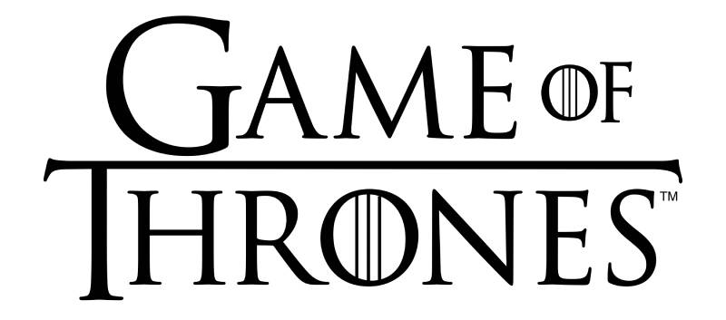
The Game of Thrones logo is a custom metallic wordmark featuring stylized serif lettering, officially introduced in 2011 by design studio Elastic for HBO. It uses aged silver and gold tones to represent the medieval political warfare at the heart of the series.
Design Type: Combination mark. The primary wordmark often appears alongside the HBO bug and, in promotional materials, with the iron throne symbol. But its core identity is a wordmark with strong decorative characteristics.
Primary Elements: The logo centers on custom serif typography with a metallic texture. The letters carry a weathered, hammered-metal feel. Thin decorative lines frame the text in certain versions. The word “OF” sits smaller between “GAME” and “THRONES,” creating a clear visual hierarchy.
Official Introduction Date: April 2011, coinciding with the premiere of Season 1 on HBO.
Designer/Agency: Elastic, a design and production studio based in Los Angeles. Angus Wall served as creative director. The same team built the now-famous opening title sequence with its mechanical map of Westeros.
Trademark Status: The logo is a registered trademark of Home Box Office, Inc., a subsidiary of Warner Bros. Discovery. It’s protected under U.S. trademark law and internationally through HBO’s licensing agreements.
Color Palette: The primary palette uses metallic gold (#C5A55A), aged silver (#8A8D8F), and deep charcoal black (#1A1A1A). Some promotional versions introduce a dark crimson red (#6B0F1A) for house-specific branding.
Usage Context: The logo appears on broadcast title cards, streaming platforms (Max, formerly HBO Max), licensed merchandise, book cover designs, video games, and promotional materials. It’s been adapted for everything from collector’s editions to theme park attractions.
How Has the Game of Thrones Logo Evolved Over Time?
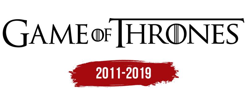
The Game of Thrones logo has gone through three main phases since 2011. Each version kept the core wordmark intact but adjusted textures, proportions, and metallic treatments to match the show’s growing production scale.
The changes were never dramatic. Honestly, unless you put them side by side, you might not even notice. But they tracked the show’s shift from scrappy fantasy newcomer to global phenomenon.
Original Game of Thrones Logo (2011-2013)
Years Active: 2011 to 2013, covering Seasons 1 through 3.
Design Description: The first version was relatively flat compared to later iterations. It used the custom serif lettering with a lightly textured metallic finish. The letters had a slightly rougher edge, giving the whole thing an aged, forged quality.
The color palette leaned toward cooler silver tones with muted gold accents. It felt restrained, almost understated for a fantasy series.
Designer: Elastic, under Angus Wall’s direction.
Context: HBO needed something that said “premium fantasy” without looking like a Dungeons & Dragons knockoff. The logo had to work as a serious drama identifier first and a fantasy brand second. That was the whole brief, basically.
Cultural Significance: This version set the tone. It told audiences right away that this wasn’t going to be campy or over-the-top in its branding, even if dragons showed up later.
Mid-Series Game of Thrones Logo (2014-2016)
Years Active: 2014 to 2016, Seasons 4 through 6.
Design Description: The metallic texture got richer. More depth, more gradient work on the letterforms. The gold tones warmed up noticeably.
Thin ornamental lines around the text became more defined. The overall composition tightened.
Key Changes from Previous: Better dimensional quality in the metallic finish. The letters looked like they’d been cast in actual metal rather than just given a surface treatment. Subtle shadow work added depth.
Context: By Season 4, the show was a juggernaut. The branding needed to reflect that. HBO was licensing the logo across thousands of products, so the mark needed to hold up at every size and on every material, from beer steins to billboards.
Cultural Significance: This was the version most people picture when they think of the show. It became the default reference point for fantasy television branding worldwide.
Final Seasons Game of Thrones Logo (2017-2019)
Years Active: 2017 to 2019, Seasons 7 and 8.
Design Description: The final version pushed the metallic rendering to its most polished state. The gold turned warmer and more saturated. Light reflections on the letterforms became sharper.
Some promotional variants introduced ice and fire texture overlays, tying into the series’ endgame themes.
Key Changes from Previous: Higher production value in the rendering. More aggressive light and shadow play. Certain versions incorporated blue-ice tones alongside the traditional gold, reflecting the White Walker storyline’s prominence.
Cultural Significance: Love it or hate it (and people had strong feelings about Season 8), this version of the logo carried the weight of one of the biggest media events in television history. It appeared on everything from Times Square billboards to Oreo packaging.
What Do the Design Elements of the Game of Thrones Logo Mean?
Every piece of the Game of Thrones logo ties back to the show’s themes of power, legacy, and conflict. The metallic treatment references forged weapons and armor. The serif lettering connects to medieval manuscripts and royal decrees.
Nothing about it is accidental. Well, almost nothing.
Why Did Game of Thrones Choose These Specific Colors?
Metallic Gold (#C5A55A): Gold represents power, royalty, and the iron throne itself. It carries a psychological weight tied to wealth and authority. You see it and you think crowns, not coins.
Gold is a staple in entertainment branding. Look at gold logos across film and television, and you’ll see the same instinct at work.
Aged Silver (#8A8D8F): The silver tone references steel, swords, and armor. It grounds the gold so the logo doesn’t feel too luxurious or soft.
There’s a deliberate coldness to it. The hue leans cool and muted, suggesting something old and battle-worn rather than shiny and new.
Charcoal Black (#1A1A1A): Black serves as the foundation. It adds weight and contrast, making the metallic elements pop. A lot of premium black logos use this same approach, letting dark backgrounds push lighter elements forward.
Dark Crimson (#6B0F1A): Used sparingly in house-specific promotions, particularly for House Lannister and House Targaryen materials. The red suggests blood, fire, and conflict. Its saturation stays low enough to feel ominous rather than vibrant.
What Typography Style Is Used in the Game of Thrones Logo?
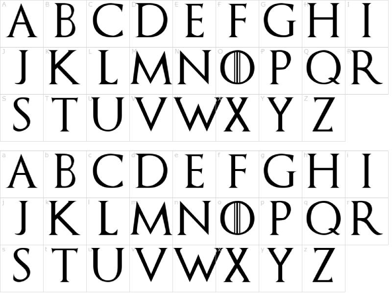
The logo uses a custom serif typeface closely modeled after Trajan Pro, a classic font based on Roman square capitals.
The letterforms are all caps with high contrast between thick and thin strokes. The serifs are sharp and triangular, giving the text an engraved, monumental quality.
Kerning is tight but not cramped. The letters breathe just enough to stay readable at smaller sizes. Tracking across the full wordmark varies slightly, with “OF” set in a smaller size to create a layered reading experience.
This font psychology choice is deliberate. Trajan-style fonts signal authority, antiquity, and prestige. Hollywood has used Trajan on movie posters for decades, and the Game of Thrones team leaned into that association hard.
What Are the Hidden Meanings in the Game of Thrones Logo?
The metallic texture on the letterforms mimics Valyrian steel, the fictional material tied to the show’s most powerful weapons. Whether Elastic intended that specific reading is debatable, but fans picked up on it immediately.
The proportional emphasis on “THRONES” over “GAME” subtly prioritizes the political power struggle over the competitive “game” metaphor.
Some designers have pointed out that the letter spacing creates a visual rhythm that mirrors castle battlements when you look at the negative space above the text. Probably a stretch. But it’s a fun one.
How Does the Game of Thrones Logo Compare to Competitor Logos?
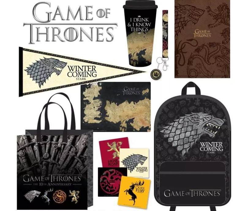
In the fantasy TV space, the Game of Thrones logo set the standard that everyone else now reacts to. It carved out a premium position that competing shows have either tried to echo or deliberately rejected.
The Vikings TV series logo went with a more runic, hand-carved aesthetic. Less polish, more raw texture. It works for that show’s Norse identity but doesn’t carry the same prestige signaling.
The Witcher logo leans into a rougher, more illustrative style with its medallion symbol. It’s trying to feel more grassroots and gritty compared to Game of Thrones’ forged-metal authority.
The Stranger Things logo takes a completely different route, pulling from 1980s book cover aesthetics. That’s a smart move because trying to out-medieval Game of Thrones would be a losing game.
Among other entertainment brands, the HBO logo itself uses a clean, modern sans-serif that contrasts sharply with the Game of Thrones wordmark. The tension between those two marks, one contemporary and one ancient, actually helped both brands stand out.
If you look at video game logos in the fantasy genre, like the Skyrim logo or the Dark Souls logo, you see similar medieval influences. But none of them achieved the same crossover into mainstream pop culture branding the way Game of Thrones did.
What Are the Technical Specifications of the Game of Thrones Logo?
Official Color Codes:
Primary Color: Metallic Gold Hex: #C5A55A | RGB: (197, 165, 90) | CMYK: (0, 16, 54, 23) | Pantone: 4515 C (closest match)
Secondary Color: Aged Silver Hex: #8A8D8F | RGB: (138, 141, 143) | CMYK: (0, 1, 0, 44) | Pantone: Cool Gray 8 C
Tertiary Color: Charcoal Black Hex: #1A1A1A | RGB: (26, 26, 26) | CMYK: (0, 0, 0, 90) | Pantone: Black 6 C
Accent Color: Dark Crimson Hex: #6B0F1A | RGB: (107, 15, 26) | CMYK: (0, 86, 76, 58) | Pantone: 1815 C
Dimensions and Proportions:
The logo maintains an approximate aspect ratio of 3:1 (width to height) in its standard horizontal configuration. The wordmark stacks “GAME OF” above “THRONES” in some versions, shifting the ratio closer to 2:1.
Minimum reproduction size for print is typically around 1 inch in width to maintain legibility of the finer serif details. For digital use, 150 pixels wide is a practical minimum at standard screen DPI.
Clear space requirements follow standard practice: a margin equal to the height of the letter “O” in “OF” should surround the logo on all sides. This keeps the mark from feeling cramped against other design elements.
For merchandise and print production, the logo is distributed as vector graphics (AI and EPS formats) to licensees. Bitmap versions in PNG and JPEG are provided at various resolutions for digital use.
What Cultural Impact Has the Game of Thrones Logo Had?
The Game of Thrones logo didn’t just brand a show. It became a shorthand for an entire genre’s upgrade in cultural status. Fantasy went from niche to mainstream, and this logo was on the front door the whole time.
It influenced how networks approach branding for prestige genre content. Before Game of Thrones, most fantasy show logos looked cheap or overly whimsical. After it, everyone wanted that forged-metal gravitas.
The mark generated massive merchandise revenue. Fans tattooed it on their bodies, put it on custom wedding invitations, and baked it into cakes. It reached a level of cultural penetration that most logos never achieve outside of sports teams and fast food brands.
The successor series House of the Dragon deliberately echoed the logo’s DNA while pushing toward a slightly different color temperature, proving the original’s lasting influence on the franchise’s visual language.
How Does the Game of Thrones Logo Fit Into the Overall Brand Identity?
The logo sits at the center of a layered brand system. It connects upward to HBO’s corporate identity, sideways to the house sigils (Stark, Lannister, Targaryen, Baratheon), and downward to merchandise, digital platforms, and licensed products.
Each house sigil functions as a sub-brand. The wolf, lion, dragon, and stag all carry their own brand guidelines and color associations. But they all defer to the main wordmark as the parent identity.
The motion graphics in the title sequence, with its mechanical map and rising structures, extend the logo’s medieval-industrial aesthetic into a full sensory experience. The music, the textures, the camera movement, they all reinforce what the static logo promises.
This kind of storytelling through design is where the brand really shines. The logo isn’t just a mark. It’s the entry point to a complete world.
How Should the Game of Thrones Logo Be Used?
Official Usage Guidelines: HBO maintains strict control over the Game of Thrones logo. Licensed partners receive detailed brand style guides specifying exact color values, minimum sizes, clear space rules, and approved background treatments.
Do’s:
- Use only official logo files provided by HBO’s licensing department
- Maintain the specified clear space around the mark
- Reproduce the logo in its approved color variations (full color, single-color metallic, or white on dark backgrounds)
- Pair it only with approved companion graphics and house sigils
Don’ts:
- Don’t stretch, skew, rotate, or alter the proportions
- Don’t change the colors outside the approved palette
- Don’t place the logo on busy backgrounds that reduce legibility
- Don’t recreate the logo using substitute fonts, even Trajan Pro itself, because the letterforms have been customized
Where to Access Official Logos: Licensed partners receive logo files directly through HBO’s brand portal. The general public can find approved imagery through HBO’s press site (press.hbo.com). Fan use falls into a gray area, but HBO has historically been aggressive about protecting the trademark on commercial products.
Licensing Information: All commercial use requires a licensing agreement through Warner Bros. Discovery’s consumer products division. Font licensing for the custom typeface is not available separately, as it’s a proprietary asset of HBO.
Trademark Protection: The Game of Thrones wordmark and associated visual elements are registered trademarks. Unauthorized commercial use can result in cease-and-desist actions. Fan art exists in a tolerated space, but selling products with the logo without a license will get you a letter from HBO’s legal team. Fast.
FAQ on The Game Of Thrones Logo
What font is used in the Game of Thrones logo?
The logo uses a custom serif typeface based on Trajan Pro, a Roman-style font known for its chiseled, monumental look.
Elastic’s design team modified the letterforms to add a medieval, hammered-metal texture. It’s not a direct copy of Trajan. The strokes and serifs were adjusted for the show’s specific visual identity.
Who designed the Game of Thrones logo?
Design studio Elastic, based in Los Angeles, created the logo under creative director Angus Wall.
The same team built the famous HBO opening credits sequence with its mechanical map of Westeros. That title card animation became just as recognizable as the wordmark itself.
What do the colors in the Game of Thrones logo mean?
The metallic gold represents royalty and the iron throne. Aged silver references swords and armor.
Charcoal black grounds the design and adds weight. Some promotional variants use a dark crimson red tied to House Lannister and House Targaryen branding.
Can I use the Game of Thrones logo for personal projects?
Fan art exists in a gray area. HBO tolerates non-commercial use but actively enforces its trademark against anyone selling products.
Commercial use requires a licensing agreement through Warner Bros. Discovery’s consumer products division. Don’t test their legal team on this one.
How has the Game of Thrones logo changed over the years?
The logo went through three subtle phases between 2011 and 2019. Each version kept the core wordmark but refined the metallic texture and dimensional quality.
The final version featured warmer gold tones and sharper light reflections. Most people wouldn’t spot the differences without a side-by-side comparison.
What type of logo is the Game of Thrones logo?
It’s a combination mark, primarily functioning as a wordmark with decorative metallic styling.
In certain promotional materials, it appears alongside the iron throne symbol or HBO bug. But the custom serif lettering is the main identifier across all platforms and merchandise.
Where can I download the official Game of Thrones logo?
HBO’s press site (press.hbo.com) provides approved imagery for media use. Licensed partners get files directly through HBO’s brand portal.
You’ll find PNG versions with transparent backgrounds floating around fan sites, but those aren’t officially sanctioned by HBO.
What is the Game of Thrones logo inspired by?
The design draws from medieval manuscripts, royal seals, and forged metalwork. Roman square capitals shaped the letterform choices.
The whole look suggests something carved or cast rather than printed. That aged, battle-worn quality ties directly to the show’s themes of war and legacy in Westeros.
Is the Game of Thrones font available for free download?
The exact custom typeface is proprietary to HBO. You can’t license it separately.
Fan-made alternatives like “Game of Thrones” by Charlie Samways exist on free font sites. They get close but aren’t identical. The gothic lettering style captures the general feel without matching the official design precisely.
How does the Game of Thrones logo compare to House of the Dragon’s logo?
House of the Dragon kept the same DNA but shifted the color temperature. Its palette leans more toward burnished bronze and deeper reds.
The serif style is similar, but the successor’s wordmark feels slightly more angular. HBO clearly wanted brand continuity while giving the prequel its own identity within the franchise.
Conclusion
The Game Of Thrones logo did what most television branding never manages. It outlasted the show itself. That custom metallic wordmark, built by Elastic for HBO back in 2011, became a permanent fixture in pop culture.
Its Trajan-inspired serif lettering and aged gold palette set a new bar for fantasy series branding. Every competing show since has had to reckon with it.
From the iron throne imagery to the house sigils, the entire visual system holds together because the core logo got it right from day one. Few game logos or entertainment marks reach that level of recognition.
It’s a case study in how strong logo design principles and smart color theory choices can turn a TV title card into something people wear on their skin.

Renowned for his expertise in logo design and visual branding, Bogdan has developed a multitude of logos for various clients.
His skills extend to creating posters, vector illustrations, business cards, and brochures. Additionally, Bogdan's UI kits were featured on marketplaces like Visual Hierarchy and UI8.
He also wrote in the past years on sites like Design Your Way, WebDesignerDepot, WPDean, Designmodo, Speckyboy, Slider Revolution, and more.
- The Windsurf Logo History, Colors, Font, And Meaning - 10 October 2026
- How to Remove Background From Product Photos (No Photoshop) - 10 October 2026
- How Designers can Build a Stronger Online Creative Identity - 9 October 2026

Bogdan Sandu is a seasoned designer who has been designing websites since 2008. Renowned for his expertise in logo design and visual branding, Bogdan has developed a multitude of logos for various clients. His skills extend to creating posters, vector illustrations, business cards, and brochures. Additionally, Bogdan's UI kits were featured on marketplaces like Visual Hierarchy and UI8. He also wrote in the past years on sites like Design Your Way, WebDesignerDepot, WPDean, Designmodo, Speckyboy, Slider Revolution, and more.
You Might Also Like