The wrong font combination can quietly undermine an otherwise solid design. The right one makes everything click.
Source Sans Pro font pairing is one of the most searched topics in web typography – and for good reason. Adobe’s first open-source typeface is clean, highly legible, and neutral enough to work alongside almost anything.
But “works with almost anything” doesn’t mean every combination is worth using.
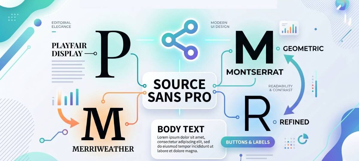
This guide covers the 10 best fonts to pair with Source Sans Pro – from editorial serif combinations like Playfair Display and Merriweather to sans-serif pairings built for modern UI design. For each one, you’ll find role assignments, weight recommendations, real use cases, and CSS to get started immediately.
Source Sans Pro Font Pairing Examples
Source Sans Pro + Playfair Display
What This Pairing Does
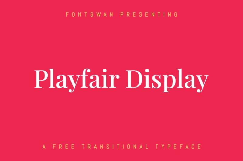
Playfair Display’s high-contrast serifs create immediate visual tension against Source Sans Pro’s clean, consistent strokes. The result reads as polished and editorial without feeling overdone.
Best Use Cases
- Magazine-style editorial websites
- Luxury brand landing pages
- Fashion and lifestyle blogs
- Corporate communications that need a refined look
Role Assignment
- Playfair Display: headings and display text
- Source Sans Pro: body text, UI labels, captions
Weight Combinations That Work
Playfair Display Bold (700) with Source Sans Pro Regular (400). For hero sections, Playfair Display Black (900) with Source Sans Pro Light (300) adds extra contrast.
Where It Falls Short
Playfair Display is purely a display font. It gets harder to read in small sizes, so keep it at 32px and above. Not great for dense UI or dashboard layouts.
Quick Setup
font-family: 'Playfair Display', serif; / headings / font-family: 'Source Sans Pro', sans-serif; / body /
Source Sans Pro + Merriweather
What This Pairing Does
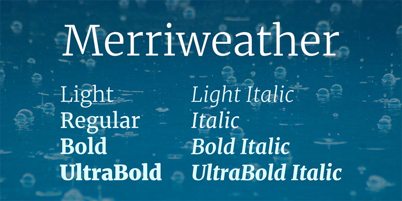
Both fonts were built for screen readability. Merriweather’s sturdy serifs and large x-height sit comfortably next to Source Sans Pro’s humanist proportions, giving you a combination that works hard in long-form reading environments.
Best Use Cases
- News and editorial platforms
- Educational content and e-learning
- Blogs with heavy text content
- Documentation sites
Role Assignment
- Merriweather: headings and subheadings
- Source Sans Pro: body text and navigation
Weight Combinations That Work
Merriweather Bold (700) with Source Sans Pro Regular (400). Merriweather Black (900) works for high-impact section headers.
Where It Falls Short
Merriweather is slightly condensed, which can feel tight on small screens without enough line-height. Set body line-height to at least 1.7 to keep things breathable.
Quick Setup
font-family: 'Merriweather', serif; / headings / font-family: 'Source Sans Pro', sans-serif; / body /
Source Sans Pro + Source Serif Pro
What This Pairing Does
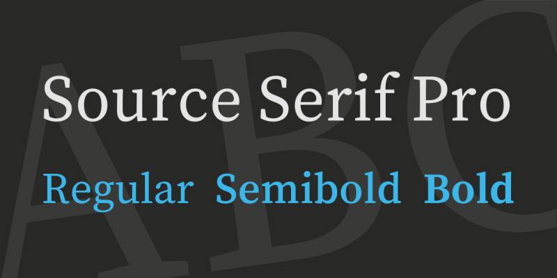
This is the cleanest possible pairing for Source Sans Pro. Both typefaces come from Adobe’s Source family, share identical x-heights, and were designed to complement each other. The serif and sans-serif contrast is built in. No guesswork.
Best Use Cases
- Design systems and documentation
- Brand identity that uses both print and web
- Academic publishing platforms
- Software product interfaces with editorial sections
Role Assignment
- Source Serif Pro: headings, pull quotes, editorial emphasis
- Source Sans Pro: body text, UI, labels
Weight Combinations That Work
Source Serif Pro SemiBold (600) with Source Sans Pro Regular (400). Both families share weight naming, so matching across the scale is straightforward.
Where It Falls Short
The pairing can feel same-y if you’re not careful with sizing and weight contrast. The stylistic similarity that makes it harmonious is also what makes it forgettable if both fonts are set at similar sizes.
Quick Setup
font-family: 'Source Serif Pro', serif; / headings / font-family: 'Source Sans Pro', sans-serif; / body /
Source Sans Pro + Lora
What This Pairing Does
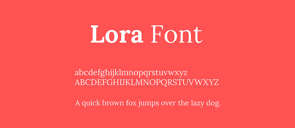
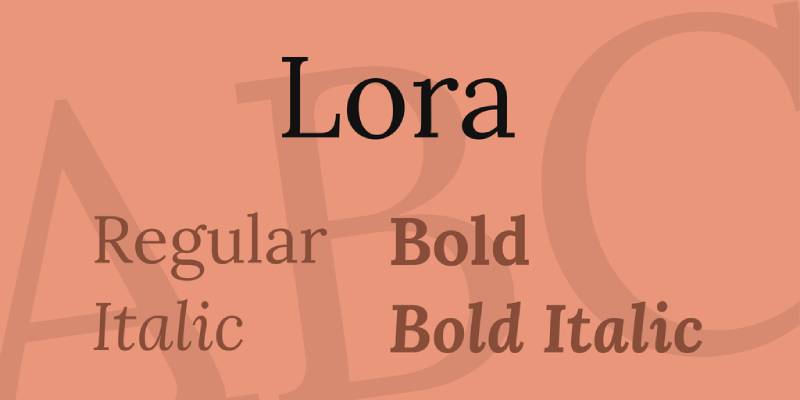
Lora’s calligraphic roots and brushed curves bring warmth to Source Sans Pro’s neutral, professional tone. The contrast is subtle but effective – one font feels hand-drawn, the other feels systematic. Together they create a layout that’s approachable but still clean.
Best Use Cases
- Lifestyle and wellness brands
- Boutique business websites
- Content-heavy blogs
- Food and hospitality sites
Role Assignment
- Lora: headings and section titles
- Source Sans Pro: body text, UI elements, metadata
Weight Combinations That Work
Lora Bold (700) with Source Sans Pro Regular (400). Lora Italic works well for pull quotes and captions alongside Source Sans Pro SemiBold subheadings.
Where It Falls Short
Lora isn’t great for very small display sizes. Also, its calligraphic character can clash with highly technical or corporate-heavy contexts where a neutral serif would feel more fitting.
Quick Setup
font-family: 'Lora', serif; / headings / font-family: 'Source Sans Pro', sans-serif; / body /
Source Sans Pro + Montserrat

What This Pairing Does
Two sans-serifs, but they work. Montserrat’s geometric structure creates visible contrast against Source Sans Pro’s humanist proportions. The difference in letterform construction is enough to build clear typographic hierarchy without needing a serif at all.
Best Use Cases
- Tech and startup websites
- SaaS product pages
- Modern corporate branding
- Infographics and pitch decks
Role Assignment
- Montserrat: headings, navigation, UI labels
- Source Sans Pro: body text and long-form content
Weight Combinations That Work
Montserrat Bold (700) or SemiBold (600) for headings. Source Sans Pro Regular (400) for body text. Avoid using both fonts at similar weights – the contrast disappears fast.
Where It Falls Short
Sans-on-sans pairings require more deliberate font spacing and size contrast to avoid looking like a single-font layout. Also, Montserrat at body text sizes (below 16px) can feel cramped.
Quick Setup
font-family: 'Montserrat', sans-serif; / headings / font-family: 'Source Sans Pro', sans-serif; / body /
Source Sans Pro + Work Sans
What This Pairing Does
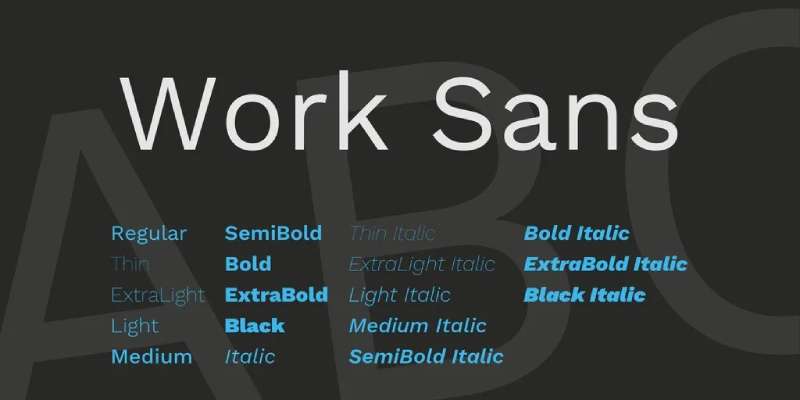
Work Sans is an early grotesque revival with a utilitarian feel. Paired with Source Sans Pro’s humanist warmth, you get a combination that’s all business – functional, clean, and efficient. Good for tools where visual hierarchy needs to communicate quickly.
Best Use Cases
- Developer dashboards and admin panels
- Productivity apps
- B2B software interfaces
- Data-heavy web pages
Role Assignment
- Work Sans: headings, navigation, section labels
- Source Sans Pro: body text, table data, form labels
Weight Combinations That Work
Work Sans SemiBold (600) for headings, Source Sans Pro Regular (400) for body text. Work Sans Medium (500) works well for secondary labels and subheadings.
Where It Falls Short
This pairing is functional, not expressive. It won’t work for brands that need warmth, creativity, or personality. Both fonts read as “neutral” which is a feature in some contexts and a drawback in others.
Quick Setup
font-family: 'Work Sans', sans-serif; / headings / font-family: 'Source Sans Pro', sans-serif; / body /
Source Sans Pro + Open Sans

What This Pairing Does
Both are humanist sans-serif fonts designed for screen legibility, and that shared intent keeps them compatible. The differences in letterform construction – Open Sans is slightly wider, with a more uniform stroke weight – create enough distinction for hierarchy without jarring contrast.
Best Use Cases
- Global-audience websites needing broad multilingual support
- Corporate communications
- Large design systems where both fonts already exist
Role Assignment
- Open Sans: headings and navigation
- Source Sans Pro: body text and UI elements
Weight Combinations That Work
Open Sans Bold (700) with Source Sans Pro Regular (400). Keep the weight contrast high – these fonts are similar enough that low-contrast pairings will look like a mistake.
Where It Falls Short
This is one of the harder sans-on-sans pairings to execute well. The fonts are close enough in personality that the combination can feel like a single font used inconsistently. Size difference and weight contrast do the heavy lifting here.
Quick Setup
font-family: 'Open Sans', sans-serif; / headings / font-family: 'Source Sans Pro', sans-serif; / body /
Source Sans Pro + Abril Fatface

What This Pairing Does
Abril Fatface is a display font with extreme thick-thin stroke contrast inspired by 19th-century advertising typography. Against Source Sans Pro’s neutral clarity, the contrast is immediate and dramatic. This pairing works precisely because the two fonts share nothing structurally.
Best Use Cases
- Magazine covers and editorial heroes
- Event promotion and poster design
- Restaurant and hospitality branding
- High-impact landing page headers
Role Assignment
- Abril Fatface: hero headlines only (display use)
- Source Sans Pro: all body text, subheadings, UI elements
Weight Combinations That Work
Abril Fatface comes in one weight only (Regular 400). Use it large, at 48px minimum. Source Sans Pro Regular (400) or Light (300) handles everything below it.
Where It Falls Short
Abril Fatface is display-only with no weight options. It cannot be used for body text, subheadings, or anything small. This pairing works only when Abril is reserved strictly for large headlines.
Quick Setup
font-family: 'Abril Fatface', serif; / display headlines / font-family: 'Source Sans Pro', sans-serif; / everything else /
Source Sans Pro + EB Garamond

What This Pairing Does
EB Garamond is a revival of Claude Garamont’s 16th-century humanist typefaces – old-world elegance meeting Source Sans Pro’s contemporary clarity. The contrast between the two is historical as much as visual. It reads as educated and considered.
Best Use Cases
- Academic publishing and university websites
- Cultural institutions and museums
- Literary blogs and book-focused platforms
- Professional services with a heritage angle
Role Assignment
- EB Garamond: headings and pull quotes
- Source Sans Pro: body text, navigation, UI elements
Weight Combinations That Work
EB Garamond Bold (700) or SemiBold (600) for headings. EB Garamond Regular (400) at display sizes also reads beautifully. Source Sans Pro Regular (400) for body text.
Where It Falls Short
EB Garamond’s thin strokes can struggle on low-resolution screens or when rendered small. It’s best at 28px and above for headings. Also not a fit for modern, tech-forward brands.
Quick Setup
font-family: 'EB Garamond', serif; / headings / font-family: 'Source Sans Pro', sans-serif; / body /
Source Sans Pro + Raleway
What This Pairing Does
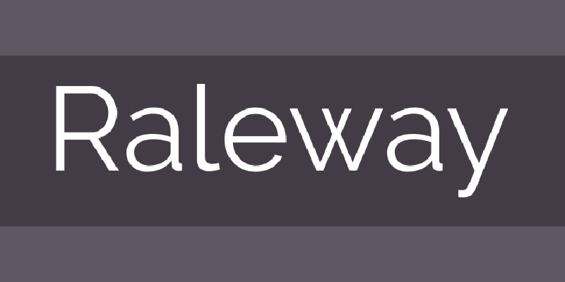
Raleway is an elegant geometric sans-serif with distinctive details – most notably its crossed “W” strokes. Paired with Source Sans Pro, you get a refined, design-forward combination. Both fonts stay in the sans-serif family, but Raleway’s aristocratic personality gives Source Sans Pro something to work against.
Best Use Cases
- Design portfolios and creative agencies
- Infographics and business reports
- Pitch decks and presentation templates
- Architecture and interior design firms
Role Assignment
- Raleway: headings, logos, display text
- Source Sans Pro: body text, UI labels, captions
Weight Combinations That Work
Raleway SemiBold (600) or Bold (700) for headings. Raleway Thin (100) or ExtraLight (200) for decorative display-only uses. Source Sans Pro Regular (400) as the body workhorse.
Where It Falls Short
Raleway’s thinner weights can hurt legibility on mobile screens. At body text sizes it loses its elegance quickly, so keep it as a heading font. Not suitable for interfaces where readability at small sizes is critical.
Quick Setup
font-family: 'Raleway', sans-serif; / headings / font-family: 'Source Sans Pro', sans-serif; / body /
FAQ on Source Sans Pro Font Pairing
What is Source Sans Pro?
Source Sans Pro is Adobe’s first open-source typeface, designed by Paul D. Hunt and released in 2012.
It draws from American Gothic type traditions while incorporating humanist proportions, making it clean and highly legible across screen and print. The font is available in six weights – ExtraLight, Light, Regular, SemiBold, Bold, and Black – all with matching italics. It’s free to use via Google Fonts and Adobe Fonts, licensed under the SIL Open Font License.
What makes a good Source Sans Pro font pairing?
Source Sans Pro is a neutral humanist sans-serif. It doesn’t impose much personality on its own, which is actually what makes it such a flexible pairing partner.
Good pairings work by introducing contrast – either through a serif companion that brings warmth and tradition, or through a display font that adds drama. The key is making sure the two fonts occupy clearly different roles. One takes headings, one takes body text. Mixing similar neutral fonts at similar sizes without weight contrast tends to fall flat.
Should I use a serif or sans-serif with Source Sans Pro?
Both work, but for different reasons.
Serif pairings (Playfair Display, Merriweather, Lora) create strong structural contrast and are easier to execute well. The visual difference between serif and sans-serif does the work for you.
Sans-serif pairings (Montserrat, Raleway, Work Sans) require more deliberate weight and size contrast to build hierarchy. They work well in UI-heavy or tech contexts where serifs feel out of place.
In general, if you’re new to pairing fonts, start with a serif headline and Source Sans Pro body text. It’s harder to get wrong.
What is the best font pairing with Source Sans Pro for websites?
For most websites, Source Sans Pro + Merriweather is the most reliable choice. Both fonts were built with screen readability as a primary goal, their x-heights align well, and the serif-to-sans-serif contrast creates clean hierarchy without fuss.
For editorial or content-heavy sites, Source Sans Pro + Playfair Display adds more visual personality. For minimal tech products, Source Serif Pro (same family, by Adobe) gives you a perfectly matched system.
Can Source Sans Pro be used as a heading font?
Yes. Source Sans Pro works well as a heading font, especially in UI contexts, dashboards, and modern web design where a clean sans-serif headline is preferred. Use SemiBold (600) or Bold (700) weights to differentiate headings from body text.
That said, when used as both heading and body font, you need to work harder on size contrast and weight differentiation to build a readable typographic hierarchy. Pairing it with a more expressive display font for headings is usually the stronger typographic choice.
What font pairs well with Source Sans Pro for print design?
For print design, Source Sans Pro pairs strongly with EB Garamond or Lora as heading fonts. Both have enough character to anchor a printed layout, and both translate well across screen-to-print workflows.
For reports and formal documents, Source Serif Pro is the most consistent choice – same design system, predictable output across PDF and print environments. Avoid Playfair Display or Abril Fatface for body text in print; their stroke contrast can make small text harder to read on paper.
How many weights of Source Sans Pro should I load?
Two to three weights is the practical limit for most projects. Regular (400), SemiBold (600), and Bold (700) cover the majority of use cases – body text, subheadings, and emphasis.
Loading all six weights adds unnecessary page weight without giving you more creative flexibility. Each additional font weight is an extra HTTP request, which adds to load time. Stick to what your typography system actually needs.
Is Source Sans Pro good for branding?
Source Sans Pro works well as a secondary or supporting typeface in brand systems, particularly for body copy, UI text, and documentation. Its neutral character means it won’t fight with a more expressive brand headline font.
As a primary brand font, it can feel generic without a distinctive pairing. Brands that need strong personality usually pair it with something more expressive – Playfair Display for elegance, Abril Fatface for impact, or Raleway for refinement. Source Sans Pro handles the workload; the companion font carries the personality.
What is the difference between Source Sans Pro and Source Sans 3?
Source Sans 3 is the updated version of Source Sans Pro. Adobe released it as a replacement on Google Fonts, adding variable font support, an expanded character set, and improved rendering across more scripts and languages.
For new projects, Source Sans 3 is the better choice. It offers the same reliable humanist design with added flexibility through variable font axes, meaning you can fine-tune weight without loading multiple font files. Existing projects using Source Sans Pro don’t need to migrate immediately, but Source Sans 3 is the forward-compatible option.
Can I use a font pairing generator for Source Sans Pro?
Yes, and it’s a good starting point. A font pairing generator lets you preview combinations quickly without committing to code. Most tools show Source Sans Pro alongside popular companions and give you a visual preview at different sizes.
That said, generators show you theoretical combinations. Always test your chosen pairing in context – in your actual layout, at your actual font sizes, on mobile and desktop. A pairing that looks great in a generator preview can fall apart in a real interface if the size ratios or weights aren’t set correctly.
FAQ on Source Sans Pro Font Pairing
What fonts pair best with Source Sans Pro?
The strongest pairings are Playfair Display, Merriweather, and Source Serif Pro for serif contrast. For sans-serif combinations, Montserrat and Raleway work well. The best choice depends on your project – editorial, UI, branding, or print.
Is Source Sans Pro good for body text?
Yes. It was designed specifically for screen legibility and UI interfaces. Its open letterforms and large x-height make it highly readable at small sizes, which is why it’s widely used for body text in web and app design.
Can I pair two sans-serif fonts with Source Sans Pro?
You can, but it takes more effort. Sans-on-sans pairings like Montserrat + Source Sans Pro require strong weight and size contrast to build clear typographic hierarchy. Without that contrast, the combination reads as a single inconsistent font.
What is the difference between Source Sans Pro and Source Sans 3?
Source Sans 3 is the updated version, now available as a variable font on Google Fonts. It offers expanded character support and better rendering. For new projects, Source Sans 3 is the recommended choice over the original Source Sans Pro.
What weight of Source Sans Pro should I use for body text?
Regular (400) is the standard choice for body text. Use SemiBold (600) for subheadings and Bold (700) for emphasis. Loading more than three weights adds unnecessary page weight without meaningful typographic benefit.
Is Source Sans Pro free to use?
Yes. It’s released under the SIL Open Font License, which allows free use in personal and commercial projects. It’s available via Google Fonts and Adobe Fonts, with no licensing fees for standard web and print use.
What is the best Source Sans Pro pairing for web design?
Source Sans Pro + Merriweather is the most reliable web pairing. Both fonts were built for screen readability, their x-heights align naturally, and the serif-to-sans-serif contrast creates clean visual hierarchy without additional adjustment.
Can Source Sans Pro be used as a heading font?
Yes. Use Bold (700) or SemiBold (600) weights for headings. It works well in UI-heavy layouts and dashboards. For more expressive heading typography, pairing it with a display font like Playfair Display or Abril Fatface gives better visual impact.
How do I add Source Sans Pro to my website?
Import it via Google Fonts with a single link tag, then apply it using the font-family CSS property. Load only the weights you need to keep page performance efficient. Source Sans 3 is now the recommended import name on Google Fonts.
What makes Source Sans Pro different from Open Sans?
Source Sans Pro draws from American Gothic type traditions with a slightly more humanist character. Open Sans is wider with more uniform stroke weight. Both target screen legibility, but Source Sans Pro has a more refined, systematic quality suited to design systems.
Conclusion
This article presenting the best Source Sans Pro font pairing options covers a lot of ground – from high-contrast serif combinations to functional sans-serif stacks built for UI design.
Each pairing serves a different context. Merriweather and Source Serif Pro work best for readability-first layouts. Playfair Display and Abril Fatface bring editorial drama. Raleway and Montserrat keep things modern and geometric.
The font stack you choose affects more than aesthetics. It shapes typographic hierarchy, reading comfort, and how your brand comes across at every size and weight.
Start with one combination, test it at actual body text sizes, and adjust from there. Good type pairing is less about rules and more about what serves your content and your audience.

Renowned for his expertise in logo design and visual branding, Bogdan has developed a multitude of logos for various clients.
His skills extend to creating posters, vector illustrations, business cards, and brochures. Additionally, Bogdan's UI kits were featured on marketplaces like Visual Hierarchy and UI8.
He also wrote in the past years on sites like Design Your Way, WebDesignerDepot, WPDean, Designmodo, Speckyboy, Slider Revolution, and more.
- The Windsurf Logo History, Colors, Font, And Meaning - 10 October 2026
- How to Remove Background From Product Photos (No Photoshop) - 10 October 2026
- How Designers can Build a Stronger Online Creative Identity - 9 October 2026

Bogdan Sandu is a seasoned designer who has been designing websites since 2008. Renowned for his expertise in logo design and visual branding, Bogdan has developed a multitude of logos for various clients. His skills extend to creating posters, vector illustrations, business cards, and brochures. Additionally, Bogdan's UI kits were featured on marketplaces like Visual Hierarchy and UI8. He also wrote in the past years on sites like Design Your Way, WebDesignerDepot, WPDean, Designmodo, Speckyboy, Slider Revolution, and more.
You Might Also Like