


Every word you read is shaped by a decision someone made about type.
Typography is the practice of arranging text to make it readable, legible, and visually effective. It covers everything from typeface selection and point size to line spacing, letter spacing, and layout.
It’s not just a design concern. Font choice affects how readers perceive a brand, how fast they process information, and whether they stay on a page at all.
This article covers what typography is, how its core elements work, and how type decisions play out across print design, web design, and UI – so you can make better choices, whether you’re a designer, developer, or brand owner.
What Is Typography
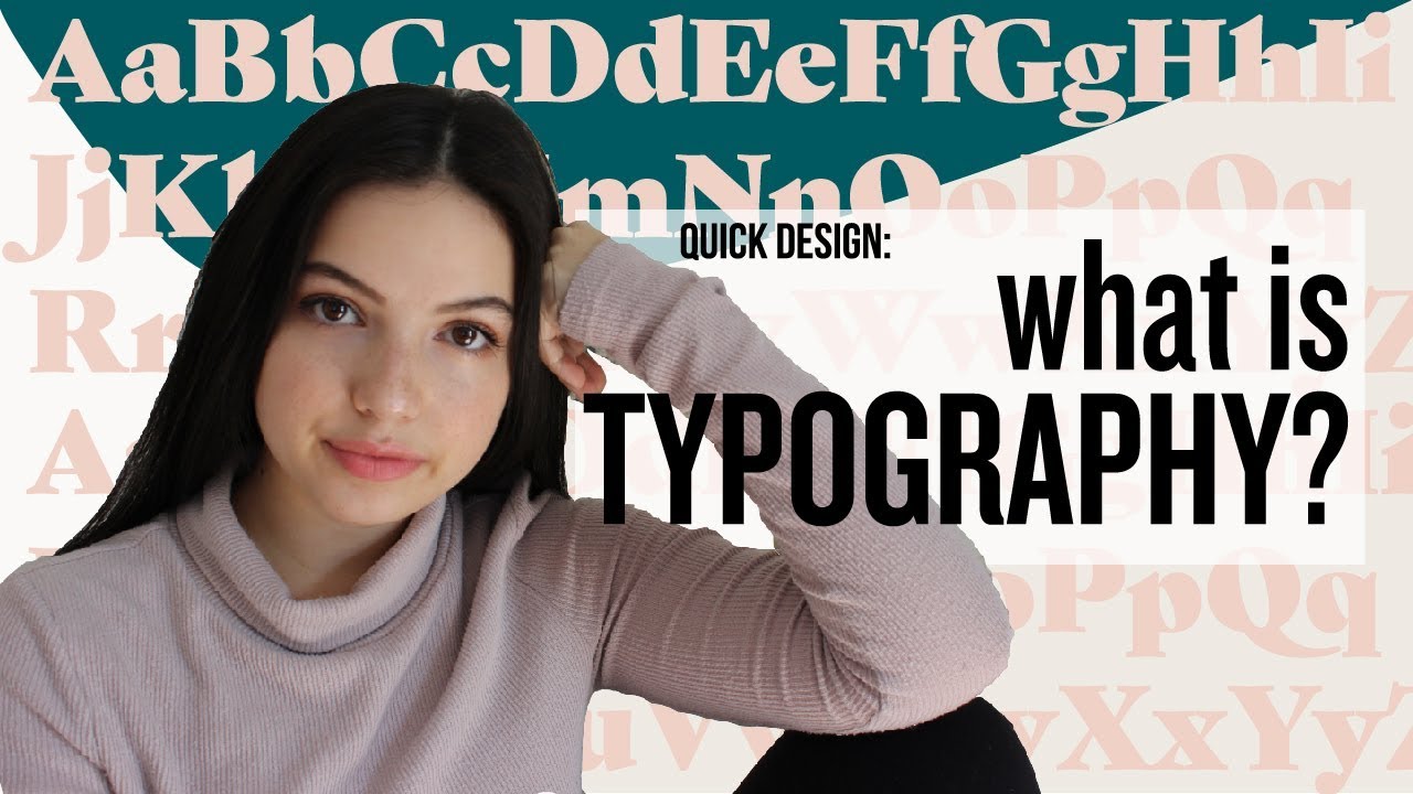
Typography is the art and technique of arranging type to make written language readable, legible, and visually effective. It covers every decision made about text – the typeface chosen, the size, the spacing, the line length, and how all of those elements sit together on a page or screen.
It is not the same thing as picking a pretty font. That’s where most people stop. Typography goes further – it asks how type communicates tone, guides the reader’s eye, and holds a layout together.
The global font and typeface market was valued at around $1.14 billion in 2024 and is projected to reach $1.66 billion by 2034 (Global Growth Insights). That number alone says something about how seriously the industry treats type as a discipline, not just decoration.
Typography applies across print design, screens, signage, packaging, and UI. Wherever words appear, someone made a typographic decision – consciously or not.
Typography vs. Typeface vs. Font
These three terms get mixed up constantly. They are not the same.
- Typography: the practice of arranging type for communication and visual effect
- Typeface: the design of the letterforms – Garamond, Helvetica, Georgia
- Font: a specific instance of a typeface – Garamond Bold 12pt is a font; Garamond is the typeface
Designers argue about this distinction constantly. Most non-designers (and honestly, most clients) use “font” to mean all three. Worth knowing the difference anyway.
Who Works with Typography
Graphic designers, web designers, UI/UX designers, type directors, brand strategists, and publishers all make typographic decisions as part of their daily work.
Developers do too – whether they realize it or not. Every time someone sets a font-family or line-height in CSS, that is a typographic choice with real impact on how readable the result is.
Monotype’s 2024 Font Use & Forecasting Survey found that 83% of designers acknowledge typography’s critical role in branding and communication. It is not a niche concern. It sits at the center of how visual communication works.
—
The Core Elements of Typography

Understanding typography elements means understanding the building blocks that every type decision is made from. Get these wrong and nothing else fixes it.
The list below covers what actually matters in practice – not the exhaustive academic inventory, just the parts that come up in every project.
| Element | What It Controls | Why It Matters |
|---|---|---|
| Kerning | Space between specific letter pairs | Prevents awkward gaps in headlines |
| Leading | Space between lines of text | Directly affects reading comfort |
| Tracking | Uniform spacing across a block of text | Useful for headlines, not body copy |
| X-height | Height of lowercase letters | Higher x-height = more readable at small sizes |
| Glyph | Individual character or symbol in a font | Determines character set coverage |
Spacing: The Part People Underestimate
Research shows that optimizing inter-letter spacing can make smaller characters up to 20% easier to read compared to default settings (Arditi, 2004). That is a significant gain from one adjustment.
Most designers spend time on typeface selection and almost no time on spacing. That’s backwards. Bad spacing wrecks even the best typeface choice.
Type Anatomy Basics
Baseline: the invisible line that characters sit on – understanding the baseline is foundational for any layout work.
Cap height: the height of uppercase letters, separate from ascenders. Sets visual weight at the top of text.
Ascenders and descenders: the parts of letters that go above or below the x-height – letters like ‘h’, ‘p’, ‘y’. They affect how cramped or open a typeface feels at a given leading.
Knowing these terms isn’t academic. They come up in real conversations with printers, developers, and other designers. Fluency here prevents a lot of miscommunication.
—
Type Classification
Typefaces are grouped into categories based on their structural characteristics. Classification matters because each category carries a different visual tone – and choosing the wrong one for a context is a fast way to undermine a design.
Serif vs. Sans-Serif

This is the most common distinction in typography. It shapes most type decisions in practice.
An analysis of 1,000 websites found that 85% prefer sans-serif fonts for web use (Toner Buzz, 2024). That preference reflects how screens rendered type for years – serifs looked muddy at low resolutions. Larger screens and better rendering have changed this, and serif fonts are making a clear comeback in digital design.
- Serif fonts – have small strokes at letter ends; convey tradition, authority, trust. Common in editorial, legal, and luxury contexts.
- Sans-serif fonts – no decorative strokes; feel modern, clean, accessible. Dominant in UI and tech.
Three-quarters of Fortune 500 companies choose sans-serif fonts for their logos (Toner Buzz, 2024). And 19% exclusively use serif. Neither is wrong – it depends entirely on what the brand is trying to communicate.
Other Major Type Categories
Slab serif: heavy, block-like serifs – strong visual presence, often used in poster design and editorial headlines. Think Rockwell or Courier.
Display fonts: built for large sizes where decorative detail can be appreciated. Not for body text. Ever.
Script fonts: mimic handwriting, convey elegance or personality. Work well in branding and packaging. Terrible for long-form reading.
Monospace: every character takes up equal horizontal space – mostly used for code. Courier and JetBrains Mono are common examples.
Mixing Type Classifications
Pairing a serif with a sans-serif is one of the most reliable combinations in type design. The contrast in structure creates contrast without chaos. The trick is finding pairs with complementary proportions – similar x-heights and overall weight.
Using two serifs together? Tricky. Two sans-serifs? Usually too similar to justify. When in doubt, check Typewolf or use Fontjoy to test combinations before committing.
—
How Typography Affects Readability and Legibility

Readability and legibility are related but not the same thing. Mixing them up leads to poor decisions.
- Legibility: can you distinguish individual characters? It’s about letterform clarity.
- Readability: can you comfortably read a block of text? It’s about how the whole system – size, spacing, line length, contrast – works together.
A typeface can be legible at the character level and still be terrible to read in paragraph form. Comic Sans is weirdly legible. Nobody wants to read a 1,000-word article set in it.
The Numbers Behind Readable Type
Research in vision science shows that proper typography can improve reading accuracy by up to 20% and reduce eye strain by 30% (adoc-studio.app, 2024). Those aren’t minor gains.
Pages with well-chosen typography experience a 15% higher retention rate compared to those with poorly designed text (Google Analytics data cited by Moldstud Research, 2024).
Meanwhile, 30% of readers abandon text they find difficult to read (Moldstud, 2024). A single bad font choice doesn’t just look unprofessional – it actively drives people away.
Line Length, Size, and Spacing
These three elements work as a system. Adjust one and the others need to shift.
Recommended body font size for web: 16px on desktop (approximately 11–12pt in print). Going smaller creates friction, especially for readers over 40, where the eye lets in significantly less light than it did at 20.
Line length: 45–75 characters per line is the widely accepted range for comfortable reading. Longer lines cause the eye to lose its place. Shorter lines break reading rhythm.
Line spacing: all readers, including low-vision readers, experience better reading speeds when line-spacing is set to 2.5 (Global Journal of Health Science). Most websites still default to 1.4–1.5. That gap matters.
Color Contrast and Accessibility
The Web Content Accessibility Guidelines (WCAG) set minimum contrast ratios for text – 4.5:1 for normal text, 3:1 for large text. These aren’t arbitrary. Small font sizes and low contrast are the number one complaint of web users related to reading online (Nielsen Norman Group).
Google Fonts researchers note there is no single most accessible font for everyone. But open letterforms, clear counters (the enclosed or semi-enclosed spaces in letters like ‘c’, ‘e’, and ‘o’), and strong typographic hierarchy consistently improve accessibility regardless of font choice.
—
The Role of Hierarchy in Typography

Visual hierarchy in type tells readers where to look first, what to read next, and what they can skip. Without it, a page becomes flat – everything competing at the same visual weight, nothing winning.
Typographic hierarchy works through four main levers: size, weight, spacing, and contrast. These work independently and together.
Building a Type Scale
A type scale is a structured set of sizes that relate to each other by a consistent ratio. The most common ratios used in web design are 1.25 (Major Third) and 1.333 (Perfect Fourth).
Google Fonts experts note that a strong hierarchy can boost readability regardless of font selection. That’s a more useful insight than most font debates. You can work with a mediocre typeface if the hierarchy is solid. The reverse rarely works.
Practical scale example using 1.333 ratio with 16px base:
- Body: 16px
- H3: 21px
- H2: 28px
- H1: 38px
Tools like Type Scale (typescale.com) and Archetype handle this math automatically. Worth bookmarking both.
Weight, Emphasis, and the Scanning Eye
Bold weight creates instant visual anchors. Readers scan before they read – they decide in seconds whether a page is worth their time. Emphasis through bold weight, along with clear heading levels, gives that scanning eye something to grab onto.
94% of designers prioritize larger font sizes for emphasis over heavier font weights alone (Toner Buzz, 2024). Though 76% combine both – size and weight together – for the strongest visual signal.
Hierarchy in Real Contexts
| Context | Hierarchy Priority | Common Approach |
|---|---|---|
| Editorial / blog | Body readability first | Comfortable body size, distinct H2/H3 |
| Landing page | Headline impact first | Large display type, supporting body |
| Dashboard / UI | Data legibility first | Compact scale, consistent weight |
| Print / book | Long-form comfort | Classic serif, generous leading |
The layout context always shapes hierarchy decisions. There is no universal “correct” scale – only what serves the reading experience for that specific format.
—
Choosing the Right Typeface

This is where type decisions get practical. And honestly, where most projects go wrong – not because the wrong font was chosen, but because the choice was made too early, without enough context.
Matching Tone to Content
Monotype’s 2023 neuroscience research (conducted with applied neuroscience company Neurons, across 8 countries) found that emotional responses to typefaces vary significantly between cultures. Serif typefaces consistently conveyed honesty and quality across regions. Humanist sans-serifs like FS Jack suggested innovation. Geometric sans-serifs like Gilroy Bold read as clear and straightforward.
A serif font on a law firm’s website lands differently than on a startup’s landing page. Neither is wrong – but only one fits the message being sent.
Spotify’s Wrapped campaigns are a useful real-world example. For Wrapped 2023 and 2024, Spotify used custom retro-inspired typefaces to create an emotional, celebratory tone – deliberately different from the clean, functional sans-serifs in their main product UI. Same brand. Two distinct typographic voices for two distinct contexts.
Practical Criteria Before Committing
Check character support: does the typeface include all the characters you actually need? Diacritics, currency symbols, numerals that align in tables?
Test at actual size: a font that looks elegant at 48px can fall apart at 14px. Always test body text at the size it will actually be read.
Font licensing: this matters more than most people think. Desktop licenses, web licenses, and app licenses are often sold separately. Using a font on a website without a web license is a real legal exposure, not a technicality designers can ignore.
Where to Find and Pair Fonts
For discovery: Google Fonts (free, open-source, excellent web performance), Fontshare (well-designed free fonts from the Indian Type Foundry), and Typewolf (curated real-world usage examples – genuinely useful).
For pairing fonts: Fontjoy generates pairings algorithmically. Font Pair focuses specifically on Google Fonts combinations. Both save time in early exploration.
70% of creatives turn to popular marketplaces for font purchases, and budget constraints remain the top barrier to using premium typefaces (Monotype, 2024). That’s why Google Fonts and Fontshare have become so central to how most web projects handle type – the quality gap between free and paid has narrowed considerably.
Variable fonts are worth considering for web projects where performance matters. Monotype’s 2023 variable font suite launch showed 54% of developers citing faster load times as a direct benefit. One variable font file can replace multiple static font files, cutting HTTP requests and reducing page weight.
Typography in Web and UI Design

Web typography sits at the intersection of design and performance. The font choices you make affect how fast a page loads, how accessible it is, and whether users stay or bounce.
Web fonts were found on roughly 88% of websites in 2025, up from 87% in 2024 (HTTP Archive Web Almanac). The medium has almost universally shifted to web fonts. System font stacks are now the exception, not the default.
How Web Fonts Are Served
Google Fonts still leads – found on approximately 57% of all pages using hosted font services in 2024 (HTTP Archive). Adobe Fonts accounts for around 4%, with most other services becoming negligible.
Self-hosting is growing. More teams prefer it because it removes external dependencies for something as critical as font rendering. When configured correctly, self-hosted fonts also deliver the best performance.
WOFF2 is now the standard web font format, used on 81% of desktop and 78% of mobile websites. It uses Brotli compression, significantly reducing file sizes compared to older formats like TTF or OTF served directly.
Variable Fonts and Performance
Variable fonts usage grew to 33% of desktop pages and 34% of mobile pages in 2024, up from 28% and 29% respectively in 2022 (HTTP Archive, 2024 Web Almanac).
The performance case is straightforward. A single variable font file replaces multiple static weight files, cutting HTTP requests. The file stores deltas rather than full outlines for each variation, so the total size stays manageable.
- Adjust weight, width, slant, and optical size through CSS
- Supported in all major modern browsers
- Works with
font-variation-settingsin CSS
Inter and Roboto Flex are common starting points for UI work. Both have wide variation ranges and strong legibility at small sizes.
CSS Properties That Matter
Font loading behavior causes more real-world problems than font selection. font-display: swap prevents invisible text during load – about 50% of the web uses it (HTTP Archive, 2025). The remaining half either relies on browser defaults or uses block, which is mostly icon fonts.
Key CSS properties for web typography:
font-sizewithclamp()for fluid scaling without media queriesline-heightas a unitless value (e.g., 1.5) rather than pxletter-spacingset inemso it scales with font sizefont-feature-settingsto unlock OpenType features like ligatures and tabular figures
Google switched its own logo from serif to a geometric sans-serif in 2015, partly to improve rendering clarity across small mobile screens. That decision was as much a technical one as it was a brand one.
Responsive Typography in Practice
The clamp() function lets type scale fluidly between a minimum and maximum size based on viewport width. No media queries needed. A typical pattern:
font-size: clamp(1rem, 2.5vw, 1.5rem);
This alone handles most scaling needs for body copy. For heading sizes, a 1.25 or 1.333 ratio works well on text-heavy sites. A 1.618 ratio (the golden ratio) creates dramatic contrast, better suited to marketing pages than data-dense interfaces.
Recommended body font sizes: 12–16px on mobile, 15–19px on tablet, 16–20px on desktop (Toptal). Going below 12px for body text creates real friction, especially for users over 40.
—
Typography Tools and Resources
Most designers have a small set of tools they actually use daily. The list below reflects what the field reaches for in practice, not just what gets recommended in blog posts.
| Tool | Purpose | Best For |
|---|---|---|
| Google Fonts | Font discovery and hosting | Web projects, performance-first workflows |
| Adobe Fonts | Premium font access via Creative Cloud | Agency and editorial workflows |
| Fontshare | Curated free fonts from Indian Type Foundry | Branding, editorial, type with personality |
| Typewolf | Real-world font usage examples | Inspiration, pairing reference, trend tracking |
Font Pairing and Testing Tools
Fontjoy generates pairings algorithmically. It’s fast and good enough for early exploration.
Typewolf is more useful once you’re past the exploration phase – it shows how specific fonts perform in real contexts, on actual sites, rather than showing abstract specimens.
For type scale: Type Scale (typescale.com) and Archetype handle ratio-based sizing calculations. Modular Scale by Tim Brown does the same. All three are free, all three save time versus doing the math manually.
Pairing Fonts Effectively
The most reliable font pairing approach: one serif for body or display, one sans-serif for the other role. Structural contrast creates hierarchy without visual noise.
Font spacing matters as much as the pairing. Two fonts that look clashing at default spacing often work once tracking and leading are adjusted to match visual weight.
70% of creatives turn to popular marketplaces for font purchases, with budget constraints as the main barrier to premium type (Monotype, 2024). Fontshare and Google Fonts close that gap for most projects without compromising output quality.
Reference Books Worth Owning
Two books come up in nearly every serious type conversation:
- “Thinking with Type” by Ellen Lupton – practical, visual, covers the fundamentals well without being dense
- “The Elements of Typographic Style” by Robert Bringhurst – more technical, more thorough, considered the standard reference for professional type practice
Both are worth reading cover to cover once. After that, Bringhurst functions as a reference you return to rather than read linearly. Took me a few attempts to get through it, but the density is the point – it covers things no blog post touches.
Understanding Font Formats
WOFF2 is the right format for web delivery. It applies Brotli compression on top of either TrueType or OpenType outlines, reducing file sizes by over 40% compared to uncompressed TTF files (White Peak Digital).
Quick format guide:
- OTF: best for desktop publishing and print – supports advanced features like ligatures, stylistic sets, and small caps
- TTF: older, simpler, widely compatible – fine for general desktop use
- WOFF2: the standard for web delivery – compressed, fast, supported by all modern browsers
- Variable fonts (.ttf/.otf): multiple styles in one file – critical for responsive web typography
Around 54% of mobile web fonts included at least one OpenType layout table (GSUB or GPOS) by 2024, up from under half in 2022 (HTTP Archive, via DesignYourWay). This reflects the industry pushing further into fine-grained typographic control at the format level, not just the CSS level.
Variable fonts are worth prioritizing in any new web project. The tooling has matured, browser support is complete, and the performance case is strong. Resistance to adopting them in 2025 is mostly inertia.
The Calligraphy Connection
Typography and calligraphy share roots but are fundamentally different disciplines. Calligraphy is the art of handwriting – each stroke is unique, variable, made in real time. Typography is a system – repeatable, consistent, designed for reproduction at scale.
The best type designers usually have some calligraphy background. It shows in how they handle stroke contrast, terminals, and letter proportions. You can often tell who does and who doesn’t.
Brand typography sits at the overlap point. Custom typefaces – like the one Spotify used for Wrapped 2023 and 2024 – borrow calligraphic traits (organic curves, ink-trap details, expressive terminals) and engineer them into a repeatable system. That combination is what makes brand typography feel both personal and scalable at the same time.
FAQ on What Is Typography
What is typography?
Typography is the art and technique of arranging type to make written language readable and visually effective.
It covers typeface selection, point size, line spacing, letter spacing, and layout – across both print and digital contexts.
What is the difference between a font and a typeface?
A typeface is the design of the letterforms – Helvetica, Garamond, Georgia.
A font is a specific instance of that typeface: Garamond Bold at 12pt is a font. Most people use the terms interchangeably, but the distinction matters in professional type work.
Why does typography matter in design?
Typography directly affects readability, brand perception, and user engagement.
Poor font choices cause readers to abandon text. Good typography is largely invisible – it guides the reader without drawing attention to itself.
What is the difference between legibility and readability?
Legibility refers to how clearly individual characters can be distinguished.
Readability describes how comfortably a full block of text can be processed. A typeface can score well on legibility but still be exhausting to read in paragraph form.
What are the main type classifications?
The core categories are serif, sans-serif, slab serif, script, display, and monospace.
Each carries a different visual tone. Serifs signal tradition and authority. Sans-serifs read as modern and clean. Script fonts suggest personality. Display types are built for headlines, not body copy.
What is kerning in typography?
Kerning is the adjustment of space between specific letter pairs.
It prevents awkward gaps in headlines – particularly between letters like A and V. Bad kerning is one of the fastest ways to make professional work look amateur.
What is leading in typography?
Leading is the vertical space between lines of text, measured from baseline to baseline.
Too tight and text feels cramped. Too loose and the eye struggles to track back to the next line. Most body text performs best between 1.4 and 1.6 times the font size.
What is a variable font?
Variable fonts consolidate multiple weights, widths, and styles into a single font file.
Designers adjust properties like weight and slant dynamically through CSS. They reduce page load times and offer more typographic flexibility than traditional static font files.
How does typography affect branding?
Font choice communicates brand personality before a single word is read.
Serif typefaces convey trust and heritage. Geometric sans-serifs signal modernity. According to Monotype’s 2024 research, 83% of designers consider typography critical to brand identity and communication.
What is typographic hierarchy?
Typographic hierarchy is the visual organization of text by importance – using size, weight, and spacing to guide the reader’s eye.
Clear hierarchy tells readers where to look first. Without it, every element competes equally and nothing wins.
Conclusion
This conclusion is for an article presenting what is typography as a discipline that goes well beyond font selection – it shapes how information is received, how brands are perceived, and how readable any text actually is.
Typographic hierarchy, spacing, and type classification are not advanced topics reserved for specialists. They are foundational decisions every designer and developer makes, whether intentionally or not.
The difference between good and poor type choices shows up in bounce rates, brand recall, and reading comprehension.
Understanding visual communication through type – from kerning and leading to variable fonts and web font performance – gives you sharper control over every text-based output you produce.
Type is everywhere. It deserves more than a default setting.

Renowned for his expertise in logo design and visual branding, Bogdan has developed a multitude of logos for various clients.
His skills extend to creating posters, vector illustrations, business cards, and brochures. Additionally, Bogdan's UI kits were featured on marketplaces like Visual Hierarchy and UI8.
He also wrote in the past years on sites like Design Your Way, WebDesignerDepot, WPDean, Designmodo, Speckyboy, Slider Revolution, and more.
- Canva vs Photoshop: When Does Each Make Sense? - 12 September 2026
- Briefing 3D Game Animation: Rigs, Clip Lists and Engine Handoffs - 11 September 2026
- The Webflow Logo History, Colors, Font, And Meaning - 10 September 2026

Bogdan Sandu is a seasoned designer who has been designing websites since 2008. Renowned for his expertise in logo design and visual branding, Bogdan has developed a multitude of logos for various clients. His skills extend to creating posters, vector illustrations, business cards, and brochures. Additionally, Bogdan's UI kits were featured on marketplaces like Visual Hierarchy and UI8. He also wrote in the past years on sites like Design Your Way, WebDesignerDepot, WPDean, Designmodo, Speckyboy, Slider Revolution, and more.
You Might Also Like


