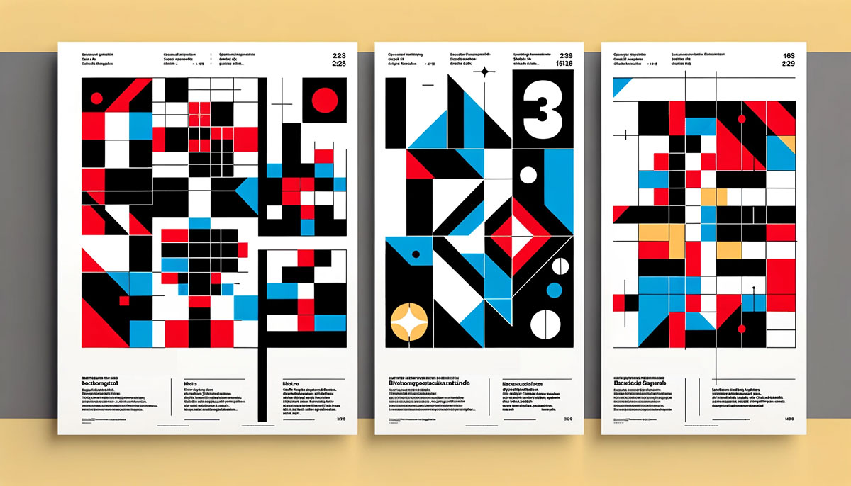
Every font size, heading level, and line of body text on your page is a typography element. Get them right, and readers move through content without thinking about it. Get them wrong, and people leave.
The HTTP Archive’s 2025 Web Almanac shows that 88% of websites now use web fonts. Yet most of those sites still make basic mistakes with heading hierarchy, spacing, and text accessibility.
This guide breaks down every typography element that affects how text looks and functions, from typeface classification and heading structure to kerning, vertical rhythm, and design system tokens. Each section covers what works, what doesn’t, and the data behind it.
What Are Typography Elements

Typography elements are the individual building blocks that control how text looks, reads, and functions on a page. They include headings, body text, blockquotes, lists, captions, links, and every other distinct text component you see on screen or in print.
Not the same thing as typographic properties. Properties like font spacing, weight, or size describe how a text element behaves. The elements themselves are the structural pieces that hold your content together.
Think of it this way. A heading is an element. The fact that your heading uses 32px bold Roboto is a collection of properties applied to that element.
The global font and typeface market was valued at roughly $1.14 billion in 2024, according to multiple industry reports. That figure covers everything from embedded system fonts to custom brand typefaces, and it’s projected to reach $1.66 billion by 2033 at a 4.3% compound annual growth rate (Business Research Insights).
Google’s Material Design and Apple’s Human Interface Guidelines both define typography elements as core components of their design systems. These frameworks standardize how headings, labels, body copy, and captions behave across platforms. And they’re not doing it for fun. Consistent type elements reduce cognitive load and keep users moving through content without friction.
In print design, typography elements follow conventions that go back centuries. Headings, pull quotes, footnotes, drop caps. Digital inherited most of these, then added its own: hyperlinks, interactive labels, responsive text blocks. The core elements of design remain the same, but the medium changes the rules for spacing, sizing, and interaction.
Typeface and Font Families
People still mix up typeface and font. A typeface is the design of the letterforms. Helvetica is a typeface. Helvetica Bold 14pt is a font. One is the blueprint, the other is a specific instance of it.
As of May 2025, Google Fonts hosts 1,826 font families (Photutorial). Roboto alone has over 28 trillion all-time views on the platform. That’s not a typo. It’s the default font for Android and most Google services, which inflates its numbers massively.
The HTTP Archive’s 2025 Web Almanac confirms that roughly 88% of websites now use web fonts. We’ve come a long way from the days when you were stuck choosing between Arial, Times New Roman, and Georgia.
| Classification | Characteristics | Common Use |
|---|---|---|
| Serif | Small strokes at letter ends, traditional feel | Long-form reading, editorial |
| Sans-serif | Clean edges, no decorative strokes | UI, web body text, tech brands |
| Monospace | Equal character width, mechanical rhythm | Code editors, terminal interfaces |
| Display | Decorative, high personality | Headlines, posters, branding |
| Script | Handwriting-inspired, flowing strokes | Invitations, luxury branding |
In CSS, font families work as a stack. You declare your preferred font first, then list fallbacks. If the browser can’t load your first choice, it moves down the list. That last generic keyword (serif, sans-serif, monospace) is your safety net.
Monotype’s 2024 Font Use & Forecasting Survey found that 83% of designers consider typography critical to branding and communication. And 76% said they prioritize readability and accessibility above all else when choosing typefaces.
Font Weight, Style, and Width
Weight runs on a numerical scale from 100 (thin) to 900 (black). Most body text sits at 400 (regular) or 700 (bold). The in-between values matter more than people think. A 500 medium weight heading can look completely different from a 600 semi-bold one.
Italic vs. oblique: true italic characters are redrawn letterforms with a different structure. Oblique is just the regular version slanted algorithmically. Most professional typefaces include true italics. Cheap ones fake it.
Width axes in variable fonts let you move between condensed and expanded versions without loading separate files. The HTTP Archive’s 2024 data shows variable fonts now appear on 34% of mobile pages, up from 30% the year before. Google Fonts serves about 92% of all variable fonts on the web.
Headings and Heading Hierarchy

Heading levels (H1 through H6) are structural markers, not just big text. Screen readers use them to build an outline of your page. Crawlers rely on them to understand content relationships. Getting the hierarchy wrong breaks both accessibility and how search engines interpret your pages.
WebAIM’s 2025 analysis of the top one million home pages found that 39% had skipped heading levels, a structural flaw that disrupts content navigation for assistive technology users.
The most common mistakes I keep seeing:
- Skipping from H2 to H4 because H3 “looked too big”
- Using heading tags for styling instead of structure
- Multiple H1 tags on the same page
- Headings that don’t describe the content below them
Typographic hierarchy creates a visual hierarchy that guides the reader’s eye through content. But that visual effect needs to match the semantic structure. If your H3 is styled larger than your H2, you’ve got a disconnect between what the user sees and what the code communicates.
Modular type scales help with this. A scale based on the Major Third ratio (1.25) produces heading sizes that feel naturally proportional. The Perfect Fourth (1.333) gives more dramatic contrast between levels. Tools like Typescale.com and Utopia.fyi generate fluid scales that adapt between breakpoints.
Wikipedia and gov.uk are good examples to study. Both use strict heading hierarchies with consistent sizing ratios. Their content is dense, and the heading structure is what makes it scannable. Your mileage may vary depending on the project, but the principle holds: headings are architecture, not decoration.
Body Text and Paragraphs
Body text carries the content weight. If your headings pull readers in, paragraphs are where they actually stay (or leave).
16px has been the standard minimum for body text on the web for years now. The U.S. Web Design System recommends at least 16px for most text, and there’s a good reason it stuck. It approximates 11 to 12pt in print, which sits in the proven comfort zone for sustained reading. Research by Rello, Pielot, and Marcos confirmed that readability and comprehension improve continuously up to a font size of 18 points.
Line height matters just as much as font size. For body text, aim for a ratio between 1.2 and 1.5 times the font size. W3C’s WCAG 2.2 guidelines recommend line spacing of at least 1.5 times the font size and letter spacing no less than 0.12 times the font size for accessibility compliance.
Smashing Magazine reported that proper spacing can reduce reading fatigue by 25%. Google’s 2023 Material Design update used a 1.5 line height ratio for interface elements and saw form completion rates jump by 18%.
Then there’s line length. Robert Bringhurst’s guideline of 45 to 75 characters per line has held up remarkably well from print to screen. The U.S. Web Design System specifies a readable range of 45 to 90 characters, with 66 characters as a solid target for long-form text. In CSS, the ch unit makes it simple to set max-width: 65ch on a text container and call it done.
Inline Text Elements
Bold, italic, underline, strikethrough. These are inline text elements that modify meaning or emphasis within a paragraph. They seem basic, but the HTML distinction matters.
<strong> vs. <b>: both render bold text, but <strong> carries semantic weight. Screen readers announce it with emphasis. <b> is purely visual.
<em> vs. <i>: same deal. <em> indicates stress emphasis that changes the meaning of a sentence. <i> is for alternate voice, like foreign words or technical terms.
Superscript, subscript, and small text round out the inline elements. You’ll use <sup> for footnote markers and ordinal indicators, <sub> for chemical formulas, and <small> for legal disclaimers or fine print.
Links and Interactive Text
Hyperlinks are a typography element unique to digital. They need to be visually distinct, accessible, and functional across five different states: link, visited, hover, active, and focus.
WebAIM’s 2025 study found that 79.1% of home pages still fail minimum color contrast requirements. Low-contrast text was the single most common accessibility violation, averaging 29.6 instances per page. A large chunk of those failures happen with link styling.
Underlines still matter. WCAG requires that links be distinguishable from surrounding text by more than just color. Contrast alone doesn’t cut it, because roughly 8% of men and 0.5% of women have some form of color vision deficiency. An underline, a border-bottom, a different font weight. Something beyond color needs to signal “this is clickable.”
Link styling differs depending on context:
- Within body text: underlined or visually offset from surrounding copy
- In navigation: styled as menu items, often without underlines but with clear hover/focus states
- As buttons: wrapped in styled containers with padding, background color, and border radius
And the “click here” problem. Writing link text like “click here” or “read more” tells screen reader users nothing about the destination. Descriptive anchor text like “view our pricing page” or “download the 2024 report” is better for both accessibility and search engines.
Lists and List Styling
Lists are structural typography elements that organize information into scannable groups. HTML gives you three types, and each serves a different purpose.
| List Type | HTML Element | Best For |
|---|---|---|
| Unordered | <ul> |
Items where sequence doesn’t matter |
| Ordered | <ol> |
Steps, rankings, sequential instructions |
| Description | <dl> |
Term-definition pairs, glossaries, metadata |
Marker styling has gotten more flexible in recent years. The ::marker pseudo-element lets you change the color, size, and content of list markers without the old workaround of hiding default bullets and adding custom ones through ::before.
list-style-type still handles the basics. Disc, circle, square for unordered lists. Decimal, lower-alpha, upper-roman for ordered ones. But custom markers open up much more creative territory, especially in editorial and web design contexts.
Nested lists need careful attention to indentation and spacing. Each nesting level should have consistent left padding, and the vertical rhythm of your list items needs to work with the line height of your surrounding body text. If your list items feel cramped or disconnected from the rest of the page, the spacing between text elements is off.
White space between list items and surrounding content keeps the page readable. A list jammed against a paragraph above and below it looks messy and breaks the flow of reading. Small margins before and after the list fix this instantly.
Blockquotes, Pull Quotes, and Captions
These three elements serve different roles, but they all present text that sits outside the main body flow. Getting them mixed up is more common than you’d think.
A blockquote is a semantic HTML element (<blockquote>) that marks text quoted from another source. It’s not a styling choice. If you’re attributing words to someone else, that’s a blockquote. The browser indents it by default, and screen readers announce it as quoted content.
A pull quote is purely editorial. It takes a sentence or phrase from your own content and highlights it visually to break up long sections. Magazines and news sites use them constantly. The New York Times, for example, uses large-format pull quotes between paragraphs to give readers a scanning point in long-form articles.
Captions belong to figures. The <figcaption> element pairs with images, charts, code blocks, or illustrations wrapped in a <figure> tag. Captions add context that the visual can’t convey on its own.
| Element | Purpose | Semantic HTML | Typical Styling |
|---|---|---|---|
| Blockquote | Attribute external source | <blockquote> |
Indented, left border, italic |
| Pull quote | Highlight own content | No dedicated tag | Large text, decorative marks |
| Caption | Describe a figure | <figcaption> |
Small text, muted color |
Styling conventions vary, but there are patterns that work. A left border with padding for blockquotes. Quotation marks or a size bump for pull quotes. Smaller, slightly lighter text for captions. The point is that each one should look distinct from body text while staying consistent within its own category across the page.
Pull quotes work best in editorial design layouts where text runs long enough to need visual breaks. If your article is 400 words, a pull quote just clutters things up.
Spacing, Tracking, and Kerning

Three terms that deal with space between characters. People use them interchangeably. They shouldn’t.
Letter-Spacing and Tracking
Tracking adjusts spacing uniformly across all characters in a word, line, or block of text. In CSS, it’s controlled with the letter-spacing property.
When to adjust tracking:
- Uppercase text (which almost always needs added spacing to look right)
- Very large headings where default spacing feels tight
- Small text where a slight increase helps readability
Research shows optimizing letter spacing can make smaller characters up to 20% easier to read compared to default settings (Arditi, 2004). The British Dyslexia Association recommends letter spacing at minimum 35% of character width for accessible text.
Kerning: Pair-Specific Adjustments
Browsers handle kerning automatically through OpenType features. The HTTP Archive’s 2025 Web Almanac confirms that roughly 61% of web font files now include at least one OpenType feature table, up from under 50% in 2022.
Key difference: tracking is global (every pair gets the same adjustment), kerning is pair-specific (only problematic combinations like AV, WA, or To get corrected).
Professional typefaces include built-in kerning pairs. Cheaper fonts don’t, and the difference shows fast in headlines and logo type. CSS enables kerning by default through font-kerning: auto, and most browsers respect it.
Word Spacing
Rarely touched, but it exists. The word-spacing property in CSS adjusts the gap between words. Most developers never change it from the default.
Where it actually matters: justified text. When text is justified, browsers stretch word spacing to fill each line, which can create ugly “rivers” of white space running vertically through paragraphs. That’s one reason WCAG recommends avoiding justified text for accessibility-critical content.
Typographic Scale and Vertical Rhythm

A typographic scale is a predefined set of font sizes that relate to each other through a consistent ratio. Pick a ratio, pick a base size, and your entire heading and text hierarchy follows automatically.
| Scale Name | Ratio | Feel |
|---|---|---|
| Minor Second | 1.067 | Subtle, tight differences between sizes |
| Major Third | 1.25 | Comfortable, good for body-heavy pages |
| Perfect Fourth | 1.333 | Stronger contrast, works for marketing |
| Golden Ratio | 1.618 | Dramatic jumps, display-heavy layouts |
Tools like Typescale.com and Utopia.fyi generate fluid type scales that adjust between breakpoints using CSS clamp(). No more writing five media queries to handle font sizes. You set a min, a max, and a preferred value tied to viewport width.
Figma reported over 10 million users by 2025, and its Library Analytics (launched February 2025) now tracks typography style adoption across organizations. That means design teams can finally measure whether their type scale is actually being used or ignored.
Vertical Rhythm in Practice
Vertical rhythm is the idea that all vertical spacing on a page follows a consistent unit. If your baseline grid interval is 8px, then line heights, margins, and padding should all be multiples of 8.
Using rem and em units makes this easier. Set your base font size on the <html> element, and everything else scales proportionally. Change the root size for a different breakpoint, and the entire type system adjusts with it.
Took me a while to stop eyeballing spacing and actually commit to a baseline unit. But once you do, pages feel more cohesive without being able to pinpoint exactly why. Your eye just reads the balance between elements without thinking about it.
Typography Elements in Design Systems

Design systems turn typography decisions into reusable, documented components that teams can apply consistently across products. Without them, every developer and designer makes slightly different type choices, and the inconsistency compounds fast.
The Design Tokens Community Group published its first stable specification (version 2025.10) in October 2025, giving teams a vendor-neutral standard for sharing typography, color, and spacing decisions across tools and platforms.
How Design Tokens Define Type Styles
Design tokens are the smallest pieces of a design system. For typography, that means tokens for font family, font size, font weight, line height, and letter spacing.
Semantic naming is the approach most mature systems use. Instead of raw values like font-size-16, they use names like body-large, heading-sm, or caption. This separates the decision (what this text is for) from the implementation (what size it actually is).
IBM Carbon, Shopify Polaris, and Atlassian’s design system all publish their typography tokens publicly. Tailwind CSS defines its type scale through utility classes like text-sm, text-lg, text-2xl. Material Design by Google specifies type roles like “Display Large,” “Headline Small,” and “Body Medium,” each with fixed size, weight, and leading values.
Typography as Code Components
In React, Vue, and other component frameworks, typography often gets abstracted into dedicated components. A <Text> or <Heading> component wraps the underlying HTML element and applies tokens automatically.
Figma commands a 40.65% market share in design tools (Cropink, 2025), and its design system analytics allow teams to track how typography styles are adopted. As of February 2025, Figma’s Library Analytics tracks not just component usage but also style and variable adoption across organizations.
Nearly 95% of Fortune 500 companies use Figma in their workflows (SQ Magazine). That level of adoption means typography decisions made in Figma’s design system tools ripple through to production code at massive scale.
Why Consistency Across Type Elements Matters More Than Any Single Choice
You can pick the perfect typeface, get your scale right, nail the line spacing, and still end up with a disjointed product if the implementation varies across teams.
Brand guidelines that only live in a PDF don’t get followed. Tokens that live in code do. The shift toward token-based systems reflects a simple truth: consistency at scale requires automation, not documentation alone.
The graphic design principles that apply to a single poster apply to design systems too, just at a different scale. Repetition builds recognition. Proximity groups related information. Alignment creates order. These principles don’t stop mattering just because you’re working in Figma instead of holding a pencil.
FAQ on Typography Elements
What are typography elements?
Typography elements are the individual text components that structure a page. Headings, body text, blockquotes, lists, captions, and links all count. Each one controls how content is organized, read, and understood by both users and screen readers.
What is the difference between a typeface and a font?
A typeface is the overall design of the letterforms (like Helvetica). A font is a specific variation within that typeface, such as Helvetica Bold 16px. One is the family, the other is a single member of it.
Why does heading hierarchy matter?
Heading levels (H1 through H6) create document structure that screen readers and search engines rely on. Skipping levels or using headings just for visual sizing breaks accessibility and confuses how your content gets indexed.
What font size should body text be on the web?
16px is the standard minimum for body text. Research confirms readability improves up to 18pt. The U.S. Web Design System and most design frameworks use 16px as the default baseline for comfortable screen reading.
What is the ideal line length for readability?
Between 45 and 75 characters per line. Robert Bringhurst established this guideline, and it holds true for digital. In CSS, setting max-width: 65ch on text containers gets you close to the sweet spot.
How do kerning and tracking differ?
Kerning adjusts space between specific letter pairs (like AV or WA). Tracking adjusts spacing uniformly across all characters in a word or block. Kerning is pair-specific. Tracking is global. Both affect readability, but they solve different problems.
What is a typographic scale?
A typographic scale is a set of font sizes based on a consistent mathematical ratio. Common ratios include Major Third (1.25) and Perfect Fourth (1.333). Tools like Utopia.fyi generate fluid scales that respond to viewport width.
What are design tokens for typography?
Design tokens store typography decisions (font size, weight, line height) as named variables. Instead of hardcoding values, systems like IBM Carbon and Shopify Polaris use semantic names like body-large or heading-sm for consistency.
What is vertical rhythm in typography?
Vertical rhythm means all spacing follows a consistent unit. If your baseline interval is 8px, then line heights, margins, and padding are all multiples of 8. It makes pages feel cohesive even when using multiple text sizes.
How does typography affect web accessibility?
WCAG requires a minimum 4.5:1 contrast ratio for normal text and line spacing at least 1.5 times the font size. WebAIM’s 2025 analysis found 79.1% of home pages still fail contrast requirements. Typography choices directly impact who can read your content.
Conclusion
Typography elements do the heavy lifting on every page you build. From heading hierarchy and font families to blockquotes, list styling, and design tokens, each piece shapes how people read, scan, and trust your content.
The numbers back this up. With 88% of sites using web fonts and variable font adoption climbing past 34% on mobile, text rendering decisions affect real performance and user experience metrics.
Get your type scale consistent. Use semantic heading levels. Pay attention to line height and character spacing. Build your choices into a token-based system so they don’t drift over time.
Good typography doesn’t draw attention to itself. It just makes everything else on the page work better. Start with the fundamentals covered here, then test and adjust based on what your audience actually needs.

Renowned for his expertise in logo design and visual branding, Bogdan has developed a multitude of logos for various clients.
His skills extend to creating posters, vector illustrations, business cards, and brochures. Additionally, Bogdan's UI kits were featured on marketplaces like Visual Hierarchy and UI8.
He also wrote in the past years on sites like Design Your Way, WebDesignerDepot, WPDean, Designmodo, Speckyboy, Slider Revolution, and more.
- How to Set Up a Digital Menu Board: Hardware to Layout - 15 September 2026
- The Arc Browser Logo History, Colors, Font, And Meaning - 14 September 2026
- From Information to Persuasion: A Practical Framework for Strategic Presentation Design - 14 September 2026

Bogdan Sandu is a seasoned designer who has been designing websites since 2008. Renowned for his expertise in logo design and visual branding, Bogdan has developed a multitude of logos for various clients. His skills extend to creating posters, vector illustrations, business cards, and brochures. Additionally, Bogdan's UI kits were featured on marketplaces like Visual Hierarchy and UI8. He also wrote in the past years on sites like Design Your Way, WebDesignerDepot, WPDean, Designmodo, Speckyboy, Slider Revolution, and more.
You Might Also Like