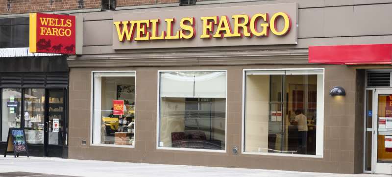
The Wells Fargo logo is one of the most recognized symbols in American banking, built around a red stagecoach icon paired with the company’s wordmark.
It represents over 170 years of financial history and has gone through several visual updates while keeping its core identity intact.
The current design reflects a balance between historical roots and modern brand standards, making it immediately recognizable across physical and digital touchpoints.
Few bank logos carry this kind of historical weight alongside consistent visual recognition.
What is the Wells Fargo Logo?
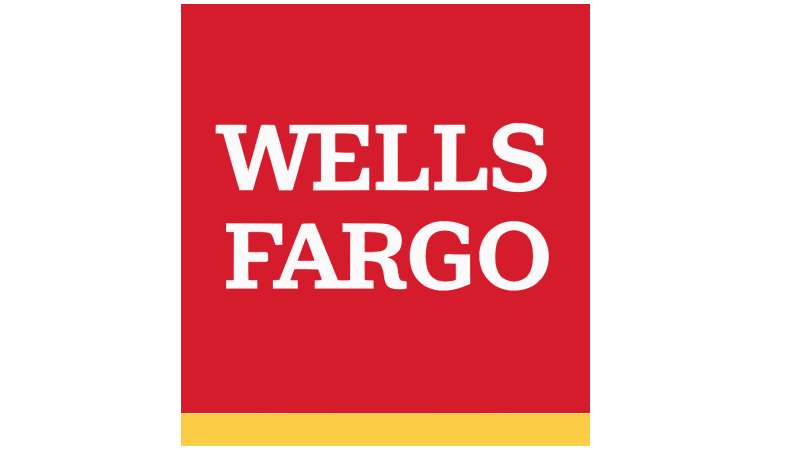
The Wells Fargo logo is a combination mark featuring a red stagecoach symbol alongside the “Wells Fargo” wordmark in a custom serif-style typeface. The current version was refined in the 2010s and uses a red and gold color palette rooted in the bank’s 19th-century origins.
- Design Type: Combination mark (icon + wordmark)
- Primary Elements: Stagecoach icon, custom wordmark typography
- Official Introduction Date: Current identity refined circa 2019
- Designer/Agency: Internal brand team (no single external agency publicly credited for the current iteration)
- Trademark Status: Registered trademark, Wells Fargo & Company
- Color Palette: Wells Fargo Red (#D71E28), Gold (#FFCD11), White (#FFFFFF)
- Usage Context: Bank branches, ATMs, digital banking platforms, marketing materials, credit and debit cards, corporate communications, and merchandise
How Has the Wells Fargo Logo Evolved Over Time?
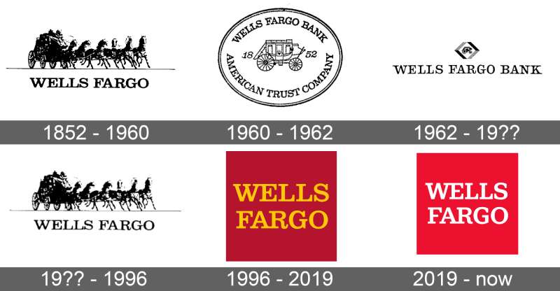
Wells Fargo’s visual identity has changed significantly since 1852, moving from text-heavy Victorian-era designs through simplified mid-century wordmarks and eventually arriving at the stagecoach-focused combination mark used today.
The stagecoach has been a recurring element for decades, but its rendering has shifted from detailed illustrative versions to the cleaner, flatter form seen now.
Original Wells Fargo Logo (1852–Early 1900s)
- Years Active: 1852 to early 1900s
- Design Description: Text-based identity typical of 19th-century commercial branding, with elaborate serif letterforms and decorative framing
- Color Scheme: Black and gold (print-focused)
- Designer: Unknown
- Context: Founded in 1852 by Henry Wells and William Fargo during the California Gold Rush; the brand identity reflected the typography conventions of the era
- Key Changes from Previous: N/A (original)
- Cultural Significance: Positioned Wells Fargo as a trustworthy express and banking company during westward expansion
Mid-Century Wordmark Era (Early 1900s–1960s)
- Years Active: Early 1900s to 1960s
- Design Description: Simplified wordmark, less ornamentation, moving toward cleaner commercial typography
- Color Scheme: Black and red introduced in some applications
- Designer: Unknown
- Context: Shift toward modern business presentation as banking became more institutionalized
- Key Changes from Previous: Removed Victorian decorative elements; cleaner letterforms
- Cultural Significance: Reflected broader American corporate identity trends of the early 20th century
Stagecoach Introduction Era (1960s–2000s)
- Years Active: 1960s to early 2000s
- Design Description: The stagecoach icon became a central brand element, often detailed and illustrated, paired with a bold serif wordmark
- Color Scheme: Red and gold as primary palette
- Designer: Various internal and agency updates over this period
- Context: Wells Fargo leaned into its Western heritage as a differentiator in a crowded banking market
- Key Changes from Previous: Addition of the stagecoach as a signature symbol; red became dominant
- Cultural Significance: Cemented the stagecoach as synonymous with Wells Fargo’s identity, tying modern banking to frontier history
Current Logo (2019–Present)
- Years Active: 2019 to present
- Design Description: Flatter, more refined stagecoach icon with a clean wordmark; optimized for digital and small-scale use
- Color Scheme: Wells Fargo Red (#D71E28), Gold (#FFCD11)
- Designer: Wells Fargo internal brand team
- Context: Introduced as part of broader brand refresh following public scrutiny and reputational challenges; a push toward cleaner, more trustworthy presentation
- Key Changes from Previous: Simplified stagecoach rendering, tighter typography, improved digital scalability
- Cultural Significance: Attempts to re-anchor the brand in reliability and its historical narrative during a period of institutional rebuilding
What Do the Design Elements of the Wells Fargo Logo Mean?
The stagecoach is the emotional core of the logo. It references Wells Fargo’s original express delivery and banking services during the Gold Rush era, when physical transport of valuables and mail was the business.
The combination of icon and wordmark gives the logo both symbolic depth and immediate name recognition. Neither element works as well alone.
What Does the Stagecoach Symbol Represent?
The stagecoach directly references Wells Fargo’s origins as an express company moving gold, mail, and passengers across the American West.
It signals reliability and forward movement. A coach pulled by horses implies speed, trust, and delivery.
Over time it became less about literal transport and more about brand heritage. It’s now a shorthand for “this is Wells Fargo” rather than a functional descriptor.
Why Did Wells Fargo Choose These Specific Colors?
The color choices are rooted in both history and color psychology.
- Wells Fargo Red (#D71E28)
- Symbolic meaning: Energy, urgency, strength
- Psychological impact: Grabs attention, signals confidence and authority
- Brand connection: Dominant color across all touchpoints; ties to the historic red stagecoach coaches used in the 1800s
- Gold (#FFCD11)
- Symbolic meaning: Wealth, the California Gold Rush, prosperity
- Psychological impact: Signals value and premium quality
- Brand connection: Direct reference to the Gold Rush context in which Wells Fargo was founded; gold is literally what the company once transported
- White (#FFFFFF)
- Symbolic meaning: Clarity, cleanliness, transparency
- Psychological impact: Creates breathing room and contrast, especially on digital platforms
- Brand connection: Used primarily as background and contrast color in digital banking applications
What Typography Style Is Used in the Wells Fargo Logo?
The wordmark uses a custom serif typeface. It’s not a standard off-the-shelf serif font, though it draws from classic banking typography traditions.
The letterforms are sturdy and clear. No thin strokes that would disappear at small sizes.
Earlier versions used heavier, more ornate serifs. The current version is tighter and more refined, better suited for screens and small print applications. The typography reads as established and serious without being stiff.
What Are the Hidden Meanings in the Wells Fargo Logo?
There’s no widely documented hidden image or subliminal trick in the Wells Fargo logo. It’s intentionally straightforward.
The stagecoach moving to the right is a subtle directional cue, visually suggesting forward momentum. Most Western brands do this deliberately.
The combination of warm red and gold, both historically associated with power and money, creates a subconscious association with financial authority that functions below the level of conscious reading. It’s not hidden exactly, just layered.
How Does the Wells Fargo Logo Compare to Competitor Logos?
Among the Big Four US banks, Wells Fargo’s logo stands out for using a pictorial icon. Its competitors rely almost entirely on abstract marks or letterform-based symbols, making the stagecoach a genuine differentiator.
The Bank of America logo uses a stylized flag/stripes mark in red, white, and blue. It’s abstract and patriotic but carries no historical narrative.
The JP Morgan Chase logo is a bold blue octagon with a stylized geometric mark. Clean, corporate, and cold compared to Wells Fargo’s warmth.
The Citigroup logo uses a wordmark with a red arc, minimal and modern.
Wells Fargo is the only major US bank whose logo tells a story. That’s both its strength and, depending on public perception of the brand, a complicating factor. The stagecoach can’t be separated from the company’s history, for better or worse.
Compared to European banks like HSBC or Barclays, Wells Fargo’s identity is warmer and more narrative-driven. HSBC uses a geometric hexagon mark that prioritizes global neutrality. Barclays uses an eagle, which is the closest parallel to Wells Fargo’s pictorial approach, though the eagle is more heraldic than historical.
What Are the Technical Specifications of the Wells Fargo Logo?
Official Color Codes
- Primary Color: Wells Fargo Red
- Hex: #D71E28
- RGB: (215, 30, 40)
- CMYK: (0, 86, 81, 16)
- Pantone: PMS 485 C (approximate)
- Secondary Color: Gold
- Hex: #FFCD11
- RGB: (255, 205, 17)
- CMYK: (0, 20, 93, 0)
- Pantone: PMS 116 C (approximate)
- Accent Color: White
- Hex: #FFFFFF
- RGB: (255, 255, 255)
- CMYK: (0, 0, 0, 0)
- Pantone: N/A
Dimensions and Proportions
- Aspect ratio: The horizontal lockup (stagecoach left, wordmark right) is approximately 3:1 width to height
- Minimum size requirements: The stagecoach icon should not be reproduced smaller than 0.5 inches (print) or 36px (digital) to maintain legibility
- Clear space specifications: A clear space equal to the height of the “W” in the wordmark is maintained on all sides
- Official usage guidelines: Available through Wells Fargo’s brand portal for authorized vendors and partners; not publicly accessible
What Cultural Impact Has the Wells Fargo Logo Had?

The stagecoach has become a cultural shorthand for old American West banking and express delivery history. It appears in museum exhibits, Western films, and historical references completely independent of the current bank.
Wells Fargo arenas and sports venues across the US have spread the visual identity into daily life well beyond banking contexts.
The logo’s red and gold combination has become so tied to the brand that any similar palette in financial services reads as a Wells Fargo reference, intentional or not.
After the 2016 accounts scandal, the logo took on complicated public associations. The stagecoach became a target of editorial commentary and protest imagery, a reminder that a strong logo is inseparable from the reputation of the company behind it. Interesting to note how the same icon that once communicated trustworthiness started being used ironically in news coverage.
Despite that period, the brand has maintained its visual identity rather than distancing itself with a full redesign. That’s a deliberate choice. A full rebrand would signal panic; staying the course signals institutional confidence, for better or worse.
How Does the Wells Fargo Logo Fit Into the Overall Brand Identity?
The logo functions as the anchor of a larger brand system that includes branch design, ATM interfaces, digital banking apps, credit card design, uniforms, and sponsorship materials.
The stagecoach appears independently as a standalone icon across digital platforms, separated from the wordmark when space is limited.
The red and gold palette extends into interior design at branch locations, into the color of physical credit cards, and into the Wells Fargo mobile app interface.
Brand guidelines govern how the logo interacts with photography, illustration, and typography across all materials. The stagecoach and wordmark are treated as a protected system with specific rules about spacing, color usage, and minimum size. The brand style guide ensures consistency whether you’re looking at a billboard or a mobile notification.
The logo also connects to a family of related entities: Wells Fargo Advisors, Wells Fargo Home Mortgage, and Wells Fargo Auto all use the same visual system with slight adaptations for their sub-brand contexts.
How Should the Wells Fargo Logo Be Used?
Official Usage Guidelines
- Do: Use approved logo files from Wells Fargo’s official brand portal
- Do: Maintain required clear space around the logo at all times
- Do: Use on approved background colors only (white, Wells Fargo Red, and approved dark backgrounds)
- Do: Scale proportionally; never stretch or distort the mark
- Don’t: Recreate the logo from scratch or modify any element
- Don’t: Use unapproved color variations
- Don’t: Place the logo on busy backgrounds that compromise legibility
- Don’t: Animate the logo without explicit brand approval
- Don’t: Use the stagecoach icon without the wordmark in contexts where brand recognition is not already established
Where to Access Official Logo Files
Official vector graphics and approved logo files are available to Wells Fargo partners, vendors, and media through the company’s official brand portal. Public access is restricted. Journalists can request approved assets through Wells Fargo’s media relations team.
Licensing and Trademark Protection
The Wells Fargo name, stagecoach icon, and combined logo are registered trademarks of Wells Fargo & Company. Unauthorized commercial use is prohibited. Any co-branding arrangement requires a formal licensing agreement directly with Wells Fargo.
Using the logo in editorial or news contexts typically falls under fair use, but commercial reproduction, parody merchandise, or implied endorsement without permission creates legal exposure. When in doubt, reach out to Wells Fargo’s legal or brand team before publishing.

Renowned for his expertise in logo design and visual branding, Bogdan has developed a multitude of logos for various clients.
His skills extend to creating posters, vector illustrations, business cards, and brochures. Additionally, Bogdan's UI kits were featured on marketplaces like Visual Hierarchy and UI8.
He also wrote in the past years on sites like Design Your Way, WebDesignerDepot, WPDean, Designmodo, Speckyboy, Slider Revolution, and more.
- The Windsurf Logo History, Colors, Font, And Meaning - 10 October 2026
- How to Remove Background From Product Photos (No Photoshop) - 10 October 2026
- How Designers can Build a Stronger Online Creative Identity - 9 October 2026

Bogdan Sandu is a seasoned designer who has been designing websites since 2008. Renowned for his expertise in logo design and visual branding, Bogdan has developed a multitude of logos for various clients. His skills extend to creating posters, vector illustrations, business cards, and brochures. Additionally, Bogdan's UI kits were featured on marketplaces like Visual Hierarchy and UI8. He also wrote in the past years on sites like Design Your Way, WebDesignerDepot, WPDean, Designmodo, Speckyboy, Slider Revolution, and more.
You Might Also Like