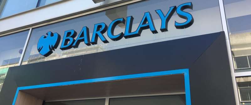
The Barclays logo is one of the most recognized symbols in global banking, built around a spread eagle emblem paired with a bold wordmark. The eagle has been tied to the bank for nearly three centuries, long before anyone used the word “logo”, and it still does most of the recognition work today.
Within the broader story of bank logos, Barclays sits in rare company. It’s one of the few major financial institutions that kept an animal symbol through multiple redesigns rather than moving toward purely abstract or typographic marks. That’s a deliberate choice, and it says a lot about how the brand thinks about heritage versus modernity.
The current flat blue eagle was introduced in 2004, after Williams Murray Hamm was hired to evolve the 1999 identity created by Interbrand Newell and Sorrell. The bank itself traces its roots to 1690, and the eagle goes back to 1728, when the business moved into premises on Lombard Street known by the sign of the Black Spread Eagle.
What Is the Barclays Logo?
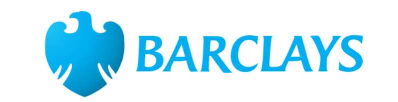
The Barclays logo is a light blue spread eagle paired with the BARCLAYS wordmark. This flat, crownless eagle was introduced in 2004 by the agency Williams Murray Hamm, replacing the 1999 Interbrand Newell and Sorrell version. The eagle itself dates back to 1728, when it was the sign above the bank’s Lombard Street premises.
| Symbol | Spread eagle (wings displayed), shown without the crowns of earlier versions |
| Designer/agency | Williams Murray Hamm (2004 evolution); Interbrand Newell and Sorrell (1999 identity) |
| Current version since | 2004 |
| Colors (hex) | Barclays light blue, commonly cited as #00AFE9; white #FFFFFF |
| Typeface | Proprietary Monotype brand fonts (Barclays Sans, later Expert Sans); no widely accepted free match |
| Previous major version | 1999–2004: blue eagle with three crowns set on a glossy globe, by Interbrand Newell and Sorrell |
How Has the Barclays Logo Evolved Over Time?
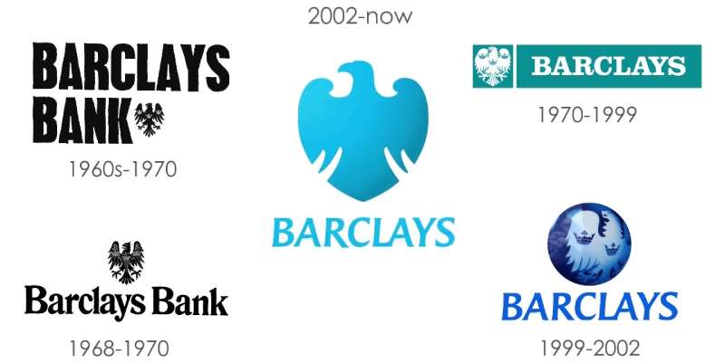
The logo has moved from a heraldic black eagle to a flat, single-color blue mark.
The eagle has been central to every version.
Each redesign simplified it further while keeping the core symbol intact.
The Black Spread Eagle Sign (1728 Onward)
- Years Active: From 1728, as a premises sign rather than a logo
- Design Description: A black spread eagle, the sign of the building at Lombard Street in the City of London
- Designer: Unknown; the sign predates the bank’s use of it
- Context: Goldsmith bankers John Freame and Thomas Gould started trading on Lombard Street in 1690. In 1728 the business moved to premises identified by the “Sign of the Black Spread Eagle”, and the eagle stayed with the bank. James Barclay, Freame’s son-in-law, became a partner in 1736, which is where the Barclay name enters the story
- Cultural Significance: Shop signs did the job of logos in an era when many customers couldn’t read, so the eagle was a practical identifier long before it was a brand asset
The 1937 Coat of Arms Eagle with Three Crowns
- Years Active: From 1937, used across the bank’s printed material for decades
- Design Description: A detailed black heraldic eagle with a crown on its body and on each wing
- Color Scheme: Black and white
- Designer: Not publicly credited
- Context: Barclays received a grant of arms in 1937. The three crowns are usually explained as a way to set the bank’s eagle apart from the many similar eagles used by royal houses and states
- Key Changes from Previous: The eagle became a formal heraldic emblem rather than just a building sign
Barclays Bank Old Logo (1960s–1970)
- Years Active: 1960s to about 1970
- Design Description: The black crowned eagle placed with the name “Barclays Bank”, appearing in different lockups, including a heavy condensed version and a serif version with the eagle above the name
- Color Scheme: Mostly black and white
- Designer: Not publicly credited
- Context: Barclays launched Barclaycard in 1966, the UK’s first credit card, and the bank needed a mark that could work across far more products and print formats
The Turquoise Eagle Panel (c. 1970–1999)
- Years Active: Around 1970 to 1999
- Design Description: A white crowned eagle set inside a turquoise-blue panel, next to the BARCLAYS name in white capitals on the same color
- Color Scheme: Turquoise blue and white
- Designer: Not publicly credited
- Context: Dealer and collector records describe the blue emblem as introduced in the 1960s and adopted in 1970. This is the version most people mean when they search for the “old Barclays logo”
- Key Changes from Previous: Color became the main identifier, and “Bank” dropped out of the name in the lockup
The Globe Eagle (1999–2004)
- Years Active: 1999–2004
- Design Description: A blue eagle with its three crowns, set on a shiny, three-dimensional blue globe, above a bold blue BARCLAYS wordmark
- Color Scheme: Several shades of blue on white
- Designer: Interbrand Newell and Sorrell
- Context: A late-1990s identity overhaul, when glossy, sphere-based marks were common across corporate branding
- Key Changes from Previous: The panel was replaced by the globe; the eagle switched from white to blue feathers
Current Barclays Logo (2004–Present)
- Years Active: 2004–present
- Design Description: A flat, light blue spread eagle with no globe and no crowns, paired with the BARCLAYS wordmark in capitals
- Color Scheme: Light blue and white
- Designer: Williams Murray Hamm, appointed in November 2003 to evolve and unify the identity
- Context: Reports from mid-2004 describe the change: the eagle was taken off the globe, the three crowns were dropped and its feathers were recolored blue
- Key Changes from Previous: Flat color instead of 3D effects; a simpler silhouette that holds up as an app icon or a card logo. The wordmark and brand typefaces have been revised since
What Do the Design Elements of the Barclays Logo Mean?
The eagle is the core of everything. It signals strength, vision, and authority, which are qualities banks have relied on heraldic imagery to communicate for centuries.
The spread wings suggest reach and readiness, fitting for a bank operating across dozens of countries.
The capitalized sans-serif wordmark keeps the overall mark grounded and contemporary, preventing the eagle from reading as purely historical.
Why Does the Eagle Appear in the Barclays Logo?
The short answer is a building. When the business moved in 1728, its new premises on Lombard Street were known by the sign of the Black Spread Eagle, and the bank kept the emblem.
The spread eagle also has deep roots in European heraldry, where it symbolized power and protection. That made it an easy fit when Barclays formalized its arms in 1937.
The crowns were part of the emblem for most of the 20th century and were only removed in 2004.
Why Did Barclays Choose These Specific Colors?
- Barclays light blue
- Symbolic meaning: Trust, stability, professionalism
- Psychological impact: Blue is the dominant color in global banking because it signals reliability. Barclays’ lighter, brighter blue reads as more approachable than the navy used by many competitors
- Brand connection: Blue has been the bank’s main color since the turquoise panel era
- White
- Symbolic meaning: Clarity, simplicity
- Psychological impact: Creates contrast and gives the mark room to breathe across digital and print applications
Understanding color psychology helps explain why Barclays has stayed with blue across every major redesign. It’s not just tradition. It’s the most trusted color in financial services, and switching away from it would require rebuilding significant brand recognition. Basic color theory explains the rest: blue reads as calm and dependable, and it keeps contrast high against white.
What Typography Style Is Used in the Barclays Logo?
The wordmark is set in capitals in a clean sans-serif font. Barclays doesn’t sell or release its brand fonts, and no designer has been publicly credited with the wordmark itself.
Trade press coverage of the bank’s brand typefaces names Monotype as the type partner: the earlier Barclays Sans and the newer Expert Sans. Both are proprietary, so there’s no official free download.
Older versions used serif and heavy display lettering, which reinforced the traditional banking look. The move to a sans-serif was a clear signal of modernization.
Good typography in a bank logo has to work at two extremes: massive branch signage and tiny card print. Barclays’ wordmark handles both reasonably well, though it’s not particularly distinctive on its own. The eagle does most of the recognition work.
What Are the Hidden Meanings in the Barclays Logo?
The wing spread is symmetrical, suggesting balance and stability. Asymmetric eagle designs read as more aggressive or dynamic, which wouldn’t fit a retail banking brand.
There’s no intentionally hidden imagery in the Barclays mark in the way that, say, the FedEx arrow works. The symbolism is straightforward. The most interesting “hidden” detail is historical: the shape still descends from a shop sign on Lombard Street.
How Does the Barclays Logo Compare to Competitor Logos?
Barclays is unusual among major UK banks for keeping an animal symbol this long. Most competitors have moved toward abstract marks or pure wordmarks, making the eagle a genuine differentiator in the category. Among blue logos in financial services, it is also one of the easiest to recognize at a glance.
The HSBC logo uses a geometric hexagon derived from a flag motif, completely abstract and globally neutral. The Royal Bank of Scotland logo moved through various iterations before settling on a typographic approach. Lloyds Bank uses a black horse, another animal symbol, but with very different connotations of strength and stubbornness versus the eagle’s more aerial, authoritative feel.
Compared to American counterparts, the JP Morgan Chase logo uses an abstract octagon, while the Bank of America logo works with a flag-inspired geometric mark. Neither uses figurative imagery. The Wells Fargo logo is the closest American parallel, using a stagecoach as a heritage symbol, though it’s more illustrative and less adaptable to minimal digital contexts than the Barclays eagle.
Within European banking, the Deutsche Bank logo is a masterclass in abstract symbol design, a diagonal slash inside a square that works at any size. The BNP Paribas logo and the Societe Generale logo both use abstract marks. The ING logo keeps a lion but renders it in a very flat, modern way similar to Barclays’ treatment of the eagle.
The UBS logo uses three keys as its symbol. It’s a more conceptually loaded mark than Barclays’ eagle, but both approaches work because the symbols have clear connections to the brand’s story.
The Standard Chartered logo and the Citigroup logo both rely on simpler, more typographic solutions, reflecting the wider trend toward wordmark-led branding in financial services.
What Are the Barclays Logo Colors?
Barclays has not published its color values publicly, so every code you’ll find online comes from third parties or from sampling the logo.
- Barclays light blue: Hex #00AFE9, RGB (0, 175, 233), commonly cited by brand color references, which match it to Pantone 298 C
- White: Hex #FFFFFF
- Dark blue: A deeper navy appears in parts of the wider Barclays brand, but no reliable source gives an exact value, so treat any navy code as an approximation
For screen work, use the RGB or hex value; for print, convert to CMYK with your printer’s profile rather than trusting a number copied from a website. If you need the mark itself, a clean vector file scales far better than a JPEG grab, and print output generally needs around 300 DPI as a general rule of thumb.
What Cultural Impact Has the Barclays Logo Had?
The Barclays eagle is one of a handful of financial logos that many British adults can identify without the wordmark present.
That kind of standalone symbol recognition is rare and takes decades to build.
The Premier League sponsorship put the name and eagle in front of football audiences worldwide. Barclaycard was title sponsor from 2001 to 2004, and Barclays from 2004 until 2016.
The Barclays Center in Brooklyn, New York carries the name in a market where most people never bank with Barclays, which shows the brand has equity beyond its products.
Among British consumers, the eagle has cultural associations that go beyond banking. It appears in protest imagery, parody, and commentary in ways that mark it as a genuinely embedded cultural symbol rather than just a corporate mark. That’s actually a sign of strong logo design. When people bother to reuse or subvert a mark, it means the original has real presence.
How Does the Barclays Logo Fit Into the Overall Brand Identity?
The eagle appears on its own on cards and app icons, while the full lockup (eagle plus wordmark) is used for signage, websites and formal communications.
The same eagle anchors the bank’s sub-brands, such as Barclaycard, so recognition carries across product lines. It’s a good example of a master brand architecture working effectively.
Brand guidelines are what keep a system like this consistent across thousands of touchpoints, from ATM screens to stadium signage to mobile apps. Barclays doesn’t publish its guidelines, but the consistency of the eagle across channels shows a well-kept brand style guide behind the scenes.
How Should the Barclays Logo Be Used?
The advice below is general good practice for designers working with any registered trademark. It is not taken from Barclays’ own rules, which are not public.
- Do: Use a clean, high-resolution version of the logo. Keep it on a plain background with some breathing room. Use it to identify the bank in editorial or factual contexts
- Don’t: Stretch, recolor, or redraw the eagle. Combine it with your own branding in a way that suggests endorsement. Use it on merchandise or ads without permission
Licensing and Trademark Protection
The Barclays eagle and wordmark are registered trademarks of Barclays. Editorial use, such as news articles, commentary, and reviews, is generally acceptable, but commercial use like merchandise, advertising, or branding needs written permission from the owner. If in doubt, ask the bank’s press office before using the mark.
FAQ on the Barclays Logo
What does the Barclays logo represent?
The Barclays logo features a spread eagle, a heraldic symbol associated with authority and strength.
It comes from the sign of the Black Spread Eagle on Lombard Street, where the bank moved in 1728.
Who designed the current Barclays logo?
The current flat eagle was introduced in 2004 by Williams Murray Hamm, which evolved the 1999 identity created by Interbrand Newell and Sorrell.
When was the current Barclays logo introduced?
In 2004. It replaced the 1999 version, dropping the globe and the three crowns and turning the eagle into a single flat blue shape.
What did the old Barclays logo look like?
From around 1970 to 1999, the old Barclays logo was a white crowned eagle inside a turquoise-blue panel, next to the BARCLAYS name. From 1999 to 2004, the eagle and crowns sat on a glossy blue globe.
Why does Barclays use an eagle in its logo?
The eagle was the sign of the bank’s Lombard Street premises in 1728. Barclays kept it, formalized it in a 1937 grant of arms, and has used it in every logo since.
Why did the Barclays eagle have three crowns?
The crowns were added in the 1930s, around the 1937 grant of arms, to set the bank’s eagle apart from the many eagles used by royal houses and states. They were removed in 2004.
What colors are used in the Barclays logo?
A light blue, commonly cited as #00AFE9 (close to Pantone 298 C), and white. Barclays has not published official color codes.
What font does Barclays use in its logo?
The wordmark uses a proprietary sans-serif. Barclays’ brand typefaces, Barclays Sans and later Expert Sans, come from Monotype and are not publicly available.
How old is the Barclays logo?
The eagle has been linked to the bank since 1728. The current version of the logo dates from 2004.
Is the Barclays logo trademarked?
Yes. The eagle symbol and wordmark are registered trademarks of Barclays. Editorial use is generally fine, but commercial use requires permission.
Conclusion
The Barclays logo is a rare case of a financial institution keeping a figurative symbol relevant for almost three hundred years.
The spread eagle, the light blue, the capitalized sans-serif wordmark: each element serves a function within the broader Barclays corporate identity.
Nothing is decorative for its own sake.
For anyone studying bank logo design or financial brand consistency, Barclays is worth paying close attention to. The 2004 redesign in particular shows how to modernize a heraldic symbol, dropping the crowns and the globe, without stripping its meaning.
Sources
- Flags of the World, Barclays Bank flags and history – https://crwflags.com/fotw/Flags/gb$barc.html
- Design Week, Barclays identity by Interbrand Newell and Sorrell (1999) – https://www.designweek.co.uk/issues/22-july-1999/barclays/
- Design Week, WMH unifies identity for Barclays (2003) – https://www.designweek.co.uk/issues/27-november-2003/wmh-unifies-identity-for-barclays/
- Nation (Seychelles), The new Barclays eagle has landed (2004) – https://nation.sc/archive/207696/the-new-barclays-eagle-has-landed
- PrintWeek, Barclays brand update will benefit print partners – https://www.printweek.com/content/news/barclays-brand-update-will-benefit-print-partners
- Westland London, Barclays spread eagle sign (history notes) – https://www.westlandlondon.com/antiques/view/10700.asp
- Brand Palettes, Barclays logo colors – https://brandpalettes.com/barclays-logo-colors/

Renowned for his expertise in logo design and visual branding, Bogdan has developed a multitude of logos for various clients.
His skills extend to creating posters, vector illustrations, business cards, and brochures. Additionally, Bogdan's UI kits were featured on marketplaces like Visual Hierarchy and UI8.
He also wrote in the past years on sites like Design Your Way, WebDesignerDepot, WPDean, Designmodo, Speckyboy, Slider Revolution, and more.
- The Lovable Logo History, Colors, Font, And Meaning - 6 November 2026
- Headless WordPress: What Marketing Teams Gain and Lose - 6 November 2026
- PicCollage Logo: How Colour, Shape and Simplicity Express Creativity - 5 November 2026

Bogdan Sandu is a seasoned designer who has been designing websites since 2008. Renowned for his expertise in logo design and visual branding, Bogdan has developed a multitude of logos for various clients. His skills extend to creating posters, vector illustrations, business cards, and brochures. Additionally, Bogdan's UI kits were featured on marketplaces like Visual Hierarchy and UI8. He also wrote in the past years on sites like Design Your Way, WebDesignerDepot, WPDean, Designmodo, Speckyboy, Slider Revolution, and more.
You Might Also Like