The Standard Chartered logo is the official visual mark of Standard Chartered PLC, one of the largest international banking groups operating across Asia, Africa, and the Middle East. It functions as a wordmark-based identity built around the bank’s full name, reinforced by a distinct color system. The current identity has gone through several refinements since the bank’s founding in 1969 through the merger of two colonial-era banks. Across its history, the logo has seen at least four major iterations.
What Is the Standard Chartered Logo?
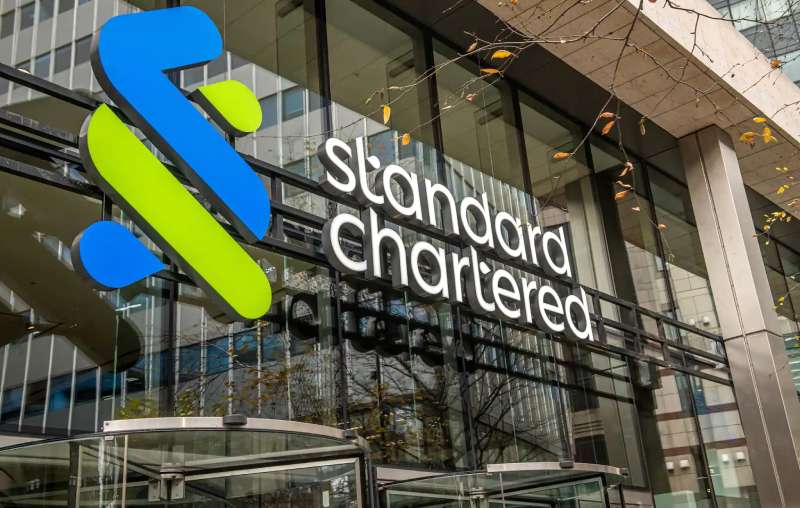
The Standard Chartered logo is a wordmark using a custom sans-serif typeface in blue and green, officially introduced in its current form in 2001. It carries no standalone symbol or icon, relying entirely on typography and color to communicate the brand’s identity across global markets.
- Design Type: Wordmark (logotype only, no standalone icon)
- Primary Elements: Custom sans-serif lettering, two-color horizontal layout
- Official Introduction Date: Current version introduced in 2001; refined further in 2020
- Designer/Agency: Developed in-house with external brand consultancy input (specific agency not publicly confirmed)
- Trademark Status: Registered trademark globally under Standard Chartered PLC
- Color Palette:
- SC Blue: #0D4EA6
- SC Green: #00A896
- Usage Context: Branch signage, digital banking platforms, marketing materials, annual reports, card products, merchandise
How Has the Standard Chartered Logo Evolved Over Time?
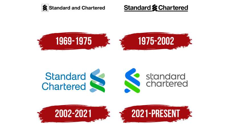
The logo has shifted from formal, heraldic-style designs rooted in its colonial banking origins to a clean, modern wordmark suited for digital-first global banking. Each major change tracked a shift in how the bank positioned itself in emerging markets.
Original Standard Chartered Logo (1969–1985)
- Years Active: 1969–1985
- Design Description: Formal crest-based mark incorporating heraldic elements drawn from both the Chartered Bank of India, Australia and China and the Standard Bank of British South Africa
- Color Scheme: Navy blue and gold
- Designer: Unknown
- Context: Formed after the 1969 merger, the identity needed to honor both legacy institutions while creating a unified presence
- Key Changes from Previous: First unified logo after merger; combined heraldic traditions from two distinct banking histories
- Cultural Significance: Reflected the bank’s colonial-era roots and formal positioning in institutional finance
Transitional Standard Chartered Logo (1985–2001)
- Years Active: 1985–2001
- Design Description: Simplified wordmark dropping most heraldic ornamentation; moved toward a cleaner typographic approach with a stylized abstract mark alongside the name
- Color Scheme: Blue-dominant with reduced use of gold
- Designer: Unknown
- Context: International expansion into Asia and Africa required a more modern, approachable look
- Key Changes from Previous: Removed crest; introduced abstract graphic element; more contemporary typeface
- Cultural Significance: Signaled the bank’s transition from a colonial institution toward a global emerging-markets player
Modern Standard Chartered Logo (2001–Present)
- Years Active: 2001–present
- Design Description: Clean two-color wordmark. “Standard Chartered” is set in a custom sans-serif, split across two lines with “Standard” in blue and “Chartered” in teal-green. No standalone icon or symbol.
- Color Scheme: SC Blue (#0D4EA6) and SC Green (#00A896)
- Designer: Refined with brand consultancy support; exact agency undisclosed
- Context: Introduced alongside a broader brand refresh aimed at presenting the bank as a modern, trusted global institution
- Key Changes from Previous: Eliminated abstract graphic mark entirely; two-color split wordmark became the core identity device; increased reliance on typography as the primary brand asset
- Cultural Significance: The blue-green split speaks directly to the bank’s two core operational zones: established financial markets (blue) and growth markets in Asia and Africa (green)
What Do the Design Elements of the Standard Chartered Logo Mean?
The logo works through a straightforward visual system: two weights of meaning carried by two colors and one typeface. The blue-green split is not decorative. It maps onto the bank’s actual geographic and strategic identity, separating established markets from growth markets in a way that feels intentional rather than arbitrary.
There’s no hidden iconography here. The design leans entirely on typography and color to do the work, which is actually a confident choice for a global financial brand operating across 50+ markets.
Why Did Standard Chartered Choose These Specific Colors?
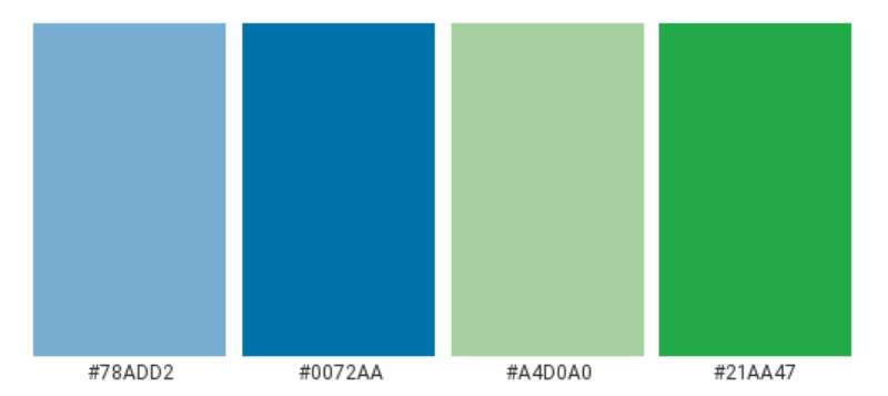
SC Blue (#0D4EA6) carries the weight of institutional trust. Blue is the dominant color across bank logos globally, and Standard Chartered’s version sits in a mid-depth range, serious without being cold.
The psychological impact is stability and reliability, exactly what you want communicating from a bank operating in politically and economically volatile regions.
SC Green (#00A896) is more unusual for banking. It pulls toward teal, which sits between the trust signals of blue and the growth associations of green. In the context of Standard Chartered’s heavy presence in Africa and Southeast Asia, it reads as forward momentum.
Together, the two colors form something close to an analogous color pairing, both sitting in the cool spectrum without clashing. The saturation levels are balanced carefully: neither color overpowers the other at standard display sizes.
What Typography Style Is Used in the Standard Chartered Logo?
The wordmark uses a custom sans-serif typeface. It’s not publicly licensed or named, which is fairly common for large corporate identities at this level.
The letterforms are geometric but not rigidly so. There’s a slight humanist quality to the curves, which stops the mark from reading as cold or mechanical. The x-height is generous, which helps legibility at small sizes across digital platforms and physical signage.
Kerning is tight but not compressed. The tracking stays neutral across both lines, keeping the two-line layout visually unified despite the color difference.
Earlier versions of the logo used a slightly more formal serif or transitional typeface. The move to a sans-serif font in the modern era tracks with the broader shift in financial branding away from tradition-signaling serifs toward clean, screen-friendly letterforms.
What Are the Hidden Meanings in the Standard Chartered Logo?
Honestly, there’s no elaborate hidden symbolism here. The bank hasn’t publicly claimed any subliminal geometry or dual-meaning mark. What you see is genuinely what’s intended.
The two-color wordmark split between “Standard” and “Chartered” does carry implicit meaning though. “Standard” in blue anchors the identity in reliability. “Chartered” in green suggests chartered territory, new ground, expansion. Whether that reading was deliberate or retrospective is unclear.
What’s worth noting is what’s absent. No globe, no stylized initial, no abstract mark. For a bank of this scale operating across emerging markets, the restraint is a design statement in itself. It communicates confidence without needing symbols to explain itself.
How Does the Standard Chartered Logo Compare to Competitor Logos?
Standard Chartered sits in a peer group of major international banks, and its logo takes a noticeably different direction from most of them. The wordmark-only approach, with no icon or emblem, is less common at this tier.
The HSBC logo uses its iconic red and white hexagon mark, which functions independently from the wordmark and has strong standalone recognition. Standard Chartered has no equivalent device.
The Barclays logo uses its spread eagle symbol, again a standalone icon with centuries of heritage. Deutsche Bank’s logo centers on a slash-within-a-square mark that’s become one of the most recognized abstract bank symbols globally.
By contrast, Standard Chartered’s reliance on pure typography puts it closer to how certain fintech brands operate, where the name itself carries the full identity weight. The Citigroup logo uses a modified wordmark with a distinctive arc element, which gives it a middle ground between pure wordmark and symbol-based identity.
The two-color split in the Standard Chartered logo is its most distinctive feature in context. Most competitors use a single dominant color with secondary tones kept to backgrounds or accents. The deliberate use of two equally weighted primary brand colors is unusual and does create recognition value, even without a standalone icon.
Among blue logos in finance, Standard Chartered’s version reads as less aggressive than JP Morgan’s deep navy and warmer than the corporate blues used by most European institutions. The teal-green addition is genuinely distinctive in this category.
What Are the Technical Specifications of the Standard Chartered Logo?

Official Color Codes
- Primary Color: SC Blue
- Hex: #0D4EA6
- RGB: (13, 78, 166)
- CMYK: (92, 53, 0, 35)
- Pantone: 286 C (approximate)
- Secondary Color: SC Green
- Hex: #00A896
- RGB: (0, 168, 150)
- CMYK: (100, 0, 11, 34)
- Pantone: 3275 C (approximate)
- Tertiary: White
- Hex: #FFFFFF
- Used for reversed logo applications on dark backgrounds
Dimensions and Proportions
- Aspect Ratio: Approximately 3:1 (width to height) in standard horizontal layout
- Minimum Size: 25mm width for print; 72px width for digital (general brand standard for international banks at this tier)
- Clear Space: Minimum clear space equal to the cap-height of the wordmark on all four sides
- File Formats: Official assets available as vector graphics (SVG, EPS, AI) for print, PNG with transparent background for digital. Avoid JPEG format for logo files due to compression artifacts around text edges. Bitmap formats should only be used when vector files are not supported.
- DPI Requirements: Minimum 300 DPI for all print applications; 72–96 DPI for standard screen use
What Cultural Impact Has the Standard Chartered Logo Had?
Standard Chartered operates in markets where brand trust matters enormously, often in regions where the banking sector has a complicated relationship with public confidence. The logo’s stability over the past two decades has contributed to consistent recognition across very different cultural contexts.
In Hong Kong, Singapore, and across sub-Saharan Africa, the blue-green wordmark appears on everything from ATM screens to stadium sponsorship boards. The bank has been a long-time sponsor of the Standard Chartered Marathon Hong Kong and the Standard Chartered Dubai Marathon, putting the logo in front of mass audiences annually across two continents.
That kind of repeated exposure in non-financial contexts builds a different kind of brand recognition than advertising alone can achieve. The logo has become associated with community events, not just financial transactions. That’s a real cultural shift for an institution historically perceived as a colonial-era bank.
The clean, modern visual identity has also helped the bank compete for talent and partnerships in markets where fintech challengers carry younger, more digital-native brand identities. The wordmark doesn’t feel dated next to digital competitors, which isn’t something every legacy bank can say.
How Does the Standard Chartered Logo Fit Into the Overall Brand Identity?
The logo is the anchor point for a broader visual system built around the same blue-green palette, the custom typeface, and a consistent approach to layout and imagery. The brand guidelines govern how these elements interact across every touchpoint from mobile app UI to physical branch environments.
The brand style guide specifies how the logo sits within layouts, what backgrounds are acceptable, and how secondary brand elements like photography and iconography relate to the core mark.
Internally, the identity connects to the bank’s stated brand purpose around being “here for good,” a positioning that leans on the green as a sustainability and forward-progress signal.
The logo also functions as a system connector across the bank’s sub-brands and product lines. Standard Chartered Private Bank, Standard Chartered Wealth Management, and the digital banking platform Mox (a Standard Chartered venture) each carry visual identities that either directly reference the parent mark or deliberately depart from it to signal a distinct audience.
Across all of this, the core wordmark stays consistent. That consistency is the identity’s actual strength.
How Should the Standard Chartered Logo Be Used?
Official Usage Guidelines
- Do: Use the approved two-color version on white or light neutral backgrounds
- Do: Use the reversed white version on SC Blue or SC Green backgrounds
- Do: Maintain required clear space on all sides
- Do: Download official files from Standard Chartered’s official brand portal or authorized press resources
- Don’t: Alter the color split or apply the full wordmark in a single flat color unless using the approved monochrome version
- Don’t: Stretch, compress, rotate, or add effects (shadows, outlines, gradients) to the logo
- Don’t: Use the logo at sizes below the minimum size specifications
- Don’t: Place the logo on busy photographic backgrounds without an approved clear zone
Where to Access Official Logo Files
Official logo assets are available through Standard Chartered’s press and media resources at sc.com/newsroom. Third-party use requires written approval from Standard Chartered’s brand or communications team.
Licensing and Trademark
The Standard Chartered name and logo are registered trademarks of Standard Chartered PLC. Unauthorized commercial use, modification, or reproduction is prohibited under international trademark law. Media and editorial use for news reporting generally falls within fair use, but any commercial or co-branded use requires explicit written permission from the bank.
FAQ on The Standard Chartered Logo
What Does the Standard Chartered Logo Look Like?
It’s a two-line wordmark with no standalone icon or symbol.
“Standard” appears in SC Blue (#0D4EA6) and “Chartered” in SC Green (#00A896), set in a custom sans-serif font. Clean, direct, no decoration.
What Colors Are Used in the Standard Chartered Logo?
Two colors: SC Blue (#0D4EA6) and SC Green (#00A896).
Blue signals institutional trust. The teal-green reflects the bank’s focus on growth markets across Asia and Africa. A white reversed version exists for use on dark backgrounds.
Has the Standard Chartered Logo Ever Changed?
Yes, several times. The original 1969 identity used a heraldic crest after the merger of two colonial-era banks.
The logo moved through a transitional phase in the 1980s before settling into the current wordmark format in 2001, with refinements continuing through 2020.
What Font Does the Standard Chartered Logo Use?
A custom sans-serif typeface not available for public licensing.
The letterforms have a slight humanist quality, which keeps the mark from reading as cold. Leading and spacing are carefully set for legibility at small sizes across digital platforms and physical signage.
Where Can I Download the Official Standard Chartered Logo?
Official logo files are available through Standard Chartered’s newsroom at sc.com/newsroom.
Assets come in vector formats (SVG, EPS, AI) for print use and PNG with transparent background for digital. Any commercial use requires written approval from the bank.
Does Standard Chartered Have a Standalone Symbol or Icon?
No. The current identity is purely a wordmark with no separate icon, emblem, or monogram.
This sets it apart from competitors like HSBC, which has its well-known hexagon mark, or Barclays with its spread eagle symbol.
What Is the Meaning Behind the Standard Chartered Logo Colors?
Blue represents stability and financial credibility. Green points to growth, sustainability, and the bank’s emerging-market focus.
Together they form a near-analogous color pairing in the cool spectrum. The hue choices map directly onto Standard Chartered’s dual identity as both an established institution and a growth-market bank.
What File Format Should I Use for the Standard Chartered Logo?
Vector formats (SVG, EPS, AI) for print and large-format use. PNG for digital applications.
Avoid JPEG files for logos. Compression artifacts appear around text edges at smaller sizes, which affects how the brand identity renders on screen.
How Does the Standard Chartered Logo Compare to Other Bank Logos?
Most major banks use a symbol alongside their wordmark. Standard Chartered doesn’t.
Among international bank logos, the two-color split wordmark is genuinely unusual. The BNP Paribas logo and ING logo, for instance, both rely on graphic marks alongside the name.
Is the Standard Chartered Logo Trademarked?
Yes. The name and logo are registered trademarks of Standard Chartered PLC across its operating markets.
Unauthorized reproduction, modification, or commercial use is prohibited. Editorial and news media use generally falls within fair use, but anything commercial requires direct approval from the bank’s communications team.
Conclusion
The Standard Chartered logo is one of the more restrained identity systems in global banking, and that restraint is deliberate.
No icon, no emblem. Just a two-color wordmark where SC Blue and SC Green carry the full weight of the bank’s brand identity across 50+ markets.
The font choice, color theory application, and the absence of decorative elements all reflect a clear position: trust through simplicity.
For a financial institution operating across Asia, Africa, and the Middle East, that kind of visual consistency is worth more than any symbol could be.

Renowned for his expertise in logo design and visual branding, Bogdan has developed a multitude of logos for various clients.
His skills extend to creating posters, vector illustrations, business cards, and brochures. Additionally, Bogdan's UI kits were featured on marketplaces like Visual Hierarchy and UI8.
He also wrote in the past years on sites like Design Your Way, WebDesignerDepot, WPDean, Designmodo, Speckyboy, Slider Revolution, and more.
- Canva vs PowerPoint: Which Is Better for Presentations? - 22 September 2026
- How to Install Fonts on Mac (Step-by-Step Guide) - 20 September 2026
- From Mockup to Code: How AI-Augmented Development Speeds Up the Design Handoff - 19 September 2026

Bogdan Sandu is a seasoned designer who has been designing websites since 2008. Renowned for his expertise in logo design and visual branding, Bogdan has developed a multitude of logos for various clients. His skills extend to creating posters, vector illustrations, business cards, and brochures. Additionally, Bogdan's UI kits were featured on marketplaces like Visual Hierarchy and UI8. He also wrote in the past years on sites like Design Your Way, WebDesignerDepot, WPDean, Designmodo, Speckyboy, Slider Revolution, and more.
You Might Also Like