The Deutsche Bank Logo History, Colors, Font, and Meaning
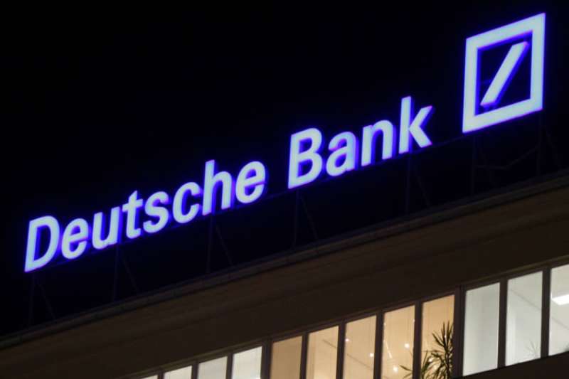
Beneath the sleek lines and bold shades of the Deutsche Bank logo, a legacy whispers. It’s the dance of design meeting purpose—a symbol that’s far more than just aesthetics. You know it when you see it; that unmistakable blue rectangle, unfurled like a flag atop towers of finance, signals a beacon of economic prowess to the world. This isn’t just about a clever twist on graphics; it’s the story of an emblem etched in the landscape of global finance.
In delving into this piece, you’ll unwrap layers of a brand identity that stretch back over centuries and yet remain fiercely relevant today.
We will navigate the intricate paths of brand recognition, unwavering in a world that’s a playground for constant change.
From its intellectual roots to the symphony of brand management and modern-day digital assets—there’s a tale behind this icon, painting vivid strokes of innovation and lineage alike.
Embark on this journey, and emerge with the currency of knowledge—a comprehensive understanding of how a world-class financial institution crafts an indelible mark upon the canvas of commerce. This insignia isn’t just recognized—it’s revered.
Stand by, as we sketch out not only the history and the evolution of the Deutsche Bank logo but also the silent language it speaks in the symphony of the banking and financial services industry.
The Meaning Behind the Deutsche Bank Logo
Diving into the world of symbols, it’s like a treasure hunt, right? When you look at the DB Logo, you notice a pretty square with a slash, and it’s more than just a bit of geometry.
A Symbol of Growth
The Deutsche Bank logo, it’s like a ‘forward slash’, right? The cool thing is, it’s not just a slash. It stands for growth and dynamic progress. Just like a seedling reaching for the sun, always striving for more.
Emblem of Unity
Here’s another secret – it’s also a sign of unity. You see, it’s made from two parts, two squares, that come together. It’s about cooperation and collaboration, making magic happen as a team.
The History of the Deutsche Bank Logo
![]()
Logo design, it’s like a journey. Changes happen, styles evolve. The Deutsche Bank logo? It’s got its own history too.
Beginning With a Bang
When it first came out, people were shocked. The year was 1974, and the logo was a far cry from the traditional bank logos of the time. It was modern, bold, and innovative.
Standing the Test of Time
Despite the initial surprise, the logo stood its ground. It withstood the test of time, remaining consistent for decades. It’s like a timeless classic, never going out of style.
The Colors of the Deutsche Bank Logo
The DB logo, it’s a study in color. Let’s unpack the color palette, shall we?
Blue: A Color of Trust
![]()
The first thing you see is that striking blue, right? It’s not just there to look pretty. Blue is a color of trust, loyalty, and stability. It tells you, “Hey, your money’s safe with us.”
White: A Symbol of Purity
Then there’s the white, crisp and clean. It’s a symbol of purity, clarity, and simplicity. It’s like the bank is saying, “We’ve got nothing to hide.”
The Font Used in the DB Logo
Just like a suit, the font you wear says a lot about you. The Deutsche Bank logo font? It’s a statement in itself.
Univers: A Universal Choice
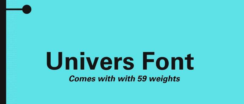
The font is called ‘Univers‘. It’s simple, it’s legible, and it’s versatile. Just like the bank, it’s here to serve everyone.
Bold and Confident
The font, it’s bold. It’s confident. It’s not afraid to take space. It represents a bank that’s confident in what it stands for.
The Geometry of the Deutsche Bank Logo
Logos, they’re like puzzles. You can break them down into shapes and lines. Let’s do that with the Deutsche Bank logo.
Squares: Building Blocks
You notice the squares first, right? They’re like building blocks. They represent stability, reliability.
Diagonal Lines: Dynamic Energy
Then there’s the diagonal line. It’s not just a line. It’s a sign of dynamic energy, of forward momentum.
The Evolution of the Deutsche Bank Logo
Every logo has its journey. The Deutsche Bank logo? It’s evolved too.
From Traditional to Modern
It started with a more traditional look. Then, in 1974, it went for a radical change. It became modern, dynamic, forward-looking.
Consistency is Key
Despite the changes, the logo remained consistent. It’s evolved, but it’s always stayed true to its core.
The Impact of the Deutsche Bank Logo
Logo design, it’s more than just creating a pretty picture. It can make or break a brand. The DB logo? It’s made quite an impact.
Setting a Trend
When it first came out, the Deutsche Bank logo was a trendsetter. It went against the grain, choosing a modern, bold design over a traditional one. It’s like a fashionista, daring to wear the newest styles.
Becoming a Recognizable Symbol
Over the years, the Deutsche Bank logo has become a recognizable symbol. It’s like a celebrity, known far and wide. It’s become synonymous with the bank itself.
The Future of the Deutsche Bank Logo
Logos, they’re like living beings. They evolve, they change, they grow. What’s the future for the Deutsche Bank logo?
Consistent Yet Adaptable
The Deutsche Bank logo, it’s likely to stay consistent. But it’ll also adapt, changing subtly to keep up with the times. It’s like a chameleon, always ready to blend in.
Remaining a Symbol of Trust
The logo will continue to be a symbol of trust and stability. It’ll remain a beacon of security for customers. It’s like a lighthouse, guiding ships safely to shore.
There you have it – the Deutsche Bank logo. It’s more than just a square with a slash. It’s a symbol of growth, unity, trust, and stability. It’s a trendsetter, a recognizable symbol, and a beacon of security. And it’s not done yet – it’s set to continue evolving and adapting, just like the bank it represents. Isn’t that cool?
FAQ on the Deutsche Bank Logo
What does the Deutsche Bank logo represent?
The blue rectangle, stark and definitive against any backdrop, stands as a beacon of trust, stability, and innovation. It’s this bank’s flag—unfurled to signify a legacy, a promise in an ever-fluctuating finance universe. It’s more than design; it’s Deutsche Bank AG’s identity, an insignia of relentlessness amidst economic waves.
Who designed the Deutsche Bank logo?
Crafted by minds that understand the weight of visual identity, this piece came to life under the careful tutelage of designers at Metro Goldwyn Mayer. Yes, the folks from the movie studio. It’s a cross-pollination of Hollywood creativity and German banking— a stroke of the unconventional in the financial world’s canvass.
When was the Deutsche Bank logo created?
Time-traveled back to 1974—a year of change and innovation. Amidst the cultural shifts and industry tides, Deutsche Bank birthed this mark of excellence. Since then, it’s been the lighthouse, guiding through banking insignia seas, a visual anchor for all who seek it.
Has the Deutsche Bank logo changed over time?
Absolutely, but think evolution rather than overhaul. Sprinkled across time, touch-ups have been subtle, adjustments almost whispered. It’s a visual story told in hushed tones—a color deepened here, a font tweaked there. The core brand imagery? Steady as she is, that bold blue rectangle.
What color is the Deutsche Bank logo?
Picture the deep blue of the ocean, vast and commanding respect. A distinct, unmistakable navy blue—a choice not random but laden with purpose. In branding’s palette, this is the color that represents professionalism, steadiness, a trustworthy beacon in the financial storm.
Is the Deutsche Bank logo trademarked?
Trademarked, you bet. It’s not just about claiming space on a branding guidelines sheet. It’s legal muscle, the unseen intellectual property law armory that guards against misuse. This corporate icon isn’t a free-for-all; it’s Deutsche Bank’s seal, protected fiercely.
Can the Deutsche Bank logo be used freely?
Simple answer, no. Here’s the legal spiel: usage is bound by a tight leash of corporate logo compliance. Want to use it? Think again, unless permission is granted. It’s corporate identity locked down, not for the common digital playground of brand imagery.
What does the “slash” in the Deutsche Bank logo mean?
It’s not just a slash—it’s a door ajar, an emblem to the future, the forward slash ubiquitous with progress. This design element brings movement, a suggestion of financial institution symbols going places, doing more, seeding tomorrow. A visual representation of forward-thinking in a static square.
Where can I find the official Deutsche Bank logo?
Hunting for the original? Look no further than Deutsche Bank’s own digital assets—the genuine article, the trademarked logo in all its high-resolution glory. Websites, branding collateral, official reports—there it is, the bona fide entity. As for unauthorized replicas? Full stop. Red lights flashing.
Why is the DB logo minimalist?
Minimalist by choice, maximal impact by design. There’s power in simplicity, a universal language spoken in the world of graphic design in finance. Less clutter, more impact, defining corporate branding in the sparsest of strokes. It’s brand equity banked on the less-is-more principle.
Conclusion
And there we have it, a deep dive into the nuances of the Deutsche Bank logo; an emblem that’s not just recognized on the skyline of metropolis but etched in the fabric of global finance. From the history of its conception, the subtle yet impactful redesigns, to its bold stance in today’s digital maelstrom, we’ve unpacked the layers that compose its legendary stature.
- Blue, bold, and unmistakably banking’s bearer.
- A trademarked beacon, legally armored, fiercely personal.
- Minimalist? By design. Impactful? Without question.
This is no ordinary branding emblem; it’s a voyage through aesthetics that doubles as an unspoken promise—a visual handshake in a world of figures and forecasts. So, whenever that slash within a square catches the eye, remember, it’s a tale of innovation, stability, and the intricate dance of corporate identity.
We’ve journeyed through the story of an icon, a visual identity that holds more than the eye perceives—a true representation of forward-thinking in the finance realm.
If you liked this article about the DB logo, you should check out this article about the Bank of America logo.
there are also similar articles discussing the Wells Fargo logo, the JP Morgan Chase logo, the UBS logo, and the HSBC logo.
And let’s not forget about articles on the Barclays logo, the Citigroup logo, the Societe Generale logo, and the ING logo.
Bogdan Sandu, a seasoned designer with 15 years of diverse experience, has been designing websites since 2008.
Renowned for his expertise in logo design and visual branding, Bogdan has developed a multitude of logos for various clients.
His skills extend to creating posters, vector illustrations, business cards, and brochures. Additionally, Bogdan's UI kits were featured on marketplaces like Visual Hierarchy and UI8.
Latest posts by Bogdan Sandu (see all)
- Out of This World: Space Color Palettes for Cosmic Designs - 28 April 2024
- The Bungie Logo History, Colors, Font, And Meaning - 27 April 2024
- After Dark: Night Color Palettes for Mysterious Designs - 27 April 2024