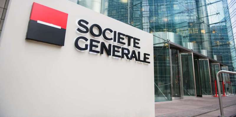
The Societe Generale Logo History, Colors, Font, and Meaning

Picture this: a splash of red and black, instantly signaling a presence that’s both assertive and reputable. That’s the Societe Generale logo for you. A masterstroke in visual branding, the emblem of this financial giant is more than just a design—it’s a powerful communication tool, woven into the very fabric of corporate identity.
This insignia is a passport to trust and recognition in the global market. Here, we’ll unpack the Societe Generale logo—the emblem’s evolution, the strategy behind its design, and its critical role in brand recognition. It’s a mirror reflecting company values, with threads connecting typography, graphic design, and the subtle language of corporate symbolism.
By the article’s close, you’ll grasp not just the aesthetics of the SG emblem but the strategy that pins it to the masthead of a banking conglomerate. Armed with the how and why, unravel the thought process behind a logo that’s more than a visual—it’s the heartbeat of Societe Generale’s brand equity.
The History of the Societe Generale Logo
Once Upon a Time in Banking
The Societe Generale logo hasn’t always been this slick, modern symbol we know today. Oh no, it’s been on quite the journey.
The Evolution

In the beginning, they kept it classy with a simple, bold “SG” in a square frame. It was all about making a statement, announcing their presence. But as they grew, they realized they needed something more. Something that spoke to their evolving identity and values.
They wanted a symbol that echoed their commitment to growth, resilience, and guidance. Something that captured their spirit.
The logo has gone through a few tweaks over the years, but the essence has remained the same. Today, it stands as a sleek, modern representation of Societe Generale’s journey and values.
The Colors of the Societe Generale Logo
Alright, guys. Let’s chat colors. In particular, the unmistakable triad of the Societe Generale logo. This ain’t just a logo, folks. It’s a bold statement, an identity, a silent shout-out to their brand’s ethos. So, let’s unmask each color, shall we?
Red: The Power Surge
Let’s kick things off with the red. Not just any red, though, but a rich, vibrant, can’t-take-your-eyes-off-it kind of red.
You feel it, right?
That electric jolt of energy? See, that’s no accident. It’s a calculated move.
This red symbolizes the fire, the dynamism, the in-your-face-can-do-attitude that Societe Generale embodies. It’s the adrenaline rush of the brand, the heartbeat of innovation.
White: The Blank Page
Moving on to white. Clean, crisp, and oh-so pristine. Think fresh snow or a blank page. It’s not just a color, guys; it’s a promise.
A promise of clarity, transparency, and possibilities. It’s the canvas where Societe Generale paints its ideas, creates its masterpieces.
It’s like the brand saying, “Hey, we’re open. We’re clear. We’re ready to build something amazing with you.”
Black: The Backbone
Lastly, let’s talk black. Strong, sophisticated, the perfect contrast to the bold red and clean white. It’s like the backbone of the logo, grounding everything else.
The black in this logo? It’s a statement of solidity, reliability, the immovable rock. It’s Societe Generale saying, “We’re here. We’re stable. You can count on us.”
The Font Used in the Societe Generale Logo
The Power of Fonts
Fonts, my friends, speak volumes. The font used in the logo is no exception. It’s clean, it’s modern, and it screams professionalism.
The Choice
Societe Generale has opted for a sans-serif typeface. Why sans-serif, you ask? It’s crisp. It’s easy to read. And it perfectly complements the modern vibe of the logo.
The Logo Across Different Mediums
Adapting Like a Chameleon
A great logo adapts. It looks equally striking whether it’s on a huge billboard or a tiny app icon. The logo? It’s a chameleon.
The Digital World

In the digital world, the logo maintains its crisp, clean look. It stands out, whether it’s on their website, social media, or your banking app.
The Physical World
In the physical world, the logo exudes elegance. On stationery, signage, or advertising materials, it’s a beacon of the Societe Generale brand.
The Impact of the Societe Generale Logo
A Logo that Resonates
Logos are like fingerprints for companies. They leave impressions. The Societe Generale logo, with its simplicity and meaningful design, has made its mark.
The Customer Perspective
For customers, the logo is a symbol of trust and stability. It’s a promise that Societe Generale will guide them through their financial journey. It’s a beacon of confidence.
The Business Impact
From a business perspective, the logo has contributed to the bank’s brand identity. It’s a powerful tool for recognition and recall. It’s the face of Societe Generale in the financial world.
The Societe Generale Logo and Corporate Social Responsibility
More than just Banking
Societe Generale isn’t just about banking. It’s about making a positive impact. Their logo reflects this commitment.
The Bridge and Social Impact
The bridge, too, has a deeper meaning. It’s Societe Generale’s pledge to bridge social gaps and contribute to a more equitable society.
FAQ on the Societe Generale Logo
What’s the story behind the Societe Generale logo?
It’s an emblem that speaks volumes. Born from a desire to signal steadfast stability and forward thrust, the Societe Generale logo combines heritage with drive. Red and black hues aren’t random; they’re a statement of strength and sophistication, a hallmark of the financial services titan rooted in Paris, France.
How often has the Societe Generale logo changed?
You’d be surprised; it’s not a case of reinventing the wheel every few years. True, brands evolve, but Societe Generale’s logo has stood the test of time with astonishing grace. Subtle tweaks over decades, ensuring it stays modern yet maintains its core visual identity, are the real secret sauce here.
What do the colors in the Societe Generale logo represent?
Red and black? They’re not just eye-catching. They speak a visual branding language where red screams passion and energy, while black grounds the emblem, exuding professionalism and authority. Together, they’re a branding strategy that’s as much about psychology as it is about aesthetics.
Is the Societe Generale logo a trademark?
Absolutely. In this game, protecting your visual identity is vital. That’s why the SG emblem is a registered trademark, safeguarding it against imitation. It’s not just an insignia; it’s a legal shield in the ruthless theater of global banking and brand recognition.
Can I use the Societe Generale logo for my project?
Hold up. This isn’t your everyday graphic. This trademark design—you respect it. Want to use it? You need explicit, written permission from Societe Generale. It’s not just about legalities; it’s about maintaining the integrity and brand equity that the logo embodies.
What was the design process for the Societe Generale logo?
Think meticulous planning meets creative genius. A tireless process where graphic design in banking met with countless drafts. The goal? To forge a symbol that resonates on both an emotional level and across the corporate landscape. Adobe Illustrator? No doubt a friend here, as is any tool helping to perfect a logo’s curves and contours.
How does the Societe Generale logo enhance the company’s brand equity?
A well-crafted logo is a cornerstone of brand equity. Societe Generale nailed it. The emblem is a visual anchor, reinforcing the brand with every sighting. It’s that repeated exposure, that instillation of trust, boosting the bank’s visibility and enhancing its esteemed reputation.
What’s the importance of the Societe Generale logo in corporate communication?
In the battlefield of corporate communication, a logo like Societe Generale’s is the flag a company rallies behind. It’s distinctive, potent, transcending language barriers. It’s the face of internal and external corporate communication, a consistent beacon in the cluttered world of financial dialogues.
How does Societe Generale protect its logo’s branding?
Brand guidelines, they’re not just a suggestion—they’re the law in visual representation land. Societe Generale enforces strict rules on how their logo is used, ensuring the corporate symbol is represented consistently, upholding the company’s visual branding across all mediums.
What impact does the logo have on Societe Generale’s marketing strategy?
Let’s get real; a logo can make or break your visual representation game. And for Societe Generale, their logo design is a marketing MVP. Integrated across campaigns, it helps carve a unique identity that meshes with the marketing collateral, keeping the brand memorable in a sea of competitors.
Conclusion
And there you have it. The journey through the Societe Generale logo‘s landscape reaches its sunset. What we’ve navigated is far more than a study of hues and designs — it’s about understanding a silent communicator, a beacon that radiates the essence of a titan in the global financial arena.
- We’ve pinpointed the tale behind the iconic red and black,
- Explored its subtle evolutions,
- And unpacked the symbolism that whispers tales of passion, drive, and unwavering stability.
This emblem is not merely an insignia; it’s a visual articulation of brand identity, a trademark that encapsulates history, ethos, and ambition. It stands as a testament, illustrating how visual branding seamlessly intertwines with brand equity and corporate communication.
As the curtain falls, let’s carry forward the appreciation for the power vested in a logo—a power to convey a company’s journey and ethos, wordlessly, yet profoundly.
If you liked this article about the Societe Generale logo, you should check out this article about the Bank of America logo.
there are also similar articles discussing the Wells Fargo logo, the JP Morgan Chase logo, the UBS logo, and the HSBC logo.
And let’s not forget about articles on the Barclays logo, the Deutsche Bank logo, the Citigroup logo, and the ING logo.
- The Asahi Logo History, Colors, Font, And Meaning - 4 May 2024
- Playtime Perfection: Fun Kids Color Palettes - 4 May 2024
- PX to REM Converter - 4 May 2024


