The Bank of America logo is one of the most recognized symbols in American banking. It uses a red, white, and blue color scheme drawn from the American flag, paired with clean, modern typography. The logo has gone through several changes since the bank’s early days, each update reflecting shifts in the company’s size, identity, and market position.
Within financial services branding, few logos carry the weight of national symbolism as directly as this one. The flag-inspired design puts Bank of America in a category of its own among major U.S. banks, making its visual identity instantly tied to American identity rather than just corporate positioning.
The current version is a wordmark with a stylized flag graphic. It was introduced in 1998 following the merger with NationsBank, with Lippincott involved in refining the identity. The design communicates stability, patriotism, and scale.
Bank of America traces its roots to 1904, when A.P. Giannini founded the Bank of Italy in San Francisco. Since then, the brand has gone through at least six distinct logo iterations, each responding to mergers, market changes, or a deliberate push to modernize the visual identity.
What Is the Bank of America Logo?
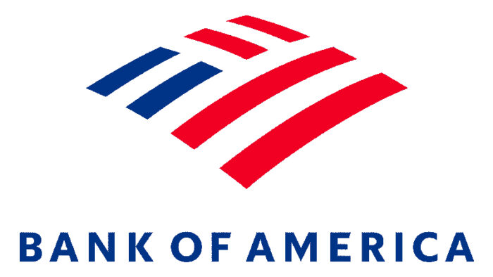
The Bank of America logo is a red, white, and blue wordmark featuring a stylized American flag graphic to the left of the bank’s name. It was officially introduced in 1998 after the NationsBank merger, with design work refined by Lippincott. The logo represents national identity, financial strength, and broad accessibility.
- Design Type: Combination mark (icon + wordmark)
- Primary Elements: Stylized flag graphic, sans-serif wordmark
- Official Introduction Date: 1998
- Designer/Agency: Lippincott (identity refinement)
- Trademark Status: Registered trademark, actively enforced across all usage contexts
- Color Palette:
- Red: #E31837
- Blue: #012169
- White: #FFFFFF
- Usage Context: Branch signage, digital platforms, credit and debit cards, marketing materials, mobile apps, merchandise, and corporate communications
How Has the Bank of America Logo Evolved Over Time?
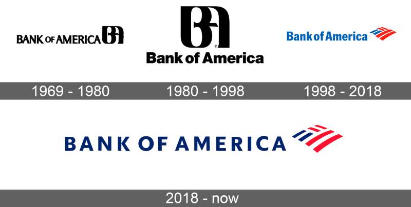
The logo has changed significantly since 1904. Early versions reflected a traditional, formal banking aesthetic. Later redesigns moved toward cleaner, more modern forms. The 1998 update after the NationsBank merger set the current direction, anchoring the identity to the American flag concept.
Original Bank of Italy Logo (1904–1930)
- Years Active: 1904–1930
- Design Description: Text-based mark using formal serif typography, reflecting the conventions of early 20th-century banking
- Color Scheme: Black and white, standard for print materials of the era
- Designer: Unknown
- Context: Founded by A.P. Giannini to serve immigrant communities in San Francisco. The name and logo reflected Italian heritage and a community-focused banking model.
- Key Changes from Previous: N/A (founding identity)
- Cultural Significance: Represented immigrant access to banking at a time when most financial institutions catered only to established, wealthy clients
Bank of America Early Wordmark (1930–1958)
- Years Active: 1930–1958
- Design Description: Serif-based wordmark following the 1930 name change from Bank of Italy to Bank of America
- Color Scheme: Black and white
- Designer: Unknown
- Context: The name change came as the bank expanded nationally. The new name needed a broader, more American-sounding identity.
- Key Changes from Previous: Entirely new name, new typographic mark
- Cultural Significance: Marked the bank’s shift from regional institution to national ambition
Mid-Century Modernization (1958–1983)
- Years Active: 1958–1983
- Design Description: Cleaner letterforms, movement toward simplified typography consistent with mid-century corporate design trends
- Color Scheme: Blue introduced as dominant brand color
- Designer: Unknown
- Context: Post-war corporate America was embracing modernism across the board. Banking brands followed suit by dropping ornate serif marks in favor of cleaner, more functional designs.
- Key Changes from Previous: Move away from traditional serif styling, introduction of blue as a primary brand color
- Cultural Significance: Reflected the broader shift in American corporate identity toward professionalism and accessibility
BankAmerica Identity (1983–1998)
- Years Active: 1983–1998
- Design Description: Stylized script or refined wordmark used during the BankAmerica Corporation period
- Color Scheme: Blue and white
- Designer: Unknown
- Context: The bank operated as BankAmerica Corporation for much of this period. The logo reflected a more conservative, corporate tone as the bank navigated financial pressures and market consolidation.
- Key Changes from Previous: Updated typography to reflect corporate restructuring
- Cultural Significance: Represented the bank during one of its most challenging financial periods, including the Latin American debt crisis
Post-Merger Logo (1998–Present)
- Years Active: 1998–Present
- Design Description: Red, white, and blue combination mark with a stylized American flag graphic and clean sans-serif wordmark
- Color Scheme: Red (#E31837), blue (#012169), white (#FFFFFF)
- Designer: Lippincott
- Context: The 1998 merger between BankAmerica and NationsBank created the largest bank in the United States at the time. A new, unified identity was needed to represent the combined entity.
- Key Changes from Previous: Introduction of the flag graphic, full American flag color palette, significant departure from prior typographic-only marks
- Cultural Significance: The flag imagery directly tied the bank to American identity at a moment when it became a truly national institution
What Do the Design Elements of the Bank of America Logo Mean?
The logo works through a straightforward visual shorthand: the American flag equals American banking. The red, white, and blue combination mark signals patriotism, stability, and scale. Every element, from the flag graphic to the type, is designed to communicate trust and national reach.
The stylized flag graphic is the most loaded element in the design.
It doesn’t just reference patriotism. It claims it. For a bank operating in all 50 states, that’s a deliberate positioning move, not just decorative choice.
Why Did Bank of America Choose These Specific Colors?
Red (#E31837 / Pantone 186)
- Symbolic meaning: Energy, confidence, urgency, strength
- Psychological impact: Grabs attention, signals action, creates a sense of importance
- Brand connection: Mirrors the red of the American flag; positions the bank as bold and decisive
Blue (#012169 / Pantone 281)
- Symbolic meaning: Stability, trust, professionalism, loyalty
- Psychological impact: Calms the viewer, communicates reliability; the dominant color in financial services branding globally
- Brand connection: Mirrors the blue of the American flag; reinforces the bank’s institutional weight. If you look at other bank logos, blue dominates across the entire sector.
White (#FFFFFF)
- Symbolic meaning: Clarity, openness, honesty
- Psychological impact: Creates contrast, improves readability, adds a sense of cleanliness and transparency
- Brand connection: Completes the flag reference; also gives the logo breathing room across different backgrounds
Understanding color psychology is useful here. Red and blue together consistently poll as trustworthy and authoritative in financial contexts, which is exactly why so many institutions gravitate toward them. The combination isn’t accidental.
What Typography Style Is Used in the Bank of America Logo?
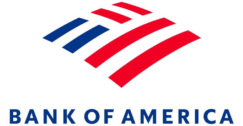
The wordmark uses a clean, humanist sans-serif typeface.
It’s not a standard off-the-shelf font. The letterforms have been customized, with specific attention to weight and spacing to give the wordmark a sense of solidity without feeling rigid.
The type is set in a medium weight. Heavy enough to read at small sizes, light enough to avoid feeling oppressive on large signage.
Tracking is slightly open, which helps legibility across formats. Kerning between the characters is tight enough to feel unified but not cramped.
Earlier versions of the logo used more traditional serif letterforms. The shift to a sans-serif mark in the late 20th century followed a broader trend in financial services branding, moving from formality toward accessibility. The sans-serif font approach made the brand feel more modern and approachable while retaining enough weight to signal institutional credibility.
What Are the Hidden Meanings in the Bank of America Logo?
There’s no confirmed subliminal element in the traditional sense, like the arrow in the FedEx logo.
But the flag graphic is intentionally ambiguous. Look at it closely and it reads as both a waving flag and a series of horizontal stripes. That layered reading is deliberate.
The spacing between the flag icon and the wordmark creates a subtle visual pause. It separates the symbol from the name without breaking the connection. That gap is doing real work in visual hierarchy terms.
Some designers have noted that the flag element also reads as an abstract representation of movement or forward motion. Whether that was a stated intention from Lippincott or a happy accident is unclear. Either way, it works.
How Does the Bank of America Logo Compare to Competitor Logos?
Among the Big Four U.S. banks, Bank of America’s logo is the most overtly patriotic. JPMorgan Chase, Wells Fargo, and Citigroup all use blue but none make the American flag as central to their identity. Bank of America owns that visual territory almost entirely.
The JP Morgan Chase logo goes in a completely different direction: a geometric blue octagon that reads more as a financial instrument than a national symbol. It’s abstract, institutional, and deliberately neutral.
The Wells Fargo logo leans into its history. The stagecoach imagery and the red and yellow palette connect to the American West and the bank’s 19th-century origins. It’s heritage-driven rather than patriotism-driven.
Citigroup’s logo uses a red arc over the “t” in Citi, which the company frames as representing a protective umbrella over clients. It’s clever, but much more subtle than the Bank of America approach.
If you look outside the U.S. at competitors like HSBC or Barclays, the contrast is sharper. Global banks tend to use abstract marks or geometric symbols that translate across cultures. Bank of America’s flag-based identity is specifically, intentionally American, which is both a strength in its home market and a potential complication internationally.
Within the broader landscape of blue logos and red logos in financial services, the Bank of America combination mark stands out precisely because it commits fully to both colors simultaneously, rather than choosing one as dominant.
What Are the Technical Specifications of the Bank of America Logo?
Official Color Codes
- Primary Color: Red
- Hex: #E31837
- RGB: (227, 24, 55)
- CMYK: (0, 89, 76, 11)
- Pantone: 186 C
- Secondary Color: Navy Blue
- Hex: #012169
- RGB: (1, 33, 105)
- CMYK: (99, 68, 0, 59)
- Pantone: 281 C
- Accent Color: White
- Hex: #FFFFFF
- RGB: (255, 255, 255)
- CMYK: (0, 0, 0, 0)
- Pantone: N/A
Dimensions and Proportions
- Aspect ratio: Approximately 4:1 (width to height) for the full horizontal lockup
- Minimum size requirements: The wordmark should not be reproduced smaller than 1 inch wide in print; digital minimum is approximately 120px wide to maintain legibility
- Clear space specifications: A clear space equal to the height of the capital “B” in the wordmark must surround the logo on all sides
- Official usage guidelines: The logo must always appear in its approved color versions. It cannot be stretched, distorted, recolored, or have elements removed. Approved variants include full color, reversed (white on dark background), and single-color black. The flag element and wordmark must never be separated and used independently.
For digital use, the logo should be exported as a vector graphic to ensure clean rendering at any size. For web contexts, SVG is the preferred format. When a rasterized version is needed, a minimum of 300 DPI is recommended for print applications.
What Cultural Impact Has the Bank of America Logo Had?
The logo has become shorthand for American institutional banking in popular culture. It shows up in films, news coverage, and political commentary as a stand-in for the broader banking industry.
During the 2008 financial crisis, the logo appeared in news coverage and protest imagery so frequently that it became visually associated with the entire crisis, not just Bank of America’s specific role. That’s the double-edged nature of having a highly recognizable identity: you absorb cultural meaning whether you want to or not.
The flag graphic has also made the logo a recurring target for parody and criticism from consumer advocacy groups. Again, that level of cultural engagement is only possible with a logo that has genuinely penetrated public consciousness.
Among logo designers, the Bank of America mark is frequently used as a case study in how to tie a brand directly to national identity. It’s referenced in design schools and branding discussions as an example of clear, committed visual positioning, even if the execution is sometimes criticized as blunt rather than subtle.
How Does the Bank of America Logo Fit Into the Overall Brand Identity?
The logo sits at the center of a broader identity system that includes branch design, card design, app interfaces, and marketing materials. Every touchpoint references the red, white, and blue palette established by the logo.
The brand guidelines that govern the logo extend to typography choices across all communications, the layout of physical spaces, and the color treatment of digital products. The flag mark appears on credit cards, ATM screens, mobile apps, and stadium sponsorships.
One thing worth noting: the logo’s color scheme creates real constraints. Red and blue are difficult to work with across all background contexts. Bank of America’s brand team has developed reversed and single-color variants specifically to handle situations where the full-color mark doesn’t work. That’s a common challenge with patriotic color palettes, as they don’t always translate well to dark backgrounds or monochrome print contexts.
The overall brand identity also connects to sponsorship and community programs. The logo appears alongside Major League Baseball partnerships, arts sponsorships, and charitable initiatives, which has helped broaden the brand associations beyond pure financial services. Compare this to how other financial brands like the UBS logo or Deutsche Bank logo manage their brand ecosystems: both use more abstract marks that flex more easily across different cultural contexts.
How Should the Bank of America Logo Be Used?
Official Usage Guidelines
Do:
- Use only the approved logo files provided through Bank of America’s official brand resources
- Maintain the minimum clear space around the logo at all times
- Use approved color variants only (full color, reversed white, single-color black)
- Reproduce the logo at or above the minimum size requirements
- Keep the flag graphic and wordmark together as a unit
Don’t:
- Stretch, compress, or distort the logo
- Recolor the logo or change individual element colors
- Add effects like drop shadows, gradients, or outlines
- Separate the flag graphic from the wordmark
- Place the logo on backgrounds that reduce legibility
- Reproduce the logo at sizes smaller than the minimum requirements
Where to Access the Official Logo
Bank of America provides official logo files through its media and press resources section on newsroom.bankofamerica.com. Approved partners and vendors can request access through official vendor channels. The logo is not available for general public download.
Licensing and Trademark Information
The Bank of America logo and name are registered trademarks. Use by third parties requires explicit written permission. Unauthorized use, including in editorial contexts that could imply affiliation or endorsement, is prohibited.
For journalists and media: editorial use of the logo in news coverage is generally permitted under fair use principles, but using the logo in ways that suggest partnership, endorsement, or affiliation requires written approval from Bank of America’s communications team.
Trademark infringement complaints are actively pursued. If you’re working on a project that involves the Bank of America brand in any capacity, getting written approval before production begins is the right move, not an afterthought.
FAQ on The Bank Of America Logo
What colors are used in the Bank of America logo?
The logo uses red, white, and blue, pulled directly from the American flag.
Officially, that’s Pantone 186 for red (#E31837) and Pantone 281 for navy blue (#012169). White completes the palette. The color scheme is one of the most recognizable in U.S. financial services branding.
When was the current Bank of America logo introduced?
The current design launched in 1998, following the merger between BankAmerica Corporation and NationsBank.
It was a deliberate rebranding effort to unify two massive institutions under one visual identity. Lippincott handled the identity refinement work.
What does the flag symbol in the Bank of America logo represent?
It’s a stylized version of the American flag, positioned to the left of the wordmark.
The flag graphic signals national reach and patriotism. It ties the bank’s identity directly to American identity, a positioning choice that very few bank logos attempt this explicitly.
Who designed the Bank of America logo?
The current logo identity was refined by Lippincott, a well-known brand strategy and design firm based in New York.
Earlier iterations of the Bank of America wordmark predate Lippincott’s involvement. The 1998 merger was the catalyst for bringing in outside design expertise.
Has the Bank of America logo always looked the same?
Not at all. The bank started as the Bank of Italy in 1904, with a formal serif-based mark that looked nothing like today’s logo.
The brand went through at least six distinct logo iterations before arriving at the current combination mark with the flag graphic and sans-serif wordmark.
What font does the Bank of America logo use?
The wordmark uses a customized humanist sans-serif font, not a standard off-the-shelf typeface.
The letterforms have been adjusted for weight and spacing. It reads cleanly at both small digital sizes and large branch signage, which is exactly what a bank operating at this scale needs.
What are the official hex codes for the Bank of America logo colors?
Red is #E31837, navy blue is #012169, and white is #FFFFFF.
For print work, the corresponding CMYK values matter more than hex. The Pantone references are 186 C for red and 281 C for blue, both widely used in the financial sector’s color palette conventions.
Is the Bank of America logo trademarked?
Yes. Both the logo and the Bank of America name are registered trademarks, actively enforced.
Third-party use requires written permission. Unauthorized reproduction, especially in ways that suggest endorsement or affiliation, is prohibited. Media outlets can use the logo editorially under fair use, but commercial use is a different matter.
How does the Bank of America logo compare to other major bank logos?
It’s the most overtly patriotic of the major U.S. bank logos. The JP Morgan Chase logo uses an abstract geometric mark. Wells Fargo leans on historical stagecoach imagery.
Bank of America is the only Big Four bank that puts the American flag at the center of its visual identity.
Where can I download the official Bank of America logo?
Official logo files are available through Bank of America’s newsroom at newsroom.bankofamerica.com, intended for press and media use.
Approved vendors and partners can request access through official channels. The logo isn’t available for general public download, and using unofficial versions creates real trademark risk.
Conclusion
The Bank of America logo is a case study in committed visual positioning: flag colors, a clean wordmark, and a combination mark that hasn’t needed a major overhaul since 1998.
That kind of staying power doesn’t happen by accident.
The corporate identity works because every element, from the Pantone 186 red to the navy blue wordmark, pulls in the same direction: national scale, institutional trust, and accessibility.
For anyone studying financial services branding or logo design principles, this one is worth looking at closely. Simple, direct, and built to last.

Renowned for his expertise in logo design and visual branding, Bogdan has developed a multitude of logos for various clients.
His skills extend to creating posters, vector illustrations, business cards, and brochures. Additionally, Bogdan's UI kits were featured on marketplaces like Visual Hierarchy and UI8.
He also wrote in the past years on sites like Design Your Way, WebDesignerDepot, WPDean, Designmodo, Speckyboy, Slider Revolution, and more.
- Canva vs PowerPoint: Which Is Better for Presentations? - 22 September 2026
- How to Install Fonts on Mac (Step-by-Step Guide) - 20 September 2026
- From Mockup to Code: How AI-Augmented Development Speeds Up the Design Handoff - 19 September 2026

Bogdan Sandu is a seasoned designer who has been designing websites since 2008. Renowned for his expertise in logo design and visual branding, Bogdan has developed a multitude of logos for various clients. His skills extend to creating posters, vector illustrations, business cards, and brochures. Additionally, Bogdan's UI kits were featured on marketplaces like Visual Hierarchy and UI8. He also wrote in the past years on sites like Design Your Way, WebDesignerDepot, WPDean, Designmodo, Speckyboy, Slider Revolution, and more.
You Might Also Like