

The HSBC Logo History, Colors, Font, and Meaning
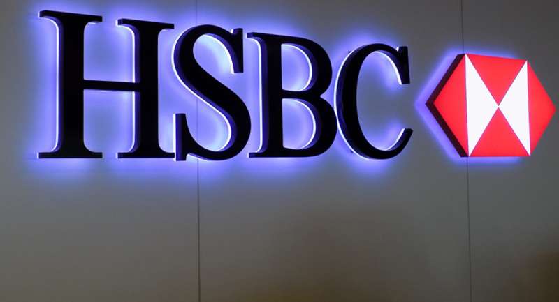
You know it when you see it. That iconic hexagon emblazoned with the letters “HSBC” – a symbol recognized worldwide. But what’s behind the visual identity that defines one of the largest financial institutions on the globe?
Step inside the world of branding, where a logo is more than a mere graphic; it’s the heart of a company’s corporate identity. We’ll unravel the story of the HSBC logo, delving into its historical canvas and exploring its role as a cornerstone of trust within the banking industry.
Our journey will dissect the elements that make up this banking icon and why it stands as a beacon of corporate reputation. Understand the nuances of color schemes, branding strategies, and the artistry of logo evolution.
By article’s end, you’ll have a holistic picture – from the importance of brand equity to navigating trademark laws. Let’s decode the secrets behind those three letters and how they represent a legacy of international finance.
The Meaning Behind the HSBC Logo
The magic of logos? They’re tiny stories. Just like HSBC’s logo, a fascinating narrative waiting to be unfolded.
Step One: The Shape
Imagine a box, an open box. Picture it wide open, symbolizing a realm of boundless opportunities. The kind of trust and reliability that can only be promised by a leading financial institution. And, yes, this box is not merely a box – it’s the primary shape in HSBC’s logo.
Step Two: Colors and Inspiration
![]()
Ever spotted the Scottish flag? A white cross over a blue background, paying homage to St. Andrew. This cross gets a geometric twist in the HSBC logo. The white rectangle breaks diagonally, creating a bold, red X. It’s more than just a pattern. It’s a statement of stability, strength, and energy.
Step Three: The Inscription
Black, bold letters spell out “HSBC”. A monogram – short, sweet, impactful. HSBC stands for Hongkong and Shanghai Banking Corporation. These four letters encapsulate the global reach of a bank born in Hong Kong, a testament to its expansive journey.
The Essence
Unveiling the HSBC logo is like time travel. You’re taken back to 1865, when the bank opened its doors, bridging the gap between Europe and Asia. From then to now, the logo echoes one mantra – a local bank serving international needs.
Let’s wrap up the story here. Remember, each logo has a tale to tell. Next time you spot HSBC’s logo, you’ll know it’s more than a symbol. It’s a journey!
The History of the HSBC Logo
![]()
Now, let’s travel back in time. Let’s trace the journey of the HSBC logo.
The Founding Era
The HSBC logo wasn’t always the sleek, modern design we see today.
The Modern Redesign
Fast forward to the 1980s. The world was changing. And so was HSBC. The bank decided it was time for a refresh. They simplified their logo, transforming into the abstract hexagon we see today.
And thus, the modern HSBC logo was born.
The Colors of the HSBC Logo
Colors aren’t just pretty. They speak. And the colors of the HSBC logo have a lot to say.
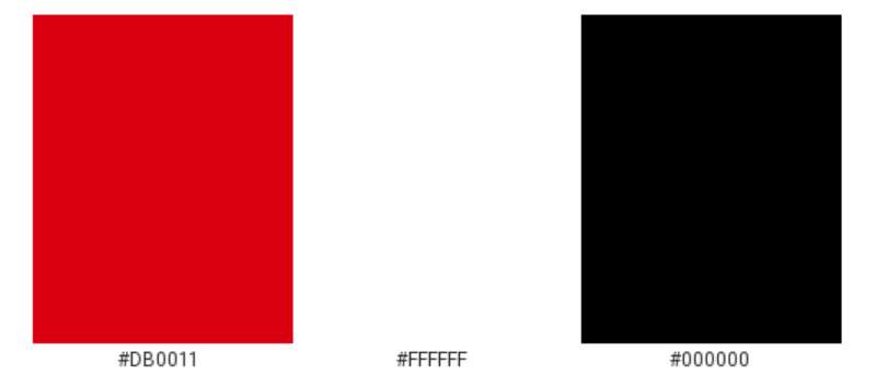
The Power of Red
The HSBC logo is red. But why red? Because red stands for passion, energy, and action. It’s also a color deeply rooted in Asian culture, symbolizing luck and prosperity.
The Serenity of White
And then there’s white. The color of purity, innocence, and simplicity. It’s the perfect balance to the bold red, creating a harmony that’s both dynamic and serene.
The Font Used in the HSBC Logo
Fonts are like voices. They express personality. And the HSBC logo has a distinct voice, thanks to its font.
The Typeface Choice
The font used in the HSBC logo is a customized typeface. It’s clean, modern, and professional. It’s the perfect choice for a global bank that values clarity, precision, and trust.
The Evolution of the HSBC Logo
The HSBC logo didn’t just appear out of thin air. It evolved. And it continues to evolve.
The Adaptability Factor
Over the years, the HSBC logo has shown a remarkable ability to adapt. It has been resized, reshaped, and recolored to suit different contexts and platforms. But no matter how it changes, it remains instantly recognizable.
The Future of the HSBC Logo
What’s next for the HSBC logo? Only time will tell. But one thing is for sure – it will continue to symbolize the bank’s commitment to strength, stability, and global reach.
The Impact of the HSBC Logo
Lastly, let’s not forget the impact of the HSBC logo. It’s more than just a logo. It’s a symbol of trust, recognized worldwide.
A Global Identity
From Hong Kong to London, from New York to Sydney, the HSBC logo is recognized and respected. It’s a global identity, a badge of honor worn proudly by the bank and its customers.
A Brand Promise
The HSBC logo isn’t just a logo. It’s a brand promise. A promise of security, stability, and trust. It’s a guarantee that wherever you see that familiar red hexagon, you’re in good hands.
The Versatility of the HSBC Logo
Versatility is key in the design world. And the HSBC logo shines in this department.
Simplicity in Complexity
The HSBC logo is deceptively simple. It’s a hexagon, yes. It’s a balance of simplicity and complexity that makes it versatile and adaptable.
Ready for Every Medium
Whether it’s on a massive billboard or a tiny mobile screen, the logo stands out. It’s been designed to work in every medium, maintaining its impact and recognition no matter where it’s seen.
So there you have it. The HSBC logo – a masterclass in design, history, and symbolism. A logo that’s not just a logo, but a story. A story of strength, stability, and global reach. A story that continues to unfold, one hexagon at a time.
FAQ on the HSBC Logo
What does the HSBC logo represent?
The logo’s not just a quirky design, you know. It’s a promise of reliability and a nod to the legacy of HSBC, reflecting their values, history, and position in international finance. That hexagon draws inspiration from the bank’s corporate identity, sealing it as a mark of global banking trust.
Why did HSBC choose a hexagon shape?
Ah, the hexagon – it’s not random. It’s inspired by the HSBC flag, a symbol from their early days. They wanted a logo that screams ‘solidity’ and the hexagonal shape, with its mathematical efficiency, speaks volumes about strength and stability in the financial world.
Has the HSBC logo changed over time?
Sure has. It’s been through tweaks and facelifts, evolving like a fine wine. They began with a simpler design; then the hexagon cropped up in the ’80s. Since then? It’s been about polishing, updating for clarity, keeping that iconic shape crisp in the digital age.
What color is the HSBC logo?
It’s all about that deep, rich red. Why? It stands out, commands attention. Beyond that, it’s a nod to the bank’s Eastern heritage and symbolism. Red in many Asian cultures means good fortune, prosperity. Smart, right? It’s visual branding with a cultural twist; memorable, impactful.
Who designed the original HSBC logo?
That credit goes to Henry Steiner, a big name in graphic design. People call him the “father of Hong Kong design” for a reason. Back in the ’80s, he crafted the hexagon and those letters inside—a mark that’s traveled well through time, across borders.
What do the letters in the HSBC logo stand for?
They unpack to “The Hongkong and Shanghai Banking Corporation.” It’s a mouthful, I know. But those letters? They make the acronym sing. It’s like a quick dial to their roots, an homage to where this global venture sparked to life.
How does the HSBC logo promote the brand?
This is where the magic of logo design shines. The logo – splashed everywhere, from towering skyscrapers to the bank cards in wallets – is a visual handshake. It says “HSBC” without a word, promoting recognition, anchoring the brand’s image in minds worldwide.
What emotion is HSBC’s logo meant to evoke?
It’s calm, it’s confidence in a shape – that’s what they’re going for. Trust is the name of the game in banking, and their logo targets just that. Every time you spot that red hexagon, it’s meant to reassure you that your finances are secure and managed.
Is the HSBC logo trademarked?
Absolutely. In the cutthroat world of business, you bet that hexagon’s under lock and key. It’s got the full backing of trademark law. It’s like a legal armor, guarding against any cheeky mimics trying to leech off their corporate identity.
Can the HSBC logo be used by others?
Now that’s a hard no unless you’ve got explicit permission, which comes rare. Intellectual property’s a sacred turf here, and the HSBC logo is a heavily guarded stronghold of their brand equity. You’d need a solid, legit reason—think partnerships, official business—for HSBC to say ‘go ahead.’
Conclusion
Wrapping up, the HSBC logo stands as a beacon of trust, an assurance of stability in a whirlwind sector; it’s a cornerstone of the bank’s visual identity and corporate reputation. Throughout its evolution—adjusting to digital mediums, and fine-tuning for brand recognition—it’s maintained its iconic status. A symbol that’s not just recognized at a glance but holds a staggering level of importance in brand equity and marketing strategies.
In the pixels, the print, on towering signage, it’s unmistakable—a symbol that has transcended its graphic design origins to embody a legacy of international finance and cultural significance, emphasized by its undying red hue. For those curious about how logos shape customer trust or the intricacies of trademark law, it’s a prime subject, rich with history and meaning.
And as we’ve seen, whether it’s wrapped around skyscrapers or nestled in wallets worldwide, the logo is more than art—it’s a promise; your finances are in secure hands.
If you liked this article about the HSBC logo, you should check out this article about the Bank of America logo.
there are also similar articles discussing the Wells Fargo logo, the JP Morgan Chase logo, the UBS logo, and the Barclays logo.
And let’s not forget about articles on the Deutsche Bank logo, the Citigroup logo, the Societe Generale logo, and the ING logo.
Bogdan Sandu, a seasoned designer with 15 years of diverse experience, has been designing websites since 2008.
Renowned for his expertise in logo design and visual branding, Bogdan has developed a multitude of logos for various clients.
His skills extend to creating posters, vector illustrations, business cards, and brochures. Additionally, Bogdan's UI kits were featured on marketplaces like Visual Hierarchy and UI8.
Latest posts by Bogdan Sandu (see all)
- The Asahi Logo History, Colors, Font, And Meaning - 4 May 2024
- Playtime Perfection: Fun Kids Color Palettes - 4 May 2024
- PX to REM Converter - 4 May 2024