

The ING Logo History, Colors, Font, and Meaning
Picture this: You’re navigating the buzzing world of finance, and there it is, the iconic ING logo. It’s more than just an orange splash with a lion; it’s a beacon of modern banking, a den of trust embedded in a simple graphic. Now, what if I told you there’s a science, an art, actually, behind that symbolism?
We’re diving into the deep end of corporate identities. Understanding the visual wink that connects client to company—you know, the kind that sticks with you. That’s the gold we’re after.
By the wrap of this read, you’ll grasp why that lion roars without making a sound; how color psychology plays hardball in logo recognition; and why, in the labyrinth of global finance icons, that particular orange feline stands tall.
Peek behind the curtain of brand narratives and behold the wizardry of the ING brand identity—an empowering journey that tosses light on visual brand representation and shakes hands with the sneaky giants of branding strategy. Brace for an odyssey through hues, emblems, and the silent language of logos.
The Meaning Behind the ING Logo
A Symbol of Strength and Unity
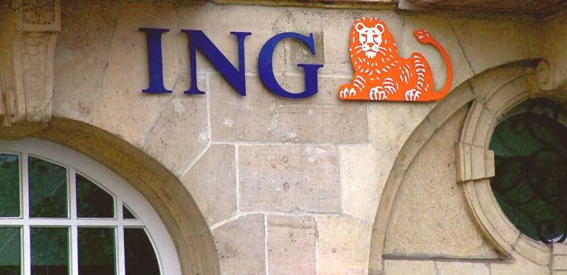
When you gaze upon the ING logo, you’re not just seeing a brand. It’s a tapestry, filled with history and national pride. Picture it, an emblematic lion, basked in orange.
The Lion. It’s sophisticated and traditional. It shows ING’s rich heritage. It sets us apart, makes us unique among banking and insurance providers. It’s our past, present, and future.
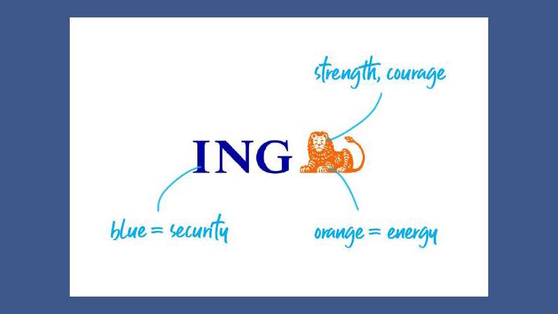
The Orange Hue: A Nod to the Dutch Roots
Then there’s the color. Oh, that distinctive orange! Did you know it’s a nod to ING’s Dutch roots?
Yep, you guessed it right.
The color orange is closely associated with the Dutch Royal family, which belongs to the House of Orange-Nassau. Hence, the bright orange of the ING logo is a way to pay tribute to the bank’s heritage. Pretty cool, eh?
The History of the ING Logo
Brought to Life in the Late 20th Century
The ING logo, as we know it today, didn’t always look this way. The story of its birth is tied to the merger of Nationale-Nederlanden and NMB Postbank Group in the 90s.
The task was to create a logo that represented this new entity, something that carried forward the legacy of the two companies while also marking a fresh start. That’s when the idea of the lion and the circle was born.
Embracing Change with Time
Over the years, the logo has gone through several changes, each modification subtly enhancing its appearance. Remember, change is inevitable, even for logos. Each modification, each tweak, was made with the intention of making the logo more modern, more appealing to the changing times and tastes.
The Colors of the ING Logo
The Power of Orange
As we already discussed, the orange in the ING logo is a tribute to its Dutch roots. But there’s more to it than just that.
Orange is also a color that represents energy, warmth, and the sun. It’s a color that stands out, that grabs attention. It’s vibrant, it’s dynamic. Just like the financial world, wouldn’t you say?
The Choice of Blue
Then there’s the blue. A calming counterpoint to the vibrant orange. Blue is a color that symbolizes trust, loyalty, and confidence. Qualities that are absolutely vital in the financial world, right?
The Font Used in the ING Logo
A Display of Modernity and Simplicity
When it comes to the font used in the ING logo, it’s all about simplicity and modernity. The typeface is clean, sans-serif, with no extra flourishes or frills. Just like the logo itself, the font is a statement of strength and straightforwardness.
Easy to Read, Easy to Remember
The font is not just about looking good. It’s also about being easy to read and easy to remember. After all, you want people to remember your brand, don’t you? The font used in the ING logo does exactly that. It’s bold, it’s recognizable, and it sticks in your mind.
The Design Process of the ING Logo
The Birth of the Lion and the Circle
It all started with an idea: a lion, a circle, and a clean, simple font. This was the initial concept that was brainstormed. The lion, a symbol of strength and authority, was a natural choice, given the bank’s Dutch heritage.
The circle, a symbol of unity and wholeness, was added to represent the unified nature of the newly merged entity.
But it wasn’t just about choosing the elements. It was also about how these elements interacted with each other. The positioning of the lion within the circle, the size of the circle in relation to the lion, every tiny detail was meticulously considered and tweaked until it was just right.
The Evolution of the Design
As the years went by, the logo evolved, but the core elements remained the same. The changes were subtle: a slight modification in the hue of the orange, a minor adjustment in the thickness of the circle, a small shift in the positioning of the lion. Each change was made with the intention of keeping the logo relevant and appealing in a changing world.
The Impact of the ING Logo
Recognizability and Consistency
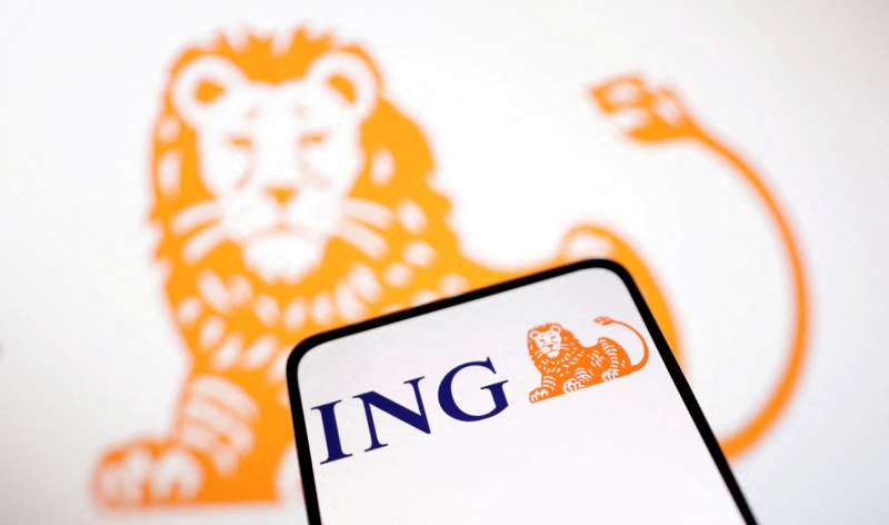
The ING logo, with its distinctive design and color scheme, is instantly recognizable. And that’s a big deal in the world of branding. A distinctive, memorable logo is key to building a strong brand identity.
The consistency of the logo, despite minor changes over the years, has also played a significant role in establishing ING as a reliable and trusted brand. The logo serves as a visual reminder of the brand and its values, creating a sense of familiarity and trust among customers.
A Symbol of Dutch Heritage
In addition to its recognizability, the logo also serves as a powerful symbol of ING’s Dutch heritage. The orange lion, a nod to the Dutch Royal family, is a constant reminder of the bank’s roots. It’s a symbol of pride, a symbol of heritage, a symbol that tells a story.
So the next time you see the ING logo, take a moment to appreciate the thought and creativity that went into its design. It’s not just a logo, it’s a piece of art, a story, a symbol of strength and unity.
FAQ on the ING Logo
What’s the story behind the ING logo?
Oh, it’s quite the tale! The ING logo, with its bold orange hue and the regal lion, mirrors not just the brand’s Dutch roots but also its strength and leadership in the global financial playground. It’s a nod to the nation’s historic heraldry, and to the bank’s commitment to secure, yet forward-thinking service.
How often has the ING logo changed?
Change isn’t just good, it’s inevitable, right? Since the fusion of Netherlands’ banking pillars in the ’90s, the ING Group has tweaked its logo a couple of times. Each refresh subtly, keeping the iconic lion and orange—brand consistency at its finest, ensuring that loyal clientele always feel at home.
What does the orange color in the ING logo symbolize?
Orange—you can’t miss it! It shouts enthusiasm, vibrance, a zest for innovation. It’s the rich color of the Dutch royal family and tells you straight away that ING is a brand that’s all about energy and encouragement—ready to ignite the financial services with some serious pep.
Is the lion in the ING logo unique to the brand?
Unique, indeed! The lion ain’t just any lion—it’s a fearless and grounded creature that’s been associated with various Dutch entities over time. This specific lion, though, has been tailored for ING, reinforcing brand identity and claiming its spot in the international banking group jungle.
What design principles were considered in the creation of the ING logo?
Let’s talk principles. When crafting that visual punch, the logo design principles of simplicity, memorability, and relevance took the lead. The ING brand identity champions easy recognition, with a logo that’s flexible for all sorts of marketing collateral and flies the banner of the brand’s ethos.
Who designed the original ING logo?
The original creator? A tale shrouded in a bit of agency privacy, but it’s common knowledge this was no solo gig. A talented team of graphic designers poured their mastery into a branding strategy that would cement ING as a titan in the banking sector.
How does the ING logo represent the brand’s values?
Spot on—it’s a storyteller. The logo brings ING’s values to life—the lion for courage and wisdom; orange for Dutch pride and approachability. It’s a visual handshake offering reliability and innovation in the ever-dynamic world of financial services branding.
How does the ING logo enhance customer recognition?
Think of the ING logo as a familiar face in a crowd. The warm orange hue and vivid lion grab eyes and plant a seed of recognition—it’s a friend in the world of international bank logos, simplifying the customer perception journey and mapping trust in the financial institution landscape.
How does the ING logo compare to other bank logos?
While we’re not throwing comparisons, let’s just say ING’s logo holds its ground in the lineup. It marries tradition with modernity and brings a dash of boldness. While other banks go for blues and greens, ING’s orange and lion set it apart in the banking logo symbolism.
What impact did the ING logo have on the company’s rebranding?
Rebranding is like shedding skin, and for ING, the logo was a central player. Maintaining the lion throughout these changes bolstered the bank’s narrative, demonstrating adaptability without losing the brand equity. The logo’s iterations have been a beacon for brand identity, guiding customers old and new through ING’s evolution.
Conclusion
Let’s wrap this up, shall we? The journey through the orange savannah, home to the stoic lion of the ING logo, it’s been less of a walk and more of a revelation. Who knew that tucked within its mane were layers of brand identity, whispers of a Dutch heritage, and a roar echoing financial institution strength.
- Unchanged core: Despite the inevitable evolutions, that visual brand representation remains true to its origins.
- Global finance icon: Not just a symbol, but a flag bearer of innovation and trust in a highly competitive arena.
- Design ingenuity: Integrating logo design principles into financial services branding—it’s a craft of precision.
The ING lion doesn’t just reside in the realm of international bank logos; it prances boldly as a corporate emblem design marvel. It’s seen pivotal moments, logo redesigns with thoughtful strokes, yet it stands immutable in its quest – to be a
If you liked this article about the ING logo, you should check out this article about the Bank of America logo.
there are also similar articles discussing the Wells Fargo logo, the BNP Paribas logo, the JP Morgan Chase logo, the UBS logo, and the HSBC logo.
And let’s not forget about articles on the Barclays logo, the Deutsche Bank logo, the Citigroup logo, and the Societe Generale logo.
Bogdan Sandu, a seasoned designer with 15 years of diverse experience, has been designing websites since 2008.
Renowned for his expertise in logo design and visual branding, Bogdan has developed a multitude of logos for various clients.
His skills extend to creating posters, vector illustrations, business cards, and brochures. Additionally, Bogdan's UI kits were featured on marketplaces like Visual Hierarchy and UI8.
Latest posts by Bogdan Sandu (see all)
- The Asahi Logo History, Colors, Font, And Meaning - 4 May 2024
- Playtime Perfection: Fun Kids Color Palettes - 4 May 2024
- PX to REM Converter - 4 May 2024