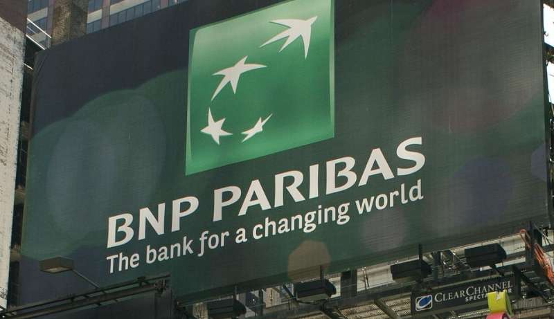
The BNP Paribas Logo History, Colors, Font, and Meaning
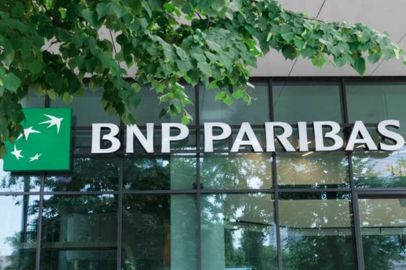
Imagine locking eyes with a symbol that whispers legacies. The BNP Paribas logo does just that—stands as a testament to the robust pillars of global banking. Anchored in French sophistication, it’s not merely a graphic. It’s a storyboard canvasing trust, innovation, and a rich international presence.
In this tight weave of pixels and strategy, there’s an untold narrative of brand identity and corporate evolution. You’re here, which means there’s a curiosity stirring within you.
Perhaps it’s about understanding the gravitational pull this emblem possesses in the crowded cosmos of financial services logos.
By the final punctuation, you’ll have unraveled the DNA of a logo that’s much more than an artistic flourish. It’s a silent ambassador of a banking powerhouse.
Dip into the palette of its visual branding, stride through the evolution of its emblematic presence, and glean insights into successfully harnessing the power of a visual identity—whether splashed across digital banking platforms or etched in the corner of marketing material.
The Meaning Behind the BNP Paribas Logo
![]()
As a graphic designer, I find it incredibly captivating to delve into the symbolism and semiotics of logos. The BNP Paribas logo is no different.
Symbolism in the Stars
The BNP Paribas logo features four stars, each a little different, dancing around a central point. Stars are often associated with aspiration and guidance, serving as a beacon. These stars seem to symbolize the global reach of the bank and its commitment to guide its customers towards financial success.
Central Point
Now, about that central point. It’s more than just a place for the stars to dance around. It’s the heart, the hub, the epicenter. It might symbolize the bank’s central role in the global financial system, or it might represent the customers, around whom all of the bank’s activities revolve.
The History of the BNP Paribas Logo
![]()
Logos evolve over time, telling a story of their own. And the BNP Paribas logo has a tale to tell.
Origins and Evolution
The BNP Paribas logo, as we know it today, came to life following the merger of Banque Nationale de Paris (BNP) and Paribas in 2000. The logo blends elements from both banks, creating a fusion that speaks of unity, strength, and shared vision.
Recent Changes
In recent years, the logo has been refined, but its core elements have remained intact. The stars and central point continue to dominate, testament to the bank’s enduring values and its commitment to its customers.
The Colors of the BNP Paribas Logo
![]()
Colors speak volumes. They convey emotions, values, and even personality traits. The BNP Paribas logo’s color scheme is simple, yet powerful.
A Sea of Green
The prominent color in the logo is green. In design and psychology, green often symbolizes growth, balance, and renewal. It’s a color that harmonizes with the ethos of a financial institution like BNP Paribas.
Accents of White
The stars and the text are rendered in crisp, clean white. White often represents clarity, innocence, and perfection. This might be the bank’s way of conveying its commitment to transparency and ethical conduct.
The Font Used in the BNP Paribas Logo
Typography is an art of its own. The font used in the BNP Paribas logo is a perfect example of this.
Simplicity and Elegance
The font is simple, clean, and elegant. It’s a sans-serif font, which usually communicates a sense of modernity and straightforwardness. The letters are all capitalized, which often symbolizes strength and reliability.
Emotion Evoked by the BNP Paribas Logo
Every great logo sparks an emotional response. Let’s explore the feelings that the BNP Paribas logo might evoke.
Trust and Confidence
With its deep green color, simple design, and elegant font, the logo inspires trust and confidence. It seems to say, “We’re dependable. We’re here for you.”
Aspiration and Achievement
The stars in the logo may ignite feelings of aspiration and achievement. They seem to encourage us to reach for our financial goals, with BNP Paribas as our trusted guide.
The BNP Paribas Logo in the Digital Age
In our modern, digitized world, logos need to be versatile and adaptable. The BNP Paribas logo checks both these boxes.
Versatility Across Platforms
The logo looks equally good on a banknote, a billboard, or a browser tab. This versatility is essential in the digital age, allowing the logo to remain recognizable and effective across various platforms.
Adaptability to Different Sizes
Thanks to its simple design, the BNP Paribas logo scales well. Whether it’s displayed on a giant screen or a tiny mobile device, it retains its clarity and impact. This adaptability is crucial in a world where logos need to work well in a multitude of formats and resolutions.
Sustainability and the BNP Paribas Logo
In today’s environment-conscious world, logos can also communicate a company’s commitment to sustainability. The BNP Paribas logo subtly does just that.
A Symbol of Sustainability
While not immediately apparent, the circular design of the logo, with the stars revolving around a central point, can be interpreted as a symbol of sustainability. It may signify a circular economy, a system that aims to eliminate waste and the continual use of resources.
In Harmony with Nature
The dominant green color of the logo may also signify respect for nature. Green is often associated with trees and nature, both of which symbolize life and sustainability.
In the end, the BNP Paribas logo is more than just a design. It’s a story, a promise, and a symbol, all rolled into one. As a graphic designer, I find this fascinating and inspiring. It’s a testament to the power and potential of good design.
FAQ on the BNP Paribas Logo
What’s the history behind the BNP Paribas logo?
Unveiled to the world, this emblem has morphed through time, each iteration a chapter in a saga. It’s more than a corporate symbol; it’s a timeline, showcasing the bank’s mergers, evolutions, and uncompromising ascent in the financial industry.
Why was the BNP Paribas logo designed the way it was?
In its DNA, the logo’s visual branding is deliberate, a calculated distillation of the bank’s ethos—strength, flexibility, and innovation. They chose the design to transmit a subliminal message: BNP Paribas is your anchorage in the shifting sands of finance.
What do the colors in the BNP Paribas logo represent?
The green is a nod to growth, stability, and a connection to the earth, while the gold signifies wealth and prosperity. Together? They’re the visual handshake of the brand’s promise, a brand identity speaking in color schemes.
Has the BNP Paribas logo changed over the years?
Just like us, the logo has seen its fair share of makeovers, adapting to stay in step with the times. Each redesign subtly shifting, always with an eye on maintaining the revered, corporate identity that’s instantly recognized worldwide.
Is the BNP Paribas logo trademarked?
Absolutely, it’s a shielded treasure. Enshrined in intellectual property law, the logo’s a registered trademark, a legal stance ensuring the exclusivity of their corporate symbol. It’s not just a design; it’s a secured asset.
What branding guidelines are associated with the BNP Paribas logo?
They’ve penned an entire scripture of dos and don’ts—strict. From logo usage guidelines to placement and color schemes, each detail articulated to preserve the sanctity of the brand’s visual identity. Deviation isn’t an option; it’s the bible for their brand consistency.
How does the BNP Paribas logo incorporate modern design elements?
It’s a blend, a concocted brew of time-honored tradition with a splash of modernism. The emblem, crisp and sleek, dances between corporate tradition and graphic elements plucked from contemporary design language—ever relevant, evergreen.
In what ways does the BNP Paribas logo enhance brand recognition?
That logo’s laser-etched into the retina of the market’s collective consciousness. Instant recognition, a reflexive identification, the branding strategy at work is nothing short of alchemy. It’s not just seen; it’s remembered, filed away under “trust.”
Can the BNP Paribas logo be used freely in marketing materials?
Hold up, not so fast. There are rules at play. Guidelines tightly lace around its usage with the goal of guarding corporate image. Marketing endeavors bow to these commands, ensuring each portrayal aligns with brand guidelines.
What makes the BNP Paribas logo distinctive from other bank logos?
It’s the narrative, the depth. While many banks may flaunt abstractness, BNP Paribas boasts of a logo that’s bold in its simplicity and unapologetic about its history—a true corporate logo that deftly articulates its brand values without a whisper.
Conclusion
Circling back after a deep dive into the essence of the BNP Paribas logo, it’s clear—it’s so much more than a mere emblem. It’s a banner that flourishes at the intersection of heritage and brand evolution. It resonates a narrative of strength, carrying within its contours the silent, yet potent language of trust and recognition in the global financial theater.
This emblem, sheathed in tradition, bolstered by the winds of change, stands as a lodestar for crafting visual identities that endure. For anyone entwined in the fabric of branding, observing this logo’s voyage offers a blueprint—a testament to seamlessly navigating the crosscurrents of modern graphic design and unwavering corporate values.
It’s not just any logo; it’s a lesson in history, a guide in design, a beacon of brand identity—all wrapped in green and gold. Let it ignite that creative spark that fuels transcendent design.
If you liked this article about the BNP Paribas logo, you should check out this article about the Royal Bank of Scotland logo.
There are also similar articles discussing the Standard Chartered logo, the Commonwealth Bank of Australia logo, the UniCredit logo, and the Barclays logo.
And let’s not forget about articles on the Deutsche Bank logo, the Citigroup logo, the Societe Generale logo, and the ING logo.
Bogdan Sandu, a seasoned designer with 15 years of diverse experience, has been designing websites since 2008.
Renowned for his expertise in logo design and visual branding, Bogdan has developed a multitude of logos for various clients.
His skills extend to creating posters, vector illustrations, business cards, and brochures. Additionally, Bogdan's UI kits were featured on marketplaces like Visual Hierarchy and UI8.
Latest posts by Bogdan Sandu (see all)
- Rainbow Color Palettes for Joyful Designs - 29 April 2024
- The Bethesda Logo History, Colors, Font, And Meaning - 28 April 2024
- Out of This World: Space Color Palettes for Cosmic Designs - 28 April 2024