

The UniCredit Logo History, Colors, Font, and Meaning
Ever paused, mid-scroll, because a logo caught your eye? A symbol that packed a punch, yet whispered the essence of a brand? That’s the magic of design—where color, form, and purpose interlock, crafting an emblem that doesn’t just mark products, but nests in the cradle of perception. Today, the UniCredit logo takes center stage.
Crafted at the crossroads of finance and creativity, this visual identity swathes Europe’s banking prowess within its crisp folds. It’s more than just a corporate symbol, it’s a beacon that guides millions towards trust and innovation.
By the article’s close, you’ll unfurl the layers behind this iconic design—delving into everything from the logo evolution and the psychology of color in marketing collateral, to why this European bank’s stamp secures an indelible impression.
Sections will color in the lines of brand identity, brand guidelines, and the undeniable influence of trademark registration on the business landscape.
Buckle in for a design odyssey; it’s going to be a masterstroke of insight.
The Meaning Behind the UniCredit Logo
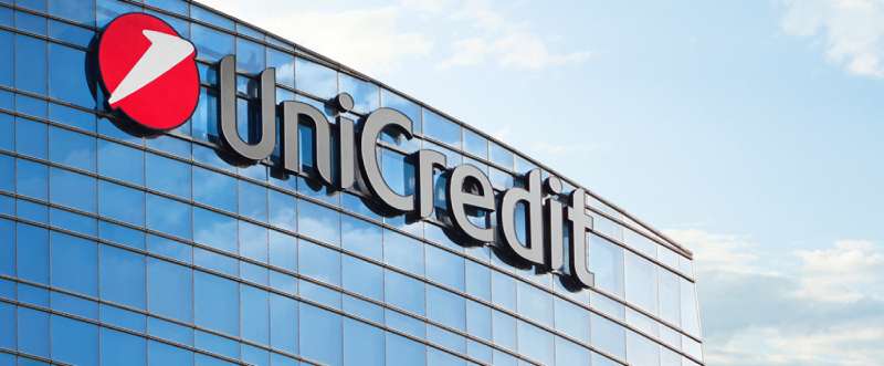
![]()
Diving into the depths of the UniCredit Logo, it’s like peeling back the layers of an onion, each layer revealing a new facet of understanding. UniCredit is colossal in the world of banking and financial services, and its logo is a significant symbol of its identity.
Symbol of Unity and Connection
You see, the logo of UniCredit is more than just a neat design. It’s a beacon of unity and connection. Imagine a pair of hands reaching toward each other, a symbol of cooperation, collaboration, and mutual trust. That’s what the UniCredit Logo stands for.
Emblem of Continuity
Look closer, and you’ll see an emblem of continuity. The way the lines interlock, creating an uninterrupted circle, it’s like a nod to the bank’s commitment to continuity and constancy. It’s a promise that they’re here for the long haul.
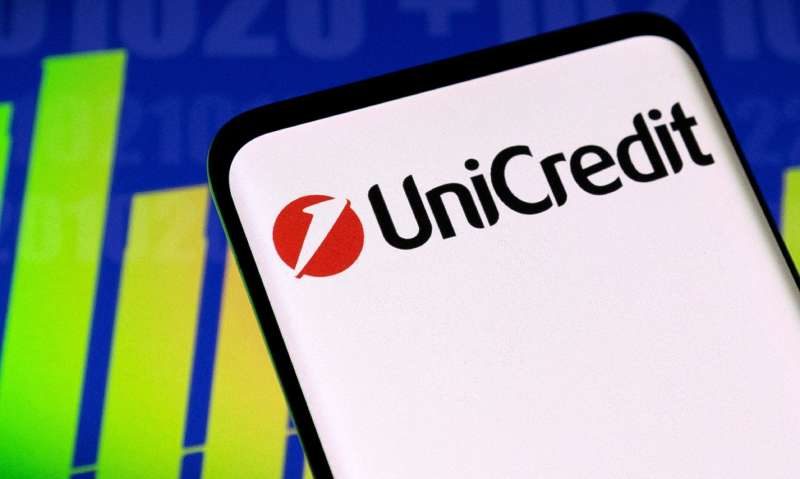
The History of the UniCredit Logo
![]()
Unfolding the story of the UniCredit Logo, it’s like reading a riveting book that has seen a few interesting plot twists.
Birth of the Logo
The birth of the logo is a chapter that carries the excitement of new beginnings. The logo was born in 1998, when UniCredito Italiano was created. The logo has been an integral part of the brand’s identity ever since.
Logo’s Evolution
Then comes the thrilling part, the logo’s evolution. Over the years, the logo has undergone subtle changes, keeping up with the times, yet never losing its core identity. It’s an illustration of how change and consistency can co-exist beautifully.
The Colors of the UniCredit Logo
When it comes to the colors of the UniCredit Logo, it’s like a visual symphony that strikes the perfect chord.
Power of Red
The prevailing color in the logo is red, a color symbolizing passion, courage, and determination. It’s a hue that resonates with the principles that UniCredit stands for.
Touch of White
The touch of white in the logo, it’s the color of purity, peace, and simplicity. It’s like a whisper of the bank’s commitment to transparency and integrity.
The Font Used in the UniCredit Logo
Talk about the font used in the UniCredit Logo, and you’re talking about the voice of the brand.
Simplicity and Clarity
The font used in the logo is clean, simple, and easy to read. It’s a reflection of UniCredit’s approach to banking – making complex things simple and understandable.
Boldness and Impact
The boldness of the font, it’s a statement. It’s UniCredit saying, “We’re here, and we’re ready to make a difference.”
The Geometry of the UniCredit Logo
Let’s get into the geometry of the UniCredit Logo, and it’s like stepping into a world where form and function meet.
The Circle
The most prominent geometric shape in the logo is the circle. It’s a symbol of wholeness, unity, and infinite possibilities.
The Interlocking Lines
The interlocking lines in the logo, they create a sense of movement and dynamism. It’s like a visual representation of the bank’s forward-thinking ethos.
The Impact of the UniCredit Logo
And finally, let’s touch upon the impact of the UniCredit Logo. It’s like appreciating the lasting impression a great work of art leaves.
Recognition and Brand Identity
The distinctive design of the Logo makes it instantly recognizable. It’s a powerful tool for establishing and reinforcing the bank’s brand identity.
Trust and Confidence
The Logo, with its clever design and thoughtful symbolism, instills a sense of trust and confidence in the minds of the customers. It’s like a silent assurance that they’re in safe hands.
The Universality of the UniCredit Logo
Bringing it all together, we’ll see how the universality of the logo shines through. It’s like a language that speaks to everyone, everywhere.
Global Appeal
The simplicity and clarity of the Logo give it a universal appeal. No matter where you are in the world, the logo is identifiable, relatable, and memorable.
Transcending Cultural Boundaries
The design of the UniCredit Logo transcends cultural boundaries. It’s a design that communicates the bank’s values and mission, irrespective of language or cultural differences.
The logo, in all its elegance and simplicity, is much more than meets the eye. Each aspect of it – the design, the color, the font, the geometry – they all come together to tell a story, a story of unity, trust, continuity, and universality. A story that resonates with people across the globe.
FAQ on the UniCredit Logo
Who designed the UniCredit logo?
It’s like a signature, isn’t it? The UniCredit logo was a brainchild of a skilled team, not just a solo gig. Their focus? Delivering a logo to embody brand identity and visual identity in the complex landscape of European banks. Look no further for sophistication meeting simplicity.
What do the elements in the UniCredit logo represent?
Dive into that logo, and you see genius. The elements? They’re not random. Each is a calculated choice, representing stability, growth, and the innovative drive of financial services. It’s a harmony of symbolism, rooted deeply in the bank’s brand assets and heritage.
When was the UniCredit logo last updated?
Refreshes keep things fresh, right? The UniCredit logo embraced change a while back, ensuring their visual brand language stayed in step with modern times. Last update? It was when they decided their image needed to reflect a more digital branding vibe to speak to an evolving clientele.
Are there different versions of the UniCredit logo for various services?
Absolutely! It’s not a one-size-fits-all deal. The logo morphs subtly across diverse UniCredit services. Each variant tailors to specific contexts—be it retail banking or investment services—maintaining the core brand guidelines and ensuring brand recognition across all marketing collateral.
What colors are used in the UniCredit logo, and do they have meaning?
Colors aren’t just eye candy. The UniCredit logo weaves blues and blacks, colors selected for their association with professionalism, confidence, and trust. It’s all part of that color psychology in marketing—vital to corporate branding and resonating with the customer perception.
How does the UniCredit logo compare to other banking logos?
In the grand arena of logos, UniCredit stands out—think the classiness of dark suits among casual tees. Its design strikes a balance between uniqueness and familiarity, aligning with trends in global banking brands while maintaining its individual brand identity.
Is the UniCredit logo trademarked?
Trademarks are like armor for logos in the business battlefield. UniCredit’s gone the whole nine yards, ensuring their logo’s protected under intellectual property laws. They’ve got it locked down, a trademark keeping their distinctive corporate symbol safe from misuse.
How does the UniCredit logo influence customer perceptions?
Imagine a logo with a gravitational pull—yeah, that’s the one! UniCredit’s logo plays a massive role in how customers see them. It’s a brand asset that bolsters the bank’s image, promoting an aura of credibility and reliability within the financial sector.
What guidelines exist for using the UniCredit logo in media or advertisements?
Don’t go wild with it, rules are in play. UniCredit has set brand guidelines to ensure their logo’s used correctly—maintaining its integrity across all media. These rules dictate the dos and don’ts, like sizing, colors, and placement, crucial for consistent corporate communication.
How has the UniCredit logo impacted the bank’s brand strategy?
It’s a cornerstone—no, really. The UniCredit logo is pivotal in the bank’s overall branding strategies. This beacon isn’t just for show; it aligns the bank’s values with its public image, reinforcing brand strength and making it a memorable contender in the arena of financial institution logos.
Conclusion
So, we’ve circled back after wading through the deep end of design, branding, and all that good stuff. The UniCredit logo, it’s not just a fanciful sketch. It’s the face of a titan, dressed in visual identity clothes, crafted to leave a mark in the sea of financial services.
We’ve untangled the threads of its colors, symbols, and even dipped our toes into the pool of branding strategies. This isn’t just artwork—it’s legacy, strategy, and psychology all folded into one neat package. Every choice, every hue of blue, it’s deliberate. Designed to echo trust, evoke a sense of continuity, and keep the wheels of recognition spinning.
Walking away, remember—it’s not just about a pretty picture. With every stroke, every decision, there’s purpose. The UniCredit logo stands as a testament to that—bold and unwavering in the bustling marketplace of global finance.
Takeaway? Logos, my friends, they’re speaking louder than words.
If you liked this article about the UniCredit logo, you should check out this article about the Royal Bank of Scotland logo.
There are also similar articles discussing the BNP Paribas logo, the Standard Chartered logo, the Commonwealth Bank of Australia logo, and the Barclays logo.
And let’s not forget about articles on the Deutsche Bank logo, the Citigroup logo, the Societe Generale logo, and the ING logo.
Bogdan Sandu, a seasoned designer with 15 years of diverse experience, has been designing websites since 2008.
Renowned for his expertise in logo design and visual branding, Bogdan has developed a multitude of logos for various clients.
His skills extend to creating posters, vector illustrations, business cards, and brochures. Additionally, Bogdan's UI kits were featured on marketplaces like Visual Hierarchy and UI8.
Latest posts by Bogdan Sandu (see all)
- Purple Color Palettes Fit for Royalty - 16 May 2024
- How To Find A Font: Top Font Finders To Use - 16 May 2024
- The Guinness Logo History, Colors, Font, And Meaning - 15 May 2024