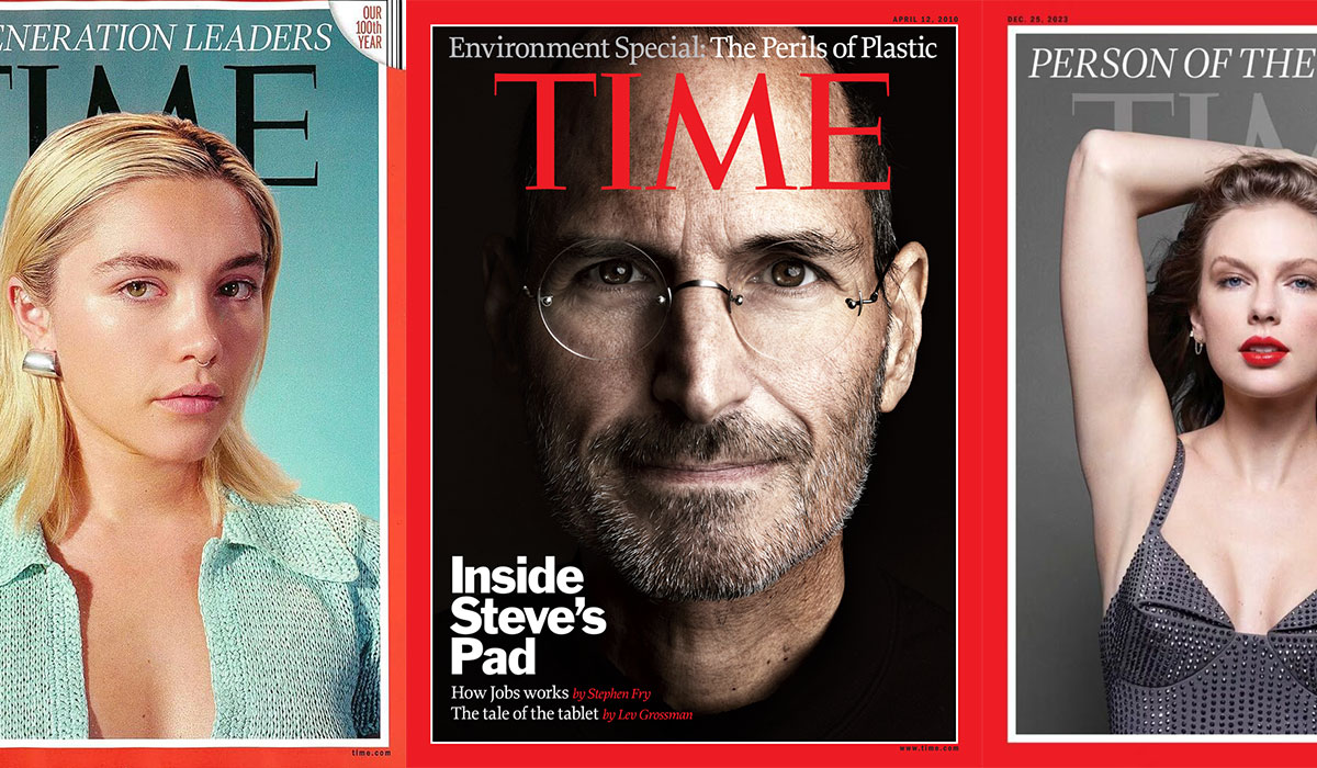
Time magazine uses a custom serif typeface for its iconic masthead, with Duplicate Ionic serving as the primary headline font and a bespoke body text typeface called Haffner in the print edition since 2015.
The masthead logo itself is not a commercial font. It is hand-drawn and custom, bearing resemblance to typefaces like FS Century and Marcus Traianus Extra Bold, but with its own modified serifs. No publicly available font replicates it exactly.
For editorial body copy, Time commissioned typographer Kent Lew to create Haffner specifically for the magazine in 2015. It is proprietary and not available for licensing. The online edition uses Georgia and Lora for body text.
—
What Type of Font Is Duplicate Ionic?
Duplicate Ionic is a slab serif display typeface rooted in 19th-century newspaper typography.
Its thick bracketed serifs and moderate stroke contrast give it a worn-in, credible feel that connects to early American press design. It reads as authoritative without being rigid or cold, which is exactly why Kent Lew chose it for Time’s headline role.
The typeface sits comfortably in the ionic or clarendon subcategory of serif fonts, a style historically tied to editorial trustworthiness. That association was deliberate. As Kent Lew put it in Time’s own announcement of the redesign, “Duplicate Ionic inherits this air of trustworthiness.”
Before Duplicate Ionic, Time relied heavily on Franklin Gothic as its display face. Franklin Gothic is a sans-serif font, which made the shift to Duplicate Ionic a meaningful move toward warmer, more editorial-forward typography.
—
Who Designed the Fonts Time Magazine Uses?
The 2015 redesign brought in typographer Kent Lew, who handled both the headline and body type choices.
Lew selected Duplicate Ionic for headlines and then created Haffner from scratch for body copy. Haffner was described by Time’s editorial team as “elegant, understated, and most of all, easy to read.” That’s not marketing language. For a publication running multi-thousand-word features, body text readability is a hard technical requirement.
The redesign was overseen by D.W. Pine, Time’s creative director, and design director Chrissy Dunleavy. The broader design direction was shaped by Pentagram’s Paula Scher and Luke Hayman during the earlier 2007 redesign, which first introduced the Proforma and Franklin Gothic system.
The masthead logo has been custom-drawn throughout the magazine’s history since 1923. No single designer is publicly credited for the current version, which features bold vertical stems, lighter horizontals, and thin unbracketed serifs.
—
Are Time Magazine’s Fonts Free to Use?

Haffner is proprietary. Kent Lew created it exclusively for Time and it has never been made available for public licensing.
Duplicate Ionic is a commercial typeface. It can be licensed through font licensing agreements, though pricing varies depending on usage and seat count. It is not available for free download on platforms like Google Fonts or Adobe Fonts.
The masthead typeface is not a font at all. It is custom-drawn artwork, so it cannot be downloaded or purchased anywhere.
For the digital edition, Georgia is a web-safe font available on all major systems at no cost. Lora is a free serif font available through Google Fonts.
Quick Licensing Overview
| Font | Role | License | Available |
| Duplicate Ionic | High-impact print headlines | Commercial | Yes (Commercial Type) |
| Haffner | Traditional print body text | Proprietary | No (Custom for Monocle) |
| Custom Masthead | Iconic logo and branding | Custom | No (Hand-lettered) |
| Georgia | Digital/Mobile body text | System Font | Yes (Pre-installed) |
| Lora | Web editorial/Digital serif | OFL (Free) | Yes (Google Fonts) |
—
What Font Did Time Magazine Use Before?

Time’s typographic history breaks into a few distinct eras.
Before 2007: The magazine used Benton Bold Condensed, a typeface Matthew Carter redesigned from Franklin Gothic, as its primary display font. Art Director Arthur Hochstein confirmed this in a DigitalArts interview.
2007 redesign: Pentagram’s Paula Scher and Luke Hayman led a significant overhaul. They brought in Proforma (designed by Petr van Blokland, published by Font Bureau) as the main editorial text face and returned to Franklin Gothic for display use. Proforma served Time’s print body text from 2007 until June 2015.
2015 redesign: Kent Lew replaced both. Duplicate Ionic took over headlines, and his custom Haffner replaced Proforma for body copy. This is the system still in use today.
| Era | Headline Font | Body Font |
| Pre-2007 | Benton Bold Condensed | Various |
| 2007–2015 | Franklin Gothic | Proforma |
| 2015–present | Duplicate Ionic | Haffner (print) / Georgia & Lora (web) |
—
What Are the Best Free Alternatives to Time’s Fonts?
Since Haffner and Duplicate Ionic are either proprietary or paid, you will need alternatives for most design work.
For headline use (replacing Duplicate Ionic), look for ionic or clarendon-style slab serif fonts with bracketed serifs and moderate stroke contrast.
For body copy (replacing Haffner or Georgia), any readable transitional serif with a generous x-height will work. High x-height matters a lot for legibility at small print sizes. That is not a minor detail. Pick something too condensed or too tight in leading and long-form text becomes genuinely hard to read.
| Font | Replaces | License | Source |
| Lora | Haffner / body text | Free (OFL) | Google Fonts |
| Libre Baskerville | Haffner / body text | Free (OFL) | Google Fonts |
| Merriweather | Haffner / body text | Free (OFL) | Google Fonts |
| Roboto Slab | Duplicate Ionic / headlines | Free (Apache) | Google Fonts |
| Cinzel | Masthead style | Free (OFL) | Google Fonts |
Cinzel specifically gets recommended often as a visual stand-in for the TIME masthead. It is based on first-century Roman inscriptions and has that same high-contrast, classical serif structure. Not a perfect match, but the closest free option for logo-style type.
—
How to Use These Fonts in Your Design Tools
Google Fonts (Lora, Merriweather, Cinzel)
All three are available for free at fonts.google.com. Download the ZIP file, install the font files on your system, and they appear automatically in Photoshop, Illustrator, and InDesign.
If you are working in a browser-based tool, embed them directly using the Google Fonts API. A single line of CSS handles it. For anyone setting up editorial-style layouts in Figma, you can add fonts to Figma via the Figma Font Helper desktop app, which makes any locally installed font available in the browser.
Canva Users
Lora and Merriweather are already built into Canva’s free font library. Search by name in the font picker and they come up instantly. If you want to upload fonts to Canva, you will need a Canva Pro subscription to bring in custom or paid typefaces like Duplicate Ionic.
InDesign (Print Layouts)
For anyone recreating a print editorial layout, adding fonts to InDesign is straightforward once they are installed system-wide. Set your body text between 9 and 11pt, keep tracking tight but not compressed, and let the leading breathe at around 120-130% of point size. That is roughly how editorial magazines handle long-form readability.
—
Why Did Time Magazine Choose These Fonts?

The 2015 redesign was not a cosmetic refresh. It was a response to a real problem: Time’s typography had drifted toward decorative, which is exactly the wrong direction for a news publication trying to hold authority.
Arthur Hochstein, Time’s Art Director from 1994 to 2009, said it plainly in describing the earlier 2007 redesign: the goal was to abandon tinted boxes and colored type in headlines, to stop treating type as illustration. That philosophy carried into 2015.
Duplicate Ionic was chosen because ionic slab serifs carry an association with early newspaper printing. They read as serious and factual without being cold. The psychology of the font choice reinforces what the editorial content is trying to say: this is reliable information.
Haffner was custom-built because no existing typeface hit the right balance of elegance and readability at small print sizes. That is a legitimate reason to commission something from scratch. Off-the-shelf options compromise somewhere. A bespoke typeface can be tuned specifically for the publication’s column width, paper stock, and ink behavior.
The masthead has stayed largely hand-drawn and custom since 1923. That is not inertia. Brand recognition for a typeface at that scale of distribution (Time has one of the highest circulations of any weekly publication globally) is worth more than any typographic modernization would gain.
The font system as a whole reflects a clear editorial visual hierarchy: a custom masthead for instant brand recognition, a trustworthy slab serif for headlines, and a purpose-built body face for long-form readability. Each layer of the typographic hierarchy does a specific job. Nothing is decorative for its own sake.
That restraint is what serious magazine typography looks like when it is working correctly.
FAQ on The What Font Does Time Magazine Use
What font does Time magazine use for its masthead?
The TIME masthead is custom-drawn artwork, not a commercial typeface.
It has never been released publicly. The closest commercial alternatives are FS Century and Marcus Traianus Extra Bold, though neither is an exact match.
What font does Time magazine use for headlines?
Since the 2015 redesign, Time has used Duplicate Ionic for print headlines.
It is a slab serif typeface with roots in 19th-century newspaper typography. Kent Lew selected it specifically for its editorial credibility and readability at large display sizes.
What font does Time magazine use for body text?
Haffner is the body text typeface used in Time’s print edition.
Kent Lew created it as a custom typeface in 2015. It is proprietary and has never been made available for public licensing or download.
Does Time magazine use Times New Roman?
No. Despite the name overlap, Time magazine does not use Times New Roman.
Times New Roman was designed for The Times of London in 1931. Time magazine has always used separate, distinct typefaces with no direct connection to that font.
What fonts does Time magazine use on its website?
The online edition of Time uses Georgia and Lora for editorial body text.
Georgia is a web-safe serif font built into most operating systems. Lora is an open-source option available through Google Fonts.
Is the Time magazine font available for free download?
No. Haffner is proprietary and Duplicate Ionic is a paid commercial typeface.
Free alternatives include Lora, Merriweather, and Cinzel, all available on Google Fonts. Cinzel is the closest free option for replicating the masthead style.
What font did Time magazine use before 2015?
From 2007 to 2015, Time used Proforma for body text and Franklin Gothic for headlines.
Before 2007, the display font was Benton Bold Condensed, a version of Franklin Gothic redesigned by Matthew Carter.
Who designed the fonts used by Time magazine?
Typographer Kent Lew designed Haffner and selected Duplicate Ionic for the 2015 redesign.
The earlier 2007 typography system was shaped by Pentagram designers Paula Scher and Luke Hayman, working alongside Art Director Arthur Hochstein.
What type of font is used in the Time magazine logo?
The logo uses a custom serif style with high-contrast strokes and thin, unbracketed serifs.
It sits closest to the display serif category. The typographic structure of the masthead has stayed largely consistent since the brand shifted to red in 1972.
As readers and designers, we gain a deeper appreciation for how such visual elements are pivotal, not just in preserving heritage but in pushing the boundaries of how stories are visually told in an era of digital transformation.
What is a good free font that looks like the Time magazine style?
Cinzel is the most recommended free alternative for the masthead style.
For the editorial body text feel, Merriweather or Libre Baskerville are solid choices. Both are open-source and work well across print and digital layouts.
Conclusion
If you have ever wondered what font does Time magazine use, the answer covers several layers: a custom masthead, Duplicate Ionic for print headlines, and the proprietary Haffner for body copy.
Each typeface serves a specific role in Time’s editorial font system, built around readability and publication authority rather than visual trends.
For practical use, free alternatives like Cinzel, Lora, and Merriweather get you close enough for most editorial and branding projects.
Magazine typography at this level is never accidental. Every weight, every serif, every kerning decision reflects a deliberate choice about how a publication wants its readers to feel.

Renowned for his expertise in logo design and visual branding, Bogdan has developed a multitude of logos for various clients.
His skills extend to creating posters, vector illustrations, business cards, and brochures. Additionally, Bogdan's UI kits were featured on marketplaces like Visual Hierarchy and UI8.
He also wrote in the past years on sites like Design Your Way, WebDesignerDepot, WPDean, Designmodo, Speckyboy, Slider Revolution, and more.
- The Beehiiv Logo History, Colors, Font, And Meaning - 18 September 2026
- Why Small Teams Wait Too Long to Bring On Specialist Engineers - 17 September 2026
- Versatile Work Sans Font Pairing for Every Project - 16 September 2026

Bogdan Sandu is a seasoned designer who has been designing websites since 2008. Renowned for his expertise in logo design and visual branding, Bogdan has developed a multitude of logos for various clients. His skills extend to creating posters, vector illustrations, business cards, and brochures. Additionally, Bogdan's UI kits were featured on marketplaces like Visual Hierarchy and UI8. He also wrote in the past years on sites like Design Your Way, WebDesignerDepot, WPDean, Designmodo, Speckyboy, Slider Revolution, and more.
You Might Also Like