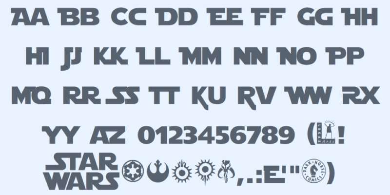
The Star Wars logo is based on a heavily modified version of Helvetica Black, hand-drawn in 1977 by graphic designer Suzy Rice.
There is no official, publicly released “Star Wars font.” The logo lettering was custom artwork, not a typeface anyone can download and install.
That said, the franchise uses several distinct typefaces across its typography: the custom logo lettering, News Gothic Bold for the opening crawl body text, and Univers Light Ultra Condensed for film subtitles in most episodes.
—
What Type of Font Is the Star Wars Logo?
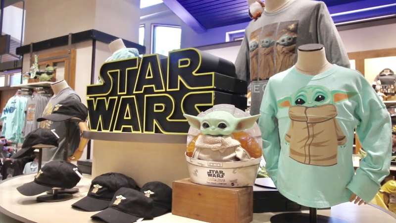
The Star Wars wordmark is a custom display lettering piece, not a standard typeface classification.
Rice used Helvetica Black as a structural reference, then redrew the letterforms almost entirely by hand. The result is a condensed, geometric sans-serif silhouette with several specific modifications.
Key visual traits of the logo lettering:
- Joined letterforms: the “ST” in STAR and “RS” in WARS connect at their strokes
- Flattened “W” with suppressed pointed tips (modified by producer Gary Kurtz before final approval)
- Extended horizontal arms on letters like “R”
- Heavy stroke weight with a bold outline
- Strong vertical compression, giving the letters a tall, blocky presence
The opening crawl uses a completely separate typeface. News Gothic Bold (designed by Morris Fuller Benton in 1908) handles the crawl body text, while Univers Light Ultra Condensed renders the episode film titles in most releases.
The original 1977 theatrical release actually used Trade Gothic Bold No. 2 for the crawl text, before it was reset in News Gothic for the 1981 re-release of Episode IV.
Who Designed the Star Wars Font?
Suzy Rice designed the Star Wars logo lettering in late 1976, while working as art director at Seiniger Advertising in Los Angeles.
th Century Fox hired Seiniger to create a promotional brochure for theater owners. Rice was assigned the job after no one else at the agency wanted it, given that Lucas had reportedly rejected multiple previous design submissions.
George Lucas briefed her with a single directive: make it look “very fascist, very intimidating.”
Rice had been reading about German typography the night before and reached for Helvetica Black as her starting point. She drew the letterforms by hand, joining key letter pairs and adjusting proportions until the result felt authoritarian and cinematic.
Joe Johnston, a Lucasfilm concept artist, later refined the design further. Producer Gary Kurtz flattened the pointed tips of the “W” before the logo appeared in the film’s opening crawl.
Rice’s contribution was not credited in the 1977 film.
Is the Star Wars Font Free to Use?
The actual Star Wars logo lettering is not available as a font. It is proprietary artwork owned by Lucasfilm, which is now part of Disney. Using it commercially without a license would be an infringement issue.
For the opening crawl fonts:
- News Gothic is a commercial typeface. Digital versions are available through Linotype, Bitstream, and MyFonts, typically ranging from $20 to $70 per weight
- Univers is a commercial typeface from Linotype, similarly priced
- Trade Gothic, used in the 1977 original crawl, is available through Adobe Fonts and Linotype
Fan-made alternatives like Star Jedi (by Boba Fonts) are available for free on DaFont for personal use. Always check the specific license before using any of these in commercial work.
What Font Did Star Wars Use Before?
Before Suzy Rice’s logo was adopted, Dan Perri designed an earlier Star Wars logotype. Perri was a seasoned Hollywood title designer who also created the famous opening crawl animation.
His logo used large block letters filled with stars, skewed toward a vanishing point to mimic the crawl’s perspective. It appeared on early pre-release posters and cinema marquees.
Producer Gary Kurtz chose Rice’s version over Perri’s design for the film’s opening titles. Perri’s skewed logo was retired from official use once the film was released.
For the opening crawl specifically, the original 1977 theatrical release used Trade Gothic Bold No. 2. This was swapped for News Gothic Bold in the 1981 re-release, which became the standard going forward.
What Are the Best Free Alternatives to the Star Wars Font?
Since the real logo lettering is proprietary and the crawl fonts are commercial, most designers reach for fan-made or similar typefaces.
| Font | Similarity | License | Source |
| Star Jedi | Closest fan recreation of the logo letterforms | Free (personal use) | DaFont |
| Franklin Gothic | Nearest match to the “A long time ago” card text | Commercial | Adobe Fonts, MyFonts |
| News Cycle | Open-source variant based on News Gothic | Free (OFL) | Google Fonts |
| Trade Gothic Next | Similar to the 1977 original crawl typeface | Commercial | Adobe Fonts |
If you need something condensed with a strong sci-fi look, Star Jedi is the most widely used option in fan projects and cosplay materials. It covers a full alphabet, including hollow and outline variants.
For the in-universe Galactic script seen on props and signage, Aurebesh fonts (available on DaFont and Font Space) replicate the fictional writing system used throughout the films and TV series.
How to Use the Star Wars Font in Your Projects
In Canva and Figma
Canva does not include Star Jedi by default, but you can upload the font to Canva if you have a Pro account.
In Figma, install the font on your system first, then it will appear in Figma’s font picker automatically. No plugin required.
In Photoshop and Illustrator
Download Star Jedi from DaFont, unzip the file, and add the font to Photoshop by placing the .ttf or .otf file into your system’s Fonts folder.
Restart the application after installing. The font will appear in the character panel under “S.”
If you want to replicate the opening crawl text effect, use News Cycle from Google Fonts. It’s free, works in any app, and gets you within striking distance of the real thing.
CSS for Web Projects
For web use, News Cycle is the practical choice since it’s available directly through Google Fonts:
“ @import url('https://fonts.googleapis.com/css2?family=News+Cycle:wght@400;700&display=swap');
body { font-family: ‘News Cycle’, sans-serif; } `
Star Jedi is not on Google Fonts, so for web use you’d need to self-host it. That does raise font licensing questions, so verify the DaFont license covers your specific use case.
Why Did Star Wars Choose This Font?
The short answer: George Lucas wanted authority. He explicitly asked for something “fascist” and “intimidating,” which is about as clear a design brief as you can get.
Helvetica Black was the obvious starting point because it was the heaviest, most authoritative sans-serif readily available in 1976. But straight Helvetica would have looked too corporate, too Swiss. Rice’s modifications, especially the joined letterforms and angular proportions, pushed the design toward something more cinematic and slightly militaristic.
The heavy stroke weight and uppercase-only structure connect to the film’s core theme: a galactic empire with enormous institutional power. That’s not accidental. It’s the same reason sans-serif fonts appear across authoritarian and military branding throughout design history.
The decision to use News Gothic for the opening crawl is more practical. News Gothic was designed for legibility at small sizes and under low-contrast conditions, which matters enormously when white text is scrolling fast across a dark starfield.
There’s also a historical reason. News Gothic had been a staple of newspaper and editorial typography since 1908. Its use in the crawl grounds the franchise’s storytelling in the tradition of newspaper headlines, reinforcing that the events of Star Wars are being “reported” as real history. A subtle touch, but it works.
The franchise has other iconic fonts worth knowing about. For comparison, films like Harry Potter use distinctly different typeface choices that target a completely different emotional register, leaning into old-English tradition rather than sci-fi authority.
If you’re curious how other major franchises handle their font psychology, the Avengers franchise is another good case study. The Avengers font also uses condensed, bold geometry to project power, though through a completely different typographic route than Star Wars.
FAQ on What Font Does Star Wars Use
Is there an official Star Wars font?
No official Star Wars typeface exists as a downloadable font. The logo lettering is proprietary custom artwork owned by Lucasfilm and Disney. Fan-made options like Star Jedi are the closest publicly available alternatives for personal projects.
What font is the Star Wars logo based on?
The logo was hand-drawn by Suzy Rice using Helvetica Black as a structural reference. She modified the letterforms heavily, joining letter pairs and redrawing strokes, making the result look nothing like standard Helvetica.
What font is used in the Star Wars opening crawl?
The crawl body text uses News Gothic Bold, a grotesque sans-serif font designed by Morris Fuller Benton in 1908. The original 1977 release actually used Trade Gothic Bold No. 2 before the crawl was reset for the 1981 re-release.
What font are the Star Wars film subtitles set in?
Most episode subtitles inside the crawl use Univers Light Ultra Condensed. Episodes IV, V, and VII are exceptions, where the subtitle text was set in News Gothic to match the crawl body text.
Can I download the Star Wars font for free?
Star Jedi by Boba Fonts is free for personal use and available on DaFont. For the crawl style, News Cycle on Google Fonts is a free open-source alternative. Neither is usable commercially without checking the specific license terms.
Who designed the Star Wars logo lettering?
Suzy Rice designed it in late 1976 at Seiniger Advertising. George Lucas asked for something “very fascist.” Rice studied German typography elements and drew the logo by hand within hours. She received no credit in the 1977 film.
What font is the “A long time ago in a galaxy far, far away” text?
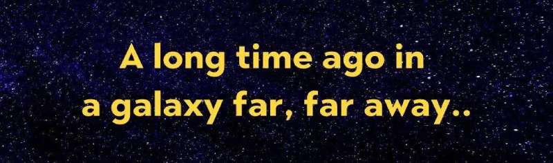
The original handwritten version was created manually for the 1977 release. From The Force Awakens onward, a digitized version was used, with Franklin Demi identified as the closest matching typeface for that specific line.
Is the Star Wars font similar to any font on Google Fonts?
News Cycle is the closest free Google Fonts option for the crawl text style. For the logo lettering itself, no Google Font comes close. Star Jedi on DaFont remains the most accurate fan recreation available anywhere.
What font does Star Wars use for its movie posters?
Poster typography varied by era. The 1977 original used ITC Serif Gothic Heavy for taglines and credits. Later films shifted to ITC Avant Garde Gothic. Each trilogy brought its own visual hierarchy and typographic choices to poster design.
Are there Star Wars fonts that work in Canva and Photoshop?
Star Jedi can be uploaded manually to both applications. Canva Pro supports custom font uploads. For Photoshop, install the .ttf file system-wide and restart the app. News Cycle works directly via Google Fonts integration in web-based tools.
Conclusion
So, what font does Star Wars use? The short answer is: no single typeface tells the whole story.
The logo lettering is custom artwork rooted in Helvetica Black, the opening crawl runs on News Gothic Bold, and film subtitles lean on Univers Light Ultra Condensed.
For anyone looking to replicate the Star Wars title font, Star Jedi remains the most practical free option, while News Cycle covers the crawl text style without a licensing headache.
Each typographic choice in the franchise, from Suzy Rice’s 1977 logo design to the sequel trilogy’s poster lettering, was deliberate. The font psychology behind these decisions connects directly to themes of power, scale, and galactic authority.
Understanding the Star Wars typeface history is genuinely useful, whether you’re building a fan project, studying what makes a font iconic, or just satisfying a very specific curiosity.

Renowned for his expertise in logo design and visual branding, Bogdan has developed a multitude of logos for various clients.
His skills extend to creating posters, vector illustrations, business cards, and brochures. Additionally, Bogdan's UI kits were featured on marketplaces like Visual Hierarchy and UI8.
He also wrote in the past years on sites like Design Your Way, WebDesignerDepot, WPDean, Designmodo, Speckyboy, Slider Revolution, and more.
- The Windsurf Logo History, Colors, Font, And Meaning - 10 October 2026
- How to Remove Background From Product Photos (No Photoshop) - 10 October 2026
- How Designers can Build a Stronger Online Creative Identity - 9 October 2026

Bogdan Sandu is a seasoned designer who has been designing websites since 2008. Renowned for his expertise in logo design and visual branding, Bogdan has developed a multitude of logos for various clients. His skills extend to creating posters, vector illustrations, business cards, and brochures. Additionally, Bogdan's UI kits were featured on marketplaces like Visual Hierarchy and UI8. He also wrote in the past years on sites like Design Your Way, WebDesignerDepot, WPDean, Designmodo, Speckyboy, Slider Revolution, and more.
You Might Also Like