In the world of professional communication, the choice of font type can speak volumes about your brand. Imagine presenting a meticulously crafted business report, only to undermine its impact with an ill-chosen typeface.
Professionalism extends beyond content; it’s embedded in the very design and typography of your documents.
From resume fonts to corporate identity materials, selecting the right serif or sans-serif font is crucial for legibility and conveying a polished image.
Arial, Calibri, and Times New Roman often top the list of corporately acceptable fonts, but the possibilities don’t end there.
By the end of this article, you’ll be equipped with insights into not just the most professional fonts but also tips on enhancing your graphic design and branding projects.
We will delve into the significance of readability in business documents, the top fonts for digital content, and how effective font pairing can elevate your presentations, business cards, and more.
What Is The Most Professional Font
The choice of the most professional font can significantly influence the perception of a document or brand. Various fonts are recognized for their professionalism, each serving different contexts and audiences. Here are some of the top contenders:
Top Professional Fonts
- Times New Roman
A classic serif font, Times New Roman is often seen as the default choice for professional documents. Its readability and traditional appearance make it suitable for formal communications, such as legal documents and academic papers. - Helvetica
Known for its clean and modern aesthetic, Helvetica is frequently used in corporate branding and signage. Its neutrality and versatility make it a favorite among designers, often considered the most professional font due to its widespread adoption in various industries. - Garamond
This elegant serif font offers a refined appearance, making it ideal for organizations that wish to convey a formal brand identity. Its classic design is both readable and aesthetically pleasing. - Georgia
Designed for clarity on screens, Georgia combines traditional serif elements with modern readability. It is often used in digital formats, making it a good choice for online communications. - Calibri
As a modern sans-serif font, Calibri is known for its clarity and versatility. It is commonly used in business documents and presentations, providing a professional yet approachable look. - Futura
With its geometric shapes, Futura offers a contemporary feel that is both professional and visually appealing. It is suitable for various applications, from branding to digital content.
The Most Professional Fonts
Choosing the right font for business communication isn’t just a design decision; it’s a matter of professionalism and credibility. Fonts like Arial, Helvetica, and Times New Roman are staples for a reason. They’re classic, clean, and maintain readability, whether in print materials or on digital screens.
Arial
Arial is a sans-serif font highly regarded for its simplicity and legibility. Used extensively in business communications like reports and presentations, Arial exudes a straightforward, no-nonsense vibe that’s ideal for maintaining a professional tone.
- Readability: Clear and easily readable across various devices and sizes.
- Versatility: Suitable for both digital content and printed documents.
- Corporate Identity: Common in office documents, ensuring a cohesive look.
Times New Roman
The quintessential serif font, Times New Roman, has long been a go-to for formal documents. Its traditional design radiates authority and content credibility.
- Classic Appeal: Perfect for business reports, formal letters, and resumes.
- Ease of Reading: Serif fonts guide the eye, making lengthy texts easier to read.
- Aesthetics: Pairs well with other professional fonts for a polished look.
Helvetica
Another sans-serif font that’s made its mark in the business world is Helvetica. It’s modern, clean, and very popular among designers for its neutrality and professionalism.
- Modern Design: Great for corporate branding and logos.
- Neutrality: Doesn’t distract from content, keeping focus on the message.
- Legibility: High clarity even on digital screens, making it a favorite for websites.
Alternative Fonts to Use
Even though Arial, Times New Roman, and Helvetica are excellent choices, some alternatives also offer a professional look without sacrificing readability or design quality.
Calibri
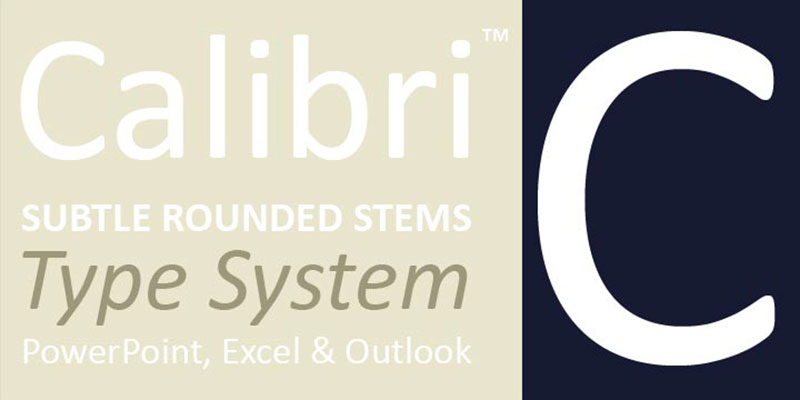
Calibri is another sans-serif font that’s gained popularity, especially in the digital realm. Its rounded edges give a softer, more human feel while maintaining professionalism.
- Modern Aesthetic: Ideal for business emails and presentations.
- Effortless Reading: Its smooth design helps prevent eye strain during extended reading.
- Versatility: Works well in both print and digital formats.
Garamond
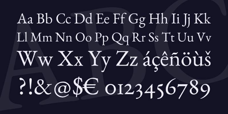
For those who appreciate a touch of elegance, Garamond is a fantastic option. This serif font brings a historical yet sophisticated vibe to documents.
- Elegance: Best for formal documents and high-end branding.
- Readable Design: Serifs guide the eye, suitable for lengthy texts.
- Aesthetic Harmony: Creates visually pleasing pairings with both modern and classic fonts.
Futura

Looking for something that stands out without being flashy? Futura offers a geometric design that is both stylish and professional.
- Geometric Shapes: Reflects modern design trends, ideal for digital content and business cards.
- Versatile Use: Suitable for typography focused designs and minimalist branding.
- Legibility: Maintains clarity in various sizes and formats.
Font Pairing for Professional Documents
Fonts don’t exist in isolation; they need to work harmoniously with other design elements. Choosing effective font pairing can elevate your brand’s identity and ensure your documents look cohesive and professional.
Combining Serif and Sans-Serif
A balanced combination of serif and sans-serif fonts can cater to various design needs while maintaining readability.
- Title and Body: Use a serif font like Times New Roman for titles and a sans-serif font like Arial for body text. This creates a classic, readable hierarchy.
- Highlighting: Utilize a distinct sans-serif font like Futura to highlight key points or sections within the text.
Hierarchical Font Choices
Creating a hierarchy in your document makes it easier to navigate and digest information.
- Headers and Subheaders: Use bold, large fonts like Helvetica for top-level headers and a complementary sans-serif like Calibri for subheaders.
- Body Text: Stick to highly readable fonts like Verdana or Garamond to ensure smooth reading flow for long sections of text.
The Impact of Typography on Branding

Typography plays a crucial role in branding and corporate identity. The fonts you choose can greatly influence how your brand is perceived by your audience.
Corporate Identity
Fonts like Arial and Helvetica are often used in logos and marketing materials to convey a sense of trust and reliability.
- Consistency: Using the same family of fonts across all materials ensures a cohesive brand image.
- Adaptability: These fonts are adaptable for various media, from print materials to digital content.
User Experience (UX)
In today’s digital age, the user experience is paramount. Fonts like Calibri and Verdana enhance readability on screens, directly impacting how users engage with your content.
- Screen Friendly: Sans-serif fonts are generally easier to read on screens, making them ideal for websites and apps.
- Accessibility: Choosing clear, readable fonts improves accessibility, ensuring your content is available to a broader audience.
Legibility in Design
The legibility of a font is crucial for ensuring your audience can easily engage with your content.
- contrast and Size: Ensure sufficient contrast between text and background and choose sizes that are easy to read.
- Spacing: Appropriate line spacing and kerning can make a huge difference in readability, particularly in business documents and presentations.
Common Mistakes to Avoid
While choosing the most professional font is essential, there are pitfalls to watch out for to ensure your documents remain polished and credible.
Overusing Decorative Fonts
Decorative fonts can add flair but often at the cost of readability and professionalism. Stick to clean, classic fonts for business communications.
- Distraction: Decorative fonts can distract from the main content and make it harder to read.
- Inconsistency: Using too many different font styles can create a cluttered, unprofessional appearance.
Ignoring Accessibility
Ensuring your content is accessible to everyone is crucial, particularly in a professional setting.
- Readability: Choose fonts that are easy to read for people with visual impairments. Sans-serif fonts like Arial and Verdana are often better choices.
- Inclusive Design: Keep in mind color contrast and text size to make sure your documents are accessible to all.
Lack of Hierarchy
A lack of visual hierarchy can make documents hard to navigate and understand.
- Emphasis: Use different fonts or styles (bold, italic) to emphasize and create a clear visual hierarchy.
- Consistency: Maintain a consistent style throughout your document to ensure readability and professionalism.
FAQ On The Most Professional Font
Which fonts are best for business reports?
For business reports, serif fonts like Times New Roman and Garamond work well. They provide a traditional, authoritative look.
For a more modern feel, sans-serif fonts like Arial and Calibri are excellent choices. They offer clarity and ease of reading.
What fonts are recommended for resumes?
Calibri, Arial, and Garamond are highly recommended for resumes. These fonts are clear, professional, and maintain legibility across various formats. Using these fonts can ensure your resume looks polished and easy to read.
How do I choose a font for professional presentations?
For professional presentations, choose fonts like Helvetica, Arial, or Calibri. They are clean, modern, and maintain excellent readability, even on digital screens. These fonts ensure your audience can easily read your content.
Are serif or sans-serif fonts more professional?
Both serif and sans-serif fonts can be professional. Serif fonts like Times New Roman are more traditional, while sans-serif fonts like Arial offer a modern feel. The choice depends on the context and the type of document.
What fonts should be avoided in professional settings?
Avoid overly decorative fonts and those hard to read, like Comic Sans and Papyrus. These fonts can undermine the professionalism of your documents and distract from the content. Stick to clean, legible fonts.
How does font choice impact brand identity?
Font choice greatly impacts brand identity by establishing a visual tone. Fonts like Helvetica and Arial are neutral and professional, suitable for corporate branding. Consistent use of fonts reinforces a cohesive corporate identity.
What’s the role of typography in business communication?
Typography enhances clarity and engagement in professional communication. Fonts like Times New Roman and Calibri ensure the content is easy to read and understand. Good typography can improve the overall user experience in business documents.
Can I mix fonts in professional documents?
Mixing fonts can work if done strategically. Use one font for headings, like Helvetica, and another for body text, like Garamond. This creates a visual hierarchy and aids readability. Ensure the fonts complement each other.
Why is readability important in professional fonts?
Readability affects how easily your audience can understand and engage with your content. Fonts like Arial and Calibri maintain high readability, making them ideal for professional documents. This ensures your message comes across clearly.
Conclusion
Choosing the right font for your business documents, presentations, and corporate branding is more than just an aesthetic decision. It’s about crafting an image of professionalism. Times New Roman, Arial, and Helvetica remain timeless choices, ensuring your content is both readable and credible.
Opt for Calibri or Garamond when a modern touch or elegance is necessary. Consider font pairing wisely, mixing serif and sans-serif fonts to create effective visual hierarchies. Avoid decorative fonts that distract from your message, and prioritize legibility to ensure your audience can easily absorb the information.
Remember, your choice in typography directly impacts how your brand identity is perceived. Use it to reinforce a consistent and polished image, whether in digital content or printed materials. By understanding the importance of font type, you elevate your communication, solidifying your professional presence.

Renowned for his expertise in logo design and visual branding, Bogdan has developed a multitude of logos for various clients.
His skills extend to creating posters, vector illustrations, business cards, and brochures. Additionally, Bogdan's UI kits were featured on marketplaces like Visual Hierarchy and UI8.
He also wrote in the past years on sites like Design Your Way, WebDesignerDepot, WPDean, Designmodo, Speckyboy, Slider Revolution, and more.
- The Windsurf Logo History, Colors, Font, And Meaning - 10 October 2026
- How to Remove Background From Product Photos (No Photoshop) - 10 October 2026
- How Designers can Build a Stronger Online Creative Identity - 9 October 2026

Bogdan Sandu is a seasoned designer who has been designing websites since 2008. Renowned for his expertise in logo design and visual branding, Bogdan has developed a multitude of logos for various clients. His skills extend to creating posters, vector illustrations, business cards, and brochures. Additionally, Bogdan's UI kits were featured on marketplaces like Visual Hierarchy and UI8. He also wrote in the past years on sites like Design Your Way, WebDesignerDepot, WPDean, Designmodo, Speckyboy, Slider Revolution, and more.
You Might Also Like