Futura looks stunning on its own, but pair it wrong and your design falls flat.
This geometric sans serif typeface demands thoughtful companions. The clean lines and perfect circles that made Paul Renner’s 1927 creation revolutionary need partners that either complement its modernist precision or provide strategic contrast.
Most designers struggle with Futura font pairing examples because the typeface occupies such a specific stylistic space. Too similar, and your typography feels redundant. Too different, and elements compete rather than collaborate.
This guide breaks down proven combinations with serif and sans serif companions. You’ll see exactly which weights to use, how to establish clear typographic hierarchy, and why specific pairings work from both aesthetic and functional perspectives.
Each example includes practical implementation details for real projects.
Futura font pairing options
| Font Pairing with Futura | Classification | Contrast Type | Best Use Case |
|---|---|---|---|
| Garamond | Old Style Serif | Geometric vs Classical | Editorial content with elegant body text |
| Baskerville | Transitional Serif | Modern Geometric vs Traditional | Professional documents and academic materials |
| Bodoni | Didone Serif | Geometric vs High-Contrast Serif | Fashion and luxury brand marketing |
| Didot | Didone Serif | Geometric vs Dramatic Serif | High-end editorial and fashion photography |
| Caslon | Old Style Serif | Modern vs Historical Serif | Heritage brand communications and books |
| Georgia | Screen-Optimized Serif | Geometric vs Digital-Friendly Serif | Web articles and digital publications |
| Merriweather | Modern Serif | Geometric vs Readable Serif | Blog posts and long-form web content |
| Playfair Display | Transitional Display Serif | Geometric vs Decorative Serif | Headlines for creative and design portfolios |
| Lora | Calligraphic Serif | Geometric vs Brushed Serif | Personal blogs and storytelling websites |
| Libre Baskerville | Web-Optimized Transitional Serif | Geometric vs Digital Transitional | Online magazines and content platforms |
| Montserrat | Geometric Sans-Serif | Minimal Geometric Harmony | Modern branding and tech startups |
| Open Sans | Humanist Sans-Serif | Geometric vs Neutral Humanist | User interfaces and web applications |
| Raleway | Elegant Geometric Sans-Serif | Refined Geometric Pairing | Premium product landing pages |
| Source Sans Pro | Neo-Grotesque Sans-Serif | Geometric vs Technical Sans | Software documentation and technical sites |
| Roboto | Neo-Grotesque Sans-Serif | Geometric vs Mechanical Sans | Android apps and Material Design projects |
Futura + Garamond
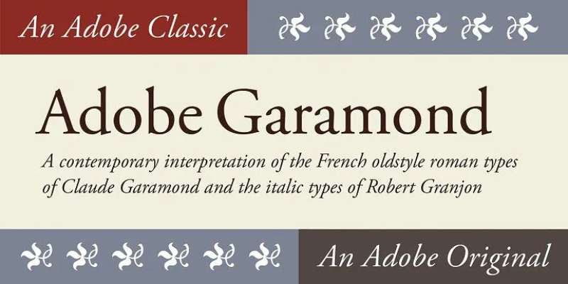
This combination brings together modernist geometry with old-style elegance. The clean lines of Futura create bold headlines that command attention while Garamond’s warm serifs soften the body text.
Visual Characteristics
The pairing creates strong typographic contrast through era and construction method. Futura’s perfect circles and straight lines feel technical. Garamond’s humanist details and slight irregularities add warmth.
Use Futura for headlines and navigation elements. Reserve Garamond for body copy where its readability shines over long passages.
Use Cases
Luxury brands love this duo. Think art galleries, high-end restaurants, premium product packaging.
Museums use it to bridge historical content with contemporary presentation. Works brilliantly for editorial layouts where sophistication matters.
Why This Pairing Works
The contrast between geometric and organic forms creates visual tension without conflict. Both are iconic fonts with proven track records. Their x-height alignment keeps the rhythm smooth despite stylistic differences.
Futura’s authority gets balanced by Garamond’s approachability. The modern/classic tension tells a story about tradition meeting innovation.
Implementation Details
- Font weights: Futura Medium or Bold for headlines, Garamond Regular or Italic for text
- Size relationships: Headline 48-72pt, body 14-16pt (3:1 to 4:1 ratio)
- Spacing adjustments: Tighten tracking on Futura headlines by -20 to -30. Use standard spacing for Garamond
Similar Alternatives
Replace Futura with Avenir or Proxima Nova for similar geometric qualities.
Swap Garamond for Bembo or Caslon if you need different historical references.
Futura + Baskerville
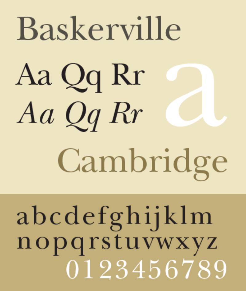
Transitional serif meets geometric sans in this refined pairing. Baskerville was revolutionary in its time, just like Futura. Both pushed boundaries.
Visual Characteristics
Baskerville’s moderate stroke contrast and vertical stress work surprisingly well with Futura’s even weight distribution. The shared sense of rationalism links them despite different construction methods.
Both have a certain formality. Neither feels casual or playful.
Use Cases
Professional services websites. Corporate branding materials. Academic publications that need accessibility without stuffiness.
Financial firms appreciate the trustworthy vibe. Law offices use it for letterhead and contracts. Architecture portfolios benefit from the structural harmony.
Why This Pairing Works
Both typefaces represent moments when designers reimagined what typography could be. Baskerville improved on Caslon’s work. Futura broke from blackletter tradition entirely.
Their similar x-heights create seamless transitions between headline and body text. The eye doesn’t stumble moving from one to the other.
Implementation Details
- Font weights: Futura Medium for headlines, Baskerville Regular for body
- Size relationships: Use 2.5:1 to 3.5:1 scaling ratio for optimal hierarchy
- Spacing needs: Baskerville benefits from slightly increased leading (1.5-1.6x)
Similar Alternatives
Try Gotham instead of Futura for similar geometric principles with more warmth.
Mrs. Eaves offers a softer take on the Baskerville structure. Libre Baskerville works as a free alternative.
Futura + Bodoni
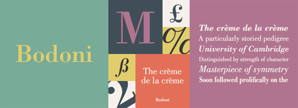
High drama emerges when geometric sans meets modern serif. This is the typography equivalent of mixing architecture with fashion.
Visual Characteristics
Bodoni’s extreme thick/thin contrast demands attention. Its hairline serifs feel delicate next to Futura’s solid construction. The visual weight difference is striking.
Futura provides stability. Bodoni adds elegance and movement.
Use Cases
Fashion magazines eat this pairing for breakfast. Cosmetic brands use it constantly.
Event invitations for upscale occasions. Theater posters. Perfume packaging. Anywhere you need sophistication with impact.
Why This Pairing Works
Both typefaces have strong graphic design principles at their core. They’re not apologetic about their stylistic choices. The balance comes from their shared commitment to geometric precision.
Bodoni’s vertical emphasis plays well with Futura’s circular forms. The rhythm feels intentionally contrasting.
Implementation Details
- Font weights: Futura Bold for strong headlines, Bodoni Book or Regular for text
- Size relationships: Large headlines (60pt+) paired with 12-14pt body text
- Critical spacing: Bodoni needs generous leading (1.6x minimum) due to vertical stress
Similar Alternatives
Didot can replace Bodoni for similar dramatic effect with slightly different character.
Consider Brandon Grotesque as a Futura alternative with more personality. Century Gothic offers a softer geometric approach.
Futura + Didot
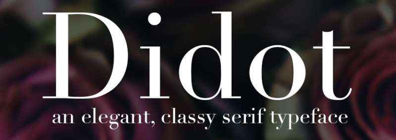
Another modern serif meets geometric sans combination. Didot brings French elegance to the table while Futura provides German efficiency.
Visual Characteristics
Didot’s extreme contrast between thick and thin strokes creates maximum visual interest. Those hairline serifs are impossibly delicate. Futura’s even strokes make Didot’s drama even more pronounced.
This pairing screams high fashion and luxury. There’s nothing subtle about it.
Use Cases
Magazine covers for fashion and lifestyle publications. Luxury brand materials. Wedding invitations where elegance is non-negotiable.
Wine labels. Jewelry packaging. Anywhere discretionary income meets aesthetic appreciation.
Why This Pairing Works
The color theory of typography comes into play here. Futura creates consistent visual weight while Didot varies dramatically. This creates tension that keeps the eye engaged.
Both represent pinnacles of their respective design movements. Swiss design meets French neoclassicism.
Implementation Details
- Font weights: Futura Medium to Bold for headlines, Didot Regular for body (use carefully)
- Size relationships: Very large headlines (72pt+) with carefully sized body text (14pt minimum)
- Spacing requirements: Generous white space essential. Leading at 1.7x or higher
Similar Alternatives
Bodoni offers similar characteristics with slightly less extreme contrast.
Replace Futura with Avenir for more organic geometry. Gill Sans provides humanist warmth while maintaining clean lines.
Futura + Caslon
Old-style serif meets early modernism. This combination has been trusted for centuries (well, parts of it anyway).
Visual Characteristics
Caslon’s moderate contrast and slightly irregular letterforms feel organic compared to Futura’s mechanical precision. The combination feels both established and forward-thinking.
Caslon brings historical legitimacy. Futura brings contemporary clarity.
Use Cases
Publishing houses use this for timeless book design. Universities apply it to promotional materials that need to feel both traditional and current.
Think tanks. Research institutions. Brands that need to communicate both expertise and innovation.
Why This Pairing Works
There’s a saying: “When in doubt, use Caslon.” It’s versatile enough to work with almost anything, but with Futura it creates something special.
The proximity of elements and alignment choices matter more here than raw contrast. Both typefaces have enough personality to be interesting but enough restraint to be professional.
Implementation Details
- Font weights: Futura Medium for headlines, Caslon Regular or Book for text
- Size relationships: More moderate scaling (2:1 to 3:1) works well
- Spacing notes: Caslon’s slightly narrow proportions mean you can use tighter line spacing than with wider serifs
Similar Alternatives
Adobe Caslon provides more refined details. Consider Big Caslon for display purposes.
Brandon Grotesque can substitute for Futura with more contemporary character. Gotham brings similar geometry with different personality.
Futura + Georgia
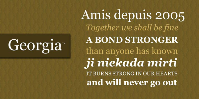
A web-friendly combination that works equally well in print. Georgia was designed specifically for screen readability.
Visual Characteristics
Georgia’s sturdy construction and large x-height make it exceptionally readable at small sizes. Futura’s clean geometry provides strong navigational hierarchy.
This feels approachable rather than precious. Professional without being stuffy.
Use Cases
Corporate websites that need broad appeal. Educational platforms. Government communications. Anywhere accessibility matters.
Email newsletters. Blog layouts. Digital magazines. It’s optimized for screens but translates to print.
Why This Pairing Works
Both typefaces prioritize function. Georgia solves the problem of screen legibility. Futura solves the problem of clear communication. Neither tries to be decorative.
The visual hierarchy practically builds itself with this duo. Headers feel like headers. Body text invites sustained reading.
Implementation Details
- Font weights: Futura Bold for headlines, Georgia Regular for text (Bold for emphasis)
- Size relationships: 16-18pt body text works well with 36-48pt headlines
- Digital optimization: Georgia designed for 96 DPI screens, so it scales predictably
Similar Alternatives
Merriweather offers similar screen optimization with different character.
Proxima Nova can replace Futura for slightly warmer geometric sans. Verdana works if Georgia feels too formal.
Futura + Merriweather
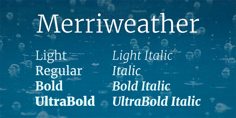
Modern geometric pairs with contemporary serif designed for digital environments. This is web design coming into its own.
Visual Characteristics
Merriweather has a tall x-height and slightly condensed letterforms optimized for screen reading. Its serifs are sturdy enough to render well at small sizes. Futura provides clean contrast in navigation and headers.
The combination feels current without trying too hard.
Use Cases
Tech company blogs. Online publications. Portfolio sites for creatives who code. Mobile apps that need personality.
SaaS marketing sites. Startup landing pages. Digital agencies showing they understand contemporary tools.
Why This Pairing Works
Both were designed with specific problems in mind. Futura solved “how do we make a purely geometric sans serif?” Merriweather solved “how do we make serif readable on screens?”
Their shared focus on functionality creates natural unity. Neither competes for attention through decorative elements.
Implementation Details
- Font weights: Futura Medium or Bold for headlines, Merriweather Regular or Light for body
- Size relationships: 18-20pt body text pairs with 40-56pt headlines
- Screen optimization: Both render cleanly at standard screen resolutions. Merriweather includes full weight range with matching italics
Similar Alternatives
Montserrat offers similar geometric qualities to Futura with more weights.
Replace Merriweather with Lora for slightly different proportions or Libre Baskerville for more traditional character.
Futura + Playfair Display
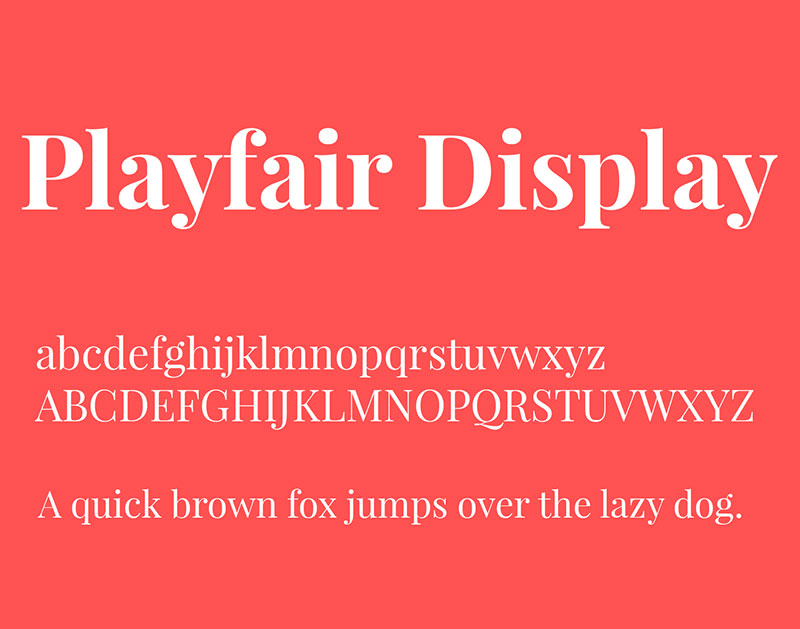
Geometric modernism meets high-contrast elegance. This pairing is all about making a statement.
Visual Characteristics
Playfair Display draws from 18th-century transitional designs but amplifies the contrast for contemporary use. Next to Futura’s even strokes, those dramatic thick/thin transitions look even more pronounced.
This combination has serious fashion credibility.
Use Cases
Wedding invitations. Fashion blogs. Beauty brands. Luxury e-commerce sites.
Lifestyle magazines. Social media graphics for upscale brands. Anywhere sophistication needs to feel approachable.
Why This Pairing Works
The scale and proportion work beautifully together. Playfair’s high contrast demands large sizes, which creates natural hierarchy when paired with Futura’s utilitarian presence.
Both have strong font psychology associations. Futura reads as clean and modern. Playfair reads as elegant and refined.
Implementation Details
- Font weights: Futura Medium for subheadings and UI, Playfair Display Bold or Black for headlines
- Size relationships: Very large headline sizes (60-96pt) with 16-18pt body
- Spacing considerations: Playfair needs generous leading (1.6x+) due to contrast and tall ascenders
Similar Alternatives
Didot or Bodoni offer similar drama with slightly different personalities.
Try Avenir instead of Futura for more organic curves. Circular provides similar geometry with contemporary details.
Futura + Lora
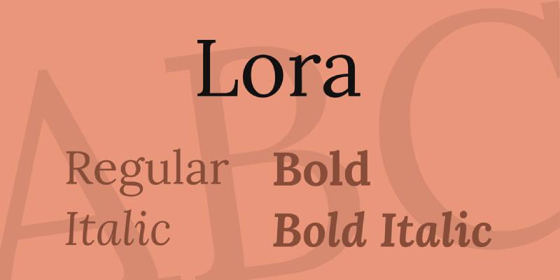
Clean geometry meets calligraphic warmth. Lora’s brush-style serifs soften Futura’s technical precision.
Visual Characteristics
Lora has a slightly calligraphic feel that adds human touch to digital layouts. Its moderate contrast and sturdy construction make it highly readable. Against Futura’s mechanical geometry, those subtle brush strokes become more noticeable.
Professional but not corporate. Elegant but not precious.
Use Cases
Consulting firm websites. Author portfolios. Creative agency about pages. Professional blogs that need warmth without sacrificing credibility.
Email newsletters for service businesses. Online courses. Coaching websites.
Why This Pairing Works
The Gestalt principles of similarity and difference both apply here. Both typefaces share certain proportions but express them differently. The contrast creates interest without chaos.
Lora’s slight irregularity makes Futura’s precision feel intentional rather than cold.
Implementation Details
- Font weights: Futura Medium or Bold for headlines, Lora Regular for body (Italic for emphasis)
- Size relationships: 2.5:1 to 3:1 ratio works well (16-18pt body with 40-54pt headlines)
- Spacing notes: Lora benefits from slightly increased leading (1.5x) due to taller ascenders
Similar Alternatives
Crimson Text provides similar warmth with slightly different proportions.
Replace Futura with Circular or GT Walsheim for more contemporary geometric sans. Roboto offers tech-friendly alternative.
Futura + Libre Baskerville
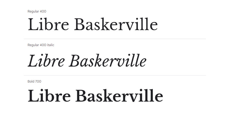
Classic transitional serif updated for the screen meets early modernist geometry. This is traditional typography meeting digital requirements.
Visual Characteristics
Libre Baskerville maintains the essential character of Baskerville but with taller x-height and sturdier serifs for screen rendering. Futura’s clean lines create strong contrast in headers and navigation.
The combination feels both established and current.
Use Cases
Academic websites. Professional service firms. Publishing houses with digital presence. Blogs about literature or history.
Online magazines covering culture. Educational platforms. Anywhere traditional expertise needs contemporary delivery.
Why This Pairing Works
Both prioritize legibility. Libre Baskerville solves Baskerville’s thin strokes for screens. Futura never needed solving because its geometry translates perfectly to any medium.
The typographic hierarchy feels natural. Headers announce sections clearly. Body text invites sustained reading.
Implementation Details
- Font weights: Futura Medium or Bold for headlines, Libre Baskerville Regular for text
- Size relationships: 16-18pt body text with 36-48pt headlines works well
- Screen optimization: Both render cleanly at standard resolutions. Full italic support for text emphasis
Similar Alternatives
Georgia provides similar screen optimization with different personality.
Try Montserrat instead of Futura for more contemporary geometric sans. Avenir offers similar principles with warmer character.
Futura + Montserrat
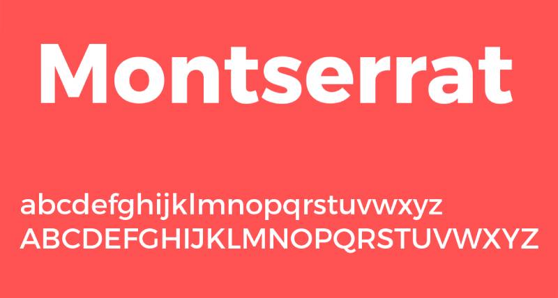
Two geometric sans serifs working together. This shouldn’t work according to conventional wisdom, but it does.
Visual Characteristics
Both share geometric construction principles but Montserrat has slightly more humanist details. The subtle differences in proportion and optical sizing create enough variety to maintain interest.
Futura’s perfect circles meet Montserrat’s slightly more organic curves.
Use Cases
Tech startups. Modern corporate identities. Mobile applications. SaaS marketing sites. Anywhere clean, contemporary aesthetics matter.
Product design portfolios. Agency websites. Digital products that need consistency across platforms.
Why This Pairing Works
Using fonts from the same classification can work when they have different weights or proportions. Montserrat offers more weight options than Futura, providing flexibility for complex hierarchies.
Both feel contemporary and accessible. The minimalist design philosophy shines through.
Implementation Details
- Font weights: Use Montserrat’s full range (Thin to Black) with Futura Medium or Bold as accent
- Size relationships: Play with weight rather than size for some hierarchy levels
- System note: Montserrat’s extended family offers more flexibility than Futura’s limited weights
Similar Alternatives
Gotham pairs similarly with Montserrat. Avenir offers more warmth.
Replace Montserrat with Raleway for similar geometric principles with different personality. Proxima Nova brings contemporary professional character.
Futura + Open Sans
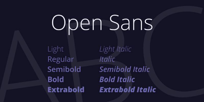
Humanist sans meets geometric sans in this highly functional pairing. Open Sans was designed for Google, optimized for screens and multilingual support.
Visual Characteristics
Open Sans has friendly, open curves that soften Futura’s mechanical precision. Its neutral appearance makes it highly versatile. Both share clean construction but express it differently.
Professional without corporate stiffness. Approachable without casual sloppiness.
Use Cases
Corporate intranets. Public-facing government sites. Educational platforms. Accessibility-focused projects.
International websites needing multilingual support. Form-heavy applications. Documentation sites.
Why This Pairing Works
Both prioritize readability and accessibility. Open Sans supports extensive character sets. Futura provides clear navigation and section headers.
The font pairing feels deliberate rather than default, even though both are extremely common choices.
Implementation Details
- Font weights: Futura Medium or Bold for headlines, Open Sans Regular for body
- Size relationships: 16-18pt body text with 36-48pt headlines for web
- Character support: Open Sans includes Latin, Greek, Cyrillic. Perfect for global projects
Similar Alternatives
Source Sans Pro offers similar function with slightly different proportions.
Replace Futura with Brandon Grotesque for contemporary geometric character. Lato provides warmer alternative to Open Sans.
Futura + Raleway
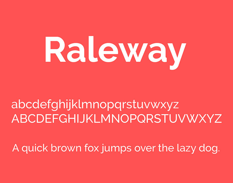
Two geometric sans serifs with distinct personalities. Raleway’s elegant thinness contrasts with Futura’s sturdy construction.
Visual Characteristics
Raleway has notably elegant thin weights that feel sophisticated. Its slightly narrower proportions create refined elegance. Next to Futura’s more utilitarian character, those thin weights really shine.
Modern and upscale without trying too hard.
Use Cases
Fashion e-commerce. Luxury goods marketing. Creative portfolios. Design agency websites. Branding projects for premium products.
Beauty and wellness brands. Architecture firms. Anywhere elegant simplicity matters.
Why This Pairing Works
The weight contrast creates clear hierarchy even within the same font classification. Raleway Thin for elegant headlines, Futura Medium for sturdy body creates interesting inversion of typical patterns.
Both respect geometric principles while expressing them differently.
Implementation Details
- Font weights: Raleway Thin or Light for large headlines, Futura Medium for body or UI elements
- Size relationships: Very large thin headlines (72-120pt) with moderate body sizes
- Spacing requirements: Raleway’s thin weights need generous letter spacing at display sizes
Similar Alternatives
Gotham provides similar geometric principles with more weight options.
Replace Raleway with Josefin Sans for similar elegance. Try Avenir Next instead of Futura for slightly more contemporary feel.
Futura + Source Sans Pro
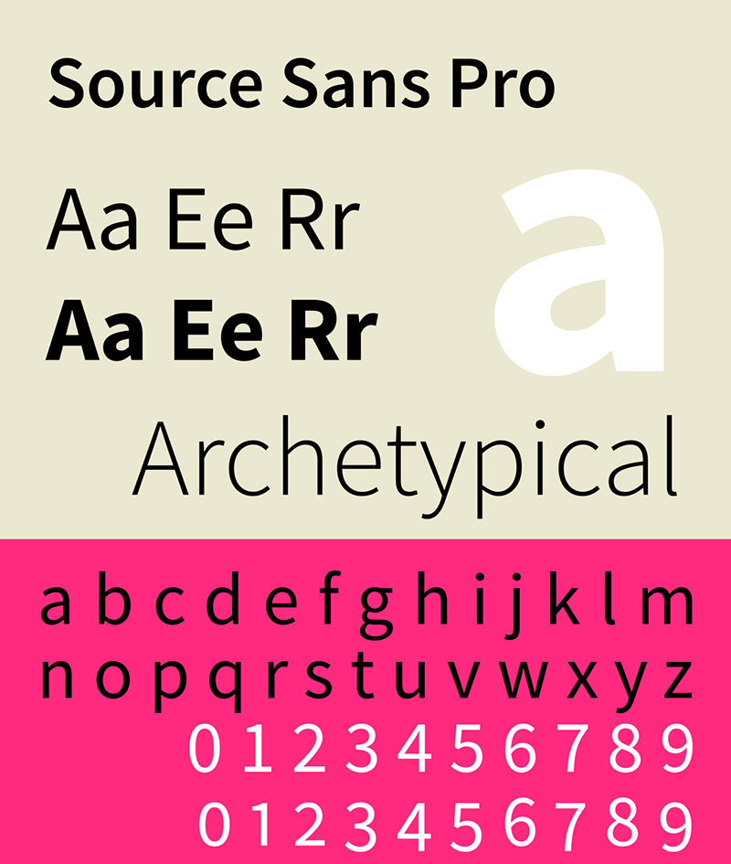
Adobe’s workhorse meets Paul Renner’s masterpiece. Both are professional tools designed to solve real problems.
Visual Characteristics
Source Sans Pro has friendly, open curves and extensive weight range. Its design prioritizes clarity and usability across platforms. Futura’s geometry provides stronger contrast in headers.
Clean, professional, utterly reliable.
Use Cases
Enterprise software interfaces. Developer documentation. Tech blogs. SaaS products. Professional web applications.
Digital products requiring extensive typographic systems. Brand style guides needing broad functionality.
Why This Pairing Works
Both were designed by professionals who understand typography systems. Source Sans Pro offers six weights with italics. Futura provides strong geometric anchor for key moments.
The grid systems practically build themselves with these fonts.
Implementation Details
- Font weights: Full Source Sans Pro range for body text hierarchy, Futura Medium or Bold for headlines
- Size relationships: Flexible scaling works well due to both fonts’ neutral proportions
- System benefits: Source Sans Pro’s extensive weights reduce need for multiple font families
Similar Alternatives
Open Sans provides similar functionality with different proportions.
Replace Futura with Circular for more contemporary geometric sans. Proxima Nova offers warmer professional alternative.
Futura + Roboto
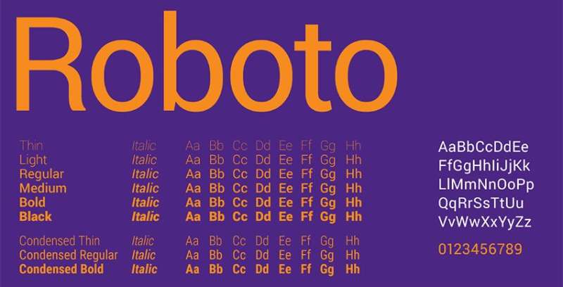
Google’s system font meets the Bauhaus classic. This pairing bridges Android interfaces and timeless print design.
Visual Characteristics
Roboto has slightly mechanical character softened by friendly curves. Its neo-grotesque construction shares some DNA with Futura’s geometry but expresses it differently. Roboto feels more contemporary.
Professional and approachable. Technical without being cold.
Use Cases
Android app design. Material Design implementations. Tech company websites. Mobile interfaces requiring system integration.
Software documentation. Developer tools. Technical blogs. Anywhere Google’s design language influences choices.
Why This Pairing Works
Both share geometric principles but from different design eras. Roboto was optimized for screens. Futura was designed for metal type. The historical distance creates subtle tension.
The extensive weight ranges in both families provide maximum flexibility for complex typographic systems.
Implementation Details
- Font weights: Full Roboto family (Thin to Black) with Futura as accent or vice versa
- Size relationships: Roboto’s large x-height means it reads well at smaller sizes than Futura
- Digital optimization: Both render cleanly at any screen density
Similar Alternatives
Montserrat provides similar geometric character with different proportions.
Replace Roboto with Open Sans for warmer humanist alternative. Try Gotham instead of Futura for more contemporary feel.
FAQ on Futura Font Pairing
What fonts pair best with Futura?
Classic serif fonts like Garamond, Baskerville, and Bodoni create elegant contrast with Futura’s geometric structure. Georgia and Merriweather work well for digital projects. Clean sans-serif fonts like Montserrat or Open Sans can work when you need modern consistency across your design system.
Can I pair Futura with another sans serif font?
Yes, but choose carefully. Pair fonts with different weights or proportions to avoid redundancy. Montserrat works because its humanist details differ from Futura’s pure geometry. Raleway’s elegant thin weights create contrast against Futura’s sturdy construction. The key is establishing clear visual hierarchy through weight and scale differences.
Why does Futura work well with serif fonts?
The contrast between geometric and organic forms creates visual interest. Futura’s mechanical precision gets balanced by serif warmth and historical character. This classic sans/serif combination has been a typography staple since modernist designers first established these principles. The combination feels both timeless and contemporary.
What size ratio should I use for Futura pairings?
Most pairings work well with 2.5:1 to 4:1 ratios between headlines and body text. Futura headlines at 48-72pt pair with 14-18pt body copy. High-contrast serifs like Didot need larger sizes due to delicate strokes. Test different ratios based on your specific layout and typographic hierarchy needs.
Is Futura good for body text or just headlines?
Futura works best for headlines, navigation, and display purposes. Its geometric construction can feel monotonous in long-form text. Use companion fonts like Garamond or Georgia for extended reading. Futura Medium or Book weights handle shorter body copy acceptably, but save it for impactful moments where its distinctive character shines.
What Futura weight should I use for headlines?
Futura Medium or Bold work best for most headline applications. Heavy weights create strong focal points in layouts. Futura Book can work for larger display sizes where delicacy matters. Avoid Light weights for headlines unless they’re extremely large. Test different weights against your chosen body text font to ensure proper contrast.
How do I adjust spacing when pairing Futura?
Tighten Futura headline tracking by -20 to -30 for display sizes. Body text fonts like Garamond or Baskerville need standard or slightly increased leading (1.5-1.6x). High-contrast serifs require generous line spacing (1.7x minimum). Adjust kerning for specific letter combinations in large headlines.
Does Futura work for web design or print?
Futura works brilliantly in both mediums. Its geometric construction translates perfectly to screens without losing clarity. Web design pairs often use Georgia or Open Sans for body text. Print design leans toward classic serifs like Caslon or Garamond. Consider font licensing requirements for commercial projects.
What industries commonly use Futura pairings?
Fashion, luxury goods, architecture, and cultural institutions favor Futura combinations. Tech companies use it for clean, modern branding. Museums and galleries pair it with classic serifs for sophisticated communications. The Bauhaus design influence makes it perfect for brands emphasizing innovation and timeless quality.
What free alternatives exist for Futura pairings?
League Spartan or Montserrat provide similar geometric qualities without licensing costs. Pair them with Google Fonts serifs like Libre Baskerville or Playfair Display. Raleway offers elegant geometry for headlines. These free options create similar visual effects while respecting budget constraints, though they lack Futura’s refined optical adjustments and historical authenticity.
Conclusion
These Futura font pairing examples demonstrate how geometric precision works with both classic and contemporary typefaces. The combinations range from traditional serif matches to modern sans serif systems.
Success comes down to understanding design elements and how they interact. Weight contrast, scale and proportion, and strategic white space matter more than following rigid rules.
Start with pairings that match your project needs. Fashion and luxury brands lean toward high-contrast serifs like Bodoni or Didot. Corporate projects benefit from reliable choices like Georgia or Open Sans.
Test your selections at actual usage sizes. What works at 72pt might fail at 16pt. Adjust font spacing and leading based on real content rather than placeholder text.
The best pairing serves your message first and aesthetic preferences second. Futura’s modernist heritage gives you a solid foundation, but your companion typeface completes the story you’re telling.
Renowned for his expertise in logo design and visual branding, Bogdan has developed a multitude of logos for various clients.
His skills extend to creating posters, vector illustrations, business cards, and brochures. Additionally, Bogdan's UI kits were featured on marketplaces like Visual Hierarchy and UI8.
He also wrote in the past years on sites like Design Your Way, WebDesignerDepot, WPDean, Designmodo, Speckyboy, Slider Revolution, and more.
- The Airtable Logo History, Colors, Font, And Meaning - 12 July 2026
- How to Blur Background in Canva: A Quick Tutorial - 11 July 2026
- Typography Trends - 10 July 2026
Bogdan Sandu is a seasoned designer who has been designing websites since 2008. Renowned for his expertise in logo design and visual branding, Bogdan has developed a multitude of logos for various clients. His skills extend to creating posters, vector illustrations, business cards, and brochures. Additionally, Bogdan's UI kits were featured on marketplaces like Visual Hierarchy and UI8. He also wrote in the past years on sites like Design Your Way, WebDesignerDepot, WPDean, Designmodo, Speckyboy, Slider Revolution, and more.
You Might Also Like