The Stella Artois logo is one of the oldest brand marks still actively used anywhere in the world. It traces back to 1366, when the Den Hoorn brewery opened in Leuven, Belgium. That horn symbol, which originally signaled beer availability to passing travelers, still sits at the center of the brand’s identity today. Few beer logos carry this kind of historical weight.
The current version of the Stella Artois logo is a combination mark. It pairs a bold serif wordmark with a decorative cartouche that includes an eight-pointed star, a hunting horn, hop leaves, and the founding year “1366.” It has gone through roughly 10 distinct versions since the brewery’s founding, with the most recent update arriving in 2023 through a collaboration between Jones Knowles Ritchie (JKR) and illustrator Alec Tear.
Owned by Anheuser-Busch InBev, Stella Artois is distributed in over 80 countries. The brand’s visual identity has become a textbook example of how heritage and modern branding can coexist without stepping on each other.
What Is the Stella Artois Logo?
![]()
The Stella Artois logo is a heraldic-style combination mark featuring the brand name in a custom serif typeface set inside a red cartouche, crowned by a gold hunting horn, hop elements, and an eight-pointed star. The 2023 redesign by Jones Knowles Ritchie refined these elements for better clarity across digital and physical formats.
Here are the main attributes of the logo:
- Design Type: Combination mark (emblem with wordmark)
- Primary Elements: Hunting horn, eight-pointed star, ornamental cartouche, hop leaves and cone, “ANNO 1366” inscription, serif wordmark
- Official Introduction Date: Original horn symbol dates to 1366. The modern heraldic emblem was first formalized in 1988 by David Taylor of Taylorbrands. The most recent version launched in 2023.
- Designer/Agency: 1988 version by David Taylor (Taylorbrands). 2023 redesign by Jones Knowles Ritchie (JKR), with illustrative work by Alec Tear and custom typefaces by Pangram Pangram Foundry.
- Trademark Status: Registered trademark owned by Anheuser-Busch InBev S.A. Active U.S. registration number 4075858, filed February 2011.
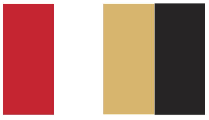
- Color Palette: Stella Red (#D50032), Stella Gold Metallic (#A39665), Stella Gold Flat (#B98528), Stella Black (#212120), Stella White (#FFFFFF), Stella Gray (#D2D9D6)
- Usage Context: Beer bottles, cans, draught taps, packaging, glassware (the Stella Artois chalice), advertising campaigns, digital platforms, event sponsorships, and merchandise
How Has the Stella Artois Logo Evolved Over Time?
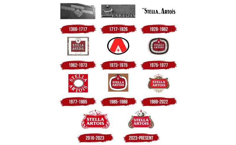
The Stella Artois logo has changed roughly ten times since the 1300s, but the core symbols have survived every single revision. The horn came first. The star came second. Everything else built around them.
What’s remarkable is how the brand kept swinging between complex and stripped-down designs across different decades, almost like a pendulum.
The Den Hoorn Brewery Mark (1366 – Early 1900s)
Years Active: 1366 through the early 20th century
The original mark was just a horn. That’s it. Den Hoorn literally means “The Horn” in Dutch, and the symbol served as a practical marker for the brewery’s location in Leuven.
Later versions from the 18th and 19th centuries added a star above the horn and the name “Artois” in large serif lettering to the right. These were hand-drawn, inconsistent by modern standards, but deeply tied to local Flemish identity.
No formal color scheme existed at this stage. The marks appeared on signage and brewery materials in whatever printing methods were available at the time.
The “Stella Artois” Wordmark Era (1926 – 1962)
Years Active: 1926 to 1962
When the brewery released its first Christmas beer in 1926, they added “Stella” (Latin for “star”) to the name. The logo during this period was pretty bare bones.
Just the name “Stella Artois” set in black, with the first word in quotation marks to signal it was a nickname. The font was a clean sans-serif, lowercase with capital initials.
No horn. No star graphic. No color. It was a stripped-back approach that looks almost out of character compared to what came before and after. But it worked for the time. The beer was building its reputation in Belgium, not chasing international shelf space yet.
The Red Square Label (1962 – 1973)
Years Active: 1962 to 1973
This is where things got interesting. The 1962 redesign introduced a genuine label format with a red square at the center, white capitalized lettering, and a brown border.
A pointed star appeared inside a circle at the top, with a stylized “A” in the middle. The founding year and beer type were included too. Multiple frames surrounded the central design, creating a layered look.
Red and white became the dominant color combination for the first time. Brown accents added warmth. The overall feel was structured and label-like, more product packaging than brand identity in the modern sense.
The Minimalist Ring Mark (1973 – 1975)
Years Active: 1973 to 1975
This one was a sharp left turn. The logo became a black ring with a cropped red letter “A” pushed into it, plus a small red star tucked into the remaining space.
Very minimalist. Very unusual for a beer brand in the 1970s. It lasted only two years, which tells you something about how well it resonated with consumers.
Still, it’s a fascinating artifact. It shows the brand was willing to experiment, even if the experiment didn’t stick.
The Rounded Label Return (1975 – 1988)
Years Active: 1975 to 1988
The brand went back to something closer to the 1962 design but made everything rounded. The lettering switched to serif. The 1973 ring mark replaced the original star at the top.
More frame layers were added with descriptions of the beer. Then in 1985, they simplified again, keeping the central design but dropping the extra text from the surrounding frames.
This period feels like the brand was searching for something. Not quite settled on how traditional or modern it wanted to be.
David Taylor’s Heraldic Emblem (1988 – 2016)
Years Active: 1988 to 2016
This is the one that changed everything. Graphic artist David Taylor of Taylorbrands created the ornate heraldic emblem that most people recognize today.
He brought back the hunting horn as a central symbol and connected it to the Den Hoorn brewery’s history. Architectural details inspired by Flemish building styles in Leuven appeared in the cartouche’s decorative frame. Bronze and gold accents gave it depth and a premium feel. Medals referencing historical brewing awards sat at the bottom.
The red background with white lettering remained. But the overall composition became far more complex and layered. Think of it as European heraldry meets beer label design. This version traveled the world with Stella Artois as it expanded into 80+ countries.
The Refined Emblem (2016 – 2023)
Years Active: 2016 to 2023
JKR (Jones Knowles Ritchie) worked with illustrator Alec Tear to redraw every single element. The proportions were adjusted. The star gained more visual weight. Light and shadow effects were added to the floral motifs surrounding the cartouche.
The top and bottom frames were removed, making the logo feel lighter and more open. “Belgium” became more readable.
Colors stayed in the red, gold, and white family. But the overall impression shifted from heavy and traditional to something that could live comfortably on both a glass bottle and a mobile screen.
The 2023 Brand World Update
Years Active: 2023 to present
The latest version pushed simplification further. Designers removed the lower decorative elements and pared down the upper ones, leaving two ears of grain, one hop leaf, and one cone.
The star returned to its 1973-era shape. Black outlines were dropped from the letters and side curls. A new horizontal logo variant was introduced for flexible placement across channels.
Two custom typefaces were created with Pangram Pangram Foundry. The color palette was formally codified as Stella Red, Stella Gold, Stella Black, Stella White, and Stella Gray.
The goal, according to JKR and Stella Artois Global VP Tim Ovadia, was to make the brand feel relevant to younger consumers while keeping every heritage symbol intact. A tricky line to walk, and your mileage may vary on whether they pulled it off.
What Do the Design Elements of the Stella Artois Logo Mean?
Every element in the Stella Artois logo points back to something specific in the brand’s history. The horn is the Den Hoorn brewery. The star is the Christmas beer. The cartouche is Flemish architecture. Nothing is decorative for decoration’s sake.
That said, the accumulated effect of all these symbols working together creates something bigger than any single reference. It signals age, craft, and European heritage in a way that few competitor logos even attempt.
What Does the Horn Represent?
The horn is the oldest element. It references “Den Hoorn,” the original brewery name from 1366. In medieval Belgium, horns were used to signal travelers, including hunters who would stop for a beer.
The shape of the horn has changed across versions, from realistic to stylized. The current rendition is flatter and more graphic, with golden tones and subtle shading that suggest craftsmanship.
It’s the one symbol that has never been removed from any version of the logo. Even the stripped-down 1973 mark kept a reference to it through the “A” monogram.
What About the Star?
“Stella” means star in Latin. The eight-pointed star represents the original Christmas beer brewed in 1926. It sits above the horn in most versions, acting as a kind of crown.
The star also doubles as a focal point that draws your eye to the top of the composition. Its bright red color pops against the gold and white elements around it.
Why Did Stella Artois Choose These Specific Colors?
The brand’s color choices are tied directly to what each shade communicates about the product.
- Stella Red (#D50032): The dominant color. Psychologically, red signals energy, warmth, and confidence. It also makes the logo pop on shelves, which matters a lot in crowded retail environments. Pantone PMS 199.
- Stella Gold Metallic (#A39665): Carries the premium positioning. Gold has always been associated with quality and luxury. Used on the horn, cartouche trim, and decorative details. Pantone PMS 10125.
- Stella Gold Flat (#B98528): A warmer, less reflective version of the metallic gold for print and flat applications.
- Stella Black (#212120): Used for “ANNO 1366” and certain accents. Provides contrast and grounds the composition. Pantone PMS Process Black.
- Stella White (#FFFFFF): The wordmark color. White against red creates high readability and a clean, direct feel.
- Stella Gray (#D2D9D6): A supporting neutral for backgrounds and secondary applications. Pantone PMS Cool Gray 1.
The red, white, and gold combination has stayed consistent since the 1960s, even as individual shades have been tweaked. That kind of color consistency builds recognition fast.
What Typography Style Is Used in the Stella Artois Logo?
The wordmark uses a custom typeface inspired by Friz Quadrata, a font originally designed by Ernst Friz in 1965. It’s technically classified as a glyphic typeface, sitting somewhere between serif and sans-serif with very subtle, almost hidden serifs.
The letters are bold, capitalized, and spaced to fill the red cartouche. The spacing between characters is tight but not cramped, giving the wordmark a solid, block-like presence.
For the 2023 brand world, JKR commissioned two additional custom typefaces from Pangram Pangram Foundry. These are used in marketing materials and campaigns, not in the logo itself. One was designed for headlines, the other for body copy.
The personality of the letterforms reads as classical European with enough weight to feel authoritative. It’s the kind of type treatment that says “we’ve been around a while” without being fussy about it.
What Are the Hidden Meanings in the Stella Artois Logo?
The decorative frame around the wordmark is pulled from Flemish architectural styles found in Leuven. It’s not generic ornamentation. The scrollwork and floral motifs reference specific building traditions from the region where the brewery has operated for centuries.
Earlier versions of the logo included medals at the bottom, representing actual awards won at Belgian trade exhibitions in the 19th and 20th centuries. The 2023 version removed these, but their influence on the logo’s premium positioning lingers.
The “ANNO 1366” inscription is a direct claim of heritage that predates most corporate branding by hundreds of years. Some brand storytelling experts consider Stella Artois to have one of the oldest continuously used logos in the world.
How Does the Stella Artois Logo Compare to Competitor Logos?
Most premium beer logos fall into one of two camps: heritage-heavy emblems or clean modern wordmarks. Stella Artois leans hard into the first camp, and that’s what sets it apart.
Look at Heineken. Green background, simple star, clean type. Very recognizable, but it doesn’t carry the same historical layering. Budweiser uses a red bowtie shape that’s become iconic through sheer advertising spend, but it doesn’t reference a specific place or founding story the way Stella’s cartouche does.
Guinness comes closest in terms of heritage branding. The harp symbol dates back to 1862 and carries real cultural significance. But Guinness opted for a much simpler execution. One symbol, one wordmark, dark background. Stella’s approach is far more ornate.
Carlsberg keeps things minimal with its green crown and clean lettering. Corona relies heavily on its crown imagery and the painted bottle aesthetic. Peroni also leans into Italian heritage but with a more streamlined approach.
What Stella Artois does differently is density. The logo packs more historical references per square inch than almost any competitor. Whether that density reads as “authentic” or “busy” depends entirely on the viewer and the context.
What Are the Technical Specifications of the Stella Artois Logo?
Official Color Codes
- Stella Red: Hex #D50032 | RGB (213, 0, 50) | CMYK (0, 100, 72, 0) | Pantone PMS 199
- Stella Black: Hex #212120 | RGB (33, 33, 32) | CMYK (0, 0, 0, 100) | Pantone PMS Process Black
- Stella Gold (Metallic): Hex #A39665 | RGB (163, 150, 101) | CMYK (26, 47, 100, 6) | Pantone PMS 10125
- Stella Gold (Flat): Hex #B98528 | RGB (185, 133, 40) | CMYK (31, 30, 65, 12)
- Stella White: Hex #FFFFFF | RGB (255, 255, 255) | CMYK (0, 0, 0, 0)
- Stella Gray: Hex #D2D9D6 | RGB (210, 217, 214) | CMYK (4, 2, 4, 8) | Pantone PMS Cool Gray 1
Dimensions and Proportions
The logo exists in two primary formats: the vertical cartouche (used on bottles, cans, and traditional applications) and a horizontal version introduced in 2023 for digital and flexible layouts.
Clear space requirements follow standard brand practice. The minimum exclusion zone around the logo is typically defined by the height of the star element. No other brand elements, text, or graphics should enter this zone.
Minimum size recommendations vary by application. For print at standard DPI, the cartouche version should not be reproduced smaller than approximately 25mm wide to keep the interior detail legible. Digital applications have similar constraints, with the logo needing enough pixel density to render the horn and star clearly.
The logo is maintained as vector artwork for scalability. Print-ready files use metallic gold inks where possible, with flat gold alternatives specified for standard printing processes.
What Cultural Impact Has the Stella Artois Logo Had?
The Stella Artois logo has become a case study in long-term brand building. Design students and branding professionals study it as an example of how historical symbols can survive centuries of change without losing their meaning.
In 2023, creative agency GUT Buenos Aires ran a campaign called “The Artois Probability.” They used an algorithm to scan historical European paintings, looking for depictions of beer that could plausibly be Stella Artois based on the glass shape, liquid color, geographic location, and time period of the painting. The campaign turned the logo’s age into a talking point, suggesting the brand (or at least the beer it represents) might have appeared in artworks centuries before modern advertising existed.
The logo’s influence also shows up in how other beer brands approach heritage branding. Many breweries now incorporate founding dates, regional symbols, and decorative frames into their identities, following a pattern that Stella Artois helped popularize.
Beyond beer, the brand has moved into fashion collaborations (including a partnership with Palace Skateboards) and lifestyle marketing. The logo’s ornate style gives it a certain cachet that translates well to merchandise, from branded chalices to clothing lines.
How Does the Stella Artois Logo Fit Into the Overall Brand Identity?
The logo doesn’t exist in a vacuum. It sits inside a larger identity system that includes the Stella Artois chalice (a distinctive stemmed glass), specific photography styles, custom typefaces, and a defined set of brand guidelines that control how everything comes together.
The 2023 JKR brand world introduced lifestyle photography by Cait Oppermann that blends fashion editorial sensibility with casual gathering scenes. The red, white, and black color balance from the logo carries through into every photograph and layout.
The chalice is probably the second most recognizable brand element after the logo itself. Its shape, with the Stella Artois cartouche etched into the glass, turns every pour into a brand moment. Few beer brands have managed to make their glassware this iconic. Guinness with its stout glass is one, maybe Hoegaarden with its hexagonal tumbler.
The tagline “Reassuringly Expensive” (used primarily in the UK from the 1980s onward) worked alongside the logo to position the brand as premium. The ornate visual identity reinforced the price positioning, and vice versa.
How Should the Stella Artois Logo Be Used?
Official Usage Guidelines
Anheuser-Busch InBev maintains strict brand style standards for the Stella Artois logo. The core rules include:
- Never alter the logo’s proportions, colors, or element arrangement
- Always maintain the required clear space around the logo
- Use only approved color versions (full color, single color, or reversed)
- Never place the logo on backgrounds that reduce readability
- The vertical cartouche is the primary mark. The horizontal version is for specific applications only.
- Metallic gold should be used in premium print applications where possible
Accessing Official Logo Files
Official Stella Artois logo files are managed through AB InBev’s brand asset management system. Licensed partners, distributors, and agencies can access approved artwork through the company’s brand portal. Public access to high-resolution logo files is not available outside of these channels.
Trademark and Legal Details
The “STELLA ARTOIS” name and associated design elements are registered trademarks of Anheuser-Busch InBev S.A. The word mark holds active registration (U.S. Registration No. 4075858, filed February 2011). Additional design mark registrations cover specific logo compositions including the cartouche, horn, and star elements.
Unauthorized use of the Stella Artois logo, name, or design elements is prohibited. This covers reproduction on merchandise, marketing materials, or digital content without written permission from AB InBev or its authorized representatives.
FAQ on The Stella Artois Logo
What does the Stella Artois logo mean?
The logo represents over 650 years of Belgian brewing heritage. The horn references the original Den Hoorn brewery in Leuven. The star comes from “Stella,” Latin for star, tied to the 1926 Christmas beer release. Every symbol traces back to a real historical event.
Why does the Stella Artois logo have a horn?
Den Hoorn means “The Horn” in Dutch. The brewery founded in 1366 used this symbol to signal beer availability to passing travelers and hunters.
It stuck. Despite centuries of ownership changes, the horn has never been removed from any version of the brand mark.
Who designed the current Stella Artois logo?
The 2023 version was created by Jones Knowles Ritchie (JKR) with illustrative work by Alec Tear. Pangram Pangram Foundry developed two custom typefaces for the broader brand identity. David Taylor of Taylorbrands designed the iconic 1988 heraldic emblem that served as the foundation.
What font does Stella Artois use?
The wordmark uses a custom typeface based on Friz Quadrata, a glyphic font designed by Ernst Friz in 1965. It sits between serif and sans-serif with nearly invisible serifs. The bold, capitalized letters give the logo its authoritative, classical European feel.
What are the official Stella Artois logo colors?
Six colors make up the official palette. Stella Red (#D50032) dominates. Stella Gold Metallic (#A39665) and Stella Gold Flat (#B98528) handle the premium accents.
Stella Black (#212120), Stella White (#FFFFFF), and Stella Gray (#D2D9D6) round out the system.
How old is the Stella Artois logo?
The horn symbol dates to 1366, making it one of the oldest recorded logos in the world. The full “Stella Artois” name appeared in 1926. The modern heraldic emblem took shape in 1988. That’s roughly 660 years of continuous visual identity evolution.
What does the star on Stella Artois represent?
The eight-pointed star represents the original Christmas beer. Brouwerij Artois brewed it as a seasonal holiday gift for the people of Leuven in 1926.
The beer was so popular it became a year-round product. The star stayed on every bottle as a reminder.
Has the Stella Artois logo changed recently?
Yes. JKR released a major brand update in 2023. They simplified the cartouche, removed lower decorative elements, and introduced a horizontal logo variant. The redesign targets younger consumers while keeping every core heritage symbol, including the horn, star, and Anno 1366 inscription.
Is Stella Artois the oldest logo in the world?
It’s widely considered one of the oldest. The horn symbol has been in continuous use since the Den Hoorn brewery opened in 1366 in Leuven, Belgium.
Other contenders exist, like Twinings (1706) and Bass Ale’s red triangle (1876). But few predate Stella’s mark.
What is the cartouche on the Stella Artois logo?
The cartouche is the ornamental frame surrounding the brand name. Its scrollwork and floral details draw from Flemish architectural styles found in Leuven. Earlier versions included medals from 19th-century Belgian trade exhibitions. The 2023 redesign stripped these away for a cleaner look.
Conclusion
The Stella Artois logo carries more than six centuries of brewing history in a single emblem. From the Den Hoorn horn to the eight-pointed Christmas star, every element earns its place through direct connection to the brand’s Belgian roots.
What makes it work is restraint in the right places. The 2023 JKR redesign proved you can modernize a heraldic brand identity without gutting its meaning.
The red and gold color scheme, the Friz Quadrata-inspired wordmark, the Flemish cartouche detail. These aren’t decorative choices. They’re proof of lineage.
Few premium lager brands anywhere in the world can match that kind of visual credibility. The logo doesn’t just identify the product. It authenticates it.
Renowned for his expertise in logo design and visual branding, Bogdan has developed a multitude of logos for various clients.
His skills extend to creating posters, vector illustrations, business cards, and brochures. Additionally, Bogdan's UI kits were featured on marketplaces like Visual Hierarchy and UI8.
He also wrote in the past years on sites like Design Your Way, WebDesignerDepot, WPDean, Designmodo, Speckyboy, Slider Revolution, and more.
- The Airtable Logo History, Colors, Font, And Meaning - 12 July 2026
- How to Blur Background in Canva: A Quick Tutorial - 11 July 2026
- Typography Trends - 10 July 2026
Bogdan Sandu is a seasoned designer who has been designing websites since 2008. Renowned for his expertise in logo design and visual branding, Bogdan has developed a multitude of logos for various clients. His skills extend to creating posters, vector illustrations, business cards, and brochures. Additionally, Bogdan's UI kits were featured on marketplaces like Visual Hierarchy and UI8. He also wrote in the past years on sites like Design Your Way, WebDesignerDepot, WPDean, Designmodo, Speckyboy, Slider Revolution, and more.
You Might Also Like