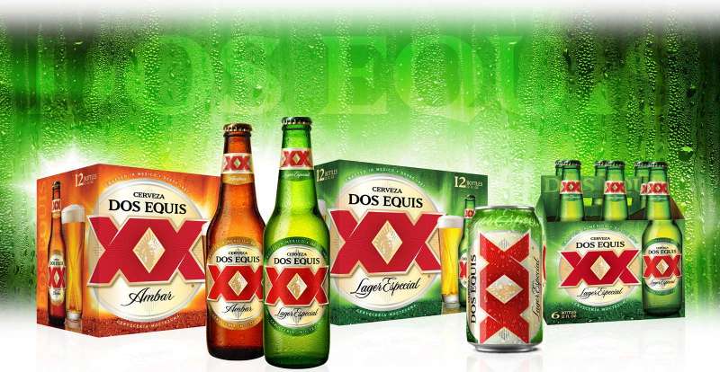
The Dos Equis logo is one of those marks you recognize before you even read the label. Two bold red Xs stacked over a gold sunburst, with the profile of an Aztec ruler tucked inside. It’s been on beer bottles since 1897, and the thing still works.
Dos Equis sits in a tricky spot within the Mexican beer market. It competes against brands like Corona and Modelo that have massive shelf presence in the U.S. and globally. But where those brands lean into simplicity or ornate crests, Dos Equis chose a different direction. The XX symbol, the Moctezuma portrait, the layered detail. It’s a combination mark that feels like it belongs on a coin, not just a bottle. The brand has gone through at least four significant redesigns over its lifetime, with the most recent arriving in late 2020 under Heineken’s ownership.
Founded by German brewer Wilhelm Hasse at the Moctezuma Brewery in Veracruz, the beer was originally called Siglo XX, meaning “20th Century.” The Roman numeral XX stuck around. The name changed. The logo kept evolving. And here we are, over 125 years later, still looking at those same two Xs.
What Is the Dos Equis Logo?

The Dos Equis logo is a combination mark featuring two large red stylized “X” letters, a gold ornamental sunburst, and a profile portrait of the Aztec leader Moctezuma. It was introduced alongside the beer’s original branding in 1897 and has been updated multiple times, most recently in 2020 by Heineken USA’s in-house team. The core symbolism ties back to the Roman numeral XX, representing the 20th century.
Here’s what defines it:
- Design Type: Combination mark (wordmark plus emblem)
- Primary Elements: Twin red “XX” letterforms, gold radiating sunburst, Moctezuma profile medallion, “CERVEZA” text arc, “DOS EQUIS” wordmark
- Official Introduction Date: 1897 (original), most recent version September 2020
- Designer/Agency: Original design attributed to the Moctezuma Brewery’s internal team under Wilhelm Hasse. Recent redesigns managed by Heineken USA
- Trademark Status: Registered trademark of Cervecería Cuauhtémoc Moctezuma, a subsidiary of Heineken International
- Color Palette: Red (#C8102E approximate), Gold (#C5A253 approximate), Black (#000000), White (#FFFFFF)
- Usage Context: Beer bottles, cans, tap handles, secondary packaging, merchandise, advertising campaigns, digital platforms, and point-of-sale displays
How Has the Dos Equis Logo Evolved Over Time?
The Dos Equis logo has gone through at least four major design phases since 1897. Each update refined the XX symbol and the Moctezuma portrait while keeping the red and gold color palette consistent. The biggest shift came in 2020, when the circular coin-inspired background was replaced with a bold golden X that fills the entire label.
Original Dos Equis Logo (1897 to Early 1900s)
Years Active: 1897 through the early 20th century
Wilhelm Hasse brewed the first batch on April 2, 1897, at his Moctezuma Brewery in Veracruz. The beer was named Siglo XX.
The original branding featured ornate, European-influenced typography and the Roman numeral XX as the centerpiece. Hasse was German, so this made sense. The design leaned heavily on Victorian-era label conventions, detailed borders, decorative type, and the kind of dense composition you’d expect from late 1800s packaging design.
The Moctezuma portrait was already present, connecting the beer to Mexico’s Aztec heritage. Hasse named his brewery after the Aztec ruler for a reason.
The original palette used dark reds and golds on cream-colored paper. It looked more like a certificate than a modern beer label. But it established every element the logo would carry forward for the next century.
Mid-Century Dos Equis Logo (1940s to 1990s)
Years Active: Approximately 1940s through the 1990s
The XX grew larger and bolder during this period. As the brand expanded through Mexico (railways helped a lot), the label needed to work at greater distances on store shelves.
The Moctezuma portrait stayed, but it was cleaned up. Less Victorian fuss, more defined lines. The sunburst behind the XX became more structured, with radiating gold rays that created a strong focal point.
Typography shifted from ornamental scripts to cleaner, more readable serif letterforms. The diamond-shaped border emerged during this era, giving the emblem a contained, medallion-like structure.
This version was on the bottles when Dos Equis first hit the U.S. market in 1973 (Ambar) and when Lager Especial was introduced to American stores in 1983.
Coin-Inspired Dos Equis Logo (2011 to 2020)
Years Active: 2011 through 2020
The 2011 redesign was a big deal. Heineken USA (which acquired the brand in 2010 through its purchase of FEMSA) updated the primary and secondary packaging significantly.
Key changes included an updated typeface for the XX, more defined rays on the front label, and the Moctezuma portrait was flipped from facing left to facing right. That directional change was intentional, representing forward momentum and progress.
In 2016, the label drew further inspiration from the Mexican Centenario coin, first minted in 1921 to mark the 100th anniversary of Mexican independence. The circular background gave the logo a premium, almost numismatic quality. The color scheme was made lighter overall.
This was also the era of “The Most Interesting Man in the World” campaign (launched in 2006 with actor Jonathan Goldsmith, replaced in 2016 by Augustin Legrand, ended 2018). The logo appeared everywhere, on T-shirts, posters, even tattoos.
Current Dos Equis Logo (2020 to Present)
Years Active: September 2020 to present
The 2020 redesign dropped the circular coin background entirely. In its place: a bold golden X that stretches across the whole label, pulling your attention straight to Moctezuma.
Both Lager and Ambar share the same foundational design now, but with their own color treatments. Ambar bottles include a bottleneck label with an illustration of the original Moctezuma Brewery.
Ligia Patrocinio, then Senior Brand Director for Dos Equis, described the update as drawing consumers in through “bold simplicity and eye-catching detail.” Research conducted before launch showed significant improvement in shelf standout, find accuracy, and premium associations.
The latest refresh (around 2023-2024) pushed things even further, making the angular XX the absolute hero of the design, combined with gold and white for a cleaner, more contemporary look.
What Do the Design Elements of the Dos Equis Logo Mean?
Every piece of the Dos Equis logo connects to the brand’s history. The XX stands for the Roman numeral 20, a direct reference to “Siglo XX” or “20th Century,” the beer’s original name. The Moctezuma portrait represents the Aztec ruler who inspired the brewery’s name. The gold sunburst calls back to Aztec sun imagery and Mexican coin traditions.
Why Did Dos Equis Choose These Specific Colors?

Red is the dominant color. It’s hard to miss on a shelf. In the context of color psychology, red drives energy and urgency.
It also ties into Mexican cultural identity. Look at the Mexican flag. Red is right there.
Gold plays a supporting role but an important one. It signals premium quality and connects to the Centenario coin reference. Gold on a beer label says “this costs more, and it should.” Within the wider category of gold logos, it consistently reads as luxury and heritage.
Black creates contrast. The Moctezuma portrait sits against a dark background, making the gold details pop. White is used sparingly for text legibility, particularly “CERVEZA” and “DOS EQUIS.”
Approximate color values:
- Dos Equis Red: Hex #C8102E, RGB (200, 16, 46), CMYK (0, 92, 77, 22), close to Pantone 186 C
- Dos Equis Gold: Hex #C5A253, RGB (197, 162, 83), CMYK (0, 18, 58, 23), close to Pantone 7407 C
- Black: Hex #000000, RGB (0, 0, 0), CMYK (0, 0, 0, 100)
- White: Hex #FFFFFF, RGB (255, 255, 255), CMYK (0, 0, 0, 0)
What Typography Style Is Used in the Dos Equis Logo?
The XX letterforms are custom. They’re not pulled from any commercial font library. The current version uses angular, geometric X shapes with sharp edges and clean intersections.
The “DOS EQUIS” wordmark uses a bold, capitalized serif style. It reads well at small sizes on cans and bottles, which matters more than most people think. The kerning is tight but comfortable, keeping the letters close without them colliding.
“CERVEZA” appears in a smaller, spaced-out uppercase style that arcs along the top of the emblem. It’s functional labeling, but the tracking gives it an air of formality.
What Are the Hidden Meanings in the Dos Equis Logo?
The Moctezuma portrait facing right was a deliberate 2011 decision. In Western reading cultures, rightward movement implies forward progress. That’s not an accident.
The sunburst pattern behind the XX calls back to Aztec sun stone imagery. Some people see it as a compass rose, suggesting exploration and adventure. Both readings work for a brand that built an entire ad campaign around being “interesting.”
The diamond border (in earlier versions) mirrors the shape of traditional Mexican tiles and architectural patterns. It’s subtle, but it roots the design in a place.
How Does the Dos Equis Logo Compare to Competitor Logos?
Mexican beer logos tend to fall into two camps. Clean and modern, or detailed and heritage-driven. Dos Equis sits firmly in the second camp, and that’s a deliberate choice.
Corona uses a minimalist crown mark with sparse detail. It sells vacation vibes. Modelo leans into a more traditional crest with lions and detailed illustration. Tecate went bold and simple with its red eagle-based redesign.
Dos Equis occupies a middle ground that I actually think is the trickiest to pull off. It’s detailed enough to feel premium, but the XX is simple enough to be instantly recognizable at a distance. Compare that to something like the Stella Artois logo, which is also ornate, but plays in the European heritage space rather than Latin American.
Among imported lagers, the Heineken logo (Dos Equis’s parent company) is the ultimate in clean simplicity. A green oval, a red star, done. Having both in the same portfolio is smart from a brand guidelines perspective. They don’t compete visually.
What Are the Technical Specifications of the Dos Equis Logo?
Official Color Codes
- Primary Color (Red): Hex #C8102E, RGB (200, 16, 46), CMYK (0, 92, 77, 22), approximate Pantone 186 C
- Secondary Color (Gold): Hex #C5A253, RGB (197, 162, 83), CMYK (0, 18, 58, 23), approximate Pantone 7407 C
- Accent Color (Black): Hex #000000, RGB (0, 0, 0), CMYK (0, 0, 0, 100), Pantone Black C
- Text/Detail (White): Hex #FFFFFF, RGB (255, 255, 255), CMYK (0, 0, 0, 0)
Dimensions and Proportions
The logo works within a roughly square aspect ratio when the full emblem (XX plus sunburst plus Moctezuma) is included. The wordmark “DOS EQUIS” sits below in a wider horizontal proportion.
Minimum size requirements for the full combination mark are typically around 25mm in width for print applications, making sure the Moctezuma portrait remains legible. For digital use, 120 pixels wide is a practical floor.
Clear space around the logo generally follows a measurement equal to the height of one of the X arms. This keeps the mark from being crowded by other graphic elements. The logo needs to be rendered in vector graphics format for any production use, and DPI requirements for print are standard at 300 or higher.
What Cultural Impact Has the Dos Equis Logo Had?

The Dos Equis logo became genuinely iconic during the “Most Interesting Man in the World” campaign, which ran from 2006 to 2018. Those ads made the XX symbol pop culture shorthand. People got the logo tattooed. It showed up on bootleg T-shirts. Bars framed the posters.
That kind of cultural crossover doesn’t happen with most beer brands. Budweiser has its bowtie shape. Guinness has the harp. Dos Equis has the double X. It entered a club of beer marks that people recognize even when they’re separated from the product entirely.
The brand also became closely tied to Cinco de Mayo celebrations and college football culture in the U.S. (Dos Equis has been the official beer sponsor of the College Football Playoff since 2016). The logo appears on everything from stadium signage to tailgate merchandise.
How Does the Dos Equis Logo Fit Into the Overall Brand Identity?

The logo is just one piece. Dos Equis has a full brand system that includes the XX monogram, the Moctezuma portrait (usable as a standalone element), the custom serif typography, the red-and-gold palette, and a tone of voice built around confidence and irreverence.
Everything feeds the same idea. Mexican heritage, premium positioning, and a personality that’s just a little cocky. The brand style guide ties these together so the logo doesn’t have to do all the heavy lifting on its own.
Under Heineken’s umbrella, Dos Equis shares shelf space with brands like Amstel and Tecate. The visual distinction between each brand is clear. No one is going to confuse a Dos Equis can for a Heineken bottle. That’s the whole point of having a strong identity system.
How Should the Dos Equis Logo Be Used?
Do:
- Use the official logo files provided by Heineken’s brand portal
- Maintain clear space around the mark
- Use the full-color version on appropriate backgrounds (dark backgrounds preferred for the main emblem)
- Keep the XX and Moctezuma portrait proportional. Stretching or squishing either one is a fast way to make it look wrong
Don’t:
- Alter the colors outside the approved palette
- Place the logo over busy photography without sufficient contrast
- Recreate the logo from scratch using similar fonts. The XX is custom for a reason
- Separate the Moctezuma portrait from the XX in unauthorized ways
The Dos Equis trademark is registered through the U.S. Patent and Trademark Office and managed by Cervecería Cuauhtémoc Moctezuma under Heineken International. Any commercial use requires licensing approval. For official logo assets, retailers and media partners typically go through Heineken USA’s brand resource portal.
If you’re a designer working with the files, keep them in vector format. The detail in the sunburst and portrait will turn into mush at low resolution, especially in bitmap or compressed JPEG formats.
FAQ on The Dos Equis Logo
What Does the Dos Equis Logo Mean?
The name translates to “Two Xs” in Spanish. The XX comes from the Roman numeral for 20, referencing the beer’s original name, Siglo XX (20th Century).
Wilhelm Hasse picked it in 1897 to mark the coming new century. The meaning stuck around long after the century arrived.
Who Designed the Dos Equis Logo?
The original design came from the Moctezuma Brewery team under Wilhelm Hasse in Veracruz. No single designer has been publicly credited.
Recent updates have been handled by Heineken USA’s internal brand teams. The 2020 redesign was managed in-house as part of a full packaging refresh.
Why Does the Dos Equis Logo Feature Moctezuma?
Hasse named his brewery after Moctezuma, the last Aztec ruler. The portrait connects the beer to Mexican heritage and pre-colonial history.
In 2011, the portrait was flipped to face right. That directional change signals forward progress, at least in Western visual culture.
What Colors Are in the Dos Equis Logo?
Red, gold, black, and white. The red is close to Hex #C8102E. Gold runs approximately #C5A253.
Red grabs attention on store shelves. Gold communicates premium positioning. Black provides depth behind the Moctezuma portrait. Simple and effective.
When Was the Dos Equis Logo Last Redesigned?
The most recent major redesign launched in September 2020. It replaced the Centenario coin-inspired background with a bold golden X across the full label.
A further refresh around 2023-2024 pushed the angular XX even more prominently into the center of the design.
What Font Does the Dos Equis Logo Use?
The XX letterforms are custom. They aren’t from a commercial font family. The “DOS EQUIS” wordmark below uses a bold, capitalized serif style.
The lettering has been refined with each redesign, getting sharper and more geometric over time. Earlier versions leaned more ornamental.
Is the Dos Equis Logo Trademarked?
Yes. It’s a registered trademark held by Cervecería Cuauhtémoc Moctezuma, a subsidiary of Heineken International. Commercial use requires licensing approval.
The trademark covers the XX symbol, the Moctezuma portrait, and the full combination mark across all product categories.
How Has the Dos Equis Brand Identity Changed Over Time?
The brand has gone through at least four major visual phases since 1897. Early labels used dense Victorian-era styling. Mid-century versions simplified things.
The 2011 coin-inspired era brought premium cues. The current 2020 version prioritizes bold simplicity and shelf visibility under Heineken’s direction.
What Makes the Dos Equis Logo Different From Other Beer Logos?
Most Mexican beer brands go either minimal or full crest. Dos Equis does both. The XX is dead simple. The emblem around it is layered and detailed.
That combination gives it range. It works on a tiny can and a massive billboard. Not every beer brand emblem can say that.
Where Can I Download the Official Dos Equis Logo?
Official logo files are available through Heineken USA’s brand resource portal for authorized partners. Retailers and media contacts can request access directly.
Fan sites offer PNG and SVG versions, but those aren’t always current. For anything commercial, go through the official channels.
Conclusion
The Dos Equis logo has survived over 125 years of redesigns, ownership changes, and shifting consumer tastes. That’s not luck. It’s what happens when a visual identity is built on real meaning rather than trends.
From Wilhelm Hasse’s first Siglo XX label in Veracruz to the current gold-and-red packaging managed by Heineken International, the double X symbol and the Moctezuma portrait have stayed central to the brand.
The beer label artwork balances Mexican cultural identity with premium shelf appeal. Few cerveza brands manage that mix as well.
Whether printed on a bottle, a tap handle, or a College Football Playoff banner, the XX reads the same. Recognizable, confident, and rooted in a story worth telling.

Renowned for his expertise in logo design and visual branding, Bogdan has developed a multitude of logos for various clients.
His skills extend to creating posters, vector illustrations, business cards, and brochures. Additionally, Bogdan's UI kits were featured on marketplaces like Visual Hierarchy and UI8.
He also wrote in the past years on sites like Design Your Way, WebDesignerDepot, WPDean, Designmodo, Speckyboy, Slider Revolution, and more.
- The Windsurf Logo History, Colors, Font, And Meaning - 10 October 2026
- How to Remove Background From Product Photos (No Photoshop) - 10 October 2026
- How Designers can Build a Stronger Online Creative Identity - 9 October 2026

Bogdan Sandu is a seasoned designer who has been designing websites since 2008. Renowned for his expertise in logo design and visual branding, Bogdan has developed a multitude of logos for various clients. His skills extend to creating posters, vector illustrations, business cards, and brochures. Additionally, Bogdan's UI kits were featured on marketplaces like Visual Hierarchy and UI8. He also wrote in the past years on sites like Design Your Way, WebDesignerDepot, WPDean, Designmodo, Speckyboy, Slider Revolution, and more.
You Might Also Like