The Modelo logo is one of those designs that hits you before you even crack open the bottle. It’s layered, detailed, and packed with references to Mexican brewing heritage that go back almost a century. Grupo Modelo first started brewing in 1925 in Mexico City, and the logo has carried that founding year ever since, right there on the golden ribbon at the center.
Within the broader beer industry, the Modelo brand mark sits in a class of detailed, heritage-driven emblems. Think of it alongside the ornate crests you see on European lagers or the bold wordmarks common among beer brands. But Modelo’s version feels uniquely Mexican. The current design was last refreshed in 2016 under Constellation Brands’ direction. It pulls together heraldic lions, barley wreaths, a brewery illustration, and a bold wordmark into a single composition that’s been through multiple small tweaks since the original version appeared in the late 1920s.
What Is the Modelo Logo?

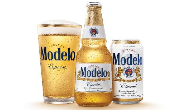
The Modelo logo is a combination mark that blends a bold, rounded serif wordmark with heraldic imagery, including two golden lions, barley stalks, a ribbon bearing “1925,” and the arched word “CERVEZA” above. It was last redesigned in 2016 by Constellation Brands to unify the Casa Modelo portfolio.
Here’s a breakdown of its core attributes:
- Design Type: Combination mark (wordmark plus emblem imagery)
- Primary Elements: “MODELO” wordmark in 3D blue lettering, two heraldic lions in gold, barley wheat stalks forming a wreath, a golden ribbon with “1925,” the arched word “CERVEZA” in red, and the sub-brand name (e.g., “Especial”) in calligraphic blue script below
- Official Introduction Date: Original logo dates to the late 1920s, shortly after the brewery’s 1925 founding. The current version was introduced in August 2016.
- Designer/Agency: The original designer has never been publicly confirmed. The 2016 redesign was overseen by Constellation Brands’ internal marketing team. Keshav Naidu is credited with defining the approved color palette.
- Trademark Status: Registered with the United States Patent and Trademark Office (USPTO) under registration number 5307115, filed October 2, 2015, and registered October 10, 2017. The trademark is held by Cervecería Modelo de México, S. de R.L. de C.V.
- Color Palette: Four official colors. Ateneo Blue (#003A6C), Jasper (#D05A2A), Spanish Yellow (#F3B614), and Brown-Nose (#6B3A24).
- Usage Context: Bottle labels, can designs, cardboard packaging, promotional posters, merchandise (clothing, hats, glassware), television and digital advertising campaigns, and point-of-sale retail displays
How Has the Modelo Logo Evolved Over Time?
The Modelo logo hasn’t gone through the dramatic overhauls you see with some brands. It’s been remarkably consistent since the 1920s, with most changes involving refinements to lettering, color depth, and how the supporting imagery around the wordmark is rendered.
The core structure, that central “MODELO” text flanked by lions on a ribbon, has been the backbone for decades.
Original Modelo Logo (1925 – 1950s)
When Cervecería Modelo opened in the Tacuba neighborhood of Mexico City in 1925, the initial branding was straightforward. The earliest labels focused on the product name in a black-and-white font with minimal decoration.
There wasn’t much of the ornate detail we associate with the brand today. It was clean, simple, and functional for the local market.
The early design reflected the brewery’s modest beginnings before it grew into Mexico’s largest beer producer. At this stage, Modelo was focused on the domestic market, and the label didn’t need to compete internationally.
Mid-Century Modelo Logo (1950s – 1970s)
By the 1950s, the logo incorporated a yellow and black color scheme with more visible branding for the “M” letterform.
The 1960s brought a version that started to include elements of Mexican national identity. This is where things got more layered.
As Grupo Modelo expanded, buying competitor breweries in Guadalajara and Torreon, the brand needed something that communicated scale and quality. The logo started picking up the heraldic touches that would become its signature.
Heraldic Modelo Logo (1970s – 2015)
This is the era when the Modelo logo really became what most people recognize. The lions appeared. The barley wreath took shape. The ribbon with “1925” anchored the composition.
The two lions flanking the wordmark closely resemble the animals on the coat of arms of Mexico City, where Grupo Modelo’s headquarters sits. That wasn’t accidental. It tied the brand to its home city in a way that felt both proud and official.
Behind the main text, you can spot a faint illustration of a building with a flag on top. That’s believed to be the original Modelo brewery. And hidden beneath the blue “MODELO” lettering is the signature of Pablo Diez Fernández, one of the co-founders of Cervecería Modelo, who served as Honorary Chairman of Grupo Modelo until his death in 1972.
The color scheme settled into blue and gold during this period. The wordmark gained its three-dimensional look with thin black outlines and white spacing between the letters.
Current Modelo Logo (2016 – Present)
In August 2016, Constellation Brands introduced the Casa Modelo master brand house. The goal was to bring Modelo Especial, Negra Modelo, and Modelo Chelada under a unified visual identity.
The 2016 redesign kept almost everything intact. But it sharpened the details. The lions got cleaner rendering. The typographic treatments became more consistent across the entire portfolio. The gold tones were made richer.
Constellation’s approach was deliberate. They didn’t want to alienate a loyal customer base by changing too much. The integrity of the original design was the selling point, not a departure from it.
What Do the Design Elements of the Modelo Logo Mean?
Every element in the Modelo logo has a purpose. The heraldic lions represent strength and pride, borrowed from Mexico City’s coat of arms. The barley stalks signal brewing tradition and ingredient quality. The year “1925” on the ribbon anchors the brand in its founding story.
And that building with a flag in the background? That’s the original Cervecería Modelo.
What Do the Lions Symbolize in the Modelo Logo?
The two lions standing on their hind legs, front paws extended toward the wordmark, are heraldic in style. Long tails bent upward, thick manes, tongues forward.
They’re pulled directly from the coat of arms of Mexico City. In heraldry, lions represent courage, high status, generosity, and royal authority. For a beer brand, that’s a deliberate positioning choice. It communicates that this isn’t just any cerveza.
The golden rendering of the lions ties into the overall warmth of the logo’s palette. They feel proud, poised, and ready, which connects to Modelo’s “Fighting Spirit” campaign slogan.
What Do the Barley Stalks Represent?
Four barley stalks appear in the logo. Two sit on the ribbon next to “1925,” and two more form a wreath-like shape in the background.
Barley is a core ingredient in beer, so this is both literal and symbolic. It signals that Modelo takes its ingredients seriously. The wreath shape adds a sense of honor and accomplishment, much like laurel wreaths in classical design.
Why Did Modelo Choose These Specific Colors?

The Modelo logo uses four approved colors, and each one pulls its weight.
- Ateneo Blue (#003A6C): This deep, dark blue is the dominant color of the “MODELO” wordmark. Blue communicates authority, professionalism, and trust. In color psychology, dark blues often create impressions of loyalty and dependability. It’s a confident choice that keeps the brand feeling serious without being stiff.
- Jasper (#D05A2A): This reddish-brown appears in the arched “CERVEZA” text. It adds warmth and energy to the composition. Red-toned branding tends to catch the eye quickly, and here it works as a secondary accent that draws attention upward.
- Spanish Yellow (#F3B614): The gold tones show up in the lions, the ribbon, and the barley. Gold signals richness, quality, and a connection to the color of the beer itself. For a brand that bottles in clear glass to literally show off the golden hue of its lager, this color choice isn’t decorative. It’s strategic.
- Brown-Nose (#6B3A24): This earthy brown grounds the palette. It appears in supporting elements and shadows, adding depth. Brown in branding often connects to earthiness, naturalness, and reliability.
Together, these colors create what color theory would describe as a warm, grounded composition with a strong cool anchor. The blue wordmark contrasts against the surrounding golds and reds, creating a clear focal point that your eyes land on first.
What Typography Style Is Used in the Modelo Logo?

The main “MODELO” wordmark uses a bold, rounded serif typeface with thick, stable characters. It has wide serifs on the vertical strokes of the “M,” “d,” and “l.”
The closest publicly available fonts are probably Petroles Medium or Alter Headletter, but the actual typeface appears to be a custom or heavily modified version. Nobody has been able to precisely identify it, which is pretty typical for beer brands that want their lettering to be completely unique.
“CERVEZA” above the wordmark is set in all capitals with short serifs, styled to look three-dimensional with white and gray outlines. And “Especial” at the bottom uses a calligraphic cursive with decorative swirls on the capital “E” and dots at the ends of the lowercase “s” and “c.” Three different typographic treatments in one logo, and somehow it works.
What Are the Hidden Meanings in the Modelo Logo?
The signature of Pablo Diez Fernández is the most commonly missed detail. It sits behind the “MODELO” wordmark, partially covered by the blue lettering. In some label versions (particularly a 2018 print), you can see it more clearly.
Then there’s the building with the flag. Most people never notice it behind the barley wreath. It’s believed to be the original Cervecería Modelo brewery in Tacuba, Mexico City.
The lions’ positioning is also worth noting. They’re not just decorative. They’re posed as if holding up the brand name, which is a classic heraldic composition called “supporters.” It gives the whole design a coat-of-arms quality that you don’t typically see in beer branding.
How Does the Modelo Logo Compare to Competitor Logos?
Modelo sits in a crowded market, and its logo tells you exactly how it wants to be positioned. Most Mexican beer competitors go for simpler, cleaner looks. Corona’s logo uses a clean wordmark with a crown, and it’s all about the beachy, approachable vibe. Dos Equis leans into its double-X mark with a more modern, stripped-down approach.
Modelo goes the other direction. It’s ornate. It’s detailed. It’s layered like a European coat of arms. That’s not accidental. The brand has always leaned into the German brewing influence behind its recipes, and the heraldic style reflects that.
Compared to European competitors, Stella Artois uses a similar heritage-heavy approach with its horn and founding year. Guinness has the harp. Heineken keeps it tight with the red star and green wordmark.
Where Modelo stands out is in how much it packs into a single label without it feeling cluttered. The visual hierarchy is well-managed. Your eye hits “MODELO” first, then drifts to the lions, then the ribbon, then the background details. That kind of layered reading experience keeps you looking.
Among American domestic beers, Budweiser has its own ornate crest-style label, but it reads as more commercial, less heritage-driven. Miller Lite and Coors Light have gone through so many redesigns they’re essentially in a different category now.
What Are the Technical Specifications of the Modelo Logo?
Official Color Codes
- Primary Color: Ateneo Blue – Hex: #003A6C, RGB: (0, 58, 108), CMYK: (100, 46, 0, 58)
- Secondary Color: Jasper – Hex: #D05A2A, RGB: (208, 90, 42), CMYK: (0, 57, 80, 18)
- Accent Color: Spanish Yellow – Hex: #F3B614, RGB: (243, 182, 20), CMYK: (0, 25, 92, 5)
- Supporting Color: Brown-Nose – Hex: #6B3A24, RGB: (107, 58, 36), CMYK: (0, 46, 66, 58)
Dimensions and Proportions
The Modelo logo doesn’t have publicly available official brand guidelines with exact aspect ratios or minimum size requirements (at least not anything Constellation Brands has released publicly). But based on standard usage across packaging, the emblem tends to sit within a roughly 4:3 ratio when the full composition is displayed.
On bottles, the label has a tall, narrow orientation. On cans and cardboard packaging, the logo is often rendered in a wider format with the lions extending outward.
Clear space around the logo is maintained in official materials, particularly keeping the “CERVEZA” arch and the “Especial” script free from other text elements. The 3D effect on the lettering requires sufficient resolution to render properly, so the logo doesn’t scale down well to very small sizes without losing detail.
What Cultural Impact Has the Modelo Logo Had?

Modelo’s visual identity has become a genuine cultural marker, especially in the U.S. and Mexico. The brand’s “Fighting Spirit” campaign tied the logo to stories of perseverance and determination, making it resonate beyond just beer.
You see the logo on UFC sponsorship banners, FIFA World Cup advertising, and Super Bowl commercials. It’s become one of the most recognized gold-toned logos in the beverage industry.
In the Hispanic market, particularly among Mexican-American communities, the Modelo brand carries a sense of cultural pride. The logo’s heraldic design, tied to Mexico City’s coat of arms, makes it more than branding. It’s an identity touchpoint.
Modelo Especial became the best-selling beer in the United States in 2023, surpassing Bud Light. That kind of market dominance means the logo is now everywhere, from corner stores to stadium signage. It’s crossed over from “imported beer” branding to mainstream American retail visibility.
How Does the Modelo Logo Fit Into the Overall Brand Identity?
The Modelo logo is the visual center of a brand system that extends across Modelo Especial, Negra Modelo, Modelo Chelada, Modelo Oro, and Modelo Reserva. Each sub-brand shares the same structural layout but adjusts its color temperature and secondary design elements.
Especial uses the lighter, golden version. Negra shifts everything darker with deep browns and blacks. Chelada adds red and green accents tied to its tomato-lime flavor profile.
The 2016 Casa Modelo restructuring under Constellation Brands was specifically about making these visual connections tighter. Cross-promotion became easier when consumers could instantly recognize the Modelo family through shared design DNA.
Beyond the logo itself, the brand guidelines extend to the distinctive bottle shape (wide base tapering to a thick neck sealed with gold foil), the clear glass that shows off the beer’s color, and consistent use of the blue-and-gold palette across all packaging design touchpoints.
How Should the Modelo Logo Be Used?
The Modelo logo is a registered trademark owned by Cervecería Modelo de México, S. de R.L. de C.V. (part of AB InBev globally, with U.S. rights held by Constellation Brands). That means there are real rules around usage.
Do:
- Use official logo files provided directly by Constellation Brands or authorized distributors
- Maintain the approved color scheme. The four official colors are non-negotiable in formal brand applications
- Keep clear space around the logo, especially around the “CERVEZA” arch and the “Especial” text
- Refer to Constellation Brands’ retailer and distributor guidelines for point-of-sale materials
Don’t:
- Modify the colors, rearrange elements, or separate the lions from the wordmark
- Use the logo on unauthorized merchandise without licensing
- Reproduce the logo in low resolution where the 3D lettering effects become muddy
- Stretch, distort, or rotate the logo from its intended orientation
For official logo files and brand assets, the best route is through Constellation Brands’ corporate communications or their authorized media portals. The trademark covers beer, clothing, accessories, paper goods, and promotional items under multiple USPTO classes.
If you’re a retailer or bar owner looking to use the logo for promotional purposes, contact your local Modelo distributor. They typically have approved brand style guides and ready-to-use assets for authorized partners.
FAQ on The Modelo Logo
What Does the Modelo Logo Look Like?
The Modelo logo features a bold blue “MODELO” wordmark flanked by two golden heraldic lions standing on a ribbon marked “1925.”
Above it, the word “CERVEZA” arches in red. Barley stalks form a wreath in the background, with a faint brewery illustration behind everything.
When Was the Modelo Logo First Created?
The original Modelo beer label appeared shortly after the brewery’s founding in 1925 in Mexico City. It started simple, mostly black and white.
The version most people recognize today took shape in the 1970s. The most recent update came in 2016 under Constellation Brands.
Who Designed the Current Modelo Logo?
The specific designer has never been publicly identified. Constellation Brands handled the 2016 redesign internally when they launched the Casa Modelo master brand.
Keshav Naidu is credited with defining the official color scheme. The original creators from the 1920s remain unknown.
What Do the Lions on the Modelo Logo Represent?
The two lions are heraldic symbols borrowed from the coat of arms of Mexico City, where Grupo Modelo is headquartered.
In heraldry, lions represent courage, pride, and authority. Their golden color ties into the brand’s premium positioning within Mexican cerveza culture.
What Are the Official Colors of the Modelo Logo?
Four colors make up the approved palette. Ateneo Blue (#003A6C) for the wordmark, Jasper (#D05A2A) for “CERVEZA,” Spanish Yellow (#F3B614) for the lions and ribbon, and Brown-Nose (#6B3A24) for supporting elements.
The blue-and-gold combination gives the Modelo brand identity its signature premium feel.
What Font Is Used in the Modelo Logo?
The “MODELO” text uses a custom rounded serif with thick, stable letterforms. Nobody has precisely identified the font’s origin.
The closest matches are Petroles Medium and Alter Headletter. Three distinct typographic styles appear across the full label design.
Has the Modelo Logo Changed Over the Years?
Yes, but not drastically. The core layout with lions, barley, and the central wordmark has remained consistent for decades.
The 2016 redesign refined details and unified the Modelo Especial packaging across the Casa Modelo portfolio. Earlier versions had simpler color schemes and less ornate imagery.
What Is the Hidden Signature in the Modelo Logo?
Behind the blue “MODELO” lettering sits the signature of Pablo Diez Fernández, co-founder of Cervecería Modelo. Most people never notice it.
It’s partially covered by the wordmark but became more visible in a 2018 label version. A subtle nod to the brewery’s Mexican heritage.
Is the Modelo Logo Trademarked?
Yes. The Modelo Especial label is registered with the USPTO under registration number 5307115, held by Cervecería Modelo de México.
The trademark covers beer, clothing, paper goods, and promotional items. It was filed in 2015 and officially registered in October 2017.
How Does the Modelo Logo Differ Between Beer Varieties?
Each sub-brand shares the same structural layout but shifts in color. Especial uses light golds and blues. Negra Modelo goes darker with deep browns and blacks.
Chelada adds red and green accents. Modelo Oro keeps things minimal. The lions and ribbon stay consistent across all varieties.
Conclusion
The Modelo logo has earned its place as one of the most recognizable beer emblems in North America. Its mix of heraldic lions, barley imagery, and that bold blue wordmark isn’t just decoration. It’s a carefully built brand symbol rooted in nearly a century of Mexican brewing history.
Few beverage labels manage to pack this much detail without feeling busy. The balance between ornate elements and readable structure is what keeps it working across bottles, cans, and billboards.
Whether you’re studying how effective logos are built or just appreciate good contrast in label design, Modelo’s approach is worth a closer look. It proves that heritage and smart design can coexist without compromise.

Renowned for his expertise in logo design and visual branding, Bogdan has developed a multitude of logos for various clients.
His skills extend to creating posters, vector illustrations, business cards, and brochures. Additionally, Bogdan's UI kits were featured on marketplaces like Visual Hierarchy and UI8.
He also wrote in the past years on sites like Design Your Way, WebDesignerDepot, WPDean, Designmodo, Speckyboy, Slider Revolution, and more.
- The Windsurf Logo History, Colors, Font, And Meaning - 10 October 2026
- How to Remove Background From Product Photos (No Photoshop) - 10 October 2026
- How Designers can Build a Stronger Online Creative Identity - 9 October 2026

Bogdan Sandu is a seasoned designer who has been designing websites since 2008. Renowned for his expertise in logo design and visual branding, Bogdan has developed a multitude of logos for various clients. His skills extend to creating posters, vector illustrations, business cards, and brochures. Additionally, Bogdan's UI kits were featured on marketplaces like Visual Hierarchy and UI8. He also wrote in the past years on sites like Design Your Way, WebDesignerDepot, WPDean, Designmodo, Speckyboy, Slider Revolution, and more.
You Might Also Like