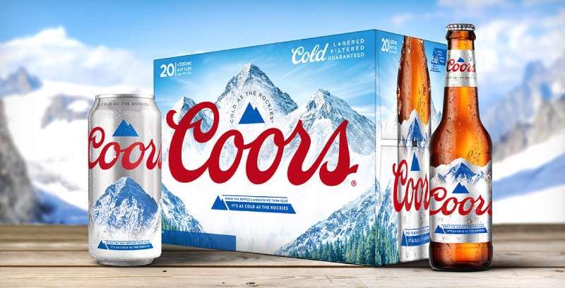
The Coors Light logo is one of the most recognized marks in the American beer industry. Built around a stylized mountain graphic and a distinctive red script wordmark, it ties directly to the brand’s roots in Golden, Colorado, and the Rocky Mountains that surround it.
Coors Light launched in 1978 under the Coors Brewing Company (now Molson Coors Beverage Company). The logo has gone through roughly seven major redesigns since then. The current version, introduced in 2015 and designed by Turner Duckworth, strips the mark down to an abstract triangular mountain icon behind the “Coors” script with “LIGHT” in clean sans-serif capitals beside it.
Within the broader beer branding space, this logo sits alongside marks from brands like Budweiser, Miller Lite, and Heineken as part of a group of beer logos that have shaped how consumers identify and connect with their favorite drinks on shelves, in bars, and across digital platforms.
What Is the Coors Light Logo?
The Coors Light logo is a combination mark featuring two abstract gray mountain peaks behind a red cursive “Coors” wordmark, paired with “LIGHT” set in a custom gray sans-serif typeface. Designed by Turner Duckworth in 2015, it represents the brand’s Colorado heritage and cold-brewed identity.
- Design Type: Combination mark (wordmark plus graphic symbol)
- Primary Elements: Abstract triangular mountain icon, flowing red “Coors” script, uppercase “LIGHT” in custom sans-serif lettering. Letters “L,” “G,” and “T” feature partially cut edges for added distinction.
- Official Introduction Date: The brand launched in 1978. The current logo version was introduced in 2015.
- Designer/Agency: Turner Duckworth, San Francisco
- Trademark Status: Registered trademark under Molson Coors Beverage Company USA LLC (U.S. Registration Number 4878646). The mark describes triangular mountains behind the words “COORS LIGHT” with “COORS” in script lettering above “LIGHT” in block lettering.
- Color Palette: Red (#C2112F), Dark Gray (#757373), Light Gray (#CBC8C7), and White
- Usage Context: Beer cans, bottles, packaging, cold-activated labels, promotional merchandise, digital advertising, sports sponsorship materials, point-of-sale displays, and social media assets
How Has the Coors Light Logo Evolved Over Time?.

The Coors Light logo has gone through roughly seven versions since 1978, moving from a vintage handwritten wordmark to the geometric, stripped-down mountain icon used today.
Each redesign responded to shifts in consumer taste and broader design movements.
The brand never fully abandoned its two key elements: the red “Coors” script and the connection to mountains. But the way those elements look? That changed a lot.
Original Coors Light Logo (1978–1980)
Years Active: 1978–1980
The first Coors Light logo used a two-level wordmark. “Coors” sat on top in red script. “Light” appeared below in black cursive, almost diagonal in angle. The whole thing sat on a light beige background.
The “Light” lettering was soft and artistic. It was the only time the brand ever used that style for the lower word.
There were no mountains yet. Just text. The font choices reflected the casual, hand-lettered approach common in late-1970s beer branding. Two versions of the handwritten font were used: one bold, one thinner.
This logo debuted when Coors Light was reintroduced after a long hiatus. The original Coors Light product had appeared briefly in the 1940s but was discontinued during World War II. It came back in 1978 to compete with Miller Lite, which had been on the market since 1972.
Monochrome Redesign (1980–1994)
Years Active: 1980–1994
The 1980 redesign switched everything to monochrome. The cursive “Light” at the bottom was gone completely.
In its place: all-capital letters in a solid serif typeface. The letter “G” was noticeably wide, which helped balance out the flowing script of “Coors” above it.
This version looked more structured, more deliberate. The shift from cursive to serifs for the “Light” portion gave the whole mark a stronger sense of visual hierarchy.
Still no mountain imagery. The brand was still building its identity around type alone.
Color Revival Logo (1994–1999)
Years Active: 1994–1999
Color came back. The “Coors” script turned red and gained a thick white outline. “LIGHT” below became white with a black contour.
This was the first version that really leaned into contrast as a deliberate design tool. Red on white, white on black. It popped.
The overall structure stayed the same, a stacked wordmark. But the added outlines and color made the logo feel bolder on shelf and in advertising. It was designed for visibility first.
Curved Wordmark (1999–2005)
Years Active: 1999–2005
Things got curvy. The horizontal layout took on a slight diagonal angle, with the “Light” section gently arched.
The letters and their contours became thicker. Cleaner lines overall. The “Coors” script seemed to roll down toward “Light,” which some people thought looked like a falling drop of liquid.
Gray shadows appeared on the second part, and every letter picked up a black base. It was flashier than the previous version, which makes sense. Late ’90s and early 2000s beer branding loved that kind of energy.
Still no mountains, though. That was about to change.
Mountain Introduction Logo (2005–2012)
Years Active: 2005–2012
This was the big one. For the first time, a graphic element joined the wordmark: snow-capped white and gray mountains sitting above the “Coors” inscription.
The mountain depicted is Wilson Peak, a 14,023-foot peak in the San Juan Mountains near Telluride, Colorado. Coors never made a big public announcement about why Wilson Peak specifically, but its rugged profile made it a natural fit for Rocky Mountain branding.
“Light” shifted to an italicized sans-serif style with a double gray and black outline. The letter “G” got a sharp, elongated tail, adding a sense of strength.
The text was aligned straight, and an alternate curved version (without mountains) also existed. This era coincided with the launch of the cold-activated can technology, where the mountains on the packaging turned blue when the beer reached 4°C.
Horizontal Layout Logo (2012–2015)
Years Active: 2012–2015
Everything moved to a single horizontal line for the first time. “Coors” and “Light” sat together with no space between them, covered by a long mountain ridge stretching across the top.
The mountain landscape was stretched to fill the wider format so there were no empty gaps. The red lettering’s outline changed from white to red, creating a brighter emphasis against the gray mountain backdrop.
The font didn’t change much. But the layout shift was significant. It suited the growing need for logos that worked on wider digital formats and packaging surfaces.
Current Minimalist Logo (2015–Present)
Years Active: 2015–Present
Turner Duckworth in San Francisco redesigned the whole thing. The detailed mountain illustration became two abstract gray triangles. Simple. Geometric. Unmistakable.
The “Coors” script got thinner, more refined. The left side of the “C” was cut diagonally, mirroring the angle of the mountain shape behind it. “LIGHT” moved to a clean, straight gray sans-serif with no tilt. Letters “L,” “G,” and “T” have partially cut edges.
Drop shadows and trimming were removed. Two reasons for that: they had fallen out of style, and simpler logos perform much better on smartphone screens.
That same year, Coors Light also launched the “Born in the Rockies” badge, a circular stamp with the mountain icon, “Born in the Rockies” text above, and “EST. 1978” below. It was meant to hammer home the Colorado heritage connection.
What Do the Design Elements of the Coors Light Logo Mean?
Every element in the Coors Light logo ties back to the brand’s identity as a cold, mountain-brewed American light beer.
The mountains represent the Colorado Rockies and specifically Wilson Peak. The red script signals the brand’s heritage. The gray tones reinforce the idea of cold, clean refreshment.
None of it is accidental. Let me break it down piece by piece.
Why Did Coors Light Choose These Specific Colors?
Red (#C2112F, Pantone PMS 200 C): The red in the “Coors” script carries energy and passion. It’s the most attention-grabbing element in the mark and ties back to the brand’s American roots. Color psychology tells us red triggers appetite and excitement, which is exactly what you want for a beer brand. You’ll find similar uses of red across many red logos in food and beverage.
Dark Gray (#757373, Pantone PMS 424 C): Used for the “LIGHT” text and parts of the mountain icon. Dark gray adds a grounded, serious quality without the heaviness of pure black. It reads as neutral and stable.
Light Gray (#CBC8C7, Pantone PMS 420 C): The lighter mountain tone. It evokes silver, which connects directly to the “Silver Bullet” nickname that Coors Light has carried for decades. Silver also reads as clean and cool.
White: Used as the background and in negative space. White keeps the whole mark feeling open, cold, and fresh. There’s a reason the brand leans into white space so heavily, it reinforces the “cold as the Rockies” message without saying a word.
What Typography Style Is Used in the Coors Light Logo?

The logo uses two custom typefaces. “Coors” is set in a flowing, cursive script that mimics handwriting. It has been a part of the brand since day one, inherited from the parent Coors Brewing Company identity.
The curves in the script feel fluid, almost liquid. That’s on purpose.
“LIGHT” uses a custom sans-serif with clean, modern lines. The partially cut edges on “L,” “G,” and “T” give it a distinctive look that you won’t find in any standard typeface library. The letter spacing is tight but readable, and the overall feel is confident without being aggressive.
The two typefaces create a nice tension. Script versus geometric. Tradition versus modernity. It works because the typographic hierarchy is clear: “Coors” dominates visually, “LIGHT” supports.
What Are the Hidden Meanings in the Coors Light Logo?
The diagonal cut on the letter “C” in “Coors” repeats the angle of the mountain triangle behind it. That repetition was intentional by Turner Duckworth, tying the typography directly to the graphic.
The mountain shape itself is a stripped-down version of Wilson Peak. Two peaks, two triangles. Nothing extra.
Some critics have pointed out that the mountain-plus-red-text combination looks similar to Evian water bottles. Coors has acknowledged the comparison but hasn’t changed the design, likely because the association with mountain purity actually helps rather than hurts them. Look, when your logo reminds people of clean mountain water, that’s not the worst problem to have.
How Does the Coors Light Logo Compare to Competitor Logos?

In the light beer segment, Coors Light sits between two other massive brands: Bud Light and Miller Lite. Their logos take very different approaches.
Bud Light has bounced between designs over the years, recently going back to a retro-inspired look. Miller Lite also returned to its 1970s design. Coors Light went the other direction entirely, pushing toward a modern, minimalist identity in 2015.
Where Bud Light and Miller Lite rely heavily on their full wordmarks, Coors Light has the mountain icon as a standalone identifier. That gives it an edge in situations where you need a recognizable symbol at small sizes, like app icons or social media avatars.
Brands like Corona lean into a completely different style, using a crown and more ornate type. Stella Artois goes heavy on heritage cues with its crest. Guinness keeps the harp. Each brand carved out its own visual lane.
Coors Light’s strength is that mountain. No other major beer brand owns mountain imagery the way Coors does. It’s distinctive enough that you can strip away the text and people still know what they’re looking at.
What Are the Technical Specifications of the Coors Light Logo?
Official Color Codes
- Red (Primary): Hex #C2112F | RGB (194, 17, 47) | CMYK (16, 100, 88, 6) | Pantone PMS 200 C
- Dark Gray: Hex #757373 | RGB (117, 115, 115) | CMYK (55, 48, 47, 13) | Pantone PMS 424 C
- Light Gray (Silver): Hex #CBC8C7 | RGB (203, 200, 199) | CMYK (20, 17, 17, 0) | Pantone PMS 420 C
- White: Used as background and negative space
Dimensions and Proportions
The current logo uses a horizontal layout. The mountain triangle sits behind and slightly above the “Coors” script, with “LIGHT” positioned to the right on the same baseline.
Clear space requirements follow standard brand guidelines practice: a minimum buffer zone around the entire mark equal to the height of the “L” in “LIGHT” on all sides. The logo should not be reproduced below a minimum width that preserves legibility of the “LIGHT” text.
The logo is available in vector formats (EPS, SVG) for scalable reproduction, as well as raster formats (PNG, JPEG) for digital use. For print, higher DPI versions are recommended to maintain sharpness at larger reproduction sizes.
What Cultural Impact Has the Coors Light Logo Had?
The Coors Light logo set a standard in the beer industry for how a brand can tie its visual identity to a specific place. The mountain icon is so well known that it’s become shorthand for Colorado itself in some circles.
The cold-activated can, where the mountain image turns from white to blue at cold temperatures, was a marketing breakthrough. It turned the logo into an interactive packaging feature, something no other beer brand had really done before.
Coors Light’s sponsorship presence in the NFL, NASCAR, and other major sports means the logo appears across stadiums, broadcasts, and digital media constantly. That kind of repeated exposure has burned the mountain silhouette into the collective memory of American sports fans.
Pop culture picked it up too. The “Silver Bullet” nickname became part of everyday beer slang. And the logo’s frequent appearances in movies, TV shows, and music have made it more than just a brand mark. It’s a cultural object at this point.
How Does the Coors Light Logo Fit Into the Overall Brand Identity?
The logo doesn’t exist on its own. It’s the anchor of a wider visual system that includes packaging colors, the cold-activated label technology, the “Born in the Rockies” secondary badge, and a specific photographic style centered on mountain landscapes, cold environments, and outdoor social settings.
Molson Coors uses the mountain icon as a flexible brand asset. Sometimes it appears alone, sometimes with the full wordmark, sometimes inside the “Born in the Rockies” stamp.
The color palette stays consistent across every touchpoint: silver cans, gray and white packaging, red accents. That kind of repetition builds recognition over time.
The brand style guide keeps everything locked in. Every piece of marketing, from a 30-second Super Bowl spot to a corner store shelf tag, follows the same rules. That’s how a brand stays recognizable across millions of touchpoints worldwide.
How Should the Coors Light Logo Be Used?
The Coors Light logo is a registered trademark of Molson Coors Beverage Company USA LLC. That means you can’t use it for commercial purposes without permission. Period.
If you need official logo files for licensed or approved use, they’re typically provided through Molson Coors’ brand portal or through direct partnership agreements. Don’t just grab a PNG off Google Images and slap it on merchandise. That’s how you get a cease-and-desist letter.
Do:
- Use official vector files provided by the brand
- Maintain required clear space around the logo
- Reproduce in approved color combinations (full color, single color, or reversed on dark backgrounds)
- Follow minimum size guidelines to keep the mark legible
Don’t:
- Alter the proportions, colors, or arrangement of elements
- Place the logo on busy backgrounds that reduce readability
- Recreate or approximate the logo with substitute fonts
- Use the logo in any way that implies endorsement without authorization
For editorial or informational use (like this article), the logo can generally be shown under fair use principles. But if you’re building something commercial around it, talk to a lawyer first. Your mileage may vary.
FAQ on The Coors Light Logo
What Does the Coors Light Logo Look Like?
The current Coors Light logo features two abstract gray triangles representing mountain peaks, with “Coors” in red cursive script overlapping the graphic.
“LIGHT” sits beside it in custom uppercase sans-serif lettering. The whole mark uses red, dark gray, light gray, and white.
What Mountain Is on the Coors Light Can?
That’s Wilson Peak, a 14,023-foot summit in Colorado’s San Juan Mountains near Telluride. It first appeared on Coors Light packaging around 2005.
The Ute tribe originally called it “Shandoka,” meaning Storm Maker. Coors never publicly explained why they picked this specific peak.
Who Designed the Current Coors Light Logo?
Turner Duckworth, a design agency based in San Francisco, created the 2015 version. They simplified the detailed mountain illustration into two geometric triangles.
They also redesigned the packaging. The goal was a cleaner look that worked better on digital screens and modern beer can formats.
What Are the Official Coors Light Logo Colors?
Red (#C2112F), dark gray (#757373), light gray (#CBC8C7), and white. The red carries Pantone PMS 200 C designation.
Silver tones connect to the “Silver Bullet” nickname. The color palette reinforces cold, clean refreshment across all brand touchpoints.
How Many Times Has the Coors Light Logo Changed?
Roughly seven major versions since 1978. Early logos were text-only wordmarks. Mountains arrived in 2005.
The biggest shift came in 2015 when Turner Duckworth stripped everything down to geometric shapes. Each redesign responded to changing packaging needs and consumer expectations.
What Font Does the Coors Light Logo Use?
Both are custom typefaces. “Coors” uses a proprietary cursive script inherited from the original Coors Brewing Company brand identity.
“LIGHT” is set in a custom sans-serif with partially cut edges on the L, G, and T. You won’t find either in any standard font library.
Why Does the Coors Light Can Turn Blue?
That’s the cold-activated label technology. Thermochromic ink on the mountain graphic changes from white to blue when the beer hits about 4°C (39°F).
It launched as a packaging feature and became one of the most recognized beer marketing tricks in the industry. Pretty clever, honestly.
Is the Coors Light Logo Trademarked?
Yes. It’s a registered trademark under Molson Coors Beverage Company USA LLC. U.S. Registration Number 4878646 describes the mark specifically.
The trademark covers the triangular mountains behind the “COORS LIGHT” wordmark arrangement. Unauthorized commercial use can result in legal action.
What Does the Coors Light Logo Symbolize?
The mountains represent the Rocky Mountains and the brand’s Colorado heritage in Golden, Colorado. The red script signals tradition and energy.
Gray and silver tones tie to cold brewing and the Silver Bullet identity. Everything points back to one message: cold, crisp, mountain-brewed American light beer.
How Does the Coors Light Logo Compare to Other Beer Logos?
Most competitors like Budweiser and Miller Lite recently returned to retro designs. Coors Light went the opposite way, pushing toward modern minimalism in 2015.
The mountain icon gives Coors something competitors lack: a standalone symbol that works without any text at all. That’s a real advantage at small sizes.
Conclusion
The Coors Light logo has earned its place among the most recognized beer brand marks in the United States. From a simple two-line wordmark in 1978 to Turner Duckworth’s geometric mountain icon, every version kept the same core idea intact: cold, Colorado-brewed refreshment.
That Rocky Mountain symbol does a lot of heavy lifting. It works at billboard scale and on a tiny app icon. Not many alcohol brand logos can say that.
The red script, the silver tones, the cold-activated can technology. These aren’t random choices. They’re the result of decades of brand refinement under Molson Coors.
Whether you’re studying beer label design or just curious about what makes the Silver Bullet tick visually, this logo is worth a closer look. It proves that good logo design principles and a clear brand story can keep a mark relevant for nearly 50 years.

Renowned for his expertise in logo design and visual branding, Bogdan has developed a multitude of logos for various clients.
His skills extend to creating posters, vector illustrations, business cards, and brochures. Additionally, Bogdan's UI kits were featured on marketplaces like Visual Hierarchy and UI8.
He also wrote in the past years on sites like Design Your Way, WebDesignerDepot, WPDean, Designmodo, Speckyboy, Slider Revolution, and more.
- Best Visual Regression Testing Tools for Web and App Design in 2026 - 13 October 2026
- Jujutsu Kaisen Font Generator - 12 October 2026
- The Windsurf Logo History, Colors, Font, And Meaning - 10 October 2026

Bogdan Sandu is a seasoned designer who has been designing websites since 2008. Renowned for his expertise in logo design and visual branding, Bogdan has developed a multitude of logos for various clients. His skills extend to creating posters, vector illustrations, business cards, and brochures. Additionally, Bogdan's UI kits were featured on marketplaces like Visual Hierarchy and UI8. He also wrote in the past years on sites like Design Your Way, WebDesignerDepot, WPDean, Designmodo, Speckyboy, Slider Revolution, and more.
You Might Also Like