The Warsteiner logo is one of those marks you either recognize instantly or walk right past. It’s a gold-toned, crown-topped emblem that’s been sitting on bottles of German pilsner since the mid-1700s. Well, not exactly in its current form. But the bones have been there for a very long time.
Warsteiner Brauerei, Germany’s largest privately owned brewery, has operated out of the Arnsberg Forest Nature Park in North Rhine-Westphalia since 1753. Founded by Antonius Cramer, the brewery remains family-owned to this day under Catharina Cramer. The logo itself has gone through roughly three documented versions, each refining what came before without tearing the whole thing down. That kind of restraint is rare in beer branding.
What Is the Warsteiner Logo?

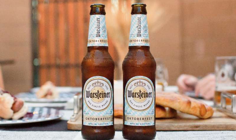
The Warsteiner logo is a round emblem featuring Gothic-style lettering of the brand name, topped by a golden crown and framed within a circular gold border. Introduced alongside the brewery’s founding in 1753 and refined most recently in 2016, it uses a custom typeface close to Killviners Regular. The crown symbolizes the beer’s royal quality claim, while the gold and black palette signals premium positioning.
Here’s how it breaks down:
- Design Type: Combination mark (emblem with wordmark and pictorial elements)
- Primary Elements: Crown icon, Gothic-style wordmark, circular gold frame, founding year “1753,” and the slogan “Das Einzig Wahre” (The One and Only)
- Official Introduction Date: The original emblem dates to 1753. The current version launched in 2016.
- Designer/Agency: Not publicly attributed to a specific external agency. The 2015 U.S. rebrand was managed internally through Warsteiner’s brand team.
- Trademark Status: Registered trademark. Legally protected across international markets.
- Color Palette: Gold (#C5A644 approximate), Black (#000000), White (#FFFFFF)
- Usage Context: Bottle labels, can packaging design, tap handles, advertising, merchandise, and digital platforms
How Has the Warsteiner Logo Evolved Over Time?

Warsteiner’s logo has gone through three main phases since 1753. Each version kept the circular frame and crown but gradually stripped away ornamental clutter.
The shift went from heavy lighting effects and white lettering to a cleaner, bolder approach with black text and sharper gradients. Took me a while to notice, actually, because the changes are subtle if you’re not looking side by side.
Original Warsteiner Logo (1753 to 2013)
- Years Active: 1753 – 2013
- Design Description: A white/beige circular badge with a wide golden ring. Inside, a solid gold circle held the “Warsteiner” name in white Gothic lettering with a thin contrasting border. The elongated “s” acted as a visual anchor. Around the name, the phrase “die Königin unter den Bieren” (the queen among beers) ran in a ring. A golden crown sat on top.
- Color Scheme: Gold, white, black accents
- Designer: Unknown (in-house, likely)
- Context: This logo carried the brewery through its expansion from a small Westphalian operation to Germany’s largest private brewery. It was the mark people saw when Warsteiner started exporting to the U.S. and Canada in 1980.
- Cultural Significance: The heavy gold and crown imagery positioned Warsteiner firmly in the premium segment. During a period when German print advertising still dominated, this emblem needed to look good in newspapers and on glass bottles alike.
Transitional Warsteiner Logo (2013 to 2016)
- Years Active: 2013 – 2016
- Design Description: The golden frame got thinner. Much of the glossy lighting effects were removed. The wordmark became larger inside the circle. The crown moved directly on top of the central circle rather than floating above it. The year “1753” appeared in gold at the bottom. Hop cones and a leaf were added briefly.
- Color Scheme: More muted gold with patina-like tones, black, white
- Key Changes from Previous: The accent shifted from the elongated “s” to the letter “t,” which was stretched vertically with an obliquely cut top bar. The “queen among beers” tagline was still present but less prominent.
- Context: This version was a bridge. The beer market was getting more competitive, and younger drinkers weren’t connecting with the ornate old design. Warsteiner needed something that worked on screens, not just glass.
Current Warsteiner Logo (2016 to Present)
- Years Active: 2016 – present
- Design Description: The name now appears in black Gothic lettering (previously white). The gold frame returned to a wider width with a strong metallic sheen and more distinct gradient treatment. The bar on the “t” was reduced. The dot above the “i” became a rhombus shape. The founding year “1753” flanks both sides of the crown. The slogan “Das Einzig Wahre” (The One and Only) replaced the old queen tagline at the bottom.
- Color Scheme: Metallic gold, black, white
- Key Changes from Previous: Black lettering replaced white for better readability. The “Queen among Beers” tag was removed entirely from the round mark. The overall feel became sharper and more digital-friendly.
- Cultural Significance: This redesign coincided with Warsteiner’s push into the U.S. market with new packaging. The brand explicitly said the refresh was aimed at millennial beer drinkers who were embracing the product.
What Do the Design Elements of the Warsteiner Logo Mean?
Every piece of the Warsteiner logo ties back to the brewery’s identity as a centuries-old, premium German pilsner brand. The crown is the most obvious signal. It’s a direct reference to the brand’s former tagline, calling the beer a “queen among beers.”
But there’s more going on. The circular frame itself acts as a seal of authenticity. You see this shape psychology in a lot of European brewery marks. Circles suggest completeness and tradition.
Why Did Warsteiner Choose These Specific Colors?

Gold is doing the heavy lifting here. It’s the dominant hue across the entire emblem, and there’s a reason for that.
The color palette breaks down like this:
- Gold (#C5A644 approximate): Represents premium quality and the beer’s golden color. In color psychology, gold triggers associations with wealth, achievement, and craftsmanship. For a pilsner brand, it also mirrors the literal color of the product in the glass.
- Black (#000000): Provides contrast and grounding. Black against gold reads as sophisticated without trying too hard. It’s the color of the lettering in the current version, which made the name far more legible than the old white-on-gold approach.
- White (#FFFFFF): Used in background elements and spacing. Functions as breathing room within the circular composition. In the earlier versions, white was the primary text color.
Together, it’s a classic tricolor that you’d see on a lot of gold-toned logos. The combination avoids looking cheap, which is exactly the point when you’re selling a product built on 270 years of tradition.
What Typography Style Is Used in the Warsteiner Logo?

The typeface is custom, but it’s rooted in Gothic blackletter traditions. The closest commercial matches are Killviners Regular or Byzantus Regular, though both would need significant modifications to replicate the exact letterforms.
The characters are bold with narrow proportions. There’s a heaviness to each glyph that feels deliberate, almost like each letter was carved rather than drawn.
One thing worth noting: the letter spacing is tight. The words compress within the circular frame, which gives the whole mark a dense, compact look. The surrounding circular text (the slogan) uses a simpler grotesque face for readability at smaller sizes.
What Are the Hidden Meanings in the Warsteiner Logo?
The stretched “t” in the current version is probably the most interesting detail. In the original logo, the elongated “s” was the visual anchor. When the redesign happened, that role shifted to the “t” with its vertically extended stroke.
Why? The old German-style long “s” looked dated. The “t” extension keeps that vertical accent alive without relying on archaic letterforms.
The rhombus-shaped dot over the “i” is another quiet choice. It replaced a standard oblique stroke and adds a geometric sharpness. And the crown flanked by “17” and “53” frames the founding year as something almost heraldic. That reads less like marketing and more like a family crest.
How Does the Warsteiner Logo Compare to Competitor Logos?
German pilsner branding has a certain look. Circular badges, crowns, crests, lots of gold. Warsteiner sits right in the middle of that tradition, but a few things set it apart from competitors like Krombacher, Bitburger, Veltins, and Beck’s.
Krombacher leans harder into nature imagery with its “Pearl of Nature” positioning. The Carlsberg logo uses a completely different approach with its hop leaf and green palette. Beck’s went in a totally opposite direction with its red key symbol on a green bottle, which is more abstract and modern.
Bitburger keeps things cleaner with a simpler blue-and-white shield. The Heineken logo is another useful comparison. It uses a red star and green backdrop, nothing like Warsteiner’s ornate gold emblem.
Where Warsteiner stands out is in how much it leans into the “old money” aesthetic. Most competitors have modernized more aggressively. Warsteiner’s Gothic lettering and crown make it look like something that belongs in a museum display case (and I mean that as a compliment). The Guinness logo takes a similar approach with its harp and traditional type, so there’s precedent for this working at a global scale.
Among other Stella Artois and Budweiser type premium brands, Warsteiner’s mark feels less corporate and more heritage-driven.
What Are the Technical Specifications of the Warsteiner Logo?
Official Color Codes
- Primary Color: Gold
- Hex: #C5A644 (approximate)
- RGB: (197, 166, 68)
- CMYK: (0, 16, 65, 23)
- Pantone: Closest match is Pantone 117 C
- Secondary Color: Black
- Hex: #000000
- RGB: (0, 0, 0)
- CMYK: (0, 0, 0, 100)
- Tertiary Color: White
- Hex: #FFFFFF
- RGB: (255, 255, 255)
- CMYK: (0, 0, 0, 0)
Dimensions and Proportions
The logo is roughly a 1:1 aspect ratio thanks to its circular form. The crown extends slightly above the circle, making the full mark closer to 1:1.15 when including the crown element.
Minimum size requirements aren’t publicly documented in detail, but given the fine Gothic lettering, anything below about 25mm in diameter starts losing legibility on the name. The surrounding slogan text would need even more room.
Clear space around the emblem generally follows the width of the gold border ring as a buffer zone. This keeps the logo from getting crowded by other design elements on packaging or ads.
For digital use, vector graphic formats (SVG, AI, EPS) are available through various logo libraries. The gradient in the gold requires careful handling when converting to flat color for single-color print applications.
What Cultural Impact Has the Warsteiner Logo Had?

Warsteiner’s emblem has become one of the more recognizable German beer marks outside of Europe. It appears at the Warsteiner International Montgolfiade, Europe’s largest hot air balloon festival, which the brand sponsors. That’s millions of eyeballs on the crown-and-circle mark every year.
In Germany, the brand’s slogan “Das Einzig Wahre” tested at 62% correct attribution in brand recall studies. That’s high. It means more than six out of ten people can match the slogan to the logo without prompting.
The mark also shows up in sports sponsorships and music events across Germany. Its presence at Oktoberfest, where Warsteiner has been an official partner for decades, has kept the emblem visible in a context where most people are actively looking at beer labels. And over 3 million casks sell annually, so the logo gets a lot of physical distribution too.
How Does the Warsteiner Logo Fit Into the Overall Brand Identity?
The logo is the anchor point. Everything else in Warsteiner’s visual system connects back to it.
The gold and black brand style runs through all packaging. The Premium German Pilsener cans use metallic gold finishes with prominent black accents. The Dunkel line shifts to amber tones but keeps the same crown mark.
Warsteiner’s brand guidelines maintain unity across products by treating the round emblem as a constant while adjusting surrounding elements per sub-brand. The logo works on glass bottles, aluminum cans, tap handles, coasters, and digital banners without losing its core structure.
It’s a system built on repetition. The same circle, the same crown, the same lettering. Across 60+ export countries, the mark stays consistent with only minor regional adaptations.
How Should the Warsteiner Logo Be Used?
The Warsteiner logo is a registered trademark. That means you can’t just grab it off Google Images and slap it on your homebrew label. There are rules.
Do’s:
- Use official logo files provided by Warsteiner’s brand or press team
- Maintain the specified clear space around the emblem
- Reproduce in approved color configurations (full color, single-color gold, or black-and-white)
- Keep the crown and wordmark together as a unit
Don’ts:
- Stretch, rotate, or distort the circular proportions
- Change the logo colors outside of approved variants
- Separate the crown from the circular emblem
- Place the logo on backgrounds that compromise readability
- Use the logo to imply endorsement without written permission
For official logo downloads, Warsteiner’s press portal and various brand asset libraries carry vector and raster versions. If you’re a distributor or partner, requests go through Warsteiner’s marketing team directly.
Unauthorized commercial use will get you a cease-and-desist. The Cramer family has kept tight control over this brand for 270+ years. They’re not about to stop now.
FAQ on The Warsteiner Logo
What does the Warsteiner logo look like?
It’s a circular gold emblem with Gothic-style black lettering spelling “Warsteiner.” A crown sits on top. The founding year 1753 flanks the crown, and the slogan “Das Einzig Wahre” runs along the bottom.
Think old German brewery meets serif font tradition. Very deliberate.
What does the crown in the Warsteiner logo mean?
The crown references the brand’s original tagline, “die Königin unter den Bieren,” which translates to “the queen among beers.” It signals premium quality.
Warsteiner Brauerei dropped the tagline in 2016. But the crown stayed. Some symbols just work too well to remove.
When was the Warsteiner logo first created?
The original emblem dates back to 1753, when Antonius Cramer founded the brewery in Warstein, North Rhine-Westphalia. No exact design date exists, but the circular badge format has been there from early on.
Has the Warsteiner logo changed over time?
Yes. Three main versions. The original ran until 2013, a transitional version lasted from 2013 to 2016, and the current mark launched in 2016 with black lettering and a cleaner gold frame.
Each version kept the symmetry and crown.
What font is used in the Warsteiner logo?
It’s a custom typography style based on Gothic blackletter traditions. The closest commercial matches are Killviners Regular and Byzantus Regular, both with heavy modifications.
The circular slogan text uses a separate grotesque face for legibility.
What colors are in the Warsteiner logo?
Gold, black, and white. The gold carries a metallic saturation that mimics real metal. Black handles the wordmark. White fills background space within the emblem.
A classic tricolor for premium German pilsner branding.
Why did Warsteiner redesign its logo in 2016?
The brewery wanted to reach younger drinkers. The old Gothic “s” looked dated on digital screens, so the emphasis shifted to a stretched “t” instead. They also removed the “Queen among Beers” tagline for cleaner readability.
Is the Warsteiner logo trademarked?
Yes. It’s a registered trademark protected across international markets. The Cramer family has owned and controlled the Warsteiner brand identity since 1753. Unauthorized commercial use will get flagged fast.
How does the Warsteiner logo compare to other German beer logos?
Most German pilsner brands use crests or shields. Warsteiner’s circular emblem with Gothic lettering leans harder into heritage than competitors like Krombacher, Bitburger, or Corona.
It’s less modern, more “old money.” And that’s by design.
Where can I download the official Warsteiner logo?
Vector and raster files are available through brand asset libraries and Warsteiner’s press portal. Formats include SVG, AI, EPS, and PNG. For commercial use, you’ll need direct permission from the Warsteiner marketing team.
Conclusion
The Warsteiner logo has held its ground for over 270 years. Not many brewery emblems can say that. From its original Gothic wordmark to the current streamlined version, every update respected what came before while pushing toward better visual hierarchy and modern readability.
The gold, black, and white color scheme still works. The crown still communicates premium positioning without a single word of explanation.
For a family-owned German pilsner brand competing against massive corporate breweries, that kind of visual consistency is worth more than any rebrand could deliver. The Cramer family clearly knows when to refine and when to leave things alone.

Renowned for his expertise in logo design and visual branding, Bogdan has developed a multitude of logos for various clients.
His skills extend to creating posters, vector illustrations, business cards, and brochures. Additionally, Bogdan's UI kits were featured on marketplaces like Visual Hierarchy and UI8.
He also wrote in the past years on sites like Design Your Way, WebDesignerDepot, WPDean, Designmodo, Speckyboy, Slider Revolution, and more.
- Jujutsu Kaisen Font Generator - 12 October 2026
- The Windsurf Logo History, Colors, Font, And Meaning - 10 October 2026
- How to Remove Background From Product Photos (No Photoshop) - 10 October 2026

Bogdan Sandu is a seasoned designer who has been designing websites since 2008. Renowned for his expertise in logo design and visual branding, Bogdan has developed a multitude of logos for various clients. His skills extend to creating posters, vector illustrations, business cards, and brochures. Additionally, Bogdan's UI kits were featured on marketplaces like Visual Hierarchy and UI8. He also wrote in the past years on sites like Design Your Way, WebDesignerDepot, WPDean, Designmodo, Speckyboy, Slider Revolution, and more.
You Might Also Like