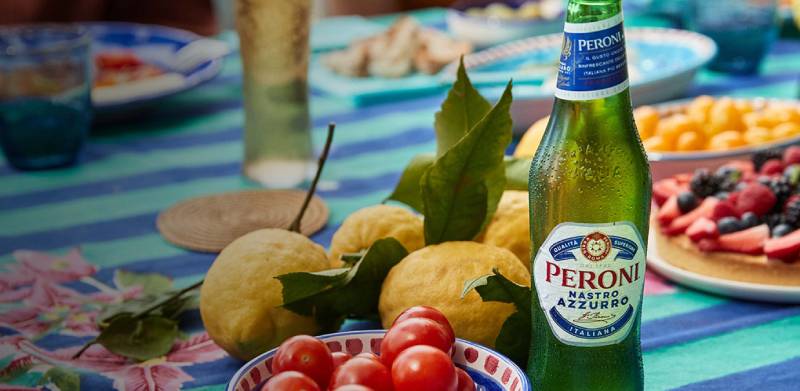
The Peroni logo is one of those marks that immediately tells you something about where a beer comes from. Before you even read the label, the colors and crest pull you toward Italy. Founded in 1846 by Francesco Peroni in Vigevano, Lombardy, the brand has been through multiple ownership changes, design refreshes, and global expansions. The logo sitting on bottles today looks nothing like the one from the 1900s. And that’s the point. It grew up alongside the company.
Birra Peroni currently operates under Asahi Group Holdings after being acquired from SABMiller in 2016. The brand’s visual identity has gone through at least six major redesigns across nearly 180 years. The most recent overhaul, handled by Milan-based agency Smith Lumen around 2024, stripped things back significantly. Deep red replaced the old primary color scheme, the serif typeface was swapped for something closer to mid-century Italian poster lettering, and the blue ribbon that once wrapped around the wordmark is now gone.
What Is the Peroni Logo?

The Peroni logo is a combination mark featuring a custom wordmark set inside a gold-bordered frame, topped by a heritage crest displaying the founding year 1846 and an alchemy symbol from the original Birra Peroni emblem. It was most recently redesigned by Smith Lumen in Milan. The mark signals premium Italian brewing heritage and craftsmanship.
Here’s what defines the current version:
- Design Type: Combination mark (wordmark plus crest emblem)
- Primary Elements: Custom “PERONI” wordmark in bold lettering, gold rectangular border, heritage crest with alchemy symbol, and the “1846” founding date split across the seal
- Official Introduction Date: The current redesign rolled out in 2024, marking Peroni’s 175+ year anniversary refresh
- Designer/Agency: Smith Lumen, a Milan-based creative agency specializing in drink branding and packaging design
- Trademark Status: Registered trademark owned by Birra Peroni S.r.l., a subsidiary of Asahi Group Holdings
- Color Palette: Deep red (profondo rosso), gold, white, and dark navy as an accent on select product lines
- Usage Context: Bottles, cans, draft tap handles, glassware engravings, marketing campaigns, bar signage, and digital platforms worldwide
How Has the Peroni Logo Evolved Over Time?
The Peroni logo has been redesigned roughly six times since the brewery’s founding in 1846. Each version tracked changes in Italian culture, ownership shifts, and the beer market’s competitive pressures. The path runs from ornate Victorian-era medals and crests to today’s stripped-back, confident wordmark.
The Original Peroni Emblem (1846 to Early 1900s)
Francesco Peroni started his brewery in Vigevano with a small pub attached. Back then, branding looked nothing like what we’d recognize today.
The earliest known mark appeared on a letterhead from 1901. It featured a six-pointed star with a beer mug at the center and the words “Peroni Roma” wrapped around it. Medals and award symbols surrounded the composition, which was typical for the era.
There were no strict graphic rules. The color palette was mostly black ink on paper. This was before consistent brand identity systems existed, so variations popped up on different materials.
The founding date and Roman connection already mattered, though. Even in those early marks, you could see the brewery tying itself to Rome and its heritage.
The Shield and Eagle Era (1930s to 1950s)
By the 1930s, Peroni’s logo grew more structured. A thick frame contained the words “Birra Peroni Roma” alongside a shield bearing an eagle.
Some versions included a crown, referencing Peroni’s status as a supplier to the Italian Royal House. Without binding graphic rules, several logo-signatures coexisted on enamel plates and signage during this period.
After World War II, the famous red gold cap became a symbol for the company. The lettering shifted to Gothic characters in the 1950s, taking cues from traditional German beer label conventions. This was a common choice across European breweries at the time, borrowing credibility from Germany’s long brewing tradition.
The “Blonde Peroni” Advertising Era (1960s to 1970s)
The 1960s changed everything for Italian consumer brands. Peroni rode the country’s economic boom hard.
The iconic “blonde Peroni” advertising campaigns, created by Armando Testa’s agency through the legendary Caroselli TV spots (1967 to 1977), turned the brand into a household name. The logo during this period settled into a more standardized form, though it still carried heavy ornamentation.
Nastro Azzurro launched in 1963 as the premium line, named after the Blue Riband award won by the Italian ocean liner SS Rex in 1933. The blue ribbon became a permanent fixture in the design elements of the brand’s visual identity from this point forward.
The Modernized Crest (1970s to 2005)
The bird-in-flight logo introduced in the 1934 redesign was eventually replaced in the 1970s with a cleaner version. The crest was simplified but retained its Italian references.
Red, white, and blue became the definitive Peroni colors. The wordmark settled into a serif typeface that would stick around for decades. Gold accents were introduced to push the premium positioning.
This version carried Peroni through its expansion into over 50 countries and the SABMiller acquisition in 2005.
The Nude Brand Creation Refresh (2018)
The 2018 redesign was the most significant update since 2005. Nude Brand Creation, working closely with the Peroni team, visited the Birra Peroni brewery in Rome and dug through the archives before touching anything.
The updated wordmark drew from traditional Italian font styles and referenced the original 1963 Nastro Azzurro lettering. The Peroni Amaretti (the decorative elements around the logo) were refined. Rome’s provenance was reintroduced, and the 1846 date was linked to the brewery crest.
The alchemy symbol from the original Peroni bottles returned to the crest center. Giovanni Peroni’s signature was given more prominence on bottle engravings. The hexagonal label shape was inspired by the original Birra Peroni crest.
The Smith Lumen Redesign (2024 to Present)
For its 175th anniversary, Peroni handed the keys to Smith Lumen in Milan. This one was a bigger departure.
The serif typeface was dropped entirely. The new wordmark uses a style that feels closer to mid-century Italian liquor poster typography. Bold, confident, and much less ornate than what came before.
The blue ribbon, which had been a signature visual for decades, was removed from the main packaging. The wordmark now sits inside a gold box on a deep red background. Primary colors were replaced with more neutral, timeless tones.
The green bottles were kept only for Peroni’s Chill Lemon variant. Everything else shifted to the new profondo rosso palette. It’s a big move, but the goal was clearly longevity over trendiness.
What Do the Design Elements of the Peroni Logo Mean?
Every part of the Peroni logo connects back to the brewery’s Italian roots, its Roman heritage, and the premium positioning it’s maintained since the 1960s. The crest, colors, and letterforms all serve a specific purpose.
The alchemy symbol at the crest’s center comes from the very first Peroni bottles. It references the craft of brewing itself. The 1846 date anchors the brand’s age. The signature of Giovanni Peroni, engraved on modern bottles, reinforces a family legacy.
Why Did Peroni Choose These Specific Colors?

The classic Peroni color scheme used red, white, and blue, a direct nod to Italian national identity. The psychology behind these color choices runs deep.
Red signals energy and passion. It connects to Italian culture and food traditions. In the latest redesign, the deep “profondo rosso” red became the dominant brand color. It reads as premium and mature.
Blue, historically used through the Nastro Azzurro ribbon, represented the Blue Riband nautical heritage. The name literally translates to “Blue Ribbon.” Its presence tied the brand to the story of the SS Rex ocean liner.
Gold was always there as an accent. It communicates quality and a higher price point. In the 2024 redesign, gold took on a bigger role as the border framing the wordmark.
White provided contrast and readability. It also suggested purity and clean brewing standards.
The official hex codes for the classic Peroni Brewery palette include Valentine Red (#E42849), Intense Cobalt Blue (#002374), Golden Warp (#C7AF71), and Acorn Green (#795E17). The Peroni US variant uses Congress Blue (#023E84), Tangaroa (#031C47), and White (#FFFFFF).
What Typography Style Is Used in the Peroni Logo?
Peroni uses a custom typeface. It’s not pulled from any public font library. The current version replaced the long-standing serif font with a bolder style inspired by mid-century Italian advertising posters.
The previous serif had been part of the brand identity for decades. It was refined, traditional, and aligned with Peroni’s European heritage positioning. But it also felt stuck in time.
Smith Lumen’s newer letterforms have more weight and character. They project confidence without losing the Italian feel. The kerning is tight but readable, and the overall impression lands somewhere between authoritative and approachable.
What Are the Hidden Meanings in the Peroni Logo?
The hexagonal label shape on the 2018 bottles wasn’t random. It came from the geometric center of the original Birra Peroni crest. Most people wouldn’t notice that connection unless someone pointed it out.
The alchemy symbol buried in the crest references a pre-industrial view of brewing as a kind of transformation, turning raw ingredients into something greater. That’s a neat touch.
The hand-drawn maize icon introduced in the 2018 refresh highlighted the Nostrano dell’Isola corn used in brewing, tying the visual identity directly to ingredient quality. The engraved Giovanni Peroni signature on the bottle glass isn’t printed. It’s physically cut into the glass surface.
How Does the Peroni Logo Compare to Competitor Logos?
Peroni sits in the premium European lager space alongside Heineken, Stella Artois, Carlsberg, and Corona. Each brand takes a different visual approach, and the differences say a lot about market positioning.
Heineken keeps things tight with its green and red star mark. Clean, recognizable, and unchanged for years. The brand leans on that consistency. But there’s nothing about the Heineken logo that screams “origin story.” It’s just efficient.
Stella Artois goes heavy on heritage with its horn and star crest dating back centuries. The chalice imagery reinforces its premium self-image. But Stella’s branding has drifted in recent years, moving away from its European roots in U.S. marketing, using NFL players and generic urban settings.
Peroni chose the opposite direction. Every recent redesign doubled down on Italian identity. Rome. The founding date. The family signature. While competitors softened their European credentials to go mainstream, Peroni kept pushing its provenance harder.
Look at the broader landscape of beer logos and you’ll see a trend: premium lagers are either stripping back (like Peroni’s 2024 refresh) or adding craft-style complexity. Peroni’s bet on simplicity with heritage depth is a clear strategic move against both directions.
What Are the Technical Specifications of the Peroni Logo?
Official Color Codes
- Primary Red (Valentine): Hex #E42849, RGB (228, 40, 73)
- Deep Blue (Intense Cobalt): Hex #002374, RGB (0, 35, 116), CMYK (98, 53, 0, 48)
- Gold (Golden Warp): Hex #C7AF71, RGB (199, 175, 113)
- Dark Gold (Acorn Green): Hex #795E17, RGB (121, 94, 23)
- Congress Blue (US variant): Hex #023E84, RGB (2, 62, 132)
- Deep Navy (Tangaroa): Hex #031C47, RGB (3, 28, 71)
- White: Hex #FFFFFF, RGB (255, 255, 255)
Dimensions and Proportions
Peroni maintains strict brand guidelines governing how the logo appears across different surfaces. The wordmark has a fixed aspect ratio that should not be distorted. Clear space requirements exist around the mark to prevent visual crowding.
Minimum size specifications ensure the logo remains legible at small scales, particularly on can and bottle neck labels. The crest element above the wordmark has its own proportional relationship to the text below it.
For digital use, the logo is available in vector graphics formats (SVG, AI, EPS) to maintain sharpness at any resolution. Pixel-based versions in PNG format are provided for web and social media at multiple resolution tiers.
What Cultural Impact Has the Peroni Logo Had?
The Daily Telegraph once listed Peroni alongside Gucci and Ferrari as a top Italian icon. That’s not nothing. The logo played a direct role in building that perception, especially outside Italy.
In the UK, where Peroni Nastro Azzurro launched over a decade ago, the brand’s visual identity helped reposition Italian beer from a niche import to a mainstream premium choice. The elegant bottle, the crest, the blue ribbon, all of it communicated “this is not just another lager.”
Peroni’s House of Peroni initiative, which later became a platform supporting emerging fashion talent, used the logo as its anchor point. The mark translated cleanly from beer labels to fashion studio settings, gallery events, and style-focused marketing.
The original Peroni brewery in Rome was even transformed into the Museum of Contemporary Art of Rome (MACRO) in 2002. The brand’s visual legacy literally lives inside a cultural institution now.
How Does the Peroni Logo Fit Into the Overall Brand Identity?
The logo doesn’t work alone. It’s one piece of a system that includes bottle shape, glassware design, the Giovanni Peroni signature engraving, the Birra Peroni barrel stamp, and specific approaches to print and advertising photography.
Peroni’s brand style guide ties everything together. The waisted glass profile, the hexagonal base, the neck label, the ingredient iconography. Each element connects back to the same story the logo tells: Italian, premium, rooted in history, built for today.
The 2024 Smith Lumen redesign made this cohesion even tighter. By stripping out the blue ribbon and simplifying the color scheme, every touchpoint now shares the same red-and-gold DNA. The visual hierarchy is clearer. Your eye goes straight to the name.
It’s worth noting that Peroni also extended its design system to sub-brands like Peroni Cruda and Peroni Non Filtrata, where Smith Lumen adapted the brand mark with a “crafty” brushstroke treatment while keeping core recognition intact. That kind of flexibility is what separates a good logo system from a rigid one.
How Should the Peroni Logo Be Used?
Peroni’s trademark is protected and cannot be used for personal or commercial purposes without permission from Birra Peroni S.r.l. or Asahi Group Holdings. This covers everything, bottles, merchandise, event materials, digital content, all of it.
If you’re a bar, restaurant, or retailer stocking Peroni products, official brand assets are typically provided through distributor partnerships. The brand supplies approved logo files, glassware, tap handles, and point-of-sale materials that meet its guidelines.
For designers or marketers looking at the Peroni logo as a reference, vector files are available through brand asset platforms like Brandfetch and Brands of the World. But downloading and viewing for reference is different from using the mark commercially.
The key rules: don’t alter the proportions, don’t change the colors outside the approved palette, don’t remove the crest from the wordmark on materials where they’re meant to appear together, and don’t place the logo on backgrounds that reduce its legibility. Standard trademark stuff, but worth stating because people get it wrong constantly.
FAQ on The Peroni Logo
What Does the Peroni Logo Look Like?
The Peroni logo features a custom wordmark in bold lettering framed by a gold border. A heritage crest sits above it, displaying the 1846 founding date and an alchemy symbol from the original Birra Peroni emblem.
Deep red dominates the current version. Gold and white fill in the rest.
When Was the Peroni Logo First Created?
The earliest known Peroni mark appeared on an 1901 letterhead. It showed a six-pointed star with a beer mug and the words “Peroni Roma.” The brand identity has been redesigned at least six times since Francesco Peroni founded the brewery in 1846.
Who Designed the Current Peroni Logo?
Milan-based agency Smith Lumen handled the most recent redesign around 2024. They replaced the old serif with a mid-century Italian poster style.
The 2018 version before it was created by Nude Brand Creation, who worked directly with the Birra Peroni brewery team in Rome.
What Do the Colors in the Peroni Logo Mean?
Red represents Italian passion and energy. Blue referenced the Nastro Azzurro “Blue Ribbon” heritage tied to the SS Rex ocean liner. Gold signals premium quality.
The 2024 refresh shifted toward a deep “profondo rosso” red as the primary brand color, replacing the older tricolor approach.
What Font Does the Peroni Logo Use?
Peroni uses a custom typeface not available in any public font library. The current lettering draws from mid-century Italian liquor advertising styles.
Previous versions used a traditional serif. The switch gave the beer brand identity more boldness and shelf presence.
Has the Peroni Logo Changed Over the Years?
Yes. Multiple times. From Victorian-era medal compositions to Gothic lettering in the 1950s, then a standardized crest through the 2000s. The most recent logo evolution stripped away the iconic blue ribbon entirely.
Each change tracked shifts in the Italian beer market and ownership structure.
What Is the Blue Ribbon in the Peroni Logo?
The blue ribbon represented “Nastro Azzurro,” meaning Blue Ribbon in Italian. It honored the SS Rex, an ocean liner that won the Blue Riband for fastest Atlantic crossing in 1933.
Smith Lumen removed it from the main packaging in the 2024 redesign. Some fans still miss it.
Is the Peroni Logo Trademarked?
Absolutely. The logo is a registered trademark owned by Birra Peroni S.r.l., a subsidiary of Asahi Group Holdings. Using it commercially without permission violates trademark law.
This covers bottles, merchandise, event materials, and digital content. No exceptions.
What Is the Symbol at the Center of the Peroni Crest?
It’s an alchemy symbol pulled from the very first Peroni bottles. It references brewing as a transformative craft, turning raw ingredients into something refined.
Nude Brand Creation reintroduced this element during the 2018 brand renovation after finding it in the brewery archives.
Where Can I Download the Official Peroni Logo?
Official Peroni brand assets are available through platforms like Brandfetch and Brands of the World in vector and PNG formats. These are for reference only.
Commercial use requires direct authorization from Birra Peroni or Asahi Group Holdings. Bars and retailers receive approved materials through distributor partnerships.
Conclusion
The Peroni logo has tracked nearly 180 years of Italian brewing history, from hand-drawn letterheads in Vigevano to a sleek gold-framed wordmark built for global shelves. Each redesign reflected something real, whether it was a shift in ownership, a new competitive pressure, or a changing consumer base.
What makes it stick is the commitment to provenance. The 1846 date, the Roman heritage, Giovanni Peroni’s signature. These aren’t decorative. They’re strategic.
Smith Lumen’s latest version bets on premium beer branding through restraint rather than ornamentation. Whether dropping the blue ribbon pays off long-term is still an open question.
But the direction is clear. Fewer elements, stronger presence, deeper roots.

Renowned for his expertise in logo design and visual branding, Bogdan has developed a multitude of logos for various clients.
His skills extend to creating posters, vector illustrations, business cards, and brochures. Additionally, Bogdan's UI kits were featured on marketplaces like Visual Hierarchy and UI8.
He also wrote in the past years on sites like Design Your Way, WebDesignerDepot, WPDean, Designmodo, Speckyboy, Slider Revolution, and more.
- Canva vs PowerPoint: Which Is Better for Presentations? - 22 September 2026
- How to Install Fonts on Mac (Step-by-Step Guide) - 20 September 2026
- From Mockup to Code: How AI-Augmented Development Speeds Up the Design Handoff - 19 September 2026

Bogdan Sandu is a seasoned designer who has been designing websites since 2008. Renowned for his expertise in logo design and visual branding, Bogdan has developed a multitude of logos for various clients. His skills extend to creating posters, vector illustrations, business cards, and brochures. Additionally, Bogdan's UI kits were featured on marketplaces like Visual Hierarchy and UI8. He also wrote in the past years on sites like Design Your Way, WebDesignerDepot, WPDean, Designmodo, Speckyboy, Slider Revolution, and more.
You Might Also Like