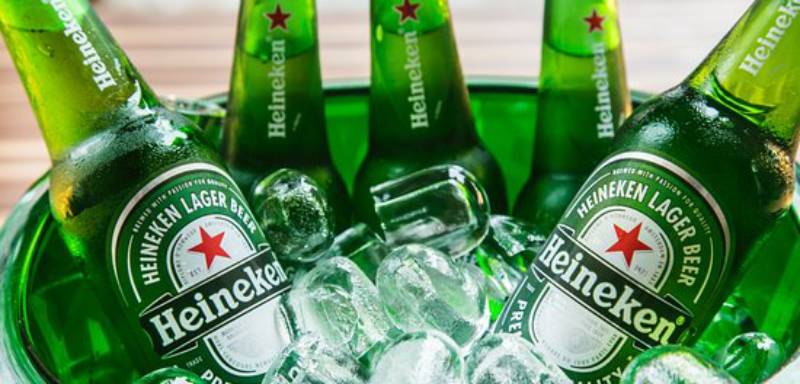
The Heineken logo is one of the most recognized brand marks in the global beer industry. A green wordmark paired with a red five-pointed star, it sits on bottles, cans, billboards, and bar signs in over 190 countries.
Heineken N.V., founded by Gerard Adriaan Heineken in 1864 in Amsterdam, built this visual identity over more than 160 years. The current version of the logo, introduced in 1991, stripped away decades of ornate oval labels and award inscriptions to leave behind just the name and the star.
The brand has gone through roughly 10 major logo iterations since the 1880s. Alfred Henry “Freddy” Heineken, grandson of the founder, is widely credited with shaping the modern logo during his time as CEO. He pushed for friendlier letterforms and oversaw the creation of the now-famous “smiling e” that tilts slightly backward in the wordmark.
What Is the Heineken Logo?

The Heineken logo is a combination mark featuring a custom green wordmark with three tilted letter “e”s and a red five-pointed star positioned above or beside the text. It was refined into its current form in 1991 by Heineken’s in-house design team, with the star symbolizing a medieval brewer’s mark tied to the craft of beer-making.
Here’s a breakdown of the key attributes:
- Design Type: Combination mark (wordmark plus symbol)
- Primary Elements: Custom serif wordmark with the “smiling e,” a red five-pointed star, and the registered trademark symbol
- Official Introduction Date: The current simplified version launched in 1991. The original oval label first appeared in 1884.
- Designer/Agency: Freddy Heineken directed the visual identity for decades. The design firm Eden developed the corporate font based on the Horizon typeface. LucasFonts later refined the Heineken Serif, Sans, and Hybrid typeface families around 1999-2000.
- Trademark Status: Registered globally by Heineken Brouwerijen B.V. Multiple active U.S. trademark registrations exist, including Registration Number 5911201 (filed 2018, registered 2019) covering beers and non-alcoholic beverages. Colors green, red, grey, and white are claimed as features of the mark.
- Color Palette: Heineken Green (#008200), Heineken Corporate Green (#205527), Heineken Red (#FF2B00), and Heineken Silver (#C3C3C3)
- Usage Context: Beer bottles, cans, tap handles, bar signage, neon signs, merchandise, digital advertising, sponsorship materials (UEFA Champions League, Formula 1), and the Heineken Experience museum in Amsterdam
How Has the Heineken Logo Evolved Over Time?

The Heineken logo started as a detailed, word-heavy oval label in the 1880s and went through roughly a century of gradual simplification before arriving at the clean wordmark-and-star combo we see today.
Green has been the primary color for most of its history. The star, the black ribbon, and the oval shape were constant features for over 100 years before the 1991 redesign stripped them all back.
Original Heineken Logo (1864-1883)
The very first Heineken emblem was created when Gerard Adriaan Heineken purchased the De Hooiberg brewery in Amsterdam. No surviving copies exist.
What we know is this: it featured a blue oval badge with an illustration of the brewery building in the center. The company’s full name ran around the border in white uppercase letters.
A second early version swapped in a red oval ring with beige coloring. The brewery illustration was removed, “Heineken’s” appeared in the middle, and coat-of-arms shields flanked the sides.
These were product labels more than brand logos. They looked like what you’d expect from a 19th-century Dutch brewery, lots of text, lots of detail.
The First Oval Logo (1884-1889)
This is the oldest logo we can actually see. It introduced the oval shape with a thick green frame and white outline that would define Heineken’s visual identity for the next century.
A black horizontal ribbon cut across the center with “PILSENER BIER” in white uppercase. Above it sat a five-pointed star (not yet red). Below, a fine green ornament filled the space.
The green border carried the text “HEINEKEN’S AMSTERDAM-ROTTERDAM.” Green was chosen around this era because Gerard Heineken wanted his bottles to stand out from the typical brown beer bottles of the time.
This is where the DNA of the Heineken brand identity really began taking shape.
Award-Decorated Logo (1889-1930)
Heineken had won multiple awards by this point, and the logo had to show them off. The redesign added red inscriptions including “GRAND PRIX PARIS 1889” and medal imagery.
The green became darker and more intense. Red elements started creeping in. Two medal illustrations replaced the ornamental design at the bottom.
This version set the stage for the brand’s signature green-and-red color palette that persists today.
Dual Logo Era: Dutch and International (1930-1951)
Something interesting happened here. Heineken started running two different logos at the same time.
The Dutch market version used a vertical rectangle with rounded corners. A large red star sat in the center, flanked by coats of arms. “HEINEKEN’S,” “PILSENER,” and “BIER” were written across the star.
The international version kept the oval format but added “BREWED IN HOLLAND” to the black ribbon. The star was now clearly red.
This dual approach lasted until 1954. It’s a good reminder that global brands didn’t always look the same everywhere.
Post-War Revision (1951-1954)
The red star became white. That was the big change here, and it wasn’t about aesthetics.
After World War II, Heineken wanted to avoid any connection to communism and the Soviet red star. The green got brighter. The bottom section with award inscriptions became more ornate.
The company added a lengthy text running along the white border, almost like they were trying to fit the entire brand story onto the label. This was peak information density for the Heineken logo.
The Freddy Heineken Era (1954-1974)
This is where things got interesting, design-wise.
In 1954, the oval logo was updated with “Heineken” on the black ribbon, switching from all-caps to mixed case for the first time. And here’s the detail that changed everything: Freddy Heineken introduced the “smiling e.”
He tilted the crossbar of each lowercase “e” slightly upward, making the letters look like they were grinning. It sounds small. It wasn’t. That one tweak gave the entire wordmark a friendly, approachable character that still defines it today.
The black lines and borders shifted to red, and the label started using just “Heineken” instead of “Heineken’s.”
Refined Classic (1974-1991)
The 1974 update brought the green wordmark we recognize now. The brand’s name appeared in a custom serif typeface with soft, mildly bold letterforms outside of the oval label context.
The oval label itself got cleaner, with more distinct lines and shapes. The green settled into its signature shade. The black ribbon was slightly extended, lettering enlarged. Red elements were pulled back, giving the name more room to breathe.
Two official logos were now in play: the detailed oval for packaging, and the clean green wordmark with the red star for broader use.
Modern Heineken Logo (1991-Present)
Everything changed. The oval was gone. The awards, the medals, the ornate borders, all removed.
What remained: the green wordmark with the smiling e’s, and the red five-pointed star. That’s it. Sometimes the star appears above the name, sometimes to the left. Sometimes only the wordmark is used. But the core identity was now reduced to its two strongest elements.
The design firm Eden later developed the Heineken Serif corporate font based on the Horizon typeface, with that characteristic beveled “e.” LucasFonts refined it further around 1999-2000 into a full type family.
Sub-brand logos followed the same structure: Heineken 0.0 uses blue instead of red for the star, Heineken Light uses white. But the wordmark stays consistent across all of them.
What Do the Design Elements of the Heineken Logo Mean?
Every piece of the Heineken logo carries a specific reference, from the star’s medieval origins to the carefully angled letters.
The brand didn’t just pick a star because it looked nice. And the green isn’t random either. Each element connects back to the company’s history and brewing tradition.
Why Did Heineken Choose These Specific Colors?

The green came first and it came from a practical decision. Around 1900, Gerard Adriaan Heineken wanted his premium beer to stand out from the brown bottles that dominated the market. Green expressed the fresh, natural character of his lager.
Understanding color psychology helps explain why this worked so well. Green signals freshness, growth, and naturalness. For a beer brand promoting quality ingredients, that association was perfect.
The red came later, first appearing in the 1889 redesign. Red draws attention. It creates energy. Against the green, it provides strong contrast that makes both colors more visible.
Here are the official color codes:
- Heineken Green: Hex #008200 | RGB (0, 130, 0) | CMYK (100, 0, 100, 24) | Pantone PMS 7739 C
- Heineken Corporate Green: Hex #205527 | RGB (32, 85, 39) | CMYK (90, 0, 100, 60) | Pantone PMS 7483 C
- Heineken Red: Hex #FF2B00 | RGB (255, 43, 0) | CMYK (0, 100, 100, 0) | Pantone PMS Bright Red C
- Heineken Silver: Hex #C3C3C3 | RGB (195, 195, 195) | CMYK (0, 0, 0, 30) | Pantone PMS 877 C
The silver is mostly used in secondary applications and metallic finishes on packaging. But the green-red-white core has remained stable since 1991.
What Typography Style Is Used in the Heineken Logo?

The Heineken wordmark uses a custom serif typeface with soft, rounded characteristics. It’s not available as a public font. The brand developed it specifically for their identity.
The most distinctive feature is the tilted “e,” which Freddy Heineken introduced in the 1950s. The crossbar angles upward slightly, creating what the brand calls the “smiling e.” All three e’s in “Heineken” do this.
The typeface family was formalized around 1999-2000 when the design agency Eden and type designer Luc(as) de Groot created Heineken Serif, Heineken Sans, and Heineken Hybrid. These were custom-built for corporate communications, derived from the logo’s letterforms and the Horizon font.
The kerning is carefully tuned. The serifs have a distinctive cant. Look at the capital “H” and you’ll notice the diagonal treatment on the serif edges. These are small details, but they’re what separate a custom brand typeface from something you’d grab off Google Fonts.
What Are the Hidden Meanings in the Heineken Logo?
The red star is the big one. It’s a brewer’s star, a symbol that dates back to medieval European breweries. According to Heineken’s own brand guidelines, four points represent the natural ingredients: malted barley, water, hops, and Heineken’s unique A-yeast. The fifth point was traditionally the “unknown magic of brewing.” These days, the company says they’ve replaced the magic with craftsmanship.
The smiling e wasn’t accidental. Freddy Heineken specifically wanted the label to feel friendly and approachable, not stiff or corporate. Tilting those crossbars was his way of injecting personality into the typography.
There’s also the green bottle itself, which functions as an extension of the logo. The bottle shape, combined with the star and the wordmark, creates a three-dimensional brand mark that works even without a label.
How Does the Heineken Logo Compare to Competitor Logos?
Most beer logos lean on heritage, tradition, and craftsmanship cues. Heineken does too, but it does it with significantly less visual clutter than most competitors.
Look at the Budweiser logo with its bowtie shape and elaborate script. Or the Guinness logo with the Brian Boru harp and dense label design. The Stella Artois logo carries a horn and detailed crest imagery. The Corona logo uses a crown and stylized gothic lettering.
Heineken went the other direction. Two elements. Green name. Red star. Done.
That minimalist approach gives it a significant advantage in digital contexts, where complex logos tend to lose detail at small sizes. Meanwhile, Carlsberg has been simplifying its own identity in recent years, and Amstel (which Heineken actually owns) keeps a more traditional oval label.
The green bottle and red star combination is arguably the most instantly recognizable beer brand mark in the world. Even Coors Light and Miller Lite, which have strong identities, don’t achieve quite the same level of global recognition with their visual systems.
What Are the Technical Specifications of the Heineken Logo?
Here are the official color codes for print and digital production:
Heineken Green (Primary)
- Hex: #008200
- RGB: (0, 130, 0)
- CMYK: (100, 0, 100, 24)
- Pantone: PMS 7739 C
Heineken Corporate Green (Secondary)
- Hex: #205527
- RGB: (32, 85, 39)
- CMYK: (90, 0, 100, 60)
- Pantone: PMS 7483 C
Heineken Red
- Hex: #FF2B00
- RGB: (255, 43, 0)
- CMYK: (0, 100, 100, 0)
- Pantone: PMS Bright Red C
Heineken Silver
- Hex: #C3C3C3
- RGB: (195, 195, 195)
- CMYK: (0, 0, 0, 30)
- Pantone: PMS 877 C
According to Heineken’s 2019 brand guidelines, the logo has both horizontal and vertical orientations. The preferred application is reversed out of green (white on green background). Reversed out of black or grey is also acceptable.
For small use, when the logo appears at less than 35mm wide or is printed with rough techniques, a simplified version exists. The brand specifies minimum clear space around the logo, and logo elements (the star, the smiling e, the H) must never be used in isolation, as doing so weakens trademark protection.
The logo should not appear on background colors that conflict with the brand, such as blue or red. In those cases, a Heineken green area should isolate the logo from the surrounding color.
What Cultural Impact Has the Heineken Logo Had?

The Heineken logo is one of the few beer brand marks that works as a cultural symbol beyond the product itself. You see it on clothing, in films, at sporting events, and in bars across six continents.
Its sponsorship of the UEFA Champions League and Formula 1 racing has made the star-and-wordmark combo one of the most frequently seen brand identities in global sports. The Heineken Experience, a museum and brewery tour in Amsterdam, turns the logo into a physical, walkable brand space.
The red star has also sparked political controversy. In 2017, Hungary’s ruling party proposed banning commercial use of red stars, seen as communist symbols in the former Soviet-bloc nation. The move was widely interpreted as retaliation against Heineken following a trademark dispute. Heineken maintained the star has no political meaning and traces to medieval brewing tradition.
The “Open Your World” campaign and subsequent global advertising have turned the logo into something people associate with social connection and inclusivity, not just beer. That’s a hard thing to pull off with a two-element design.
How Does the Heineken Logo Fit Into the Overall Brand Identity?
The logo doesn’t exist alone. It’s part of a tightly controlled visual system governed by detailed brand guidelines that cover everything from bottle labels to digital advertising.
The green bottle is essentially a 3D extension of the logo. The red star cap, the label layout, the “smiling e” wordmark, they all work together as a packaging design system that’s instantly identifiable even from across a crowded bar.
Sub-brands follow the same architecture. Heineken 0.0 swaps the red star for blue. Heineken Light uses white. Heineken Silver shifts the palette accordingly. But the wordmark with the tilted e’s stays the same, providing unity across the portfolio.
The brand uses four official logos: the Brand logo (default), the Original Lager Beer logo (for product-specific use), the 0.0 logo, and the Light logo. Each has vertical and horizontal variants, plus versions for different background colors and small reproduction sizes.
What makes the system work is consistency. The Heineken brand style guide is strict about not modifying the logo in any way. You don’t rotate it, don’t change the colors, don’t separate the elements. Took me a while to appreciate how much discipline goes into keeping a 160-year-old brand looking clean and modern, but it’s clearly working. The same logo reads well on a neon sign in Tokyo and a coaster in Amsterdam.
How Should the Heineken Logo Be Used?
Heineken’s trademark guidelines leave very little room for interpretation. Here’s what matters if you’re working with the logo in any capacity:
Do:
- Use the official logo files provided by Heineken
- Apply the ® symbol the first time “Heineken®” appears in any communication
- Write “Heineken” with a capital H and use it as an uninflected adjective (e.g., “Heineken® beer,” not “a Heineken”)
- Prefer the green-background reversed version as the default logo application
- Maintain the required clear space around the logo
- Add “Heineken® is a registered trademark” in a suitable position in communications
Don’t:
- Use logo elements in isolation. No star by itself, no smiling e by itself, no standalone H. This is a trademark protection issue.
- Modify the graphic design, colors, or dimensions of the logo in any way
- Place the logo on brand-conflicting background colors without a green isolation area
- Use the horizontal logo version vertically, or vice versa
- Modify the word “Heineken” (no plurals, no possessives, no verb forms)
For official logo assets, the Heineken brand design team manages distribution. Contact Heineken’s Group Legal Affairs for licensing questions or if you spot unauthorized trademark use. The brand actively monitors and enforces its trademark rights globally.
If you’re a bar owner or retailer, Heineken provides approved signage and promotional materials through their distribution network. Using the logo outside of these official channels for commercial purposes without authorization is a trademark violation. Your mileage may vary on enforcement depending on your market, but they’ve shown (like in the Csiki brewery dispute) that they take it seriously.
FAQ on The Heineken Logo
What Does the Red Star on the Heineken Logo Mean?
The red star is a medieval brewer’s symbol. Four points represent barley, water, hops, and Heineken’s A-yeast. The fifth point originally stood for the “magic of brewing.” Heineken says they’ve since replaced that with craftsmanship.
Who Designed the Current Heineken Logo?
Alfred Henry “Freddy” Heineken directed the brand’s visual identity for decades. The 1991 simplified version came from the in-house team. Eden design firm later developed the corporate typeface around 1999-2000, with LucasFonts refining it further.
Why Is the Heineken Logo Green?
Gerard Adriaan Heineken chose green bottles around 1900 to stand out from brown bottles dominating the market. Green communicated freshness and natural ingredients. The Heineken green color scheme stuck and became the brand’s signature across all packaging and advertising.
What Font Does Heineken Use in Its Logo?
Heineken uses a custom serif typeface built specifically for the brand. It’s not publicly available. The letterforms feature the famous “smiling e” with a tilted crossbar. Heineken Serif was derived from the Horizon font by Eden and LucasFonts.
What Is the “Smiling E” in the Heineken Logo?
Freddy Heineken tilted the crossbar of each lowercase “e” slightly upward in the 1950s. This made the letters look like they were grinning. He wanted the Heineken label design to feel friendly, not stiff. All three e’s in the wordmark do this.
Has the Heineken Logo Changed Over the Years?
Yes, roughly 10 times since the 1880s. The brand used ornate oval labels for over a century before the 1991 redesign stripped everything back to just the green wordmark and red star. The Heineken brand evolution has been gradual and deliberate.
What Are the Official Heineken Logo Colors?
Heineken Green (#008200), Corporate Green (#205527), Heineken Red (#FF2B00), and Heineken Silver (#C3C3C3). The palette has been consistent since 1991. Green and red form the primary combination across all Heineken beer branding materials worldwide.
Is the Heineken Logo Trademarked?
Yes. Heineken Brouwerijen B.V. holds multiple global trademark registrations. The colors green, red, grey, and white are claimed features. The brand actively enforces its Heineken trademark rights and prohibits using logo elements like the star in isolation.
Why Did Heineken Remove the Red Star Temporarily?
In 1951, Heineken changed the red star to white. The reason was political. After World War II, the company wanted to avoid association with communism and the Soviet Union’s red star symbol. The red returned later once tensions eased.
Can I Use the Heineken Logo for My Business or Project?
Not without authorization. Heineken’s brand guidelines strictly prohibit unauthorized commercial use. You can’t modify the logo, separate its elements, or place it on conflicting backgrounds. Contact Heineken’s Group Legal Affairs for any licensing requests.
Conclusion
The Heineken logo proves that stripping things down works. A green wordmark, a red star, and 160 years of careful iteration got the brand to where most green logos in the beer industry can only dream of being.
Freddy Heineken’s decision to tilt those e’s changed the entire feel of a global brand. Small choices like that matter more than most people think.
The Heineken visual identity balances Dutch brewing heritage with modern simplicity. It works on a neon sign in Shanghai and a draft tap in São Paulo.
Few premium beer logos achieve that kind of range. Even fewer do it with just two design elements and a consistent color theory approach that hasn’t changed since 1991.

Renowned for his expertise in logo design and visual branding, Bogdan has developed a multitude of logos for various clients.
His skills extend to creating posters, vector illustrations, business cards, and brochures. Additionally, Bogdan's UI kits were featured on marketplaces like Visual Hierarchy and UI8.
He also wrote in the past years on sites like Design Your Way, WebDesignerDepot, WPDean, Designmodo, Speckyboy, Slider Revolution, and more.
- How to Install Fonts on Mac (Step-by-Step Guide) - 20 September 2026
- From Mockup to Code: How AI-Augmented Development Speeds Up the Design Handoff - 19 September 2026
- The Beehiiv Logo History, Colors, Font, And Meaning - 18 September 2026

Bogdan Sandu is a seasoned designer who has been designing websites since 2008. Renowned for his expertise in logo design and visual branding, Bogdan has developed a multitude of logos for various clients. His skills extend to creating posters, vector illustrations, business cards, and brochures. Additionally, Bogdan's UI kits were featured on marketplaces like Visual Hierarchy and UI8. He also wrote in the past years on sites like Design Your Way, WebDesignerDepot, WPDean, Designmodo, Speckyboy, Slider Revolution, and more.
You Might Also Like