From Batman’s iconic bat symbol to Superman’s legendary shield, superhero emblems shape how we recognize our favorite heroes before they even speak a word. These visual identities transcend comic book pages, becoming cultural symbols that represent courage, justice, and hope across generations.
Whether you’re designing your own heroic brand, studying iconic character development, or simply fascinated by the artistry behind cape crusader symbols, understanding what makes these examples of superhero logos so memorable reveals the genius of visual storytelling.
Comic book branding follows specific design principles that transform simple shapes into unforgettable symbols. From Marvel’s bold geometric approaches to DC’s classic emblematic designs, each hero’s visual identity serves as their calling card.
This exploration breaks down the most recognizable superhero symbols, examining their design elements, color psychology, and cultural impact. You’ll discover how these fictional character logos evolved from simple comic illustrations into globally recognized brands worth billions.
Examples of Superhero Logos
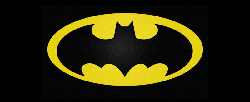
Batman logo
![]()
Batman’s iconic emblem represents Gotham City’s Dark Knight, a vigilante who uses fear as his primary weapon against criminals. First appearing in Detective Comics #27 in 1939, the logo has undergone over 30 design modifications while maintaining its core bat silhouette. This symbol transcends comic book pages to become one of the most recognizable superhero emblems globally.
Logo Design Elements
- Primary Colors: Black (mystery, power) with occasional yellow oval background (1964-2000) representing hope and visibility
- Symbolic Imagery: Bat silhouette with spread wings, typically featuring five pointed wing tips and prominent ears
- Typography Style: Text-free design focusing purely on symbolic recognition
- Shape Architecture: Angular wings with sharp points, elongated head, and varying wing curvature across different eras
Visual Identity Attributes
- Brand Recognition Score: Consistently ranks among top three most recognizable superhero logos worldwide
- Cultural Impact Period: 1939-present, with major design updates in 1964 (yellow oval addition) and 2000 (oval removal)
- Design Evolution Stages: Simple wings (1939), enhanced bat features (1940s), gothic styling (1950s), yellow background era (1964-2000), modern minimalism (2000-present)
- Licensing Applications: Entertainment media, merchandise, gaming, corporate partnerships
Semantic Associations
- Character Powers: Psychology of shapes reflects stealth, intelligence, detective skills, martial arts mastery
- Universe Context: DC Comics flagship character, founding Justice League member
- Target Demographics: Cross-generational appeal spanning children to adults across global markets
- Merchandising Value: Multi-billion dollar licensing empire spanning apparel, collectibles, technology
Technical Specifications
- File Format Standards: SVG recommended for scalability, PNG for digital applications
- Color Palette Codes: Primary black (
#000000), optional yellow oval (#FFEB00) - Scalability Range: Optimal visibility from 16px favicon to billboard applications
- Trademark Status: Heavily protected DC Comics intellectual property
Related Logo Variations
- Animated Adaptations: Streamlined designs for television animation, varying wing proportions for different series
- Comic Era Versions: 1940s gothic styling, 1960s yellow oval period, modern angular interpretation
- Costume Integration: Embossed chest emblems in films, tactical applications in video games
- Merchandise Applications: Simplified versions for apparel, detailed variants for collectibles
Superman logo
![]()
Superman’s shield represents hope and heroism through its distinctive diamond-shaped emblem containing the iconic “S” symbol. Created by Joe Shuster in 1938, this Kryptonian family crest has become the most recognizable superhero logo globally, transcending comic origins to achieve universal cultural significance.
Logo Design Elements
- Primary Colors: Red (
#C80000), yellow (#FFEB00), blue backgrounds in various interpretations - Symbolic Imagery: Diamond shield containing stylized “S”, representing Kryptonian House of El family crest
- Typography Style: Custom-designed letterform integrated within geometric shield structure
- Shape Architecture: Diamond/pentagon shield configuration with bold serif-inspired “S” centerpiece
Visual Identity Attributes
- Brand Recognition Score: Highest globally recognized superhero symbol across all demographics
- Cultural Impact Period: 1938-present, establishing template for superhero logo design principles
- Design Evolution Stages: Simple shield (1938), refined diamond shape (1940s), standardized proportions (modern era)
- Licensing Applications: Entertainment, merchandise, corporate partnerships, humanitarian organizations
Semantic Associations
- Character Powers: Invulnerability, super strength, flight, heat vision, x-ray vision reflected in bold design
- Universe Context: DC Comics flagship character, Justice League leader, American cultural icon
- Target Demographics: Universal appeal across age groups, cultures, and global markets
- Merchandising Value: Multi-billion dollar licensing revenue across all product categories
Technical Specifications
- File Format Standards: Vector graphics essential for trademark accuracy and scalability
- Color Palette Codes: Red
#C80000, Yellow#FFEB00, Blue variations#0060AA - Scalability Range: Maintains clarity from 12px digital icons to architectural applications
- Trademark Status: Rigorously protected DC Comics/Warner Bros intellectual property
Related Logo Variations
- Animated Adaptations: Simplified geometry for animation efficiency while maintaining shield proportions
- Comic Era Versions: Golden Age simplicity, Silver Age refinement, Modern Age standardization
- Costume Integration: Chest emblem scaling, cape clasps, belt buckle applications
- Merchandise Applications: Monochromatic versions, gradient effects, textural variations for different products
Punisher logo

The Punisher’s skull emblem represents Frank Castle’s vigilante war against crime, symbolizing death and intimidation rather than traditional heroic values. Created by Gerry Conway in 1974, this white skull on black background serves as both protective armor targeting and psychological warfare against criminals.
Logo Design Elements
- Primary Colors: White skull on black background, with reverse variations in modern applications
- Symbolic Imagery: Elongated skull with prominent nasal cavity and four distinct teeth, representing death and fear
- Typography Style: Typically text-free design, occasional “Punishment” typeface in film adaptations
- Shape Architecture: Simplified skull silhouette with angular features and prominent eye sockets
Visual Identity Attributes
- Brand Recognition Score: High recognition within military and law enforcement communities
- Cultural Impact Period: 1974-present, with controversial real-world adoption by military and police forces
- Design Evolution Stages: Simple skull (1974), refined proportions (1980s), standardized design (modern era)
- Licensing Applications: Limited due to violent connotations, primarily comic and entertainment media
Semantic Associations
- Character Powers: Military training, weapons expertise, tactical planning, psychological warfare
- Universe Context: Marvel Comics antihero, operates outside traditional superhero moral codes
- Target Demographics: Adult audiences, military personnel, mature comic readers
- Merchandising Value: Controversial due to real-world appropriation by extremist groups and law enforcement
Technical Specifications
- File Format Standards: High contrast required for symbolic impact and recognition
- Color Palette Codes: Primary white (
#FFFFFF) on black (#000000) background - Scalability Range: Maintains intimidation factor from patch size to vehicle decals
- Trademark Status: Marvel Comics property with complex real-world usage implications
Related Logo Variations
- Animated Adaptations: Softened edges for broadcast standards while maintaining menacing appearance
- Comic Era Versions: Various skull proportions and detailing across different artists and decades
- Costume Integration: Chest emblem designed to draw enemy fire to armored areas
- Merchandise Applications: Limited official merchandise due to controversial real-world associations
Wonder Woman logo
Wonder Woman’s golden eagle emblem represents divine power and Amazonian heritage, combining ancient Greek symbolism with modern superhero aesthetics. Created by William Moulton Marston in 1941, this logo emphasizes femininity, strength, and justice through its distinctive winged design and warm color palette.
Logo Design Elements
- Primary Colors: Gold/yellow representing divinity and wisdom, red accents for strength and courage
- Symbolic Imagery: Stylized eagle or “WW” monogram with spread wings symbolizing freedom and protection
- Typography Style: Integrated letterforms within wing structure or standalone serif-inspired double-W
- Shape Architecture: Symmetrical wing span with central focal point, balance emphasizing harmony
Visual Identity Attributes
- Brand Recognition Score: Strong recognition within superhero genre, particularly among female demographics
- Cultural Impact Period: 1941-present, symbol of female empowerment and equality
- Design Evolution Stages: Simple eagle (1940s), “WW” monogram development, modern stylized versions
- Licensing Applications: Fashion, cosmetics, empowerment campaigns, entertainment media
Semantic Associations
- Character Powers: Divine strength, lasso of truth, flight, warrior training reflected in eagle symbolism
- Universe Context: DC Comics Trinity member alongside Superman and Batman
- Target Demographics: Cross-gender appeal with strong female identification and empowerment themes
- Merchandising Value: Premium fashion collaborations, jewelry, lifestyle products
Technical Specifications
- File Format Standards: Vector graphics essential for detail preservation in wing elements
- Color Palette Codes: Gold
#FFD700, Red#DC143C, with bronze and copper variations - Scalability Range: Complex wing details require careful optimization for smaller applications
- Trademark Status: DC Comics protected property with specific usage guidelines
Related Logo Variations
- Animated Adaptations: Simplified wing structures for animation efficiency
- Comic Era Versions: Golden Age eagle prominence, Silver Age “WW” development, Modern Age refinement
- Costume Integration: Chest emblem, tiara designs, bracelet applications
- Merchandise Applications: Jewelry-inspired designs, fashion accessories, luxury brand collaborations
Spider-Man logo

Spider-Man’s arachnid emblem captures the character’s dual nature as both hero and outsider through its distinctive web-crawler design. Created by Steve Ditko in 1962, this logo emphasizes agility, intuition, and the relatable struggles of Peter Parker while maintaining iconic simplicity across all media adaptations.
Logo Design Elements
- Primary Colors: Red and black creating high visual contrast and immediate recognition
- Symbolic Imagery: Stylized spider silhouette with extended legs, often incorporating web patterns
- Typography Style: Text-free design relying entirely on symbolic representation
- Shape Architecture: Organic curves balanced with angular leg extensions, central body focal point
Visual Identity Attributes
- Brand Recognition Score: Top-tier recognition across global markets and age demographics
- Cultural Impact Period: 1962-present, representing teenage heroism and relatability
- Design Evolution Stages: Original Ditko design, costume variations, movie adaptations, video game versions
- Licensing Applications: Toys, apparel, technology, food products, educational materials
Semantic Associations
- Character Powers: Wall-crawling, web-shooting, spider-sense, agility reflected in arachnid imagery
- Universe Context: Marvel Comics flagship character, Avengers member, street-level hero
- Target Demographics: Strong youth appeal with cross-generational recognition
- Merchandising Value: Massive toy and apparel markets, technology partnerships
Technical Specifications
- File Format Standards: Detailed spider anatomy requires high-resolution vector graphics
- Color Palette Codes: Primary red
#FF0000, black#000000, with blue accents in costume variations - Scalability Range: Intricate leg details require optimization for mobile and small format applications
- Trademark Status: Marvel Comics/Disney protected intellectual property
Related Logo Variations
- Animated Adaptations: Simplified spider anatomy for animation production efficiency
- Comic Era Versions: Original Ditko spider, McFarlane spaghetti webbing era, Ultimate universe redesign
- Costume Integration: Chest emblems, back spiders, web pattern integration
- Merchandise Applications: Simplified versions for children’s products, detailed variants for collectibles
Iron Man logo
Iron Man’s arc reactor emblem symbolizes technological innovation and heroic transformation through its distinctive circular energy core design. Debuting in 1963 and refined through various media adaptations, this logo represents the fusion of human ingenuity with advanced technology in Tony Stark’s superhero identity.
Logo Design Elements
- Primary Colors: Metallic gold and red reflecting armor aesthetics, blue energy core accents
- Symbolic Imagery: Circular arc reactor with geometric patterns, often incorporating “I” or face mask elements
- Typography Style: Sleek, futuristic typography when text elements appear
- Shape Architecture: Concentric circles with radial energy patterns, technological precision in geometric forms
Visual Identity Attributes
- Brand Recognition Score: High recognition boosted significantly by Marvel Cinematic Universe success
- Cultural Impact Period: 1963-present, with massive popularity surge post-2008 film
- Design Evolution Stages: Simple mask design (1960s), arc reactor introduction, movie modernization
- Licensing Applications: Technology products, automotive, luxury goods, corporate partnerships
Semantic Associations
- Character Powers: Powered armor, flight, repulsors, artificial intelligence integration shown through tech aesthetics
- Universe Context: Marvel Comics, Avengers founder, corporate superhero archetype
- Target Demographics: Tech enthusiasts, adult collectors, corporate professionals
- Merchandising Value: Premium collectibles, technology accessories, luxury partnerships
Technical Specifications
- File Format Standards: Complex lighting effects require careful optimization for various media
- Color Palette Codes: Gold
#FFD700, Red#FF0000, Blue energy#00BFFF - Scalability Range: Detailed reactor elements need simplification for smaller applications
- Trademark Status: Marvel Comics/Disney protected with strict licensing guidelines
Related Logo Variations
- Animated Adaptations: Simplified reactor designs maintaining energy core concept
- Comic Era Versions: Original face mask, modern arc reactor, various armor mark iterations
- Costume Integration: Chest reactor, helmet designs, armor panel applications
- Merchandise Applications: LED-enabled products, tech accessories, premium collectibles
Black Panther logo
Black Panther’s feline emblem represents Wakandan royalty and advanced African technology through its sleek panther silhouette design. Created by Stan Lee and Jack Kirby in 1966, this logo combines traditional African symbolism with futuristic aesthetics, emphasizing stealth, power, and cultural pride.
Logo Design Elements
- Primary Colors: Deep black and silver/gray creating sophisticated monochrome colors palette
- Symbolic Imagery: Stylized panther head or full body silhouette emphasizing feline grace and power
- Typography Style: African-inspired geometric patterns when text elements incorporated
- Shape Architecture: Sleek curves and angular features balancing organic and technological elements
Visual Identity Attributes
- Brand Recognition Score: Significantly elevated following 2018 film cultural phenomenon
- Cultural Impact Period: 1966-present, with massive cultural breakthrough in 2010s
- Design Evolution Stages: Original Kirby design, modern comic refinement, cinematic interpretation
- Licensing Applications: Fashion, technology, cultural products, educational materials
Semantic Associations
- Character Powers: Enhanced strength, agility, vibranium technology reflected in sleek design aesthetics
- Universe Context: Marvel Comics, Avengers member, African representation in superhero genre
- Target Demographics: Diverse audiences with strong cultural significance for African diaspora
- Merchandising Value: Fashion collaborations, cultural products, premium collectibles
Technical Specifications
- File Format Standards: Sleek curves require high-quality vector graphics for precision
- Color Palette Codes: Deep black
#000000, silver#C0C0C0, purple accents#800080 - Scalability Range: Maintains elegance from jewelry applications to architectural scale
- Trademark Status: Marvel Comics/Disney property with cultural sensitivity considerations
Related Logo Variations
- Animated Adaptations: Simplified panther features maintaining regal characteristics
- Comic Era Versions: Original geometric design, modern realistic interpretation, tribal variants
- Costume Integration: Mask designs, chest emblems, technological pattern integration
- Merchandise Applications: Fashion accessories, jewelry, cultural celebration products
Deadpool logo
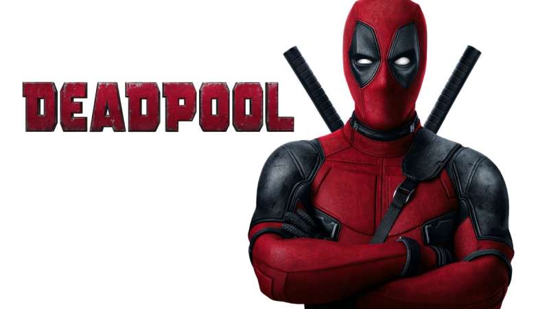
Deadpool’s mask emblem represents irreverent humor and antihero sensibilities through its distinctive red and black design. Created by Rob Liefeld in 1991, this logo breaks traditional superhero conventions with its asymmetrical eye design and comedic undertones while maintaining recognizable masked vigilante aesthetics.
Logo Design Elements
- Primary Colors: Bright red and black creating high contrast and comic book vibrancy
- Symbolic Imagery: Stylized mask with asymmetrical eye shapes reflecting character’s instability and humor
- Typography Style: Playful, often hand-lettered style matching character’s irreverent personality
- Shape Architecture: Organic mask curves with distinctive eye cutouts, deliberately imperfect symmetry
Visual Identity Attributes
- Brand Recognition Score: Strong recognition among comic fans, elevated by film success
- Cultural Impact Period: 1991-present, breakthrough mainstream recognition in 2010s
- Design Evolution Stages: Original Liefeld design, comic refinement, cinematic adaptation
- Licensing Applications: Adult-oriented merchandise, gaming, entertainment media
Semantic Associations
- Character Powers: Regeneration, weapons expertise, fourth-wall breaking reflected in unconventional design
- Universe Context: Marvel Comics antihero, X-Force member, parody of superhero conventions
- Target Demographics: Adult comic readers, irreverent humor enthusiasts, mature audiences
- Merchandising Value: Adult collectibles, gaming products, parody merchandise
Technical Specifications
- File Format Standards: Bold shapes suitable for various reproduction methods and scales
- Color Palette Codes: Red
#FF0000, Black#000000, occasional white accents#FFFFFF - Scalability Range: Simple design maintains clarity across all size applications
- Trademark Status: Marvel Comics/Disney property with mature content considerations
Related Logo Variations
- Animated Adaptations: Maintained design integrity across various animation styles
- Comic Era Versions: Original mask design, artistic interpretations, movie adaptations
- Costume Integration: Full head mask, belt buckle, weapon decorations
- Merchandise Applications: Adult humor products, gaming accessories, parody items
The Flash logo
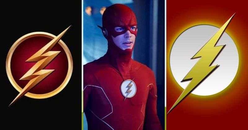
The Flash’s lightning bolt emblem represents super-speed and energy through its dynamic arrow-like design. Created by Gardner Fox and Harry Lampert in 1940, this logo emphasizes movement, power, and the Speed Force connection while maintaining clear readability across high-velocity visual applications.
Logo Design Elements
- Primary Colors: Bright yellow/gold with red accents creating energetic and optimistic palette
- Symbolic Imagery: Stylized lightning bolt with angular cuts suggesting speed and electrical energy
- Typography Style: When text appears, dynamic fonts with speed lines and motion blur effects
- Shape Architecture: Angular lightning bolt with precise geometric cuts, forward-pointing directionality
Visual Identity Attributes
- Brand Recognition Score: High recognition within superhero genre, elevated by television success
- Cultural Impact Period: 1940-present, with significant television-driven popularity surge
- Design Evolution Stages: Original simple bolt, refined angular design, modern variations
- Licensing Applications: Sports products, energy drinks, technology, entertainment media
Semantic Associations
- Character Powers: Super-speed, time travel, dimensional travel reflected in lightning symbolism
- Universe Context: DC Comics, Justice League founding member, Speed Force conduit
- Target Demographics: Youth appeal through dynamic design, cross-generational superhero fans
- Merchandising Value: Sports merchandise, energy products, youth-oriented collectibles
Technical Specifications
- File Format Standards: Clean angular lines ideal for vector graphics reproduction
- Color Palette Codes: Yellow
#FFFF00, Red#FF0000, with electrical blue accents - Scalability Range: Simple geometric shape maintains clarity at all scales
- Trademark Status: DC Comics protected property with specific design guidelines
Related Logo Variations
- Animated Adaptations: Motion trail effects, electrical animation enhancements
- Comic Era Versions: Golden Age simplicity, Silver Age refinement, modern geometric precision
- Costume Integration: Chest emblem, ear pieces, belt buckle applications
- Merchandise Applications: Sports gear, energy drink partnerships, speed-themed products
Green Lantern logo

Green Lantern’s power ring emblem represents willpower and cosmic authority through its distinctive circular design. Created by Bill Finger and Martin Nodell in 1940, this logo emphasizes the Green Lantern Corps’ universal scope while maintaining clear geometric simplicity suitable for intergalactic recognition.
Logo Design Elements
- Primary Colors: Vibrant green symbolizing willpower, with black outline for definition
- Symbolic Imagery: Stylized lantern within circle, or simplified geometric ring design
- Typography Style: Clean, authoritative sans-serif fonts when text elements included
- Shape Architecture: Perfect circular symmetry with central lantern focal point, geometric precision
Visual Identity Attributes
- Brand Recognition Score: Moderate recognition within superhero genre, cosmic scope appeal
- Cultural Impact Period: 1940-present, with various interpretation periods and character iterations
- Design Evolution Stages: Original lantern design, simplified ring symbol, modern geometric versions
- Licensing Applications: Science fiction products, jewelry, cosmic-themed merchandise
Semantic Associations
- Character Powers: Energy constructs, flight, space travel reflected in cosmic design elements
- Universe Context: DC Comics, Justice League member, Green Lantern Corps cosmic police
- Target Demographics: Science fiction fans, cosmic adventure enthusiasts, jewelry collectors
- Merchandising Value: Jewelry products, science fiction collectibles, cosmic adventure themes
Technical Specifications
- File Format Standards: Geometric precision requires accurate vector graphics reproduction
- Color Palette Codes: Green
#00FF00, Black outline#000000, energy effects variants - Scalability Range: Simple geometric design maintains clarity across all applications
- Trademark Status: DC Comics protected with specific color palette requirements
Related Logo Variations
- Animated Adaptations: Energy glow effects, construct manifestation animations
- Comic Era Versions: Detailed lantern imagery, simplified ring designs, corps variations
- Costume Integration: Chest emblem, ring design, energy construct applications
- Merchandise Applications: Jewelry replicas, cosmic adventure products, science fiction collectibles
Captain America logo

Captain America’s shield represents patriotic heroism and American ideals through its distinctive circular design featuring stars and stripes. Created by Joe Simon and Jack Kirby in 1941, this vibranium shield serves as both defensive weapon and national symbol, embodying the values of freedom, justice, and protection that define the First Avenger.
Logo Design Elements
- Primary Colors: Red (
#B22234), white (#FFFFFF), and blue (#3C3B6E) directly mirroring American flag symbolism - Symbolic Imagery: Circular shield with central white star surrounded by alternating red and white concentric rings
- Typography Style: Typically text-free design, with custom serif font in movie titles when needed
- Shape Architecture: Perfect circular symmetry with central star focal point, geometric precision in ring spacing
Visual Identity Attributes
- Brand Recognition Score: Extremely high recognition due to patriotic symbolism and MCU popularity
- Cultural Impact Period: 1941-present, with significant resurgence during World War II and modern MCU era
- Design Evolution Stages: Original triangular heater shield (1941), circular design introduction (1941), color refinements through decades
- Licensing Applications: Patriotic merchandise, military products, educational materials, entertainment media
Semantic Associations
- Character Powers: Enhanced strength, tactical leadership, shield throwing mastery reflected in protective design
- Universe Context: Marvel Comics, Avengers leader, symbol of American heroism and values
- Target Demographics: Patriotic audiences, military personnel, cross-generational American appeal
- Merchandising Value: Premium collectibles, patriotic products, military appreciation items
Technical Specifications
- File Format Standards: Precise geometric circles require high-quality vector graphics for accuracy
- Color Palette Codes: Red
#B22234, Blue#3C3B6E, White#FFFFFFmatching official American flag specifications - Scalability Range: Simple geometric design maintains clarity from pin badges to architectural applications
- Trademark Status: Marvel Comics/Disney protected with specific patriotic usage guidelines
Related Logo Variations
- Animated Adaptations: Simplified ring patterns for animation efficiency while maintaining star prominence
- Comic Era Versions: Golden Age triangular shield, Silver Age circular refinement, modern proportional standards
- Costume Integration: Chest emblem scaling, belt buckle applications, helmet designs
- Merchandise Applications: Patriotic products, military appreciation items, shield replica collectibles
Hawkeye logo

Captain America Logo
Captain America’s shield represents patriotic heroism and American ideals through its distinctive circular design featuring stars and stripes. Created by Joe Simon and Jack Kirby in 1941, this vibranium shield serves as both defensive weapon and national symbol, embodying the values of freedom, justice, and protection that define the First Avenger.
Logo Design Elements
- Primary Colors: Red (
#B22234), white (#FFFFFF), and blue (#3C3B6E) directly mirroring American flag symbolism - Symbolic Imagery: Circular shield with central white star surrounded by alternating red and white concentric rings
- Typography Style: Typically text-free design, with custom serif font in movie titles when needed
- Shape Architecture: Perfect circular symmetry with central star focal point, geometric precision in ring spacing
Visual Identity Attributes
- Brand Recognition Score: Extremely high recognition due to patriotic symbolism and MCU popularity
- Cultural Impact Period: 1941-present, with significant resurgence during World War II and modern MCU era
- Design Evolution Stages: Original triangular heater shield (1941), circular design introduction (1941), color refinements through decades
- Licensing Applications: Patriotic merchandise, military products, educational materials, entertainment media
Semantic Associations
- Character Powers: Enhanced strength, tactical leadership, shield throwing mastery reflected in protective design
- Universe Context: Marvel Comics, Avengers leader, symbol of American heroism and values
- Target Demographics: Patriotic audiences, military personnel, cross-generational American appeal
- Merchandising Value: Premium collectibles, patriotic products, military appreciation items
Technical Specifications
- File Format Standards: Precise geometric circles require high-quality vector graphics for accuracy
- Color Palette Codes: Red
#B22234, Blue#3C3B6E, White#FFFFFFmatching official American flag specifications - Scalability Range: Simple geometric design maintains clarity from pin badges to architectural applications
- Trademark Status: Marvel Comics/Disney protected with specific patriotic usage guidelines
Related Logo Variations
- Animated Adaptations: Simplified ring patterns for animation efficiency while maintaining star prominence
- Comic Era Versions: Golden Age triangular shield, Silver Age circular refinement, modern proportional standards
- Costume Integration: Chest emblem scaling, belt buckle applications, helmet designs
- Merchandise Applications: Patriotic products, military appreciation items, shield replica collectibles
Hawkeye Logo
Hawkeye’s target emblem represents precision marksmanship and human determination through its distinctive archery-inspired design. Created for Clint Barton’s character evolution, this logo emphasizes skill over superpowers while incorporating purple and black colors that reference both traditional archery targets and the character’s distinctive comic book aesthetic.
Logo Design Elements
- Primary Colors: Deep purple (
#663399) and black (#000000) creating sophisticated contrast with yellow accents - Symbolic Imagery: Stylized target/bullseye with arrow fletching centerpiece representing marksmanship precision
- Typography Style: Custom lowercase sans-serif font with arrow-inspired letter modifications
- Shape Architecture: Concentric circles with central fletching, geometric precision emphasizing accuracy
Visual Identity Attributes
- Brand Recognition Score: Moderate recognition elevated by Disney+ series and MCU appearances
- Cultural Impact Period: 1964-present, with significant brand development during 2021 Disney+ series
- Design Evolution Stages: No official logo for decades, Disney+ series wordmark creation, target symbol standardization
- Licensing Applications: Archery products, sports merchandise, precision-themed items
Semantic Associations
- Character Powers: Master archery, tactical analysis, enhanced accuracy reflected in target imagery
- Universe Context: Marvel Comics, Avengers member, represents human skill achievement without superpowers
- Target Demographics: Archery enthusiasts, sports fans, skill-based achievement admirers
- Merchandising Value: Sports equipment, precision instruments, skill-based training products
Technical Specifications
- File Format Standards: Concentric circle precision requires accurate geometric vector graphics
- Color Palette Codes: Purple
#663399, Black#000000, Yellow#FFFF00for wordmark applications - Scalability Range: Target design maintains clarity across sporting goods to digital applications
- Trademark Status: Marvel Comics/Disney property with archery and sports usage considerations
Related Logo Variations
- Animated Adaptations: Simplified target rings with enhanced fletching detail for animation
- Comic Era Versions: Various unofficial interpretations, Disney+ standardized design, merchandise variants
- Costume Integration: No traditional chest emblem, equipment markings, quiver designs
- Merchandise Applications: Archery equipment, sports gear, precision-themed accessories
Thor logo

Thor’s hammer emblem represents divine power and Asgardian heritage through its distinctive Mjolnir design. Rooted in Norse mythology and created by Stan Lee and Jack Kirby in 1962, this logo emphasizes the connection between ancient divine authority and modern superhero responsibility through iconic hammer symbolism.
Logo Design Elements
- Primary Colors: Metallic silver and steel gray with blue energy accents representing divine power
- Symbolic Imagery: Stylized Mjolnir hammer with runic inscriptions and lightning energy effects
- Typography Style: Bold runic-inspired typeface when text elements appear, emphasizing ancient Nordic origins
- Shape Architecture: Angular hammer head with cylindrical handle, emphasis on weight and power through design
Visual Identity Attributes
- Brand Recognition Score: High recognition through MCU success and mythological familiarity
- Cultural Impact Period: 1962-present, with massive popularity surge through Marvel Cinematic Universe
- Design Evolution Stages: Comic book simplification, movie realistic interpretation, merchandise standardization
- Licensing Applications: Norse mythology products, fantasy merchandise, power tool marketing
Semantic Associations
- Character Powers: Weather control, super strength, flight, divine authority reflected in hammer symbolism
- Universe Context: Marvel Comics, Avengers founding member, bridge between cosmic and earthly realms
- Target Demographics: Fantasy enthusiasts, mythology fans, power and strength admirers
- Merchandising Value: Fantasy collectibles, mythology education, strength-themed products
Technical Specifications
- File Format Standards: Complex hammer details require high-resolution preservation in vector formats
- Color Palette Codes: Steel Gray
#708090, Silver#C0C0C0, Blue energy#4169E1 - Scalability Range: Detailed engravings require careful optimization for smaller applications
- Trademark Status: Marvel Comics/Disney property with Norse mythology public domain considerations
Related Logo Variations
- Animated Adaptations: Simplified hammer design with enhanced lightning effects
- Comic Era Versions: Original geometric design, realistic movie interpretation, merchandise simplification
- Costume Integration: Belt buckle, cape clasp, hammer markings
- Merchandise Applications: Fantasy collectibles, mythology products, strength-themed items
Black Widow logo
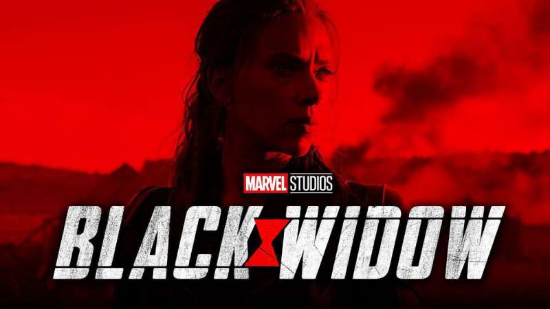
Black Widow’s spider emblem represents deadly elegance and covert operations through its distinctive arachnid design. Created for Natasha Romanoff’s character, this logo emphasizes stealth, precision, and lethal grace while incorporating red and black colors that reference both danger and sophistication in espionage contexts.
Logo Design Elements
- Primary Colors: Deep red (
#8B0000) and black (#000000) creating dramatic and threatening aesthetic - Symbolic Imagery: Stylized black widow spider with characteristic red hourglass marking
- Typography Style: Sleek, spy-thriller inspired typography when text elements included
- Shape Architecture: Organic spider curves with angular leg extensions, predatory stance emphasis
Visual Identity Attributes
- Brand Recognition Score: Strong recognition elevated by solo film and MCU appearances
- Cultural Impact Period: 1964-present, with major brand elevation through 2021 solo film release
- Design Evolution Stages: Comic book spider variants, MCU costume integration, merchandise standardization
- Licensing Applications: Spy-themed products, fashion accessories, covert operations aesthetic
Semantic Associations
- Character Powers: Master spy, weapons expertise, enhanced agility reflected in spider symbolism
- Universe Context: Marvel Comics, Avengers member, espionage and covert operations specialist
- Target Demographics: Spy thriller fans, strong female character admirers, tactical enthusiasts
- Merchandising Value: Fashion accessories, spy gadgets, empowerment-themed products
Technical Specifications
- File Format Standards: Organic spider anatomy requires detailed vector graphics precision
- Color Palette Codes: Deep Red
#8B0000, Black#000000, silver accents for variations - Scalability Range: Spider leg details need optimization for smaller format applications
- Trademark Status: Marvel Comics/Disney protected with espionage and fashion considerations
Related Logo Variations
- Animated Adaptations: Simplified spider anatomy maintaining threatening characteristics
- Comic Era Versions: Various spider interpretations, movie costume integration, tactical variants
- Costume Integration: Belt buckle, suit detailing, equipment markings
- Merchandise Applications: Fashion jewelry, spy-themed accessories, empowerment products
Captain Marvel logo
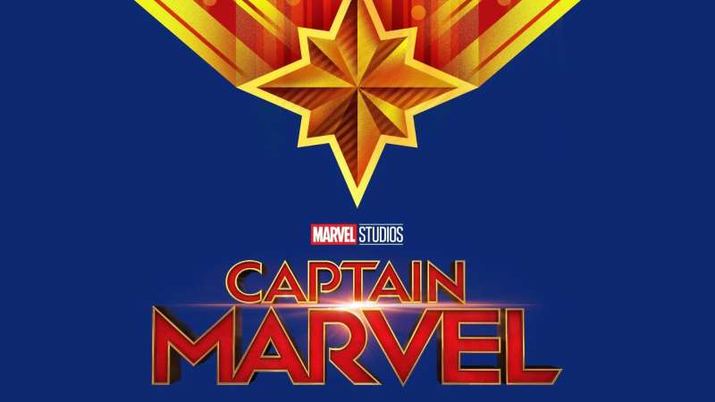
Captain Marvel’s star emblem represents cosmic power and military precision through its distinctive angular design. Created for Carol Danvers’ transformation from Ms. Marvel to Captain Marvel, this logo emphasizes the connection between Earth’s military heritage and cosmic responsibility while incorporating bold geometric forms that suggest both flight and energy projection.
Logo Design Elements
- Primary Colors: Bright red (
#FF0000), blue (#0000FF), and gold (#FFD700) creating patriotic yet cosmic palette - Symbolic Imagery: Eight-pointed star with angular cuts suggesting energy burst and military insignia heritage
- Typography Style: Bold military-inspired sans-serif fonts reflecting Air Force background
- Shape Architecture: Geometric star points with sharp angles, focal point radiating energy outward
Visual Identity Attributes
- Brand Recognition Score: Rapidly growing recognition following 2019 MCU debut and character prominence
- Cultural Impact Period: 1977-present as Ms. Marvel, 2012-present as Captain Marvel with major film boost
- Design Evolution Stages: Lightning bolt Ms. Marvel logo, star transition period, current angular star design
- Licensing Applications: Aviation products, military appreciation, space exploration themes
Semantic Associations
- Character Powers: Energy projection, flight, super strength, cosmic awareness reflected in star burst design
- Universe Context: Marvel Comics, Avengers powerhouse, bridge between Earth and cosmic threats
- Target Demographics: Aviation enthusiasts, military personnel, space exploration fans
- Merchandising Value: Aviation products, military appreciation items, space-themed collectibles
Technical Specifications
- File Format Standards: Sharp angular points require precise geometric construction in vector formats
- Color Palette Codes: Red
#FF0000, Blue#0000FF, Gold#FFD700with energy gradient variations - Scalability Range: Angular design maintains impact from aviation patches to architectural scale
- Trademark Status: Marvel Comics/Disney property with military and aviation usage guidelines
Related Logo Variations
- Animated Adaptations: Enhanced energy glow effects around star points for animation
- Comic Era Versions: Lightning bolt Ms. Marvel era, star evolution phases, movie standardization
- Costume Integration: Chest emblem, glove detailing, helmet designs
- Merchandise Applications: Aviation gear, military appreciation, space exploration products
Wolverine logo

Wolverine’s claw marks represent primal ferocity and unbreakable will through their distinctive slash design. Created to emphasize Logan’s animalistic nature and adamantium claws, this logo suggests both the savage beast within and the protective instincts that define the character’s complex moral code.
Logo Design Elements
- Primary Colors: Metallic silver (
#C0C0C0) and yellow (#FFFF00) with black outline creating stark contrast - Symbolic Imagery: Three diagonal claw slashes suggesting both attack and protection capabilities
- Typography Style: Aggressive, jagged fonts when text appears, emphasizing savage nature
- Shape Architecture: Angular diagonal slashes with sharp termination points, dynamic movement suggestion
Visual Identity Attributes
- Brand Recognition Score: Extremely high recognition across global markets due to Hugh Jackman’s portrayal
- Cultural Impact Period: 1974-present, with peak popularity during X-Men film series era
- Design Evolution Stages: Comic mask design, claw mark emphasis, movie logo standardization
- Licensing Applications: Action products, martial arts gear, protective equipment themes
Semantic Associations
- Character Powers: Healing factor, adamantium claws, enhanced senses reflected in claw imagery
- Universe Context: Marvel Comics, X-Men member, represents struggle between civilization and primal nature
- Target Demographics: Action fans, martial arts enthusiasts, anti-hero character admirers
- Merchandising Value: Action figures, martial arts equipment, protective gear
Technical Specifications
- File Format Standards: Sharp claw angles require precise vector graphics for clean cuts
- Color Palette Codes: Silver
#C0C0C0, Yellow#FFFF00, Black#000000for outlines - Scalability Range: Simple slash design maintains aggression from patches to vehicle graphics
- Trademark Status: Marvel Comics/Disney protected with action and martial arts considerations
Related Logo Variations
- Animated Adaptations: Enhanced metallic sheen effects on claw marks
- Comic Era Versions: Mask-based early designs, claw mark evolution, movie integration
- Costume Integration: Mask designs, belt buckle, glove markings
- Merchandise Applications: Action gear, martial arts products, protective equipment
Daredevil logo

Daredevil’s devil horn emblem represents justice through darkness and sensory compensation. Created for Matt Murdock’s dual identity as lawyer and vigilante, this logo emphasizes the character’s connection to both legal justice and street-level crime fighting while incorporating red colors that reference both danger and the devil imagery.
Logo Design Elements
- Primary Colors: Deep red (
#8B0000) with black (#000000) creating dramatic nocturnal aesthetic - Symbolic Imagery: Stylized devil horns integrated with “DD” monogram suggesting duality
- Typography Style: Legal brief inspired serif fonts balanced with street-level urgency
- Shape Architecture: Horn curves with sharp points, balance between threatening and heroic elements
Visual Identity Attributes
- Brand Recognition Score: Strong recognition within comic community, elevated by Netflix series
- Cultural Impact Period: 1964-present, with significant television-driven popularity surge
- Design Evolution Stages: Yellow costume era, red suit transition, modern minimalist approach
- Licensing Applications: Legal themed products, night vision equipment, urban justice themes
Semantic Associations
- Character Powers: Enhanced senses, martial arts mastery, legal expertise reflected in horn symbolism
- Universe Context: Marvel Comics, street-level hero, represents intersection of law and vigilante justice
- Target Demographics: Legal professionals, martial arts fans, urban crime drama enthusiasts
- Merchandising Value: Legal accessories, martial arts gear, urban justice themes
Technical Specifications
- File Format Standards: Horn curves require smooth bezier precision in vector construction
- Color Palette Codes: Deep Red
#8B0000, Black#000000, occasional yellow#FFFF00accents - Scalability Range: Horn details maintain threatening presence across legal documents to billboards
- Trademark Status: Marvel Comics/Disney property with legal profession and justice considerations
Related Logo Variations
- Animated Adaptations: Enhanced shadow effects emphasizing night-time operations
- Comic Era Versions: Yellow costume period, red suit evolution, television adaptation
- Costume Integration: Chest emblem, helmet horns, belt buckle designs
- Merchandise Applications: Legal accessories, martial arts equipment, urban hero products
Aquaman logo

Aquaman’s trident emblem represents oceanic sovereignty and Atlantean heritage through its distinctive three-pronged design. Created to emphasize Arthur Curry’s dual nature as surface dweller and underwater king, this logo connects ancient mythology with modern environmental themes while incorporating blue and gold colors that reference both ocean depths and royal authority.
Logo Design Elements
- Primary Colors: Ocean blue (
#006994) and gold (#FFD700) representing water and royal authority - Symbolic Imagery: Stylized trident with wave elements emphasizing oceanic command
- Typography Style: Flowing aquatic-inspired typography suggesting underwater movement
- Shape Architecture: Three-pronged symmetry with wave integration, unity between weapon and water
Visual Identity Attributes
- Brand Recognition Score: Moderate recognition elevated significantly by 2018 film success
- Cultural Impact Period: 1941-present, with major cultural breakthrough via Jason Momoa portrayal
- Design Evolution Stages: Simple trident design, Atlantean complexity addition, movie modernization
- Licensing Applications: Ocean conservation, swimming products, marine biology education
Semantic Associations
- Character Powers: Underwater breathing, marine telepathy, super strength reflected in trident symbolism
- Universe Context: DC Comics, Justice League member, environmental protection advocate
- Target Demographics: Ocean enthusiasts, environmental advocates, mythology fans
- Merchandising Value: Swimming equipment, ocean conservation products, mythology collectibles
Technical Specifications
- File Format Standards: Flowing wave elements require detailed vector graphics for organic curves
- Color Palette Codes: Ocean Blue
#006994, Gold#FFD700, silver accents for trident details - Scalability Range: Wave details need optimization for smaller marine equipment applications
- Trademark Status: DC Comics/Warner Bros property with ocean and environmental considerations
Related Logo Variations
- Animated Adaptations: Enhanced water flow effects around trident design
- Comic Era Versions: Simple geometric trident, Atlantean detailed version, movie realistic interpretation
- Costume Integration: Chest emblem, belt designs, royal regalia applications
- Merchandise Applications: Swimming gear, ocean conservation products, marine education materials
FAQ on Superhero Logos
What makes a superhero logo iconic?
Iconic superhero symbols combine simplicity with immediate recognition. They use bold geometric shapes, strong contrast, and meaningful visual metaphors. Superman’s diamond shield and Batman’s angular bat demonstrate how effective comic book branding relies on memorable silhouettes rather than complex details.
Which superhero has the most recognizable logo?
Superman’s S-shield ranks as the most globally recognized superhero emblem. The diamond-shaped symbol transcends comic universes, appearing across merchandise, movies, and pop culture references worldwide. Its simple red and yellow design creates instant brand recognition across all demographics.
How do Marvel and DC logos differ in design approach?
Marvel typically uses bold typography and dynamic lettering in hero emblems, while DC favors geometric symbols and iconic shapes. Marvel’s Spider-Man uses web patterns, whereas DC’s Green Lantern employs a simple circle. These design philosophies reflect each publisher’s distinct visual identity.
What colors work best for superhero logos?
Primary colors dominate superhero branding because they convey strength and heroism. Red symbolizes courage, blue represents trust, while yellow adds energy. Color psychology plays a crucial role, with villains often using darker palettes like purple, black, or metallic tones for contrast.
Can I use superhero logos for my business?
Most comic character symbols are heavily protected by trademark and copyright laws. Using Batman, Superman, or other established hero emblems commercially without permission violates intellectual property rights. Instead, create original designs inspired by superhero aesthetics while avoiding direct copying.
What design software creates the best superhero logos?
Professional designers use Adobe Illustrator for vector graphics because superhero emblems need scalability across multiple mediums. Vector formats maintain crisp edges whether displayed on business cards or billboards. Alternative options include Inkscape, CorelDRAW, or online tools like Canva for simpler designs.
How do animated superhero logos differ from comic versions?
Animated adaptations often simplify comic designs for better screen readability. The X-Men symbol becomes more streamlined in cartoons, while maintaining its core identity. Animation requires visual hierarchy considerations, ensuring logos remain visible during fast-paced action sequences and various lighting conditions.
What typography works with superhero branding?
Bold sans-serif fonts dominate superhero design because they convey strength and modernity. Custom lettering often incorporates angular elements or dynamic shapes. Avoid delicate scripts or overly decorative typefaces that diminish the powerful, heroic aesthetic essential to character branding.
How have superhero logos evolved over decades?
Classic hero emblems have simplified over time for better reproduction across media. Superman’s symbol gained cleaner lines, while Batman’s logo became more angular and aggressive. Modern versions prioritize scalability and digital compatibility while maintaining the core visual elements that define each character.
What mistakes should I avoid when designing superhero-inspired logos?
Avoid overcomplicated designs that lose impact when scaled down. Don’t ignore symmetry principles or use too many colors. Most importantly, ensure your design maintains originality while drawing inspiration from established superhero aesthetics rather than directly copying existing emblems.
Conclusion
These superhero logos demonstrate how powerful visual storytelling transforms simple shapes into enduring cultural symbols. From Wonder Woman’s golden eagle to The Flash’s lightning bolt, each emblem represents decades of comic book iconography that continues influencing modern graphic design movements.
The most successful hero emblems share common traits: strong focal points, effective use of negative space, and memorable silhouettes that work across multiple mediums. Whether studying classic Marvel character logos or analyzing DC’s geometric approach, these designs prove that simplicity often creates the strongest brand recognition.
Understanding superhero branding principles helps any designer create compelling visual identities. The psychology of shapes behind these comic universe symbols reveals why certain forms resonate with audiences while others fade into obscurity. These timeless design lessons extend far beyond cape crusader emblems into modern corporate identity development.
Renowned for his expertise in logo design and visual branding, Bogdan has developed a multitude of logos for various clients.
His skills extend to creating posters, vector illustrations, business cards, and brochures. Additionally, Bogdan's UI kits were featured on marketplaces like Visual Hierarchy and UI8.
He also wrote in the past years on sites like Design Your Way, WebDesignerDepot, WPDean, Designmodo, Speckyboy, Slider Revolution, and more.
- NHL Team Color Codes - 14 July 2026
- How Hosting Hermes Agent Improves Your AI Workflow Efficiency - 14 July 2026
- The Best Fonts for Titles That Command Attention - 13 July 2026
Bogdan Sandu is a seasoned designer who has been designing websites since 2008. Renowned for his expertise in logo design and visual branding, Bogdan has developed a multitude of logos for various clients. His skills extend to creating posters, vector illustrations, business cards, and brochures. Additionally, Bogdan's UI kits were featured on marketplaces like Visual Hierarchy and UI8. He also wrote in the past years on sites like Design Your Way, WebDesignerDepot, WPDean, Designmodo, Speckyboy, Slider Revolution, and more.
You Might Also Like