The Superman logo stands as one of the most recognized symbols in global pop culture. That red and yellow S-shield has been around since 1938, appearing on everything from comic book covers to billion-dollar movie franchises.
It represents the House of El, Superman’s Kryptonian family crest. But for most people, it just means hope. Or heroism. Or that guy in the cape who can bench press a planet.
Within superhero logos, the Superman emblem holds a unique position. It came first. Batman, Spider-Man, Wonder Woman, they all followed. The S-shield set the template for how we visualize superhero identity.
The current version maintains the classic diamond shape with serif-style lettering. DC Comics has tweaked proportions over the decades, but the core design remains intact. Somewhere around 15 to 20 major iterations exist, depending on how you count film and TV adaptations.
What Is the Superman Logo?
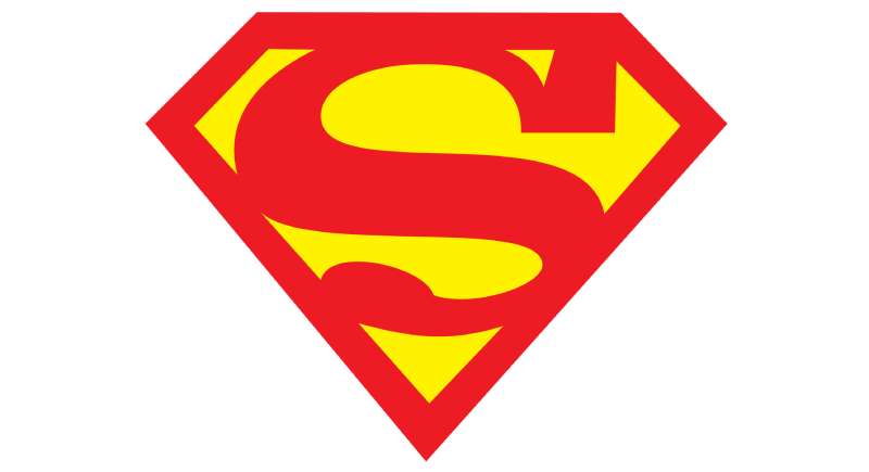
The Superman logo is a stylized letter S enclosed within a diamond-shaped shield, officially introduced in Action Comics #1 in June 1938. Created by Jerry Siegel and Joe Shuster, it symbolizes hope and the House of El on Krypton.
Design Type: Emblem (combination of symbol and letterform)
Primary Elements:
- Diamond-shaped shield outline
- Stylized serif S letterform
- Negative space creating depth
- Bold geometric construction
Official Introduction Date: June 1938 (Action Comics #1)
Designers: Jerry Siegel (writer) and Joe Shuster (artist)
Trademark Status: Registered trademark owned by DC Comics, a subsidiary of Warner Bros. Discovery
Color Palette:
- Primary Red: #ED1D24
- Primary Yellow: #FCCC0A
- Outline variations in black or dark red depending on application
Usage Context: Comic books, films, television series, merchandise, video games, theme park attractions, and licensed products worldwide
How Has the Superman Logo Evolved Over Time?
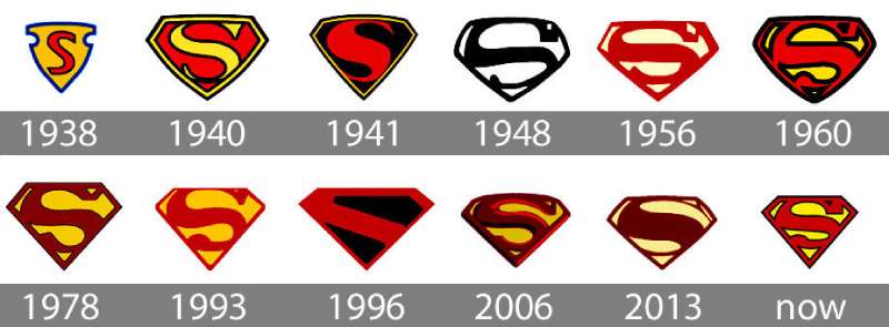
The Superman logo has gone through significant changes since 1938. Early versions were triangular and rough. Modern versions are refined, symmetrical, and built for digital media.
The biggest shifts happened in 1940, 1978, and 2013. Each redesign reflected changes in printing technology, cultural aesthetics, and storytelling needs.
Original Superman Logo (1938-1940)
Years Active: 1938-1940
Design Description: A yellow triangle (not diamond) containing a red S with a simple serif style. The shape was irregular and hand-drawn.
Color Scheme: Yellow background, red S, minimal outlining
Designer: Joe Shuster
Context: Created for Action Comics #1 during the Great Depression. Superheroes were brand new. Nobody knew what would stick.
Key Changes from Previous: This was the original. No previous version existed.
Cultural Significance: Birth of superhero visual identity. This rough triangle started everything.
Golden Age Superman Logo (1940-1955)
Years Active: 1940-1955
Design Description: The triangle became a proper diamond. The S grew thicker with more defined serifs. Yellow remained the primary background.
Color Scheme: Yellow shield, red S, occasional black outlines
Designer: DC Comics art department (evolving house style)
Context: World War II era. Superman punched Nazis on covers. The logo needed to be bolder and more readable at small sizes.
Key Changes from Previous: Triangle to diamond shape, thicker letterform, more geometric consistency
Cultural Significance: Established the classic shield shape that would define the character forever
Silver Age Superman Logo (1955-1986)
Years Active: 1955-1986
Design Description: A cleaner, more streamlined S inside a refined diamond. The negative space became more intentional. Proportions standardized.
Color Scheme: Bright yellow background, saturated red S
Designer: Various DC Comics artists including Curt Swan
Context: Television arrived. George Reeves wore the shield on screen. The logo needed to work in black and white broadcasts.
Key Changes from Previous: Refined proportions, cleaner lines, better reproduction quality
Cultural Significance: The version most Baby Boomers grew up recognizing
Christopher Reeve Era Logo (1978-1987)
Years Active: 1978-1987
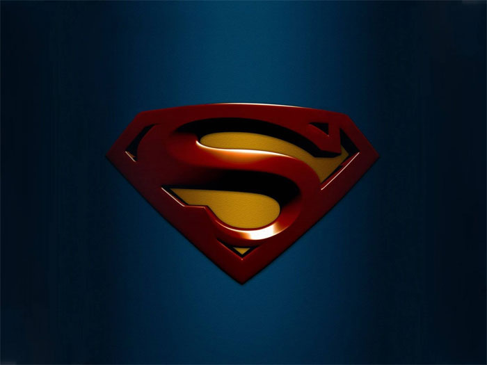
Design Description: Three-dimensional rendering with metallic sheen. The S gained depth and shadow. The shield appeared raised, almost sculptural.
Color Scheme: Deep red, golden yellow with gradient effects
Designer: Production design team for Superman: The Movie
Context: Richard Donner’s film needed a logo that felt real, tangible. You had to believe a man could fly. You also had to believe his chest emblem had weight.
Key Changes from Previous: Added dimensionality, metallic texture, cinematic polish
Cultural Significance: Proved superhero iconography could translate to serious filmmaking
Modern Era Logo (2013-Present)
Years Active: 2013-present
Design Description: Darker, more angular interpretation. The S became sharper with elongated serifs. Texture added alien, almost technological feel.
Color Scheme: Deep crimson red (#8B0000), muted gold, silver metallic accents
Designer: Production design for Man of Steel (James Acheson, costume design)
Context: Zack Snyder’s grounded, realistic approach required a logo that felt ancient and alien simultaneously. This wasn’t your dad’s Superman.
Key Changes from Previous: Muted colors, textured surface, elongated proportions, sci-fi aesthetic
Cultural Significance: Represented DC’s attempt to compete with Marvel’s cinematic universe through tonal differentiation
What Do the Design Elements of the Superman Logo Mean?
The diamond shield represents protection and strength. The S originally stood for Superman, but DC Comics later reinterpreted it as the Kryptonian symbol for hope.
This retroactive meaning added depth to a simple letter.
Why Did DC Comics Choose These Specific Colors?
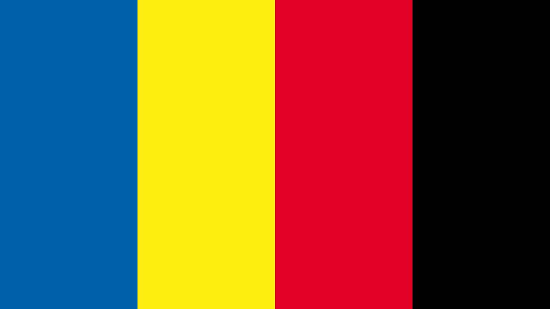
Red grabs attention. It signals power, courage, and action. In color psychology, red triggers urgency and excitement.
Yellow (or gold) represents optimism and warmth. It creates high contrast against red, making the logo readable from distance.
Together, these colors work because they’re primary and bold. No subtlety. No ambiguity. Just pure, immediate recognition.
Red:
- Hex: #ED1D24
- Pantone: 485 C (approximate)
- Symbolism: Strength, passion, Krypton’s red sun
- Psychological impact: Energizing, attention-grabbing
Yellow/Gold:
- Hex: #FCCC0A
- Pantone: 116 C (approximate)
- Symbolism: Hope, optimism, Earth’s yellow sun (source of Superman’s power)
- Psychological impact: Cheerful, confident
What Typography Style Is Used in the Superman Logo?
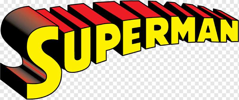
The S is custom-designed, not pulled from any existing font family. It features heavy serifs and dramatic thick-thin stroke contrast.
The style echoes early 20th century display lettering. Think circus posters and newspaper headlines from the 1930s.
Over time, the serifs became more pronounced. The curves got smoother. Digital tools allowed for precision that hand-drawing never could.
What Are the Hidden Meanings in the Superman Logo?
Joe Shuster likely based the S on his own signature style. Some historians see Art Deco influences in those geometric curves.
The diamond shape may reference baseball logos popular in 1930s America. That connection to American pastimes was probably intentional.
In 2013, the Kryptonian language translation added official in-universe meaning: the symbol represents hope on Krypton, not the letter S at all.
How Does the Superman Logo Compare to Competitor Logos?
Superman’s emblem is clean and symbolic. Batman’s uses a silhouette. Spider-Man relies on a creature. Each approach reflects character personality.
The S-shield feels almost heraldic, like a coat of arms. It connects to European nobility and American optimism simultaneously.
Compared to the Batman logo, Superman’s design is warmer and more approachable. The bat symbol suggests fear and shadow. The S-shield suggests daylight and openness.
Marvel heroes tend toward more complex emblems. The Avengers A, the X-Men X, Spider-Man’s spider. Superman keeps it simpler. One letter. One shield. Done.
Within DC’s own roster, Wonder Woman’s WW uses similar geometric construction. Aquaman’s trident is more literal. The Flash’s lightning bolt is more dynamic. Superman’s logo remains the template they all reference.
What Are the Technical Specifications of the Superman Logo?
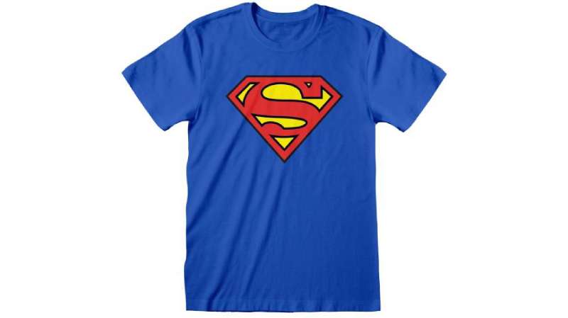
Official Color Codes:
Primary Red:
- Hex: #ED1D24
- RGB: (237, 29, 36)
- CMYK: (0, 100, 100, 0)
- Pantone: 485 C
Primary Yellow:
- Hex: #FCCC0A
- RGB: (252, 204, 10)
- CMYK: (0, 15, 100, 0)
- Pantone: 116 C
Black (outline variations):
- Hex: #000000
- RGB: (0, 0, 0)
- CMYK: (0, 0, 0, 100)
Dimensions and Proportions:
- Aspect ratio: Approximately 1:1.15 (width to height)
- The diamond is taller than it is wide
- Clear space: Minimum padding equal to the height of the S serif
- Minimum size: DC guidelines typically specify no smaller than 0.5 inches in print
Construction Notes:
- The S should never be separated from the shield
- Colors should not be inverted (no red shield with yellow S)
- The logo works best as vector graphics for scalability
What Cultural Impact Has the Superman Logo Had?
The S-shield transcends comic books. It appears on protest signs, charity campaigns, and memorial tributes. People wear it to feel powerful.
After 9/11, firefighters and rescue workers were photographed wearing Superman emblems. The symbol had become shorthand for heroism itself.
In fashion, the logo cycles through ironic and sincere interpretations. Vintage Superman tees signal nostalgia. New versions signal fandom. Both work.
The logo has appeared in fine art, street murals, and museum exhibitions. Andy Warhol played with superhero imagery. Contemporary artists continue the tradition.
How Does the Superman Logo Fit Into the Overall Brand Identity?
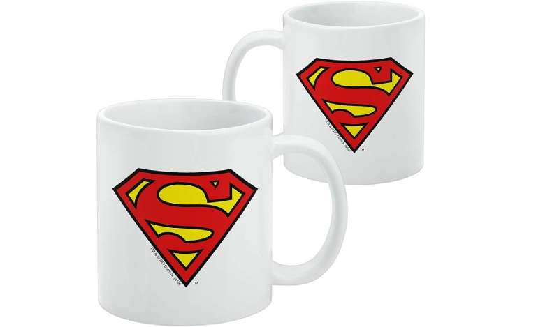
DC Comics positions Superman as their flagship character. The logo anchors merchandise, publishing, and entertainment divisions.
The S-shield connects to the broader Justice League identity while maintaining standalone recognition. It works alone or alongside other hero emblems.
Warner Bros. uses the logo across film company logos, streaming platforms, and theme parks. The symbol has equity beyond comics.
Within DC’s brand guidelines, the Superman logo receives specific protection. Colors, proportions, and usage contexts are strictly controlled.
How Should the Superman Logo Be Used?
Official Usage Guidelines:
Do:
- Maintain original proportions when scaling
- Use approved color combinations only
- Ensure adequate clear space around the logo
- Apply to appropriate, brand-aligned contexts
Don’t:
- Stretch, distort, or rotate the logo
- Change the official colors
- Add effects like drop shadows or gradients (unless specified)
- Combine with other brand logos without approval
- Use for commercial purposes without licensing
Where to Access Official Logos:
- DC Comics press portal (for media use)
- Warner Bros. licensing department (for commercial use)
- Official style guides provided to licensed partners
Licensing Information:
- All commercial use requires written permission from DC Comics/Warner Bros.
- Fan art exists in a gray area, generally tolerated for non-commercial purposes
- Parody use may be protected under fair use, but legal consultation is recommended
Trademark Protection:
- The Superman logo is a registered trademark in most countries
- DC Comics actively defends against unauthorized commercial use
- The character and logo have been subject to multiple high-profile legal disputes throughout history
FAQ on The Superman Logo
What Does the Superman Logo Mean?
The S shield represents hope. On Krypton, the symbol belongs to the House of El, Superman’s family crest.
It wasn’t always this way. Originally, the S just stood for Superman. DC Comics added the Kryptonian meaning later, giving the emblem deeper storytelling potential.
Who Designed the Superman Logo?
Joe Shuster created the original Superman symbol in 1938. He worked alongside writer Jerry Siegel to develop the character for Action Comics #1.
Later versions involved DC Comics artists and film production designers. The Christopher Reeve era logo came from the Superman: The Movie team.
Why Is the Superman Logo Shaped Like a Diamond?
The diamond shape actually started as a triangle. Joe Shuster’s first version was rougher and more pointed.
By 1940, it became the iconic diamond shield we recognize today. The shape suggests a coat of arms, connecting to ideas of nobility and protection.
What Are the Official Colors of the Superman Logo?
Red and yellow. The primary red uses hex code #ED1D24. The yellow (or gold) uses #FCCC0A.
These colors follow basic color theory principles. High contrast makes the superhero emblem visible from any distance. Similar boldness appears in other red logos across industries.
When Was the Superman Logo First Used?
June 1938. Action Comics #1 introduced both Superman and his chest emblem to the world.
That comic book cover launched an entire industry. The Man of Steel symbol became the template for superhero visual identity.
Is the Superman Logo Trademarked?
Yes. DC Comics (owned by Warner Bros. Discovery) holds the trademark. They actively protect it against unauthorized commercial use.
Fan art typically gets a pass for non-commercial purposes. But selling Superman merchandise without a license? That triggers legal action fast.
What Font Is the Superman S?
It’s not a standard font. The S is custom-designed with heavy serifs and dramatic stroke contrast.
The typography style echoes 1930s display lettering. Circus posters and newspaper headlines from that era share similar characteristics.
Has the Superman Logo Changed Over the Years?
Multiple times. The logo evolution includes at least 15 major versions across comics, films, and television.
Biggest changes happened in 1940 (triangle to diamond), 1978 (Christopher Reeve’s 3D version), and 2013 (Man of Steel’s darker interpretation with Henry Cavill).
Can I Use the Superman Logo for My Project?
Depends on the project. Personal, non-commercial use is generally tolerated. Commercial use requires licensing from Warner Bros.
Educational references usually fall under fair use. But check with a lawyer if money’s involved. DC Comics doesn’t mess around with their brand recognition.
Why Do People Wear the Superman Symbol?
It represents heroism and hope. The Kryptonian symbol transcends comic book fandom.
People wore it after 9/11 to honor rescue workers. Athletes wear it for motivation. The pop culture symbol communicates strength without saying a word. That’s the power of good logo design principles at work.
Conclusion
The Superman logo remains an American cultural icon after nearly nine decades. From Jerry Siegel and Joe Shuster’s original sketch to the Man of Steel’s modern interpretation, the S-shield has proven its staying power.
Few symbols achieve this level of recognition. The Kryptonian crest of Kal-El transcends comic books, films, and Superman merchandise.
It communicates hope without a single word. That’s the mark of effective visual hierarchy and smart design choices.
Whether worn by Christopher Reeve, Henry Cavill, or fans at Comic-Con, the iconic superhero symbol carries the same meaning. Strength. Protection. The belief that heroes exist.

Renowned for his expertise in logo design and visual branding, Bogdan has developed a multitude of logos for various clients.
His skills extend to creating posters, vector illustrations, business cards, and brochures. Additionally, Bogdan's UI kits were featured on marketplaces like Visual Hierarchy and UI8.
He also wrote in the past years on sites like Design Your Way, WebDesignerDepot, WPDean, Designmodo, Speckyboy, Slider Revolution, and more.
- How to Embed Fonts in PDF for Reliable Printing - 30 September 2026
- How to Create Product Design Principles That Evolve With Your Product - 29 September 2026
- Canva vs Midjourney: AI Design Tools Compared - 28 September 2026

Bogdan Sandu is a seasoned designer who has been designing websites since 2008. Renowned for his expertise in logo design and visual branding, Bogdan has developed a multitude of logos for various clients. His skills extend to creating posters, vector illustrations, business cards, and brochures. Additionally, Bogdan's UI kits were featured on marketplaces like Visual Hierarchy and UI8. He also wrote in the past years on sites like Design Your Way, WebDesignerDepot, WPDean, Designmodo, Speckyboy, Slider Revolution, and more.
You Might Also Like