The Wonder Woman Logo History, Colors, Font, and Meaning
The Wonder Woman logo: more than just an emblem, it’s a cultural beacon that blazes across mediums, from gritty pages of comic books to the cinematic gloss of the big screen. Like a mythic symbol etched in the collective conscience, this icon does more than just distinguish Diana Prince from her superhero counterparts in the Justice League.
You see it and instantly, a universe of Amazonian might and a legacy of empowerment floods your thoughts.
In this deep dive, we unravel the tapestry of the logo’s storied lineage and the visual language that defines it.
We explore its transformation from a comic strip representation to a symbol of strength and honor that now adorns everything from t-shirts to cosplay costumes.
Together, we’ll decode the semiotics that signpost not only a superhero but a concept, a conversation that whisks us from Greek mythology to the frontlines of feminism.
By the final word, the emblem won’t just be something you recognize; it’ll be something you understand. Get ready to journey through the ever-evolving narrative of a shield that does more than deflect; it defines.
The Meaning Behind the Wonder Woman Logo
Symbol of Strength and Femininity
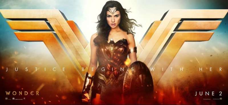
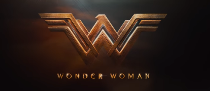
There’s a certain power in the Wonder Woman logo, you know? It’s like a mix of strength and grace. It’s more than just a couple of W’s. It represents the essence of Wonder Woman herself.
This logo is a symbol of her invincibility, the quiet power of femininity, and a warrior spirit that doesn’t back down. It’s a blend of force and compassion.
The Iconic Double W’s
What’s cool about the design is how the double W’s interlock, one atop the other. They’re like mirror images, a reflection of balance and harmony. It’s almost like it’s saying, “Hey, strength and compassion? They’re two sides of the same coin.”
The History of the Wonder Woman Logo
The Original Design
Digging into the past, the first Wonder Woman logo wasn’t as sleek or minimalistic as the one we know today. It was actually a full-on illustration of Wonder Woman herself, encased in a circle.
And you know what? It had its charm. It was unapologetically bold, just like our heroine.
The Evolution and Modernization
Over time, the logo took on a cleaner, more symbolic approach. The illustrative style gave way to the double W emblem we’re all familiar with. The modern logo retained the circle from the original design, tying it to its roots while marching confidently into the future.
The Colors of the Wonder Woman Logo
The Royal Palette
The color scheme is dope, for real. It’s all about the royal vibes with gold, red, and blue. The gold is for the glimmer of truth, the red is the courage in her heart, and the blue is her unwavering loyalty. Together, they form a palette that screams ‘royalty,’ just as befits an Amazonian princess.
The Font Used in the Wonder Woman Logo
Bold and Clean Typeface
The typeface used in the logo is like the cherry on top. It’s bold, it’s clean, it’s assertive.
It’s as if the words themselves are ready to leap into action, just like Wonder Woman herself. Yet, despite its boldness, it’s also beautifully simple, just enough to let the double W’s take center stage.
The Impact of the Wonder Woman Logo
A Global Icon
This logo isn’t just a logo. It’s become a global icon. It’s a beacon of empowerment, not just for women, but for everyone who believes in equality and justice. From t-shirts to tattoos, it’s made its mark all over the world, and it continues to inspire millions.
Influence on Pop Culture
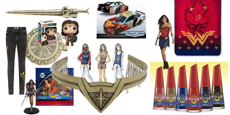
The Wonder Woman logo’s influence on pop culture is beyond epic. It’s appeared in comics, movies, merchandise, and even graffiti. It’s more than just a logo – it’s a symbol that resonates with people across generations and cultures.
The Future of the Wonder Woman Logo
Timeless Yet Adaptable
Despite its many iterations, the essence of the Wonder Woman logo has remained unchanged. It’s a timeless symbol, but it’s also proven to be adaptable. As our society evolves, so does the logo, subtly shifting to reflect our changing values and aspirations.
A Legacy to Carry Forward
What’s really exciting is thinking about what the future holds for this logo. Just like Wonder Woman herself, it’s a legacy that will continue to inspire and empower future generations. It’s a testament to the power of design and the enduring appeal of this iconic character.
FAQ On The Wonder Woman Logo
What’s the History Behind the Wonder Woman Logo?
The logo we all recognize? It’s evolved. Initially, it mirrored the eagle on Wonder Woman’s costume, a nod to her Amazonian roots and American identity.
Now? It’s streamlined, the iconic ‘W’ shaped like eagle wings—a blend of her heritage and the feminism she’s come to symbolize.
Why Does the Wonder Woman Logo Feature Stars?
It’s like the star-spangled banner wrapped onto her uniform. Stars are there for Americana, that patriotic vibe. They scream freedom, hope, and that fighting spirit. This imagery? It’s tethered to the very fabric of the nation she’s fighting for and the democratic ideals she embodies.
Is the Wonder Woman Logo a Copyrighted Design?
Absolutely. Warner Bros owns the rights. They’re like the legal guardians of the Wonder Woman brand, the logo included. From those action figures to the haute couture, it’s protected.
Try using it without permission, and you’ll face more than just an angry Amazonian; you’ll have the legal eagles swooping in.
What Does the Wonder Woman Logo Symbolize?
Strength. Honor. Feminine power. It’s not just about looking good on merchandise or in the latest movie promotion. That ‘W’? It carries weight. Like a beacon, it stands for every lady who ever fought to be heard, who struggled to prove her worth in a ‘man’s world.’
How Has the Wonder Woman Logo Changed Over the Years?
Started off as an eagle; now it’s sleek, modern—the double ‘W’. Each change? It tracked the character’s journey, her cultural impact, the whole zeitgeist. Graphic artists have kept the core soul, just dressed it in new threads for the current crowd.
Can the Wonder Woman Logo Be Used for Personal Projects?
Tread carefully. Personal, often equals ‘non-commercial’, which might be okay—but still a gray area. Warner Bros, they’re the gatekeepers here, so better safe than sorry. Your best bet? Get permission or just admire from afar.
What Role Does the Wonder Woman Logo Play in Branding?
It’s massive. The logo, it’s the face of the franchise. Slap it on something and it’s no longer just an item; it now speaks of heroism, of legacy. The emblem’s more than just branding; it’s storytelling with every glimpse.
How Do Greek Mythology and the Wonder Woman Logo Connect?
It’s all woven from the same mythical tapestry. Greek mythology, it’s her origin story—she’s an Amazon, born of gods’ whims and mortal turmoil. The logo, with its sharp aesthetics, speaks to that ancestry, that otherworldly lineage that courses through her narrative.
What’s the Significance of Wonder Woman Logo in Pop Culture?
Outgrown comics, that logo’s in the cultural bloodstream now. It catches eyes on cosplay costumes at Comic-Con, it struts the red carpets of blockbuster premieres, and it’s been inked onto skin as a symbol of empowerment. It’s pop culture royalty.
Are There Any Legal Considerations When Creating Art with the Wonder Woman Logo?
You bet. That logo, it’s an entity wrapped in red tape as much as golden lassos. Art’s cool, tribute’s fine, but the second things inch towards selling or distribution? Those legal shackles fasten tight. Artistry meets copyright—the eternal dance.
Conclusion
And there it stands, the Wonder Woman logo: not merely a splash of design flanking superhero merch. It’s the badge that’s sailed through time—morphing, adapting, but never losing its pulse. From the eagle’s broad wings to the simplistic yet forceful double ‘W,’ it’s been a journey through symbolism, a crusade across pop culture’s vast landscape.
Let’s not forget, it’s entwined with legal bindings tighter than her Lasso of Truth. It’s not just an emblem; it’s Warner Bros’ trademark, and with that label comes a fortress of rules.
So, whip that creative license but holster it with caution. Whether for branding that latest and greatest Comic-Con swag or drafting the next viral graphic tee, remember the power behind the shield. Full of mythological might with a sprinkle of stars and stripes—the logo endures, the silent yet inexorable chant of equality, valor, and a punch of female finesse that only Wonder Woman could deliver.
If you liked this article about the Wonder Woman logo, you should check out this article about the Batman logo.
There are also similar articles discussing the Superman logo, the Punisher logo, the Spider-Man logo, and the Iron Man logo.
And let’s not forget about articles on the Black Panther logo, the Deadpool logo, the Flash logo, and the Green Lantern logo.
Bogdan Sandu, a seasoned designer with 15 years of diverse experience, has been designing websites since 2008.
Renowned for his expertise in logo design and visual branding, Bogdan has developed a multitude of logos for various clients.
His skills extend to creating posters, vector illustrations, business cards, and brochures. Additionally, Bogdan's UI kits were featured on marketplaces like Visual Hierarchy and UI8.
Latest posts by Bogdan Sandu (see all)