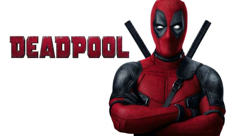
The Deadpool logo is one of the most recognizable symbols in Marvel Comics, built around Wade Wilson’s iconic red-and-black masked face with hollow oval eyes. It functions less like a traditional corporate mark and more like a character portrait that doubles as a brand symbol. Since the character’s debut in 1991, the logo has evolved alongside Deadpool’s growing cultural footprint, from cult comic antihero to full-blown Hollywood franchise. The emblem now appears across film, merchandise, gaming, and apparel at a scale most superhero logos never reach.
What Is the Deadpool Logo?
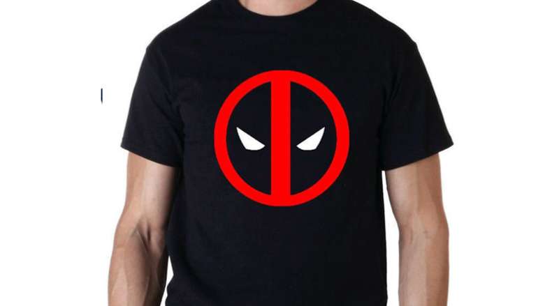
The Deadpool logo is a mascot-style emblem featuring the character’s masked face: a red and black design with large white oval eyes, first formalized in Marvel Comics during the early 1990s and widely standardized through the 2016 Fox film. It has no credited single designer.
- Design Type: Mascot-based emblem
- Primary Elements: Stylized masked face, oval eye cutouts, red and black color blocking, no typography in the core icon
- Official Introduction Date: Character debuted February 1991 (New Mutants Vol. 1 #98); logo standardized circa 2016 for film marketing
- Designer/Agency: Original character design by Rob Liefeld; film logo adapted by Marvel Studios and Fox marketing teams
- Trademark Status: Trademarked by Marvel Entertainment (Disney subsidiary)
- Color Palette: Red (#CC0000 primary), Black (#000000), White (#FFFFFF) for eye elements
- Usage Context: Film posters, comic covers, merchandise, apparel, digital platforms, gaming assets
How Has the Deadpool Logo Evolved Over Time?
The logo went from a loose comic-panel face to a globally standardized icon across three decades, gaining sharpness and brand consistency as the character’s commercial profile grew.
Early comic appearances had no unified logo treatment. The face appeared inconsistently across artists. It wasn’t until the film era that a locked-up, repeatable mark became standard.
Original Comic-Era Deadpool Emblem (1991–2015)
- Years Active: 1991–2015
- Design Description: Loose illustrated face, varying by artist and issue; no standardized icon version
- Color Scheme: Red and black, occasionally with white highlights depending on the artist
- Designer: Rob Liefeld (character creator), with numerous artists contributing variations
- Context: Deadpool was a supporting character before becoming a solo title star; the face served as costume detail rather than brand mark
- Key Changes from Previous: N/A (first iteration)
- Cultural Significance: Established the visual DNA: red mask, black shadows, hollow eyes. Readers recognized the face before it became a marketable icon
Film-Era Deadpool Logo (2016–2018)
- Years Active: 2016–2018
- Design Description: Cleaner, symmetrical face icon with bold red fill, sharp black outlines, and distinct white oval eyes. Used as a standalone mark across all marketing for the first two films
- Color Scheme: Bright red (#CC0000), solid black (#000000), white (#FFFFFF)
- Designer: Fox/Marvel marketing departments; no single credited designer publicly confirmed
- Context: The Ryan Reynolds-led 2016 film turned Deadpool into a mainstream phenomenon, requiring a consistent, reproducible logo for global merchandise and campaign use
- Key Changes from Previous: Standardized proportions, clean vector treatment replacing hand-drawn variation, far more symmetrical eye shapes
- Cultural Significance: This version became the definitive public image of the character. It appeared on everything from t-shirts to billboards and established the face as a standalone mark that needed no supporting text
MCU-Era Deadpool Logo (2024–Present)
- Years Active: 2024–present
- Design Description: Refined version of the film-era mark, now integrated into Marvel Studios’ visual identity system. Slightly more polished, with updated proportions suited to Disney’s brand standards
- Color Scheme: Red, black, white, with occasional gold accent elements in specific campaign uses
- Designer: Marvel Studios creative team
- Context: Deadpool & Wolverine (2024) marked the character’s transition into the MCU proper. The logo had to coexist with Marvel Studios’ broader identity while retaining Deadpool’s irreverent character
- Key Changes from Previous: Subtle refinements in line weight and proportion; integrated alongside Wolverine visual elements in co-branded campaign materials
- Cultural Significance: Signals Deadpool’s permanent place in the MCU canon, a legitimization that longtime fans had debated for years
What Do the Design Elements of the Deadpool Logo Mean?
![]()
The logo’s power comes from its simplicity. Two oval eyes on a red-and-black masked face is all it takes. That reductive design is exactly what makes it work at small sizes, on merchandise, and in fast-moving marketing contexts.
Every element connects directly to the character’s identity: the red signals aggression and danger, the black creates contrast and shadow, and the hollow eyes give the mask a blank, unpredictable quality that suits an antihero known for chaos.
What Does the Masked Face Symbolize?
The mask represents concealment with attitude. Unlike heroes whose masks suggest protection or mystery, Deadpool’s mask is almost comedic in its bluntness.
The hollow eyes give nothing away emotionally, which works perfectly for a character who uses humor and unpredictability as weapons. There’s something deliberately unsettling about a completely blank face that still reads as expressive.
It also connects to a long tradition of masked characters in comics, though Deadpool subverts the convention by being loud, irreverent, and self-aware about wearing the mask at all.
What Is the Historical Context Behind the Design?
Rob Liefeld created Deadpool during a period when comic book design was maximalist, detail-heavy, and often overwrought.
The costume design, with its tight red-and-black suit and simple face, was actually more restrained than many of its contemporaries. That relative simplicity made it more memorable and easier to reproduce across media.
As the character moved from page to screen, the design’s core elements survived intact because they were already clean enough to translate.
What Cultural References Does the Logo Draw From?
The oval eye shapes echo Spider-Man’s mask design, a connection Deadpool himself jokes about constantly in the comics.
The red-and-black color split has roots in both ninja aesthetics and classic comic villain design. But Deadpool recontextualizes both: he’s not a villain, not quite a hero, and the logo’s familiar-but-wrong quality captures that perfectly.
Some fans read the blank eyes as a reference to theatrical masks, specifically the neutral mask used in physical performance traditions where expression comes from movement, not face.
Why Did Deadpool’s Designers Choose These Specific Colors?

- Red (#CC0000)
- Symbolic meaning: Danger, aggression, violence, passion
- Psychological impact: Immediately attention-grabbing; triggers alertness. Understanding color psychology shows why red dominates action-oriented character design
- Brand connection: Red is dominant in many red logos associated with energy and urgency. It fits Deadpool’s chaotic, high-energy persona
- Black (#000000)
- Symbolic meaning: Contrast, shadow, the antihero’s moral ambiguity
- Psychological impact: Creates visual weight and makes the red pop harder. Also reads as edgy, fitting for a character who operates outside conventional heroism
- Brand connection: Black logos project authority and sophistication. Here it does neither, which is the point
- White (#FFFFFF)
- Symbolic meaning: The eye openings represent the void behind the mask, a character with no visible identity beneath the costume
- Psychological impact: The white creates contrast against both red and black, making the eyes the undeniable focal point of the entire mark
- Brand connection: Pure white prevents the logo from feeling heavy or oppressive despite the red-black dominance
What Typography Style Is Used in the Deadpool Logo?
The core Deadpool icon contains no typography. The face mark stands alone.
When text appears in film title treatments, it typically uses bold, condensed, distressed lettering that fits the character’s rough-around-the-edges personality. The font choices vary by campaign, but the common thread is weight and attitude over elegance.
No custom typeface has been officially trademarked as “the Deadpool font.” Different marketing teams have used similar styles without locking into a single typographic system, which honestly fits the character’s anti-establishment brand persona.
What Are the Hidden Meanings in the Deadpool Logo?
The most discussed “hidden” element is the face’s similarity to a skull when stripped of color context. The hollow eyes read differently depending on how much red is present.
Some designers have pointed out that the oval eye shapes create an almost symmetrical design that, at small sizes, can read as a simple smiley face, which is darkly appropriate for a character who jokes through violence.
There are no officially confirmed subliminal elements. Rob Liefeld has spoken about the costume design in interviews but hasn’t referenced intentional hidden symbolism. What’s there is what you see: a red mask, black contrast, and eyes that tell you nothing.
How Does the Deadpool Logo Compare to Competitor Logos?
Within Marvel’s roster, Deadpool’s logo is unusual for relying entirely on a face rather than an abstract symbol, a weapon, or a letter. Most superhero marks keep more distance between character and icon.
Compare it to the Spider-Man logo, which uses a spider symbol separate from Peter Parker’s face. Or the Iron Man logo, which abstracts the helmet into a graphic mark. Deadpool goes further by making the character’s literal face the logo with no abstraction at all.
Over on DC’s side, the Wonder Woman logo uses a stylized “WW” letterform, and the The Flash logo centers on a lightning bolt. Both are symbolic rather than representational.
The Punisher logo is the closest equivalent: a skull face used as a standalone mark. Both work for the same reason. They’re simple enough to function at any size, instantly recognizable, and tied directly to the character’s personality rather than their powers or backstory.
The Wolverine logo uses a mask silhouette with claw marks, and the Black Panther logo leans into a panther-head abstraction. Both are more graphically refined but arguably less instantly ownable than Deadpool’s face.
What Deadpool’s icon does better than most is work without color. The red-and-black version is definitive, but the silhouette alone is recognizable. That’s the test most logo designers use, and Deadpool passes it cleanly.
What Are the Technical Specifications of the Deadpool Logo?
Official Color Codes
- Primary Color: Red
- Hex: #CC0000
- RGB: (204, 0, 0)
- CMYK: (0, 100, 100, 20)
- Pantone: 186 C (approximate; no official confirmation from Marvel)
- Secondary Color: Black
- Hex: #000000
- RGB: (0, 0, 0)
- CMYK: (0, 0, 0, 100)
- Pantone: Black C
- Accent Color: White (eye elements)
- Hex: #FFFFFF
- RGB: (255, 255, 255)
- CMYK: (0, 0, 0, 0)
- Pantone: White
Dimensions and Proportions
- Aspect Ratio: Approximately 1:1 (the face icon is near-square in its base form)
- Minimum Size Requirements: Not officially published; in practice, the icon holds legibility down to approximately 24px at screen resolution
- Clear Space: Marvel’s general brand standards recommend clear space equal to the height of the primary mark on all sides, though Deadpool-specific guidelines aren’t publicly released
- File Formats: Official assets are distributed as vector graphics for professional use; consumer-facing downloads are typically JPEG or PNG. High-resolution bitmap versions are used in print contexts requiring specific DPI output
- Usage Guidelines: Governed by Marvel Entertainment’s trademark and licensing terms. Unauthorized commercial use is prohibited
What Cultural Impact Has the Deadpool Logo Had?
Few comic character logos have crossed over into mainstream fashion culture the way Deadpool’s has. The face appears on clothing worn by people who have never read a single issue.
That crossover happened fast. Between the 2016 film’s release and 2018’s sequel, Deadpool merchandise became one of Marvel’s top-selling categories globally. The logo drove that, partly because it works as pure graphic design even without franchise context.
The icon has also become a platform for fan creativity in a way that Marvel actively tolerates more than most of its properties. Fan-made variations place the mask on everything from other characters to food items. Deadpool’s self-aware, irreverent brand persona makes this feel appropriate rather than off-brand.
In tattoo culture specifically, the Deadpool face is among the most requested comic character designs, sitting alongside the Punisher skull and the Batman symbol as marks that translate well to body art. The simplicity and bold contrast make it ideal for that medium.
The 2024 Deadpool & Wolverine film extended this cultural reach further, introducing the logo to an audience that came to the character through the MCU rather than Fox’s earlier films. The mark has now existed across three distinct studio contexts and retained its recognizability through all of them.
How Does the Deadpool Logo Fit Into the Overall Brand Identity?
The logo sits at the center of a broader identity system that includes the character’s red-and-black costume, Wade Wilson’s voice and humor, Ryan Reynolds’ public persona, and Marvel’s franchise ecosystem.
These elements reinforce each other. Reynolds’ off-screen humor matches Deadpool’s on-screen personality, which matches the logo’s chaotic-but-clean visual attitude. The logo functions as the visual anchor for all of it.
Within Marvel’s broader brand, Deadpool occupies a deliberately separate lane. The logo rarely appears alongside the main Marvel Studios lockup in promotional materials, preserving its standalone identity. This separation is strategic: Deadpool’s brand is built on being the exception to every rule, and the logo treatment reflects that.
The character also connects visually to the wider world of film company logos and entertainment branding, where character-as-icon has become increasingly common. Deadpool did it before it was the obvious move, which is part of why the logo feels fresh even now.
From a brand guidelines perspective, the Deadpool mark is unusually flexible. It works in monochrome, in color, reversed, on dark or light backgrounds, and at sizes from app icons to stadium banners. That flexibility is a significant design achievement for what is, at its core, a very simple graphic.
How Should the Deadpool Logo Be Used?
Official Usage Guidelines
- Do: Use officially licensed assets from Marvel’s authorized channels. Maintain the original color proportions. Keep clear space around the mark. Use vector formats for any print or large-format application
- Don’t: Alter the color scheme without authorization. Stretch or distort the proportions. Combine with other marks in ways that imply official partnership without a license. Use on commercial products without a valid Marvel licensing agreement
Where to Access Official Logos
- Marvel’s official press and media portal for credentialed press use
- Licensed merchandise through Marvel’s authorized retail partners
- Marvel’s official brand licensing program for commercial partners
Licensing Information
Deadpool is a trademarked character owned by Marvel Entertainment, a subsidiary of The Walt Disney Company. Any commercial use of the logo, including on merchandise, apparel, print, or digital products, requires a valid licensing agreement with Marvel.
Fan art and non-commercial use exists in a gray area that Marvel has historically been relatively tolerant of, particularly for the Deadpool property. That said, tolerance is not authorization, and any commercial application requires proper licensing regardless of how the mark is being used.
Trademark Protection Details
- The Deadpool character, name, costume design, and associated marks are registered trademarks of Marvel Characters, Inc.
- Use of the logo in editorial, review, or news contexts generally falls under fair use provisions
- Online sellers offering unauthorized Deadpool merchandise regularly face takedown actions from Disney’s legal team
- The logo’s widespread fan use doesn’t reduce its legal protection status
FAQ on the Deadpool Logo
What does the Deadpool logo look like?
It’s a stylized masked face: red and black, with large white oval eyes.
No text, no weapon, no abstract shape. Just Wade Wilson’s mask rendered as a clean, repeatable emblem that works at any size.
What colors are used in the Deadpool logo?
The primary colors are red (#CC0000), black (#000000), and white (#FFFFFF) for the eye cutouts.
Red carries most of the visual weight. The black creates contrast and shadow. Together they make the Deadpool mask design instantly readable even at small sizes.
Who created the Deadpool logo?
Rob Liefeld designed the original Deadpool costume in 1991, which formed the basis for the logo.
The film-era mark was developed by Fox and Marvel’s marketing teams for the 2016 movie. No single designer has been officially credited for the standardized icon version.
When was the Deadpool logo first used?
The character debuted in New Mutants Vol. 1 #98, February 1991.
The face wasn’t used as a formal standalone logo until the 2016 film campaign. That’s when the Deadpool emblem became a locked, reproducible mark used consistently across global merchandise and marketing.
Is the Deadpool logo copyrighted?
Yes. It’s a registered trademark of Marvel Characters, Inc., a Disney subsidiary.
Commercial use without a valid Marvel licensing agreement isn’t permitted. Fan art in non-commercial contexts exists in a gray area, but that tolerance isn’t the same as authorization.
What is the meaning behind the Deadpool logo?
The hollow oval eyes signal blankness and unpredictability. There’s no readable emotion, which suits an antihero built on chaos and dark humor.
The red-and-black color split ties directly to color theory associations with danger and aggression, fitting for the merc with a mouth.
How has the Deadpool logo changed over time?
Early comic appearances had no standardized treatment. Each artist drew the mask differently.
The 2016 film locked in a clean, symmetrical vector mark. The 2024 MCU era brought subtle refinements to fit Marvel Studios’ broader brand style guide, while keeping the core Deadpool visual identity intact.
Where can I download the Deadpool logo PNG?
Official assets are available through Marvel’s press portal for credentialed media use.
For personal or fan use, many sites host Deadpool logo PNG and transparent versions. For any commercial application, you need a proper Marvel license. Using unofficial downloads on products sold publicly is a trademark violation.
How does the Deadpool logo compare to other Marvel logos?
Most Marvel character marks use abstract symbols or letterforms. Deadpool uses a literal face, which is unusual.
The Captain America logo uses a shield. The Thor logo leans on a hammer or wordmark. Deadpool skips abstraction entirely, making it one of the most character-specific icons in the Marvel roster.
What font is used in the Deadpool logo?
The core icon has no typography at all.
Film title treatments use bold, condensed, distressed lettering that matches the character’s personality. No single typeface has been officially locked in as the Deadpool font across all campaigns and merchandise uses.
Conclusion
The Deadpool logo works because it breaks the rules that most character marks follow.
No abstraction, no letterform, no weapon. Just a red-and-black masked face with hollow eyes that reads instantly at any scale.
From Rob Liefeld’s original Wade Wilson costume sketch to a globally licensed Marvel emblem, the Deadpool insignia has held its core identity across comics, film, and merchandise without losing what makes it recognizable.
That consistency, across three decades and three studio contexts, is the real achievement behind the merc with a mouth icon.
Renowned for his expertise in logo design and visual branding, Bogdan has developed a multitude of logos for various clients.
His skills extend to creating posters, vector illustrations, business cards, and brochures. Additionally, Bogdan's UI kits were featured on marketplaces like Visual Hierarchy and UI8.
He also wrote in the past years on sites like Design Your Way, WebDesignerDepot, WPDean, Designmodo, Speckyboy, Slider Revolution, and more.
- The Airtable Logo History, Colors, Font, And Meaning - 12 July 2026
- How to Blur Background in Canva: A Quick Tutorial - 11 July 2026
- Typography Trends - 10 July 2026
Bogdan Sandu is a seasoned designer who has been designing websites since 2008. Renowned for his expertise in logo design and visual branding, Bogdan has developed a multitude of logos for various clients. His skills extend to creating posters, vector illustrations, business cards, and brochures. Additionally, Bogdan's UI kits were featured on marketplaces like Visual Hierarchy and UI8. He also wrote in the past years on sites like Design Your Way, WebDesignerDepot, WPDean, Designmodo, Speckyboy, Slider Revolution, and more.
You Might Also Like