The Green Lantern logo is one of DC Comics’ most recognizable superhero emblems, a stylized green lantern symbol that has appeared on the chest of multiple characters since the character’s debut in 1940. It functions as both a badge of membership in the Green Lantern Corps and a visual shorthand for willpower, protection, and cosmic authority. Few comic book symbols have gone through as many meaningful redesigns while still staying instantly readable across decades of storytelling.
Within the broader history of superhero logos, the Green Lantern emblem sits in an interesting spot. It’s not a letter, not an animal, not an abstract shape. It’s a literal object turned symbol, which puts it in a small group alongside logos that derive meaning from actual imagery rather than pure iconography.
The current version of the logo features a black oval ring encircling a stylized green lantern shape, introduced in its modern form during the Silver Age revival of the character in 1959. The original Alan Scott version from 1940 used a more ornate, almost gothic lantern design. DC’s in-house artists handled most of the logo’s evolution over the years, though the 1959 redesign is credited to artist Gil Kane.
The character was first created in 1940 by Martin Nodell and Bill Finger. Since then, the logo has gone through at least five distinct iterations tied to different characters wearing the ring.
What is the Green Lantern Logo?
The Green Lantern logo is a DC Comics superhero emblem featuring a stylized lantern shape enclosed in a circular or oval border, rendered in green and black. Introduced in its current form in 1959, the symbol was refined by artist Gil Kane and represents willpower, the Green Lantern Corps, and cosmic peacekeeping authority.
- Design Type: Emblem / combination mark
- Primary Elements: Stylized lantern shape, circular or oval border, color blocking in green and black
- Official Introduction Date: 1959 (Silver Age version); original version 1940
- Designer/Agency: Gil Kane (1959 Silver Age redesign); Martin Nodell (1940 original)
- Trademark Status: Registered trademark of DC Comics / Warner Bros. Discovery
- Color Palette: Primary Green (#00B140 approximately), Black (#000000), White (#FFFFFF)
- Usage Context: Comic book covers, merchandise, film and TV productions, video games, apparel, digital platforms, and licensed products
How Has the Green Lantern Logo Evolved Over Time?
The Green Lantern logo has gone through five major design phases since 1940, moving from a detailed, ornate lantern to a clean, geometric emblem suited for modern media.
Each version tracked with a different character holding the ring, and the visual changes were rarely subtle.
Original Green Lantern Logo (1940-1951)
- Years Active: 1940-1951
- Design Description: A highly detailed, gothic-style lantern with ornate metalwork, often depicted in full color with dimensional shading. The symbol was more illustrative than iconic.
- Color Scheme: Red, green, and purple dominated Alan Scott’s costume during this era; the lantern itself was typically rendered in green and gold.
- Designer: Martin Nodell
- Context: Created during the Golden Age of comics. Alan Scott was a railroad engineer who found a magical green lantern, not a sci-fi space cop. The design reflected that mystical origin.
- Key Changes from Previous: N/A (original version)
- Cultural Significance: Established the core visual concept of the lantern as symbol. Readers recognized the object immediately, which made it effective even in its most complex form.
Silver Age Green Lantern Logo (1959-1986)
- Years Active: 1959-1986
- Design Description: A much cleaner, more geometric lantern shape inside a black oval. Gil Kane stripped away the ornamentation and created something that could be reproduced consistently at small sizes. This is the version most people picture when they think of the character.
- Color Scheme: Green and black, with white accents on Hal Jordan’s costume.
- Designer: Gil Kane
- Context: DC relaunched the character as Hal Jordan, a test pilot, shifting the mythos from fantasy to science fiction. The logo needed to feel modern and technical, not magical.
- Key Changes from Previous: Removed decorative metalwork, standardized the oval border, reduced the lantern shape to its essential geometry.
- Cultural Significance: This is the logo that defined the character internationally. It appeared on the chest of every Green Lantern Corps member and became the visual identity of one of DC’s most expansive cosmic storylines.
Post-Crisis / Modern Logo (1986-2004)
- Years Active: 1986-2004
- Design Description: Minor refinements to the Silver Age design. Cleaner lines, slightly adjusted proportions, better suited for offset printing improvements of the era. The core shape stayed the same.
- Color Scheme: Green (#00B140 range) and black, with variations across different Corps members’ costumes.
- Designer: DC Comics in-house art department
- Context: DC’s Crisis on Infinite Earths restructured the DC universe in 1986. Multiple characters held the ring during this period including John Stewart, Guy Gardner, and Kyle Rayner, each with slight costume variations but sharing the same core emblem.
- Key Changes from Previous: Printing quality improvements made the green more consistent; slight thinning of the oval border.
- Cultural Significance: The logo proved its flexibility during this period. It worked across different skin tones, costume designs, and character interpretations without needing modification.
New 52 / Rebirth Logo (2011-Present)
- Years Active: 2011-present
- Design Description: A refined digital version of the Silver Age emblem. The lantern shape is slightly more angular in some uses, with the oval border cleaned up for high-resolution digital display. Some adaptations use a glowing effect around the symbol.
- Color Scheme: Bright digital green (#00E676 in some digital uses), black, with occasional gradient treatments for marketing materials.
- Designer: DC Comics / Warner Bros. design teams
- Context: DC’s New 52 relaunch in 2011 modernized the entire line. The Green Lantern corner of the DC universe was actually one of the stronger-performing lines going into this period, so the logo changes were conservative.
- Key Changes from Previous: Optimized for digital display and merchandise; slight geometric tightening; adapted for the DC Extended Universe film branding.
- Cultural Significance: The first version of the logo truly designed for screens as a primary medium rather than print.
What Do the Design Elements of the Green Lantern Logo Mean?
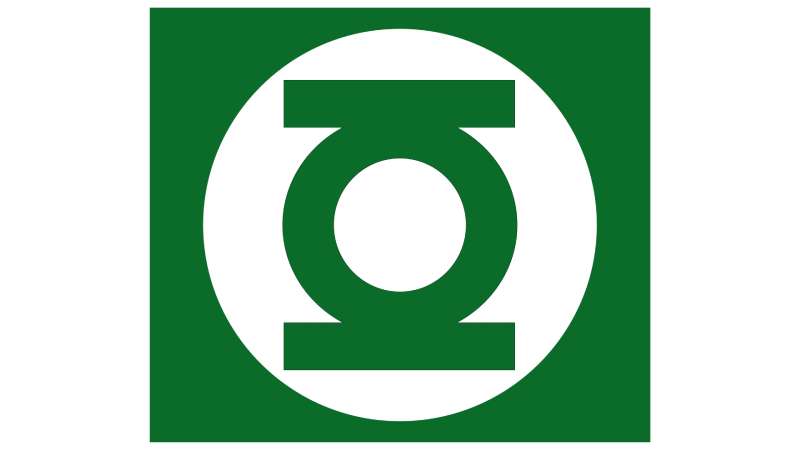
The Green Lantern logo communicates authority and membership through a simple object turned symbol. The lantern itself references both the power source of the ring and the original Golden Age character’s origin, while the oval border signals cosmic order and the structured hierarchy of the Corps.
Every element in the logo has a function. Nothing is decorative for its own sake.
What Does the Lantern Shape Symbolize?
The lantern shape traces back directly to Martin Nodell’s 1940 concept, where a magical green lantern was the literal power source for Alan Scott’s abilities.
When DC rebooted the character in 1959, the lantern became a power battery for a cosmic police force instead of a mystical artifact. But the image stayed, now carrying a different meaning: a universal symbol for the Green Lantern Corps that transcends language or planet of origin.
It’s a clever piece of visual storytelling. Any Corps member, anywhere in the universe, wears the same symbol. The lantern shape communicates belonging and shared purpose without words.
What Does the Oval Border Represent?
The black oval border added in the 1959 redesign does real design work. It creates a contained, badge-like shape that reads clearly at small sizes and works as a chest emblem without requiring perfect alignment.
The framing effect also puts the lantern symbol on a kind of pedestal, separating it from the costume fabric and giving it visual weight.
Compare this to something like the Superman S-shield, which has no border and relies entirely on the shield shape itself for containment. The Green Lantern oval is doing similar work with a different geometry.
Why Did Green Lantern Choose These Specific Colors?
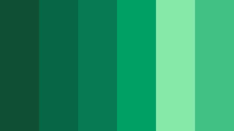
Green is the most deliberate choice in the entire design. Within DC’s mythology, green represents willpower, which is the core power source for every Green Lantern ring. The color psychology here actually aligns with real-world associations: green signals growth, stability, and forward motion.
- Green
- Hex: #00B140 (standard); #00E676 (digital/bright variant)
- Pantone: 354 C (closest standard match)
- Symbolic meaning: Willpower, life, cosmic authority, Corps membership
- Psychological impact: Trust, stability, forward momentum
- Brand connection: Directly tied to the in-universe color spectrum of emotions; green sits at the center of the emotional spectrum in DC mythology
- Black
- Hex: #000000
- Symbolic meaning: Contrast, authority, void of space
- Psychological impact: Weight, seriousness, grounding element
- Brand connection: Creates the contrast that makes the green pop at any size; also connects visually to the space setting of the Corps
- White
- Hex: #FFFFFF
- Symbolic meaning: Light, energy, the glow of ring constructs
- Psychological impact: Clarity, clean presentation
- Brand connection: Used as accent in costume design and logo variations; suggests the energy constructs made from ring power
The monochrome colors approach (green on black) keeps the logo readable across every application, from a tiny merchandise pin to a billboard.
What Typography Style Is Used in the Green Lantern Logo?
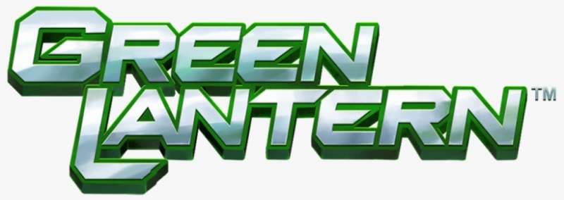
The standard Green Lantern logo is wordmark-free in its emblem form. The chest symbol contains no text.
When the “Green Lantern” name does appear in official branding, DC has used bold, condensed sans-serif typography with strong weight contrast. The lettering tends toward blocky, high-impact forms that read at a distance, consistent with how DC handles most of its character branding.
The 2011 film used a custom logotype with a slightly more aggressive angular treatment. The animated series branding leaned cleaner and more geometric. Neither version has become the definitive typographic standard the way the emblem itself has.
What Are the Hidden Meanings in the Green Lantern Logo?
The most interesting hidden layer in the logo is how the lantern shape functions as a literal power battery in miniature. Every Corps member charges their ring by holding it to a power battery that looks exactly like the logo on their chest. The symbol is both the brand and the fuel source, represented simultaneously.
There’s also a subtle nod to the original Golden Age character that most casual readers miss. Alan Scott’s lantern was carved from a meteorite called the Starheart. The modern logo retains the same basic object shape, quietly connecting two very different characters across eight decades of comics.
Unintentionally, the oval border reads differently across cultures. In some contexts it can suggest a police badge or official seal, which actually reinforces the Corps-as-cosmic-police-force narrative without anyone planning it that way.
How Does the Green Lantern Logo Compare to Competitor Logos?
Among DC and Marvel superhero emblems, the Green Lantern logo occupies a specific design category: object-based symbols. It doesn’t use a letter, an animal, or an abstract shape. It uses a recognizable object, which is rarer than it sounds.
Compared to the Iron Man logo, which relies on a face/helmet silhouette, the Green Lantern emblem is more abstract and less character-specific. That’s actually a design advantage: it scales across multiple characters wearing the ring without modification.
The Captain America logo uses a similar badge-like structure with its circular shield design, but it’s character-specific. The Green Lantern Corps concept means the same logo applies to hundreds of characters across DC’s mythology, which is a unique design challenge solved reasonably well.
The The Flash logo goes the other direction entirely: a simple lightning bolt that communicates speed instantly without any object reference. Both approaches work, but the Flash symbol is arguably more immediately readable to someone with zero comic book context.
Against Marvel’s equivalent cosmic characters, the Captain Marvel logo uses a starburst/lightning bolt hybrid that’s more aggressive and harder to reproduce at small sizes. The Green Lantern oval-and-lantern combination is actually cleaner at miniature scale.
The Wonder Woman logo and Aquaman logo both rely heavily on stylized letterforms (W and A respectively), which makes them more immediately readable as character-specific but less adaptable as a shared organizational symbol.
What Are the Technical Specifications of the Green Lantern Logo?
Official Color Codes
- Primary Color: Green
- Hex: #00B140
- RGB: (0, 177, 64)
- CMYK: (100, 0, 64, 0)
- Pantone: 354 C
- Secondary Color: Black
- Hex: #000000
- RGB: (0, 0, 0)
- CMYK: (0, 0, 0, 100)
- Pantone: Black C
- Accent Color: White
- Hex: #FFFFFF
- RGB: (255, 255, 255)
- CMYK: (0, 0, 0, 0)
- Pantone: White
Dimensions and Proportions
- Aspect ratio: Approximately 1:1.2 (width to height) for the oval emblem
- Minimum size requirements: DC’s brand guidelines for licensed merchandise typically require a minimum of 0.5 inches (approximately 36px at 72 DPI) for the emblem to remain legible
- Clear space specifications: A minimum clear space equal to the width of the oval border should surround the emblem on all sides
- Official usage guidelines: Available through DC Comics licensing agreements; vector graphics formats are required for print production above business card size
- File formats: Official assets distributed in vector (AI, EPS, SVG) and raster (PNG with transparent background) formats for different use cases
What Cultural Impact Has the Green Lantern Logo Had?
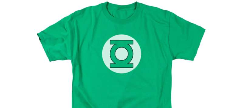
The Green Lantern symbol has punched above its weight culturally, especially considering the character has never had a breakout film franchise the way Batman or Superman have.
The most significant cultural moment came through John Stewart’s version of Green Lantern in the Justice League animated series (2001-2004). For an entire generation of kids, John Stewart was Green Lantern, and his version of the logo became the default mental image for millions of viewers who had never read a comic.
That animated run is one of the reasons the character’s logo ranks consistently among the most recognized superhero logos despite the character having less mainstream film presence than Marvel’s cosmic heroes.
The symbol also became a genuine subculture marker. Green Lantern Corps merchandise, tattoos, and fan art all use the emblem as a signal of belonging to a specific corner of comics fandom, which parallels how the symbol functions within the actual DC mythology.
The 2011 Ryan Reynolds film underperformed commercially, but it did briefly push the logo into mass market visibility through merchandise, fast food tie-ins, and promotional campaigns. Even in failure, the emblem reached wider audiences than the comic alone could manage.
In recent years, HBO Max’s Green Lantern series development kept the logo circulating in entertainment news, maintaining brand visibility without a major theatrical release to anchor it.
How Does the Green Lantern Logo Fit Into the Overall Brand Identity?
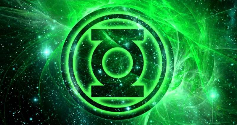
The Green Lantern logo doesn’t exist in isolation. It connects to a wider network of DC brand elements, Corps mythology, and character-specific visual systems that all relate back to the central emblem.
Within DC’s broader brand style guide, the Green Lantern emblem sits alongside other character logos as part of a consistent visual language. DC tends to use bold, high-contrast emblems across its character roster, and the Green Lantern design fits that system while staying distinct from it.
The Corps concept actually extends the brand identity in an unusual way. Because multiple characters wear the same symbol, the logo represents an organization rather than an individual. That makes it function more like a sports team emblem than a traditional superhero logo, closer to an NHL logos or NFL logos system than a character-specific mark.
The color green also connects the logo to a specific emotional and thematic territory within DC’s mythology. Other Corps (Yellow Lanterns, Red Lanterns, etc.) use the same oval-and-symbol structure but swap the color, which means the color palette is doing most of the identity work in distinguishing groups from each other.
The brand guidelines for Green Lantern licensing are managed through Warner Bros. Discovery’s consumer products division, which coordinates consistency across comics, animation, film, and merchandise.
How Should the Green Lantern Logo Be Used?
Official Usage Guidelines
- Do use: Official vector files from DC’s licensed asset library for any print or large-format application
- Do use: The logo at approved minimum sizes to maintain legibility of the lantern shape and oval border
- Do use: The approved green (#00B140 / Pantone 354 C) rather than substituting similar greens that shift the brand color
- Don’t: Alter the proportions of the oval border or lantern shape
- Don’t: Use the logo on backgrounds that create insufficient contrast with the green; the emblem requires either a dark or white background for clear reading
- Don’t: Apply drop shadows, bevels, or 3D effects to the standard flat logo without authorization from DC’s licensing team
- Don’t: Reproduce the logo from screenshot or low-resolution sources for any professional application; rasterized versions pulled from web searches will fail at print DPI requirements
Where to Access Official Logo Files
Official Green Lantern logo assets are not publicly available for download. Access requires a licensing agreement with DC Comics / Warner Bros. Discovery Consumer Products. Fan and editorial use falls under fair use provisions, but commercial applications (merchandise, promotional materials, product packaging) require formal licensing.
For fan art and non-commercial creative work, the logo appears in various DC Comics publications and can be referenced for personal projects without formal approval, though DC actively monitors commercial misuse of its trademarked characters and symbols.
Licensing and Trademark Information
- Trademark owner: DC Comics / Warner Bros. Discovery
- Registration: Registered trademark in the United States and internationally
- Licensing inquiries: Handled through Warner Bros. Discovery Consumer Products licensing division
- Fan/editorial use: Generally permitted for non-commercial, clearly transformative, or journalistic purposes under fair use provisions
- Commercial use: Requires formal licensing agreement; unauthorized commercial use is actively enforced
FAQ on The Green Lantern Logo
What Does the Green Lantern Logo Represent?
The Green Lantern emblem represents willpower and membership in the Green Lantern Corps, DC’s intergalactic peacekeeping force.
The stylized lantern shape inside a black oval connects directly to the power battery that every ring-wielder uses to recharge their abilities.
Who Designed the Original Green Lantern Symbol?
Martin Nodell created the original lantern insignia in 1940 for the Golden Age character Alan Scott.
Gil Kane later redesigned it in 1959 for Hal Jordan’s Silver Age debut, producing the cleaner, more geometric version that most people recognize today.
What Do the Colors in the Green Lantern Logo Mean?
Green represents willpower in DC’s emotional spectrum mythology. It’s the color at the center of the spectrum, flanked by fear (yellow) and rage (red).
Black provides contrast and grounds the emblem visually, while also suggesting the void of deep space where the Green Lantern Corps operates.
How Many Times Has the Green Lantern Logo Changed?
The logo has gone through at least five distinct versions since 1940, tracking with each major character who has held the power ring.
Alan Scott, Hal Jordan, John Stewart, Guy Gardner, and Kyle Rayner each brought slight variations, though the core lantern sigil stayed consistent.
Is the Green Lantern Logo the Same for All Green Lanterns?
Yes. The corps emblem is universal across all Green Lantern Corps members, regardless of species or planet of origin.
That’s actually unusual in superhero branding. The logo functions more like a military insignia than a personal character mark, which is a deliberate design choice.
What Is the Official Green Color Used in the Green Lantern Logo?
The standard green is closest to Pantone 354 C, with a hex value around #00B140.
Digital versions sometimes use a brighter variant near #00E676 for screen applications. Neither is universally standardized across all DC licensed products, which creates some inconsistency in merchandise.
What Type of Logo Is the Green Lantern Symbol?
It’s a pure emblem mark, no wordmark or letterform involved in the core chest symbol.
The logo design uses a pictorial approach, a literal object (a lantern) rendered in simplified geometric form, which puts it in a small category of superhero logos that use recognizable objects rather than abstract shapes or letters.
How Does the Green Lantern Logo Compare to Other DC Hero Logos?
Most DC logos are character-specific. The Green Lantern emblem is unique because it represents an entire organization, not just one hero.
Compared to the Spider-Man logo or Daredevil logo, which are tied to single characters, the Green Lantern power ring symbol works more like a badge of office shared across hundreds of Corps members throughout DC comics history.
Can the Green Lantern Logo Be Used Commercially?
No, not without a formal licensing agreement through Warner Bros. Discovery Consumer Products.
The Green Lantern chest symbol is a registered trademark of DC Comics. Fan and editorial use is generally tolerated under fair use, but commercial applications on merchandise or marketing materials require approved licensing.
What Is the Cultural Legacy of the Green Lantern Logo?
The logo gained major mainstream recognition through the Justice League animated series (2001-2004), where John Stewart’s version reached audiences far beyond comic book readers.
That run shaped how an entire generation pictures the Green Lantern badge, arguably more than any print run or film has since.
Conclusion
The Green Lantern logo is more than a chest emblem. It’s a corps insignia that has represented willpower, cosmic authority, and organizational identity across eight decades of DC Comics storytelling.
Few superhero symbols carry that kind of dual function, working as both a personal badge and a shared organizational mark across hundreds of characters.
From Martin Nodell’s ornate 1940 original to Gil Kane’s cleaner power ring symbol, each version tracked a shift in how the character was positioned culturally.
The lantern corps logo remains one of the most structurally distinctive emblems in comic book branding, built to scale across merchandise, animation, and digital platforms without losing its core readability.

Renowned for his expertise in logo design and visual branding, Bogdan has developed a multitude of logos for various clients.
His skills extend to creating posters, vector illustrations, business cards, and brochures. Additionally, Bogdan's UI kits were featured on marketplaces like Visual Hierarchy and UI8.
He also wrote in the past years on sites like Design Your Way, WebDesignerDepot, WPDean, Designmodo, Speckyboy, Slider Revolution, and more.
- Versatile Work Sans Font Pairing for Every Project - 16 September 2026
- Organize Digital Files Like a Pro Before Your Next Client Handoff - 16 September 2026
- How to Set Up a Digital Menu Board: Hardware to Layout - 15 September 2026

Bogdan Sandu is a seasoned designer who has been designing websites since 2008. Renowned for his expertise in logo design and visual branding, Bogdan has developed a multitude of logos for various clients. His skills extend to creating posters, vector illustrations, business cards, and brochures. Additionally, Bogdan's UI kits were featured on marketplaces like Visual Hierarchy and UI8. He also wrote in the past years on sites like Design Your Way, WebDesignerDepot, WPDean, Designmodo, Speckyboy, Slider Revolution, and more.
You Might Also Like