The Captain America logo is one of the most recognizable symbols in comic book history. It’s a circular shield design featuring a white star at the center, surrounded by concentric rings of red and blue. First appearing in 1941, the emblem has been tied to patriotism, wartime heroism, and Marvel’s broader universe ever since. Over eight decades, it has appeared across comics, film, merchandise, and digital platforms, making it one of the most reproduced superhero logos in pop culture.
What Is the Captain America Logo?
The Captain America logo is a circular shield emblem with a white five-pointed star at its center, framed by alternating red and blue concentric rings. It was introduced in 1941 by co-creators Joe Simon and Jack Kirby and serves as both a weapon and a symbol of American ideals within Marvel Comics.
Design Type: Emblem / Badge mark
Primary Elements: Circular shield, five-pointed white star, concentric red and blue rings
Official Introduction Date: March 1941 (Captain America Comics #1)
Designer/Agency: Joe Simon and Jack Kirby
Trademark Status: Registered trademark owned by Marvel Entertainment, LLC (subsidiary of The Walt Disney Company)
Color Palette:
- Red: #B22234
- Blue: #3C3B6E
- White: #FFFFFF
Usage Context: Comic books, MCU films, merchandise, apparel, video games, digital platforms, theme park attractions
How Has the Captain America Logo Evolved Over Time?
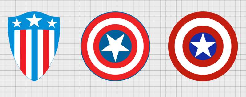
The logo has gone through several notable shifts since 1941, moving from a more angular wartime design to the smoother, film-ready emblem seen today. Each version reflects the era it came from, whether that’s WWII-era propaganda aesthetics or the polished visual language of the MCU.
Original Captain America Logo (1941-1950)
- Years Active: 1941-1950
- Design Description: A roughly circular shield with a central star, early printing limitations made the colors appear flatter and the lines less precise
- Color Scheme: Red, white, and blue (limited by four-color printing of the era)
- Designer: Joe Simon and Jack Kirby
- Context: Created during WWII as a direct response to Nazi Germany, the character and his shield were meant to embody American resistance
- Key Changes from Previous: First version; no prior iteration
- Cultural Significance: Represented wartime morale and patriotism; the shield became an instant icon even before the character was fully fleshed out
Silver Age Captain America Logo (1964-1980s)
- Years Active: 1964-1980s
- Design Description: Cleaner, more consistent circular form as Marvel’s printing improved; the star became crisper and the rings more evenly spaced
- Color Scheme: Brighter reds and blues reflecting improved four-color printing
- Designer: Jack Kirby (character revival), refined by Marvel’s in-house art team
- Context: Steve Rogers returned to comics in Avengers #4 (1964); the logo needed to work in a more modern storytelling context
- Key Changes from Previous: More uniform geometry, improved color consistency
- Cultural Significance: Repositioned the character from a WWII relic to a man out of time, and the cleaner logo helped sell that transition
Modern Comics Logo (1990s-2010)
- Years Active: 1990s-2010
- Design Description: Digital tools allowed for perfectly symmetrical circles and sharp star geometry; some runs experimented with shading and a slightly three-dimensional look
- Color Scheme: Richer, deeper reds and blues with occasional metallic treatments
- Designer: Marvel’s design and editorial team
- Context: Comics went through significant visual evolution as desktop publishing took over; the shield got a more polished, almost rendered quality
- Key Changes from Previous: Introduction of digital shading and depth effects
- Cultural Significance: Kept pace with changing comic aesthetics while staying true to the core shape
MCU Film Logo (2011-Present)
- Years Active: 2011-present
- Design Description: The most refined version. The shield is a perfectly proportioned circle with clean, flat color bands and a sharp central star. The MCU version is also physically realized as a prop, which shaped how the logo reads on screen
- Color Scheme: Standardized red (#B22234), blue (#3C3B6E), and white (#FFFFFF)
- Designer: Marvel Studios design team in collaboration with prop and costume departments
- Context: The First Avenger (2011) required a logo that could work across film, merchandise, and global marketing simultaneously
- Key Changes from Previous: Standardized color codes, strictly geometric proportions, optimized for both physical and digital use
- Cultural Significance: Became a global icon through the MCU’s massive reach, recognized far beyond comic book audiences
What Do the Design Elements of the Captain America Logo Mean?
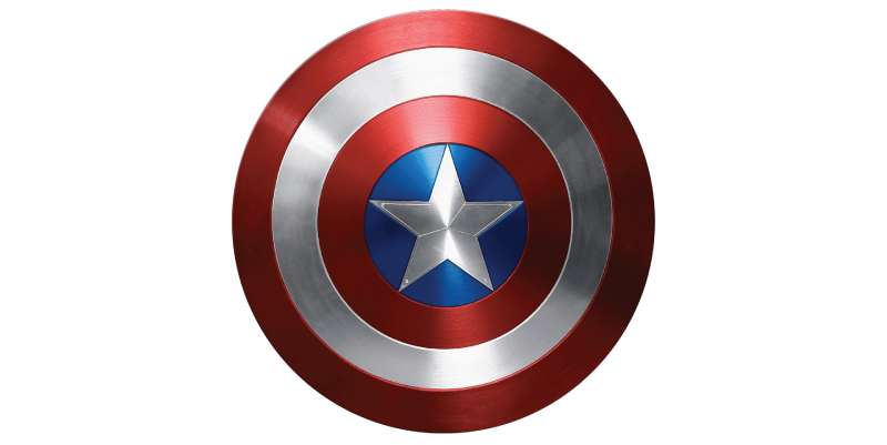
Every part of the shield is deliberate. The circular form, the star, the color bands, none of it is accidental. The logo functions as both a character symbol and a broader statement about the values Captain America represents.
The circle is one of the oldest shapes in design, suggesting protection, completeness, and unity.
In the context of the shield, it communicates defense first. Steve Rogers doesn’t charge in with a weapon; he leads with a barrier.
That’s a meaningful design choice, especially for a character created during wartime.
Why Did Captain America’s Designers Choose These Specific Colors?
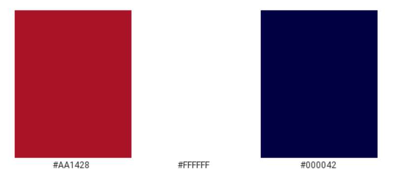
Red (#B22234)
- Symbolic meaning: Valor, sacrifice, and urgency
- Psychological impact: Commands attention, signals action
- Brand connection: Direct reference to the American flag; in red logos broadly, this shade reads as bold and authoritative
Blue (#3C3B6E)
- Symbolic meaning: Trust, loyalty, and steadiness
- Psychological impact: Calming counterpoint to red; suggests reliability
- Brand connection: Also pulled from the American flag; blue logos are consistently associated with authority and dependability
White (#FFFFFF)
- Symbolic meaning: Purity, clarity, and moral integrity
- Psychological impact: Creates contrast, draws the eye to the star
- Brand connection: Represents the idealism at the character’s core
Together, the three colors form a color theory setup rooted in national symbolism, but they also just work visually. High contrast, clear hierarchy, instantly readable at any size.
What Typography Style Is Used in the Captain America Logo?
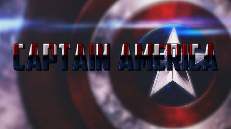
The shield itself contains no typography. When text does appear in official Captain America branding, it tends toward bold, condensed sans-serif styles.
These choices prioritize strength and legibility over elegance.
The character’s name in promotional materials often uses heavy slab or military-adjacent letterforms, reinforcing the wartime origins.
No specific custom typeface has been officially named as the Captain America font, but the visual language across Marvel’s branding leans toward bold, no-nonsense letterforms that feel both authoritative and accessible.
What Are the Hidden Meanings in the Captain America Logo?
The shield’s circular form wasn’t always the plan. Early designs showed a heater-shaped shield (triangular, like a medieval knight’s), which was changed after complaints from MLJ Comics that it resembled their character The Shield.
That constraint actually produced a better design.
The circle is more universal. It reads as a target, a symbol, and a weapon all at once.
The central star has five points, matching the stars on the American flag, but it also sits dead center in a perfectly symmetrical composition. That level of symmetry creates an almost subconscious sense of stability and order, which suits a character defined by consistency and moral clarity.
How Does the Captain America Logo Compare to Competitor Logos?
Within the superhero space, few logos match the Captain America shield for instant recognition. It’s geometric, color-coded, and shape-based, making it readable even at small sizes or from a distance.
Compare that to the Spider-Man logo, which relies on a spider silhouette that requires slightly more detail to read clearly.
The Iron Man logo is more abstract, an arc reactor shape that makes sense in context but doesn’t carry the same standalone symbolic weight.
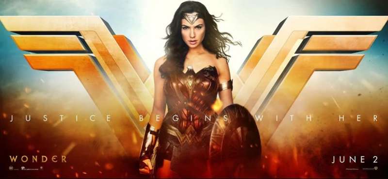
The Wonder Woman logo is actually a close competitor in terms of clarity: bold, geometric, color-driven. Both work because they’re simple enough to recognize instantly but loaded with enough meaning to hold up under scrutiny.
Where Captain America’s logo differs is in its dual function. The shield isn’t just a chest symbol; it’s the actual weapon/tool the character uses. That’s rare. The logo and the object are the same thing, which gives it a layer of authenticity that most superhero insignias don’t have.
Compared to DC’s Flash logo or Green Lantern logo, the Captain America shield also benefits from being purely shape-based with no letterform dependency. You don’t need to read anything to understand it.
What Are the Technical Specifications of the Captain America Logo?
Official Color Codes:
Primary Color: Red
- Hex: #B22234
- RGB: (178, 34, 52)
- CMYK: (0, 81, 71, 30)
- Pantone: 193 C
Primary Color: Blue
- Hex: #3C3B6E
- RGB: (60, 59, 110)
- CMYK: (45, 46, 0, 57)
- Pantone: 281 C
Accent Color: White
- Hex: #FFFFFF
- RGB: (255, 255, 255)
- CMYK: (0, 0, 0, 0)
- Pantone: White
Dimensions and Proportions:
- Aspect ratio: 1:1 (perfect circle)
- Minimum size requirements: Marvel’s brand guidelines generally require a minimum of 1 inch (72px) diameter for digital use to maintain star and ring legibility
- Clear space: A minimum clear space equal to the radius of the shield on all sides is recommended in official merchandise guidelines
- Official usage: RGB color mode for digital; CMYK for print. For high-resolution print applications, a minimum of 300 DPI is standard. The logo is distributed as a vector graphic for scalability across all official channels
What Cultural Impact Has the Captain America Logo Had?
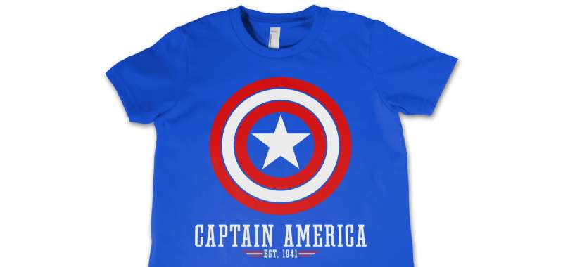
Few fictional symbols have crossed over into real-world cultural conversations the way the Captain America shield has.
During WWII, the character was literal wartime propaganda, used to sell war bonds and boost morale. The shield was on the cover of Captain America Comics #1 (March 1941), depicting Cap punching Adolf Hitler, months before the US officially entered the war.
That’s a bold editorial statement, and the shield was at the center of it.
In the decades since, the logo has appeared on everything from military-themed fan gear to political protest signs, sometimes used sincerely, sometimes ironically. That kind of versatility is unusual for a corporate IP symbol.
The MCU pushed recognition even further. After Avengers: Endgame (2019), the shield became shorthand for a certain kind of selfless heroism in global pop culture, not just American culture. It’s now one of the most merchandised symbols in the entertainment industry, alongside recognizable marks from tech giants and sports franchises.
It also shows up frequently in discussions about patriotism, identity, and what America’s values actually look like in practice, conversations the comics themselves have actively engaged with, particularly in stories where Steve Rogers challenges government overreach.
How Does the Captain America Logo Fit Into the Overall Brand Identity?
The shield sits within a much larger connected system. It’s one node in Marvel’s broader visual identity, which spans dozens of characters, each with their own recognizable marks.
Within the Avengers as a group, each character’s logo needs to work both independently and as part of a collection. The Captain America shield does this well because its circular form and bold color palette hold their own without competing visually with other symbols.
It connects directly to the broader Marvel Studios brand, which itself operates under Disney’s umbrella. That means the shield has to work within Marvel’s brand guidelines, Disney’s licensing framework, and the specific visual language of whatever film, series, or product it appears on.
The logo also functions as a character identifier in merchandise contexts. When you see the shield on a backpack or phone case, you don’t need the character’s name. That level of standalone recognition is something most fictional brands never achieve.
Compared to other Marvel character logos, the shield arguably has the most brand independence. The Black Panther logo, the Thor logo, even the Hawkeye logo all tend to be recognized primarily by fans. The Captain America shield gets recognized by people who’ve never read a comic in their lives.
How Should the Captain America Logo Be Used?
Official usage guidelines (do’s):
- Use only official, high-resolution files sourced from Marvel’s licensed asset library
- Maintain the correct color codes across all applications (RGB for screen, CMYK for print)
- Preserve the shield’s proportions; never stretch or skew the circular form
- Keep required clear space around the logo intact
- Use vector graphics format (SVG, EPS, or AI) for scalable applications to avoid quality loss
Don’ts:
- Do not alter the color scheme or apply gradients, drop shadows, or effects not approved by Marvel
- Do not recreate the logo from memory or use unofficial fan-made versions in commercial contexts
- Do not place the logo on cluttered backgrounds that reduce legibility
- Do not use the logo in any context that could imply Marvel’s endorsement without a licensing agreement
- Do not use low-resolution raster files (such as a JPEG screenshot) for print applications
Where to access official logos: Official assets are available to licensed partners through Marvel’s brand portal. Fan use is subject to Marvel’s fan content policy, which permits non-commercial creative use under specific conditions.
Licensing information: Commercial use of the Captain America logo requires a licensing agreement with Marvel Entertainment, LLC. Unauthorized commercial use constitutes trademark infringement. Marvel actively enforces its intellectual property rights globally.
Trademark protection: The shield design is a registered trademark of Marvel Entertainment, LLC, a subsidiary of The Walt Disney Company. This covers the circular shield design, the color combination, and the star placement as a unified mark.
FAQ on The Captain America Logo
What does the Captain America logo represent?
The circular shield emblem represents American ideals: courage, protection, and moral integrity.
The white star at the center reinforces the patriotic superhero icon status, while the red and blue rings directly reference the American flag’s color palette.
Who designed the original Captain America shield logo?
Joe Simon and Jack Kirby created the original design in 1941 for Timely Comics, later Marvel Comics.
The heater-shaped shield was scrapped early on. The circular version we know came from a practical dispute with MLJ Comics over a similar design.
What are the official colors of the Captain America logo?
The three official colors are red (#B22234), blue (#3C3B6E), and white (#FFFFFF).
These map directly to Pantone standards: 193 C for red and 281 C for blue. Consistent across all MCU merchandise and Marvel Studios productions.
Has the Captain America logo changed over the years?
Yes, several times. The Steve Rogers insignia evolved from rough wartime printing in 1941 through cleaner Silver Age versions to today’s precisely geometric MCU shield.
Each iteration reflects its era’s printing technology and visual design standards.
What shape is the Captain America logo?
A perfect circle with a 1:1 aspect ratio. This wasn’t always the case; early designs used a triangular heater shape before the circular shield became the standard First Avenger emblem.
Is the Captain America logo trademarked?
Yes. Marvel Entertainment, LLC (a Disney subsidiary) holds the registered trademark covering the shield’s circular form, star placement, and red-white-blue color combination as a unified mark.
Commercial use requires a licensing agreement.
How does the Captain America logo compare to other Avengers logos?
It’s arguably the most standalone-readable among all team-based logos in Marvel’s lineup. Unlike character-specific marks that need context, the vibranium shield graphic is recognized globally by people well outside comic book audiences.
What file formats are available for the Captain America logo?
Official licensed assets come in vector formats (SVG, EPS, AI) for scalable use. You’ll also find PNG with transparent backgrounds for digital applications.
Avoid using low-resolution bitmap versions for anything beyond casual personal use.
What is the meaning of the star in the Captain America logo?
The five-pointed star mirrors the stars on the American flag, connecting the star-centered shield art directly to national symbolism.
Placed dead center in a perfectly symmetrical composition, it also creates an immediate focal point that draws the eye instantly.
Where can I find the official Captain America logo for use?
Licensed partners access official assets through Marvel’s brand portal.
For fan and non-commercial creative use, Marvel’s fan content policy permits limited use under specific conditions. Any commercial application requires a formal licensing agreement with Marvel Entertainment.
Conclusion
The Captain America logo has held its ground for over 80 years, and that’s not an accident.
A circular shield, a white star, three colors pulled straight from the American flag; it’s a clean, direct design that works at any size and in any context.
From Jack Kirby’s original comic book badge to the MCU character emblem seen across global merchandise, the core visual has barely needed to change.
That kind of staying power comes from strong logo design principles baked in from the start: simplicity, symbolism, and a shape that doubles as the character’s defining weapon.
Among Marvel superhero emblems, few carry this much weight with this little complexity.

Renowned for his expertise in logo design and visual branding, Bogdan has developed a multitude of logos for various clients.
His skills extend to creating posters, vector illustrations, business cards, and brochures. Additionally, Bogdan's UI kits were featured on marketplaces like Visual Hierarchy and UI8.
He also wrote in the past years on sites like Design Your Way, WebDesignerDepot, WPDean, Designmodo, Speckyboy, Slider Revolution, and more.
- Versatile Work Sans Font Pairing for Every Project - 16 September 2026
- Organize Digital Files Like a Pro Before Your Next Client Handoff - 16 September 2026
- How to Set Up a Digital Menu Board: Hardware to Layout - 15 September 2026

Bogdan Sandu is a seasoned designer who has been designing websites since 2008. Renowned for his expertise in logo design and visual branding, Bogdan has developed a multitude of logos for various clients. His skills extend to creating posters, vector illustrations, business cards, and brochures. Additionally, Bogdan's UI kits were featured on marketplaces like Visual Hierarchy and UI8. He also wrote in the past years on sites like Design Your Way, WebDesignerDepot, WPDean, Designmodo, Speckyboy, Slider Revolution, and more.
You Might Also Like