


The Hawkeye logo refers to two distinct visual identities: the University of Iowa’s athletic branding and the Marvel Comics character’s symbol. Both have gone through real design work, not just slapping a hawk on a jersey and calling it done. The Iowa version, known as the Tigerhawk, is one of college athletics’ most recognized marks. The Marvel version has evolved alongside the character through decades of comic runs and, more recently, the Disney+ series.
Within logo design history, both versions sit at interesting crossroads. Sports branding and superhero iconography don’t usually share design DNA, but Hawkeye pulls from the same instinct: make something instantly readable at a distance, whether on a helmet or a comic cover.
Current version: Iowa’s Tigerhawk has been in use since 1979. The Marvel/MCU version was refreshed for the 2021 Disney+ series.
Designer: Evelyn Hotopp (Iowa Tigerhawk). The Marvel series logo was developed by the in-house Marvel Studios team.
Iterations: Iowa has gone through roughly six logo phases. The Marvel character logo has changed with nearly every major comic relaunch.
What is the Hawkeye Logo?
The Hawkeye logo exists in two primary forms: the University of Iowa’s Tigerhawk, an abstract hawk head mark introduced in 1979 and designed by Evelyn Hotopp, and the Marvel character emblem, a stylized “H” or arrow motif tied to Clint Barton’s archery identity.
- Design Type: The Iowa version is an abstract emblem/mascot-based mark. The Marvel version functions as an icon and combination mark depending on context.
- Primary Elements: Iowa: bold hawk head silhouette in black and gold. Marvel: stylized arrow or “H” letterform, often in purple.
- Official Introduction Date: Iowa Tigerhawk: 1979. Marvel MCU series logo: November 2021.
- Designer/Agency: Evelyn Hotopp (Iowa). Marvel Studios creative team (MCU).
- Trademark Status: The Tigerhawk is a registered trademark of the University of Iowa. Marvel’s Hawkeye branding is owned by Marvel Entertainment, LLC.
- Color Palette: Iowa uses Black (#000000) and Old Gold (#FFCD00). Marvel’s Hawkeye uses Purple (#4B0082 range) and dark neutrals.
- Usage Context: Uniforms, merchandise, digital platforms, stadium signage (Iowa). Comic covers, streaming platform branding, merchandise (Marvel).
How Has the Hawkeye Logo Evolved Over Time?
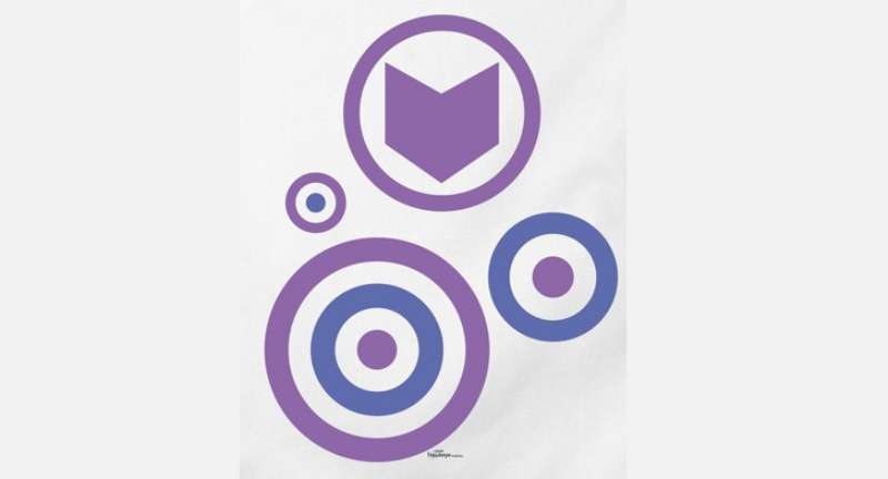
Iowa’s branding went from a literal bird illustration in the early 1900s to the clean, abstract Tigerhawk that’s been on helmets since 1979. Marvel’s Hawkeye symbol has been redesigned more times than most people realize, often tied to costume overhauls.
Original Iowa Hawkeyes Logo (Early 1900s–1940s)
- Years Active: Early 1900s–1940s
- Design Description: Illustrated hawk figure, more naturalistic and detailed, typical of early collegiate sports marks.
- Color Scheme: Black and gold, though reproduction was inconsistent across applications.
- Designer: Unknown.
- Context: Adopted as part of Iowa’s early athletic identity as the school leaned into the “Hawkeyes” nickname.
- Key Changes from Previous: N/A (first iteration).
- Cultural Significance: Established the hawk as Iowa’s primary visual identity marker.
Mid-Century Iowa Logo (1940s–1970s)
- Years Active: 1940s–1979
- Design Description: Cartoon-style hawk, more expressive face, used across multiple sports programs with slight variations.
- Color Scheme: Black and gold.
- Designer: Unknown.
- Context: Common in the era of mascot-heavy collegiate branding. Most schools had a similar illustrated animal mascot.
- Key Changes from Previous: More stylized and less naturalistic than the original.
- Cultural Significance: Became recognizable regionally but lacked the boldness needed for modern reproduction on helmets and small-format merchandise.
The Tigerhawk (1979–Present)
- Years Active: 1979–present
- Design Description: Abstract hawk head facing left, built from geometric shapes, bold black lines on gold background. No unnecessary detail.
- Color Scheme: Black (#000000) and Old Gold (#FFCD00).
- Designer: Evelyn Hotopp.
- Context: Iowa Athletics commissioned a rebrand. Hotopp’s design was chosen for its scalability and boldness on football helmets.
- Key Changes from Previous: Completely dropped the illustrative style. Moved to pure abstraction.
- Cultural Significance: One of the most copied marks in college sports. Multiple schools have been accused of borrowing elements from this design.
Marvel Hawkeye Comic Logo (1964–2012)
- Years Active: 1964–2012 (various iterations)
- Design Description: Mostly text-based title treatments on comic covers. The character’s costume “H” mask served as the de facto icon.
- Color Scheme: Purple and blue, reflecting the character’s costume.
- Designer: Various Marvel Comics art directors over the decades.
- Context: Hawkeye debuted in Tales of Suspense #57 (1964). His visual identity was tied closely to costume design rather than a standalone logo.
- Key Changes from Previous: N/A (first iteration).
- Cultural Significance: Established purple as the character’s signature color, which has stuck through every redesign.
Matt Fraction Era Logo (2012–2015)
- Years Active: 2012–2015
- Design Description: The David Aja-designed Hawkeye series introduced a clean, graphic “H” with an arrow motif. Bold, flat, almost retro. Very intentional.
- Color Scheme: Purple and white with strong black outlines.
- Designer: David Aja (series artist/designer).
- Context: The Matt Fraction/David Aja run is widely considered one of the best Hawkeye comics ever. The logo matched the book’s graphic novel aesthetic perfectly.
- Key Changes from Previous: First time the character had a truly distinct, standalone logo mark that worked outside of a comic cover context.
- Cultural Significance: Massive. This design influenced the MCU’s visual approach to the character significantly.
MCU Disney+ Series Logo (2021–Present)
- Years Active: 2021–present
- Design Description: The Disney+ Hawkeye series used a stylized arrow letterform integrated into the title treatment. Clean, modern, with a Christmas-red and dark color palette for the holiday setting.
- Color Scheme: Dark navy, red accents, white typography.
- Designer: Marvel Studios creative team.
- Context: The show premiered November 2021. The branding needed to balance superhero identity with the series’ lighter, holiday-thriller tone.
- Key Changes from Previous: Shifted away from purple as the dominant color. More cinematic, less comic-book.
- Cultural Significance: Introduced Kate Bishop as co-lead, which the logo subtly acknowledged through its dual-arrow design elements.
What Do the Design Elements of the Hawkeye Logo Mean?
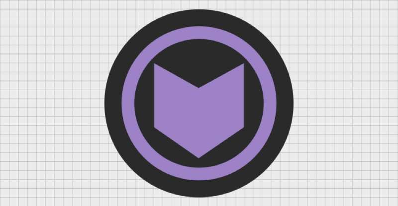
The Iowa Tigerhawk communicates aggression and precision through pure geometry, no decoration needed. The Marvel version has always used arrows and angular forms to signal the character’s core identity as a marksman, someone defined by aim and accuracy.
What Does the Hawk Symbol Mean in Iowa’s Logo?
The hawk head is stripped down to its most readable form. The sharp beak and angular eye aren’t decorative, they communicate speed and predatory focus. Iowa chose a bird of prey for a reason. It maps directly onto athletic competition: sharp, fast, dominant. The abstract approach also means it scales perfectly from a helmet decal to a stadium banner without losing legibility.
What Is the Historical Significance Behind the Hawkeye Name?
Iowa’s “Hawkeyes” nickname traces back to the 1840s, tied to a fictional character named Hawkeye in James Fenimore Cooper’s stories and adopted as a regional identifier for Iowa residents. The University officially adopted the name for its athletic programs in the early 1900s. For Marvel, Hawkeye (Clint Barton) first appeared in 1964. The name fits the character’s precision archery skills and his role as the “human” member of a superhero team full of enhanced individuals.
Why Did Hawkeye’s Design Reference Archery Imagery?
The arrow is Hawkeye’s defining symbol across every iteration of the character. In the David Aja comic run, arrows were used as design elements throughout the entire book, not just the logo. It became almost a visual language. The MCU series continued this, using arrow motifs in title cards and marketing to signal the character’s identity before a single frame of the show aired.
Why Did the University of Iowa Choose These Specific Colors?

- Black (#000000): Strength, boldness, high contrast on field and on screen. Psychologically signals authority and power. Standard in college athletics for good reason.
- Old Gold (#FFCD00): Iowa’s gold is warmer than most school yellows. It reads as prestigious rather than bright. The hue sits closer to amber, which gives it weight. Psychologically, gold signals achievement and tradition.
For Marvel’s Hawkeye, purple has been the constant. Purple reads as unconventional and slightly rebellious, which fits a character who is technically just a guy with a bow in a world of gods and armored suits.
What Typography Style Is Used in the Hawkeye Logo?
The Iowa Tigerhawk doesn’t actually use typography as a primary element. The hawk mark stands alone. When wordmarks are used in Iowa Athletics materials, they tend to use bold, condensed sans-serif treatments that match the mark’s weight and energy. The Marvel Hawkeye series logo used custom lettering for the title treatment in both the Fraction-era comics and the Disney+ series. The Aja version had a particularly strong typographic identity, almost brutalist in its directness. The MCU series used a tight, slightly compressed display treatment that read clearly on streaming thumbnails, which is its own design challenge worth taking seriously.
What Are the Hidden Meanings in the Hawkeye Logo?
The Tigerhawk’s name is itself a blend: “Tiger” from an older Iowa mascot concept, “Hawk” from the primary identity. The design doesn’t show a tiger, but the name stuck. Some designers have noted the mark’s negative space suggests motion, the eye shape creates a sense of the hawk turning its head. For the Marvel Aja logo, the arrow integrated into the letterforms wasn’t subtle at all. It was intentional and direct. David Aja has talked about wanting every design element in that book to feel purposeful.
How Does the Hawkeye Logo Compare to Competitor Logos?
Iowa’s Tigerhawk is arguably cleaner and more scalable than most Big Ten competitor marks. The Marvel Hawkeye logo, particularly the Aja version, is more graphically sophisticated than most superhero title treatments.
Among Big Ten schools, Iowa’s mark is unusual for its level of abstraction. Most schools use either a full mascot illustration or a straightforward wordmark. The Tigerhawk splits the difference in a way that actually works. Compare it to Michigan’s block “M” (pure wordmark), Penn State’s similar minimalism, or Nebraska’s “N” and you see Iowa occupying a distinct visual position.
Among superhero logos, Hawkeye’s mark lacks the instant global recognition of the Spider-Man logo or the Iron Man logo. But the Aja-designed version is genuinely more interesting from a pure design standpoint. It’s less iconic but more considered.
Characters like Black Widow, Captain America, and Thor all have logos that lean heavily on shape symbolism. Hawkeye’s arrow-integrated mark is more typographic, which makes it unusual in the superhero logo category.
What Are the Technical Specifications of the Hawkeye Logo?
Iowa Tigerhawk Official Color Codes
- Primary Color: Black
- Hex: #000000
- RGB: (0, 0, 0)
- CMYK: (0, 0, 0, 100)
- Pantone: Black C
- Secondary Color: Old Gold
- Hex: #FFCD00
- RGB: (255, 205, 0)
- CMYK: (0, 12, 100, 0)
- Pantone: 109 C
Marvel Hawkeye (MCU Series) Color Codes
- Primary Color: Deep Navy
- Hex: #1A1A2E
- RGB: (26, 26, 46)
- CMYK: (43, 43, 0, 82)
- Pantone: 282 C (approximate)
- Accent Color: Red
- Hex: #C0392B
- RGB: (192, 57, 43)
- CMYK: (0, 70, 78, 25)
- Pantone: 485 C (approximate)
Dimensions and Proportions
- Aspect Ratio: The Tigerhawk is designed on roughly a 1:1 ratio, making it flexible for square and circular applications.
- Minimum Size: Iowa Athletics guidelines recommend no smaller than 0.75 inches for print to maintain legibility of the hawk’s facial features.
- Clear Space: Standard practice is to maintain clear space equal to the height of the hawk’s eye on all sides.
- File Formats: Official versions are distributed as vector graphics (EPS, SVG) for scalability. JPEG and PNG versions are provided for digital use. Bitmap formats are used for specific merchandise applications where vector output isn’t possible.
- Resolution: Digital exports are typically provided at 300 DPI for print-ready use.
What Cultural Impact Has the Hawkeye Logo Had?

The Iowa Tigerhawk has had a measurable impact on college sports branding. It’s been borrowed, referenced, and imitated more than the university would probably like. Several high school programs in Iowa and surrounding states have adopted near-identical marks. That’s either a compliment or a trademark headache, depending on how you look at it. The mark’s staying power since 1979 says something real. Most college athletic logos have been updated multiple times in that span. Iowa has made only minor refinements. On the Marvel side, the David Aja Hawkeye comics developed a cult following largely because of the book’s visual identity, not just the writing. The logo and design language became part of the product in a way that most superhero comics don’t manage. The Disney+ series brought the character’s visual identity to a much wider audience. The arrow motif showed up in promotional materials, app icons, and merchandise in ways that reinforced the character’s identity more consistently than his previous MCU appearances.
How Does the Hawkeye Logo Fit Into the Overall Brand Identity?
The Tigerhawk functions as the centerpiece of a broader Iowa Athletics identity system that includes wordmarks, color applications, and uniform standards across all sports programs.
The mark connects directly to Iowa’s black-and-gold color palette, which runs consistently across every team and every piece of merchandise. The Tigerhawk sits at the center of a network of related elements: the “IOWA” wordmark, the helmet stripe pattern, the court and field designs at Kinnick Stadium and Carver-Hawkeye Arena. These elements don’t just coexist, they reference each other. The brand style guide specifies how the mark interacts with typography, what color backgrounds are permitted, and how much space must surround it. For Marvel, Hawkeye’s logo fits into a broader MCU identity system while maintaining character-specific distinctiveness. The purple accent color and arrow motif carry across merchandise, digital content, and print in a way that makes the character identifiable even outside the Avengers logo context. Both versions benefit from the same basic principle: the logo is only as strong as the system around it. A great mark in a poorly managed identity system still ends up looking inconsistent.
How Should the Hawkeye Logo Be Used?
Iowa Tigerhawk Usage Guidelines
- Do: Use official files obtained directly from the University of Iowa Athletics department. Maintain the required clear space. Use approved color versions only (full color, black, white/reversed).
- Don’t: Stretch, rotate, recolor, add effects, or combine the mark with other logos without written permission. Don’t use low-resolution versions for print.
- Access: Official media files are available through Iowa Athletics’ media relations office. Licensing inquiries go through the university’s licensing office.
- Trademark Protection: The Tigerhawk is a registered trademark. Unauthorized commercial use is an infringement. The university actively enforces this.
Marvel Hawkeye Logo Usage Guidelines
- Do: Use official Marvel-provided assets for press and editorial purposes. Follow Disney/Marvel’s brand licensing terms for any commercial application.
- Don’t: Use the logo on merchandise, apparel, or commercial products without a valid Marvel licensing agreement. Fan art is generally tolerated but not officially sanctioned for sale.
- Access: Press assets are available through Marvel’s press site. Commercial licensing goes through Disney’s consumer products and licensing division.
- Trademark Protection: Hawkeye and all associated marks are owned by Marvel Entertainment, LLC, a subsidiary of The Walt Disney Company. Enforcement is active, particularly around merchandise.
FAQ on The Hawkeye Logo
What is the official Hawkeye logo?
There are two main versions. The University of Iowa uses the Tigerhawk, an abstract hawk head mark designed by Evelyn Hotopp in 1979.
Marvel’s Hawkeye logo is a stylized arrow emblem tied to Clint Barton’s archery identity, most recently updated for the 2021 Disney+ series.
What colors does the Hawkeye logo use?
Iowa’s Tigerhawk uses Black (#000000) and Old Gold (#FFCD00). These have been the official Iowa Hawkeyes colors since the program’s early years.
Marvel’s version leans on deep purple and dark navy, with red accents added specifically for the Disney+ series branding.
Who designed the Iowa Hawkeyes logo?
Evelyn Hotopp created the Tigerhawk in 1979 for Iowa Athletics. It replaced a cartoon-style hawk that had been used since the mid-century era.
The design has remained largely unchanged for over four decades, which is rare in college athletic branding.
What does the Hawkeye logo symbolize?
Iowa’s abstract hawk head communicates speed, aggression, and precision through geometry alone. No decorative detail, just pure shape.
For Marvel, the arrow motif directly references Clint Barton’s identity as a marksman, someone defined entirely by aim and accuracy.
How many times has the Hawkeye logo been redesigned?
Iowa has gone through roughly six logo phases since the early 1900s, moving from naturalistic bird illustrations to the current abstract Tigerhawk.
Marvel’s Hawkeye logo has changed more frequently, with near every major comic relaunch bringing an updated title treatment or character emblem.
Is the Hawkeye logo trademarked?
Yes. The Iowa Tigerhawk is a registered trademark of the University of Iowa, actively enforced against unauthorized commercial use.
Marvel’s Hawkeye branding is owned by Marvel Entertainment, LLC, a subsidiary of Disney. Licensing for commercial use requires a formal agreement.
What font is used in the Hawkeye logo?
Iowa Athletics uses bold, condensed sans-serif wordmarks alongside the Tigerhawk mark. No standard commercial font is publicly identified as the official choice.
The David Aja comic series used custom lettering that became iconic on its own, heavily influencing the MCU series title treatment.
Where can I download the official Hawkeye logo?
Iowa Athletics distributes official vector files through their media relations office. These are intended for press and licensed use, not general download.
Marvel press assets are available via Marvel’s official press site. Consumer use outside editorial context requires a valid licensing agreement with Disney.
How does the Iowa Tigerhawk compare to other Big Ten logos?
It’s more abstract than most. Michigan uses a block “M,” Nebraska a simple “N.” Iowa’s Tigerhawk is the rare Big Ten mark built on full abstraction rather than letterforms.
That’s exactly why it’s been copied so often by high school programs across the Midwest.
What impact did the Marvel Hawkeye logo have on the character’s popularity?
The David Aja-designed logo from the 2012 Matt Fraction comic run gave the character a distinct visual identity for the first time.
That design directly influenced the Disney+ series branding, which brought the arrow emblem to a global streaming audience in November 2021.
Conclusion
The Hawkeye logo carries real weight whether you’re talking about Iowa’s Tigerhawk or Marvel’s arrow emblem.
Both versions have earned their place through consistent use, strong design decisions, and clear connections to the identities they represent.
Evelyn Hotopp’s 1979 abstract mark remains one of the most copied designs in collegiate athletic branding. That’s not an accident.
On the Marvel side, the David Aja era gave Clint Barton a visual identity that finally matched the character’s underdog appeal, and the Disney+ series carried that forward to a global audience.

Renowned for his expertise in logo design and visual branding, Bogdan has developed a multitude of logos for various clients.
His skills extend to creating posters, vector illustrations, business cards, and brochures. Additionally, Bogdan's UI kits were featured on marketplaces like Visual Hierarchy and UI8.
He also wrote in the past years on sites like Design Your Way, WebDesignerDepot, WPDean, Designmodo, Speckyboy, Slider Revolution, and more.
- Versatile Work Sans Font Pairing for Every Project - 16 September 2026
- Organize Digital Files Like a Pro Before Your Next Client Handoff - 16 September 2026
- How to Set Up a Digital Menu Board: Hardware to Layout - 15 September 2026

Bogdan Sandu is a seasoned designer who has been designing websites since 2008. Renowned for his expertise in logo design and visual branding, Bogdan has developed a multitude of logos for various clients. His skills extend to creating posters, vector illustrations, business cards, and brochures. Additionally, Bogdan's UI kits were featured on marketplaces like Visual Hierarchy and UI8. He also wrote in the past years on sites like Design Your Way, WebDesignerDepot, WPDean, Designmodo, Speckyboy, Slider Revolution, and more.
You Might Also Like


