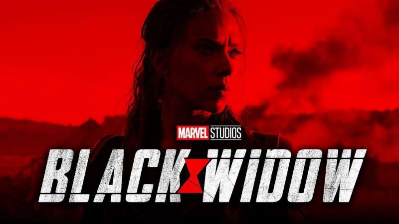
The Black Widow logo is one of Marvel’s most recognized character symbols, built around a stylized hourglass shape drawn directly from the red marking found on real black widow spiders. It represents Natasha Romanoff, a trained assassin and S.H.I.E.L.D. operative who became a core Avenger. Within superhero logos broadly, it sits apart from the more bombastic emblems because it’s restrained, dark, and quietly threatening. The mark has appeared across comics since the 1960s, with the film era giving it a more polished, production-ready form.
What Is the Black Widow Logo?
The Black Widow logo is a character emblem built around a red hourglass silhouette, symbolizing danger and precision. It was refined for the Marvel Cinematic Universe starting around 2010 and has appeared across comics, film, and merchandise without a single credited independent design agency.
- Design Type: Emblem / Icon mark
- Primary Elements: Hourglass shape derived from the Latrodectus spider’s abdominal marking; minimal graphic form with no wordmark in the standalone icon version
- Official Introduction Date: The character debuted in Tales of Suspense #52 (April 1964); the modern stylized hourglass mark was formalized for MCU use around 2010–2012
- Designer/Agency: No single external agency credited; developed internally through Marvel Studios’ art and production departments
- Trademark Status: Trademarked under Marvel Entertainment, LLC, a subsidiary of The Walt Disney Company
- Color Palette: Primary black (#000000), accent red (#C8102E or close variants depending on application)
- Usage Context: Comic book covers, film posters, merchandise, costume design, digital platforms, and promotional materials
How Has the Black Widow Logo Evolved Over Time?
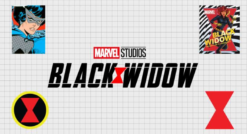
The Black Widow symbol started as a loose comics-era motif and gradually tightened into the clean hourglass mark used across MCU films and merchandise today. Each shift tracked both the character’s changing role and Marvel’s broader design standards.
Original Black Widow Comics Symbol (1964–2000s)
- Years Active: 1964–early 2000s
- Design Description: No single consistent emblem; hourglass imagery appeared on costume details inconsistently across different artists and print runs
- Color Scheme: Black and red, though color rendering varied significantly across print eras
- Designer: Multiple Marvel Comics artists over decades, including Don Heck and Stan Lee (character co-creators)
- Context: Natasha Romanoff’s visual identity was handled differently by each artist; the hourglass appeared as a belt buckle detail or chest emblem depending on costume iteration
- Key Changes from Previous: N/A (original version)
- Cultural Significance: Tied Black Widow’s visual identity to the natural danger signal of the actual spider, reinforcing her role as a lethal, precise operative
MCU Transition Logo (2010–2019)
- Years Active: 2010–2019
- Design Description: Cleaner, more geometric hourglass form; used primarily on costume details, marketing materials, and merchandise. The logo became more standardized as Scarlett Johansson’s portrayal cemented the character’s mainstream presence
- Color Scheme: Deep black (#000000) with red (#C8102E), sometimes shifted to silver or grey in certain merchandise lines
- Designer: Marvel Studios production design team
- Context: Iron Man 2 (2010) introduced Black Widow into the MCU, triggering a need for consistent visual branding across a massive merchandise and marketing operation
- Key Changes from Previous: Moved from artist-interpreted emblem to a standardized, reproducible icon; cleaner geometry, production-print-ready
- Cultural Significance: Brought the character to global audiences; the emblem began appearing on clothing, toys, and digital platforms at enormous scale
Post-2021 Film Era Logo (2021–Present)
- Years Active: 2021–present
- Design Description: The standalone Black Widow film (2021) introduced a more refined title treatment alongside the hourglass emblem; cleaner, bolder, with better digital scalability
- Color Scheme: Black and red, with white used in reversed applications
- Designer: Marvel Studios creative team in collaboration with film marketing agencies
- Context: The film gave the character her first solo title, prompting a more intentional approach to standalone branding
- Key Changes from Previous: More deliberate typographic pairing with the hourglass icon; cleaner digital-first applications
- Cultural Significance: Marked the character’s graduation from ensemble member to solo franchise anchor
What Do the Design Elements of the Black Widow Logo Mean?
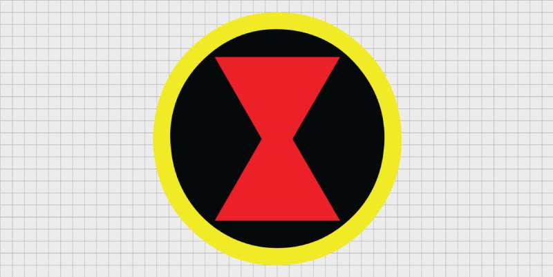
The hourglass is the entire visual argument. It signals danger, precision, and time running out, all without a single word. Every element in the logo connects directly to the character’s identity as an assassin operating in the shadows.
What Does the Hourglass Symbol Represent?
The hourglass comes directly from the red marking on the underside of female Latrodectus spiders, a universal warning signal in nature.
In design terms, it creates immediate tension. The shape is symmetrical but unstable-looking, which mirrors the character’s own duality.
It also works as a nod to mortality. Black widows kill their mates; the hourglass says time is always running out for someone near Natasha Romanoff.
The emphasis in the design sits entirely on that one shape. Nothing else competes with it.
What Historical Context Shaped the Logo?
The character was created in 1964 during the Cold War, and her original visual identity reflected Soviet spy aesthetics: dark, understated, built for concealment.
The hourglass mark didn’t become a fixed emblem immediately. It took decades of comic book iterations before it solidified into a consistent, standalone icon.
The MCU formalized it. Once Scarlett Johansson’s portrayal hit mainstream audiences, Marvel needed one consistent mark to put on everything from action figures to film posters.
What Cultural References Are Embedded in the Design?
The spider imagery connects to a long history of femme fatale archetypes in fiction, predatory, precise, and misunderstood.
The hourglass also shows up in playing cards, poison warning labels, and alchemical symbols. It carries centuries of loaded meaning before Marvel even touches it.
Within the MCU’s visual language, it sits alongside other strong geometric marks like the Captain America logo and the Iron Man logo, each using shape and color psychology to do character work instantly.
Why Did Black Widow’s Designers Choose These Specific Colors?

- Black (#000000)
- Symbolic Meaning: Stealth, authority, lethality
- Psychological Impact: Creates a sense of threat and sophistication simultaneously; among black logos, it’s one of the more character-specific uses of the color
- Brand Connection: Ties the character to espionage, shadow operations, and the Red Room’s aesthetic
- Red (#C8102E)
- Symbolic Meaning: Danger, blood, urgency
- Psychological Impact: Red triggers an instinctive alert response; it’s the same reason stop signs and warning labels use it. Among red logos in entertainment, Black Widow’s use is unusually precise in its intent
- Brand Connection: Mirrors the actual spider’s warning coloration; reinforces the “don’t get close” subtext of the character
What Typography Style Is Used in the Black Widow Logo?
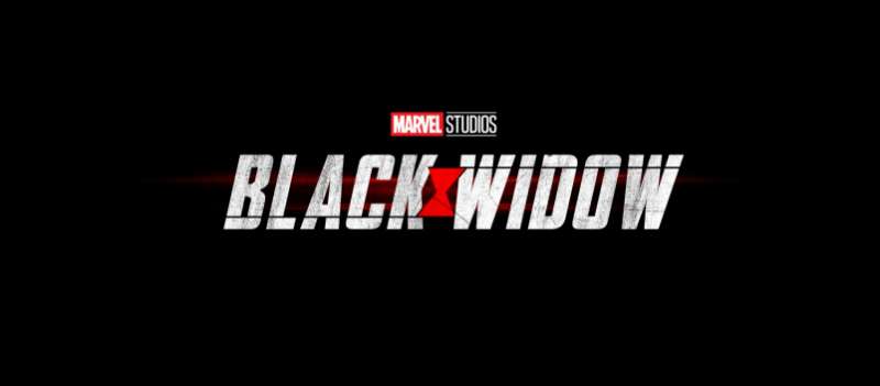
The standalone icon version of the logo doesn’t use a wordmark at all, which is a deliberate choice. The hourglass carries the full weight of recognition on its own.
When text does appear, particularly in film title treatments, it uses bold sans-serif letterforms. Clean, high-contrast, no decorative elements. The typography choices prioritize legibility at large scale, which matters when you’re designing for IMAX posters and 6-inch action figure packaging simultaneously.
The typographic hierarchy in promotional materials typically places the character name large, with supporting text significantly smaller. Nothing competes with the title.
There’s no custom typeface attributed to Black Widow specifically. Marvel uses a family of proprietary and licensed fonts across its properties, adapted per project.
What Are the Hidden Meanings in the Black Widow Logo?
The hourglass is symmetrical, but that symmetry reads differently depending on orientation. Right-side up, it looks like a figure standing with legs apart. Upside down, it looks like a drop of venom. Both readings work.
There’s also the time pressure reading. An hourglass counts down. Every appearance of Black Widow in the MCU carries a sense of ticking clocks and unresolved ledgers, and the emblem reinforces that subconsciously.
The focal point in the design is the narrow center of the hourglass, the pinch point. Compositionally, that’s where your eye goes first, and it’s the most tense part of the shape.
Whether intentional or not, the mark also reads as two opposing triangles barely touching, a visual representation of balance disrupted. The balance principle in graphic design says that tension between elements creates energy, and this logo lives in that tension.
How Does the Black Widow Logo Compare to Competitor Logos?
Among Marvel character emblems, Black Widow’s mark is one of the most restrained. Most superhero logos lean into bold shapes, bright colors, or dramatic motion. This one does the opposite, and that contrast is exactly what makes it work.
Compare it directly to similar character marks:
- Spider-Man logo: Also spider-based, but expressive and dynamic. The Spider-Man emblem stretches across a chest, full of movement and personality. Black Widow’s mark is compressed and still.
- Hawkeye logo: Arrow-based, geometric, directional. It implies speed and trajectory. Black Widow’s hourglass implies waiting, which is more unsettling.
- Thor logo: Mjolnir silhouette, heavy and mythic. Entirely different weight class of visual communication.
- Captain Marvel logo: Star-based, bright, expansive. Built for optimism. Black Widow’s emblem goes the other direction entirely.
- Daredevil logo: The closest comparison in tone. Both use dark palettes and minimal shapes to suggest threat rather than heroism. But Daredevil’s double-D mark is typographic where Black Widow’s is purely symbolic.
Within the broader category of superhero logos, Black Widow’s stands out because it borrows directly from nature rather than geometry or mythology. That’s unusual, and it gives the mark a grounded, real-world menace that most superhero emblems don’t have.
What Are the Technical Specifications of the Black Widow Logo?
Official Color Codes
- Primary Color: Black
- Hex: #000000
- RGB: (0, 0, 0)
- CMYK: (0, 0, 0, 100)
- Pantone: Black C
- Accent Color: Red
- Hex: #C8102E (standard Marvel red; exact shade may vary by application)
- RGB: (200, 16, 46)
- CMYK: (0, 92, 77, 22)
- Pantone: 186 C
- Reversed Application: White
- Hex: #FFFFFF
- RGB: (255, 255, 255)
- CMYK: (0, 0, 0, 0)
Dimensions and Proportions
- Aspect Ratio: The hourglass emblem is roughly 1:1.6 (width to height), though exact ratios vary across official applications
- Minimum Size Requirements: Marvel’s brand guidelines (not publicly released in full) typically require character emblems to maintain legibility at no smaller than 0.5 inches in print contexts
- Clear Space: Standard Marvel practice maintains clear space equal to the height of the emblem on all sides
- File Formats: Official assets distributed as vector graphics (AI, EPS, SVG) for scalability; JPEG and PNG for digital use. Raster versions are typically exported at minimum 300 DPI for print
- Digital pixel dimensions: Varies by platform; web use typically 512x512px minimum for icon applications
What Cultural Impact Has the Black Widow Logo Had?
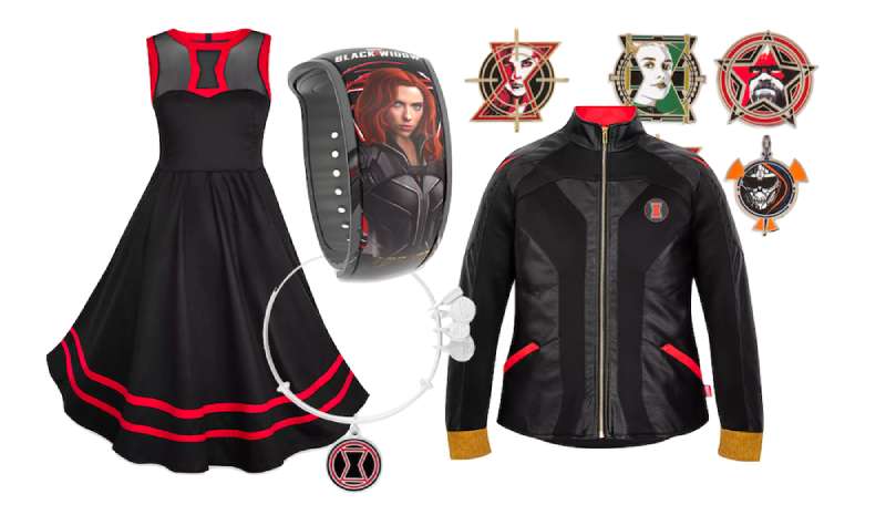
Few character marks from the MCU have crossed as cleanly into general fashion and streetwear as the Black Widow hourglass. It appears on clothing worn by people who’ve never read a comic in their lives, which says something about the mark’s visual self-sufficiency.
The symbol became especially significant after 2021. The film’s release during a period of heightened conversation around female representation in action franchises gave the emblem additional cultural weight.
It’s also one of the cleaner examples of storytelling through design. Someone who knows nothing about the character can still read danger and precision from the mark. That cross-context legibility is hard to achieve.
The hourglass has also been adapted by fans into tattoos, custom patches, and independent art at a scale that most character logos don’t reach. That level of adoption usually signals that a mark has genuinely connected with people beyond pure franchise loyalty.
Within graphic design movements more broadly, the logo represents a moment where entertainment branding stopped leaning on maximalism and started recognizing that restraint communicates more. It’s not the only example, but it’s a clean one.
How Does the Black Widow Logo Fit Into the Overall Brand Identity?
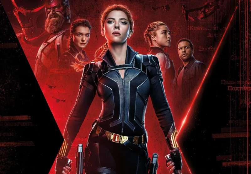
The Black Widow mark doesn’t exist in isolation. It operates inside a dense network of interconnected Marvel visual identities, each designed to feel distinct while sharing a coherent family logic.
The hourglass connects directly to Natasha Romanoff as an entity, but it also plugs into the Avengers visual system, Marvel Studios’ broader brand guidelines, and Disney’s global licensing operation.
Think of it as a node in a larger map. The character emblem links to film posters, which link to merchandise, which link to theme park applications, which link to digital storefronts. Each touchpoint uses the hourglass as an anchor point for recognition.
The relationship between the character logo and the overall Marvel identity follows a consistent logic: the parent brand (Marvel Studios’ logo) gets prominence in marketing, while the character emblem handles product-level identification. They rarely compete because they operate at different scales and contexts.
The brand style guide governing Black Widow’s visual identity is internal to Marvel/Disney and not publicly available in full. But the consistency of the mark across 15+ years of global applications suggests tight governance.
Compared to something like the Black Panther logo, which also uses dark tones and animal-derived imagery, Black Widow’s emblem is more minimalist and less ceremonial. Both sit within the same Marvel visual family but serve different emotional registers.
How Should the Black Widow Logo Be Used?
Official Usage Guidelines
- Do: Use official assets obtained through Marvel’s licensing portal or authorized merchandise channels
- Do: Maintain the mark’s color integrity; don’t substitute the red for other colors without authorization
- Do: Respect the clear space around the emblem; don’t crowd it with other graphic elements
- Don’t: Alter, stretch, or distort the hourglass proportions
- Don’t: Use the mark in contexts that imply official Marvel endorsement without a licensing agreement
- Don’t: Reproduce the logo for commercial purposes without a valid license from Marvel Entertainment, LLC
Where to Access Official Assets
- Licensed partners access official files through Marvel’s brand asset management system
- Press and editorial use is handled through Marvel’s media relations department
- Fan and non-commercial use falls under Marvel’s published fan content policy, which permits limited personal, non-commercial projects
Licensing and Trademark Details
- The Black Widow character and associated marks are trademarked by Marvel Entertainment, LLC
- Marvel Entertainment is a wholly-owned subsidiary of The Walt Disney Company
- Commercial use without a licensing agreement constitutes trademark infringement
- Licensing inquiries should be directed to Marvel’s official licensing contacts through marvel.com
- Fan artists selling merchandise using the emblem, even modified versions, operate in a legally grey area and risk cease-and-desist notices from Disney’s legal team
FAQ on the Black Widow Logo
What does the Black Widow logo symbolize?
The logo uses the hourglass marking found on real black widow spiders.
It signals danger, precision, and mortality. Time running out. For Natasha Romanoff, that’s not just visual design – it’s character biography compressed into a single shape.
Who designed the Black Widow logo?
No single designer is publicly credited.
The Natasha Romanoff emblem evolved through decades of Marvel Comics artists before Marvel Studios’ internal team standardized it for MCU use around 2010. Don Rico and Stan Lee co-created the character, but the logo came later.
What colors are used in the Black Widow logo?
Black (#000000) and red (#C8102E).
Black signals stealth and authority. Red triggers an instinctive danger response – the same reason the actual Latrodectus spider uses it. The color palette is intentional at every level.
When was the Black Widow logo first introduced?
The character debuted in Tales of Suspense #52 in April 1964.
The hourglass as a consistent, standalone Marvel character emblem wasn’t formalized until the MCU era, roughly 2010–2012, when Iron Man 2 brought Natasha Romanoff to mainstream audiences.
Is the Black Widow logo trademarked?
Yes. It’s trademarked by Marvel Entertainment, LLC, a subsidiary of The Walt Disney Company.
Commercial use without a licensing agreement is infringement. Fan art for personal, non-commercial use generally falls under Marvel’s published fan content policy, but selling merchandise is a different matter entirely.
How does the Black Widow logo compare to other Marvel superhero logos?
It’s notably more restrained than most.
The Spider-Man logo is expressive and dynamic. The Thor logo is heavy and mythic. Black Widow’s hourglass is compressed, still, and quietly threatening – which actually makes it more distinctive within the superhero logos category.
What font is used in the Black Widow logo?
The standalone icon version uses no wordmark at all.
When text appears in film title treatments, bold sans-serif letterforms are used. No custom typeface is publicly attributed to Black Widow specifically – Marvel adapts licensed and proprietary fonts per project.
What is the Black Widow hourglass symbol?
It’s a stylized version of the red abdominal marking found on female Latrodectus spiders.
In nature, it’s a warning signal. In the MCU, it carries the same message. The spider widow symbol works because it doesn’t need explanation – the meaning is baked into the shape itself.
Has the Black Widow logo changed over time?
Yes, across three broad phases.
Comics-era versions were inconsistent across artists. The MCU transition (2010–2019) standardized it. The 2021 solo film refined it further for digital-first applications. Each shift tracked both the character’s evolving role and Marvel’s tightening brand guidelines.
Where can I find the official Black Widow logo files?
Licensed partners access assets through Marvel’s internal brand management system.
Press and editorial use goes through Marvel’s media relations team. For everything else, Marvel’s official site is the starting point. Downloading random PNG files from fan sites gets you a bitmap of questionable quality – not the real thing.
Conclusion
The Black Widow logo holds up because it earns its recognition – not through size or complexity, but through precision.
The hourglass spider symbol borrows directly from nature, which gives it a credibility that purely invented marks rarely achieve.
Across decades of Marvel Comics iterations and MCU character branding, the Natasha Romanoff emblem stayed consistent in intent even when the execution varied.
That’s the real measure of a strong superhero visual identity: it survives different hands, different contexts, and different scales without losing what makes it work.

Renowned for his expertise in logo design and visual branding, Bogdan has developed a multitude of logos for various clients.
His skills extend to creating posters, vector illustrations, business cards, and brochures. Additionally, Bogdan's UI kits were featured on marketplaces like Visual Hierarchy and UI8.
He also wrote in the past years on sites like Design Your Way, WebDesignerDepot, WPDean, Designmodo, Speckyboy, Slider Revolution, and more.
- Jujutsu Kaisen Font Generator - 12 October 2026
- The Windsurf Logo History, Colors, Font, And Meaning - 10 October 2026
- How to Remove Background From Product Photos (No Photoshop) - 10 October 2026

Bogdan Sandu is a seasoned designer who has been designing websites since 2008. Renowned for his expertise in logo design and visual branding, Bogdan has developed a multitude of logos for various clients. His skills extend to creating posters, vector illustrations, business cards, and brochures. Additionally, Bogdan's UI kits were featured on marketplaces like Visual Hierarchy and UI8. He also wrote in the past years on sites like Design Your Way, WebDesignerDepot, WPDean, Designmodo, Speckyboy, Slider Revolution, and more.
You Might Also Like